
This page describes how to configure a record list, format it, and add an Export to Excel button.
OverviewCopy link to clipboard
Once you've configured the source of your record type and modeled your data, you want to consider how users will view and navigate that data.
To allow users to easily navigate your data, you can configure a record list and allow users can search, filter, export, and take action on records from the list. Users can easily access this record list in Tempo or sites, or you can use it to jump-start your records-powered grids.
Record listCopy link to clipboard
The record list is a single, drillable list that users can search and filter to find the records they need. This list is configured on the record type, and can be formatted as a feed or grid.
In the record list, you can choose which fields appear and how they are formatted—either as plain text, a link, an image, an action, or any other display option.
You can also add user filters to a list so users can filter and save their results as needed. By adding record list actions, users can easily add new records to the list or start related processes.
Once you configure the record list, you can display it in Tempo, sites, and interfaces using records-powered grid. Whenever you create a records-powered grid, the record list will automatically populate to give you a head start on your configuration.
Format the record listCopy link to clipboard
The record list can be displayed as a grid or as a feed. By default, all new record types have a grid style as the record list format.
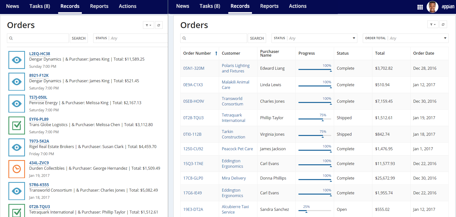
In the Orders list shown below, you can see the same set of records displayed in both a feed (left) and a grid (right).

Consider the following when choosing how to format your record list:
| Grid Style | Feed Style | |
|---|---|---|
| List format | Each record is displayed in rows like a spreadsheet. | Each record is displayed in a vertical list like a news feed. |
| Configuration | Use a design-mode experience to choose which fields appear in the list and how those fields appear using different display elements. | Create an expression using the a!listViewItem() function. |
| Field references | Use fv!row followed by a record field reference. For example, fv!row[recordType!Case.fields.caseNumber] |
Use rv!record followed by a record field reference. For example, rv!record[recordType!Case.fields.caseNumber] |
| Row limit | None. | 100 rows. |
Grid-style record listCopy link to clipboard
A grid-style record list organizes and displays your record data in tabular view. This list style is configured with an interface that is similar to the interface object. It allows you to easily navigate and configure the components of the grid.
To configure your grid-style list:
- In your record type, go to List.
- Click Edit List.
If this is a new record type, you'll notice that there's already a grid configured. A column is automatically generated for the first 50 fields in your source table. You can add, remove, or modify columns as necessary to display the record data you want to appear in the grid. You can always return to the default record list configuration by clicking Reset List.
There are three main levels to the grid that allow you to easily navigate between the record list configurations in the left pane: (1) Grid level, (2) Column level, and (3) Component level.
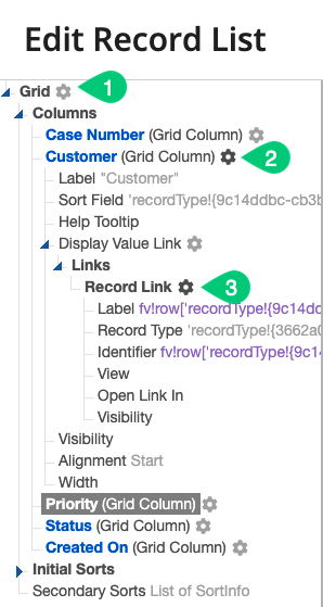
Click Test at any time to refresh the grid preview. This resets sorting so you can preview how the grid will look when it's first loaded.
Grid-level settingsCopy link to clipboard
The following properties can be configured for the grid-style record list:
| Field | Description |
|---|---|
| Columns | The data columns to show in the grid. Click Add Column to add a new column to the list. |
| Empty Grid Message | The value that displays when there are no records due to security, search, or applied filters. |
| Rows to Display per Page | The maximum number of records visible to users at a given time. Users can use the paging controls to see more data. |
| Initial Sort Field | The record field on which to sort when the record list first loads. Configure multiple initial sorts to create a list of sorts to apply to the record list when it first loads. |
| Secondary Sort Field | The record field on which to sort after a user manually sorts a column. |
| Spacing | Determines the spacing within grid cells. Valid values: "STANDARD" (web default), "DENSE" (mobile default). |
| Border Style | Determines the style of the grid border. Valid values: STANDARD (default), LIGHT. |
| Shade Alternate Rows | Determines whether alternate rows are shaded. Valid values: true (default), false. |
| Row Header | Index of the column to be used as the row header. Screen readers will announce the value in each row header when navigating to other cells within that row. Used only for accessibility; produces no visible change. |
| Accessibility Text | Additional text to be announced by screen readers. Used only for accessibility; produces no visible change. |
Column-level settingsCopy link to clipboard
The following properties can be configured for each column in the grid-style record list:
| Field | Description |
|---|---|
| Label | The label that appears as the column header. |
| Sort Field | The record field on which to sort when a user sorts this column. If no value is selected, the column is not sortable. |
| Help Tooltip | The tooltip that appears in the column header. |
| Display Value | The value to display in the column cell. This is configured at the component-level. |
| Visibility | Determines whether the column is displayed on the interface. |
| Alignment | Alignment of the column heading. Valid values are Start (default), Center, and End. |
| Width | Column width. Valid values are Auto (default), Icon, Icon plus, Narrow, Narrow plus, Medium, Medium plus, Wide and a range of 1X - 10X. |
There are two ways to edit a column's settings. You can edit a column by clicking on any column name in the navigation pane or the Columns section of the Grid settings.
Component-level settingsCopy link to clipboard
Each grid column can take an expression that evaluates to a component in Display Value and apply it across all column rows.
Note: If you don't configure a component for your column, the column fields will display as plain text.
You can use the following components as display values:
- Text
- Images
- Links
- Rich text display
- a!tagField()
- a!buttonArrayLayout()
- a!recordActionField()
- a!progressBarField()
DISPLAY OPTIONS provides a list of formatting templates for the most common component types and allows you to select the one you want to set up. To edit an existing component, simply click on the component's name.
To reference record fields in the grid-style list, use fv!row followed by a record field reference. For example, fv!row[recordType!Purchase Order.fields.purchaserName].
If you have relationships configured on your record type, you can also access fields from those record types using relationship references. For example, fv!row[recordType!Purchase Order.relationships.Customer.field.displayName].
Feed-style record listCopy link to clipboard
The feed-style record list is a vertical list of records that resembles a news feed. This is an alternative to the grid-style list.
Only the first 100 records display in a feed-style record list. If you have more than 100 records, consider a grid-style record list. You may also consider creating user filters so that users can filter the records to return only those that match the selected filter.
To create a feed-style record list:
- In your record type, go to List.
- Select Feed.
- Click Edit Record List to open the Edit List dialog.
- In List View, use the a!listViewItem() function to create your list view.
-
In Sort Field, select a field to sort on and the sort order.
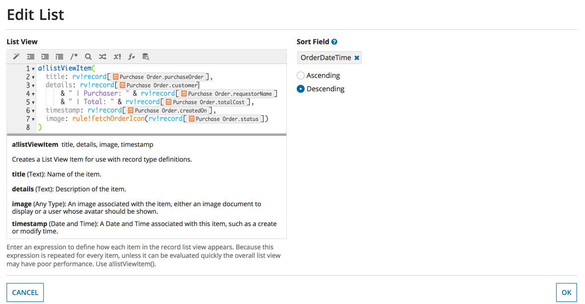
- Click OK.
To reference record fields in the feed-style list, use rv!record followed by a record type field reference.
For example, rv!record[recordType!Employee.fields.firstName] refers to the firstName field of the Employee record. Like the grid-style, you can also use fields from related records to display data in the feed. To learn more about rv!record, see Reference a Record Type in your Applications.
The listViewItem expression in the previous image results in a list that looks like this:
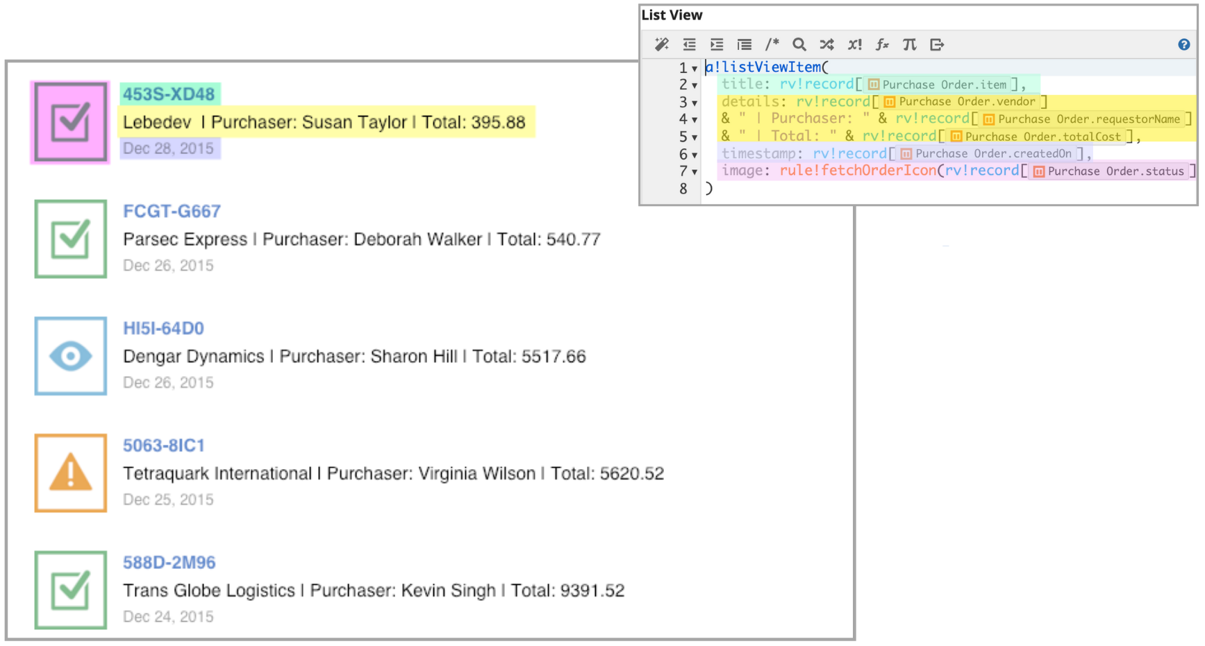
Tip: Many users find it helpful to create the list view in a separate expression rule and call that rule here.
In this example, the record image itself (in the image parameter) is called from a rule that returns an image for each record based on the record's status. Below is the rule we used to choose the appropriate image.
fetchOrderIcon
1
2
3
4
5
6
7
8
9
10
11
12
13
14
15
16
17
a!localVariables(
  local!status: choose(wherecontains(ri!status,cons!CASE_APP_OrderStatus),
    "EYE",
    "CLOCK",
    "WARNING",
    "PAPER_AIRPLANE",
    "TASK"
     ),
  local!color: choose(wherecontains(ri!status,cons!CASE_APP_OrderStatus),
    "BLUE",
    "GREY",
    "ORANGE",
    "GREEN",
    "GREEN"
  ),
  a!iconNewsEvent(local!status,local!color)
)
Copy
Add an export to Excel buttonCopy link to clipboard
You can allow users to export the record list by enabling the Export to Excel button. This button allows end users to export up to 100,000 records from the list, including rich text, images, and links, to Excel.
To add an export button to your record list:
- In your record type, go to List.
- Select the Show Export to Excel Button checkbox.
Record types that use a web service require additional logic necessary to handle paging, sorting, searching, and filtering. Since record lists are exported using batches to minimize memory usage, Appian requires designers to support a page size of 1,000 records. Make sure to test your web API or integration with this page size to determine whether the export operation will succeed.
Tip: See Export Records to Excel to learn how data is exported and how to optimize your record list for export.
Formatting restrictions for exportCopy link to clipboard
When you export the record list, the way Appian components appear in Excel may differ. Since Excel has its own formatting and styling restrictions, consider how the following components will display in Excel when designing your record list:
| Component | Restrictions |
|---|---|
| Rich text | Excel only supports one text format per cell. Cells with more than one text format will export without formatting. Additionally, for rich text icons, only the value of the altText parameter will be exported. |
| Images | Only image captions will be exported. If a caption is not available, either the document parameter on the document image or the source parameter on the web image will be exported. |
| Links | Excel only supports one link per cell. If there are multiple links, the link label will be followed by each link URL as text in parenthesis. Link types Dynamic Link, Start Process Link, and Authorization Link will export as text. All other link types will export as expected. |
Refresh the record listCopy link to clipboard
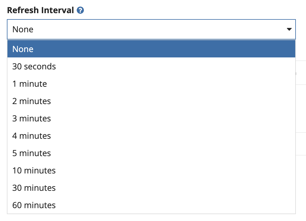
To keep the list up-to-date, you can define a Refresh Interval to seamlessly refresh the record list with the latest record data every few minutes.
With a time-based refresh, your list of records will be automatically refreshed even when the user doesn't interact with the list. If the Refresh Interval is set to None, users will need to click the refresh button on the list or manually refresh the page on the browser to view the latest records in the list.
Note: Defining a Refresh Interval will not trigger a sync on record type with data sync enabled. Instead, refreshing the record list will only re-query the cached version of your data.
To automatically refresh the record list:
- In your record type, go to List.
-
Under Refresh Interval, use the dropdown to select how often the list should be refreshed in minutes.
Note that refresh intervals may impact performance. See Performance considerations for more information.