This page provides a sample reporting scenario and related reporting patterns.
OverviewCopy link to clipboard
Reports allow you to explore and analyze your enterprise data so you can make better business decisions. For example, a simple report that tracks your sales trends over the last year can help you determine which regions need more support, which products should you restock, or which employees deserve a promotion.
To show you how fast and easy it is to build insightful reports, we've created a series of common reporting patterns that can be configured with little to no code. You can build and test all of these patterns using data from the Appian Retail application, a free, fully configured application available in Appian Community Edition.
These patterns show you the fastest way to build reports, and include sample business requirements so you can better understand when and why you'd create these types of reports. To get the most out of these reporting patterns, we recommend reviewing the story of the Appian Retail Company. This story provides context that simulates a real-world reporting scenario, including stakeholders and common business questions that can be answered in a report.
Here's the storyCopy link to clipboard
The Appian Retail Company is a large retail chain. They sell a variety of outdoor products like bikes, bike accessories, components, and clothing. Now, they’re thinking about expanding some of their product lines; however, this is a big business decision, one that should be backed by data.
Before making this investment, the company needs to better understand their existing sales trends and customer needs. This is when they ask you, their Appian developer, to create a few reports to show them how their business is doing.
But you need more information than that to create useful reports. You need to know who the audience is, and what questions do they need answered? Understanding your audience and the information they need will ultimately help you determine your requirements and create a better story with your data.
In this scenario, there are three different audiences who want to use these reports. Specifically, they want to know:
| Audience | Questions to Answer |
| Sales Executives |
|
| Account Managers |
|
| Inventory Managers |
|
To address their questions, you can create a series of reports that show sales trends over time, customers by highest sales generation, sales comparisons by product, and more. To allow stakeholders to investigate and collect their own insights, you can even make these reports dynamic and customized to their needs.
Let's take a look at the types of reports you can build to answer the questions outlined above.
Sales executive reportsCopy link to clipboard
First, let's address the questions posed by the sales executives:
- How are this year's sales compared to last year?
- Which global sales regions are performing the best?
Show sales growthCopy link to clipboard
Sales executives want to know how their sales in 2021 compared to their sales in 2020 so they can see, overall, how business is doing. Specifically, they need to know if business has grown over the year before they decide to expand existing product lines. If business has not grown, this may indicate that they need to shift their existing product strategy before expanding to new ones.
To show how 2021 sales compare to 2020 sales, you'll use the pattern on this page to calculate the company's year-over-year sales growth and display that value as a key performance indicator (KPI). This way, executives can quickly determine if the company is experiencing positive growth, and if so, move forward with their product expansion.
To create this report, see the Show year-over-year sales growth pattern.
Show sales by regionCopy link to clipboard
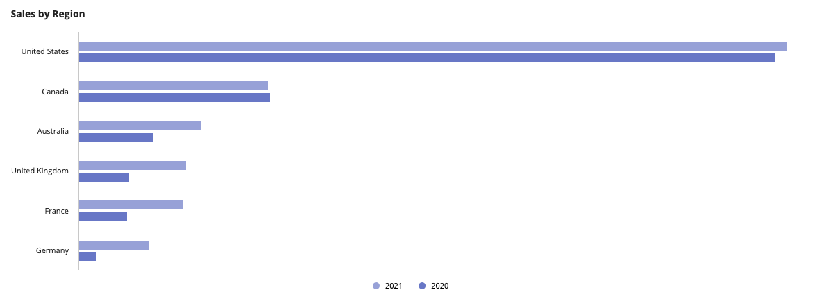
In their final report, sales executives want to know which global sales regions have the highest sales numbers so they can hire more employees and dedicate more resources to high-performance areas.
To show the sales regions with the highest sales, you'll create a bar chart that displays the sum of sales generated by each sales region in 2021. To see if sales have improved for certain regions, you'll also show the sum of sales generated by each region in 2020.
To create this report, see the Show sales by region pattern.
Account manager reportsCopy link to clipboard
Now, let's address the questions posed by the account managers:
- How many orders were purchased online compared to in-person?
- How many orders contain items purchased with promo codes?
Show the percentage of online salesCopy link to clipboard
Account managers want to know how much of their 2021 sales were generated from online sales so they can determine if they need to do more online advertising, or hire more in-person staff.
To show the percentage of online sales, you’ll first calculate the sum of sales for all orders purchased in 2021 and the sum of sales for orders purchased online in 2021. Then, you'll uses a gauge component to calculate and display the percentage of online sales generated that year.
To see if online sales are growing, you'll also calculate the percent of online sales generated in 2020. This way, account managers can quickly understand if sales are growing, stagnant, or decreasing, and make the necessary adjustments.
To create this report, see the Show the percentage of online sales pattern.
Show total orders compared to orders purchased with promo codesCopy link to clipboard
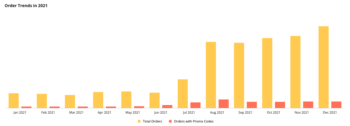
Account managers also want to know: of the total number of orders placed in 2021, how many orders had at least one item purchased with a promo code? Account managers will use this information to see if promo codes are having a positive effect on their total number of sales. Depending on the data, they may choose to send more promo codes during lower performing months to boost sales.
To allow account managers to analyze the relationship between promo codes and total orders, you'll create a column chart that shows the count of total orders and the count of orders that contain at least one promo code.
To create this report, see the Show the number of orders purchased with at least one promo code pattern.
Inventory manager reportCopy link to clipboard
Finally, we'll create a report that answer the question posed by the inventory managers: How did each product category affect total sales?
Show sales by product category compared to total salesCopy link to clipboard
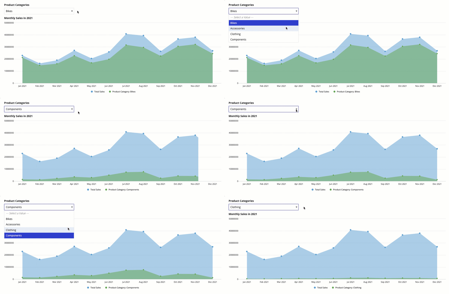
Inventory managers want to know how monthly sales were divided among the different product categories to see how their line of products impact overall sales. Since each inventory manager is responsible for a certain product category, they want this report to help them determine if they need to change their inventory strategy to follow sales trends.
To allow different inventory managers to view their own product category sales, you'll create an area chart that can be filtered by product category. This way, users can see their monthly sales for the selected category compared to the total sales generated each month.
To create this report, see the Dynamically Show Sales by Product Category Compared to Total Sales pattern.
Other report patternsCopy link to clipboard
Looking for other reporting patterns? Try these other report patterns that use the Employee record type as the source of their components.
Note: To follow along with these patterns, first complete the Database-Backed Record Type Tutorial to create the Employee record type used in these patterns.
Chart patternsCopy link to clipboard
-
Aggregate Data and Conditionally Display in a Chart or Grid (Reports, Charts, Query Data, Grids, Records): Aggregate data and conditionally display it in a pie chart or grid. In this pattern, we will calculate the total number of employees in each department and display it in a pie chart and a read-only grid. Then, we'll use a link field to conditionally display each component.
-
Aggregate Data on a Date or Date and Time Field (Reports, Query Data, Grids, Records): Aggregate data, specifically the total number of employees by date.
-
Conditionally Hide a Column in a Grid (Grids, Conditional Display): Conditionally hide a column in a read-only grid when all data for that column is a specific value.
-
Delete Rows in a Grid (Grids): Delete one or more rows of data in a read-only grid.
-
Display Last Refresh Time (Auto-Refresh, Grids, Records): Display the last time the interface was updated, either based on a user interaction or a timer.
-
Filter the Data in a Grid (Grids, Filtering, Records): Configure a user filter for your read-only grid that uses a record type as the data source. When the user selects a value to filter by, update the grid to show the result.
-
Filter the Data in a Grid Using a Chart (Charts, Grids, Filtering, Records): Display an interactive pie chart with selectable sections so that a user may filter the results in a grid.
-
Limit the Number of Rows in a Grid That Can Be Selected (Validation, Grids, Records): Limit the number of rows that can be selected to an arbitrary number.
-
Show Calculated Columns in a Grid (Formatting, Grids, Records): Display calculated values in columns in a grid.
Grid patternsCopy link to clipboard
-
Aggregate Data and Conditionally Display in a Chart or Grid (Reports, Charts, Query Data, Grids, Records): Aggregate data and conditionally display it in a pie chart or grid. In this pattern, we will calculate the total number of employees in each department and display it in a pie chart and a read-only grid. Then, we'll use a link field to conditionally display each component.
-
Aggregate Data and Display in a Chart (Reports, Charts, Query Data, Records): Aggregate data, specifically the total number of employees in a given department, to display in a pie chart.
-
Aggregate Data by Multiple Fields and Display in a Chart (Reports, Charts, Query Data, Records): Aggregate data by multiple fields and display it in a stacked column chart. In this pattern, we will calculate the total number of employees for each title in each department and display it in a stacked column chart.
-
Aggregate Data using a Filter and Display in a Chart (Reports, Charts, Query Data, Filtering, Records): Aggregate data, specifically the total number of employees for each title in the Engineering department, to display in a bar chart.
-
Filter the Data in a Grid Using a Chart (Charts, Grids, Filtering, Records): Display an interactive pie chart with selectable sections so that a user may filter the results in a grid.


