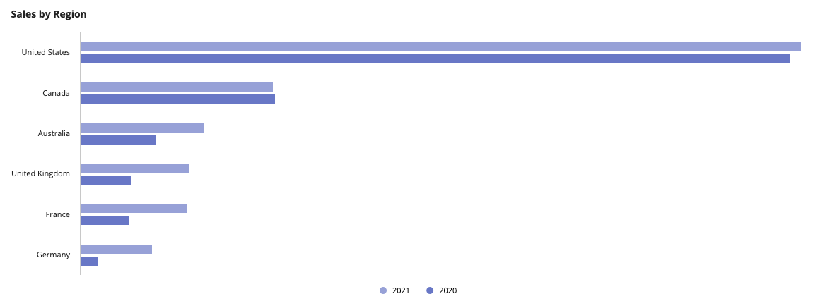
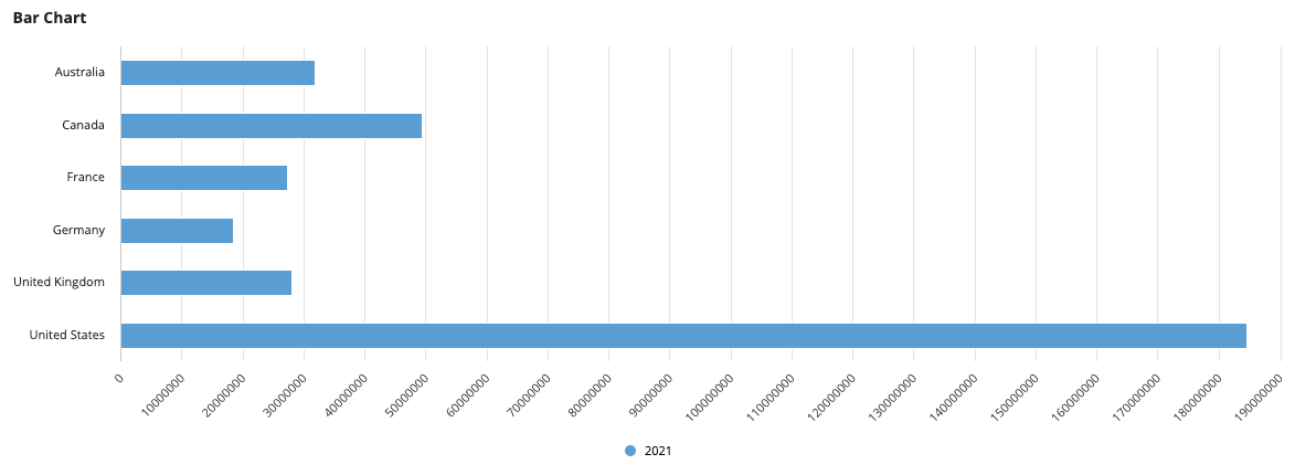
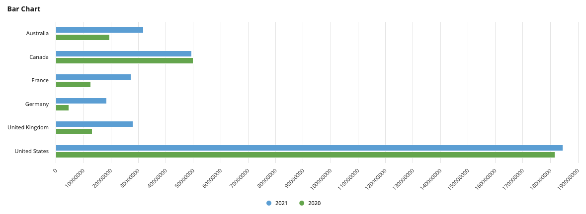
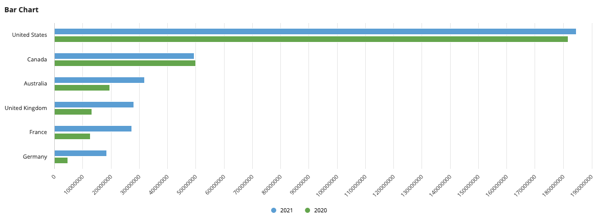
This pattern illustrates how to create a bar chart that shows sales per sales region. This pattern also provides a sample scenario to show how you can take common business requirements and quickly turn them into a report.
You'll notice that this pattern provides more than just an expression, it shows you the fastest way to build reports in Design Mode. To get the most out of this pattern, follow the steps in Create this pattern to learn how to build advanced reports using the latest low-code features.
ScenarioCopy link to clipboard
Sales executives at the Appian Retail company want to know which global sales regions have the highest sales numbers so they can hire more employees and dedicate more resources to high-performance areas.
To show the sales regions with the highest sales, you'll use the pattern on this page to create a bar chart that displays the sum of sales generated by each region in 2021. To see if sales have improved for certain regions, you'll also show the sum of sales generated by each region in 2020.
The report will look like this:
SetupCopy link to clipboard
This pattern uses data from the Appian Retail application, available for free in Appian Community Edition. To follow along with this pattern, log in to Appian Community and register for Appian Community Edition.
In Appian Community Edition, create a test application to follow along with patterns and examples using data from the Appian Retail application.
This pattern will use data from the following record types in the Appian Retail application:
- Sales Regions: Contains the geographical regions where sales teams are located. For example, the Northwest or Central territories in North America, Canada, France, and Germany.
- Country: Contains country names. For example, the United States or Australia.
- Order Detail record type: Contains specific order details like the number of order items, order totals, promo codes applied, and products. For example, an order contained one product that cost $2,024.99.
Create this patternCopy link to clipboard
To create this pattern:
- Create a bar chart that shows sales per region.
- Add a second measure to show 2020 sales per region.
- Sort the chart by 2021 sales.
- (Optional) Format the bar chart.
Step 1: Create a bar chart that shows sales per regionCopy link to clipboard
To create the bar chart for this pattern:
- In your test application in Appian Community Edition, go to the Build view.
- Click NEW > Interface.
- Configure the interface properties and click CREATE.
- From the PALETTE, drag a BAR CHART component into the interface.
- From Data Source, select RECORD TYPE and search for the Sales Region record type.
- For Primary Grouping, remove the existing field. Then, use the dropdown to hover over the country relationship and select the name field. This displays the country of each sales region.
- Click the pencil icon next to the Measure to configure the chart's aggregation:
- For Label, enter
2021. This will represent the 2021 sales. - For Aggregation Function, select Sum of.
- For Field, remove the existing field. Then, use the dropdown to hover over order > orderDetail and select the lineTotal field. The field will display as order.orderDetail.lineTotal.
- For Alias, enter
sales2021. - For Format Value, use the dropdown to choose Dollar.
- For Label, enter
- Click + ADD FILTERS.
- Click Add Filter and configure a filter so only sales from this year are calculated in the measure:
- For Field, use the dropdown to hover over the order relationship and select the orderDate field. The field will display as order.orderDate.
- For Condition, select Date Range.
- For Value, use the context menu () to select Expression.
- Click null to edit the expression.
-
Replace the existing value with the following expression:
1
2
3
4
{
  todatetime("01/01/2021"),
  todatetime("12/31/2021")
}
Copy
Tip: In your own applications, you can use Date Presets to dynamically filter data. This pattern uses a static date for testing purposes.
- Click OK.
-
Click OK to close the dialog.
Step 2: Add 2020 salesCopy link to clipboard
The chart currently displays the sum of sales from orders placed in 2021. Now, you're going to add a second measure with a different filter so it displays the sum of sales from orders placed in 2020.
To add 2020 sales data:
- Return to the Bar Chart component configuration.
- Click ADD MEASURE.
- Click the pencil icon next to the Measure to configure the second aggregation:
- For Label, enter
2020. This will represent last year's year-to-date sales. - For Aggregation Function, select Sum of.
- For Field, use the dropdown to hover over order > orderDetail and select the lineTotal field. The field will display as order.orderDetail.lineTotal.
- For Alias, enter
sales2020. - For Format Value, use the dropdown to choose Dollar.
- For Label, enter
- Click + ADD FILTERS.
- Click Add Filter and configure a filter so only sales from last year are calculated in the measure:
- For Field, use the dropdown to hover over the order relationship and select the orderDate field. The field will display as order.orderDate.
- For Condition, select Date Range.
- For Value, use the context menu () to select Expression.
- Click null to edit the expression.
-
Replace the existing value with the following expression:
1
2
3
4
{
  todatetime("01/01/2020"),
  todatetime("12/31/2020")
}
Copy
Tip: In your own applications, you can use Date Presets to dynamically filter data. This pattern uses a static date for testing purposes.
- Click OK.
-
Click OK to close the dialog.
Step 3: Sort by 2021 salesCopy link to clipboard
To allow executives to quickly see the top performing sales regions, you'll sort the chart by the highest sales in 2021.
To sort the chart:
- Return to the Bar Chart component configuration.
- Click ADD SORT.
- For Sort By, leave the default selection of Alias.
- Use the dropdown to choose the sales2021 alias.
-
For Order, keep the default selection of Descending.
Optional chart formattingCopy link to clipboard
In this last step, you'll add a chart label, change the color scheme, and hide the Y-Axis labels so it's easier to read the chart.
To format the chart:
- For Label, enter
Sales by Region. - For Color Scheme, keep the default Choose pre-defined color scheme, and choose Midnight from the dropdown.
-
For Y-Axis Style, choose None.
Full expressionCopy link to clipboard
The resulting expression will look like this:
Note: You can copy and paste this expression into an interface in a Appian Community Edition testing application to see the fully configured pattern. These record type references are specific to the Appian Retail application, so you will only need to replace the record field references if you're following along in a different environment.
1
2
3
4
5
6
7
8
9
10
11
12
13
14
15
16
17
18
19
20
21
22
23
24
25
26
27
28
29
30
31
32
33
34
35
36
37
38
39
40
41
42
43
44
45
46
47
48
49
50
51
52
53
54
55
56
57
58
59
60
61
62
63
64
65
66
67
{
  a!barChartField(
    data: 'recordType!{c25947c0-2230-41cb-86a6-bd86d14d0af9}Sales Region',
    config: a!barChartConfig(
      primaryGrouping: a!grouping(
        field: 'recordType!{c25947c0-2230-41cb-86a6-bd86d14d0af9}Sales Region.relationships.{0ea75675-bc93-491c-8cc2-3c74668c96d3}country.fields.{85846423-5eb5-46c0-ac1a-263e4f522be7}name',
        alias: "name_primaryGrouping"
      ),
      measures: {
        a!measure(
          label: "2021",
          function: "SUM",
          field: 'recordType!{c25947c0-2230-41cb-86a6-bd86d14d0af9}Sales Region.relationships.{91b8d190-173e-407a-bf9b-e42e8e32a437}order.relationships.{0bde4028-fd7a-411f-97ad-7ad5b84e0d18}orderDetail.fields.{db456082-5f77-4765-bc3e-f662651e0d52}lineTotal',
          filters: a!queryLogicalExpression(
            operator: "AND",
            filters: {
              a!queryFilter(
                field: 'recordType!{bec4a875-9980-4bbf-a38c-c492ebed065a}Order Detail.relationships.{e6b1dbca-6c3c-4540-a093-3c581a73ad17}order.fields.{fbcc99f6-1ddf-4923-903b-18122a1737c6}orderDate',
                operator: "between",
                value: {
                  todatetime("01/01/2021"),
                  todatetime("12/31/2021")
                }
              )
            },
            ignoreFiltersWithEmptyValues: true
          ),
          alias: "sales2021",
          formatValue: "DOLLAR"
        ),
        a!measure(
          label: "2020",
          function: "SUM",
          field: 'recordType!{c25947c0-2230-41cb-86a6-bd86d14d0af9}Sales Region.relationships.{91b8d190-173e-407a-bf9b-e42e8e32a437}order.relationships.{0bde4028-fd7a-411f-97ad-7ad5b84e0d18}orderDetail.fields.{db456082-5f77-4765-bc3e-f662651e0d52}lineTotal',
          filters: a!queryLogicalExpression(
            operator: "AND",
            filters: {
              a!queryFilter(
                field: 'recordType!{bec4a875-9980-4bbf-a38c-c492ebed065a}Order Detail.relationships.{e6b1dbca-6c3c-4540-a093-3c581a73ad17}order.fields.{fbcc99f6-1ddf-4923-903b-18122a1737c6}orderDate',
                operator: "between",
                value: {
                  todatetime("01/01/2020"),
                  todatetime("12/31/2020")
                }
              )
            },
            ignoreFiltersWithEmptyValues: true
          ),
          alias: "sales2020",
          formatValue: "DOLLAR"
        )
      },
      sort: { a!sortInfo(field: "sales2021") },
      dataLimit: 100
    ),
    label: "Sales by Region",
    labelPosition: "ABOVE",
    stacking: "NONE",
    showLegend: true,
    showTooltips: true,
    colorScheme: "MIDNIGHT",
    height: "MEDIUM",
    xAxisStyle: "STANDARD",
    yAxisStyle: "NONE",
    refreshAfter: "RECORD_ACTION"
  )
}
Copy


