
| This content applies solely to Connected Servicing, which must be purchased separately from the Appian base platform. This content was written for Appian 23.3 and may not reflect the interfaces or functionality of other Appian versions. |
IntroductionCopy link to clipboard
The TRENDS dashboard allows managers and other users to monitor tasks and service request completion performance. This page describes how managers can view these trends and metrics to see how the organization performs in specific areas.
Using the trends dashboardCopy link to clipboard
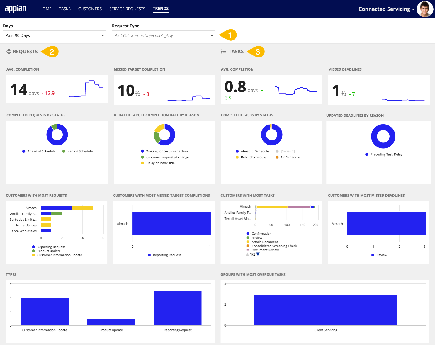
The TRENDS dashboard has three main parts:
- The filters
- The service request reports
- The task reports

Trends dashboard filtersCopy link to clipboard
A manager can use the two filter options to change the data displayed on the dashboard. Changing either one of the filters will apply this filter to all displayed charts.
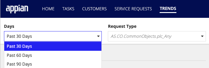
The two available filters are:
-
Time period - the user can select to look at the data over a 30, 60, or 90-day historical period. By default, the dashboard will use a period of the past 30 days.
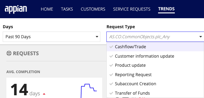
-
Service Request type - the user can select to look at a service request for a specific type only. By default, all of the service request types display.
Service Requests reportsCopy link to clipboard
The charts and figures on the trends page give insight into service requests. Some questions that this service request data can answer are:
- How long are service requests taking to complete?
- Are service requests completed on time?
- Why have target completion dates for service requests changed?
- Which customers have the most service requests?
- Which customers have the most missed target completion dates?
- Which types of service requests are most reported?
Average completionCopy link to clipboard
The AVG. The COMPLETION section shows the average days it takes to complete service requests.
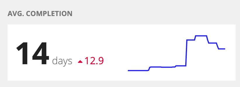
In this section, you see:
- The average number of days a service request takes to complete in the past 30, 60, or 90 days.
- A line chart showing the average number of days per service request over the past 30, 60, or 90 days.
- The percent change of the average number of days compared to 30, 60, or 90 days ago.
- The percentage will appear green when a service request's average length is trending downward.
- The percentage will appear red when a service request's average length is trending upward.
Missed target completion dateCopy link to clipboard
The MISSED TARGET COMPLETION section shows how many service requests have missed their target completion dates.
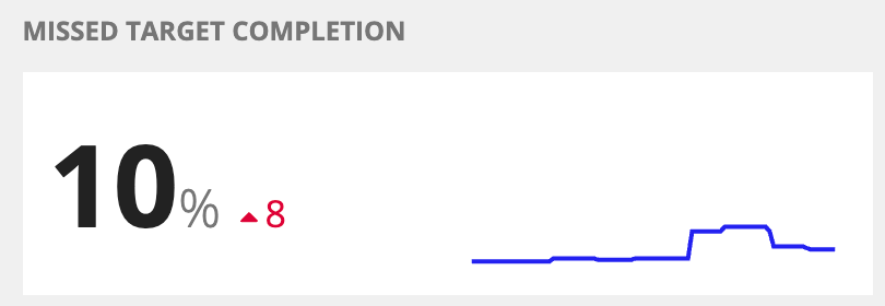
In this section, you see:
- The percentage of onboardings that have missed their funding date over the past 30, 60, or 90 days.
- A line chart showing the percentage of onboardings that have missed their funding dates over the past 30, 60, or 90 days.
- The percent change of the percentage of onboardings that missed funding date compared to those 30, 60, or 90 days ago.
- The percentage will appear green when the rate of missed funding dates decreases.
- The percentage will appear red when the rate of missed funding dates increases.
Completed service requests by statusCopy link to clipboard
The COMPLETED REQUESTS BY STATUS donut chart shows data about when service requests were completed relative to their target completion dates.
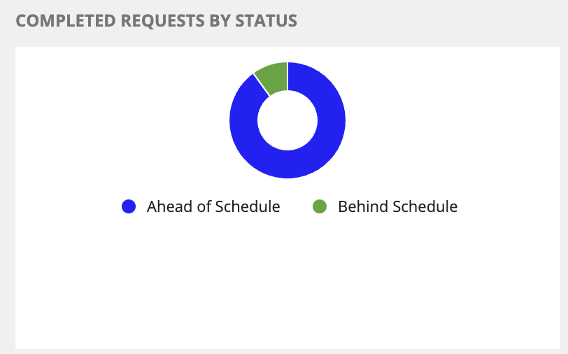
On this chart, you can:
- View service requests grouped by whether they were completed: Ahead of Schedule, On Schedule, or Behind Schedule.
- Drill down into a specific service request status to view additional information.
Target completion date changes by reasonCopy link to clipboard
The UPDATED TARGET COMPLETION DATE BY REASON donut chart shows why a target completion date changed for a service request.
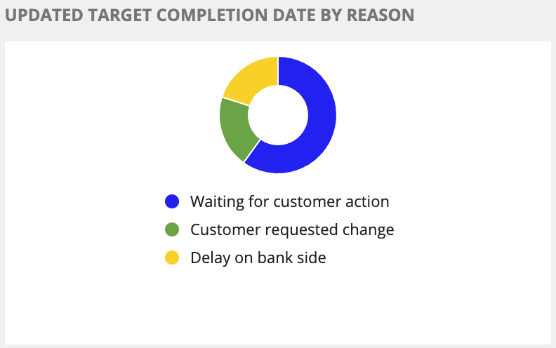
On this chart, you can:
- View the reasons that service requests have had their target completion dates changed.
- Drill down into a specific change reason to view additional information about those service requests.
Service requests by customerCopy link to clipboard
The CUSTOMERS WITH MOST REQUESTS bar chart shows service requests grouped by customer. Connected Servicing groups the service requests by request type: Reporting Request, Product Update, or Customer Information Update to provide additional insight.
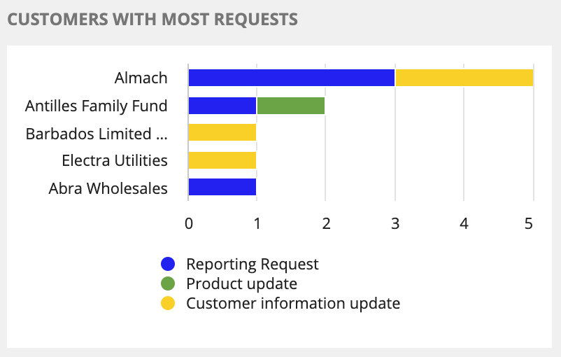
On this chart, you can:
- View service requests by customers.
- View which types of service requests were reported by each customer displayed.
- Drill down into service request type to view additional information about the service requests for a specific customer.
Most missed target completion datesCopy link to clipboard
The CUSTOMERS WITH MOST MISSED TARGET COMPLETIONS bar chart shows which customer has the most service requests with missed target completion dates within a specific period. Connected Servicing groups the service requests by request type: Reporting Request, Product Update, or Customer Information Update to provide additional insight.
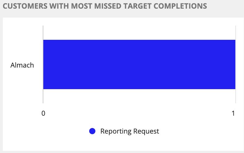
On this chart, you can:
- View service requests with the most missed target completion dates by customers.
- View which types of service requests missed were most impacted.
- Drill down into the service requests to view additional information.
Service requests by typeCopy link to clipboard
The TYPES bar chart shows service requests grouped by type for a specific period.
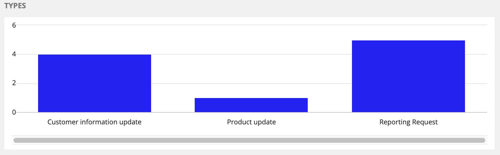
On this chart, you can:
- View all service requests by type for a specific period.
- Drill down into a specific type to view additional information about the service requests.
Task reportsCopy link to clipboard
The sections and charts on the trends page give insight into service request tasks. Some questions that this task data can answer are:
- Are tasks completed on time?
- Why are task due dates being changed?
- Which customers have the most overdue tasks?
- Which customers have the most missed task deadlines?
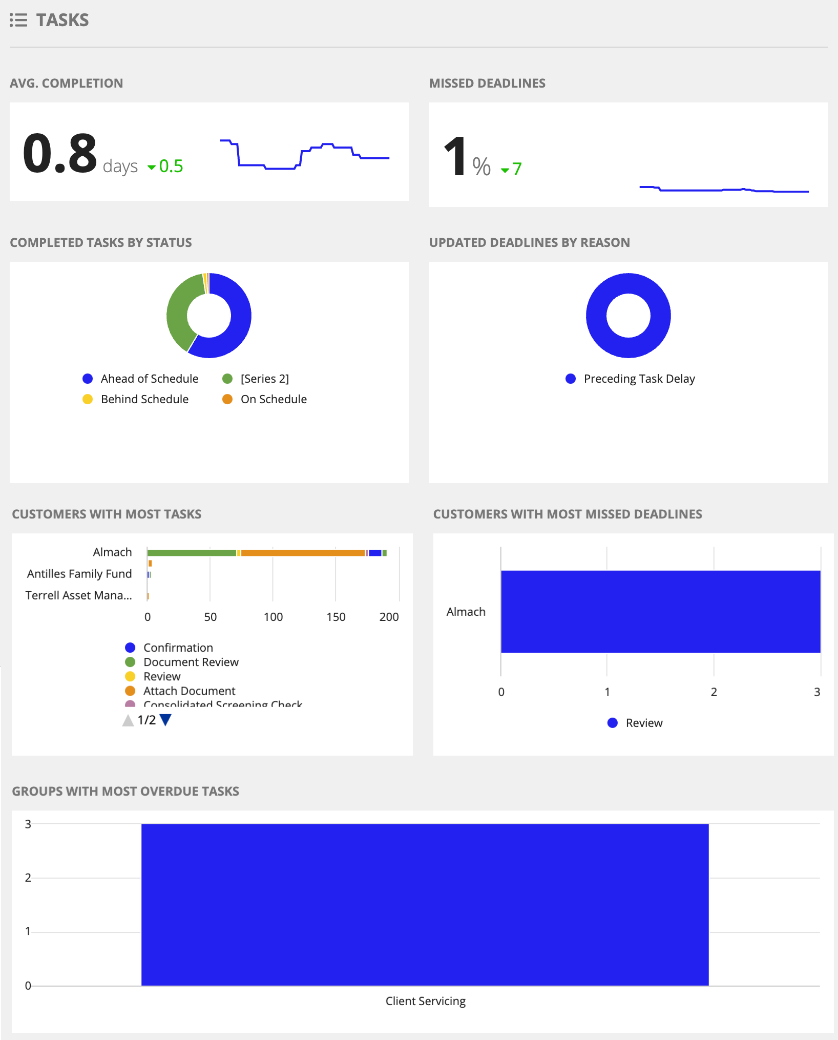
Average task completionCopy link to clipboard
The AVG. COMPLETION section shows the average task completion time in a given period.
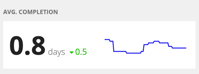
In this section, you see:
- The average number of days a task takes to complete in the past 30, 60, or 90 days.
- A line chart showing the average task completion time over the past 30, 60, or 90 days.
- The percent change of the average task completion time compared to those 30, 60, or 90 days ago.
- The percentage will appear green when the average task completion time increases.
- The percentage will appear red when the average task completion time decreases.
Percentage of tasks with missed deadlinesCopy link to clipboard
The MISSED DEADLINES report shows the percentage of tasks with missed deadlines for a given period.
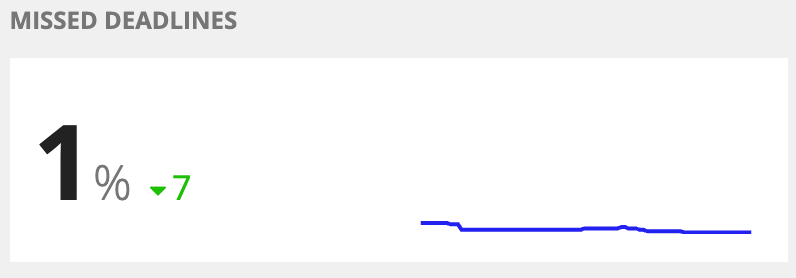
In this section, you see:
- The percentage of tasks that missed their deadlines over the past 30, 60, or 90 days.
- A line chart shows the percentage of tasks that missed their deadlines over the past 30, 60, or 90 days.
- The percent change of the percentage of tasks that missed their deadlines compared to those 30, 60, or 90 days ago.
- The percentage will appear green when the percentage of tasks missed their deadlines increase.
- The percentage will appear red when the percentage of tasks missed their deadlines decreases.
Completed tasks by statusCopy link to clipboard
The COMPLETED TASKS BY STATUS donut chart shows when tasks are completed relative to their due dates.
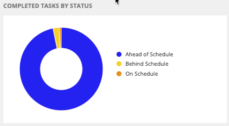
On this chart, you can:
- View tasks grouped by whether they were completed: Ahead of Schedule, On Schedule, or Behind Schedule.
- Drill down into a specific task completion status to view additional information.
Task due date changes by reasonCopy link to clipboard
The COMPLETED TASKS BY STATUS donut chart shows why a task due date changed for a specific period.
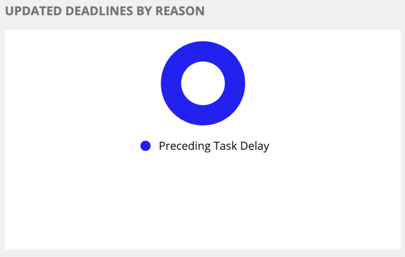
On this chart, you can:
- View reasons that task completion due dates have changed.
- Drill down into a specific change reason to view additional tasks information.
Customers with the most tasksCopy link to clipboard
The CUSTOMERS WITH MOST TASKS bar chart shows customers with the most completed tasks. Additionally, the chart groups the completed tasks for each customer by type, which allows users to drill into each type to view more detailed information.
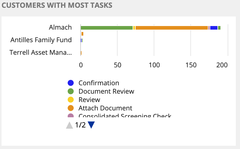
On this chart, you can:
- View tasks by customers with the most completed.
- View which task types were completed for a specific customer.
- Drill down into a task type for more information about the tasks.
Customers with the most missed tasks due datesCopy link to clipboard
The CUSTOMERS WITH MOST MISSED DEADLINES bar chart shows customers with the most missed task deadlines for a specific period. The chart also groups the tasks for each customer by type, allowing users to drill into each type to view more detailed information.
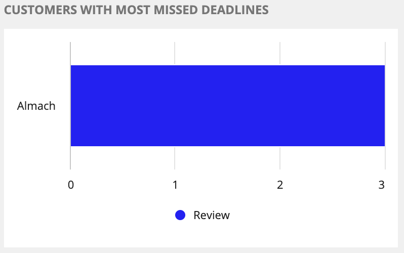
On this chart, you can:
- View tasks with the most missed deadlines by customers.
- View tasks with the most missed deadlines for a specific customer by task type.
- Drill down into a task type for more information about the tasks.
Overdue tasks by customer groupCopy link to clipboard
The GROUPS WITH MOST OVERDUE TASKS bar chart shows the customer groups with the most overdue tasks for a specific period.

On this chart, you can:
- View the most overdue tasks by customer groups.
- Drill down into the customer group for more information about the overdue tasks.