

| SAIL Design System guidance available for Charts
Every chart should tell a story. What does yours say? Learn how to build rich reporting dashboards that provide users with visualizations of their data. |
FunctionCopy link to clipboard
a!areaChartField(label, instructions, categories, series, xAxisTitle, yAxisTitle, yAxisMin, yAxisMax, stacking, referenceLines, showLegend, showDataLabels, showTooltips, allowDecimalAxisLabels, labelPosition, helpTooltip, showWhen, connectNulls, accessibilityText, colorScheme, height, xAxisStyle, yAxisStyle, data, config, refreshAlways, refreshInterval, refreshOnReferencedVarChange, refreshOnVarChange, refreshAfter)
Displays a series of numerical data as points connected by lines with the area between the line and axis shaded. Use an area chart to visualize trends over time and compare multiple values. If specific values are more important than the trend, consider using a column chart.
See also:
ParametersCopy link to clipboard
| Name | Keyword | Types | Description |
|---|---|---|---|
|
Label |
|
Text |
Text to display as the field label. |
|
Instructions |
|
Text |
Supplemental text about this field. |
|
Categories |
|
List of Variant |
Text, Date, or Date and Time array to display on the x-axis below each data point. If you are using an array of Date or Date and Time, make sure the data is sorted prior to using it as a category. |
|
Series |
|
List of AreaChartSeries |
Array of data series created with a!chartSeries(). |
|
X-Axis Title |
|
Text |
Title for the independent (horizontal) axis. |
|
Y-Axis Title |
|
Text |
Title for the dependent (vertical) axis. |
|
Min Y-Axis |
|
Number (Decimal) |
Determines the minimum displayed point on the vertical axis. |
|
Max Y-Axis |
|
Number (Decimal) |
Determines the maximum displayed point on the vertical axis. |
|
Stacking |
|
Text |
Determines if series values display as stacked, or stacked to a height of 100% to show the contribution to the whole, or overlapping. Valid values: |
|
Reference Lines |
|
List of Variant |
Array of reference line values for each threshold to be defined on the chart. Configured using a!chartReferenceLine(). |
|
Show legend |
|
Boolean |
Determines if a color legend displays below the chart. Default: |
|
Show data labels |
|
Boolean |
Determines if data values are displayed next to each data point. Default: |
|
Show tooltips |
|
Boolean |
Determines if a tooltip displays the data value for each data point. Default: |
|
Allow decimal axis labels |
|
Boolean |
Allows dependent (vertical) values to display as decimal numbers instead of integers. Default: |
|
Label Position |
|
Text |
Determines where the label appears. Valid values:
|
|
Help Tooltip |
|
Text |
Displays a help icon with the specified text as a tooltip. The tooltip displays a maximum of 500 characters. The help icon does not show when the label position is |
|
Visibility |
|
Boolean |
Determines whether the component is displayed on the interface. When set to false, the component is hidden and is not evaluated. Default: |
|
Connect Null Data Points |
|
Boolean |
Determines whether to connect an area across null points, or render a gap between the two points on either side of the null. Default: |
|
Accessibility Text |
|
Text |
Additional text to be announced by screen readers. Used only for accessibility; produces no visible change. |
|
Color scheme |
|
Any type |
Determines which color scheme to use in the chart. Use one of the following valid values: |
|
Height |
|
Text |
Determines the chart height. Valid values: |
|
X-Axis Style |
|
Text |
Determines how to display the labels and axis separators for the X-Axis. Valid values: |
|
Y-Axis Style |
|
Text |
Determines how to display the labels, axis separators, and grid lines for the Y-Axis. Valid values: |
|
Data |
|
Any type |
Reference to the record type used for the source of this chart. Can accept a!recordData or a record type reference. |
|
Chart Configuration |
|
AreaChartConfig |
Configures how to display data on the chart, including fields used for calculations and grouping, using a!areaChartConfig(). Only applies when using a record type as a source in the data parameter. |
|
Refresh Always |
|
Boolean |
When true, chart data will be refreshed after each user interaction and each interval refresh. Default: |
|
Refresh After an Interval of Time |
|
Number (Decimal) |
How often chart data gets refreshed in minutes. When null, chart data will not be refreshed on an interval. Valid values: |
|
Refresh on Reference Variable Change |
|
Boolean |
When true, chart data will be refreshed each time the value of any variable referenced in the data parameter is updated. To refresh chart data when another variable that is not used in the data parameter changes, use |
|
Refresh on Variable Change |
|
Any Type |
Refreshes chart data each time any of these specific variables change. This allows you to refresh the chart data when a variable that is not referenced in the data parameter is updated. You can define a single variable (e.g. |
|
Refresh After |
|
List of Text String |
Refreshes chart data each time a specified event completes. Valid values: |
|
Allow Image Download |
|
Boolean |
Determines if the chart download button displays on the chart. Default: |
ConfigurationCopy link to clipboard
There are two ways to configure an area chart:
- Set a record type as the data source and define fields to display on the chart.
- Perform your own query and define lists of data within the categories and series.
If you have a record type that uses a database as the source, or a record type with data sync enabled, we recommend using the record type as the source of your chart. This configuration is easier because Appian will perform the query for you and display the results directly in the chart.
If your record type uses a web service as the source and does not have data sync enabled, use the categories and series to construct the chart manually.
Using record dataCopy link to clipboard
Configuring an area chart using a record type as the source requires using two parameters: data and config. Once you provide a record type in the data parameter and provide the fields in the config parameter, the chart displays the results.
See Chart Configuration Using Record Data for details on using a record type as the source. See Build Reports from Records for examples of reports created with different charts.
Using categories and seriesCopy link to clipboard
When using categories and series, you must provide the list of data labels and values directly to these parameters.
CategoriesCopy link to clipboard
- The order of items in the categories array determines the display order of categories on the chart with the left-most item in the array appearing on the far left of the x-axis.
- For each null or empty item in the array passed to categories,
[Category #]displays on the x-axis with#as the index number in the categories array of the null or empty item. For example,[Category 1]. - The index of each item in the categories array must match with the index of its series data value.
SeriesCopy link to clipboard
- A single Series item produces a single line with line points for each categories item. Multiple series items produce multiple lines with one line for each series label item displayed in a distinct color.
- Use a!chartSeries() to create the Chart Series array.
- If a series data value is greater than the Max Y-Axis value or less than the Min Y-Axis value, the line line and shaded area will not appear on the chart.
- If the series argument has a non-null label value paired with a 0, null, or empty data value, the data value still displays in the legend.
- If the series argument has a null or empty label value paired with a non-null data value, the label value displays as
[Series #]with#as the index number of the data value. For example,[Series 1].
Usage considerationsCopy link to clipboard
Using the stacking parameterCopy link to clipboard
- The stacking parameter has three possible values:
-
"NONE"is best for showing an overlapping area chart. This will shade each line from its vertical value to the common baseline (zero). Use this value when you want to compare two values. If you need to compare more than two values, consider using a line chart instead since it may be hard for users to read multiple overlapping areas. See Area charts vs. line charts for other considerations. -
"NORMAL"is best for showing part-to-whole relationships. This will stack each value on top of each other so the topmost line corresponds to the total of all values. Use this value when you want to see a breakdown of a total. -
"PERCENT_TO_TOTAL"is best for showing the distribution of categories as part of a whole. The Y-axis will display values starting from 0% (the baseline) to 100%. Use this value when the cumulative total is unimportant.Note: If you've set a Min Y-Axis or Max Y-Axis value, the value will correspond to a percentage. For example, if you set a Min Y-Axis of 20, it will display as 20%.
-
Area charts vs. line chartsCopy link to clipboard
- Area charts are most similar to line charts in that they are great for showing trends over time. So when should you choose an area chart or a line chart?
- Consider using an area chart to display large differences between multiple data points, or when you need to show how multiple data points relate to a total value.
- Consider using a line chart to show multiple data comparisons over time.
- For more information on which type of chart to use in your reports, see Charts design guidance.
Chart refresh behaviorCopy link to clipboard
- You can define
a!refreshVariableparameters directly in the chart without creating additional local variables. The only exception beingrefreshOnVarChange, which refreshes the chart after a specific local variable has changed. - When you use a record type as the source of your chart, it's recommended to use the refresh parameters in the chart instead of using local variables and the a!refreshVariable() function. This is because the refresh behavior will automatically apply to the fields specified in the data parameter of the chart.
- If you're not using a record type as the source of your chart, use local variables and the a!refreshVariable() function to define refresh behavior since you won't use the data parameter to configure your chart.
Row limit for records-powered componentsCopy link to clipboard
Interface components that use a record type as the data source are known as records-powered components.
Records-powered components can display a maximum of 5,000 rows. As a best practice, you should not display all 5,000 rows in a component since it may impact performance.
ExampleCopy link to clipboard
To experiment with examples, copy and paste the expression into an interface object.
The examples below demonstrate how to configure your charts using categories and series. For examples on using record data, see Chart Configuration Using Record Data.
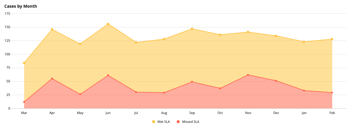
Multiple series area chart with normal stackingCopy link to clipboard
1
2
3
4
5
6
7
8
9
10
11
12
13
{
  a!areaChartField(
    label: "Cases by Month",
    labelPosition: "ABOVE",
    categories: {"Mar", "Apr", "May", "Jun", "Jul", "Aug", "Sep", "Oct", "Nov", "Dec", "Jan", "Feb"},
    series: {
      a!chartSeries(label: "Met SLA", data: {72, 91, 93, 95, 92, 99, 98, 99, 79, 83, 90, 99}),
      a!chartSeries(label: "Missed SLA", data: {12, 55, 26, 61, 30, 29, 49, 37, 62, 51, 33, 29})
    },
    stacking: "NORMAL",
    colorScheme: "SUNSET",
  )
}
Copy
Displays the following:
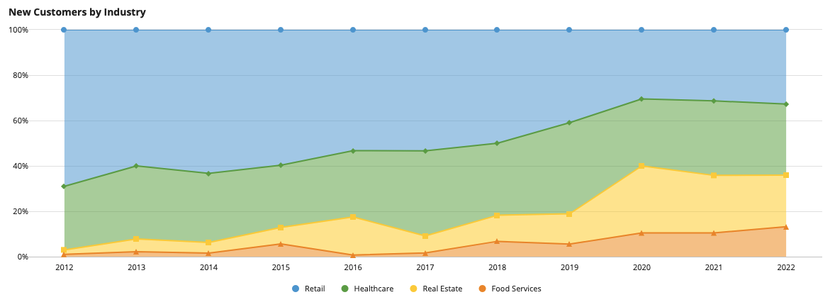
Multiple series area chart with percent to total stackingCopy link to clipboard
1
2
3
4
5
6
7
8
9
10
11
12
13
14
15
{
  a!areaChartField(
    label: "New Customers by Industry",
    labelPosition: "ABOVE",
    categories: {"2012", "2013", "2014", "2015", "2016", "2017", "2018", "2019", "2020", "2021", "2022"},
    series: {
      a!chartSeries(label: "Retail", data: {69, 54, 81, 74, 73, 64, 74, 52, 64, 63, 72}),
      a!chartSeries(label: "Healthcare", data: {28, 29, 39, 34, 40, 45, 47, 51, 62, 66, 69}),
      a!chartSeries(label: "Real Estate", data: {2, 5, 6, 9, 23, 9, 17, 17, 62, 51, 50}),
      a!chartSeries(label: "Food Services", data: {1, 2, 2, 7, 1, 2, 10, 7, 22, 21, 29})
    },
    stacking: "PERCENT_TO_TOTAL",
    colorScheme: "CLASSIC"
  )
}
Copy
Displays the following:
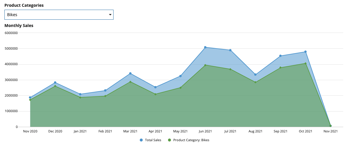
Multiple series area chart with no stackingCopy link to clipboard
To learn how to create this area chart, see the Dynamically Show Sales by Product Category Compared to Total Sales pattern.
Feature compatibilityCopy link to clipboard
The table below lists this component's compatibility with various features in Appian.
| Feature | Compatibility | Note |
|---|---|---|
| Portals | Compatible | |
| Offline Mobile | Compatible | |
| Sync-Time Custom Record Fields | Compatible | Can be used to create a custom record field that only evaluates at sync time. |
| Real-Time Custom Record Fields | Incompatible | Custom record fields that evaluate in real time must be configured using one or more Custom Field functions. |
| Process Reports | Incompatible | Cannot be used to configure a process report. |
| Process Events | Incompatible | Cannot be used to configure a process event node, such as a start event or timer event. |
Related PatternsCopy link to clipboard
The following patterns include usage of the Area Chart Component.
- Dynamically Show Sales by Product Category Compared to Total Sales (Records, Reports, Charts, Filtering): This pattern illustrates how to create an area chart that dynamically displays sales generated by product category compared to total sales.