| SAIL Design System guidance available for Charts
Every chart should tell a story. What does yours say? Learn how to build rich reporting dashboards that provide users with visualizations of their data. |
FunctionCopy link to clipboard
a!scatterChartField(data, label, instructions, xAxisTitle, yAxisTitle, yAxisMin, yAxisMax, xAxisMin, xAxisMax, referenceLines, showDataLabels, showTooltips, showLegend, allowDecimalAxisLabels, labelPosition, helpTooltip, accessibilityText, showWhen, colorScheme, height, xAxisStyle, yAxisStyle, refreshAlways, refreshInterval, refreshOnReferencedVarChange, refreshOnVarChange, refreshAfter, primaryGrouping, secondaryGrouping, xAxisMeasure, yAxisMeasure, sort, dataLimit, link)
Displays the relationship between two numerical data points. Use a scatter chart to compare multiple values, visualize trends over time, and spot outliers.
See also:
ParametersCopy link to clipboard
| Name | Keyword | Types | Description |
|---|---|---|---|
|
Data |
|
Any type |
Reference to a synced record type or unsynced database-backed record type used as the source of the chart. Can accept a!recordData or a record type reference. |
|
Label |
|
Text |
Text to display as the field label. |
|
Instructions |
|
Text |
Supplemental text about the chart. |
|
X-Axis Title |
|
Text |
Title for the horizontal axis. |
|
Y-Axis Title |
|
Text |
Title for the vertical axis. |
|
Min X-Axis |
|
Number (Decimal) |
Determines the minimum displayed point on the horizontal axis. |
|
Max X-Axis |
|
Number (Decimal) |
Determines the maximum displayed point on the horizontal axis. |
|
Min Y-Axis |
|
Number (Decimal) |
Determines the minimum displayed point on the vertical axis. |
|
Max Y-Axis |
|
Number (Decimal) |
Determines the maximum displayed point on the vertical axis. |
|
Reference Lines |
|
List of Variant |
Array of reference line values for each threshold to be defined on the chart. Configured using a!chartReferenceLine(). |
|
Show data labels |
|
Boolean |
Determines if data values are displayed next to each data point. Default: |
|
Show legend |
|
Boolean |
When a secondary grouping is used, determines if a color legend displays below the chart. Default: |
|
Show tooltips |
|
Boolean |
Determines if a tooltip displays the data value for each data point. Default: |
|
Allow decimal axis labels |
|
Boolean |
Allows values to display as decimal numbers instead of integers. Default: |
|
Label Position |
|
Text |
Determines where the label appears. Valid values:
|
|
Help Tooltip |
|
Text |
Displays a help icon with the specified text as a tooltip. The tooltip displays a maximum of 500 characters. The help icon does not show when the label position is |
|
Accessibility Text |
|
Text |
Additional text to be announced by screen readers. Used only for accessibility; produces no visible change. |
|
Visibility |
|
Boolean |
Determines whether the component is displayed on the interface. When set to false, the component is hidden and is not evaluated. Default: |
|
Color scheme |
|
Any type |
Determines which color scheme to use in the chart. Use one of the following valid values: |
|
Height |
|
Text |
Determines the chart height. Valid values: |
|
X-Axis Style |
|
Text |
Determines how to display the labels and axis separators for the X-Axis. Valid values: |
|
Y-Axis Style |
|
Text |
Determines how to display the labels, axis separators, and grid lines for the Y-Axis. Valid values: |
|
Refresh Always |
|
Boolean |
When true, chart data will be refreshed after each user interaction and each interval refresh. Default: |
|
Refresh After an Interval of Time |
|
Number (Decimal) |
How often chart data gets refreshed in minutes. When null, chart data will not be refreshed on an interval. Valid values: |
|
Refresh on Reference Variable Change |
|
Boolean |
When true, chart data will be refreshed each time the value of any variable referenced in the data parameter is updated. To refresh chart data when another variable that is not used in the data parameter changes, use |
|
Refresh on Variable Change |
|
Any Type |
Refreshes chart data each time any of these specific variables change. This allows you to refresh the chart data when a variable that is not referenced in the data parameter is updated. You can define a single variable (e.g. |
|
Refresh After |
|
List of Text String |
Refreshes chart data each time a specified event completes. Valid values: |
|
Primary Grouping |
|
Grouping |
Defines the field labels to display on the points in the chart. Configured using a!grouping(). |
|
Secondary Grouping |
|
Grouping |
Defines the field labels to display on the points in the chart. Configured using a!grouping(). |
|
X-Axis Measure |
|
Measure |
Defines the numerical calculations for the x-axis of the chart. Configured using a!measure(). |
|
Y-Axis Measure |
|
Measure |
Defines the numerical calculations for the y-axis of the chart. Configured using a!measure(). |
|
Sort |
|
SortInfo |
Use a!sortInfo() to define a sort in ascending or descending order. Use the alias of any groupings or measures to sort by the values in the chart. Use a record field or related record field reference to sort by data that is not referenced in the chart. |
|
Data Limit |
|
Integer |
Maximum number of data points to display on the chart. Default: |
|
Link |
|
Any Type |
Link to execute when a user selects a data point on the chart. Use |
|
Allow Image Download |
|
Boolean |
Determines if the chart download button displays on the chart. Default: |
ConfigurationCopy link to clipboard
The data for a scatter chart is any record type with data sync enabled or a database-backed record type without data sync enabled. When you set the data parameter, Appian will perform the necessary query; select a primaryGrouping, xAxisMeasure, and yAxisMeasure; and display the results directly in the chart.
See Configure Charts Using Records for details on using a record type as the source. See Build Reports from Records for examples of reports created with different charts.
Usage considerationsCopy link to clipboard
Select a record typeCopy link to clipboard
The record type in the data parameter is the central concept you want to compare in the chart. You can use record fields or related record fields in your groupings and measures. However, groupings cannot use related record fields from a one-to-many relationship because you cannot combine two or more values into a single data point.
Imagine you are building a scatter chart to analyze your sales team's performance. In your app's data model, each salesperson is related to one or more orders.
If you use the Sales Person record type as the source of the chart, you could not group by fields from the related record type Order.
Instead, you should use the Order record type as the source of your chart so you can group by the salesperson's name. Because each order has only one salesperson associated with it, the chart shows each order as its own data point.
Use the sort parameterCopy link to clipboard
Sorting only applies when the chart has a secondary grouping, the sort field is the secondary grouping's alias, and the legend is shown. The sort order determines if the legend items are shown in ascending or descending order.
In this chart, the secondary grouping is the salesperson's region. Sorting on this field lets you display the legend in alphabetical order.
Chart refresh behaviorCopy link to clipboard
- You can define
a!refreshVariableparameters directly in the chart without creating local variables. The only exception isrefreshOnVarChange, which refreshes the chart after a specific local variable has changed. - It's recommended to use the refresh parameters in the chart instead of using local variables and the a!refreshVariable() function. This is because the refresh behavior will automatically apply to the fields specified in the data parameter of the chart.
Select a primary groupingCopy link to clipboard
The scatter chart requires a primary grouping. This grouping appears as the title in your chart's tooltips to help users understand each data point.
If you want to show users unique values, use a primary grouping field with unique labels (such as order number or item name). Set the xAxisMeasure and yAxisMeasure to use the average of the fields you want to measure.
For example, if you want to examine information about individual employees, your User record type may have a field like userId or fullName that is unique to each person. Selecting this field for grouping would display unique data points for each individual in your chart.
If you want to show aggregate data, use a primary grouping field with common values (such as customer or item color). Then, use the appropriate aggregation to summarize the data.
Instead of grouping by a unique value like fullName, you could select a field like department or jobTitle to view data for groups of users that have a matching attribute.
Work within the data limitCopy link to clipboard
Scatter charts are limited to 5000 data points, but it is important to include
as many unique values as possible to ensure you do not omit relevant information and construct a misleading chart. Setting up measures using the AVG function is a good way to balance the goals of including enough data and maintaining performance.
Because production datasets can be large, we recommend using the default limit of 5000 even if your development dataset is smaller.
ExamplesCopy link to clipboard
The following example data is from the Appian Retail application, available for free in Appian Community Edition. To follow along with this example, log in to Appian Community and register for Appian Community Edition.
Scatter chart with one groupingCopy link to clipboard
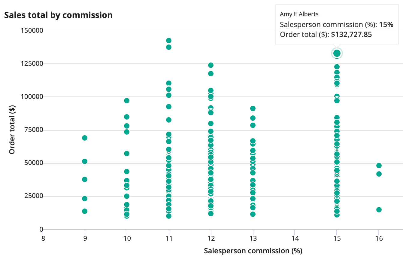
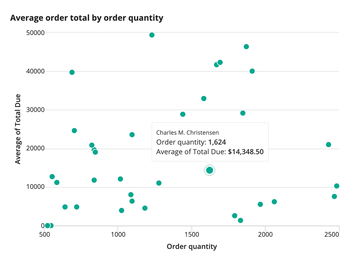
This example shows a comparison of the number of items in an customer's order and the order total. The primary grouping, the customer's name, is shown as the title of the tooltip. A positive correlation is expected in this case. Any outlier points are customers that either purchased a few expensive items or many inexpensive items.
1
2
3
4
5
6
7
8
9
10
11
12
13
14
15
16
17
18
19
20
21
a!scatterChartField(
  data: 'recordType!{ad898682-e651-4b2d-af67-47c1fcb1171f}Order',
  primaryGrouping: a!grouping(
     field: 'recordType!{ad898682-e651-4b2d-af67-47c1fcb1171f}Order.relationships.{35d1f7f4-442e-471f-8583-ecf70127f1ed}customer.relationships.{ab3f9d64-6b2e-4bd6-9289-a03dc5e7d386}person.fields.{120551bc-43ca-4057-8d03-dd69fcd018ed}fullName',
     alias: "fullName_primaryGrouping"
  ),
  xAxisMeasure: a!measure(
    label: "Order quantity",
    function: "SUM",
    field: 'recordType!{ad898682-e651-4b2d-af67-47c1fcb1171f}Order.relationships.{0bde4028-fd7a-411f-97ad-7ad5b84e0d18}orderDetail.fields.{8e3748dd-bbaf-4ece-b9d6-b6108a93da40}orderQty',
    alias: "orderQty_sum_measure1"
  ),
  yAxisMeasure: a!measure(
    label: "Average of Total Due",
    function: "SUM",
    field: 'recordType!{ad898682-e651-4b2d-af67-47c1fcb1171f}Order.fields.{f4f2ef33-2a2b-4947-a6f2-11603994ed9f}totalDue',
    alias: "totalDue_sum_measure1",
    formatValue: "DOLLAR"
  ),
  label: "Average order total by order quantity"
)
Copy
Displays the following:
Scatter chart with two groupingsCopy link to clipboard
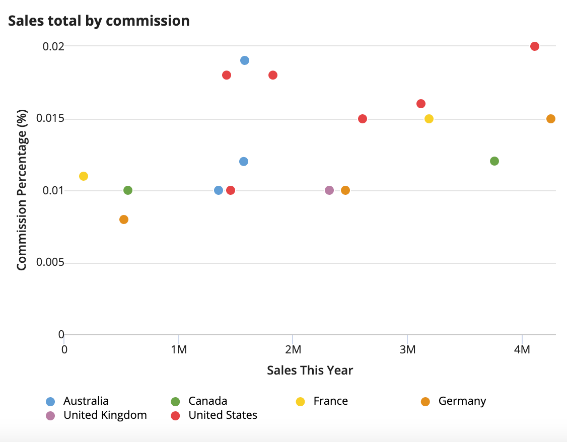
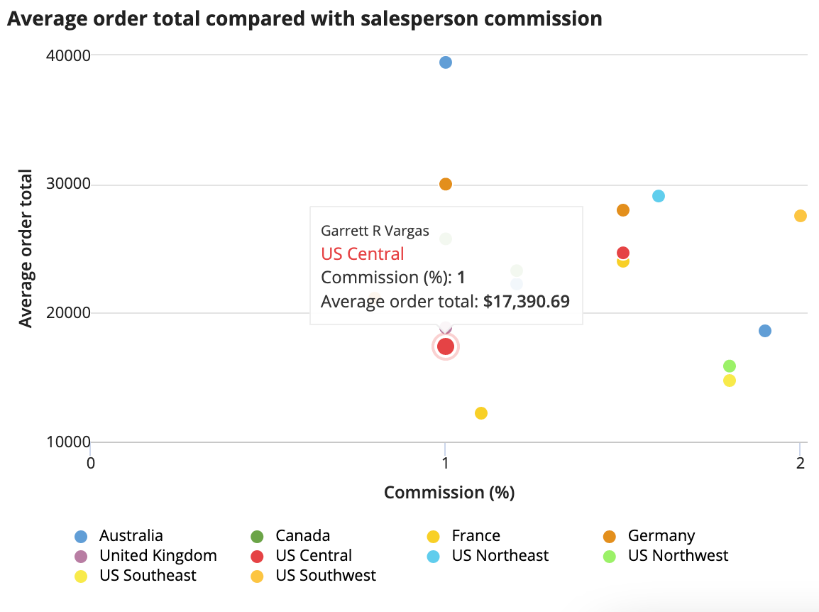
This example shows a comparison between sales commission and the salesperson's year-to-date sales total. The chart also includes location data—the salesperson's territory—as the secondary grouping. The values in the legend correspond to the unique values of the secondary grouping (the sales territory). Both grouping values are shown in the tooltip.
This chart shows that employees earning a higher commission tend to make larger sales overall. The secondary grouping lets viewers compare this across the company's sales regions.
1
2
3
4
5
6
7
8
9
10
11
12
13
14
15
16
17
18
19
20
21
22
23
24
25
26
27
28
29
30
31
a!scatterChartField(
  data: 'recordType!{ad898682-e651-4b2d-af67-47c1fcb1171f}Order',
  primaryGrouping: a!grouping(
    field: 'recordType!{ad898682-e651-4b2d-af67-47c1fcb1171f}Order.fields.{3f2ba6f1-4afd-4a21-afd1-f399eb6c18e0}orderNumber',
    alias: "orderNumber_primaryGrouping"
  ),
   secondaryGrouping: a!grouping(
    field: 'recordType!{ad898682-e651-4b2d-af67-47c1fcb1171f}AW Sales Order Header.relationships.{cc547bb2-c17d-4884-97c7-7c67dbb5dd76}salesPerson.fields.{2c03cc2d-c998-4719-9e64-e719e33fccf5}territoryId',
    alias: "territoryId_secondaryGrouping"
  ),
  xAxisMeasure: a!measure(
    label: "Salesperson commission (%)",
    function: "AVG",
    field: 'recordType!{ad898682-e651-4b2d-af67-47c1fcb1171f}Order.relationships.{afdc307f-fe3b-4ded-867d-734cf283d54f}salesPerson.fields.{77dd5675-8988-4381-a574-ec7a86d3477d}commissionPercent',
    alias: "commissionPercent_avg_measure1",
    formatValue: if(
      a!isNullOrEmpty(fv!value),
      "No commission",
      tostring(concat(product(fv!value, 100),"%"))
    )
  ),
  yAxisMeasure: a!measure(
    label: "Order total",
    function: "AVG",
    field: 'recordType!{ad898682-e651-4b2d-af67-47c1fcb1171f}Order.relationships.{afdc307f-fe3b-4ded-867d-734cf283d54f}salesPerson.fields.{7a3fdc19-53c0-40a8-a441-e8eb8500d4c1}ytdSales',
    alias: "ytdSales_avg_measure1"
  ),
  label: "Average order total compared with salesperson commission",
  yAxisMin: 10000,
  colorScheme: "CLASSIC"
)
Copy
Displays the following:
Feature compatibilityCopy link to clipboard
The table below lists this component's compatibility with various features in Appian.
| Feature | Compatibility | Note |
|---|---|---|
| Portals | Compatible | |
| Offline Mobile | Compatible | |
| Sync-Time Custom Record Fields | Compatible | Can be used to create a custom record field that only evaluates at sync time. |
| Real-Time Custom Record Fields | Incompatible | Custom record fields that evaluate in real time must be configured using one or more Custom Field functions. |
| Process Reports | Incompatible | Cannot be used to configure a process report. |
| Process Events | Incompatible | Cannot be used to configure a process event node, such as a start event or timer event. |

