| SAIL Design System guidance available for Gauges
What gets measured gets done. So measure what matters with gauges. Learn how to configure and display gauges on your interface designs so you can visualize progress on your most important goals and initiatives. |
FunctionCopy link to clipboard
a!gaugeField( label, labelPosition, instructions, helpTooltip, percentage, primaryText, secondaryText, color, size, align, accessibilityText, showWhen, tooltip, marginAbove, marginBelow )
Displays a completion percentage in a circular style similar to the Progress Bar. Best used for showing progress when there is a target value, such as the number of completed surveys out of 360 total surveys, or number of hired employees out of 20 total open positions.
See also:
ParametersCopy link to clipboard
| Name | Keyword | Types | Description |
|---|---|---|---|
|
Label |
|
Text |
Text to display as the field label. |
|
Label Position |
|
Text |
Determines where the label appears. Valid values:
|
|
Instructions |
|
Text |
Supplemental text about this field. |
|
Help Tooltip |
|
Text |
Displays a help icon with the specified text as a tooltip. The tooltip displays a maximum of 500 characters. The help icon does not show when the label position is |
|
Percentage |
|
Number (Decimal) |
Number to display between 0 and 100. |
|
Primary Text |
|
Text |
Optional text to display on the first line inside the gauge. Create using plain text, a!gaugeIcon(), a!gaugePercentage(), or a!gaugeFraction(). |
|
Secondary Text |
|
Text |
Optional text to display on the second line inside the gauge. |
|
Color |
|
Text |
Determines the color. Access the percentage using fv!percentage. Valid values: Any valid hex color or |
|
Size |
|
Text |
Determines the size of the gauge. Valid values: |
|
Align |
|
Text |
Determines alignment of the gauge. Valid values: |
|
Accessibility Text |
|
Text |
Additional text to be announced by screen readers. Used only for accessibility; produces no visible change. |
|
Visibility |
|
Boolean |
Determines whether the component is displayed on the interface. When set to false, the component is hidden and is not evaluated. Default: true. |
|
Tooltip |
|
Text |
Text to display as a tooltip on the gauge. |
|
Margin Above |
|
Text |
Determines how much space is added above the layout. Valid values: |
|
Margin Below |
|
Text |
Determines how much space is added below the layout. Valid values: |
Usage considerationsCopy link to clipboard
Using the percentage parameterCopy link to clipboard
- If the percentage value is negative or null, the gauge shows with 0% of the circle complete.
- If the percentage value is greater than 100, the gauge shows with 100% of the circle complete.
Editing the gauge primary textCopy link to clipboard
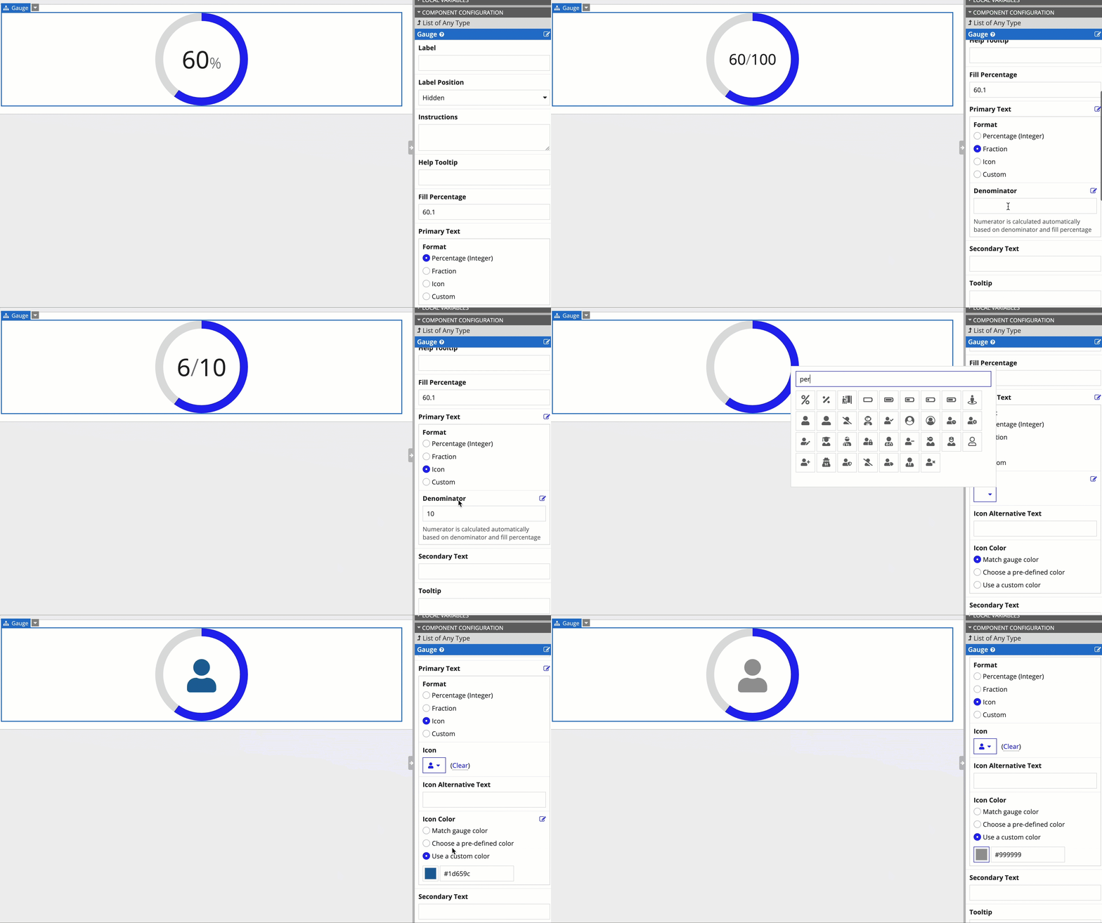
The gauge configuration pane contains a step-by-step designer to help you quickly try out all Primary Text formats. We recommend you use this designer to select the format that works best for your gauge.

Formatting primary text width and colorCopy link to clipboard
- If custom primaryText or secondaryText does not fit within the gauge, it is truncated.
- If the primaryText is formatted using a!gaugeIcon(), a!gaugePercentage(), or a!gaugeFraction(), it will resize to fit within the circle.
- To conditionally set the color of the gauge, use
fv!percentageas shown in the "Gauge Setting Color Based on Percentage" example below.
ExamplesCopy link to clipboard
To experiment with examples, copy and paste the expression into an interface object.
Gauge showing fraction completeCopy link to clipboard
Use the interactive editor below to test out your code:
Gauge showing percent completeCopy link to clipboard
Use the interactive editor below to test out your code:
Gauge showing icon with secondary textCopy link to clipboard
Use the interactive editor below to test out your code:
Gauge setting color based on percentageCopy link to clipboard
Use the interactive editor below to test out your code:
Feature compatibilityCopy link to clipboard
The table below lists this component's compatibility with various features in Appian.
| Feature | Compatibility | Note |
|---|---|---|
| Portals | Compatible | |
| Offline Mobile | Compatible | |
| Sync-Time Custom Record Fields | Incompatible | |
| Real-Time Custom Record Fields | Incompatible | Custom record fields that evaluate in real time must be configured using one or more Custom Field functions. |
| Process Reports | Incompatible | Cannot be used to configure a process report. |
| Process Events | Incompatible | Cannot be used to configure a process event node, such as a start event or timer event. |
Related PatternsCopy link to clipboard
The following patterns include usage of the Gauge Component.
-
Percentage of Online Sales (Records, Reports, Formatting): This pattern illustrates how to calculate the percent of sales generated from online orders and display it in a gauge component.
-
Use the Gauge Fraction and Gauge Percentage Configurations (Formatting, Reports): This recipe provides a common configuration of the Gauge Component using a!gaugeFraction() and a!gaugePercentage(), and includes a walkthrough that demonstrates the benefits of using design mode when configuring the gauge component.
