FunctionCopy link to clipboard
a!eventHistoryListField( label, labelPosition, instructions, helpTooltip, emptyListMessage, eventData, eventStyle, formatTimestamp, displayUser, displayUserColorScheme, previewListPageSize, pageSize, showWhen, refreshAlways, refreshAfter, refreshInterval, refreshOnReferencedVarChange, refreshOnVarChange, userFilters, eventFilters, CollapseDetailsByDefault, showSearchBox, showReverseSortButton, commentLayout, mentionableUsers, commentCardColor )
Displays the event history for one or more record types. If you configured record events on your record type, we recommend using the Event History record type to populate this list.
ParametersCopy link to clipboard
| Name | Keyword | Types | Description |
|---|---|---|---|
|
Label |
|
Text |
Text to display as the list label. |
|
Label Position |
|
Text |
Determines where the label appears. Valid values:
|
|
Instructions |
|
Text |
Supplemental text about this list. |
|
Help Tooltip |
|
Text |
Displays a help icon with the specified text as a tooltip. The tooltip displays a maximum of 500 characters. The help icon does not show when the label position is |
|
Empty List Message |
|
Text |
Text to display in the list when no data is available. Default is |
|
Event Data |
|
List of Event Data |
The record event data that populates the list, created using one or more instances of a!eventData(). |
|
Event Style |
|
Text |
Determines how the component displays. Valid values: |
|
Date Display |
|
Text |
Determines how the component formats the event data timestamp. Valid values include: |
|
User Image Style |
|
Text |
Determines if and how to display user avatars. Valid values include: |
|
User Color Scheme |
|
Any Type |
If no profile picture is available, determines which color scheme to use for users in the event history list. Valid values: |
|
Preview List Page Size |
|
Number (Integer) |
The maximum number of rows to display in each page of the initial list when the |
|
Page Size |
|
Number (Integer) |
The maximum number of rows to display in each page of the list when the |
|
Visibility |
|
Boolean |
Determines whether the component is displayed on the interface. When set to |
|
Refresh after each user interaction |
|
Boolean |
When true, eventData will be refreshed after each user interaction and each interval refresh. Default: |
|
Refresh after record action completes |
|
List of Text String |
Refreshes eventData data each time a specified action completes. Valid values: |
|
Refresh after an interval of time |
|
Number (Decimal) |
How often grid data gets refreshed in minutes. When null, eventData will not be refreshed on an interval. Valid values: |
|
Refresh after referenced variable changes |
|
Boolean |
When true, grid data will be refreshed each time the value of any variable referenced in the eventData parameter is updated. To refresh grid data when another variable that is not used in the eventData parameter changes, use refreshOnVarChange. Default: |
|
Refresh after variable changes |
|
Any Type |
Refreshes data each time any of these specific variables change. This allows you to refresh the data when a variable that is not referenced in the eventData parameter is updated. You can define a single variable (for example, |
|
User Filters |
|
List of Variant |
List of user filter references to display, configured using the |
|
Component Filters |
|
List of Text |
Determines which out-of-the-box filters to show. These filters exist only on the component, not on the record type. Use any combination of the following values { |
|
Initially collapse event details |
|
Boolean |
Determines if the event details are collapsed when the interface first loads. Default: |
|
Show search box |
|
Boolean |
Determines if the record search box should be shown. Default: |
|
Show reverse sort button |
|
Boolean |
Determines if the list should include a button to reverse the event data sort. Default: |
|
Comment Layout |
|
Text |
If comments are enabled, determines whether to display events in a list or card view. Valid values: |
|
Mentionable Users |
|
Text |
If comments are enabled, this constant specifies the group of users who can be mentioned in comments. Mentioned users will receive email notifications when mentioned in comments. |
|
Comment Card Color |
|
Text |
Determines the color applied to the comment background for list and card layouts. Valid values: any valid hex color or |
Usage considerationsCopy link to clipboard
Using the eventStyle parameterCopy link to clipboard
The eventStyle parameter allows you to display your event history in the following styles:
| Style | Description |
|---|---|
"PREVIEW_LIST" |
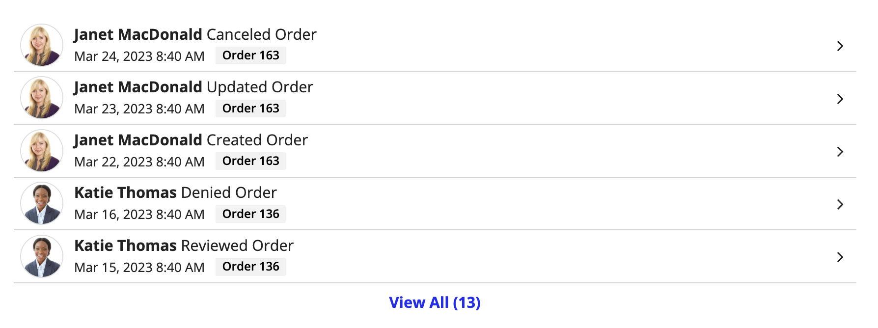
Displays a short list of events with the ability to view all events in a dialog. The dialog will display a longer list of events that users can search and filter on. This option is best when you want to display your event history in a record view or alongside other components. Note that you cannot use this style when the component displays in a dialog. |
"FULL_LIST" |
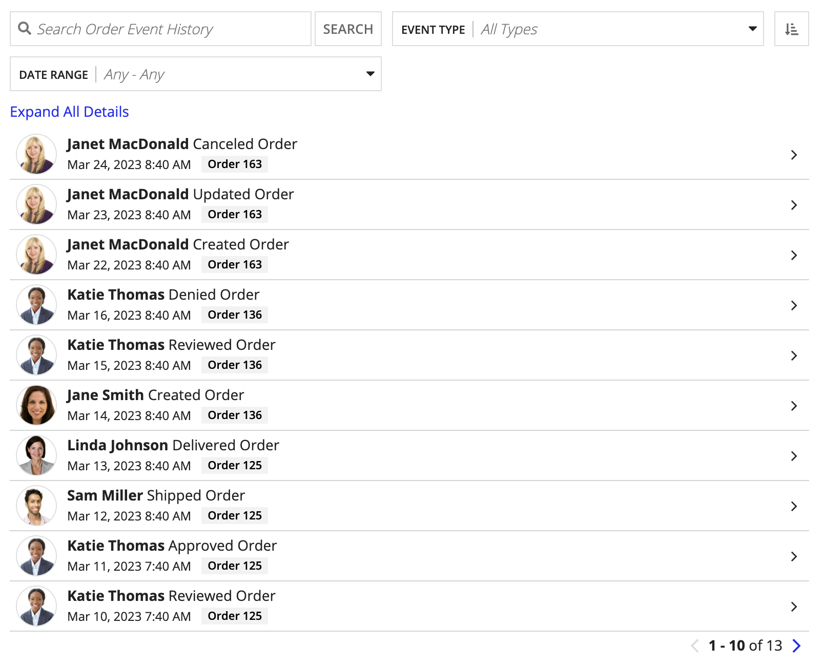
Displays a long list of events that users can search and filter on. This option is best when you want to display your event history as a single page in a site. |
"LIST_WITH_COMMENTS" |
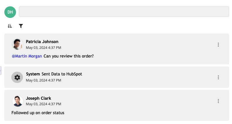
Displays a list of events with the ability to add comments and view a unified activity stream of events and comments. This option is best when you want to enable ad hoc user collaboration in event history list components. |
"TIMELINE" |
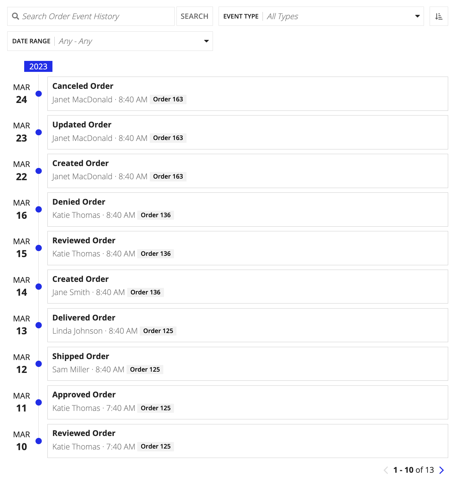
Displays a timeline of events where events are organized by the timestamp field. This option is best if you want to analyze events based on time rather than event type. |
Display automation typesCopy link to clipboard
If you are capturing the specific automation type that completed an event, you can use a!automationType() to display the automation type in the details parameter of the component.
For example, in the a!eventData() function, you could use the following expression in the details parameter to explain when an order is completed by automation.
1
2
3
4
5
if(
  a!isNullOrEmpty(fv!data[recordType!Order Event History.fields.user]),
  a!automationType(fv!data[recordType!Order Event History.fields.automationTypeId]) & " completed this order.",
  {}
)
Copy
Enable user collaborationCopy link to clipboard
You can enable comments on event history list components to allow users to collaborate, add context to events, and mention other users in discussions.
To enable users to collaborate and comment on the event history list component:
- Confirm the Event History record type has a
commentfield of type Text. This field will store any user comments. - Confirm the Event Type Lookup record type has an event type for adding comments. If you generated your event record types, this is the
Commented on Recordvalue in theeventNamefield. -
Configure the following parameters in the
a!eventHistoryListField()function:Parameter Action eventStyle Set the value to "LIST_WITH_COMMENTS".commentLayout (Optional) Specify how to display comments. By default, comments display as cards. mentionableUsers (Optional) Specify a constant pointing to the group of users that can be mentioned in a comment. -
Configure the following parameters in the
a!eventData()function:Parameter Action allowUsersToComment Set the value to true.comment Select the commentfield from the Event History record type specified in the recordType parameter.baseRecordIdForComment Write an expression indicating the identifier that links a comment to a specific record in the base record type. In most cases, you can reference the common field that links the Event History record type to the base record type.
You can index using a rule input or local variable to return the identifier. For example, if your interface has a rule input that points to the base record type, this would be:ri!record[recordType!Order.fields.Id].
Row limit for records-powered componentsCopy link to clipboard
Interface components that use a record type as the data source are known as records-powered components.
Records-powered components can display a maximum of 5,000 rows. As a best practice, you should not display all 5,000 rows in a component since it may impact performance.
ExamplesCopy link to clipboard
The following examples illustrate how to configure different styles of the event history list component.
Record type object references are specific to each environment. If you copy and paste these examples into your interface, they will not evaluate. Use them as a reference only.
Preview list of eventsCopy link to clipboard
The expression looks like this:
1
2
3
4
5
6
7
8
9
10
11
12
13
14
15
16
17
18
19
20
21
22
23
24
25
26
27
28
29
30
a!eventHistoryListField(
    label: "Event History Preview List",
    labelPosition: "COLLAPSED",
    eventData: {
      a!eventData(
        recordType: recordType!Order Event History,
        filters: null,
        timestamp: recordType!Order Event History.fields.timestamp,
        user: recordType!Order Event History.fields.user,
        eventTypeName: fv!data[recordType!Order Event History.relationships.eventType.fields.eventName],
        details: if(
          isNullOrEmpty(fv!data[recordType!Order Event History.fields.details]),
          "No additional details",
          fv!data[recordType!Order Event History.fields.details]
        ),
        recordTypeForTag: recordType!Order,
        recordIdentifier: recordType!Order Event History.fields.recordId
      )
    },
    refreshAfter: "RECORD_ACTION",
    eventStyle: "PREVIEW_LIST",
    previewListPageSize: 5,
    pageSize: 10,
    formatTimestamp: "DATE_TIME",
    collapseDetailsByDefault: false,
    displayUser: "IMAGE",
    showSearchBox: true,
    eventFilters: { "EVENT_TYPE", "DATE_RANGE" },
    showReverseSortButton: true
  )
Copy
Full list of eventsCopy link to clipboard
The expression looks like this:
1
2
3
4
5
6
7
8
9
10
11
12
13
14
15
16
17
18
19
20
21
22
23
24
25
26
27
28
29
a!eventHistoryListField(
    label: "Event History Full List",
    labelPosition: "COLLAPSED",
    eventData: {
      a!eventData(
        recordType: recordType!Order Event History,
        filters: null,
        timestamp: recordType!Order Event History.fields.timestamp,
        user: recordType!Order Event History.fields.user,
        eventTypeName: fv!data[recordType!Order Event History.relationships.eventType.fields.eventName],
        details: if(
          isNullOrEmpty(fv!data[recordType!Order Event History.fields.details]),
          "No additional details",
          fv!data[recordType!Order Event History.fields.details]
        ),
        recordTypeForTag: recordType!Order,
        recordIdentifier: recordType!Order Event History.fields.recordId
      )
    },
    refreshAfter: "RECORD_ACTION",
    eventStyle: "FULL_LIST",
    pageSize: 10,
    formatTimestamp: "DATE_TIME",
    collapseDetailsByDefault: true,
    displayUser: "IMAGE",
    showSearchBox: true,
    eventFilters: { "EVENT_TYPE", "DATE_RANGE" },
    showReverseSortButton: true
  )
Copy
Full list with commentsCopy link to clipboard
In this example, the interface has a rule input that points to the Order record type. The baseRecordIdForComment parameter indexes into the rule input to return the identifier of the record associated with the comment.
The expression looks like this:
1
2
3
4
5
6
7
8
9
10
11
12
13
14
15
16
17
18
19
20
a!eventHistoryListField(
  label: "Event History List with Comments",
  labelPosition: "COLLAPSED",
  eventData: a!eventData(
    recordType: recordType!Order Event History,
    filters: null,
    timestamp: recordType!Order Event History.fields.timestamp,
    user: recordType!Order Event History.fields.user,
    allowUsersToComment: true,
    comment: recordType!Order Event History.fields.comment,
    baseRecordIdForComment: ri!record[recordType!Order.fields.Id],
    eventTypeName: fv!data[recordType!Order Event History.relationships.orderEventType.fields.eventName],
  ),
  refreshAfter: "RECORD_ACTION",
  eventStyle: "LIST_WITH_COMMENTS",
  commentLayout: "CARD",
  mentionableGroup: cons!ACCOUNT_MANAGERS,
  pageSize: 10,
  displayUser: "IMAGE"
)
Copy
Timeline of eventsCopy link to clipboard
The expression looks like this:
1
2
3
4
5
6
7
8
9
10
11
12
13
14
15
16
17
18
19
20
21
22
23
24
25
a!eventHistoryListField(
    label: "Event History Timeline",
    labelPosition: "COLLAPSED",
    eventData: {
      a!eventData(
        recordType: recordType!Order Event History,
        filters: null,
        timestamp: recordType!Order Event History.fields.timestamp,
        user: recordType!Order Event History.fields.user,
        eventTypeName: fv!data[recordType!Order Event History.relationships.eventType.fields.eventName],
        recordTypeForTag: recordType!Order,
        recordIdentifier: recordType!Order Event History.fields.recordId
      )
    },
    refreshAfter: "RECORD_ACTION",
    eventStyle: "TIMELINE",
    previewListPageSize: 5,
    pageSize: 5,
    formatTimestamp: "DATE_TIME",
    collapseDetailsByDefault: true,
    displayUser: "IMAGE",
    showSearchBox: true,
    eventFilters: { "EVENT_TYPE", "DATE_RANGE" },
    showReverseSortButton: true
  )
Copy
Feature compatibilityCopy link to clipboard
The table below lists this component's compatibility with various features in Appian.
| Feature | Compatibility | Note |
|---|---|---|
| Portals | Incompatible | |
| Offline Mobile | Incompatible | |
| Sync-Time Custom Record Fields | Incompatible | |
| Real-Time Custom Record Fields | Incompatible | Custom record fields that evaluate in real time must be configured using one or more Custom Field functions. |
| Process Reports | Incompatible | Cannot be used to configure a process report. |
| Process Events | Incompatible | Cannot be used to configure a process event node, such as a start event or timer event. |


