|
| This content applies solely to Connected Onboarding, which must be purchased separately from the Appian base platform. This content was written for Appian 23.1 and may not reflect the interfaces or functionality of other Appian versions.
|
Introduction
The trend report dashboard allows managers and other users to monitor tasks and onboarding completion performance. This page describes how managers can view these trends and metrics to see how the organization performs in specific areas.
Using the trends dashboard
The trends dashboard has three main parts:
- The filters
- The onboarding reports
- The task reports
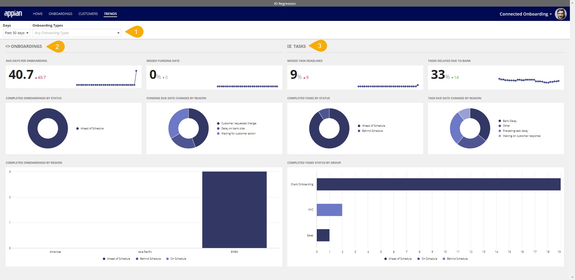
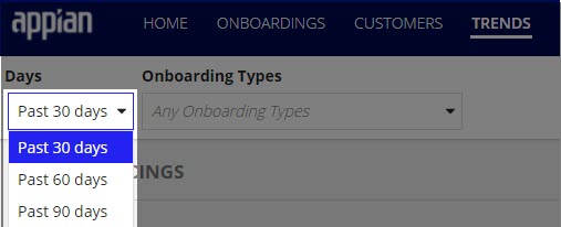
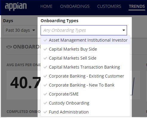
Trends dashboard filters
A manager can use the two filter options to change the data displayed on the dashboard. Changing either one of the filters will apply this filter to all displayed charts.
The two available filters are:
-
Time period - the user can select to look at the data over a 30, 60, or 90-day historical time period. By default, the dashboard will use a time period of the past 30 days.
-
Onboarding type - the user can select to look at an onboarding of a specific type only. By default, all of the onboarding types will be shown.
Onboarding reports
The charts and figures on the trends page give insight into onboardings. Some questions that this onboarding data can answer are:
- How long are onboardings taking to complete?
- Are onboardings completed on time?
- Why have funding dates changed?
- In what region are most onboardings taking place?
Average days per onboarding
The average days per onboarding section shows the manager data about how long it takes to complete onboardings.
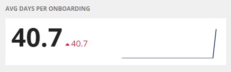
In this section, you see:
- The number of days an onboarding takes to complete in the past 30, 60, or 90 days.
- A line chart showing the average number of days per onboarding over the past 30, 60, or 90 days.
- The percent change of the average number of days compared to 30, 60, or 90 days ago.
- The percentage will appear green when the average length of an onboarding is trending downward.
- The percentage will appear red when the average length of an onboarding is trending upward.
Missed funding date
The missed funding date section shows the manager data about how many onboardings have missed their funding dates.
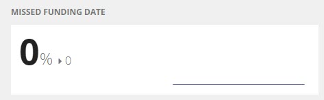
In this section, you see:
- The percentage of onboardings that have missed their funding date over the past 30, 60, or 90 days.
- A line chart showing the percentage of onboardings that have missed their funding dates over the past 30, 60, or 90 days.
- The percent change of the percentage of onboardings that missed funding date compared to those 30, 60, or 90 days ago.
- The percentage will appear green when the percentage of missed funding dates is trending downward.
- The percentage will appear red when the percentage of missed funding dates is trending upward.
Completed onboardings by status
The Completed Onboardings by Status chart shows data about when onboardings were completed relative to their funding dates.
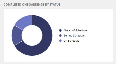
On this chart, you can:
- View onboardings grouped by whether they were completed ahead of schedule, on schedule, or behind schedule.
- Drill down into a specific segment of onboardings to view further information about those onboardings.
Funding due date changes by reason
The Funding Due Dates By Reason chart shows users why a funding date changed for an onboarding.
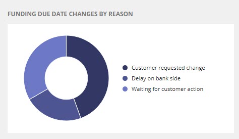
On this chart, you can:
- View the reasons that onboardings have had their funding dates changed.
- Drill down into a specific change reason to view further information about those onboardings.
Completed onboardings by region
The Completed Onboardings by Region chart shows onboardings grouped by which region the customer is domiciled, then further broken down by whether they were completed ahead of schedule, on schedule, or behind schedule.
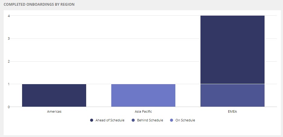
On this chart, you can:
- View onboardings by region (Asia Pacific, EMEA, and Americans).
- View which onboardings were completed ahead of schedule, on schedule, or behind schedule in each region.
- Drill down into an onboarding region to view further information about the onboardings of that region.
Task reports
The charts and figures on the trends page give insight into tasks. Some questions that can be answered by this task data are:
- Are tasks being completed on time?
- Why are task due dates being changed?
- Which group is responsible for the most overdue tasks?
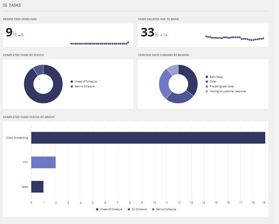
Missed task deadlines
The missed task deadlines section shows the manager data about how many tasks have missed their funding dates.
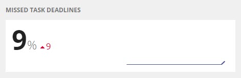
In this section, you see:
- The percentage of late tasks over the past 30, 60, or 90 days.
- A line chart shows the percentage of late tasks over the past 30, 60, or 90 days.
- The percent change of the percentage of late tasks compared to those 30, 60, or 90 days ago.
- The percentage will appear green when the overdue task rate is downward.
- The percentage will appear red when the rate of overdue tasks increases.
Tasks delayed due to bank
The Tasks Delayed Due to Bank report shows data on how many tasks due dates changed with a reason of delay due to the bank.
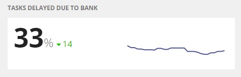
In this section, you see:
- The percentage of tasks with changed due dates because of bank delays over the past 30, 60, or 90 days.
- A line chart shows the percentage of tasks that had their due date changed because of bank delays over the past 30, 60, or 90 days.
- The percent change of the percentage of tasks that had their due date changed because of bank delays compared to those 30, 60, or 90 days ago.
- The percentage will appear green when the percentage of task due dates changes because of bank delays trending downward.
- The percentage will appear red when the percentage of task due dates changes because of bank delays trending upward.
Completed tasks by status
The Completed Tasks by Status shows data about when tasks complete relative to their due dates.
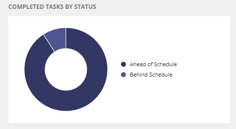
On this chart, you can:
- View tasks grouped by whether they were completed ahead of schedule, on schedule, or behind schedule.
- Drill down into a specific group of tasks to view further information about those tasks.
Task due date changes by reason
The Task Due Date Changes by Reason chart shows users why a task due date changed.
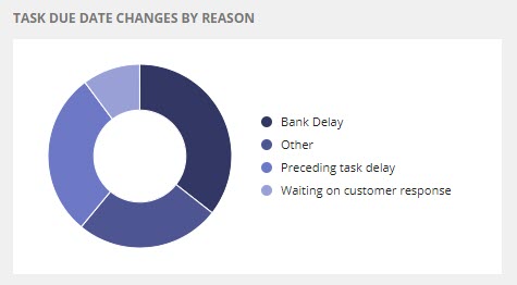
On this chart, you can:
- View reasons that task due dates have changed.
- Drill down into a specific change reason to view further information about those tasks.
Completed tasks status by group
The Completed Tasks Status by Group chart shows tasks grouped by which group completed those tasks, then further breaks it down by whether they were completed ahead of schedule, on schedule, or behind schedule.
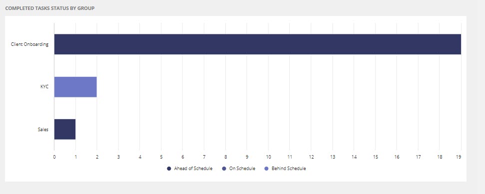
On this chart, you can:
- View tasks by the group.
- View which tasks were completed ahead of schedule, on schedule, or behind schedule in each region.
- Drill down into a group to view further information about the tasks.

