

| SAIL Design System guidance available for Grids
Grids should help your users take action and make decisions. Check out the grids design guidance page to learn how to display your data in a structured, easy-to-scan layout to help your users find what they need. |
Tip: Eager to get started with the read-only grid? Check out the Grid Tutorial for the fastest and easiest way to create a read-only grid.
FunctionCopy link to clipboard
a!gridField( label, labelPosition, instructions, helpTooltip, emptyGridMessage, data, columns, pageSize, initialSorts, secondarySorts, pagingSaveInto, selectable, selectionStyle, selectionValue, selectionSaveInto, selectionRequired, selectionRequiredMessage, disableRowSelectionWhen, validations, validationGroup, showWhen, spacing, height, borderStyle, shadeAlternateRows, rowHeader, accessibilityText, refreshAlways, refreshAfter, refreshInterval, refreshOnReferencedVarChange, refreshOnVarChange, userFilters, showSearchBox, showRefreshButton, showExportButton, recordActions, openActionsIn, actionsDisplay, actionsStyle, maxSelections, showSelectionCount, loadDataAsync )
Accepts a set of data and displays it as read-only text, links, images, or rich text in a grid that supports selecting, sorting, and paging.
The a!gridField() function allows you to create a read-only grid in your interface to display data as rich text, links, images, buttons, tags, record actions, and progress bars. This grid component also supports searching, filtering, selecting, sorting, and paging.
From design mode, you can quickly and easily set up a read-only grid by dragging and dropping the component into live view and selecting your grid's data source. You can choose from record type, query, variable, rule, or expression. When you choose a record type as your data source, you can reuse features configured on your record list such as user filters, record actions, and export to Excel. You can also use fields from related records to display data on the grid.
Although, design mode allows for a easier and faster setup for your read-only grid, you can still use the a!gridField() function in expression mode to customize and configure your read-only grid.
- To learn how to work with the read-only grid, see Configuring the Read-Only Grid.
- To organize editable inputs in a tabular layout, use an editable grid.
See also:
ParametersCopy link to clipboard
Note: Not all parameters are immediately available in design mode; some display only after enabling others. For example, after selecting Selectable, other selection-related parameters will be available.
| Name | Keyword | Types | Description |
|---|---|---|---|
|
Label |
|
Text |
Text to display as the grid label. |
|
Label Position |
|
Text |
Determines where the label appears. Valid values:
|
|
Instructions |
|
Text |
Supplemental text about this grid. |
|
Help Tooltip |
|
Text |
Displays a help icon with the specified text as a tooltip. The tooltip displays a maximum of 500 characters. The help icon does not show when the label position is |
|
Empty Grid Message |
|
Text |
Text to display in the grid when no data is available. Default is |
|
Data |
|
recordType, List of Map and List of Dictionary, DataSubset, or PortalReportDataSubset |
The data to display in the grid. Use a record type reference or a!recordData() to source your data from records and utilize records functionality, such as user filters and export to Excel. For other cases, you can use a query, such as |
|
Columns |
|
List of |
The columns to display in the grid, configured using a!gridColumn(). |
|
Rows to Display Per Page |
|
Number (Integer) |
The maximum number of rows to display at a time. Default: 10 |
|
Initial Sorts |
|
List of SortInfo |
Sorts applied to the grid upon initial load only. Each sort is applied in the order listed. The first sort in the list will display an active-sort arrow indicator (either up or down for ascending or descending) in its corresponding grid column (if applicable). |
|
Secondary Sorts |
|
List of SortInfo |
Sorts applied to the grid after every user interaction. If the user activates a sort on a column, these sorts will be applied to the other columns in the order they're listed. For example, adding a secondary sort on Month will keep them in order when the user sorts on Year. Secondary sorts do not display an active-sort indicator. |
|
Paging Save Into |
|
List of Save |
One or more variables that are updated only when user invokes a paging action on the grid. You can reference the current paging of the grid using |
|
Selectable |
|
Boolean |
Determines if grid rows are selectable. When selection style is |
|
Selection Style |
|
Text |
Determines the style when a row is selected. Valid values: |
|
Selection Value |
|
Text Array or Integer Array |
Identifiers of the rows that should appear as selected. Can be set to have rows be pre-selected for the user. Supported types: Text Array and Integer Array. |
|
Save Selection To |
|
List of Save |
One or more variables that are updated with the selected identifiers when the user changes selections. Use |
|
Selection required |
|
Boolean |
Determines if a selection is required to submit the form. Default: |
|
Selection Required Message |
|
Text |
Custom message to display when a selection is required and not provided. |
|
Disable Row Selection |
|
Boolean |
Determines for each row if selection is disabled. The condition defined in this parameter is evaluated once for each row. Reference fields from the source using dot notation, such as |
|
Validations |
|
List of Variant |
Validation errors to display below the grid when the data is invalid, configured using |
|
Validation Group |
|
Text |
When present, the requiredness of the field is only evaluated when a button in the same validation group is pressed. The value for this parameter cannot contain spaces. For example, |
|
Visibility |
|
Boolean |
Determines whether the component is displayed on the interface. When set to false, the component is hidden and is not evaluated. Default: true. |
|
Spacing |
|
Text |
Determines the spacing within grid cells. Valid values: |
|
Height |
|
Text |
Determines height of the grid. Valid values: |
|
Border Style |
|
Text |
Determines the style of the grid border. Valid values: |
|
Shade Alternate Rows |
|
Boolean |
Determines whether alternate rows are shaded. Default: |
|
Row Header |
|
Number (Integer) |
Index of the column to be used as the row header. Screen readers will announce the value in each row header when navigating to other cells within that row. Used only for accessibility; produces no visible change. |
|
Accessibility Text |
|
Text |
Additional text to be announced by screen readers. Used only for accessibility; produces no visible change. |
|
Refresh Always |
|
Boolean |
When true, grid data will be refreshed after each user interaction and each interval refresh. Default: false. |
|
Refresh After |
|
List of Text String |
Refreshes grid data each time a specified action completes. Valid values: |
|
Refresh After an Interval of Time |
|
Number (Decimal) |
How often grid data gets refreshed in minutes. When null, grid data will not be refreshed on an interval. Valid values: |
|
Refresh on Reference Variable Change |
|
Boolean |
When true, grid data will be refreshed each time the value of any variable referenced in the data parameter is updated. To refresh grid data when another variable that is not used in the data parameter changes, use |
|
Refresh on Variable Change |
|
Any Type |
Refreshes grid data each time any of these specific variables change. This allows you to refresh the grid data when a variable that is not referenced in the data parameter is updated. You can define a single variable (e.g. |
|
User Filters |
|
List of Variant |
List of user filter references to display, configured using the |
|
Show search box |
|
Boolean |
Determines if the record search box should be shown. This parameter only applies when a record type is used as the source in the data parameter. Default: true. |
|
Show Refresh Button |
|
Boolean |
Determines if the grid should include a refresh button to manually refresh data. This parameter only applies when a record type is used as the source in the data parameter. Default: true. |
|
Show Export to Excel Button |
|
Boolean |
Determines if grid data can be exported. This parameter only applies when a record type is used as the source in the data parameter. Default: false. |
|
Record Actions |
|
List of Variant |
List of record action items to display above the grid, configured using a!recordActionItem(). If you use |
|
Open Actions In |
|
Text |
Determines how record actions should open to the user. Valid values: |
|
Actions Display |
|
Text |
Determines which details are shown for record actions, regardless of style. Valid values: |
|
Actions Display |
|
Text |
Determines how the list of actions should be displayed above the grid. Valid values: |
|
Maximum Selections |
|
Number (Integer) |
The maximum number of items the user can select. When the user selects the maximum number of items, row selection is disabled. |
|
Show Selection Count |
|
Text |
Determines when the number of selected items displays below the grid. Valid values: |
|
Load Grid Data in Background |
|
Boolean |
Determines whether to load the grid data and filters independently from the rest of the components in the interface. When true, this can improve user experience by allowing users to view the rest of the page while the data loads. See Asynchronous Loading for more information. Default: false. |
Usage considerationsCopy link to clipboard
Using read-only grids with record dataCopy link to clipboard
Read-only grids that use a record type as the source are known as records-powered grids.
Consider the following when creating a records-powered grid.
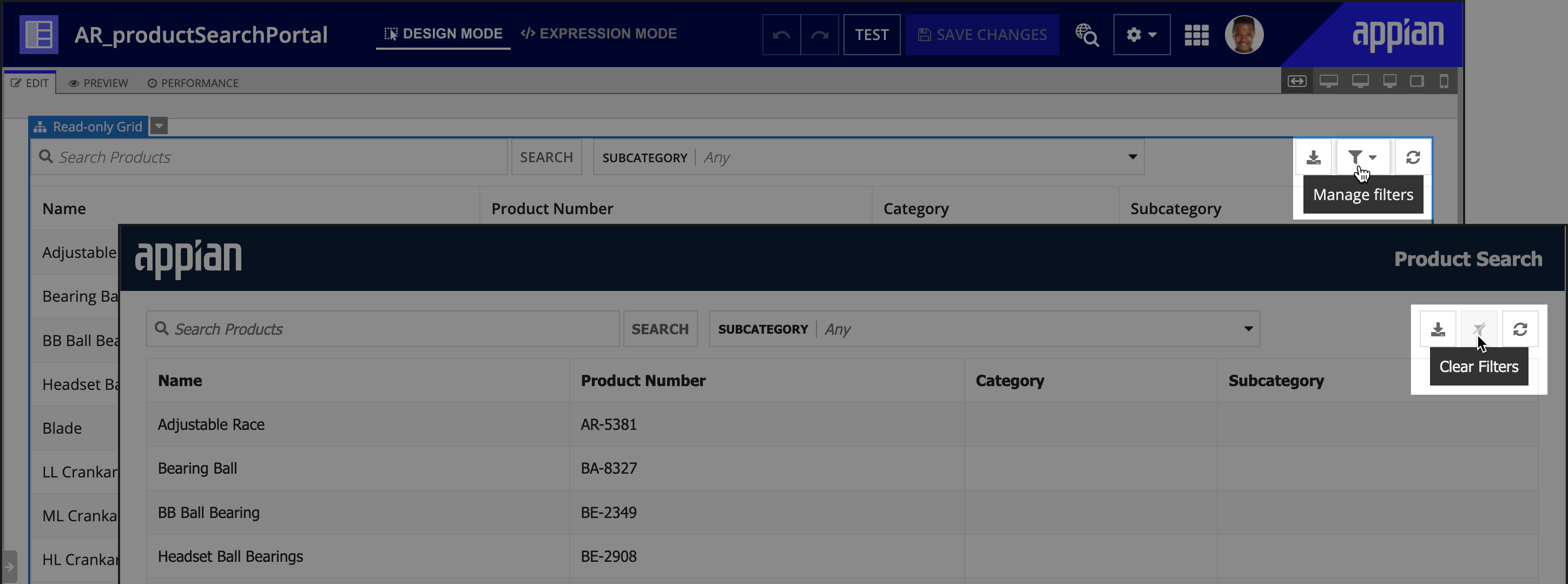
Using records-powered grids in a portalCopy link to clipboard
When you use a records-powered grid in a portal, there are a few things to keep in mind:
- Some record components don't work in portals: Certain record components, such as record links and record actions, are incompatible with portals. When you create a read-only grid using a record type, it may automatically use these components, so be sure to remove the incompatible components before publishing your portal.
- Users can't save their filters in a portal: The record list search, refresh button, export to Excel, and user filters will all function in a portal. However, users can't save their filters in a portal since they aren't signed in. The Manage filters button is replaced with a Clear Filters button in a published portal.
- Asynchronous loading is not compatible with portals.

See Working with Data in Portals for more information about using records as the source for read-only grids in portals.
Autopopulate a grid with a record listCopy link to clipboard
When a record type is used as the data source for your read-only grid, Appian automatically generates grid columns based on the columns configured for the record list.
Specify which fields to query and whenCopy link to clipboard
By default, a grid will query and display all the data specified in the columns, pagingSaveInto, and selectionSaveInto parameters. This default behavior can potentially impact performance if your grid includes dynamic behavior since it may result in querying more data than necessary.
For example, let's say you configured the showWhen parameter on the columns in your grid so that certain columns only appear to managers. Even when columns are hidden from the grid, those fields will still be queried since they're specified in the columns parameter of the grid.
To alter this default behavior, you can specify when the grid should query the fields in your columns using the fields parameter in a!recordData(). Learn more about using the fields parameter in a!recordData().
Reference related dataCopy link to clipboard
If you use a record type with data sync enabled as the source of your grid, you can also reference related record fields in your grid.
You can use related record fields in your columns, or to sort and filter the grid.
Filter, limit, and sort related one-to-many dataCopy link to clipboard
If you reference a related record field from a one-to-many relationship as a column in the grid, the maximum number of related records returned for each base record is 10.
To filter, limit, and sort the related record set returned from the one-to-many relationship, you can leverage the relatedRecordData parameter in a!recordData().
Avoid using relationship references to display related one-to-many data. Instead, you should only reference the specific related record field you want to display. This avoids querying more data than necessary, which can impact the grid's performance and export behavior.
For example, to display a list of cases associated with each customer, you should use the related record field reference recordType!Customer.relationships.cases.fields.title in the grid column. You should not use the relationship reference recordType!Customer.relationships.cases.
Use records-specific componentsCopy link to clipboard
You can display the following components on any records-powered grid:
Export data to ExcelCopy link to clipboard
When set to true, the showExportButton parameter allows users to export the grid data to Microsoft Excel. By default, any columns visible in the grid will export to Excel. You can specify which columns are exported by configuring the exportWhen parameter on individual grid columns.
Review how much data can be exported from the grid, and how certain display elements are exported to Excel.
Display and style record actionsCopy link to clipboard
The recordActions parameter allows you to display record actions, like related actions or record list actions, on the grid. You can display actions from different record types.
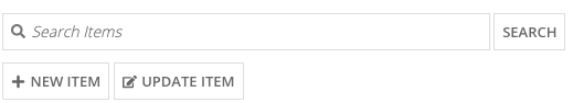
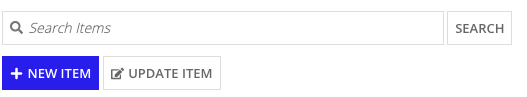
You can then use the actionsStyle parameter to determine whether all actions display as with standard styling, or if the first record action displays as a primary button style. Appian recommends using the "TOOLBAR_PRIMARY" option when you want the first action, typically the most common action, to stand out.
When actionsStyles is set to "TOOLBAR", the buttons display like this:
When actionsStyles is set to "TOOLBAR_PRIMARY", the buttons display like this:
See the record action component for other details to consider when adding record actions to a grid.
Record action securityCopy link to clipboard
Each action specified in the recordActions parameter has security that is checked to ensure only the right users can see the right actions. In most cases where you use security rules, Appian evaluates the security for the entire grid before it is shown to the user. Because security rules are verified in bulk, the overall grid loading time will be shorter than if security expressions are used.
Note: If you use a!localVariables() inside an a!recordActionItem(), Appian cannot perform a bulk security evaluation, so the grid may load slower than expected. Whenever possible, create local variables outside a!recordActionItem().
Row limit for records-powered componentsCopy link to clipboard
Interface components that use a record type as the data source are known as records-powered components.
Records-powered components can display a maximum of 5,000 rows. As a best practice, you should not display all 5,000 rows in a component since it may impact performance.
Configuring grid displayCopy link to clipboard
- If the value for a column is empty or null, the grid still renders the column with just the label.
- The selectionStyle of
ROW_HIGHLIGHTdoes not have any visual indicator when selection is disabled through the disableRowSelectionWhen parameter. - For accessibility purposes, every grid should have a row header configured. The first column containing text is usually the correct choice for row header. See the SAIL Design System for more information.
Configuring grid pagingCopy link to clipboard
- To reduce clutter on smaller grids, the following happens:
- No paging controls are displayed when all rows are on one page.
- Paging controls to jump to the first or last page are not displayed when a grid has less than 3 pages.
- When a read-only grid is used offline, paging and sorting don't function and images won't render.
- If you are managing your own paging, you cannot pass a datasubset which has a paging configuration that uses a batch size of
-1. - When entering a query in the data parameter (either directly, or indirectly from a rule reference), the query must return the total count (
fetchTotalCount: true).
Grid height and column widthCopy link to clipboard
-
Grid heights behave as a fixed height on web but a maximum height on mobile.
-
For columns using the
"AUTO"width, each column's width is determined by the length of the longest value in that column.- See the read-only grid column component for more information on using the
"AUTO"width. - For complete guidance on when and how to use column widths, see Column Widths.
- See the read-only grid column component for more information on using the
Design mode guidanceCopy link to clipboard
Note: This guidance does not apply to grids that use a record type as the data source. See Configuring the Read-Only Grid to learn how to configure a records-powered grid in design mode.
The following guidance applies when configuring a read-only grid in design mode:
- Generated columns:
- When you populate the data parameter from design mode and let the grid manage the paging, the grid will automatically generate an initial set of columns in the order they appear.
- Grid columns are not automatically generated when you select VARIABLE as the data source and use a local variable to power the read-only grid.
-
The initial values for automatically-generated columns are:
Parameter Value Description label fv!row.<fieldname>The field name is converted to title case. If the field name is in camel case, it will be split and converted to title case. If the field name is too long, it will be truncated with ellipses ( ...).value fv!row.<fieldname>The field value to display. sortField <fieldname>The field name of the primary key. align "END"orfixed()The alignment depends on the field's data type. If the data type for the column value is numerical or date-based, then it will set align : "END". If the data type for the column value is a decimal, then it will be wrapped in thefixed()function to two decimal places. Ex.value: fixed(fv!row.cost, 2).
- Updating columns:
- After initial columns have been generated, the grid will automatically update with new columns to match any new fields added to the data source.
- However, automatic updates do not occur when the data source is an RULE or EXPRESSION. To update the columns displayed in the grid, you must update the data source, and add or remove the columns manually.
- Selecting QUERY as the data source:
- If you select QUERY as the data source, you'll use the query editor to configure the query that powers your grid.
- Appian will automatically use the following query values in your grid:
- The query's batchSize will be the value of the grid's pageSize parameter.
- The query's sortInfo will be used as the grid's initialSort parameter.
- Batch size limitation:
- The grid cannot use a query that has a paging info with a batch size of
-1in design mode.
- The grid cannot use a query that has a paging info with a batch size of
Using the loadDataAsync parameterCopy link to clipboard
Setting the loadDataAsync parameter to true allows the interface to load without waiting for grid data, displaying a placeholder skeleton in its place. This improves user experience by enabling users to interact with other parts of the interface while the grid loads.
Only enable this if either:
- The grid is the slowest-loading component on the interface.
- The grid is the only component on the interface and it takes more than one second to load.
See Asynchronous Loading for more detailed information about enabling asynchronous (async) loading and how it works.
Note: Async loading is not compatible with offline mobile or portal interfaces.
ExamplesCopy link to clipboard
You can find example configurations of the grid at Configuring the Read-Only Grid and Grid Tutorial.
Feature compatibilityCopy link to clipboard
The table below lists this component's compatibility with various features in Appian.
| Feature | Compatibility | Note |
|---|---|---|
| Portals | Compatible | |
| Offline Mobile | Compatible | |
| Sync-Time Custom Record Fields | Incompatible | |
| Real-Time Custom Record Fields | Incompatible | Custom record fields that evaluate in real time must be configured using one or more Custom Field functions. |
| Process Reports | Incompatible | Cannot be used to configure a process report. |
| Process Events | Incompatible | Cannot be used to configure a process event node, such as a start event or timer event. |
| Process Autoscaling | Compatible |
Old versionsCopy link to clipboard
There are older versions of this interface component. You can identify older versions by looking at the name to see if there is a version suffix. If you are using an old version, be sure to refer to the corresponding documentation from the list below.
| Old Versions | Reason for Update |
|---|---|
| a!gridField_19r1 | Now supports embedded queries, columns widths, and rich text. |
| a!gridField_23r3 | Enhanced read-only grids that use a record type as the source so they only query the record fields specified in the columns, pagingSaveInto, and selectionSaveInto parameters. This allows for more optimal grid performance. Additionally, if your grid includes dynamic behavior, you can configure the fields parameter in a!recordData() to specify when to query fields in the grid. |
| a!gridField_24r3 | Enhanced records-powered grids so they can automatically detect if fields have been queried from a different relationship and skip any redundant queries. Additionally, updated the grid's default border style and shading. |
To learn more about how Appian handles this kind of versioning, see the Function and Component Versions page.
Related PatternsCopy link to clipboard
The following patterns include usage of the Read-Only Grid Component.
-
Aggregate Data and Conditionally Display in a Chart or Grid (Reports, Charts, Query Data, Grids, Records): Aggregate data and conditionally display it in a pie chart or grid. In this pattern, we will calculate the total number of employees in each department and display it in a pie chart and a read-only grid. Then, we'll use a link field to conditionally display each component.
-
Conditionally Hide a Column in a Grid (Grids, Conditional Display): Conditionally hide a column in a read-only grid when all data for that column is a specific value.
-
Configure a Chart Drilldown to a Grid (Charts, Grids, Query Data, Records): Displays a column chart with aggregate data from a record type and conditionally shows a grid with filtered records when a user selects a column on the chart.
-
Configure a Chart to Grid Toggle (Charts, Grids): Display a column chart with a toggle to display an alternate grid view of the data.
-
Delete Rows in a Grid (Grids): Delete one or more rows of data in a read-only grid.
-
Display Last Refresh Time (Auto-Refresh, Grids, Records): Display the last time the interface was updated, either based on a user interaction or a timer.
-
Display Processes by Process Model with Status Icons (Grids, Images, Reports): Use an interface to display information about instances of a specific process model.
-
Display a User's Tasks in a Grid With Task Links (Grids, Reports, Looping): Display the tasks for a user in a Read-Only Grid and allow them to click on a task to navigate to the task itself.
-
Drilldown Pattern (Grids): The drilldown pattern allows users to select an item from a grid to see more details in place of the grid.
-
Drilldown Report Pattern (Grids, Charts, Reports): The drilldown report pattern consists of a bar chart and column chart, which each drill down into a grid.
-
Filter the Data in a Grid (Grids, Filtering, Records): Configure a user filter for your read-only grid that uses a record type as the data source. When the user selects a value to filter by, update the grid to show the result.
-
Filter the Data in a Grid Using a Chart (Charts, Grids, Filtering, Records): Display an interactive pie chart with selectable sections so that a user may filter the results in a grid.
-
Grid With Detail Pattern (Grids): The grid with detail pattern allows users to select an item from a grid to see more details next to the grid.
-
Grid with Heatmap Pattern (Grids): Displays a grid with conditional formatting of background colors at different thresholds.
-
Grid with Selection Pattern (Grids, Heading component): This pattern is an example of good UX design for a grid that allows users to select items and easily view their selections when there are multiple pages of data. It also provides information on a common save behavior.
-
Limit the Number of Rows in a Grid That Can Be Selected (Validation, Grids, Records): Limit the number of rows that can be selected to an arbitrary number.
-
More-Less Link (Grids, Rich Text): Use this pattern to keep grids with rows containing varying text lengths looking clean and uniform. This design also improves readability and the user experience by limiting the amount of text in the interface.
-
Offline Mobile Task Report (Grids, Filtering, Process Task Links, Task Reports, Looping): Display a task report for a user that will work in Appian Mobile, even when the user is offline.
-
Refresh Data Using a Refresh Button (Auto-Refresh):
-
Save a User's Report Filters to a Data Store Entity (Grids, Smart Services, Filtering, Reports): Allow a user to save their preferred filter on a report and automatically load it when they revisit the report later.
-
Searching on Multiple Columns (Grids, Filtering, Reports): Display a grid populated based on search criteria specified by end users.
-
Show Calculated Columns in a Grid (Formatting, Grids, Records): Display calculated values in columns in a grid.
-
Task Report Pattern (Grids, Filters, Process Task Links, Task Reports): Provides a simple way to create and display an Appian task report.
-
Use Links in a Grid to Show More Details and Edit Data (Grids): Allow end users to click a link in a read-only grid to view the details for the row, and make changes to the data. The data available for editing may include more fields than are displayed in the grid.
-
Use the Write to Data Store Entity Smart Service Function on an Interface (Smart Services, Grids, Looping): Allow the user to publish several rows of data to a table through the a!writeToDataStoreEntity() smart service function.