

| SAIL Design System guidance available for Grids
Grids should help your users take action and make decisions. Check out the grids design guidance page to learn how to display your data in a structured, easy-to-scan layout to help your users find what they need. |
FunctionCopy link to clipboard
a!gridColumn( label, sortField, helpTooltip, value, showWhen, align, width, backgroundColor, accessibilityText, exportWhen )
Displays a column of data as read-only text, links, images, rich text, buttons, tags, record actions, or progress bars within the Read-Only Grid Component.
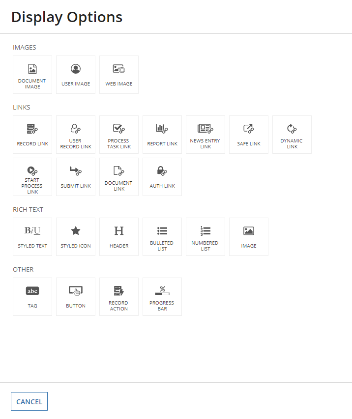
When configuring the component, click Display Options after choosing a value.
ParametersCopy link to clipboard
| Name | Keyword | Types | Description |
|---|---|---|---|
|
Label |
|
Text |
Text to display as the column header. |
|
Sort Field |
|
Any Type |
The field used to sort the grid when selecting this column header. Grids that use record data must use the |
|
Help Tooltip |
|
Text |
Displays a help icon in the column header with the specified text as a tooltip. |
|
Display Value |
|
Any Type |
The value to display in each cell within the column. The value can be text, |
|
Visibility |
|
Boolean |
Determines whether the column is displayed in the grid. When set to |
|
Alignment |
|
Text |
Determines the alignment for the header label and all values within the column. Valid values: |
|
Width |
|
Text |
Determines the column width. Valid values: |
|
Background Color |
|
Text |
Determines the cell background color. To set the color based on the value of the cell, use |
|
Accessibility Text |
|
Text |
Additional text to be announced by screen readers. Used only for accessibility; produces no visible change. |
|
Export When |
|
Boolean |
Determines whether the column is displayed in the grid on export. When set to |
Usage considerationsCopy link to clipboard
Using the value parameterCopy link to clipboard
| If the value parameter… | Then… |
|---|---|
| Is null or empty | The grid will render the column with only the label. |
| Is a relationship reference | The column will not display any data. Instead, reference a specific related record field in this parameter to display related data in a column. For example, recordType!Order.relationships.customers.fields.fullName. |
Avoid using a query directly in the value parameter since it will cause the query to run for each row in the grid. Instead, you can use a records-powered grid to easily reference data from a record type and any of it's related record types.
Using the width parameterCopy link to clipboard
When you use the "AUTO" value, note that:
- The width is determined by the length of the longest unbroken value in that column. For example, this could be the length of the longest word in a paragraph or the width of the widest image.
- If you use
"ICON"&"AUTO"widths together, the column using"ICON"will always be the same width and the column using"AUTO"will fill up the remaining space. - You should avoid using
"AUTO"and weighted column widths (such as"1X","2X", or"3X") together.
If you use a fixed width (such as "NARROW" or "MEDIUM") for a column that doesn't take up the width of the page, the width will auto distribute depending on the content inside the column.
For complete guidance on when and how to use column widths, see Column Widths.
Using the backgroundColor parameterCopy link to clipboard
To conditionally format the background color, use a logical function like a!match() to define the conditions and the color to display when the condition is met. See the grid with heatmap pattern for an example of a grid with conditionally formatted background colors. Note that header cells do not display a background color.
Note: Background colors are not included when you export a grid to Excel. Instead, you can save the page as a PDF if you want to include the grid background colors and share it with users who don't have access to your app.
Using the accessibilityText parameterCopy link to clipboard
When you've configured a background color, you should also set equivalent accessibilityText values for screen readers to announce. This way, your grid will be accessible to a wider range of users.
For example, say your grid shows product information and one column shows the average customer rating. You could set the column's backgroundColor to be red, yellow, or green based on the value of that field. To indicate the meaning of these values to screen readers, add the accessibilityText parameter with text to read when the same conditions are met.
1
2
3
4
5
6
7
8
9
10
11
12
13
14
15
16
17
18
19
20
a!gridColumn(
  label: "Average customer rating",
  backgroundColor: a!match(
    value: fv!row,
    whenTrue: fv!row <= 4,
    then: "NEGATIVE",
    whenTrue: fv!row <= 7,
    then: "WARN",
    whenTrue: fv!row >= 8,
    then: "SUCCESS"
    default: "NONE"),
  accessibilityText: a!match(
    value: fv!row,
    whenTrue: fv!row <= 4,
    then: "Poor",
    whenTrue: fv!row <= 7,
    then: "OK",
    whenTrue: fv!row >= 8,
    then: "Good",
    default: "No ratings")
Copy
The screen reader will announce the value of label, so you don't need to include the word rating in the accessibilityText values.
Using the exportWhen parameterCopy link to clipboard
The exportWhen parameter allows you to choose which columns are exported from a records-powered grid.
You can use this parameter to omit certain columns from export, like those containing formatting or styling unsupported by Microsoft Excel, and add additional columns that are only visible upon export.
For example, the expression below includes a column for "Status," which uses rich text icons to indicate whether a customer is active or inactive. Since icons cannot be exported to Excel, the column is hidden from export and an additional "Status" column is configured to export instead.
Similarly, the column containing record actions is also hidden from export, since users can't access the actions in Excel.
1
2
3
4
5
6
7
8
9
10
11
12
13
14
15
16
17
18
19
20
21
22
23
24
25
26
27
28
29
30
31
32
33
34
35
36
37
38
39
40
41
42
43
44
45
46
47
48
49
50
51
52
53
54
55
56
57
58
59
60
61
62
63
64
65
66
67
68
69
70
71
72
73
74
75
76
77
78
79
80
81
82
83
84
85
86
87
88
89
90
91
92
93
94
95
96
97
98
99
100
101
102
103
104
105
106
107
108
109
110
111
112
113
114
115
116
117
118
119
120
121
122
123
124
125
126
127
128
129
130
131
132
133
134
{
  a!gridField(
    label: "Read-only Grid",
    labelPosition: "ABOVE",
    data: recordType!Customer,
    columns: {
      a!gridColumn(
        label: "Name",
        sortField: recordType!Customer.fields.displayName,
        value: a!linkField(
          links: {
            a!recordLink(
              label: fv!row[recordType!Customer.fields.displayName],
              recordType: {
                recordType!Customer
              },
              identifier: fv!row[recordType!Customer.fields.id]
            )
          }
        )
      ),
      a!gridColumn(
        label: "District",
        sortField: recordType!Customer.relationships.district.fields.name,
        value: fv!row[Customer.relationships.district.fields.name]
        align: "START"
      ),
      a!gridColumn(
        label: "Status",
        sortField: recordType!Customer.fields.isActive,
        value: if(
          fv!row[recordType!Customer.fields.isActive],
          a!richTextDisplayField(
            label: "active icon",
            labelPosition: "COLLAPSED",
            value: a!richTextIcon(
              icon: "check-circle",
              color: "POSITIVE"
            )
          ),
          a!richTextDisplayField(
            label: "inactive icon",
            labelPosition: "COLLAPSED",
            value: a!richTextIcon(
              icon: "times-circle",
              color: "SECONDARY"
            )
          )
        ),
    /* Hide this column from export since */
    /* rich text icons cannot be exported to Excel */
        exportWhen: false
      ),
      a!gridColumn(
        label: "Status",
        value: if(
          fv!row[recordType!Customer.fields.isActive],
          "Active",
          "Inactive"
        ),
    /* Hide this column from the app, but */
    /* export this column to show customer status */
        showWhen: false,
        exportWhen: true
      ),
      a!gridColumn(
        label: "YTD Payment",
        sortField: recordType!Customer.fields.ytdPayment,
        value: if(
          isnull(
            fv!row[recordType!Customer.fields.ytdPayment]
          ),
          "-",
          fixed(
            fv!row[recordType!Customer.fields.ytdPayment],
            2
          )
        ),
        align: "END"
      ),
      a!gridColumn(
        label: "# Payments",
        sortField: recordType!Customer.fields.paymentCount,
        value: fv!row[recordType!Customer.fields.paymentCount],
        align: "END"
      ),
      a!gridColumn(
        label: "# Deliveries",
        sortField: recordType!Customer.fields.deliveryCount,
        value: fv!row[recordType!Customer.fields.deliveryCount],
        align: "END"
      ),
      a!gridColumn(
        label: "Customer Since",
        sortField: recordType!Customer.fields.customerSince,
        value: if(
          isnull(
            fv!row[recordType!Customer.fields.customerSince]
          ),
          "-",
          datetext(
            fv!row[recordType!Customer.fields.customerSince],
            "default"
          )
        ),
        align: "END"
      ),
      a!gridColumn(
        label: "",
        value: a!recordActionField(
           actions:{
             a!recordActionItem(
               action: recordType!Customer.actions.updateCustomer,
               identifier: fv!identifier
             ),
             a!recordActionItem(
               action: recordType!Customer.actions.deleteReCustomer,
               identifier: fv!identifier
             )
           },
           style: "MENU_ICON"
         ),
      /* Hide this column from export since */
      /* record actions aren't needed upon export */
         exportWhen: false
      )
    },
    showExportButton: true,
    validations: {},
    refreshAfter: "RECORD_ACTION",
    showSearchBox: true,
    showRefreshButton: true,
  )
}
Copy
ExamplesCopy link to clipboard
You can find example configurations of a read-only grid and its columns at Configuring the Read-Only Grid and Grid Tutorial.
Feature compatibilityCopy link to clipboard
The table below lists this component's compatibility with various features in Appian.
| Feature | Compatibility | Note |
|---|---|---|
| Portals | Compatible | |
| Offline Mobile | Compatible | |
| Sync-Time Custom Record Fields | Incompatible | |
| Real-Time Custom Record Fields | Incompatible | Custom record fields that evaluate in real time must be configured using one or more Custom Field functions. |
| Process Reports | Incompatible | Cannot be used to configure a process report. |
| Process Events | Incompatible | Cannot be used to configure a process event node, such as a start event or timer event. |
| Process Autoscaling | Compatible |
Old versionsCopy link to clipboard
There are older versions of this interface component. You can identify older versions by looking at the name to see if there is a version suffix. If you are using an old version, be sure to refer to the corresponding documentation from the list below.
| Old Versions | Reason for Update |
|---|---|
| a!gridTextColumn | Now supports multiple interface components. |
To learn more about how Appian handles this kind of versioning, see the Function and Component Versions page.
Related PatternsCopy link to clipboard
The following patterns include usage of the Read-Only Grid Column Component.
-
Aggregate Data and Conditionally Display in a Chart or Grid (Reports, Charts, Query Data, Grids, Records): Aggregate data and conditionally display it in a pie chart or grid. In this pattern, we will calculate the total number of employees in each department and display it in a pie chart and a read-only grid. Then, we'll use a link field to conditionally display each component.
-
Conditionally Hide a Column in a Grid (Grids, Conditional Display): Conditionally hide a column in a read-only grid when all data for that column is a specific value.
-
Configure a Chart Drilldown to a Grid (Charts, Grids, Query Data, Records): Displays a column chart with aggregate data from a record type and conditionally shows a grid with filtered records when a user selects a column on the chart.
-
Configure a Chart to Grid Toggle (Charts, Grids): Display a column chart with a toggle to display an alternate grid view of the data.
-
Delete Rows in a Grid (Grids): Delete one or more rows of data in a read-only grid.
-
Display Last Refresh Time (Auto-Refresh, Grids, Records): Display the last time the interface was updated, either based on a user interaction or a timer.
-
Display Processes by Process Model with Status Icons (Grids, Images, Reports): Use an interface to display information about instances of a specific process model.
-
Display a User's Tasks in a Grid With Task Links (Grids, Reports, Looping): Display the tasks for a user in a Read-Only Grid and allow them to click on a task to navigate to the task itself.
-
Drilldown Pattern (Grids): The drilldown pattern allows users to select an item from a grid to see more details in place of the grid.
-
Drilldown Report Pattern (Grids, Charts, Reports): The drilldown report pattern consists of a bar chart and column chart, which each drill down into a grid.
-
Filter the Data in a Grid (Grids, Filtering, Records): Configure a user filter for your read-only grid that uses a record type as the data source. When the user selects a value to filter by, update the grid to show the result.
-
Filter the Data in a Grid Using a Chart (Charts, Grids, Filtering, Records): Display an interactive pie chart with selectable sections so that a user may filter the results in a grid.
-
Grid With Detail Pattern (Grids): The grid with detail pattern allows users to select an item from a grid to see more details next to the grid.
-
Grid with Heatmap Pattern (Grids): Displays a grid with conditional formatting of background colors at different thresholds.
-
Grid with Selection Pattern (Grids, Heading component): This pattern is an example of good UX design for a grid that allows users to select items and easily view their selections when there are multiple pages of data. It also provides information on a common save behavior.
-
Limit the Number of Rows in a Grid That Can Be Selected (Validation, Grids, Records): Limit the number of rows that can be selected to an arbitrary number.
-
More-Less Link (Grids, Rich Text): Use this pattern to keep grids with rows containing varying text lengths looking clean and uniform. This design also improves readability and the user experience by limiting the amount of text in the interface.
-
Offline Mobile Task Report (Grids, Filtering, Process Task Links, Task Reports, Looping): Display a task report for a user that will work in Appian Mobile, even when the user is offline.
-
Refresh Data Using a Refresh Button (Auto-Refresh):
-
Save a User's Report Filters to a Data Store Entity (Grids, Smart Services, Filtering, Reports): Allow a user to save their preferred filter on a report and automatically load it when they revisit the report later.
-
Searching on Multiple Columns (Grids, Filtering, Reports): Display a grid populated based on search criteria specified by end users.
-
Show Calculated Columns in a Grid (Formatting, Grids, Records): Display calculated values in columns in a grid.
-
Task Report Pattern (Grids, Filters, Process Task Links, Task Reports): Provides a simple way to create and display an Appian task report.
-
Use Links in a Grid to Show More Details and Edit Data (Grids): Allow end users to click a link in a read-only grid to view the details for the row, and make changes to the data. The data available for editing may include more fields than are displayed in the grid.
-
Use the Write to Data Store Entity Smart Service Function on an Interface (Smart Services, Grids, Looping): Allow the user to publish several rows of data to a table through the a!writeToDataStoreEntity() smart service function.