
This page applies to business users. It describes the visualizations of analyzed data that you can review on a drilldown page or saved insight page of your process.
OverviewCopy link to clipboard
Process insights provides visualizations to help you understand important aspects of your analyzed data.
The data shown in a visualization is filtered based on the context in which you're viewing it. This context can include any of the following:
Location |
Context |
|---|---|
Cases or occurrences associated with the process. |
|
Cases or occurrences associated with the view. |
|
Cases or occurrences related to the KPI. |
|
Cases or occurrences related to a characteristic in the drilldown. |
|
Cases or occurrences related to the saved insight. |
Also, the visualizations you'll see depend on which type of KPI the drilldown or insight is related to, as follows:
KPI Type |
Visualization |
|---|---|
Duration |
|
Count |
Tip: Visualizations that you access from a process diagram are treated as if they are related to an average case duration KPI. For example, you'll see the duration comparison chart when you view details for an activity from a process diagram in the process page.
Duration ComparisonCopy link to clipboard
The elements in this visualization vary depending on whether you are viewing details for an attribute value or a process part.
Attribute valueCopy link to clipboard
This chart compares the selected attribute value to other values of the attribute in the current context.
For example:
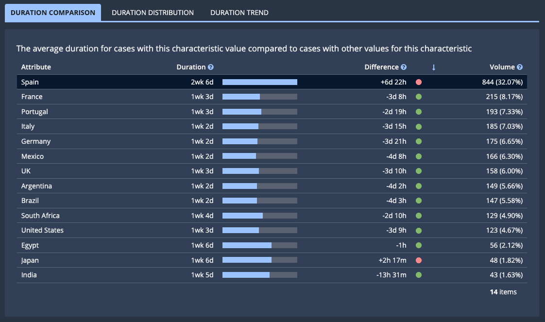

This table contains the following columns:
Column |
Description |
|---|---|
Attribute |
An attribute value. |
Duration |
The average duration of cases related to this KPI or insight that have this attribute value. |
Difference |
The difference between the average duration of cases with this attribute value and the average duration of cases with all other values of this attribute. |
Volume |
A two-part value specifying (1) the total number of cases related to this KPI or insight that have this attribute value, and (2) what percent cases with this attribute are out of all cases in the current context. |
Process partCopy link to clipboard
This chart compares the selected process part to other process parts in the current context. For example, if you're looking at sequence details in a KPI, the chart compares the selected sequence to other sequences in cases related to that KPI.
For example:
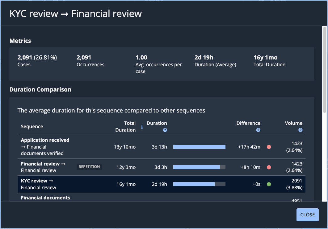
This table contains the following columns:
Column |
Description |
|---|---|
|
Sequence/Value |
The name of this part of the process. For activities, this appears as a single name. For sequences and repetitions, this appears in the following format: <start activity> <end activity>. |
|
Total Duration |
The total duration of all occurrences of this sequence or repetition in cases in the current context. This column is not present for activities. |
Duration |
The average duration of the process part in the cases you're investigating. |
Difference |
The difference between the average duration of this process part and the average duration of other process parts in the current context. |
Volume |
The percentage of occurrences of the process part in this insight. Hover to see the occurrence counts. |
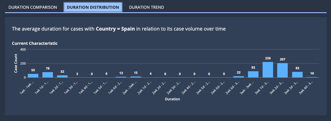
Duration DistributionCopy link to clipboard
This chart displays how long cases with this attribute take on average (Duration) in relation to the number of cases with the attribute value (Case Count).
You can use this chart to identify the duration with the highest number of cases, so you can drill down further.
For example:
Duration TrendCopy link to clipboard
This chart displays how long cases with the attribute value have taken over time (Duration) in relation to the number of cases or occurrences without the attribute value (Volume).
For example:
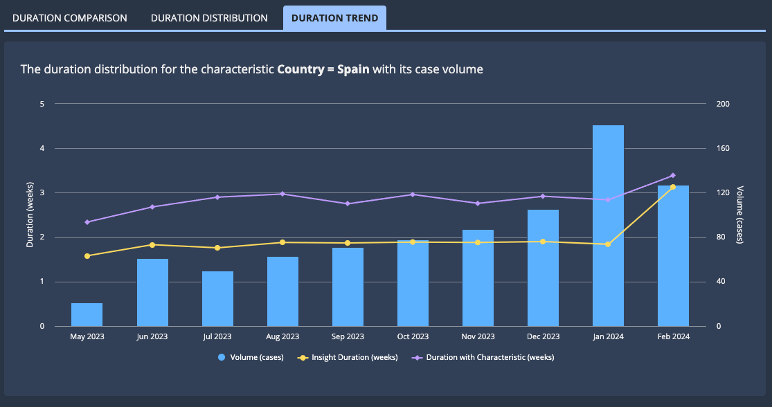
You can use this chart to identify increases in duration over time, so you can further evaluate other attributes associated with those specific dates.
When evaluating this chart, keep in mind the following:
- An increase in average duration at the same time as an increase in case or occurrence count might indicate that the team handling the work needs additional resources.
- An increase in average duration without an increase in case or occurrence count might indicate that the process itself needs refinement.
Value ComparisonCopy link to clipboard
This chart compares the selected attribute value to other values of the attribute in cases related to the KPI.
For example:
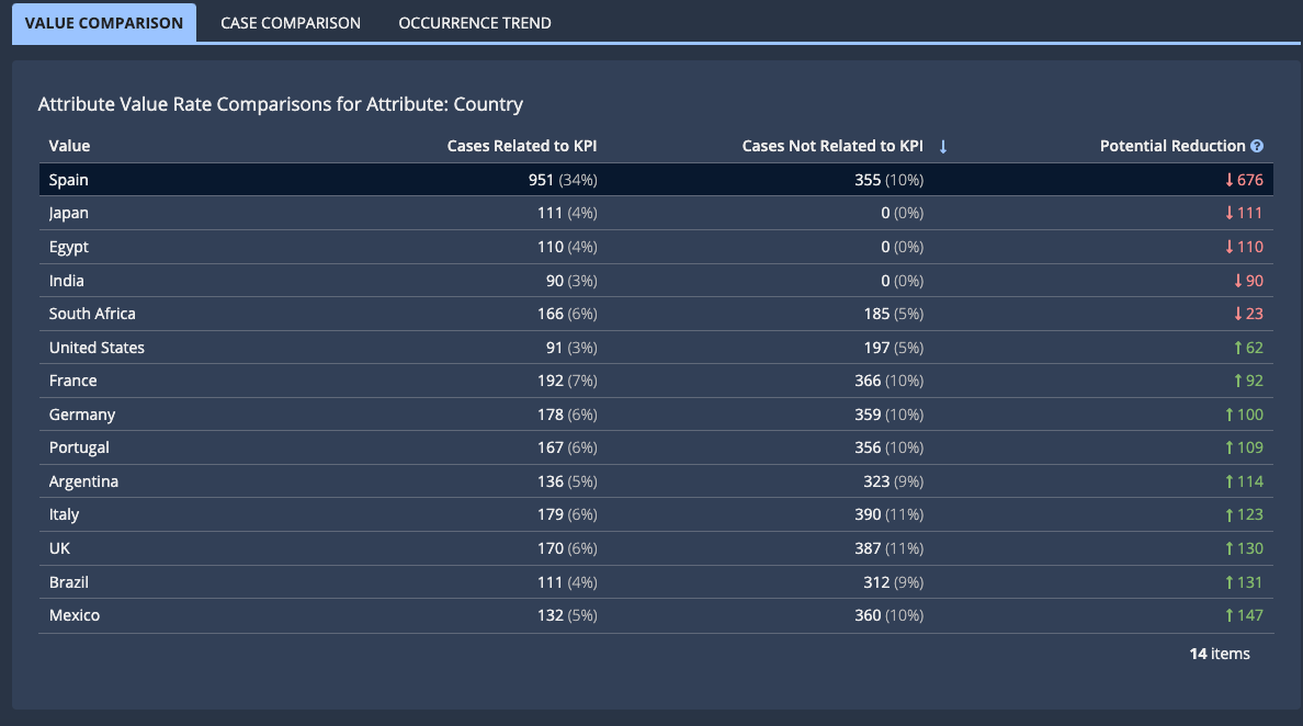
This table contains the following columns:
Column |
Description |
|---|---|
Value |
An attribute value. |
Cases Related to KPI/Insight |
How often this attribute occurs in cases related to the KPI. |
Cases Not Related to KPI/Insight |
How often this attribute occurs in cases not related to this KPI. |
Potential Reduction |
A number that indicates the potential for eliminating unwanted occurrences of an attribute, sequence, repetition, or activity. The higher the number, the greater the potential. Learn more about how this number is calculated. |
Case ComparisonCopy link to clipboard
This chart displays how this attribute occurs in cases related to this KPI compared to cases not related to this KPI.
For example:
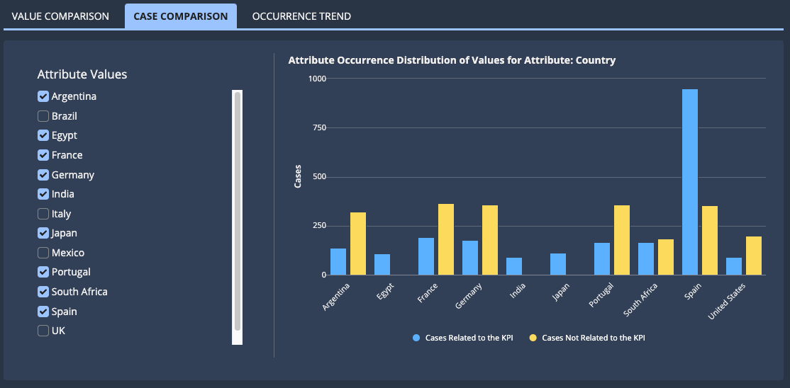
To change which attribute values display in the chart, select Attribute Values checkboxes as appropriate.
To view details for an attribute value, hover over the corresponding bar in the chart.
Occurrence TrendCopy link to clipboard
This chart displays how many cases with the attribute value have occurred over time in relation to the number of cases without the attribute value.
For example:
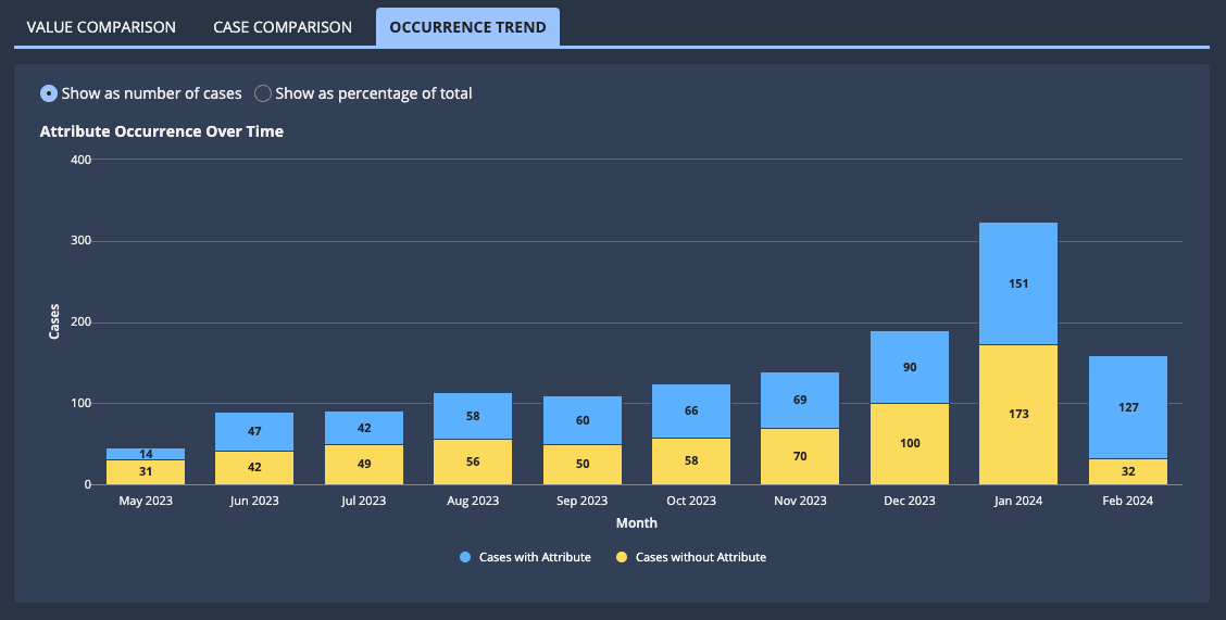
The chart can display as a number of cases or a percentage of total cases. To change the display, select the appropriate option.
To view details for an individual unit of time, hover over the corresponding bar in the chart.