
FunctionCopy link to clipboard
a!styledTextEditorField( label, labelPosition, instructions, helpTooltip, value, saveInto, readOnly, required, requiredMessage, disabled, validations, validationGroup, showWhen, accessibilityText, height, sizeLimit, placeholder )
Allows users to enter and view styled text. Text is stored with HTML formatting. To display text as a design element in your interface, use the rich text display component.
For more information on text input components and when to use each, see the Inputs best practices in the SAIL Design System.
Supported text formattingCopy link to clipboard
The styled text editor supports the following text formatting:
- Bold text
- Italic text
- Underline text
- Strikethrough text
- Links
- Bulleted lists
- Numbered lists
Additionally, it also supports the following Markdown formatting:
| Format | Markdown Formatting | Example | Returns |
|---|---|---|---|
| Bold | Double asterisks ** or underscores __ |
**text** or __text__ |
text |
| Italics | Single asterisk * or underscore _ |
*text* or _text_ |
text |
| Strikethrough | Double tildes ~~ |
~~text~~ |
|
| Bulleted list | At the beginning of a new line, an asterisk *, dash -, or plus sign +, followed by a space |
* text- text-or- + text |
|
| Numbered list | At the beginning of a new line, any number followed by a period and a space | 1. text1. text |
|
To keep the Markdown characters in your text without applying the formatting, after the formatting is applied, select the backspace key. The effect will be removed and the Markdown characters will be visible as plain text. This must be done right after the effect appears. After you move the cursor away from the formatted text, selecting backspace will no longer revert the formatting.
ParametersCopy link to clipboard
| Name | Keyword | Types | Description |
|---|---|---|---|
|
Label |
|
Text |
Text to display as the field label. |
|
Label Position |
|
Text |
Determines where the label appears. Valid values:
|
|
Instructions |
|
Text |
Supplemental text about this field. |
|
Help Tooltip |
|
Text |
Displays a help icon with the specified text as a tooltip. The tooltip displays a maximum of 500 characters. The help icon does not show when the label position is |
|
Display Value |
|
Text |
Text to display in the field, including the HTML formatting. |
|
Save Input To |
|
List of Save |
One or more variables that are updated with the text when the user changes it. Use a!save() to save a modified or alternative value to a variable. |
|
Read-only |
|
Boolean |
Determines if the field should display as not editable. Default: false. |
|
Required |
|
Boolean |
Determines if a value is required to submit the form. Default: false. |
|
Required Message |
|
Text |
Custom message to display when the field's value is required and not provided. |
|
Disabled |
|
Boolean |
Determines if the field should display as potentially editable but grayed out. Default: false. |
|
Validations |
|
List of Text String |
Validation errors to display below the field when the value is not null. |
|
Validation Group |
|
Text |
When present, this field is only validated when a button in the same validation group is pressed. Do not use spaces in the value for this parameter. For example, instead of |
|
Visibility |
|
Boolean |
Determines whether the component is displayed on the interface. When set to false, the component is hidden and is not evaluated. Default: true. |
|
Accessibility Text |
|
Text |
Additional text to be announced by screen readers. Used only for accessibility; produces no visible change. |
|
Height |
|
Text |
Determines the field height. Valid values: |
|
Size Limit |
|
Number (Integer) |
Determines how much text the user can enter. The parameter value is about equal to the number of characters allowed, including HTML formatting. |
|
Placeholder |
|
Text |
Text to display in the field when it is empty. Does not show if the field is read only. |
Usage considerationsCopy link to clipboard
Inputting and formatting textCopy link to clipboard
The styled text editor uses standard HTML to format text. For example, when a user applies underline formatting to text, behind the scenes the styled text editor wraps the value in HTML tags like this: <u>Text</u>.
Because of this, users can copy and paste text from other programs, such as documents and emails, and the supported text formatting will be preserved. Any unsupported formatting will be removed. For example, if someone copies and pastes a table, the table row and column formatting will be removed, but any supported formatting, such as bold text or links, will be preserved.
If users copy and paste or manually type HTML tags, the tags will be treated as plain text. When the value is stored, the less-than (<) and greater-than (>) symbols in the HTML tags will be replaced with their character reference—< for < and > for >.
For example, if a user types or pastes <u>Text</u>, it will be saved as <u>Text</u>. However, if a user copies "Text" into a styled text editor, it will be saved as <u>Text</u>.
When the text that the user is inputting reaches 100,000 bytes, the styled text editor will prevent them from entering more text.
Displaying styled text editor valuesCopy link to clipboard
Displaying the read-only valueCopy link to clipboard
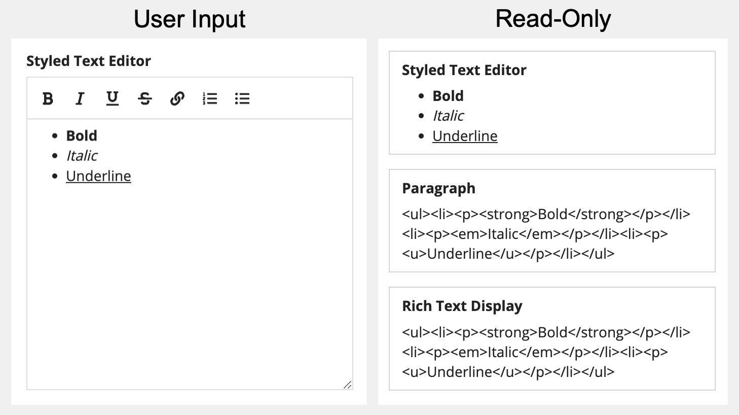
When you need to display the styled text editor value in an interface, display it in a styled text editor component with the readOnly parameter set to true. If you try to display it in any other component, it will display with the HTML tags.
The below screenshot shows the difference between displaying the value in rich text display, paragraph, and styled text editor components.
See Displaying read-only styled text editor values for guidance on displaying read-only values so that they are set apart from other formatted text in the interface.
Displaying the value in a gridCopy link to clipboard
By default, displaying the value from a styled text editor component in a grid includes the HTML tags used for formatting.
If you need to display a styled text editor value in a grid, save an alternate value using stripHtml() to a separate field in your database. Use the alternate value for the sortField and value parameters in the grid column.
For considerations about using the value from a styled text editor in a grid, see Choosing which text input to use.
Displaying the value in emailsCopy link to clipboard
Because emails sent from Appian use HTML for formatting, you can use the styled text editor value in an Send E-Mail node and it will display with the user's formatting applied to the text.
Using parametersCopy link to clipboard
Using the sizeLimit parameterCopy link to clipboard
The size limit valueCopy link to clipboard
The value of the sizeLimit parameter is in bytes, not characters. Most characters are one byte. However, certain characters are more than one byte, including emojis and some characters from non-latin alphabets. So if you set the sizeLimit parameter to 4,000, you are allowing 4,000 bytes, not necessarily 4,000 characters.
Keep in mind that the HTML tags that are saved with the styled text editor value are included in the size limit. So even if a user enters exactly 4,000 characters, when they add any formatting, they will exceed the size limit.
Matching the size limit to the database fieldCopy link to clipboard
Make sure the value you set for the sizeLimit parameter matches the length of the field in the CDT or record field.
- For a CDT field, set the Length to the same value you use for the sizeLimit parameter.
- For a record type with data sync enabled, if the sizeLimit parameter is more than 255, select Long Text for the field. Because the field character limit for synced record types is 4,000, be sure to set the sizeLimit parameter to 4,000 or less.
Size limit validationsCopy link to clipboard
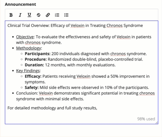
When a user approaches the size limit, the styled text editor displays the remaining percentage of text they have left. When they exceed the size limit, it displays the percentage of how far they are over the size limit and a size limit validation message appears below the component.
Using a large size limit or no size limitCopy link to clipboard
Whenever possible, set the sizeLimit parameter to 4,000 or less.
If you need to allow users to enter more text, avoid using the value in a process model. To save the value to a database, write it directly from the interface using a!writeToDataStoreEntity() or a!writeRecords() in the saveInto parameter of a button component.
Using the readOnly parameterCopy link to clipboard
- If readOnly is set to
true, the component's value displays without a box around it. - If you pass the same local variable to value and saveInto when readOnly is set to
false, you can use the user's input in the component to modify the interface.
ExamplesCopy link to clipboard
Use the interactive editor below to test out your code:
Read-only styled text editor componentCopy link to clipboard
See Displaying read-only styled text editor values for guidance on displaying read-only values so that they are set apart from other formatted text in the interface.
Storing styled text editor value in a local variableCopy link to clipboard
Feature compatibilityCopy link to clipboard
The table below lists this component's compatibility with various features in Appian.
| Feature | Compatibility | Note |
|---|---|---|
| Portals | Compatible | |
| Offline Mobile | Compatible | |
| Sync-Time Custom Record Fields | Incompatible | |
| Real-Time Custom Record Fields | Incompatible | Custom record fields that evaluate in real time must be configured using one or more Custom Field functions. |
| Process Reports | Incompatible | Cannot be used to configure a process report. |
| Process Events | Incompatible | Cannot be used to configure a process event node, such as a start event or timer event. |