| SAIL Design System guidance available for Pane Layout
When users need to scroll through information but also leave part of the interface static, use the pane layout. Learn how to use two- and three-pane layouts to build flexible interfaces with greater user control. |
FunctionCopy link to clipboard
a!paneLayout( panes, showWhen )
Displays two or three vertical panes, each with independent scrolling.
See also:
ParametersCopy link to clipboard
| Name | Keyword | Types | Description |
|---|---|---|---|
|
Pane |
|
Any Type |
List of two or three panes to display in the pane layout. |
|
Visibility |
|
Boolean |
Determines whether the layout is displayed on the interface. When set to false, the layout is hidden and is not evaluated. Default: true. |
Usage considerationsCopy link to clipboard
Panes as a top-level layoutCopy link to clipboard
The pane layout is a top-level layout that is meant to provide the overall structure for an interface, similar to form layout and header content layout.
This means you can't:
- Place other components next to a pane layout.
- Nest a pane layout inside other components, including a header content layout.
- Place more than one pane layout on an interface.
Using the pane layout with Appian MobileCopy link to clipboard
Pane layouts have different behavior when the interface is viewed in the Appian Mobile app. Panes are converted to columns, so the contents cannot be scrolled independently. Larger devices like tablets will display the columns side by side, while phones and other smaller devices will show the panes as stacked columns. This may result in very long pages depending on a pane's contents.
Note: Pane layouts are not converted for mobile browsers. Users viewing the paned interface this way will have a similar experience to those using a desktop browser. See Adjusting for different screen sizes to learn how to adapt the layout for smaller screens.
Adjusting for different screen sizesCopy link to clipboard
The user's screen size should be considered when designing a paned interface. Let's look at the message inbox template as an example.
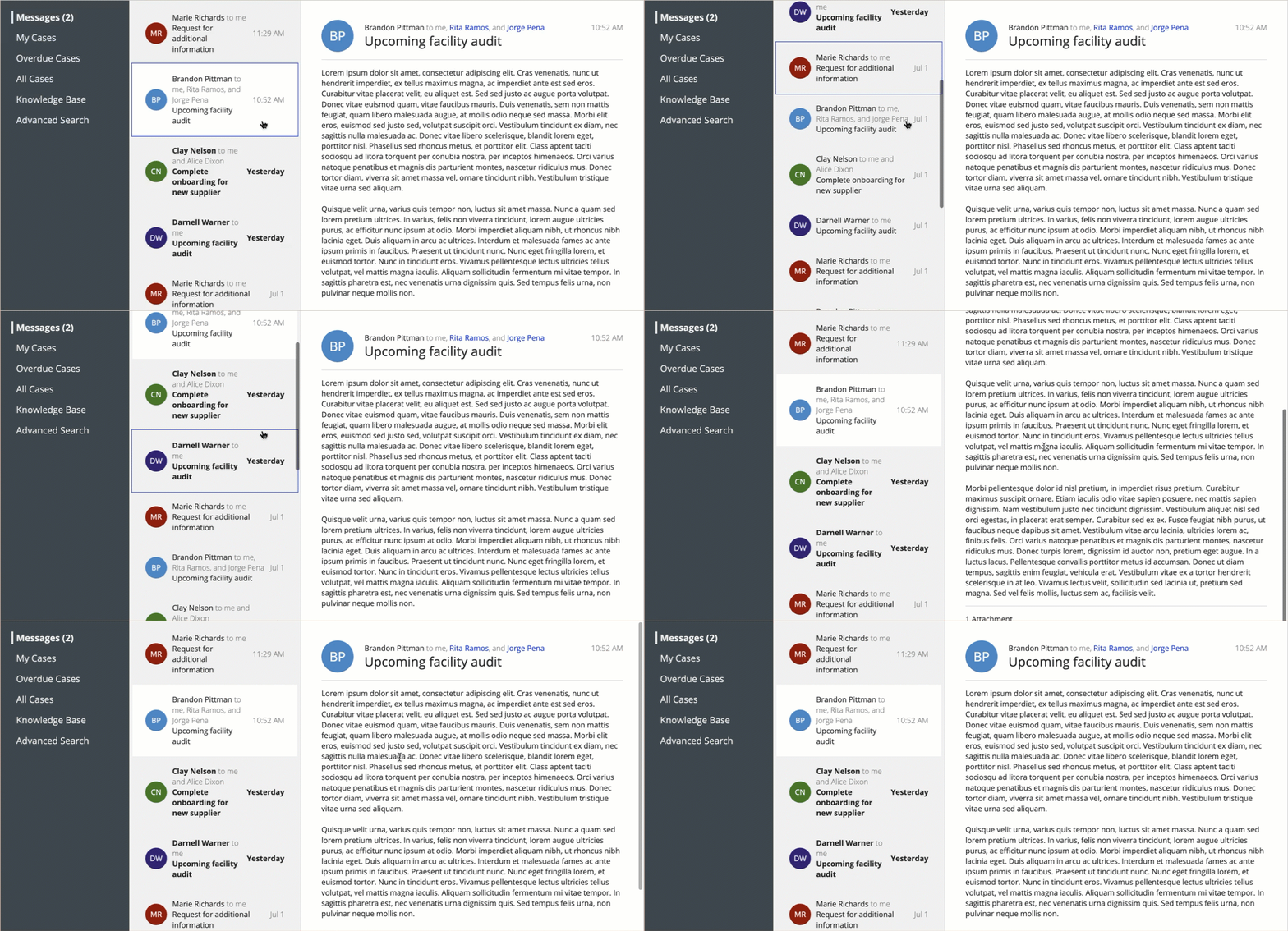
On a large, wide screen, such as a laptop display, this interface uses three panes so users can scroll both the list of messages and the message contents.
For smaller screens, we recommend considering alternative layouts to better accommodate the contents of the panes.
You can reuse the wide display for a tablet in landscape mode, but the user will not have the ability to scroll the panes independently.
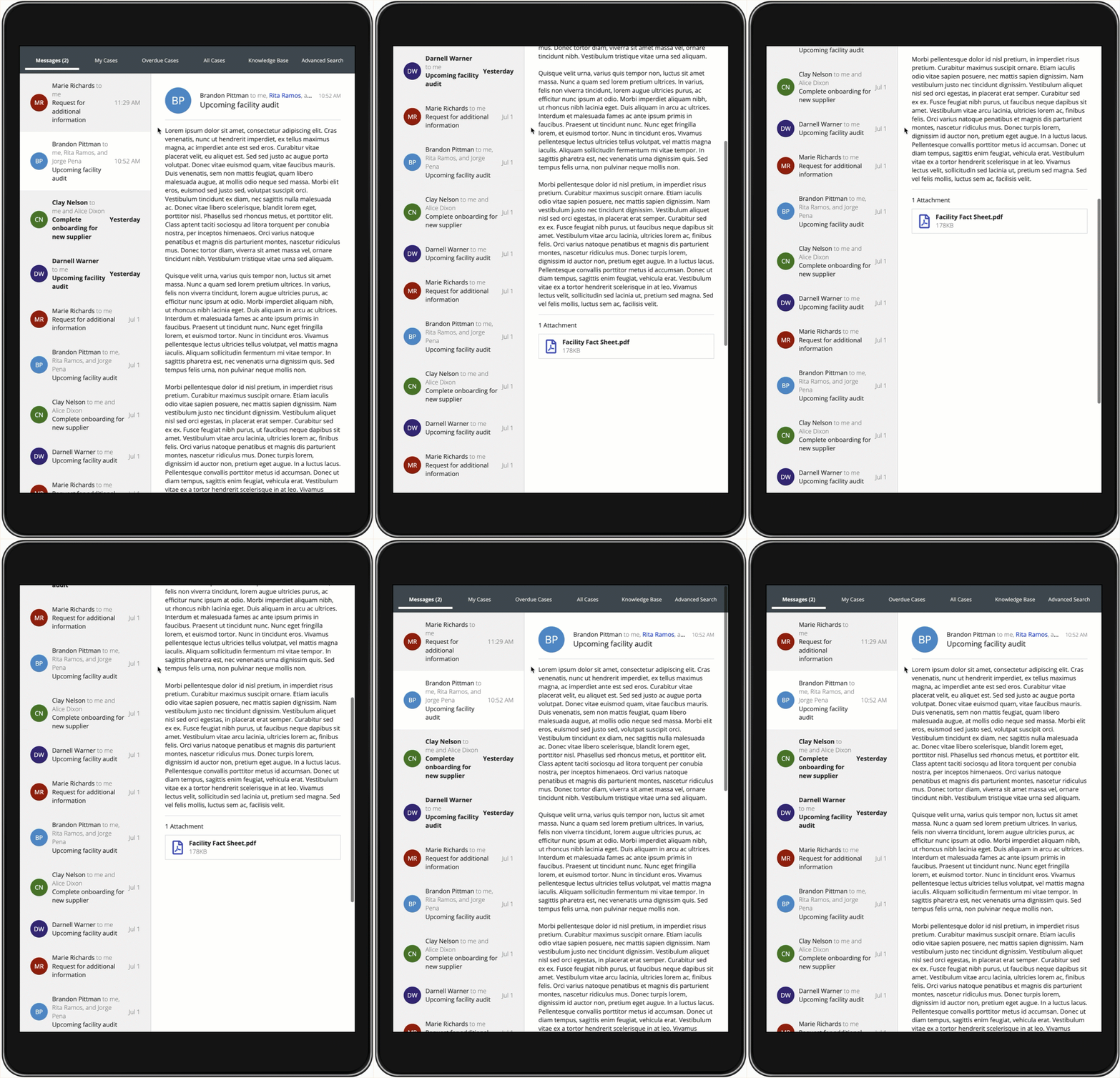
For a tablet in portrait mode, moving the navigation elements to a top bar helps save some space so users can still comfortably see the list of messages and message details.
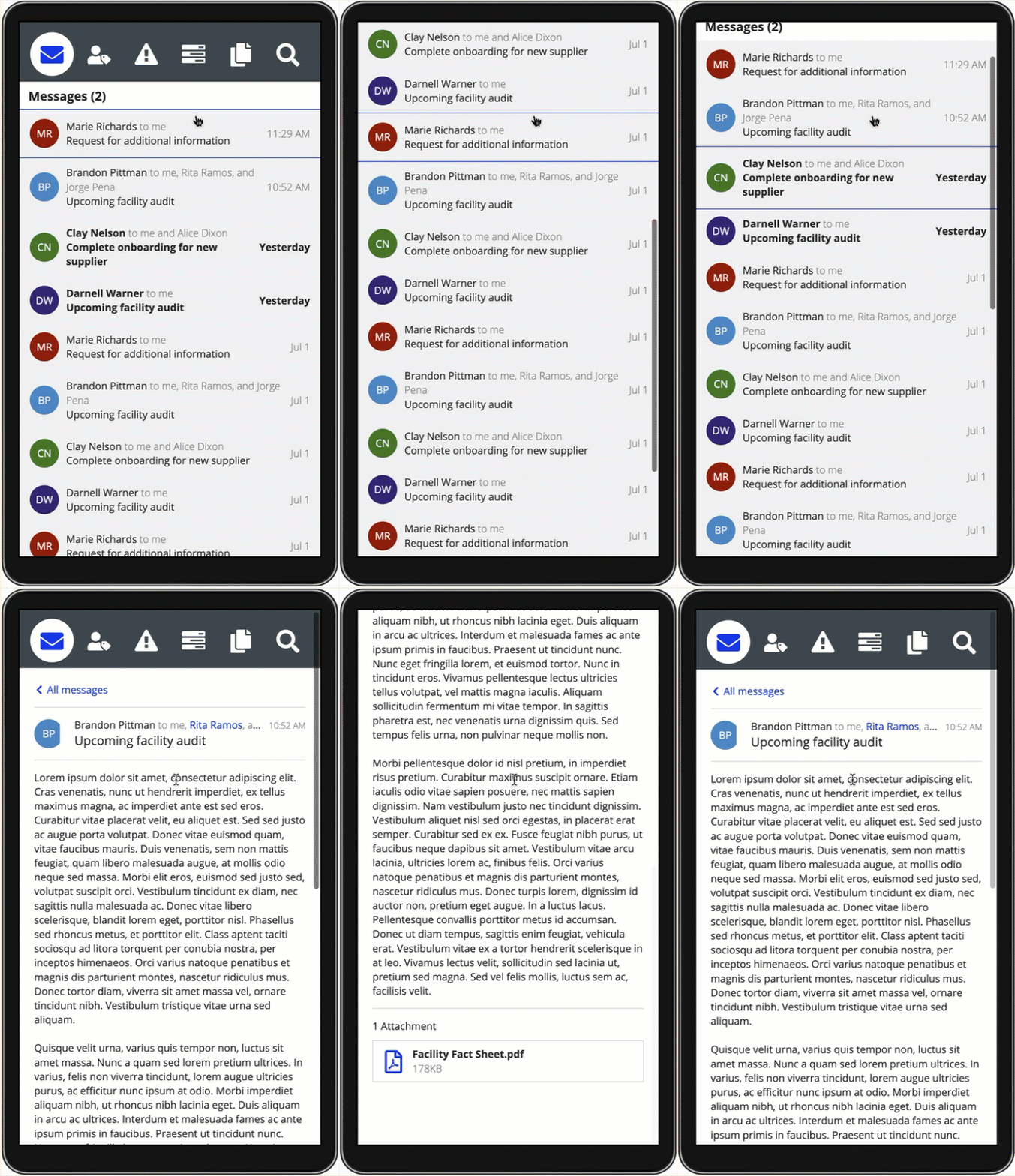
On phone screens, you can display the list of messages separately from the message contents to give users the ability to navigate each set of information freely.
ExamplesCopy link to clipboard
Pane layout with two panesCopy link to clipboard
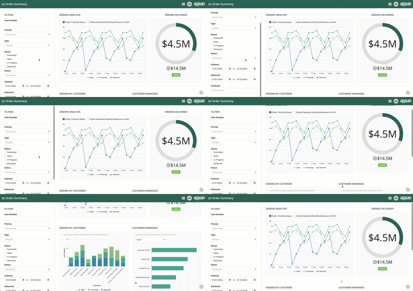
This example shows a two-pane layout for a dashboard with filter controls. Users can select from the available filters to apply to the dashboard data. Each pane can be scrolled while the other remains fixed.
Pane layout with three panesCopy link to clipboard
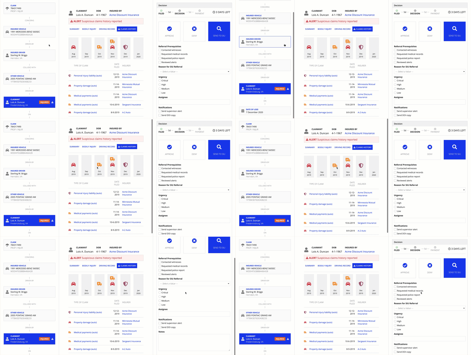
This example shows a three-pane layout from an insurance claim processing app. The layout includes a timeline, claim details, and input fields for the claim reviewer to add their findings. Each pane can be scrolled while the others remain fixed.
Feature compatibilityCopy link to clipboard
The table below lists this component's compatibility with various features in Appian.
| Feature | Compatibility | Note |
|---|---|---|
| Portals | Compatible | |
| Offline Mobile | Compatible | |
| Sync-Time Custom Record Fields | Incompatible | |
| Real-Time Custom Record Fields | Incompatible | Custom record fields that evaluate in real time must be configured using one or more Custom Field functions. |
| Process Reports | Incompatible | Cannot be used to configure a process report. |
| Process Events | Incompatible | Cannot be used to configure a process event node, such as a start event or timer event. |

