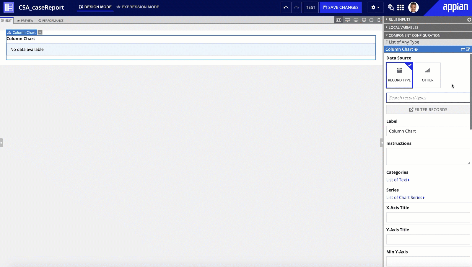
This page explains how to configure a chart that uses a record type as its source.
Charts in Appian can be configured using one of two methods:
categories and series parameters in the chart.If you have a record type that uses a database as the source, or a record type with data sync enabled, you can simply select the record type as the source of your chart. Once you select the record type, you can seamlessly reference record fields and related record fields in the chart's labels and calculations.

If you have a record type that uses a web service as the source and it does not have data sync enabled, use the categories and series parameters to construct the chart using an expression. See examples for configuring charts using categories and series directly in the component pages for each chart.
To easily configure your charts, Appian recommends using a record type as the source. To configure a chart to use record data, you will:
Appian makes it quick and easy to select a record type as the source of your chart. Simply choose Record Type as the source of your data and search for your record type. The selected record type determines which fields are available to display on the chart.
Once you select the source, there are two key configurations needed to display your record data: groupings and measures. The combination of these configurations determine what data to query from the record type and how to display the results on the chart. You can also add filters, sorts, and a data limit to your chart to display the data you need.
To configure a chart to use a record type as its source:
Depending on the chart you choose, you can configure additional chart properties like X-Axis and Y-Axis Titles, Reference Lines, Color Scheme, and more.
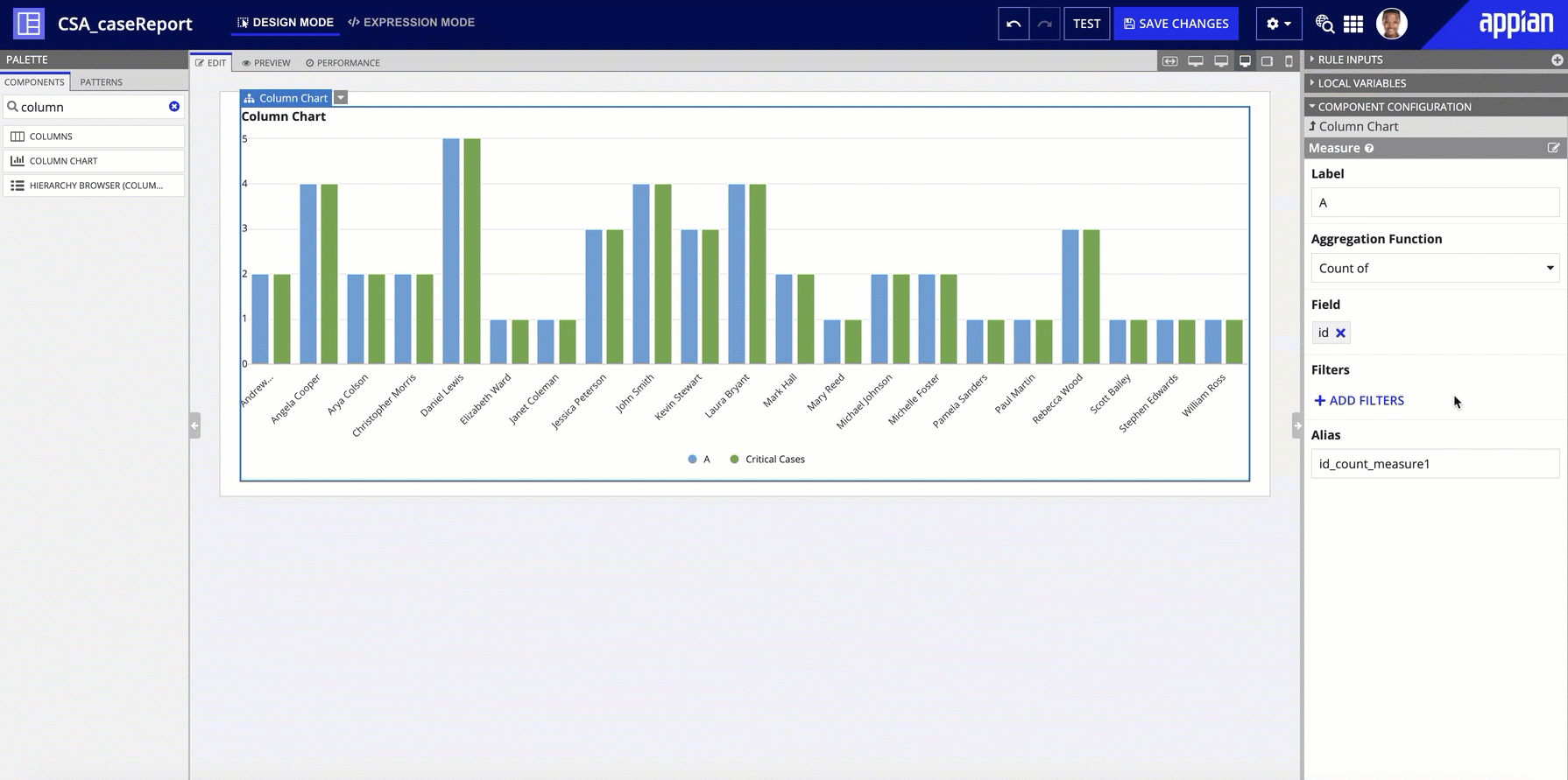
Once you select a source record type, record fields will auto-populate in Design View for the primary grouping and the measure. Each of these parameters define a key aspect of the design for your chart.
Groupings allow you to determine how the data is grouped together in the chart. You can group by any field in the record type, including related record fields.
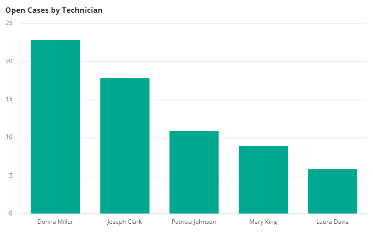
For example, say you have a record type of all open support cases and you want to see how many open cases are associated with each employee. You can use grouping to group open cases by employee.
Depending on the type of chart you use, the way you group your data and the complexity of your groupings will vary:
Line and area charts also support multiple groupings. Like bar and column charts, the Primary Grouping displays on the x-axis. We recommend using time series data for this grouping. A Secondary Grouping will show as multiple lines in a line and as stacked layers in an area chart.
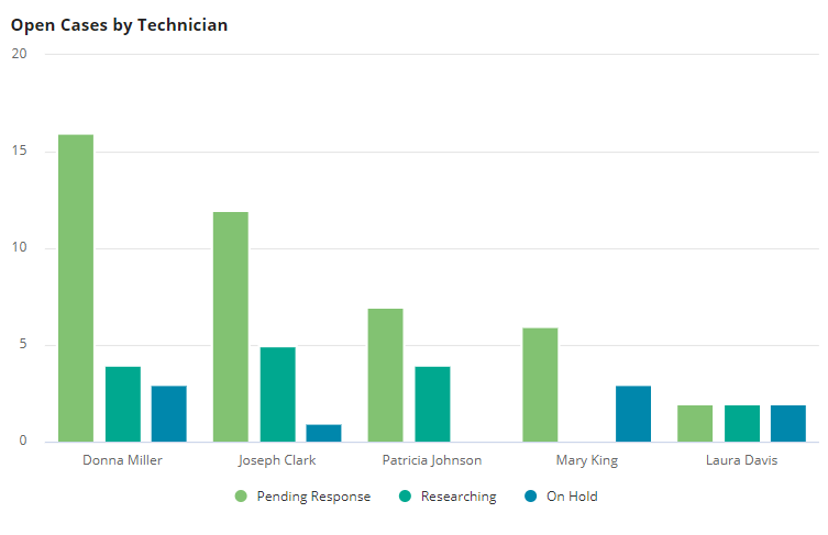
Note: When there are multiple measures in your bar, column, line, or area chart, you cannot add a Secondary Grouping.
To configure a chart's groupings in Expression Mode, see the Grouping Component or the examples below.
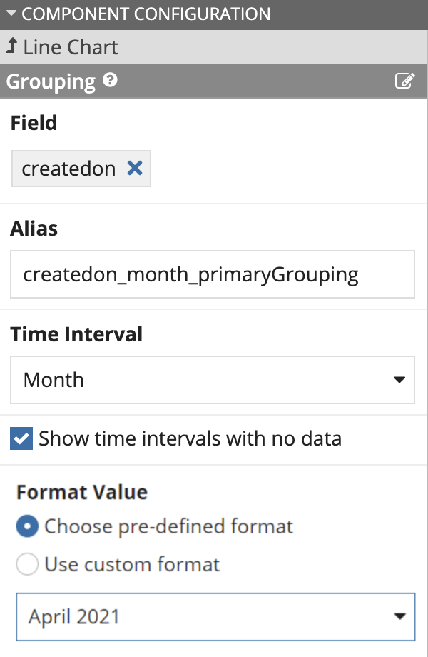
When configuring the grouping of a chart, you can also use a date interval to group dates together and view trends at a summarized level.
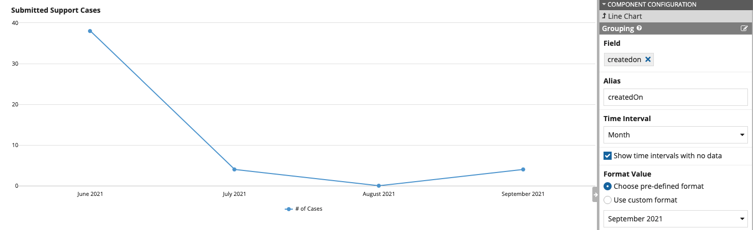
For example, suppose you would like to display a line chart with the number of cases created over time. However, the only relevant field you have is createdOn, which is a Date and Time field. If you chose to group by the createdOn field without an interval, it will only group together data that occurred at the exact same time. Instead of grouping by the full date and time, it makes sense instead to group at a higher level, for instance by showing cases created by month.
In this example, you can add an interval that will group the data by the month. There are several intervals available, and each provides a different perspective on your data. See the Grouping Component for a list of available interval values.
To choose an interval in Design Mode, click the pencil icon next to your grouping. If you are grouping by a Date, Date and Time, or Time field, you can select an interval from the Time Interval dropdown. When you choose a time interval other than "AUTO", the Show time intervals with no data checkbox is also selected to display all date values between the first and last date, even when there are no values returned for some dates.
For example, the chart below shows support cases created each month; however, there were no support cases created in August. Since the Show time intervals with no data checkbox is selected, that month still appears on the axis of the chart.
After you choose an interval, you can also define how the data is formatted using a Format Value. Some intervals have pre-defined formats that you can choose. If you select one of these formats, it will automatically localize the data based on language for the user viewing the chart. For example, if you select the long text version of date, the value in US English will show as April 13, 2021. However, a user with a French locale will see the same chart with the value 13 avril 2021.
You also have the flexibility to customize your date format. With the Use custom format option, you can use the following characters to format your date values:
| Unit of Time | Character | Valid Combinations |
|---|---|---|
| Year | y |
yy, yyyy |
| Month | M |
M, MM, MMM, MMMM, MMMMM |
| Day | d |
d, dd, ddd |
| Hour | h |
h, hh |
| Minute | m |
mm |
| Second | s |
ss |
| Day of Week | E |
EEE, EEEE |
| AM / PM | a |
a |
| Timezone | z |
z, zzzz |
You can combine these characters to create a variety of formats, and use special characters like / or - to separate your values. For example, d-m-yy will return 17-9-21, whereas dd mmmm yyyy will return 17 September 2021.
In addition to using Format Value to format your dates, you can also use this option to format text and integer fields used in your groupings.
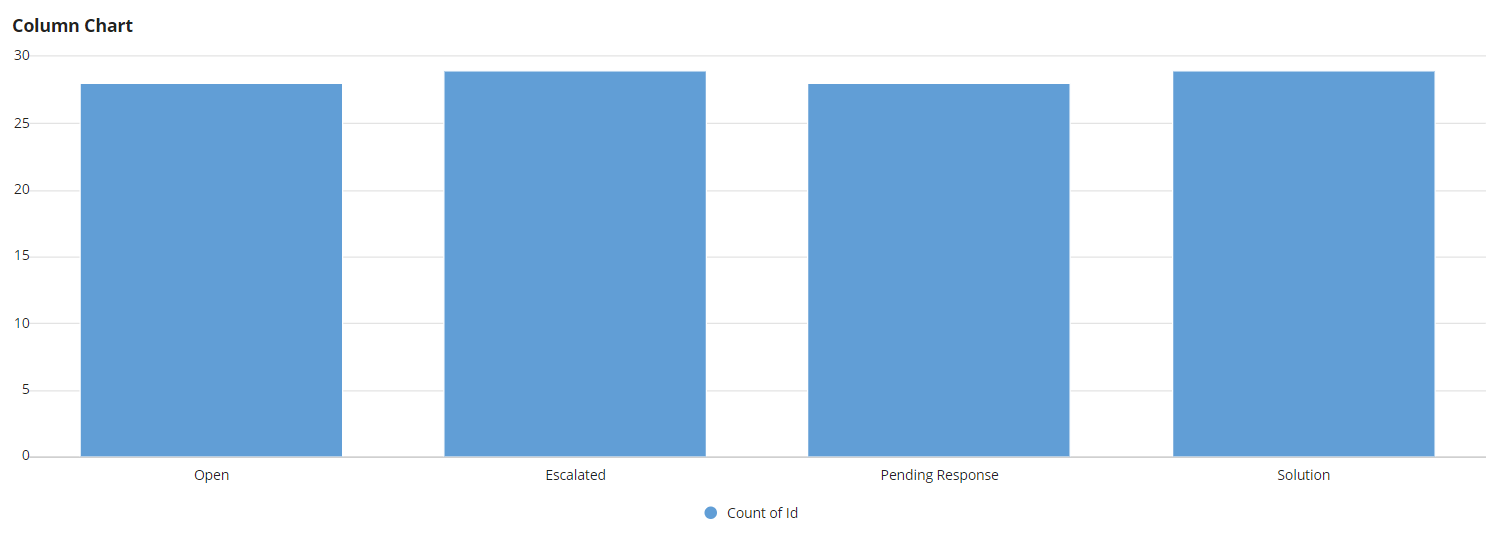
For example, suppose the grouping field displayed on the chart is the status ID. The status labels exist in a constant, so the labels aren't available directly from the data source. Using the status ID as the grouping field would display on the chart like this:
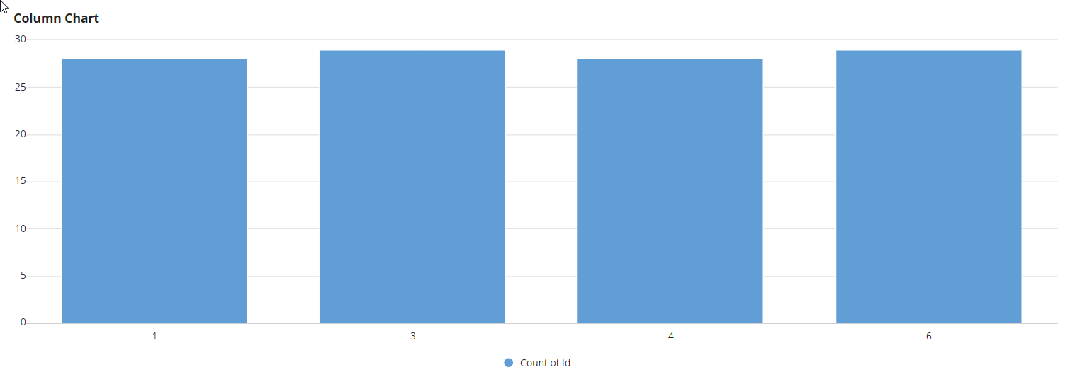
To display the status labels instead, we can add an expression to the formatValue parameter of a!grouping():
1
2
3
4
5
6
7
8
9
a!grouping(
  field: recordType!Cases.field.statusId,
  alias: "status",
  formatValue: index(
    cons!MY_APP_STATUS_LABELS /* Status labels available in a constant*/
    fv!value,
    "Unknown Status"
  )
)
Using the expression above, the chart will instead display like this:
A measure determines how to calculate the values of a field in a chart. A measure can be calculated on any field in the record type, including related record fields, but it should usually be a numeric field.
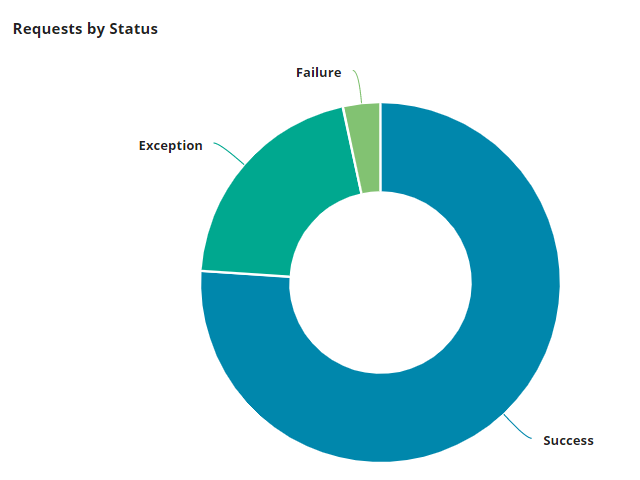
For example, say you have a record type that lists all customer requests and you want to see how many requests have been marked as "Success", "Fail", or "Exception". You can use grouping to display requests by status and use measure to count the number of requests per status.
To configure a chart's measure:
If you use a bar, column, line, or area chart, you can display multiple measures if no Secondary Grouping field is provided. When multiple measures display on a chart, each measure displays in chronological order on the chart and legend, and is assigned a different color based on the color scheme.
To configure a chart's measure in Expression Mode, see the Measure Component or the examples below.
If your record type has data sync enabled, you also have the flexibility to add filters to your measures. By applying filters on a record field or a related record field, you can determine which values are included in the measure's calculation.
For example, let's say you want to create a column chart that shows the number of orders associated with each customer, and you also want to see how many of those orders have a priority level of "Critical".
In your chart, you'd use the Customer record type to group by the name field and use the relationship with the Order record type to create two measures. The first measure will calculate the count of order Ids. The second measure will also calculate the count of order Ids and add a filter on the label field from the Priority record type so you only count orders that have a priorityLabel = Critical.
See Filters to learn more about configuring filters in Basic or Expression mode.
Formatted numbers make it easier for users to scan and understand the data shown in a chart. You can use the Format Value option to format the numbers used in your measures. You can choose from several predefined options (Automatic, Integer, Decimal, Dollar, or Euro) or use a custom format.
For example, a dashboard may contain a chart showing the total sales for each country. If you build the chart using the default options, the result might be similar to the following sample.
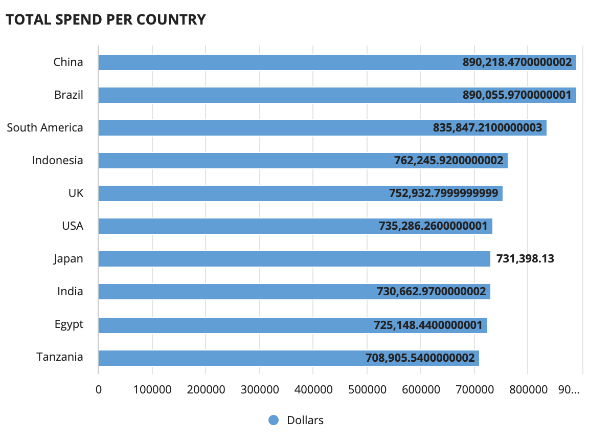
While the data is accurate, it is hard to read and may not match what the user expects to see in a sales report.
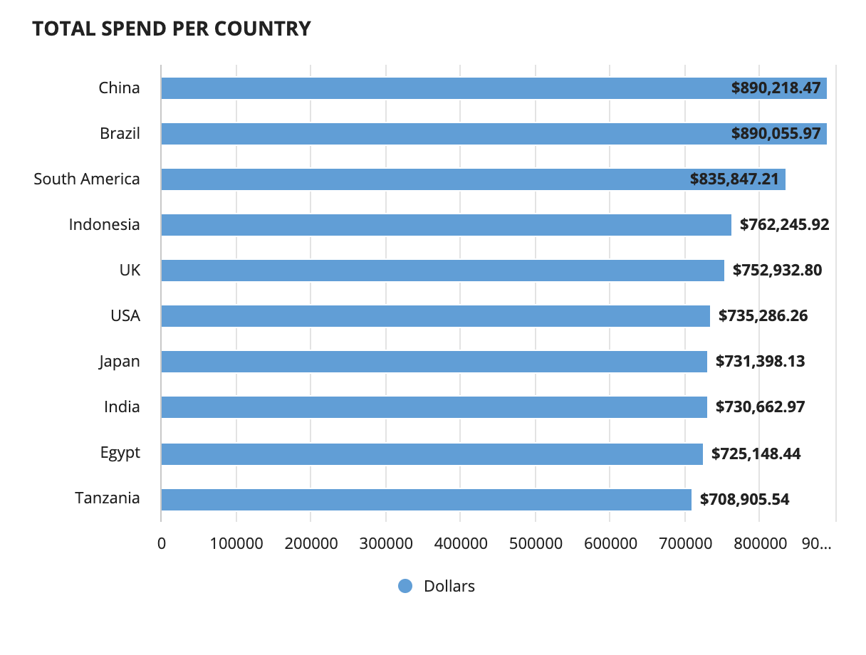
By changing the format value to Dollar, the data labels will show the same data with a dollar sign before the number and rounded to the nearest cent.
A link in a chart can be used to drill down into a grid, or filter other components on an interface. Chart links consist of a dynamic link and the variable fv!selection that contains the current selected values.
The fv!selection variable returns a map with all information about the current selected item, which allows you to dynamically pass chart data. To save the current selected values, you'll create a local variable to store the values.
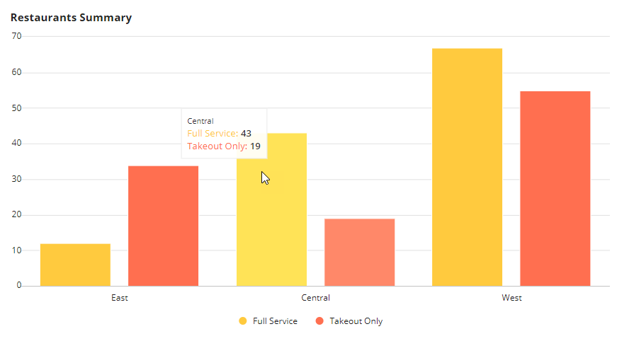
For example, suppose you have the following stacked column chart that displays a count of restaurants by region and type:
In Expression Mode, you'll see that the chart's link parameter is pre-populated with the a!dynamicLink() function, and the value parameter contains fv!selection.
To dynamically save the current selected values, you'll add a local variable, like local!selectedItem, and use it in the saveInto parameter:
1
2
3
4
5
6
7
8
9
10
11
12
13
14
15
16
17
18
19
20
21
22
23
24
25
26
27
a!localVariables(
  local!selectedItem,
  {
    a!columnChartField(
      data: recordType!Restaurants,
      config: a!columnChartConfig(
        primaryGrouping: a!grouping(
          field: recordType!Restaurants.fields.region,
          alias: "region"
        ),
        secondaryGrouping: a!grouping(
          field: recordType!Restaurants.fields.type,
          alias: "type"
        ),
        measures: a!measure(
          field: recordType!Restaurants.fields.id,
          function: "COUNT",
          alias: "id_count"
        ),
        link: a!dynamicLink(
          value: fv!selection,
          saveInto: local!selectedItem
        )
      )
    )
  }
)
Now, when you select the bar chart shown above, the following data is saved to the local variable:
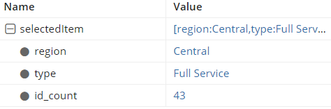
Notice that the data that is saved depends on the alias defined for each field. If you add a drilling link, the alias field is required. To add an alias, click the pencil icon next to Primary Grouping or Measure and enter a value in the Alias field.
Additionally, the saved value is always the unformatted result. For instance, suppose the Primary Grouping field is a boolean type, but the chart displays as Yes or No using the formatValue parameter. When using a link, the data in fv!selection for that field will be a boolean instead of a text. This applies when using some intervals that provide localized formatting too. For example, the DATE_TEXT interval returns the date as a text, like November 16, 2021. However, when you add a link for this field, the resulting value is the original date value 11/16/2021, not the localized text.
Once you store the currently selected chart data to a local variable, it's easy to use the selection for filtering, drilling, or other interactions on the page. See the recipe on how to configure a chart drilldown to a grid for an example on how to use the selection.
In addition to the groupings and measures, charts that use a record type as a source contain options for setting a batch size and sorting.
To limit the batch size, enter a value in the Data Limit field of the chart's Component Configuration. The data limit determines how many unique groupings are on the chart. The data limit is most useful when using a single grouping.
For example, if you want a chart to display the top 10 products by their sales, the limit of 10 will return the correct results. The data limit also determines the combination of groupings. So, if both a primary and secondary grouping are used, a data limit of 100 would return a total of 100 values (10 primary grouping values x 10 secondary grouping values). For this reason, we recommend using the maximum limit of 5,000 when using multiple groupings.
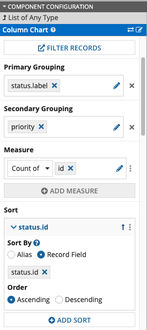
To sort the record data in the chart, use the Sort field of the chart's Component Configuration. Sort is used to determine which values display first on the chart.
To configure a chart's sort behavior in Design Mode:
Click ADD SORT to configure the sort behavior.
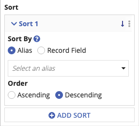
Note: You can only select fields of type Number (Integer), Number (Decimal), Date, Date and Time, Time, or Boolean.
To configure the sort behavior in Expression Mode, use the a!sortInfo function.
Let's look at a few examples to understand how to configure a chart to use a record type as the source.
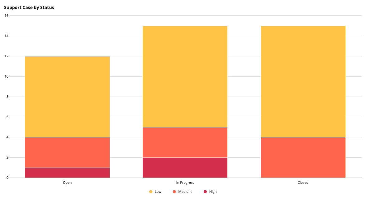
In this example, let's say you have a Case record type that has a many-to-one relationship with the Status record type, and you want to see how many cases have a status of Open, In Progress, or Closed. Within this chart, you also want to see a breakdown of case priority.
An easy way to display this data is using a stacked column chart, and you can use the Case record type as the source. Since the Case record type has a relationship with the Status record type, you can easily reference related record fields from the Status record type in the chart. To display the case status in the correct order of Open, In Progress, and Closed, you can also sort by the id field from the Status record type.
Here's what the chart looks like:
To configure this chart in Design Mode:
For Order, select Ascending.
To configure this chart in Expression Mode:
1
2
3
4
5
6
7
8
9
10
11
12
13
14
15
16
17
18
19
20
21
22
23
24
25
26
27
28
29
30
31
32
33
34
35
36
37
38
{
  a!columnChartField(
    data: recordType!Case,
    config: a!columnChartConfig(
      primaryGrouping: a!grouping(
        field: recordType!Case.relationships.status.fields.label,
        alias: "status"
      ),
      secondaryGrouping: a!grouping(
        field: recordType!Case.fields.priority,
        alias: "priority"
      ),
      measures: {
        a!measure(
          function: "COUNT",
          field: recordType!Case.fields.id,
          alias: "id_count"
        )
      },
      sort: {
        a!sortInfo(
          field: recordType!Case.relationships.status.fields.id
        )
      },
      dataLimit: 100
    ),
    label: "Column Chart",
    stacking: "NORMAL",
    showLegend: true,
    showTooltips: true,
    labelPosition: "ABOVE",
    colorScheme: "SUNSET",
    height: "MEDIUM",
    xAxisStyle: "STANDARD",
    yAxisStyle: "STANDARD",
    refreshAfter: "RECORD_ACTION"
  )
}
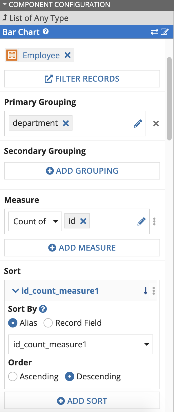
In this example, you'd like to count the number of employees in the company grouped by their department. To easily compare the number of employees in each department, you can use a bar chart.
Here's what the chart looks like:
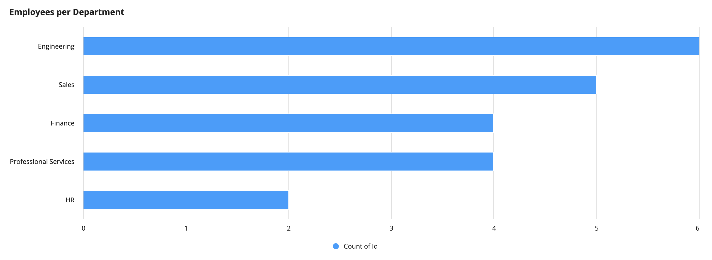
To configure this chart in Design Mode:
For Order, select Descending.
To configure this chart in Expression Mode:
1
2
3
4
5
6
7
8
9
10
11
12
13
14
15
16
17
18
19
20
21
22
23
24
25
26
27
28
29
30
31
32
33
34
{
  a!barChartField(
    data: recordType!Employee,
    config: a!barChartConfig(
      primaryGrouping: a!grouping(
        field: recordType!Employee.fields.department,
        alias: "department_primaryGrouping"
      ),
      measures: {
        a!measure(
          function: "COUNT",
          field: recordType!Employee.fields.id,
          alias: "id_count_measure1"
        )
      },
      sort: {
        a!sortInfo(
          field: "id_count_measure1"
        )
      },
      dataLimit: 100
    ),
    label: "Employees per Department",
    labelPosition: "ABOVE",
    stacking: "NONE",
    showLegend: true,
    showTooltips: true,
    colorScheme: "OCEAN",
    height: "MEDIUM",
    xAxisStyle: "STANDARD",
    yAxisStyle: "STANDARD",
    refreshAfter: "RECORD_ACTION"
  )
}
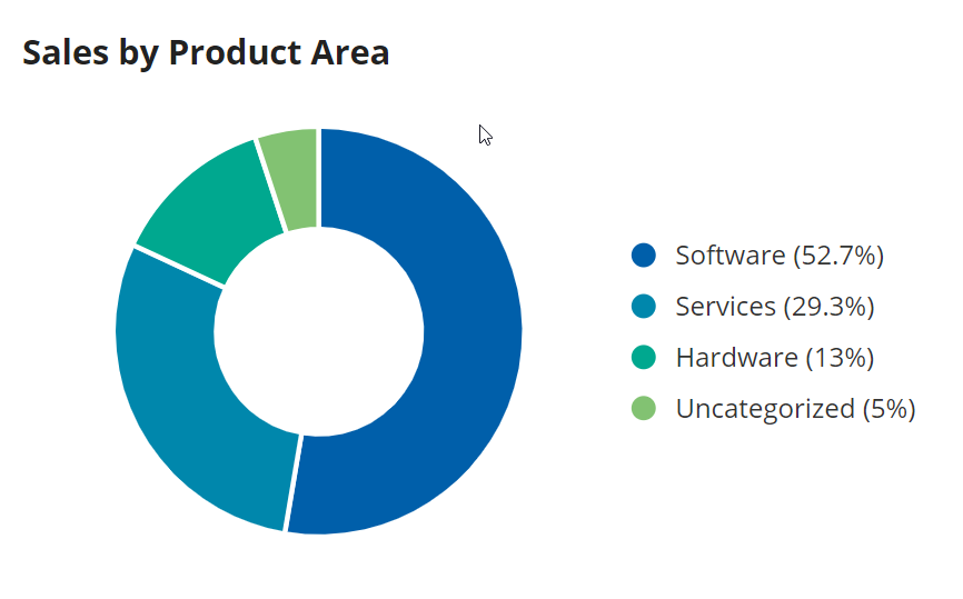
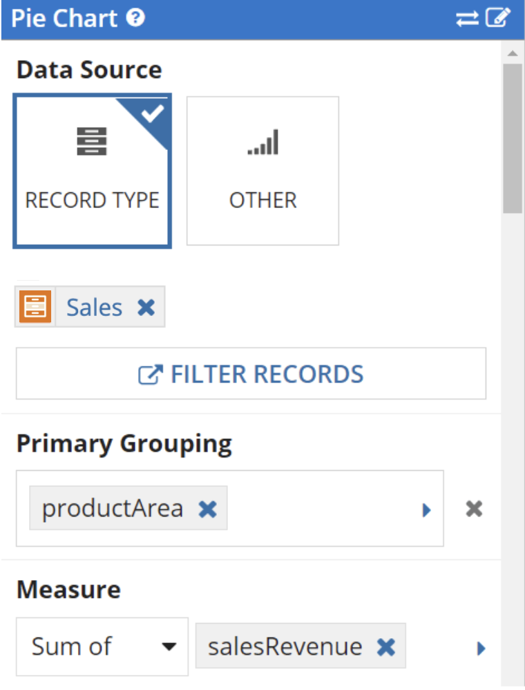
Now suppose you have a record type that contains a list of sales for each product. A pie chart is a great way to view the contributions made by each product area.
Here's what the chart looks like:
To configure this chart in Design Mode:
For Measure, select Sum of as the aggregation function, and choose the salesRevenue field. The sum of sales revenue will determine the size of each pie slice.
To configure this chart in Expression Mode:
1
2
3
4
5
6
7
8
9
10
11
12
13
14
15
16
17
18
19
20
21
22
23
24
25
26
27
28
a!pieChartField(
  label: "Sales by Product Area",
  data: recordType!Sales,
  config: a!pieChartConfig(
    primaryGrouping: a!grouping(
      field: recordType!Sales.fields.productArea,
      alias: "productArea"
    ),
    measures: a!measure(
      function: "SUM",
      field: recordType!Sales.fields.salesRevenue,
      alias: "sum_salesRevenue"
    ),
    dataLimit: 100,
    sort: a!sortInfo(
      field: "sum_salesRevenue",
      ascending: false
    )
  ),
  labelPosition: "ABOVE",
  height: "SHORT",
  showDataLabels: true,
  showAsPercentage: true,
  seriesLabelStyle: "LEGEND",
  colorScheme: "RAINFOREST",
  style: "DONUT"
)
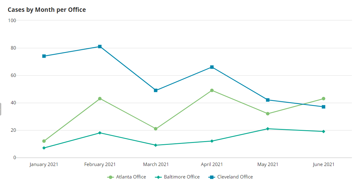
Suppose you'd like to create a chart that displays the total number of cases created within each office over time. When displaying trends over time, a line chart is typically a good choice.
Here's what the chart looks like:
To configure this chart in Design Mode:
To configure this chart in Expression Mode:
1
2
3
4
5
6
7
8
9
10
11
12
13
14
15
16
17
18
19
20
21
22
23
24
25
26
a!lineChartField(
  data: recordType!Case,
  config: a!lineChartConfig(
    primaryGrouping: a!grouping(
      field: recordType!Case.fields.createdOn,
      alias: "createdOn_month_primaryGrouping",
      interval: "MONTH_TEXT"
    ),
    secondaryGrouping: a!grouping(
      field: recordType!Case.fields.office,
      alias: "office"
    ),
    measures: {
      a!measure(
        function: "COUNT",
        field: recordType!Case.fields.id,
        alias: "id_count"
      )
    },
    dataLimit: 5000,
    showIntervalsWithNoData: true
  ),
  label: "Cases by Month per Office",
  showTooltips: true,
  colorScheme: "RAINFOREST",
)
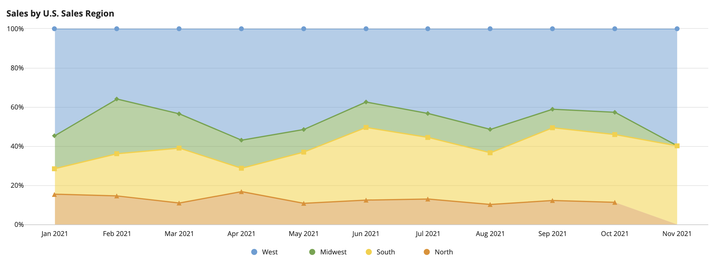
In this last example, let's say you want to create a chart that shows which sales regions generated the most sales revenue this past year.
Line charts and area charts are both great for showing trends over time; however, an area chart would be a better fit for this use case since you want to see a part-to-whole relationship (which region's sales makes up most of the total sales). Since the total number of sales generated this past year is not the key performance indicator, you may choose to create an area chart that shows the percent to total ratio of each region's sales.
Here's what the chart looks like:
To configure this chart in Design Mode:
To configure this chart in Expression Mode:
1
2
3
4
5
6
7
8
9
10
11
12
13
14
15
16
17
18
19
20
21
22
23
24
25
26
27
28
29
30
31
32
33
34
35
{
  a!areaChartField(
    data: recordType!Order,
    config: a!areaChartConfig(
      primaryGrouping: a!grouping(
        field: recordType!Order.fields.orderDate,
        alias: "orderDate_month_primaryGrouping",
        interval: "MONTH_DATE"
      ),
      secondaryGrouping: a!grouping(
        field: recordType!Order.relationships.salesRegion.fields.name,
        alias: "name_secondaryGrouping"
      ),
      measures: {
        a!measure(
          function: "COUNT",
          field: recordType!Order.fields.orderId,
          alias: "orderId_count_measure1"
        )
      },
      dataLimit: 100,
      showIntervalsWithNoData: true
    ),
    label: "Area Chart",
    labelPosition: "ABOVE",
    stacking: "PERCENT_TO_TOTAL",
    showLegend: true,
    showTooltips: true,
    colorScheme: "CLASSIC",
    height: "MEDIUM",
    xAxisStyle: "STANDARD",
    yAxisStyle: "STANDARD",
    refreshAfter: "RECORD_ACTION"
  )
}
Configure Charts Using Records
