Tip: Eager to get started with the new grid? Check out the Grid Tutorial for the fastest and easiest way to create a read-only grid.
This page explains the main elements of the read-only grid, and how to configure them.
OverviewCopy link to clipboard
Grids are how we display data in a tabular format. The read-only grid component can be used to display the following types of data:
- Record data returned from a record type.
- Data returned from querying a database table.
- An array of data.
- A list of dictionary.
- An expression.
- A variable.
The read-only grid component is a modern interface component that is designed to handle your data intelligently. The grid can display data in various formats, provide advanced filtering, paging, and sorting options, allow row selection, and pass record data to other components in the interface.
In addition, when you use a record type as the grid's data source, you can bring in records-specific components, like record actions and user filters. The grid will even populate with your record list configuration by default, allowing you to build your grid faster. This is why these grids are often referred to as records-powered grids.
Create a quick gridCopy link to clipboard
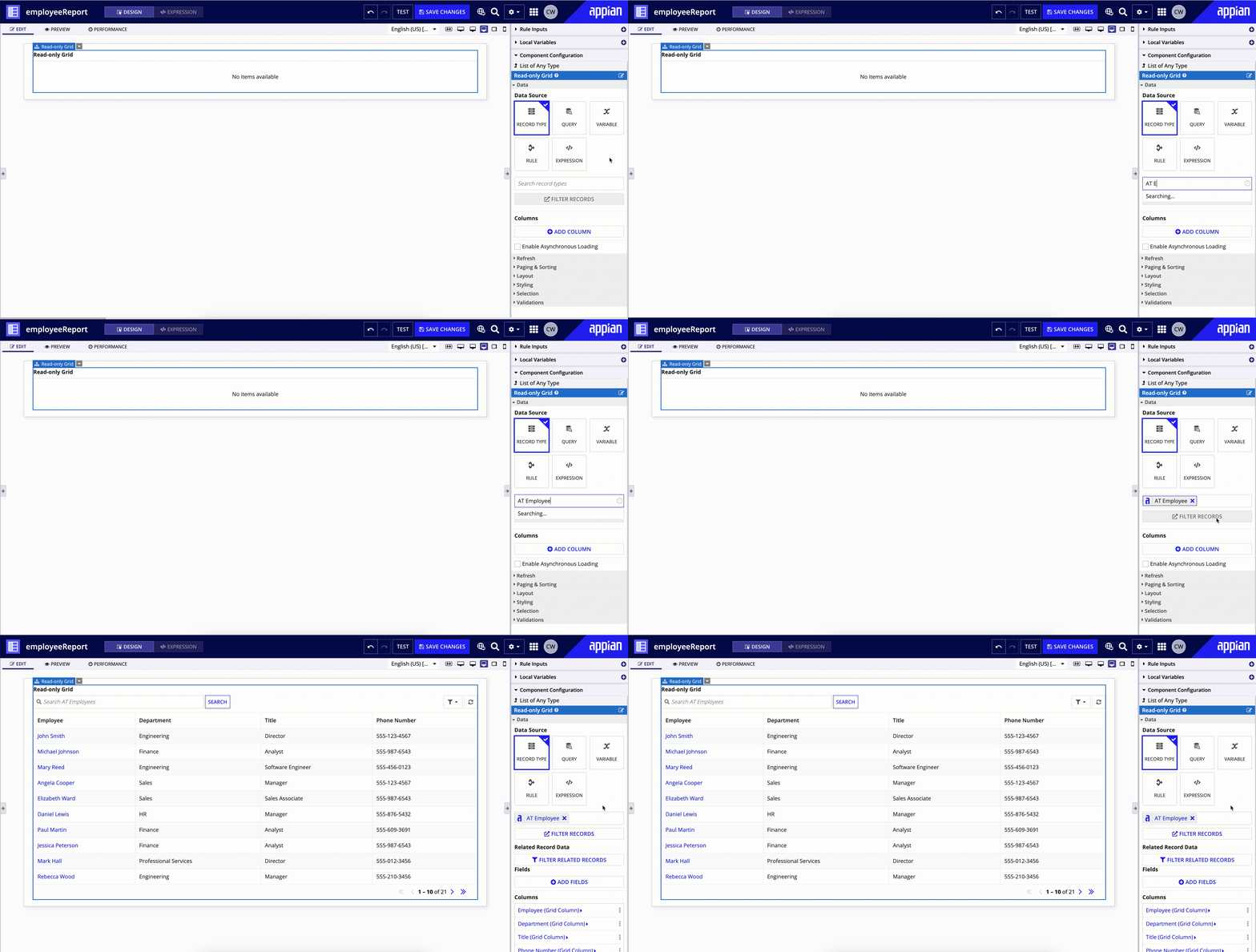
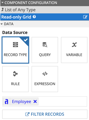
You can quickly create a grid in design mode by selecting a record type as the data source.
The basic workflow for creating a quick and easy read-only grid is:
- Drag the READ-ONLY GRID component from the COMPONENT PALETTE onto your interface.
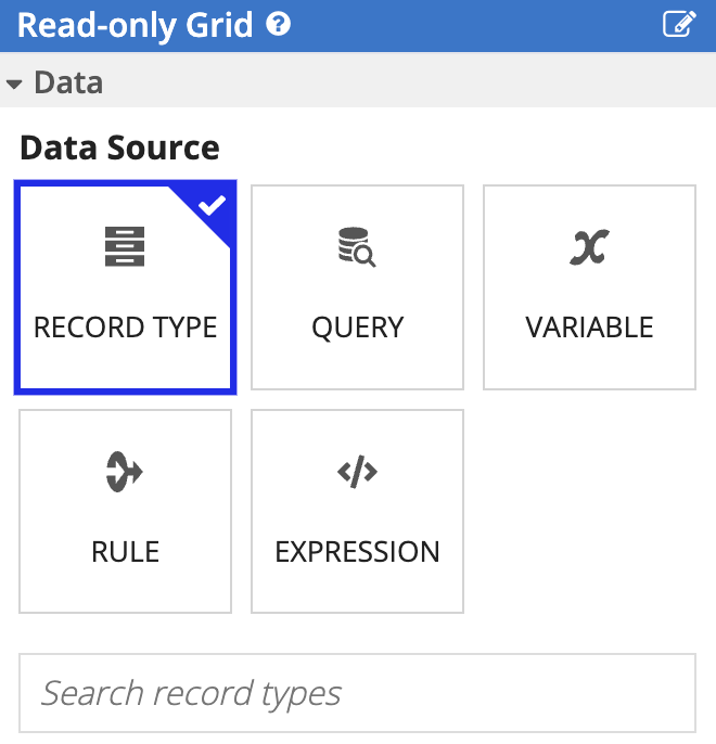
- Leave the default Data Source selection as a Record Type.
- Enter the name of the record type you want to use as the grid's data source in the Search record types field.
- Click ADD COLUMNS to add any additional columns to the grid.
- Click FILTER RECORDS or FILTER RELATED RECORDS to filter the data displayed in the grid.
- Click ADD USER FILTERS to allow users to filter the data displayed in the grid.
- Configure the grid's page and sort options in the PAGING & SORTING section.
- Adjust the column spacing, height, and border style in the STYLING section.
The sections below provide more details around each step in building a quick grid.
DataCopy link to clipboard
In the grid's Data (data) parameter, you can choose one of the following data sources to power your grid:
| Data Source | Value |
|---|---|
| Record Type | A record type. |
| Query | A query to a data store entity generated by the query editor. |
| Variable | A rule input or local variable defined in that interface that returns an array of data or a list of dictionary. |
| Rule | An expression rule. |
| Expression | An expression defined directly in the read-only grid. |
The easiest way to build a grid is by choosing a record type as the grid's data source. This also allows you to leverage the record list view in your grid along with other configurations in the record type, such as the search box, user filters, record actions, and the Export to Excel button.
In expression mode, you can configure the grid's data source using a!recordData(), a!queryEntity(), a!queryProcessAnalytics(), a datasubset, a list of dictionary, or an array of data. When using a query that returns a datasubset, you must set the fetchTotalCount parameter to true.
ColumnsCopy link to clipboard
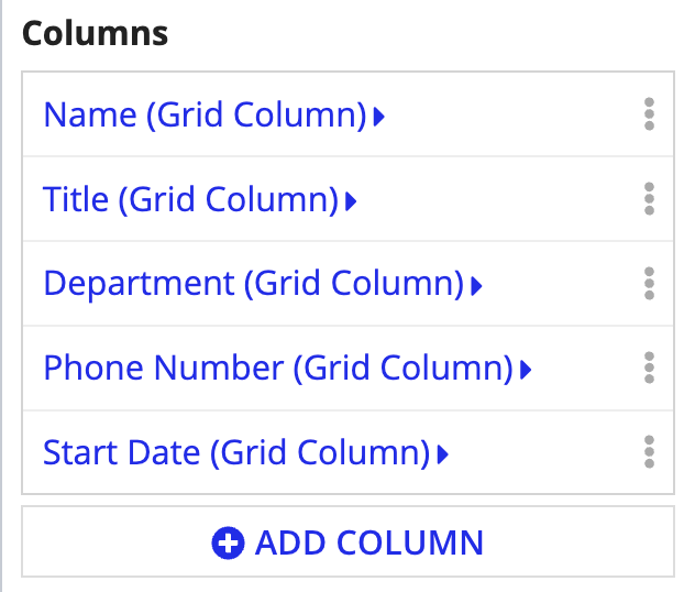
The grid's Columns (columns) parameter determines which fields to display in the grid and how you want to display them. This parameter is populated by a list of a!gridColumn().
For most data sources, when you populate the Data parameter for the grid from design mode, the grid automatically generates an initial a set of columns for you based on the fields in the data or query results.
The grid will convert camel case field names to title casing, and, depending on the underling data type of those fields, the grid will also format some of the display values.
Columns are configured at two levels: (1) column selection and order and (2) column width and data display options. Click on any of the Columns to access the Grid Column component configuration.
Arrange columnsCopy link to clipboard
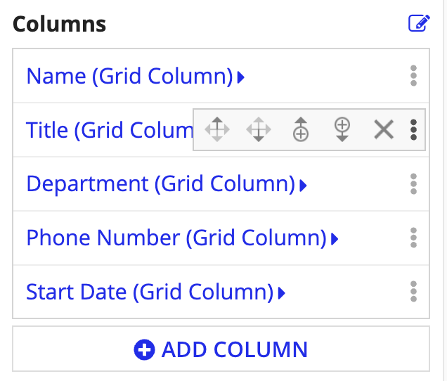
You can add, remove, and reorder columns in the read-only grid by hovering over the option menu ( ). From any column in the list, the options menu allows you to move your columns, add a column above or below, or remove a column.
To make other changes to a particular column, like its display value and display options, click the column name.
Display valueCopy link to clipboard
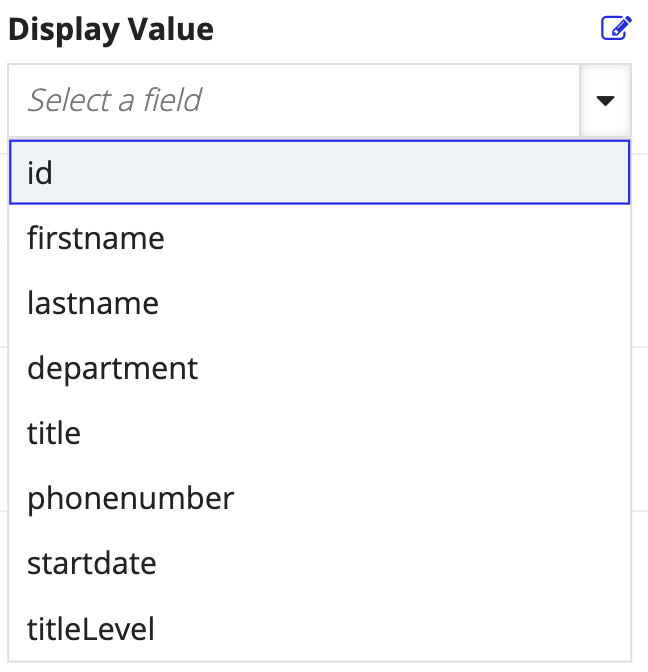
Within each column, you'll determine which field data to display using the Display Value (value) parameter.
If you've added a new column, no value is selected. To add a value, use the field dropdown.
If you selected a record type as your data source, you can choose a record field or a related record field.
If you configure columns in expression mode, you must use the function variable fv!row to specify a field in the grid's value parameter. For example, let's say you want to reference the department field from the Employee record type as a column in the grid. You would need to use fv!row followed by a record field reference in brackets, like fv!row[recordType!Employee.fields.department].
Display optionsCopy link to clipboard
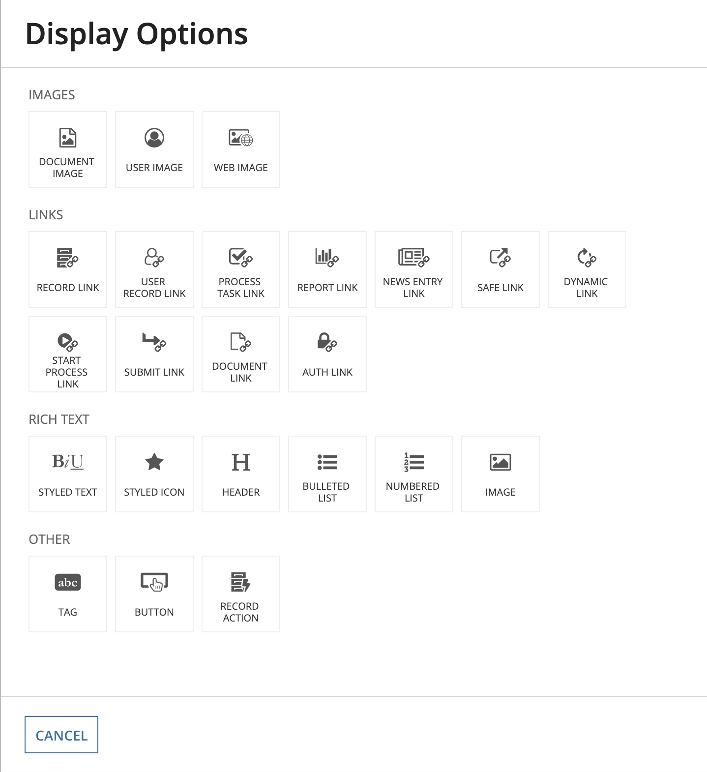
You can also customize how field values display in each column by adding display options.
To customize how data appear in a column, click DISPLAY OPTIONS under Display Value to choose a compatible interface component.
In expression mode, you can customize the column's display option by using an interface component function directly in the value parameter of a!gridColumn().
Background colorCopy link to clipboard
You can choose the background color for each column. Background colors are configured on each column individually, so make sure to update all of the columns in your grid as needed.
You can choose background colors to customize the overall look of your grid, or use conditional formatting so the background color of each cell depends on the cell's value.
See Using the backgroundColor parameter for more information about conditionally formatting background colors.
FieldsCopy link to clipboard
By default, a grid will query and display all the data specified in the columns, pagingSaveInto, and selectionSaveInto parameters. This default behavior can potentially impact performance if your grid includes dynamic behavior since it may result in querying more data than necessary.
For example, let's say you configured the showWhen parameter on the columns in your grid so that certain columns only appear to managers. Even when columns are hidden from the grid, those fields will still be queried since they're specified in the columns parameter of the grid. To alter this default behavior, you can specify when the grid should query the fields in your columns using the fields parameter in a!recordData().
To configure the fields parameter of a!recordData(), click FIELDS in the grid's component configuration. Then, you can write an expression using conditional logic (like the if() or a!match function) to specify when certain fields should be queried.
For example, the following expression will only query certain fields when a manager views the grid. If someone other than a manager views the grid, then a different set of fields will be queried.
1
2
3
4
5
6
7
8
9
10
11
12
13
14
15
16
17
18
19
20
a!recordData(
recordType: recordType!Case,
fields: if(local!managers,
  { /* Fields for Managers */
    recordType!Case.fields.id,
    recordType!Case.fields.name,
    recordType!Case.fields.description,
    recordType!Case.fields.createdOn,
    },
  { /* Fields for Engineers */
    recordType!Case.fields.id,
    recordType!Case.fields.description,
    recordType!Case.fields.status,
    recordType!Case.fields.assignedTo,
    recordType!Case.fields.timeInQueue,
    recordType!Case.relationships.comment.fields.description,
    recordType!Case.fields.createdOn,
  }
 )
)
Copy
Learn more about using the fields parameter in a!recordData().
FilteringCopy link to clipboard
There are a few ways to filter the data in your grid depending on your source.
If you use a record type as the source of your grid, you can:
If you're using a data store entity to return your grid data, you can use a!queryEntity() or a!queryLogicalExpression() to configure an expression with a list of filters.
Filter records in the gridCopy link to clipboard
When you select a record type as the source of your grid, your grid will automatically populate with the data used in your record list. You can easily filter this data by configuring one or more filter conditions. These filters are specific to each interface component that pulls in the record data. This means that you can configure different filters for different grids that use the same record type.
To configure a filter on a records-powered grid:
-
On the Read-only Grid component configuration, click FILTER RECORDS.
-
In the Filter Records dialog, click Add Filter.
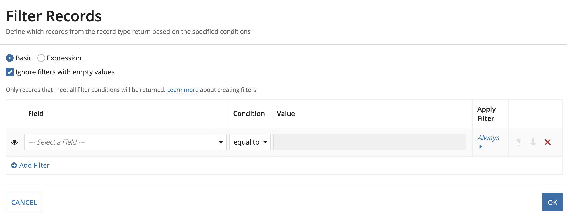
- From the Field picker, select a record field or related record field that you want to use to filter the data.
- From the Condition list, select the operator to apply to the filter.
- Use the context menu next to the Value field to select how you want to pass the value into the filter. The options in this menu change based on the data type of the field selected.
- To apply conditional filters, click the condition link (shown as either Always or When) in the Apply Filter column:
- Enter an expression returns
trueorfalse. - Click OK to close the Apply Filters dialog.
- Enter an expression returns
- Click OK to close Filter Records dialog.
Filter related records from a one-to-many relationship in the gridCopy link to clipboard
By default, when you add a related record field from a one-to-many relationship as a column in a grid, the grid will display a maximum of 10 related records for each base record. However, you can further limit, filter, and sort your one-to-many related data to display the exact data you need.
For example, let's say you have a read-only grid displaying Employee information, and you add the related record field quarterlyReview as a new column in the grid. By default, each customer will have a maximum of 10 quarterly reviews listed in their row. You can apply a!relatedRecordData() to reduce this limit, as well as filter and sort the related records in the grid column.
To filter, sort, and limit one-to-many related records in your grid:
-
On the Read-only Grid component configuration, under Related Record Data, click FILTER RELATED RECORDS.
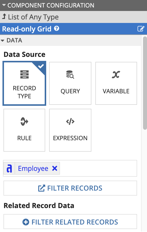
- Click List of RelatedRecordData.
- Click Related Record Data.
- In Relationship, click Edit.
-
In the Relationship dialog, enter a reference to a record type relationship using the
recordType!domain.For example,
recordType!Employee.relationships.reviewswould reference the one-to-many relationship between the Employee record type and the Reviews record type. - Click OK to close the dialog.
- Configure one or more parameters:
- In Limit, enter a value from
1to10to limit the number of related records displayed for each base record. When this value is not specified, the default is10. - In Sort, click List of SortInfo > ADD ITEM to configure a sort using
a!sortInfo(). - In Filters, click Edit to open the Filters dialog. Configure a single logical expression or a list of query filters to apply filters to the related record set.
Note: When applying a filter or sort to
a!relatedRecordData(), your record field or related record field reference must start from the related record type specified in the relationship parameter. In the example above, this would be the Reviews record type (recordType!Reviews.fields.reviewDate). - In Limit, enter a value from
Add a user filterCopy link to clipboard
If you've configured a user filter on your record type, you can reuse it in your records-powered grid so users can filter the list of records.
To add a user filter to the grid:
-
In the Read-only Grid component configuration, under RECORD LIST, click ADD USER FILTER. A dropdown appears with the user filters configured in the record type you selected as the source of your grid.
Note: If there are no user filters to select in the dropdown menu, it means there are no user filters configured on the selected record type. You will need to go to the record type and create a user filter before you can add it to the grid.
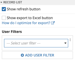
- Use the dropdown component to select a user filter. The user filter appears above the grid.
- Click ADD USER FILTER to add additional user filters. If you've added all available user filters, this button will be disabled.
User-saved filtersCopy link to clipboard
If you've added user filters to your grid, then users can create and save their own filters. To create user-saved filters, click the Filters menu on the grid and select Save filters as…

This will open the Save Filters dialog, where each user can name their filters and choose which filter they want to load by default when they navigate to the record list or a grid that uses the record type as the data source.
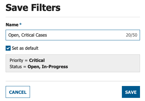
Once a user configures a user-saved filter, they can view, update, or remove their saved filters by going to the Filters menu and selecting Manage my filters…. Each user can save up to 10 filters on each record list. If they are saving filters on a grid that pulls in the record data, users can also save 10 additional filters each time a different combination of filters is used.
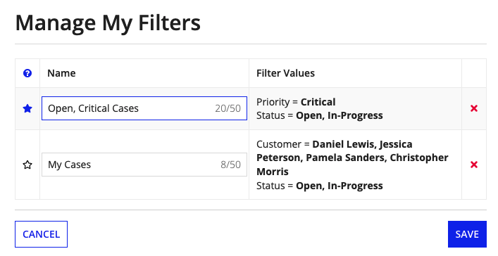
Each saved filter will display with a shortcut at the top of the page next to My Filters.

Users can save values for any filters visible on the grid. However, some changes to the record type may affect user-saved filters. If you make any of the following changes to the record type, the corresponding user-saved filter is affected:
- A user filter is removed.
- A user filter option is removed from the list of options.
- A user filter is changed from type List to Date Range (or vice versa).
- A user filter is changed from multiple to single select and the user saved multiple values.
In all of these cases, users may need to update their user-saved filter values. A warning message also displays that describes what has happened.

Configuration changes on the grid can also affect user-saved filters. If a developer adds or removes a user filter from the grid, all previously user-saved filters will no longer be visible on this grid. Users must recreate these saved filter values in order to reuse them.
RefreshCopy link to clipboard
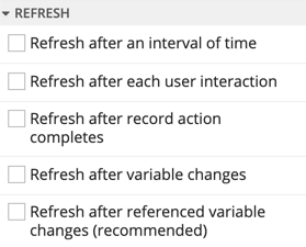
The refresh component allows you to enable or disable the data refresh feature on the grid for all data source types.
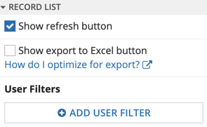
You can also configure what event triggers a data refresh, including a variable change or the completion of a specific time interval, a user interaction, or a record action.
Paging and sortingCopy link to clipboard
"Paging" refers to how many rows of data you want to display at a time, and "sorting" refers to the order in which you want to display the data.
When we display data in a read-only grid, you can set the number of rows to display at a time with the Page Size (pageSize) parameter. You can also define what order the data displays when the grid initially loads with the Initial Sorts (initialSorts) parameter. Collectively, these are referred to as "paging information."
Queries also consider paging and sorting; from the query(), function and the a!queryRecordType() function, the a!pagingInfo() function is used to determine how many records to retrieve at a time (batchSize), from which initial position (startIndex). The a!sortInfo() function is used to determine in what order (sortInfo) to sort the data in the grid.
Regardless of whether you use a record type as the grid's data source, give the grid an array of data, or give the grid a query, the grid can manage the paging information for you.
In this section, we'll walk through how to configure these settings and discuss the default sort attributes Appian automatically applies to the grid data.
Configure paging in design modeCopy link to clipboard
Design mode makes it easy to configure the page size and sort order for the data in your grid in the PAGING & SORTING section of the COMPONENT CONFIGURATION panel.
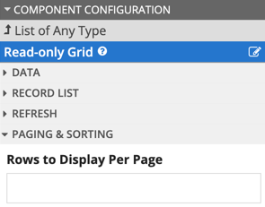
In Rows to Display Per Page*, simply enter the number of rows you want the grid to display on each page.
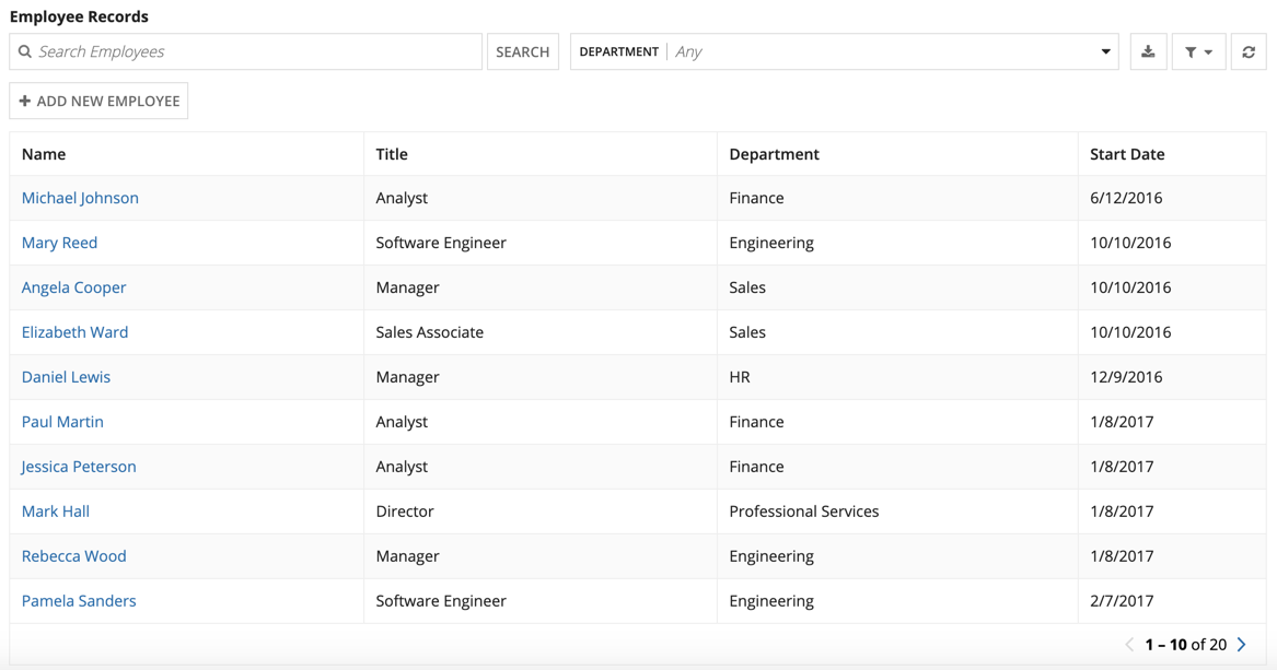
In the example shown, the grid has a total of 20 rows of record data and displays 10 rows on each page.
Grid-managed pagingCopy link to clipboard
When the grid's data source is a record type or an array of data, the grid can automatically manage paging for you.
Alternatively, if the grid uses a query as the data source to return a datasubset or a list of dictionary, you don't need to use the a!pagingInfo() function; the grid can manage the query's paging information with its own function variable, fv!pagingInfo. Use a!queryEntity() or a!queryProcessAnalytics() with pagingInfo set as fv!pagingInfo. In this case, the grid can use the pageSize value as the batchSize value in the query, fetching that number of records on every user interaction with the paging controls.
Note: While fv!pagingInfo can manage the batchSize and sortInfo for you, it always uses a startIndex of 1. If you need a different startIndex, or for other rare cases, you will have to manage the query's paging information yourself. See the manual paging section.
How you enable the grid to manage your paging depends on the data source for the grid. When your data source is just an array of data or a record type, you don't need to do anything special. When your data source is a query, you can use the grid's paging function variable, fv!pagingInfo, instead of a!pagingInfo(). The following subsections provide examples for all data-source scenarios.
Direct queryCopy link to clipboard
Entering a query directly into the Data parameter of the grid is useful in interfaces where you need a separate query, or version of a query, for a particular scenario, like displaying chart information in a grid. For an example, see the Configure a Chart Drilldown to a Grid pattern.
If you want to query a data store entity, you can set up a query directly from the grid. In the Data parameter of the grid, select Use query editor, then click CREATE QUERY. The resulting expression will look something like this:
1
2
3
4
5
6
7
8
9
10
11
a!gridField(
  label: "Read-only Grid",
  labelPosition: "ABOVE",
  data: a!queryEntity(
    entity: cons!EMPLOYEE_ENTITY,
    query: a!query(
      pagingInfo: `fv!pagingInfo`
    ),
    fetchTotalCount: true
  ),
...
Copy
Tip: If you use the query editor from the grid, and choose Rows Per Page, or choose fields to Sort By, these values will automatically populate the corresponding grid parameters (pageSize and initialSorts).
Query in an expression ruleCopy link to clipboard
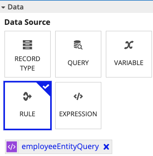
When you need to populate a grid with data from a query that's used in multiple places, you can simply reference the expression rule that has the query in it and pass fv!pagingInfo to that rule through an input.
To do so:
- In an expression rule, create an expression that queries your data.
- Create a rule input of type PagingInfo, and replace the
a!pagingInfo()function in your expression with that rule input. - Return to your interface containing your read-only grid.
- In the grid, select RULE as the data source.
- Enter the name of your expression rule.
For example, if you have the rule employeeEntityQuery, and you follow the steps above to create the rule input pagingInfo (type: PagingInfo), the resulting expression will look something like this:
1
2
3
4
5
6
7
8
9
10
11
12
13
a!queryEntity(
  entity: cons!EMPLOYEE_ENTITY,
  query: a!query(
    selection: a!querySelection(columns: {
      a!queryColumn(field: "firstName"),
      a!queryColumn(field: "lastName"),
      a!queryColumn(field: "department"),
      a!queryColumn(field: "title"),
    }),
    pagingInfo: `ri!pagingInfo`
  ),
  fetchTotalCount: true
)
Copy
When you select your expression rule from the grid, the grid will automatically map fv!pagingInfo to that input when you select it.

The resulting expression looks like this:
1
2
3
4
5
6
7
a!gridField(
    label: "Read-only Grid",
    labelPosition: "ABOVE",
    data: rule!employeeEntityQuery(
      paginginfo: `fv!pagingInfo`
    ),
...
Copy
Query in a local variableCopy link to clipboard
Having your query outside the grid, in a local variable, may be useful when you have other interface components interacting with that data, or need that exact same data to populate other interface components (when you aren't passing selected-row data). However, you cannot pass a query to the grid from a local variable, as you can with an expression rule, and still have the grid manage your paging for you. This means if you are querying a large set of data into the local variable, and only want to pull records from that entity in batches, you should use manual paging, or use a second query for the grid; you can see an example of this pattern here: Configure a Chart Drilldown to a Grid.
If you don't need to fetch results in batches, you can still pass the data (.data) to the grid. To do this:
- In the query's paging info, change batchSize to the total number of records you want to return.
- Note: Because the grid is only getting the data, it can't requery in batches.
- From the COMPONENT CONFIGURATION of the grid, for DATA, select Use expression, and enter the name of the local variable with your query data.
- You can place the
.datasuffix on the query (local!employeeData: a!queryEntity(...).data) or on the local variable reference (data: local!employeeData.data,).
- You can place the
The resulting expression will look something like this:
1
2
3
4
5
6
7
8
9
10
11
12
13
14
15
16
17
18
19
20
a!localVariables(
  `local!employeeData`: a!queryEntity(
    entity: cons!EMPLOYEE_ENTITY,
    query: a!query(
      selection: a!querySelection(columns: {
        a!queryColumn(field: "firstName"),
        a!queryColumn(field: "lastName"),
        a!queryColumn(field: "department"),
        a!queryColumn(field: "title"),
      }),
      pagingInfo: a!pagingInfo(startIndex: 1, `batchSize: -1`)
    ),
    fetchTotalCount: true
  ),
  a!gridField(
    label: "Read-only Grid",
    labelPosition: "ABOVE",
    data: `local!employeeData.data`,
    columns: {
...
Copy
More examples of this pattern:
Query and paging info in local variablesCopy link to clipboard
When using the read-only grid, you do not need a local variable with the paging information for the grid. The only reasons to do this would be if you needed to use manual paging.
Just dataCopy link to clipboard
When you pass the grid an array of data (List of Dictionary), it's no different than passing just the data returned from the query (for example, local!employeeData.data), as seen is the Query in Local Variable example. You don't need to do anything to let the grid manage your paging in this case; that's the default behavior.
Regardless of whether you give the grid an array of data, or a query, the grid can manage the paging information for you.
SortingCopy link to clipboard
Applying a sort to the grid arranges the data so it is ordered by a particular column in ascending or descending order. By default, Appian automatically applies a default sort on the primary key and sorts the data in ascending order. A deterministic sort is also applied to grid data, which ensures the record data is returned in the same order each time the sort parameters are applied.
Note: Deterministic sort is not supported for record types that use a process, expression, or web service as the source.
You can add your initial sorts to the grid directly in the Initial Sorts (initialSorts) parameter.
When you use a query as your data source, and you're letting the grid manage the paging with fv!pagingInfo, the grid will pass your initial sorts to the query as the sortInfo for the initial rendering of the grid.
Tip: Since the grid passes your initialSorts value to the query through fv!pagingInfo, you can provide initial sorts on fields that are present in the source entity, even if those fields aren't returned by the query. For example, if you query the EMPLOYEE_ENTITY, and only select firstName, lastName, and startDate as your query fields, you can still pass an initial sort on id.
The grid also offers Secondary Sorts (secondarySorts), which run after the user interacts with the grid. For example, if you have an aggregate query with dates in it, and the user wants to sort on a particular column, it may be helpful to have the YEAR and MONTH columns as secondary sorts so they remain linear.
Configuring initial and secondary sortsCopy link to clipboard
Let's look at an example. In the grid shown below, the Initial Sorts parameter is configured so the grid sorts the record data by the employee Start Date, in ascending order. Appian applies this initial sort to the record list when it initially loads in the grid.

The secondary sort defines how the grid data is ordered after the user clicks a column in the grid. In this grid shown, a secondary sort is configured and applied to the Name column. When the user clicks on the Title column, the secondary sort is applied to the data in the grid. Notice how the data is reordered in the grid so that the records are sorted in alphabetical order according to the Title column (user interaction) and ascending last name (secondary sort).
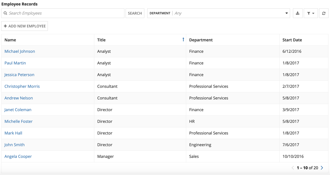
When you use a record type as your data source, you can easily add initial sorts and secondary sorts to the grid in design mode. Simply click ADD SORT under Initial Sorts from the PAGING & SORTING section of the Component Configuration panel.
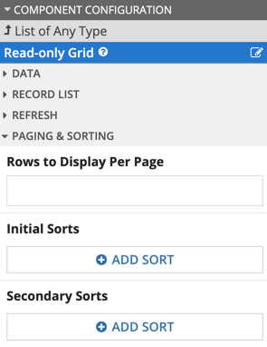
This will open the Sort Info , which allows you to define the Sort Field and Sort Order.
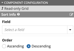
Note that you configure the grid to sort on multiple fields by defining multiple initial and secondary sort parameters for the read-only grid.
You can also configure these grid settings in expression mode. Use the Page Size (pageSize) parameter to set the number of rows to display at a time, and use the Initial Sorts (initialSorts) and Secondary Sorts (secondarySorts) parameters to define the order. Collectively, these are referred to as "paging information."
Queries also consider paging and sorting; from the query() function, the a!pagingInfo() function is used to determine how many records to retrieve at a time (batchSize), from which initial position (startIndex), and in what order (sortInfo).
Manual pagingCopy link to clipboard
Manual paging is for the very rare cases where you need to control a query's paging information. You may need to configure manual paging if you have a query that's too large to return all results at once and it has to be in a local variable. If you need to query at a start index other than 1, which fv!pagingInfo doesn't do, you'll need to configure manual paging.
When you use manual paging, you will need the paging info defined in a local variable that the grid has access to so you can provide it to the grid in the Paging Save Into (pagingSaveInto) parameter of the grid. Note that with manual paging, you cannot set the Page Size (pageSize) or Initial Sorts (initialSorts) parameters of the grid.
To setup manual paging:
- Place your paging info in a local variable in the same interface as the grid.
- Set the grid's DATA to your datasubset.
- In Paging Save Into, select your paging variable.
The resulting expression will look something like this:
1
2
3
4
5
6
7
8
9
10
11
12
13
14
15
16
17
18
19
20
21
22
23
24
25
26
27
28
29
30
31
32
a!localVariables(
  `local!pagingInfo: a!pagingInfo(startIndex: 1, batchSize: 5)`,
  local!employeeData: a!queryEntity(
    entity: cons!EMPLOYEE_ENTITY,
    query: a!query(
      selection: a!querySelection(columns: {
        a!queryColumn(field: "firstName"),
        a!queryColumn(field: "lastName")
      }),
      pagingInfo: local!pagingInfo
    ),
    fetchTotalCount: true
  ),
  a!gridField(
    label: "Read-only Grid",
    labelPosition: "ABOVE",
    data: local!employeeData,
    columns: {
      a!gridColumn(
        label: "First Name",
        sortField: "firstName",
        value: fv!row.firstName
      ),
      a!gridColumn(
        label: "Last Name",
        sortField: "lastName",
        value: fv!row.lastName
      )
    },
    pagingsaveinto: `local!pagingInfo`
  )
)
Copy
SelectionCopy link to clipboard
Selection is an inherent feature of the read-only grid. You can enable it by selecting the Selectable checkbox. You will need a local variable to store the selection indices. If the data source is an array of data, the stored value is the index of the row. If the data source is a datasubset, the stored value is the datasubset's identifiers.
Once you've created the local variable, enter it into the Selection Value (selectionValue) and Selection Save Into (selectionSaveInto) parameters of the grid. For example, with the selection variable local!selection:
1
2
3
4
5
6
a!localVariables(
  `local!selection`,
...
    `selectionValue`: local!selection,
    `selectionSaveInto`: local!selection,
...
Copy
Tip: The save!value here is the array of selection indices, so selectionValue: local!selection is the same as selectionValue: a!save(local!selection, a!save).
Selected row dataCopy link to clipboard
All row data in a selectable grid is available from the Selection Save Into (selectionSaveInto) parameter, in the function variables fv!selectedRows and fv!deselectedRows, which store the row data from the most recent user selections or deselections. More precisely, every time the user selects or deselects a row, the grid populates the associated function variables with that row's data. This means when the user selects a row, the grid stores that row's data in fv!selectedRows, and when the users selects a new row, the grid replaces the row data in fv!selectedRows with newly-selected row's data. You can see how this works from the Test Data section of the Delete Rows in a Grid pattern.
Capture and pass selected rowsCopy link to clipboard
Typically, you want to capture all the data from the currently selected rows (not just the last user interaction) into a single variable (either a local variable or a rule input). If capturing to a local variable (most common), you will end up with two selection variables in your interface: (1) to store the selection indices, and (2) to store the selected row data.
Since the data is based on user interactions, create a local variable to store the row data, then append the row data to that variable when a user selects a row, and remove row data from that variable when a user deselects a row. We recommend the following expression (with local!selection to store the selection indices, and local!selectedRows to store the selected-row data):
1
2
3
4
5
6
7
8
9
10
11
12
13
a!localVariables(
  `local!selection`,
  `local!selectedRows`,
...
selectionSaveInto: {
  /* This save stores the selection indices */
  local!selection,
  /* This save adds the full rows of data for items selected in the most recent user interaction to local!selectedRows. */
  a!save(local!selectedRows, append(local!selectedRows, `fv!selectedRows`)),
  /* This save removes the full rows of data for items deselected in the most recent user interaction to local!selectedRows. */
  a!save(local!selectedRows, difference(local!selectedRows, `fv!deselectedRows`))
}
...
Copy
You can see an example of this in the Grid with Selection pattern.
Only pass some of the row dataCopy link to clipboard
Since fv!selectedRow and fv!deselectedRow contain all the data for the fields that are defined in the data source, just as fv!row does, you are passing all the fields, even if you aren't displaying that field in a column. If you don't need all of that data, you can limit it to only the fields that are relevant with dot notation. For example: append(local!selectedRows, fv!selectedRows.lastName).
Limit the number of selected rowsCopy link to clipboard
You can limit the number of selections users are allowed to make in your grid using the maxSelections parameter. When maxSelections is greater than one, row selection is automatically disabled once the user selects the maximum number of rows. If you allow only one selection, selecting a new row automatically cancels the previous selection.
To help users keep track of the number of selections they've made, use showSelectionCount to display a selection counter in the grid. This is especially helpful for grids with paging, where users might not be able to see all of their selections at once.
For an example of a grid with limited selections, see the Limit the Number of Rows in a Grid That Can Be Selected recipe.
Disable selectionCopy link to clipboard
The ability to select rows in the grid can be disabled for the grid as a whole or on a per-row basis.
Disabled untilCopy link to clipboard
There are cases where you want to show that the grid is selectable, but have the grid selection disabled until a condition is met. For example, you may want to prevent selection until the user clicks a button. In this case, enter an expression in the Disable Row Selection (disablerowselectionwhen) parameter that evaluates to true or false. When true, the grid will show disabled checkboxes.
Disable specific rowsCopy link to clipboard
You may want to only disable certain rows. For example, if you have a grid that displays a list of transactions and their resulting statuses (APPROVED, PENDING, or REJECTED), you may want a button that will allow the user to RE-SUBMIT selected transactions. If a record type is used as the grid's data source, you would disable row selection when the transaction hasn't been rejected: disablerowselectionwhen: fv!row[recordType!MyRecord.fields.status] <> "REJECTED". When the status for a row is not REJECTED, the expression evaluates to true, which will disable that row.
Note: Whether the row is disabled or not is evaluated on a per-row basis. If rows are disabled as a result of user interaction, the user may still be able to select one of those rows before the interface has finished evaluating the disable condition. For this reason, it's best to use row disabling where the user can't accidentally select a row that should be disabled.
You may want to consider filtering the rows in your grid instead of disabling individual rows.

