FunctionCopy link to clipboard
a!isPageWidth( pageWidths )
Returns true if the interface is being viewed on a page that falls within the specified width ranges. Returns false otherwise. This function checks the width of the content area on the page, which may not be the width of the entire window.
See also:
ParametersCopy link to clipboard
| Keyword | Type | Description |
|---|---|---|
|
|
List of Text String |
Valid values: "PHONE", "TABLET_PORTRAIT", "TABLET_LANDSCAPE", "DESKTOP_NARROW", "DESKTOP", "DESKTOP_WIDE". |
ReturnsCopy link to clipboard
Boolean
Usage considerationsCopy link to clipboard
a!isPageWidth()does not work when testing or editing expression rules, in the visual query editor, or in the Process Modeler.- When designing offline forms, do not use "TABLET_LANDSCAPE" for
a!isPageWidth(). Offline forms on tablet devices will always evaluate to "TABLET_PORTRAIT". Additionally, users must be on at least version 24.1 of the Appian Mobile app for "TABLET_PORTRAIT" to work properly in offline forms.
ExamplesCopy link to clipboard
The a!isPageWidth() function gives you greater control over the responsiveness and adaptability of your interface. It can be used to resize, reorient, and conditionally display components and layouts for interfaces that are expected to be viewed on pages of varying content widths. We will show two examples of how this function can work in an interface; one resizing components and one conditionally displaying components.
Resize componentsCopy link to clipboard
The a!isPageWidth() function can make sure that your components aren't taking up too much or too little space when viewed at different page widths.
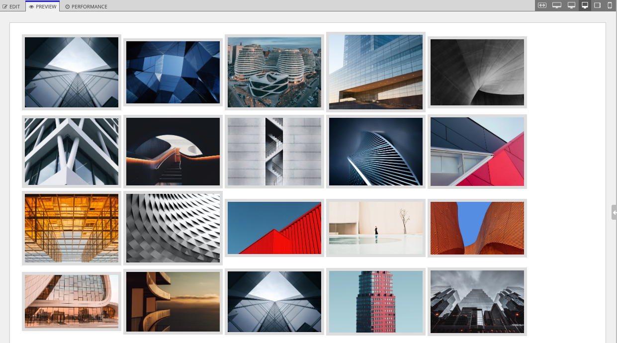
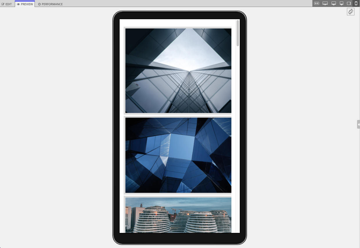
For example, it might look good to display images in a grid style on a tablet or desktop, but on a phone it looks better to display one image per row. With a!isPageWidth(), you can conditionally set different sizes for the images so that your UI looks great at all page widths.
In the interface header bar, click EXPRESSION, then copy and paste an example into the Interface Definition to test out the different image sizes.
1
2
3
4
5
6
7
8
9
10
11
12
13
14
15
16
17
18
19
20
21
22
23
24
25
26
27
28
29
30
31
32
33
34
{
  a!imageField(
    labelPosition: "COLLAPSED",
    images: a!forEach(
      items: {
        "https://source.unsplash.com/random/800x600/?architecture",
        "https://source.unsplash.com/random/900x600/?architecture",
        "https://source.unsplash.com/random/1024x768/?architecture",
        "https://source.unsplash.com/random/1000x800/?architecture",
        "https://source.unsplash.com/random/920x650/?architecture",
        "https://source.unsplash.com/random/810x580/?architecture",
        "https://source.unsplash.com/random/820x590/?architecture",
        "https://source.unsplash.com/random/830x600/?architecture",
        "https://source.unsplash.com/random/840x610/?architecture",
        "https://source.unsplash.com/random/850x620/?architecture",
        "https://source.unsplash.com/random/860x630/?architecture",
        "https://source.unsplash.com/random/870x640/?architecture",
        "https://source.unsplash.com/random/900x500/?architecture",
        "https://source.unsplash.com/random/910x510/?architecture",
        "https://source.unsplash.com/random/920x520/?architecture",
        "https://source.unsplash.com/random/930x530/?architecture",
        "https://source.unsplash.com/random/940x600/?architecture",
        "https://source.unsplash.com/random/940x610/?architecture",
        "https://source.unsplash.com/random/940x620/?architecture",
        "https://source.unsplash.com/random/940x630/?architecture"
      },
      expression: a!webImage(
        source: fv!item
      )
    ),
    size: if(a!isPageWidth("PHONE"),"LARGE","MEDIUM"),
    isThumbnail: true
  )
}
Copy
Preview on the desktop narrow form factor:

Preview on the phone form factor:

Conditionally display componentsCopy link to clipboard
If your interface is going to be viewed at different page widths, a!isPageWidth() allows you to conditionally show components or separate displays depending on the width.
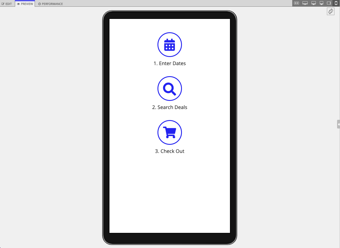
We'll look at the Stamp Steps (Icon) pattern as an example of this adaptability. In this pattern, the rich text dots in between each step don't appear on portrait tablet widths or narrower to avoid wrapping. The expression does this by using the if(), a!isPageWidth(), and a!forEach() functions to define two separate rich text display components depending on page width. The a!isPageWidth() function allows you to adaptively show a display with the dots and steps together on wider pages, and only show a display with the steps on narrow pages.
In the interface header bar, click EXPRESSION, then copy and paste this example into the Interface Definition to test out the adaptive displays.
1
2
3
4
5
6
7
8
9
10
11
12
13
14
15
16
17
18
19
20
21
22
23
24
25
26
27
28
29
30
31
32
33
34
35
36
37
38
39
40
41
42
43
44
45
46
47
48
49
50
51
52
53
54
55
56
57
58
59
60
61
62
63
64
65
66
67
68
69
70
71
72
73
74
75
76
77
78
79
80
81
82
83
84
85
86
87
88
89
90
91
92
93
94
95
96
97
98
99
100
101
102
103
104
105
106
107
108
109
110
111
112
113
114
115
116
117
118
119
120
121
122
123
124
125
126
127
128
129
130
131
132
133
134
135
136
137
{
  a!localVariables(
    local!iconStampSteps: {
      a!map(icon: "calendar",      name: "Enter Dates"),
      a!map(icon: "search",        name: "Search Deals"),
      a!map(icon: "shopping-cart", name: "Check Out")
    },
    a!columnsLayout(
      columns: {
        a!columnLayout(),
        a!columnLayout(
          contents: {
            if(
              /* Display steps vertically for phone and tablet portrait page width */
              a!isPageWidth({"PHONE", "TABLET_PORTRAIT"}),
              a!forEach(
                items: local!iconStampSteps,
                expression: {
                  a!stampField(
                    icon: fv!item.icon,
                    backgroundColor: "TRANSPARENT",
                    contentColor: "ACCENT",
                    size: "MEDIUM",
                    align: "CENTER"
                  ),
                  a!richTextDisplayField(
                    labelPosition: "COLLAPSED",
                    value: a!richTextItem(
                      text: {
                        a!richTextItem(
                          text: fv!index & ". "
                        ),
                        fv!item.name
                      },
                      size: "MEDIUM"
                    ),
                    align: "CENTER"
                  ),
                  a!richTextDisplayField()
                }
              ),
              /* Display steps horizontally for other page widths */
              {
                /* Display stamp and dots in sideBySideLayout */
                a!sideBySideLayout(
                  items: {
                    a!sideBySideItem(),
                    /* Extra spacing before first stamp */
                    a!sideBySideItem(
                      item: a!richTextDisplayField(
                        value: a!richTextItem(
                          text: " "
                        )
                      ),
                      width: "MINIMIZE"
                    ),
                    a!forEach(
                      items: local!iconStampSteps.icon,
                      expression: {
                        a!sideBySideItem(
                          item: a!stampField(
                            icon: fv!item,
                            backgroundColor: "TRANSPARENT",
                            contentColor: "ACCENT",
                            align: "CENTER"
                          ),
                          width: "MINIMIZE"
                        ),
                        a!sideBySideItem(
                          item: a!richTextDisplayField(
                            value: a!richTextItem(
                              text: repeat(13, " " & char(9679)),
                              color: "SECONDARY",
                              size: "SMALL"
                            )
                          ),
                          width: "MINIMIZE",
                          showWhen: not(fv!isLast)
                        )
                      }
                    ),
                    a!sideBySideItem(
                      width: "MINIMIZE"
                    ),
                    a!sideBySideItem()
                  },
                  alignVertical: "MIDDLE"
                ),
                /* Display step names in columnsLayout */
                a!columnsLayout(
                  columns: {
                    a!columnLayout(
                      width: "EXTRA_NARROW"
                    ),
                    a!forEach(
                      items: local!iconStampSteps.name,
                      expression: {
                        a!columnLayout(
                          contents: {
                            a!richTextDisplayField(
                              labelPosition: "COLLAPSED",
                              value: a!richTextItem(
                                text: {
                                  a!richTextItem(
                                    text: fv!index & ". "
                                  ),
                                  fv!item
                                },
                                size: "MEDIUM"
                              ),
                              align: "CENTER"
                            )
                          },
                          width: "NARROW"
                        ),
                        /* Display column for extra space between step names */
                        a!columnLayout(
                          showWhen: not(fv!isLast)
                        )
                      }
                    ),
                    a!columnLayout(
                      width: "EXTRA_NARROW"
                    )
                  },
                  spacing: "NONE"
                )
              }
            )
          },
          width: "WIDE"
        ),
        a!columnLayout()
      }
    )
  )
}
Copy
Preview on the fit form factor:

Preview on the phone form factor:

Feature compatibilityCopy link to clipboard
The table below lists this function's compatibility with various features in Appian.
| Feature | Compatibility | Note |
|---|---|---|
| Portals | Compatible | |
| Offline Mobile | Compatible | |
| Sync-Time Custom Record Fields | Incompatible | |
| Real-Time Custom Record Fields | Incompatible | Custom record fields that evaluate in real time must be configured using one or more Custom Field functions. |
| Process Reports | Incompatible | Cannot be used to configure a process report. |
| Process Events | Incompatible | Cannot be used to configure a process event node, such as a start event or timer event. |
