

| SAIL Design System guidance available for KPIs
Keep an eye on your vital information with KPIs. Learn how to configure and display KPIs on your interface designs so you can showcase your most important data points and trends. |
FunctionCopy link to clipboard
a!kpiField( data, primaryMeasure, primaryText, icon, helpTooltip, align, accessibilityText, tooltip, showWhen, secondaryMeasure, trend, trendFormat, trendIcon, trendColor, secondaryText, iconColor, primaryTextColor, primaryMeasureColor, secondaryTextColor, iconStyle, template, refreshAlways, refreshInterval, refreshOnReferencedVarChange, refreshOnVarChange, refreshAfter, size )
Displays a key performance indicator that can be configured using a record type as the source.
ParametersCopy link to clipboard
| Name | Keyword | Types | Description |
|---|---|---|---|
|
Data |
|
Any Type |
Reference to the record type used as the source of the KPI. Can accept a!recordData() or a record type reference. |
|
Primary Measure |
|
Measure |
Determines the numerical values shown in the KPI, configured using a!measure(). By default, a count of records is displayed. |
|
Primary Text |
|
Text |
The main text to identify or describe the primary measure. |
|
Icon |
|
Text |
Icon to display next to the primary text. See the available icons. |
|
Help Tooltip |
|
Text |
Displays a help icon with the specified text as a tooltip. The tooltip displays a maximum of 500 characters. The help icon does not show when the label position is |
|
Alignment |
|
Text |
Determines alignment of text on the KPI. Valid values: |
|
Accessibility Text |
|
Text |
Additional text to be announced by screen readers. Used only for accessibility; produces no visible change. |
|
Tooltip |
|
Text |
Text to display when a user hovers over (web) or long presses (mobile) the KPI. You can use the fv!primaryMeasure and fv!secondaryMeasure variables as part of an expression defining the tooltip. |
|
Visibility |
|
Boolean |
Determines whether the component is displayed on the interface. When set to false, the component is hidden and is not evaluated. Default: true. |
|
Secondary Measure |
|
Measure |
Defines the numerical calculations for the KPI’s trend elements, configured using a!measure(). |
|
Trend |
|
Text |
Defines the numerical calculations for trend data in the KPI, configured using the variables fv!primaryMeasure and fv!secondaryMeasure. If no secondary measure is provided, this parameter is ignored. Valid values: |
|
Trend Format |
|
Text |
Display value for the given trend. Valid formats are |
|
Trend Icon |
|
Text |
Icon to display next to the trend. Icon to display next to the trend. Valid values: any valid expression, |
|
Trend Color |
|
Text |
Determines the color applied to the trend and its icon, configured using fv!primaryMeasure and fv!secondaryMeasure. Valid values: any valid hex color or |
|
Secondary Text |
|
Text |
The text placed next to the trend to identify, explain, or provide more information about the data. |
|
Icon Color |
|
Text |
Determines the color applied to the icon. Valid values: any valid hex color or |
|
Primary Text Color |
|
Text |
Determines the color applied to the primary text. Valid values: any valid hex color or |
|
Primary Measure Color |
|
Text |
Determines the color applied to the primary measure. Valid values: any valid hex color or one of the following values: |
|
Secondary Text Color |
|
Text |
Determines the color applied to the secondary text. Valid values: any valid hex color or |
|
Icon Style |
|
Text |
Determines the kind of image shown next to the KPI value and text. Valid values: |
|
Template |
|
Text |
Defines the template to be used to display the KPI elements. Valid values: |
|
Refresh Always |
|
Boolean |
When true, KPI data will be refreshed after each user interaction and each interval refresh. Default: |
|
Refresh After an Interval of Time |
|
Number (Decimal) |
How often KPI data gets refreshed in minutes. When null, KPI data will not be refreshed on an interval. Valid values: |
|
Refresh on Reference Variable Change |
|
Boolean |
When true, KPI data will be refreshed each time the value of any variable referenced in the data parameter is updated. To refresh KPI data when another variable that is not used in the data parameter changes, use |
|
Refresh on Variable Change |
|
Any Type |
Refreshes KPI data each time any of these specific variables change. This allows you to refresh the KPI data when a variable that is not referenced in the data parameter is updated. You can define a single variable (e.g. |
|
Refresh After |
|
List of Text String |
Refreshes KPI data each time a specified event completes. Valid values: |
|
Size |
|
Text |
Determines the size of the KPI. Valid values: |
Usage considerationsCopy link to clipboard
TrendsCopy link to clipboard
Trends are an optional addition to the component that show how the primary measure compares to another calculated value. For example, say your KPI tracks the number of social media users that convert to customers. You may want to know the rate that conversions increase or decrease compared to the previous month.
![An example of the KPI component with a trend]](images/kpi-trend.png)

To include a trend in your KPI, you must first configure a secondaryMeasure. This determines what to compare against the primary measure. Then, you can set one or more of the following parameters to further refine the trend's display and formatting: trend, trendFormat, trendColor, and trendIcon.
![An example of the KPI component with a trend]](images/kpi-trend-labels.png)
Setting the trendColor parameterCopy link to clipboard
A trend generally falls into one of two categories based on the business impact of an increasing trend. In some cases, an upward trend is good; this is the default assumption Appian makes when displaying the KPI. For example, say your metric is the average customer satisfaction rating. If the average rating is increasing over time, you may want to indicate that with a positive color. Likewise, a negative color would indicate that the average rating is decreasing.
![An example of the KPI component with a reverse trend]](images/kpi-trend-auto-combined.png)
But an upward trend can also mean worse performance. If your metric is customer complaints, you want that number to decrease over time. In these cases, setting the trendColor to "REVERSE" will apply the correct colors to your trend.
![An example of the KPI component with a reverse trend]](images/kpi-trend-reverse-combined.png)
Customizing the trendColor and trendIcon parametersCopy link to clipboard
By default, trends are configured to appear differently depending on the comparison between the primary and secondary measures. If you want to customize the icons or colors for different results, you can use an a!match() to define those values. Make sure to include values for positive change, negative change, and a default value for no change.
1
2
3
4
5
6
7
8
9
10
11
12
13
14
15
16
trendIcon: a!match(
  value: fv!primaryMeasure,
  whenTrue: fv!value > fv!secondaryMeasure,
  then: "arrow-circle-o-up",
  whenTrue: fv!value < fv!secondaryMeasure,
  then: "arrow-circle-o-down",
  default: "circle-o"
),
trendColor: a!match(
  value: fv!primaryMeasure,
  whenTrue: fv!value > fv!secondaryMeasure,
  then: "#38CF7F",
  whenTrue: fv!value < fv!secondaryMeasure,
  then: "#DD3457",
  default: "AUTO"
),
Copy
See the metric with trend example and guidance on using colors for more information.
Formatting KPI valuesCopy link to clipboard
The primary value is automatically formatted, but you can override the default format using the measure component's formatValue parameter.
![An example of the KPI component configured as Euros]](images/kpi-format-value.png)
The trend's value is also automatically formatted, and it can be changed using the trendFormat parameter.
ExamplesCopy link to clipboard
To experiment with examples, copy and paste the expression into an interface object.
Record type object references are specific to each environment. If you copy and paste these examples into your interface, they will not evaluate. Use them as references only.
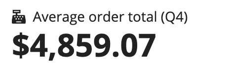
Standalone metricCopy link to clipboard
This example uses data from an Order record type to show the average value of an order from a specific date range.
1
2
3
4
5
6
7
8
9
10
11
12
13
14
15
16
17
18
a!kpiField(
  primaryText: "Average order total (Q4)",
  icon: "cash-register",
  data: recordType!AT Order,
  primaryMeasure: a!measure(
    function: "AVG",
    field: recordType!AT Order.fields.total,
    formatValue: "DOLLAR",
    filters: a!queryFilter(
    field: 'recordType!AT Order.fields.entryDate',
    operator: "between",
    value: {
      datetime(2023, 10, 1),
      datetime(2023, 12, 31)
    }
  )
  ),
)
Copy
Metric with trendCopy link to clipboard
This KPI adds trend data to the standalone metric to show how the current quarter's average compares to the rest of the year.
![An example of the KPI component with a trend]](images/kpi-with-trend.png)
1
2
3
4
5
6
7
8
9
10
11
12
13
14
15
16
17
18
19
20
21
22
23
24
25
26
27
28
29
30
31
32
33
34
35
36
37
38
39
40
41
42
43
44
45
a!kpiField(
  data: recordType!AT Order,
  primaryMeasure: a!measure(
    function: "AVG",
    field: recordType!AT Order.fields.orderTotalCost,
    filters: a!queryFilter(
      field: recordType!AT Order.fields.entryDate,
      operator: "between",
      value: {
        datetime(2020, 10, 1),
        datetime(2020, 12, 31)
      }
    ),
    formatValue: "DOLLAR"
  ),
  secondaryMeasure: a!measure(
    function: "AVG",
    field: recordType!AT Order.fields.orderTotalCost,
    filters: a!queryFilter(
      field: recordType!AT Order.fields.entryDate,
      operator: "between",
      value: { datetime(2020, 1, 1), datetime(2020, 9, 30) }
    ),
    formatValue: "DOLLAR"
  ),
  primaryText: "Average order total (Q4)",
  icon: "cash-register",
  secondaryText: "Annual average",
  trendIcon: a!match(
    value: fv!primaryMeasure,
    whenTrue: fv!value > fv!secondaryMeasure,
    then: "thumbs-up",
    whenTrue: fv!value < fv!secondaryMeasure,
    then: "thumbs-down",
    default: "smile"
  ),
  trendColor: a!match(
    value: fv!primaryMeasure,
    whenTrue: fv!value > fv!secondaryMeasure,
    then: "ACCENT",
    whenTrue: fv!value < fv!secondaryMeasure,
    then: "SECONDARY",
    default: "AUTO"
  ),
)
Copy
Feature compatibilityCopy link to clipboard
The table below lists this component's compatibility with various features in Appian.
| Feature | Compatibility | Note |
|---|---|---|
| Portals | Compatible | |
| Offline Mobile | Partially compatible | Can be used with offline mobile if it is loaded at the top of the form. |
| Sync-Time Custom Record Fields | Incompatible | |
| Real-Time Custom Record Fields | Incompatible | Custom record fields that evaluate in real time must be configured using one or more Custom Field functions. |
| Process Reports | Incompatible | Cannot be used to configure a process report. |
| Process Events | Incompatible | Cannot be used to configure a process event node, such as a start event or timer event. |