This tutorial will teach you how to build an interface in Appian, working in both Design Mode and Expression Mode. Completing this tutorial will enable you to move on to the Process Model Tutorial.
The interface we're creating in this tutorial is for a simple expense management application. This application needs a form that lets employees report their expenses, and a form that lets managers review those expenses and approve or reject them. We'll create and configure a single interface that serves both purposes at different times in the workflow.
Tip: The Appian Tutorial application is used throughout Appian tutorials. Skip the steps in this section if you've already created this application in another tutorial.
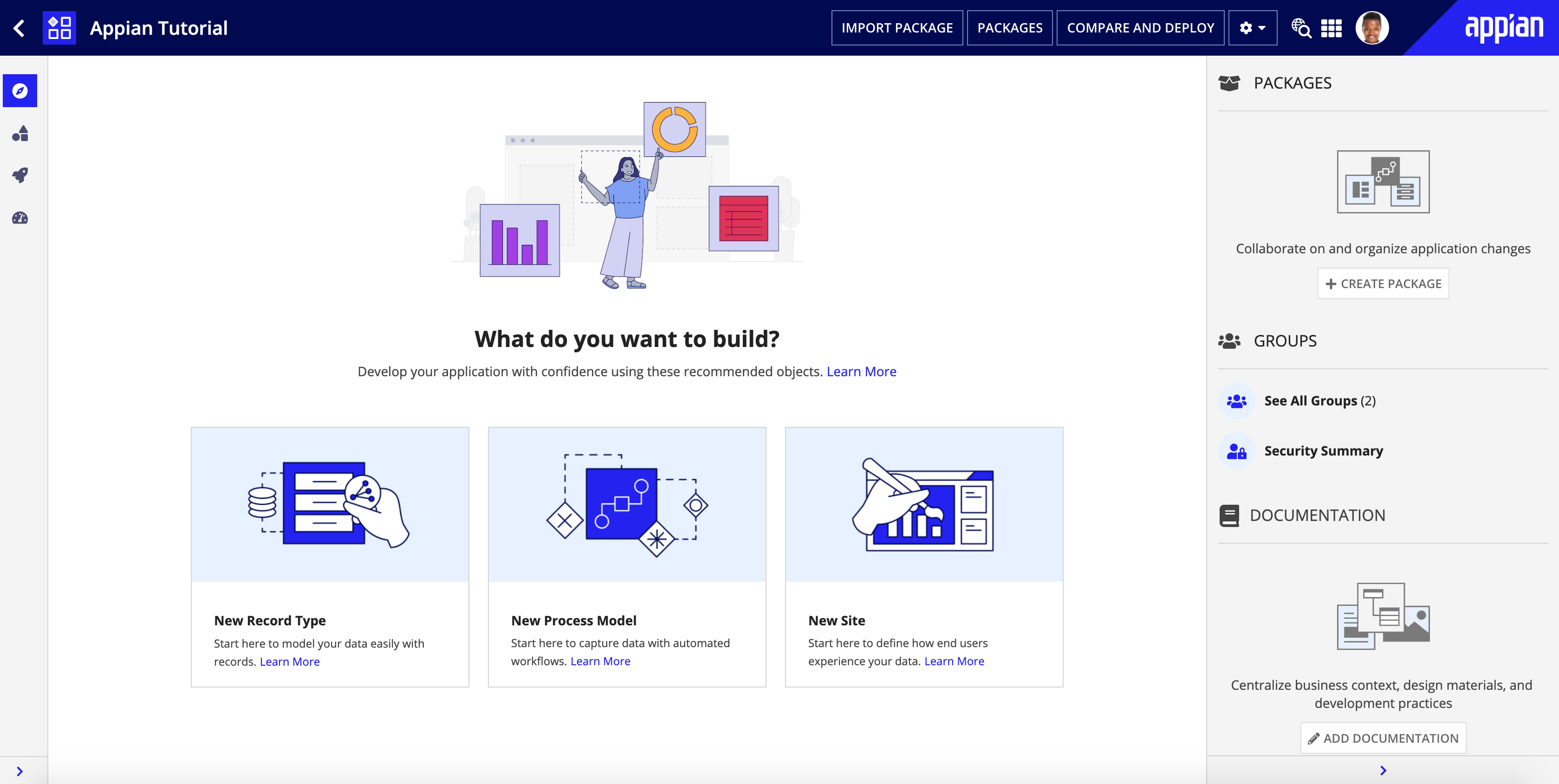
To begin with, we need to create an application to contain our design objects.
We will be creating the Appian Tutorial application for this tutorial. All of Appian's tutorials use the Appian Tutorial application as the reference application. After completing this tutorial, you can reuse this application as you work through other Appian tutorials.
To create the Appian Tutorial application:
In the Create New Application dialog, configure the following properties:
| Property | Description |
|---|---|
| Name | Enter Appian Tutorial. |
| Prefix | Keep the default prefix, AT, which Appian constructs using the initial characters of each word you entered in the Name parameter. We'll be following the recommended naming standard, and using this short, unique prefix whenever we name an object in this application. |
| Description | Leave blank. It's normally a best practice to add descriptions to all design objects. However, to save a little time during this tutorial, we'll skip adding descriptions unless the description displays to the end user. |
| Generate groups and folders to secure and organize objects | Keep this checkbox selected, so that Appian will automatically generate standard groups and folders and assign default security groups for this application. |
In the Review Application Security dialog, keep the default security settings. Because we selected the Generate groups and folders option in the previous step, Appian automatically uses the AT Users and AT Administrator groups it generated to set our application security appropriately.
Tip: The security of the application object is unrelated to the security of each of the objects contained within the application. This means that you will need to set security permissions for every object in an application in addition to the application object itself. For more information about security permissions for the application object, see Application Security.
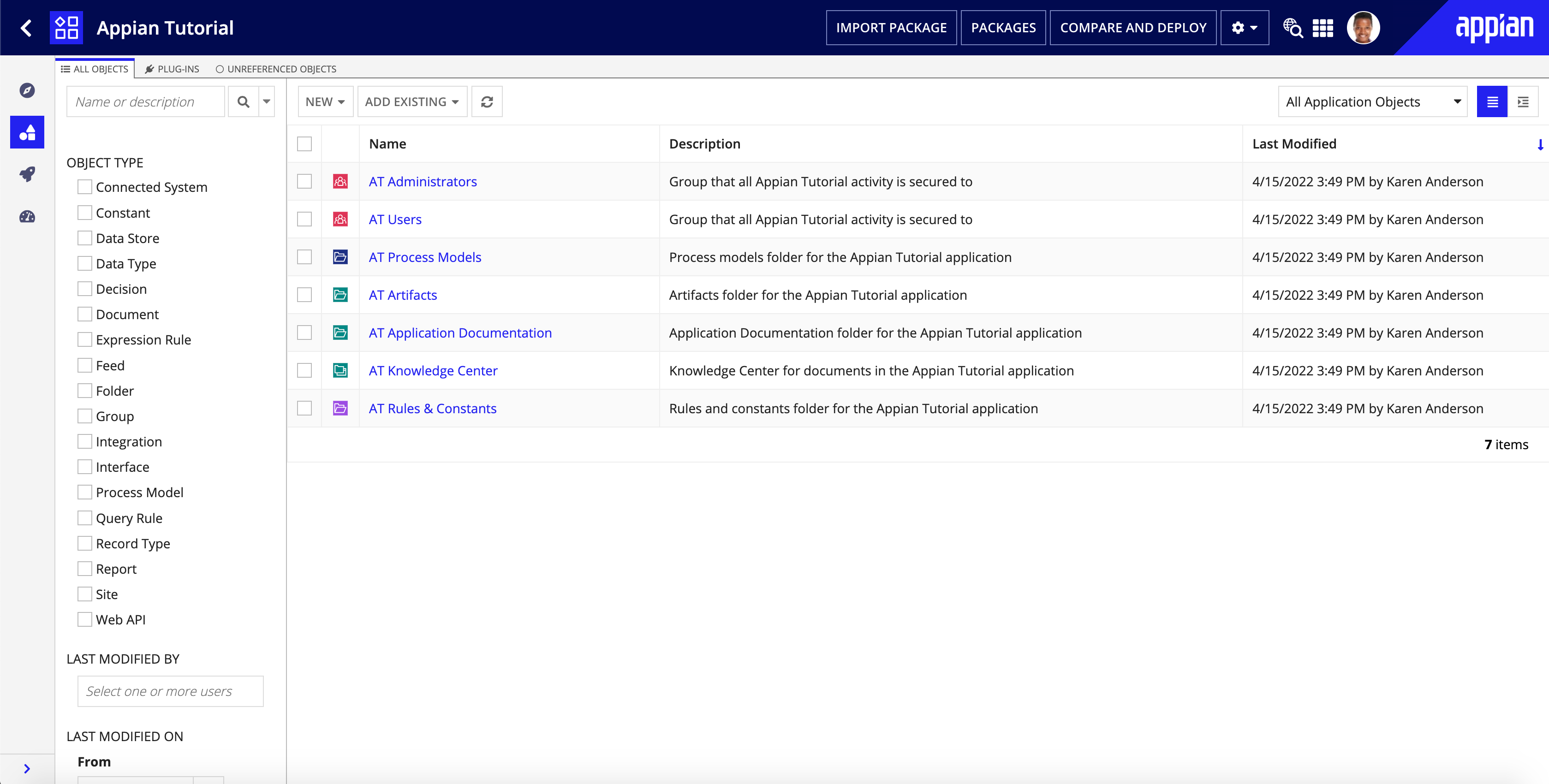
Click SAVE. The Explore view appears.
Right now, the application contains the folders and groups Appian generated automatically. To see these, click Build in the navigation pane. Each design object that you create during the course of this tutorial will appear in this list in the Build view and be associated with the tutorial application.
Now that we've created an application, let's get started on the interface.
We're going to create an interface named AT_expenseReportForm and configure the form to allow users to input values.
To create an interface object:
AT_expenseReportForm.The newly created interface will open in a new tab by default. If you don't see a new tab, make sure you have pop-ups enabled for your browser.
By default, the new interface is in DESIGN MODE. That's where we want to be for now.
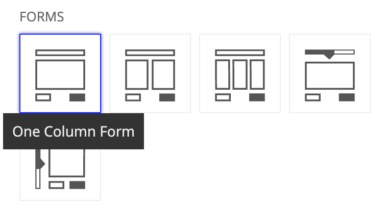
Next, let's select an interface template, so we can take advantage of functionality already configured in the template.
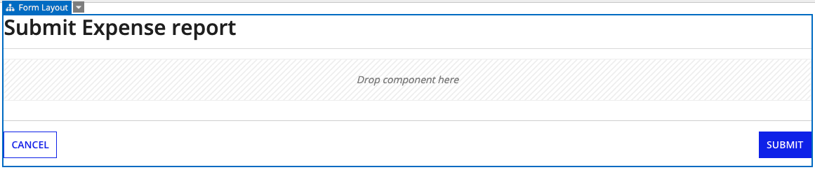
In the Select a Template panel, under FORMS, click One Column Form.

The template you selected opens in the EDIT view.
Now, let's change the form title, so that users viewing the published interface know they're in the right place to submit their expenses.
To change the form title:
In the COMPONENT CONFIGURATION pane, replace the default Label value with Submit Expense Report.
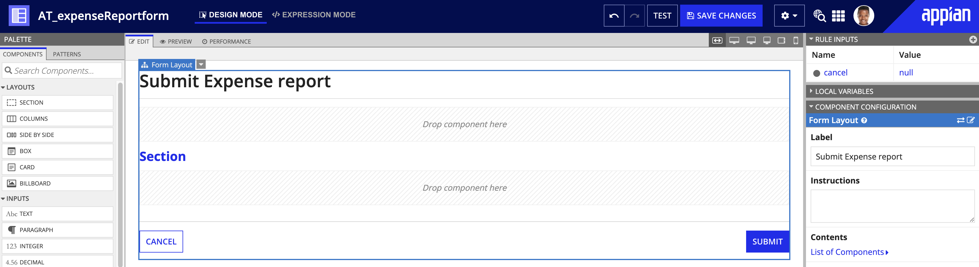
The template we selected contains sections, but we don't need them for this particular interface. We'll take those components out to make room for the components we'll add later.
Delete both Section Layout components. For each component:
Select Delete.
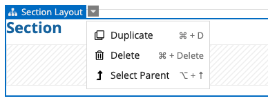
You should be left with nothing but the form layout and the cancel and submit buttons.
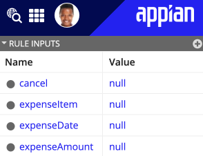
Before we add new interface components, let's add the rule inputs needed to configure properties for those components. A rule input is a variable that stores inputs from the interface, so those inputs can be successfully passed to a process model.
For each rule input we need, repeat the following steps:
Configure the following properties:
| Name | Type | Array |
|---|---|---|
expenseItem |
Text | leave unselected |
expenseDate |
Date | leave unselected |
expenseAmount |
Number (Decimal) | leave unselected |
Note: Because we used an interface template, the cancel rule input has already been added and configured for this interface.
Your finished rule inputs should look like this:
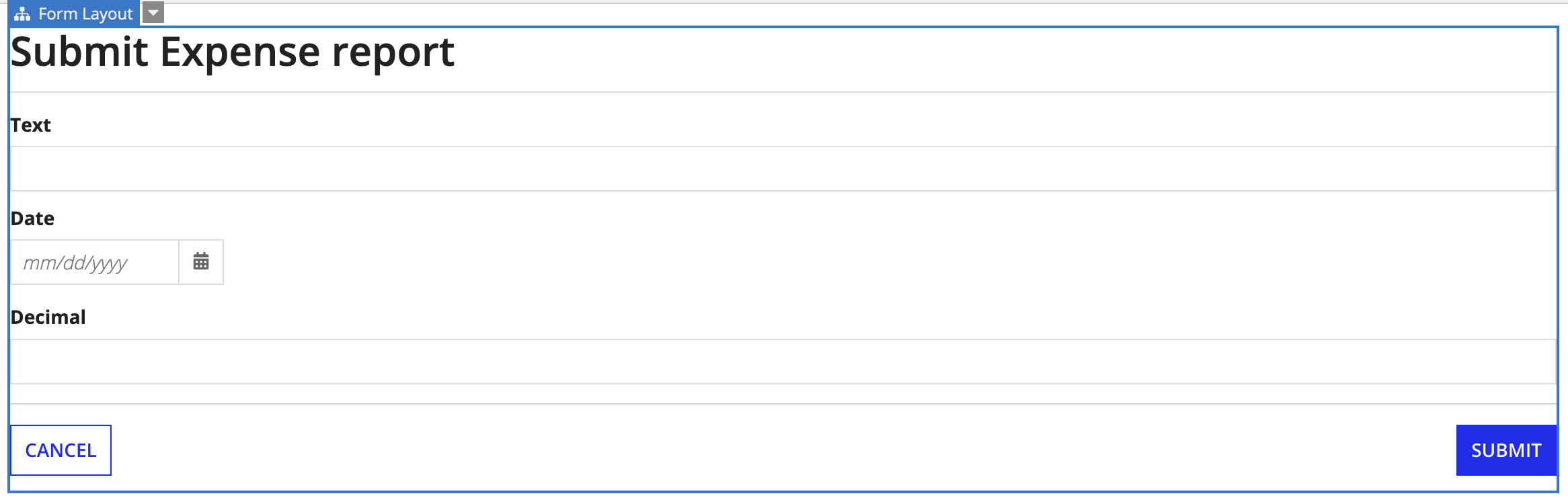
Now, we'll add the components to the interface that support user input of expense data.
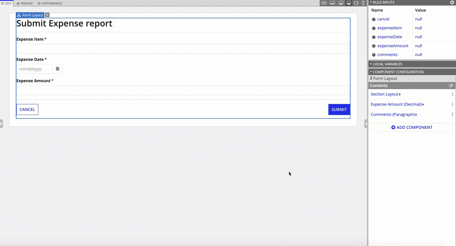
To add components to the interface, drag the following components from the PALETTE panel into the form layout:
Your interface should look like this:
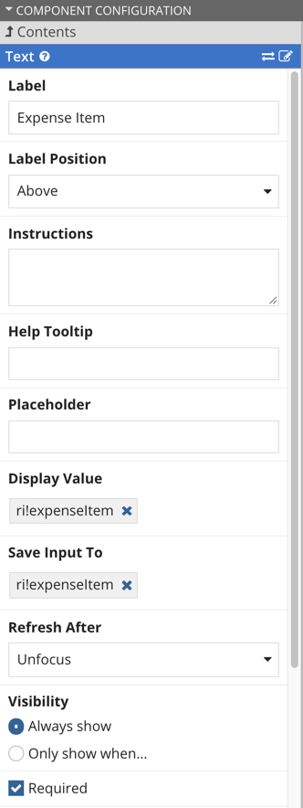
Next, we'll configure the components so that the form inputs connect to the rule inputs. We'll also specify whether a specific form input is required to submit the form.
For each of the components, perform the following steps:
In the COMPONENT CONFIGURATION pane, configure the following properties:
| Component | Label | Display Value | Save Input To | Required |
|---|---|---|---|---|
| Text | Expense Item |
ri!expenseItem |
ri!expenseItem |
selected |
| Date | Expense Date |
ri!expenseDate |
ri!expenseDate |
selected |
| Decimal | Expense Amount |
ri!expenseAmount |
ri!expenseAmount |
selected |
For example:
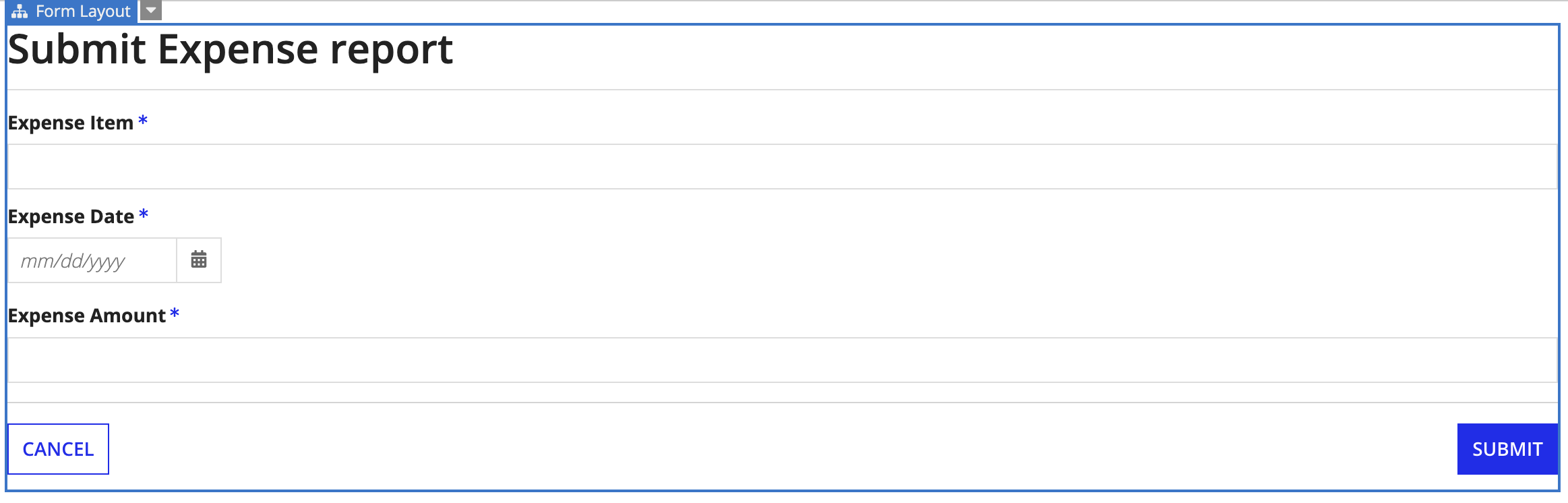
Your interface should now look like this:
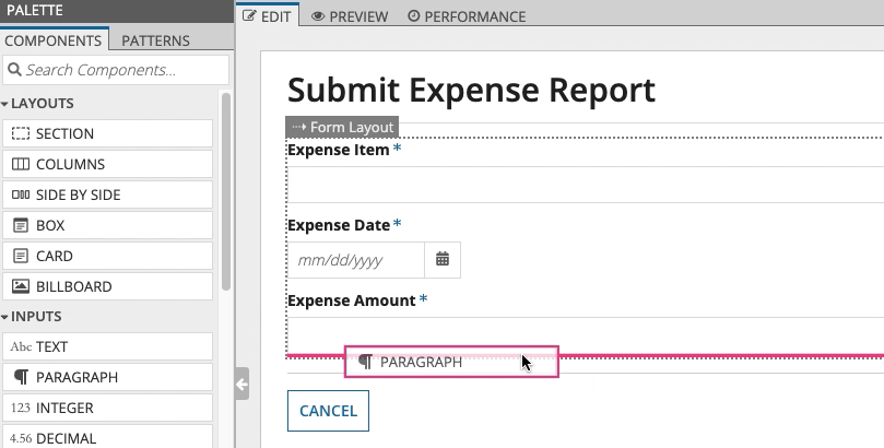
A common design requirement is to only display a component based on a condition. Because interfaces are defined using expressions, you can use the full expression library to add dynamic behavior to the interface. For this example, we'll add a paragraph component for entering comments, and we'll only display it when the expense amount is greater than $100.
To configure the visibility of the Comments field:
comments.Drag a PARAGRAPH component from the PALETTE panel to the form, and place it beneath the Expense Amount component.
In the COMPONENT CONFIGURATION pane, configure the following properties:
| Property | Description |
|---|---|
| Label | Comments |
| Display Value and Save Input To | ri!comments |
| Required | Selected |
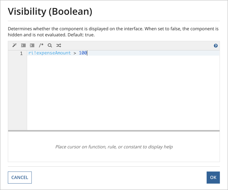
In the Visibility (Boolean) dialog, enter: ri!expenseAmount > 100
Click OK to close the expression box.
When you click this box, Appian immediately applies the conditional expression, so your Comments component will disappear. To see the component, go to the next step to test the expression, or follow the steps for selecting the hidden component.
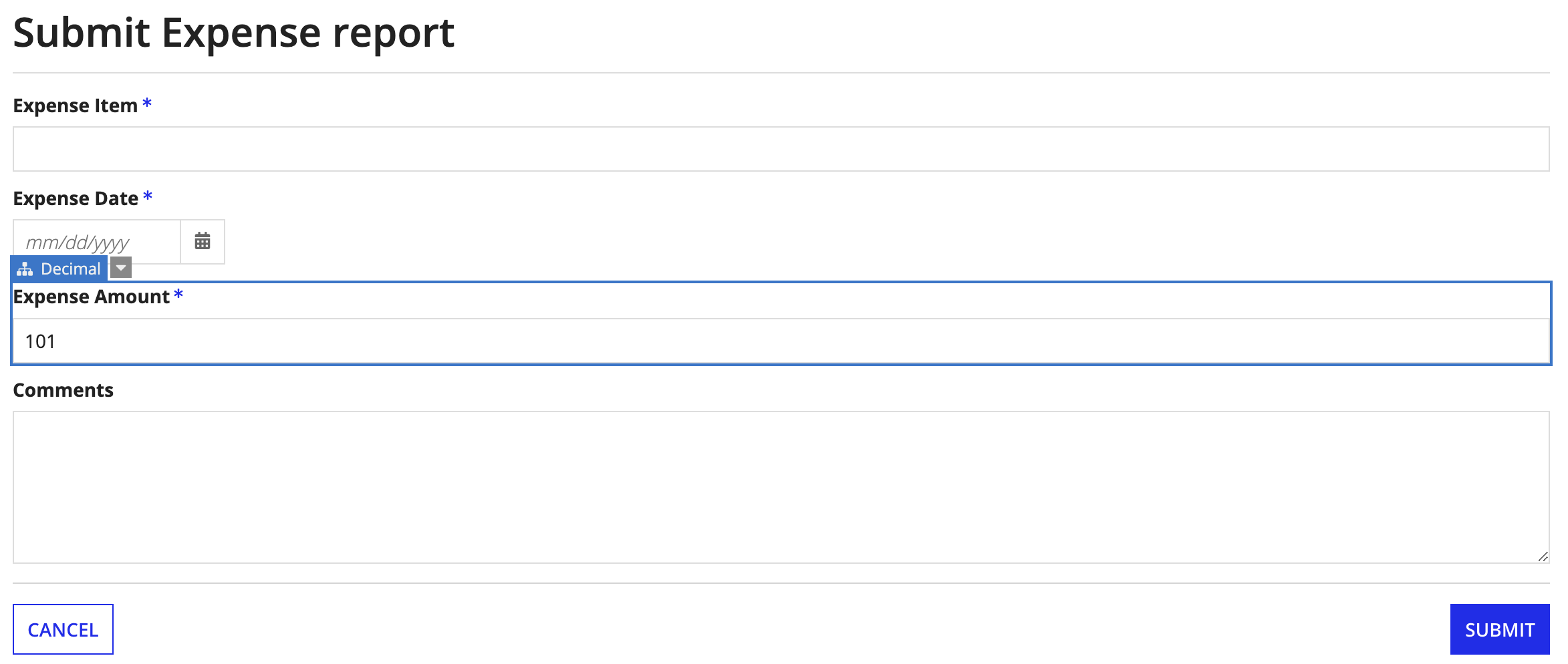
Test the conditional expression by entering 101 in the Expense Amount field, then clicking out of the field, or pressing the Enter key to see the paragraph component displayed.
Up until now you've been able to select components simply by clicking on them. However, when a component is conditionally visible, you may not be able to see it in order to click on it.
Another way you can select it would be from the interface navigation hidden in the right-hand panel. Simply drag the panel to expand it.
When you click on the component in the expanded panel, the COMPONENT CONFIGURATION pane populates with the properties for that component, and you can change the properties as needed.
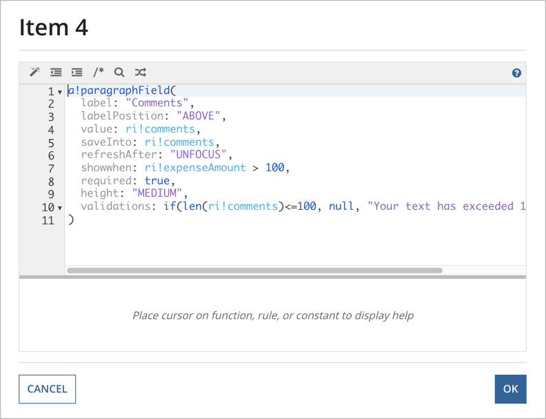
You can configure validations for the interface by adding them directly to the expression. For example, let's add a custom validation to our form that only allows users to enter up to 100 characters in the Comments field.
To add a custom validation:
Enter the following expression in the Validations (List of Text String) expression box:
1
if(len(ri!comments)<=100, null, "Your text has exceeded 100 characters")
101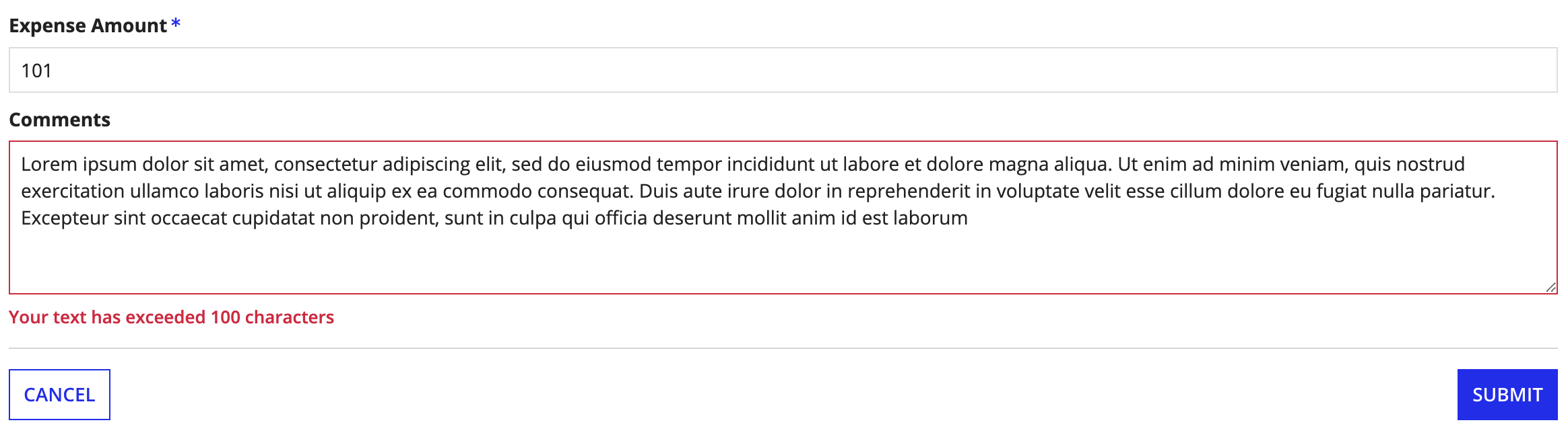
In this section, we'll learn about reusability and how interface components can be represented with the Appian expression language.
There are many cases where you'll want to reuse part or all of an interface. For example, you may have several forms that have a conditional Comments field. Rather than re-create that component on every interface, we can move the paragraph component into a new interface object and simply call the interface object whenever we need the paragraph component.
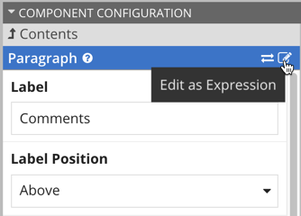
First, we'll want to take a look at the expression that represents the Comments field in the AT_expenseReportForm interface.
To view the expression:
In the COMPONENT CONFIGURATION pane, click Edit as Expression in the Paragraph section header.
You should now see the expression for the interface.
The properties listed in this expression correspond to the properties you set in the COMPONENTS CONFIGURATION pane.
Typically, at this point, you'd want to copy this expression so that you can paste it into a new interface, where you then edit the expression to make it reusable. For this tutorial, we're going to save you that copying and editing step by including the edited version of the expression in the next step, so no need to copy the expression here.
Next, let's create the reusable interface and configure it using the expression from the original interface.
To create and configure the reusable interface:
AT_enterComments, and save it in the AT Rules & Constants folder.In the RULE INPUTS pane, add the following rule inputs:
| Name | Type | Array |
|---|---|---|
showWhen |
Boolean | Leave unselected |
labelPosition |
Text | Leave unselected |
readOnly |
Boolean | Leave unselected |
required |
Boolean | Leave unselected |
commentValue |
Text | Leave unselected |
commentSaveInto |
Text | Selected |
Replace the current expression with the following expression:
1
2
3
4
5
6
7
8
9
10
11
12
a!paragraphField(
label: "Comments",
labelPosition: `ri!labelPosition`,
value: `ri!commentValue`,
saveInto: `ri!commentSaveInto`,
refreshAfter: "UNFOCUS",
showWhen: `ri!showWhen`,
required: `ri!required`,
height: "MEDIUM",
+   readOnly: ri!readOnly,
validations: if(len(`ri!commentSaveInto`)<=100, null, "Your text has exceeded 100 characters")
)
Note: After you paste, remove the plus sign (+) at the start of the readOnly property line. This character is present only to indicate that the readOnly property was added to the expression.
This expression represents the Comments expression from the original interface, but has been edited so that it can be reused. The edited properties are highlighted for your reference.
With these changes, the Comments component can receive values from the parent interface, so the comments can be handled in ways specific to that interface. In this example, the Comments data could be saved to a data entity for expense report data, as set in the parent interface. This same reusable interface could also be used in a time-off request form, and the Comments data would be saved to the data entity for time-off requests instead, based on the properties in the parent interface.
Now that we've created the reusable interface, we can call it in our original interface.
To call the reusable interface:
Replace the existing expression with the following:
1
2
3
4
5
6
7
8
rule!AT_enterComments(
  showWhen: ri!expenseAmount > 100,
  labelPosition: "ABOVE",
  readOnly: false,
  required: true,
  commentValue: ri!comments,
  commentSaveInto: ri!comments
)
Test the new expression by entering 101 for Expense Amount, then hovering over the Comments field when it appears. You should see the following:
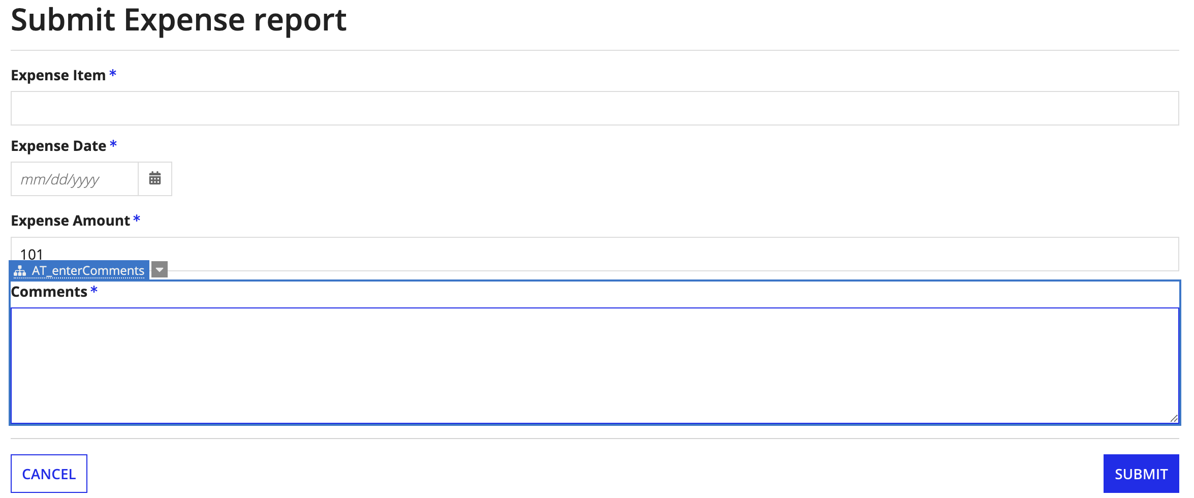
Note that your Comments field is now calling AT_enterComments.
In this section, we'll learn more about reusability, dynamic interface behavior, interface testing, and working in Expression Mode.
We have a form to submit an expense report, and now we need a form that an approver can use to review the expense report. The only difference between these forms is that the review form will need to be read-only and contain an additional input so the managers can approve or reject the expense report.
This means we don't have to design two interfaces. Instead, we can configure the components of our single AT_expenseReportForm interface to display as read-only under certain conditions.
To make this interface conditionally read-only, we'll:
Add the following rule inputs to the AT_expenseReportForm interface:
| Name | Type | Array |
|---|---|---|
steps |
Text | Leave unselected |
approve |
Boolean | Leave unselected |
To add review options to the interface:
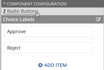
HIDDENri!approveri!approveApprove for the first option.Reject for the second option.Click the back link in the Radio Buttons section header.
true.false.Local variables allow you to store interface-specific values that can be used to affect the behavior of the interface.
For example, in this case, we're going to add a local variable (local!readOnly) that tells the interface when it should be considered read-only. The interface should be read-only if we're in the review phase, so we'll define this variable based on whether the ri!steps value is REVIEW.
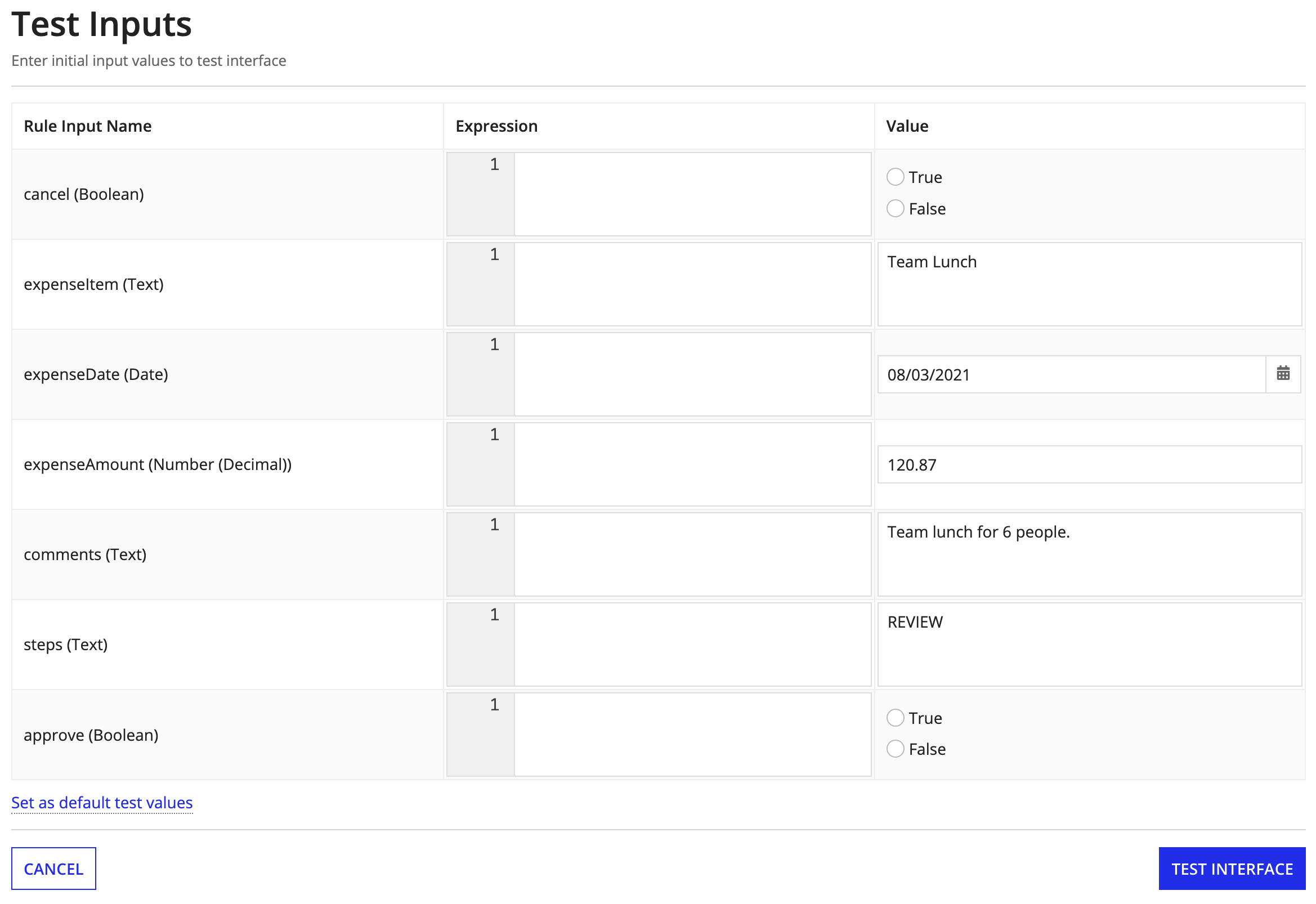
In this tutorial, we'll use the TEST feature to set the ri!steps value to REVIEW.
In a real-world scenario, the process calling this interface would pass the ri!steps value to the interface.
We'll also add a local variable (local!labelPosition) that specifies the label position for components when the interface is read-only. It saves us time to add this value here, rather than as a property in each individual interface component.
We need to know the values of these variables as soon as we open the interface, so we'll put the entire interface definition into the a!localVariables() function. As a result, the local variables will initialize when the interface loads.
To add local variables to the interface:
Click </> EXPRESSION MODE in the title bar. This action replaces the component palette with the INTERFACE DEFINITION panel, where you can see the entire expression that defines the interface.
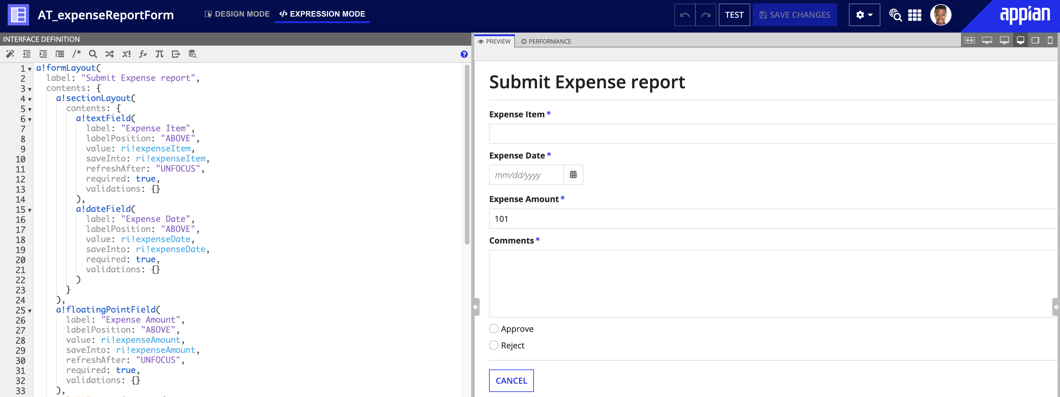
Edit the interface definition so that the properties match the values highlighted below:
1
2
3
4
5
6
7
8
9
10
11
12
13
14
15
16
17
18
19
20
21
22
23
24
25
26
27
28
29
30
31
32
33
34
35
36
37
38
39
40
41
42
43
44
45
46
47
48
49
50
51
52
53
54
55
56
57
58
59
60
61
62
63
64
65
66
67
68
69
70
71
72
73
+    a!localVariables(
+      local!readOnly: ri!steps="REVIEW",
+      local!labelPosition: if(local!readOnly, "ADJACENT", "ABOVE"),
      a!formLayout(
        label: "Submit Expense Report",
        contents: {
          a!textField(
            label: "Expense Item",
            labelPosition: "ABOVE",
            value: ri!expenseItem,
            saveInto: ri!expenseItem,
            refreshAfter: "UNFOCUS",
            required: true,
            validations: {},
            align: "LEFT"
          ),
          a!dateField(
            label: "Expense Date",
            labelPosition: "ABOVE",
            value: ri!expenseDate,
            saveInto: ri!expenseDate,
            required: true,
            validations: {},
            align: "LEFT"
          ),
          a!floatingPointField(
            label: "Expense Amount",
            labelPosition: "ABOVE",
            value: ri!expenseAmount,
            saveInto: ri!expenseAmount,
            refreshAfter: "UNFOCUS",
            required: true,
            validations: {},
            align: "LEFT"
          ),
          rule!AT_enterComments(
            showWhen: ri!expenseAmount > 100,
            labelPosition: "ABOVE",
            readOnly: false,
            required: true,
            commentValue: ri!comments,
            commentSaveInto: ri!comments
          ),
          a!radioButtonField(
            labelPosition: "COLLAPSED",
            choiceLabels: {"Approve", "Reject"},
            choiceValues: {true, false},
            value: ri!approve,
            saveInto: ri!approve,
            required: true
          )
        },
        buttons: a!buttonLayout(
          primaryButtons: {
            a!buttonWidget(
              label: "Submit",
              style: "PRIMARY",
              submit: true
            )
          },
          secondarybuttons: {
            a!buttonWidget(
              label: "Cancel",
              style: "SECONDARY",
              value: true,
              saveInto: ri!cancel,
              submit: true,
              validate: false
            )
          }
        )
      )
+ )
Click SAVE CHANGES.
The interface currently has the following input fields:
a!textField)a!dateField)a!floatingPointField)rule!AT_enterComments),We want to configure these fields so that they are conditionally read-only and optional when the interface is in read-only mode. We'll use the new local!readOnly variable to do this.
We also want to change the position of each field's label based on whether the interface is in read-only mode. We'll use the new local!labelPosition to do this.
For each input field listed above, make the following changes:
local!labelPosition.not(local!readOnly).local!readOnly.1
2
3
4
5
6
7
8
9
10
11
12
13
14
15
16
17
18
19
20
21
22
23
24
25
26
27
28
29
30
31
32
33
34
35
36
37
38
39
40
41
42
43
44
45
46
47
48
49
50
51
52
53
54
55
56
57
58
59
60
61
62
63
64
65
66
67
68
69
70
71
72
73
74
75
76
a!localVariables(
local!readOnly: ri!steps="REVIEW",
local!labelPosition: if(local!readOnly, "ADJACENT", "ABOVE"),
a!formLayout(
label: "Submit Expense Report",
contents: {
a!textField(
label: "Expense Item",
labelPosition: `local!labelPosition`,
value: ri!expenseItem,
saveInto: ri!expenseItem,
refreshAfter: "UNFOCUS",
required: `not(local!readOnly)`,
+ readOnly: local!readOnly,
validations: {},
align: "LEFT"
),
a!dateField(
label: "Expense Date",
labelPosition: `local!labelPosition`,
value: ri!expenseDate,
saveInto: ri!expenseDate,
required: `not(local!readOnly)`,
+ readOnly: local!readOnly,
validations: {},
align: "LEFT"
),
a!floatingPointField(
label: "Expense Amount",
labelPosition: `local!labelPosition`,
value: ri!expenseAmount,
saveInto: ri!expenseAmount,
refreshAfter: "UNFOCUS",
required: `not(local!readOnly)`,
+ readOnly: local!readOnly,
validations: {},
align: "LEFT"
),
rule!AT_enterComments(
showWhen: ri!expenseAmount > 100,
labelPosition: `local!labelPosition`,
readOnly: `local!readOnly`,
required: `not(local!readOnly)`,
commentValue: ri!comments,
commentSaveInto: ri!comments
),
a!radioButtonField(
labelPosition: "COLLAPSED",
choiceLabels: {"Approve", "Reject"},
choiceValues: {true, false},
value: ri!approve,
saveInto: ri!approve,
required: true
)
},
buttons: a!buttonLayout(
primaryButtons: {
a!buttonWidget(
label: "Submit",
style: "PRIMARY",
submit: true
)
},
secondarybuttons: {
a!buttonWidget(
label: "Cancel",
style: "SECONDARY",
value: true,
saveInto: ri!cancel,
submit: true,
validate: false
)
}
)
)
)
We want the review options to display only when the interface is on the review step of the workflow.
For the review options component (a!radioButtonField), add a showWhen property set to local!readOnly.
1
2
3
4
5
6
7
8
9
10
11
12
13
14
15
16
17
18
19
20
21
22
23
24
25
26
27
28
29
30
31
32
33
34
35
36
37
38
39
40
41
42
43
44
45
46
47
48
49
50
51
52
53
54
55
56
57
58
59
60
61
62
63
64
65
66
67
68
69
70
71
72
73
74
75
76
77
a!localVariables(
  local!readOnly: ri!steps="REVIEW",
  local!labelPosition: if(local!readOnly, "ADJACENT", "ABOVE"),
  a!formLayout(
    label: "Submit Expense Report",
    contents: {
      a!textField(
        label: "Expense Item",
        labelPosition: local!labelPosition,
        value: ri!expenseItem,
        saveInto: ri!expenseItem,
        refreshAfter: "UNFOCUS",
        required: not(local!readOnly),
        readOnly: local!readOnly,
        validations: {},
        align: "LEFT"
      ),
      a!dateField(
        label: "Expense Date",
        labelPosition: local!labelPosition,
        value: ri!expenseDate,
        saveInto: ri!expenseDate,
        required: not(local!readOnly),
        readOnly: local!readOnly,
        validations: {},
        align: "LEFT"
      ),
      a!floatingPointField(
        label: "Expense Amount",
        labelPosition: local!labelPosition,
        value: ri!expenseAmount,
        saveInto: ri!expenseAmount,
        refreshAfter: "UNFOCUS",
        required: not(local!readOnly),
        readOnly: local!readOnly,
        validations: {},
        align: "LEFT"
      ),
      rule!AT_enterComments(
        showWhen: ri!expenseAmount > 100,
        labelPosition: local!labelPosition,
        readOnly: local!readOnly,
        required: not(local!readOnly),
        commentValue: ri!comments,
        commentSaveInto: ri!comments
      ),
      a!radioButtonField(
        labelPosition: "COLLAPSED",
        choiceLabels: {"Approve", "Reject"},
        choiceValues: {true, false},
        value: ri!approve,
        saveInto: ri!approve,
        required: true`,`
+       showWhen: local!readOnly
      )
    },
    buttons: a!buttonLayout(
      primaryButtons: {
        a!buttonWidget(
          label: "Submit",
          style: "PRIMARY",
          submit: true
        )
      },
      secondarybuttons: {
        a!buttonWidget(
          label: "Cancel",
          style: "SECONDARY",
          value: true,
          saveInto: ri!cancel,
          submit: true,
          validate: false
        )
      }
    )
  )
)
We want to hide the CANCEL button on the review step.
For the appropriate a!buttonWidget component, add a showWhen property set to not(local!readOnly).
1
2
3
4
5
6
7
8
9
10
11
12
13
14
15
16
17
18
19
20
21
22
23
24
25
26
27
28
29
30
31
32
33
34
35
36
37
38
39
40
41
42
43
44
45
46
47
48
49
50
51
52
53
54
55
56
57
58
59
60
61
62
63
64
65
66
67
68
69
70
71
72
73
74
75
76
77
78
a!localVariables(
  local!readOnly: ri!steps="REVIEW",
  local!labelPosition: if(local!readOnly, "ADJACENT", "ABOVE"),
  a!formLayout(
    label: "Submit Expense Report",
    contents: {
      a!textField(
        label: "Expense Item",
        labelPosition: local!labelPosition,
        value: ri!expenseItem,
        saveInto: ri!expenseItem,
        refreshAfter: "UNFOCUS",
        required: not(local!readOnly),
        readOnly: local!readOnly,
        validations: {},
        align: "LEFT"
      ),
      a!dateField(
        label: "Expense Date",
        labelPosition: local!labelPosition,
        value: ri!expenseDate,
        saveInto: ri!expenseDate,
        required: not(local!readOnly),
        readOnly: local!readOnly,
        validations: {},
        align: "LEFT"
      ),
      a!floatingPointField(
        label: "Expense Amount",
        labelPosition: local!labelPosition,
        value: ri!expenseAmount,
        saveInto: ri!expenseAmount,
        refreshAfter: "UNFOCUS",
        required: not(local!readOnly),
        readOnly: local!readOnly,
        validations: {},
        align: "LEFT"
      ),
      rule!AT_enterComments(
        showWhen: ri!expenseAmount > 100,
        labelPosition: local!labelPosition,
        readOnly: local!readOnly,
        required: not(local!readOnly),
        commentValue: ri!comments,
        commentSaveInto: ri!comments
      ),
      a!radioButtonField(
        labelPosition: "COLLAPSED",
        choiceLabels: {"Approve", "Reject"},
        choiceValues: {true, false},
        value: ri!approve,
        saveInto: ri!approve,
        required: true,
        showWhen: local!readOnly
      )
    },
    buttons: a!buttonLayout(
      primaryButtons: {
        a!buttonWidget(
          label: "Submit",
          style: "PRIMARY",
          submit: true
        )
      },
      secondarybuttons: {
        a!buttonWidget(
          label: "Cancel",
          style: "SECONDARY",
          value: true,
          saveInto: ri!cancel,
          submit: true,
          validate: false`,`
+         showWhen: not(local!readOnly)
        )
      }
    )
  )
)
We want the form title to change based on which step in the workflow we're on.
For the a!formLayout component, set the label property to the following expression:
1
2
3
4
5
6
7
8
9
10
11
12
13
14
15
16
17
18
19
20
21
22
23
24
25
26
27
28
29
30
31
32
33
34
35
36
37
38
39
40
41
42
43
44
45
46
47
48
49
50
51
52
53
54
55
56
57
58
59
60
61
62
63
64
65
66
67
68
69
70
71
72
73
74
75
76
77
78
a!localVariables(
  local!readOnly: ri!steps="REVIEW",
  local!labelPosition: if(local!readOnly, "ADJACENT", "ABOVE"),
  a!formLayout(
    label: `if(local!readOnly, "Approve Expense Report", "Submit Expense Report")`,
    contents: {
      a!textField(
        label: "Expense Item",
        labelPosition: local!labelPosition,
        value: ri!expenseItem,
        saveInto: ri!expenseItem,
        refreshAfter: "UNFOCUS",
        required: not(local!readOnly),
        readOnly: local!readOnly,
        validations: {},
        align: "LEFT"
      ),
      a!dateField(
        label: "Expense Date",
        labelPosition: local!labelPosition,
        value: ri!expenseDate,
        saveInto: ri!expenseDate,
        required: not(local!readOnly),
        readOnly: local!readOnly,
        validations: {},
        align: "LEFT"
      ),
      a!floatingPointField(
        label: "Expense Amount",
        labelPosition: local!labelPosition,
        value: ri!expenseAmount,
        saveInto: ri!expenseAmount,
        refreshAfter: "UNFOCUS",
        required: not(local!readOnly),
        readOnly: local!readOnly,
        validations: {},
        align: "LEFT"
      ),
      rule!AT_enterComments(
        showWhen: ri!expenseAmount > 100,
        labelPosition: local!labelPosition,
        required: not(local!readOnly),
        readOnly: local!readOnly,
        commentValue: ri!comments,
        commentSaveInto: ri!comments
      ),
      a!radioButtonField(
        labelPosition: "COLLAPSED",
        choiceLabels: {"Approve", "Reject"},
        choiceValues: {true, false},
        value: ri!approve,
        saveInto: ri!approve,
        required: true,
        showWhen: local!readOnly
      )
    },
    buttons: a!buttonLayout(
      primaryButtons: {
        a!buttonWidget(
          label: "Submit",
          style: "PRIMARY",
          submit: true
        )
      },
      secondarybuttons: {
        a!buttonWidget(
          label: "Cancel",
          style: "SECONDARY",
          value: true,
          saveInto: ri!cancel,
          submit: true,
          validate: false,
          showWhen: not(local!readOnly)
        )
      }
    )
  )
)
Click SAVE CHANGES.
Now let's test the read-only behavior of the interface.
To test this behavior:
Team Lunch08/03/2021120.87Team lunch for 6 people.steps (Text): REVIEW
You should see the following:
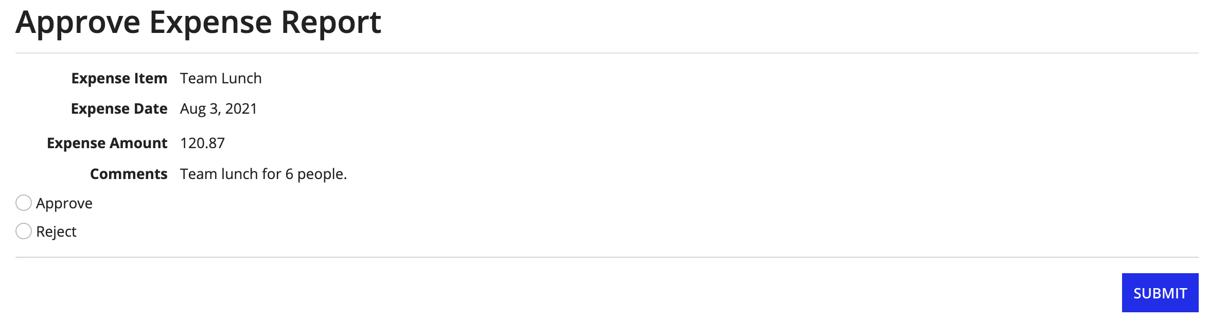
You did it! You created an interface that satisfies two business use cases. You're ready to move on to other tutorials.
See Also: Interface Recipes to create different interfaces with specific layouts and dynamic behavior
