This page explains how to build interfaces in Design Mode.
Design Mode offers drag and drop functionality to accelerate the layout and configuration of an interface.
For information about editing interfaces as an expression, see the expression mode section of the Interfaces page.
Tip: We will be recreating the Sales Team Dashboard example displayed when you first create the interface.
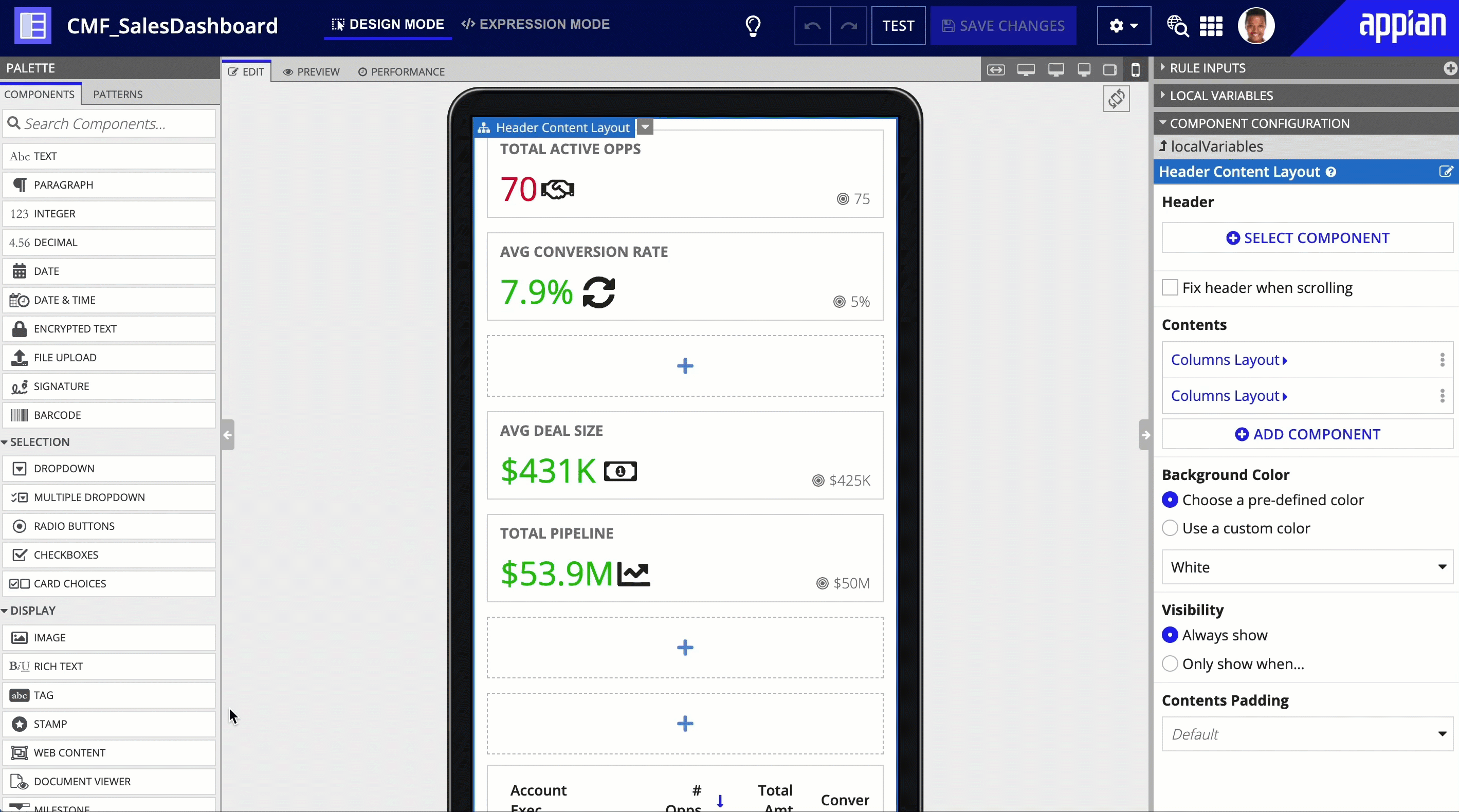
Design Mode is composed of three panels: the palette, the live view, and the configuration panel.
The palette is located on the left side of Design Mode.
The palette contains the primary elements you'll use to create interfaces:
Components: The fundamental building blocks of interfaces. Components are organized in the palette by component type. Learn more about components.
Patterns: Combinations of components that represent common interface features. Learn more about Patterns.
From the palette, you can drag and drop individual components and patterns into the live view.
Learn more about using the palette.
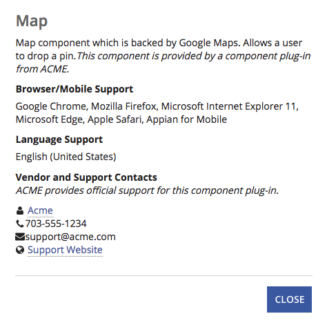
If there are any component plug-ins installed, they will appear at the bottom of the Components tab of the palette under Custom Components. Each custom component includes a link in the palette to view more information about the component vendor, whether the component is supported by the vendor, the support contacts, and the available languages and browsers/mobile clients. This information is also available in the component function documentation in expression mode.
Patterns are combinations of components that represent a typical design of component arrangement and appearance with UX best practices already accounted for. But they are more than just a pretty face! Patterns also come with handling for basic interactivity out of the box where applicable. As such, utilizing patterns can really accelerate the creation of rich interfaces.
Patterns use hard-coded data to showcase the component appearance and interactivity. To use a pattern in your interface, you'll need to replace the hard-coded data with data from your application. In each pattern, the underlying expression has helpful comments to guide you on which variables should be updated for customization. Learn how to adapt a pattern for your application.
The live view is the central panel in Design Mode.
This view contains three tabs:
EDIT: Represents your primary workspace for the interface. By default, this tab is active when you first open an interface object. The palette is only available when this tab is active.
PREVIEW: Allows you to see what the interface will look like when it's in use. The configuration panel is available when this tab is active.
Note: When you view your interface in the PREVIEW tab, the site branding configurations are not yet applied. Review the interface in the site to see these configurations applied.
PERFORMANCE: Provides a real-time report on the performance of the current configuration of the interface.
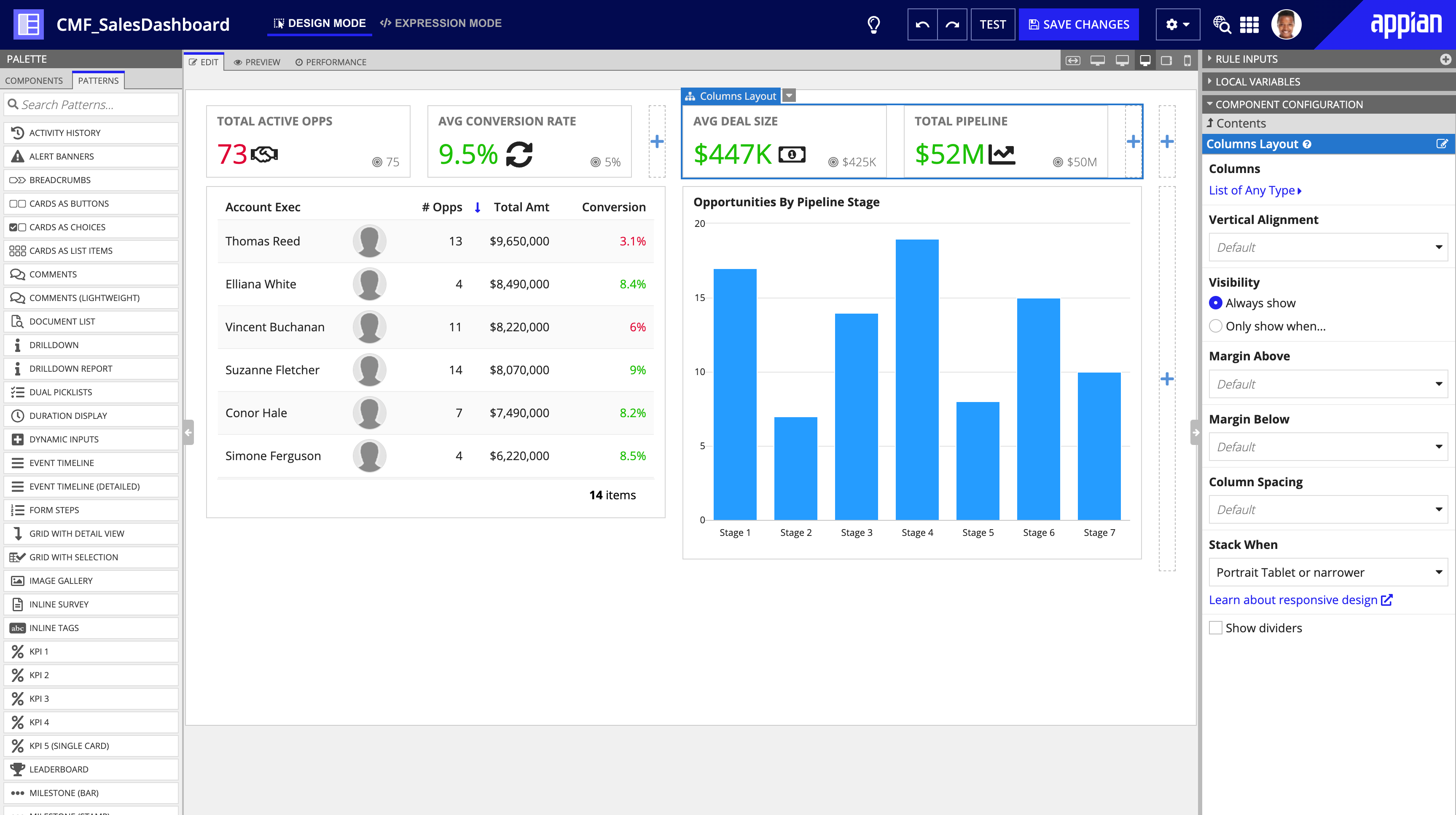
The configuration panel is on the right side of Design Mode.
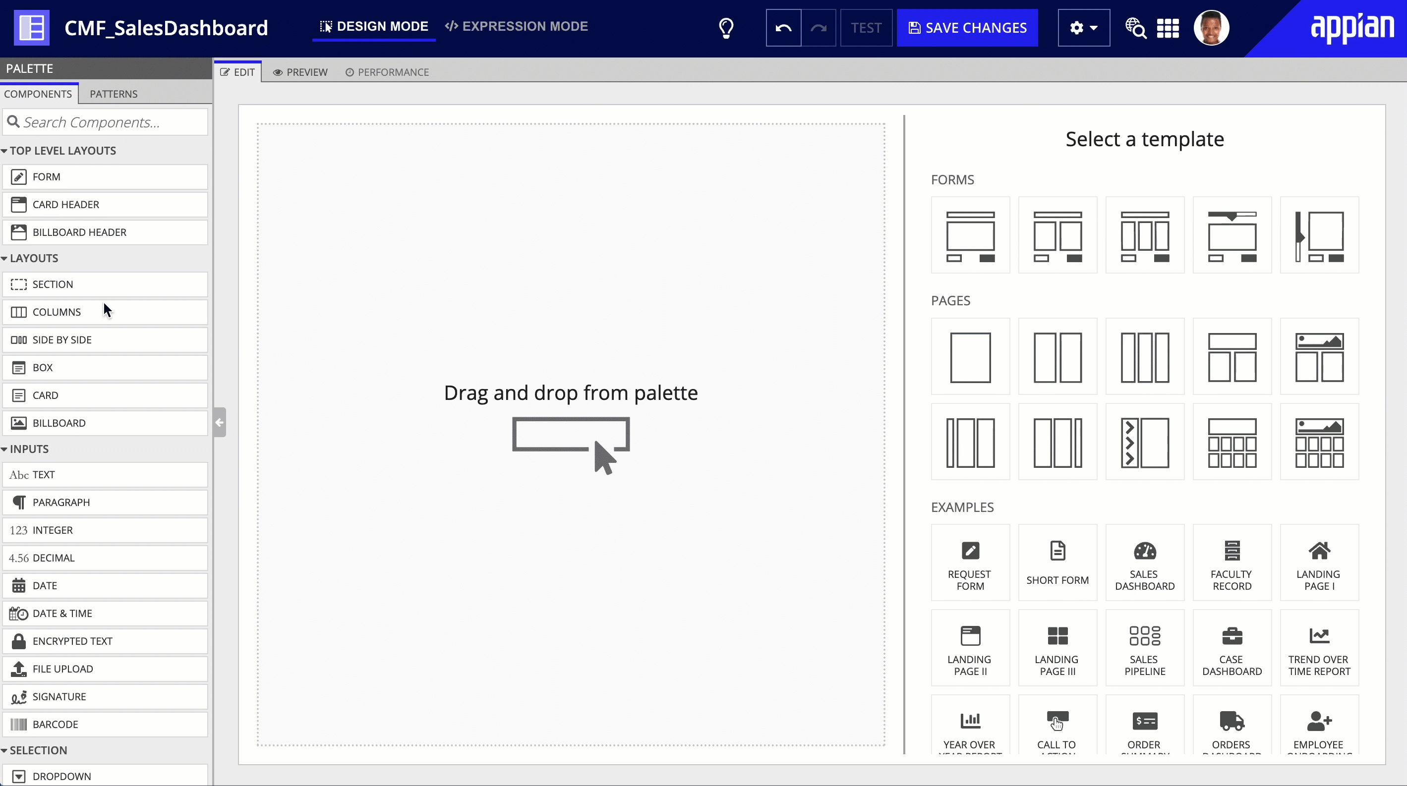
When you view a new interface for the first time, the configuration panel displays a list of interface templates you can use to jumpstart your interface. Learn more about templates.
Once you've added components to interface, the configuration panel consists of the following panes:
To get started creating an interface in Design Mode, start by adding a layout. Once you have a layout, add different interface components to make a beautiful, insightful user experience.
You can drag any component over to the EDIT tab of the live view, but typically you'll want to start your interface with a layout component.
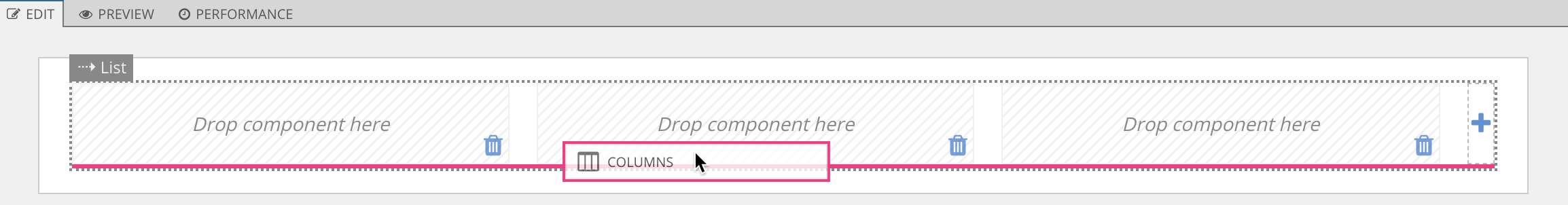
Drag and drop is pretty straight forward. Let's go ahead and drag over a columns layout.
As soon as the columns layout is dragged over, notice that the live view changes with that layout.
Layout components appear with their own drag and drop areas where other components can be dropped.
Note: Safari users will need to drag components from their non-interactive areas. For example, you cannot drag from the input area of a text field.
You've got your layout in place. Now it's time to fill that layout with useful components.
You can find out where the component will drop by where the pink highlight bar is located. The dotted gray outline and label tells you which area of the interface your component will drop into.
From here, we can continue to drag more components until we have the framework of our interface complete.
Tip: Duplicate is a very helpful feature when working if with interfaces. If you have a layout that requires the same or similar type of components, it's generally easier to create one set of components and duplicate as many as you need.
Drag and drop is designed to let you know when an interface doesn't work out quite right. For example, section layouts should not be nested within each other. So if we accidentally dragged over a section into another section, the interface would let us know about it.
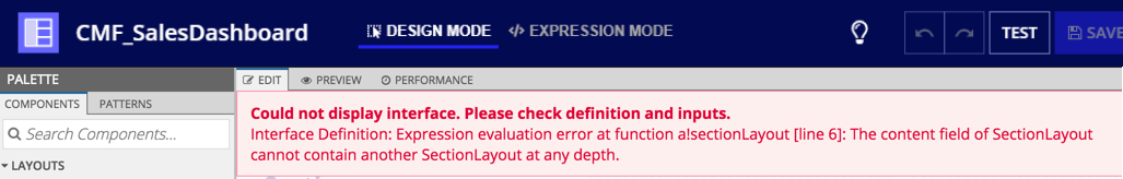
Fixing the issue is as easy as clicking the undo button or using the CTRL+Z keyboard shortcut.
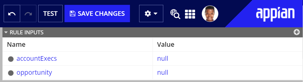
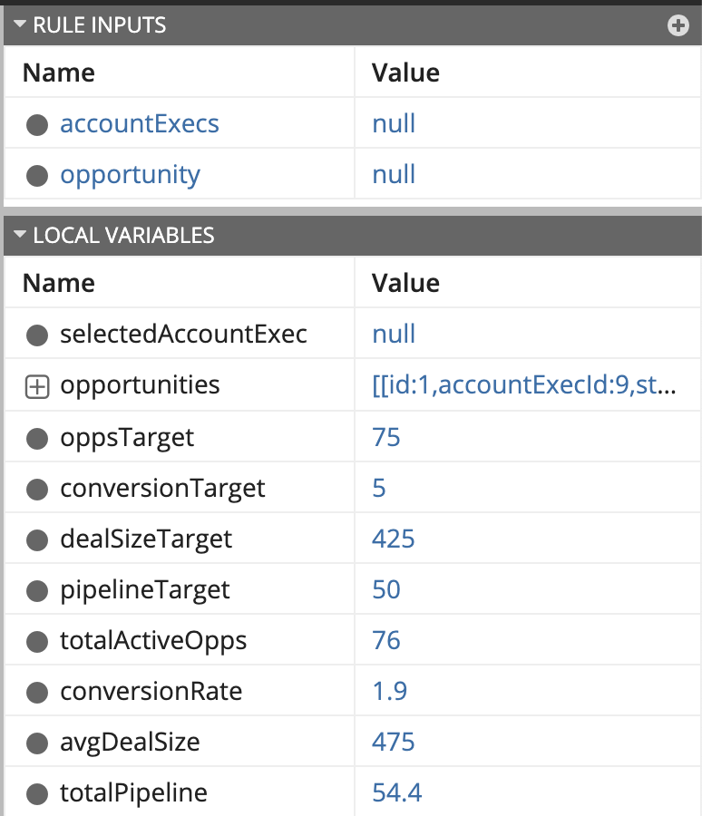
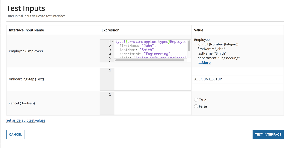
Before configuring the interface, it's important to know where we're getting or sending our data. The Rule Inputs pane allows us to define a variable for a specific data type and value and reference it in our expression.
Each rule input must have a name and data type. If the rule input has multiple values, select the Array (multiple values) checkbox.
For this interface, it is assumed that Appian is passing in a rule input to retrieve data. However, this can also be handled via local variables.
After creating some rule inputs, it's useful to set default test data. To get a more accurate representation of what our users will see, we can add test values to the interfaces by clicking the TEST button to open the Test Inputs dialog.
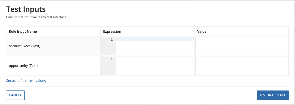
Tip: Click on the Set as default test values link in the test inputs dialog. That way the next time you open this interface, it will be pre-populated with data.
You may need to define a specific type of variable that is only available within a particular expression and function. Local variables allow you to define and store data for this specific use case. See Defining Local Variables for more examples.
All local variables defined using the a!localVariables function display in the Local Variables grid, which appears between the Rule Input pane and the Component Configuration pane. This grid displays both the name and the value of each local variable.
By default, all local variables are flattened in a list and ordered according to their definition in the expression rule. Similar to rule inputs, a local variable defined as a list, dictionary, or CDT is initially collapsed in the grid. You can click next to the variable name to expand the local variable and view the values.
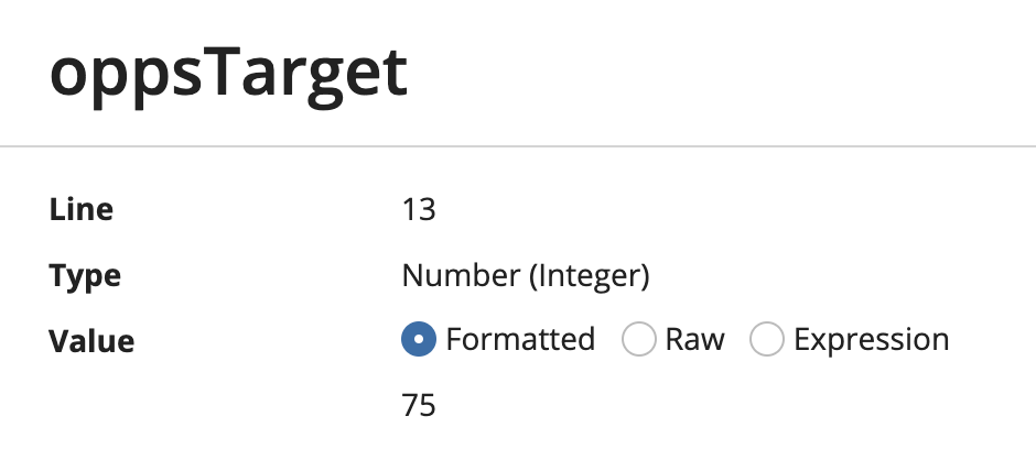
Additionally, each local variable value has a link that allows you to open a dialog, which provides more detail including the local variable name, the line number of the variable definition, the variable type, and the full variable value.
Now that we have some data to work with, we can start to configure our components.
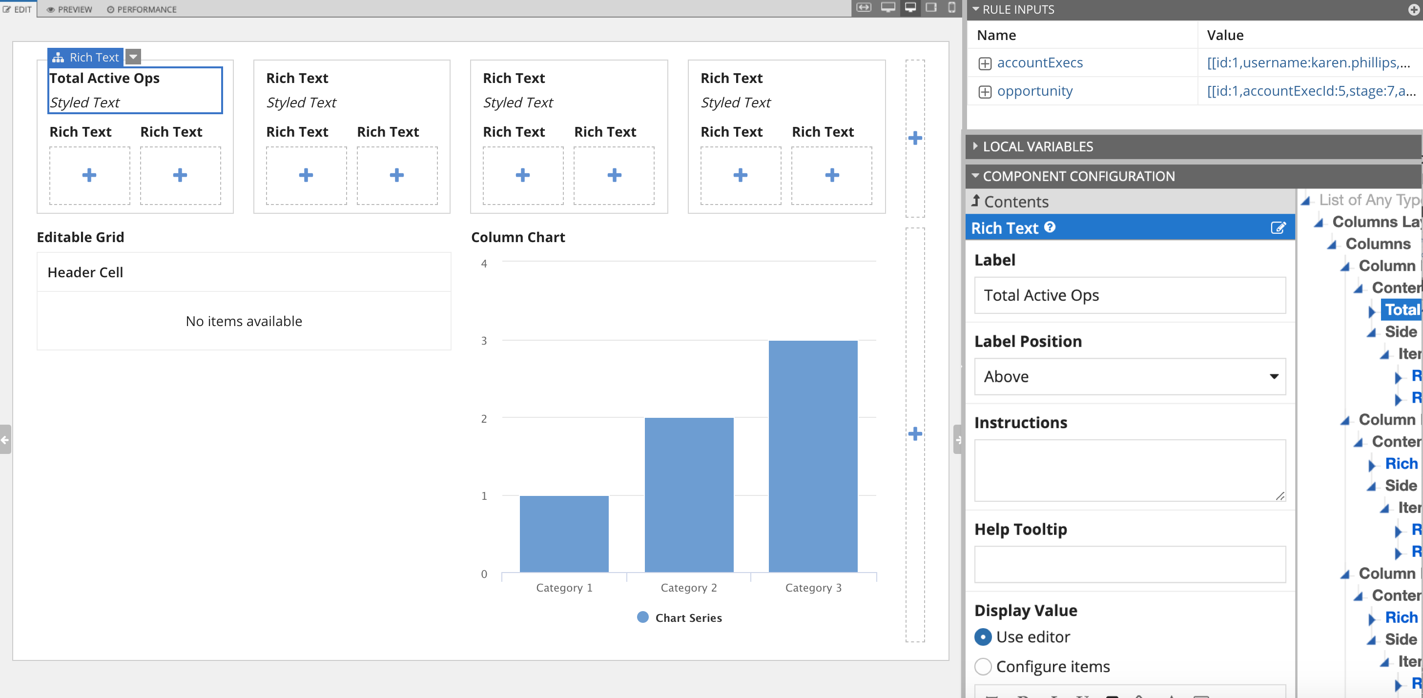
To configure an individual component, select the component in the live view. The component's properties then display for editing in the Component Configuration pane. For more information about configuring individual components, see Interface Components.
To select a component in the live view, hover over the component until pink highlighting appears around the component, then click the component. The selected component will then be highlighted in blue.
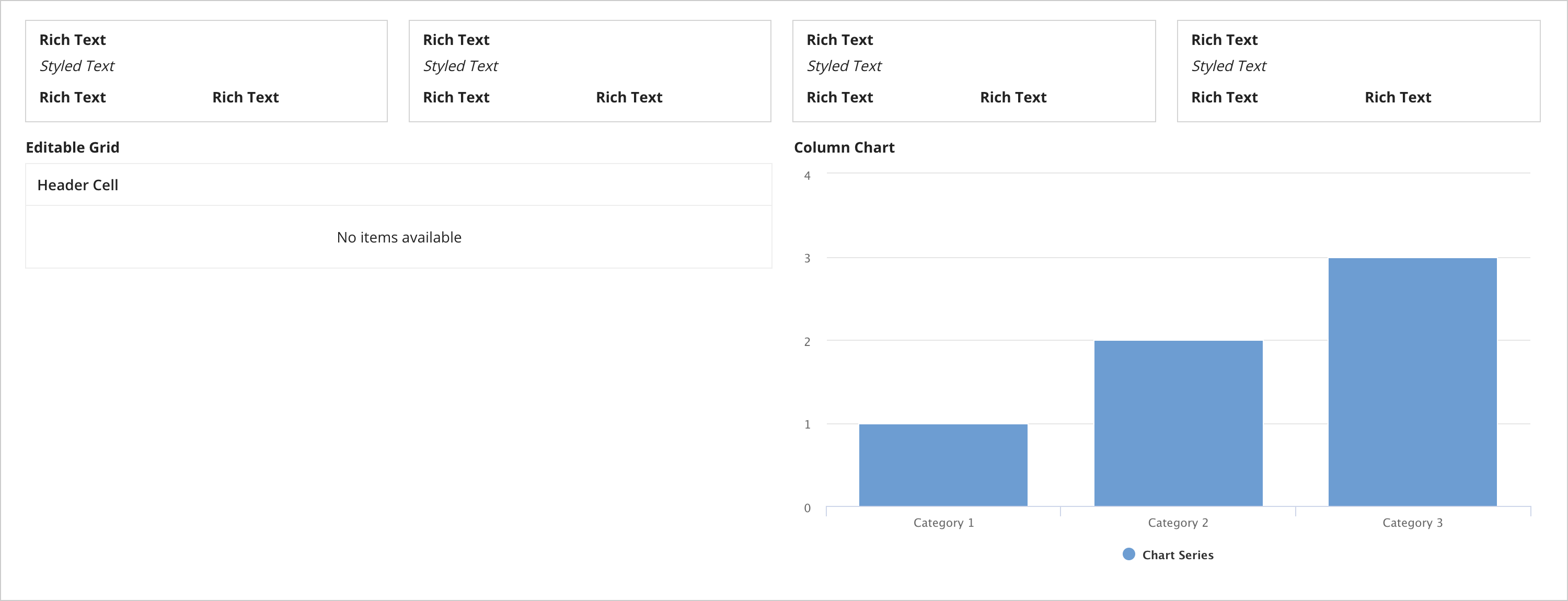
For example:
Tip: If you are working in a heavily nested set of components, it can sometimes be difficult to select the right one directly in the live view. Instead, hover over the selected component to reveal all of the components in that click area of the live view.
You'll notice that a label appears as part of the highlighting. This label identifies the component type. For example, in the image above, the highlight label reads Rich Text.
To quickly select the parent of the selected component, hover over the label until the parent label appears above it, then click the parent label.
You can also click the down arrow next to the label to access a context menu of actions:
Once you've configured all the components in your interface, your interface is ready to use with other objects in your application.
As you configure your interface, the interactive live view immediately updates, allowing you to test the dynamic behavior of its components. The current values of all rule inputs are displayed in the Rule Inputs pane and the current values of all local variables are displayed in the Local Variables pane, so you can see how the data changes as a result of an interaction in the live view. You can also simulate different scenarios using the Test button in the top right corner.
You can change any component label by clicking directly on it (while on the Edit tab of Design Mode). The value of other variables can be changed by interacting with the component in the live view that saves into that variable. However, you may wish to change the values of these variables outside of interactions with the live view. There are three ways to do this:
Note: Values of all local variables except those defined using "refreshAlways", "refreshInterval", or in a with() function are persisted across reevaluations in the live view just as they would be in Tempo. Therefore, if you change the default value for a local variable in your expression, you may need to click the Test button to see the updated changes.
Developers have an option to save a set of default test values with the interface. This allows you to save a common test scenario that can be used by any developer who modifies or tests the interface.
Test values may be expressions or literal values. All expression or text values have a 4,000 character limit. Additionally, the developer must have access to all selected users, groups, documents, or folders to save as a test value.
To save a set of default test values, enter the values in the Test Inputs dialog and click the Set as default test values link below the grid. Once set, the default values will be saved with the interface.
While the default live view displays your interface exactly as it would appear on a desktop web browser, you can also toggle between mobile views while editing in design or expression mode. To preview your interface on a tablet or phone, use the form factor preview options for those devices on the upper right of the Edit and Preview tabs (below the Save Changes button). You can drag and drop components directly into the phone and tablet views to see the changes to the interface as you make them.
Please note that while the tablet and phone options do show an accurate representation of the interface's layout, they do not show a pixel perfect (native) rendering of the individual components. For example, a dropdown menu in the live view will not have the same appearance as an iOS dropdown, but will have the same layout and stacking behavior, allowing you to create your interface for mobile use.
In general, most components behave exactly the same in the interface live view as they do on an interface in Tempo. However, there are a few exceptions listed below:
Default test values are always exported with the interface, but can only imported if the destination environment has the Allow Test Values to Be Imported with Design Objects setting enabled. For more about this configuration, see the Deployment section of the Admin Console page.
