OverviewCopy link to clipboard
This page explains how to build interfaces in design mode.
Design mode offers drag and drop functionality to accelerate the layout and configuration of an interface.
For information about editing interfaces as an expression, see the expression mode section of the Interfaces page.
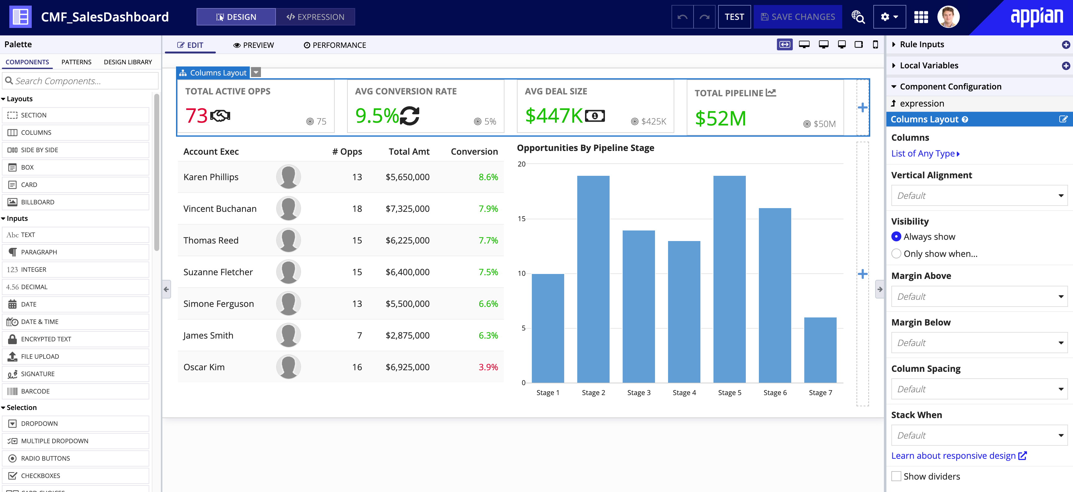
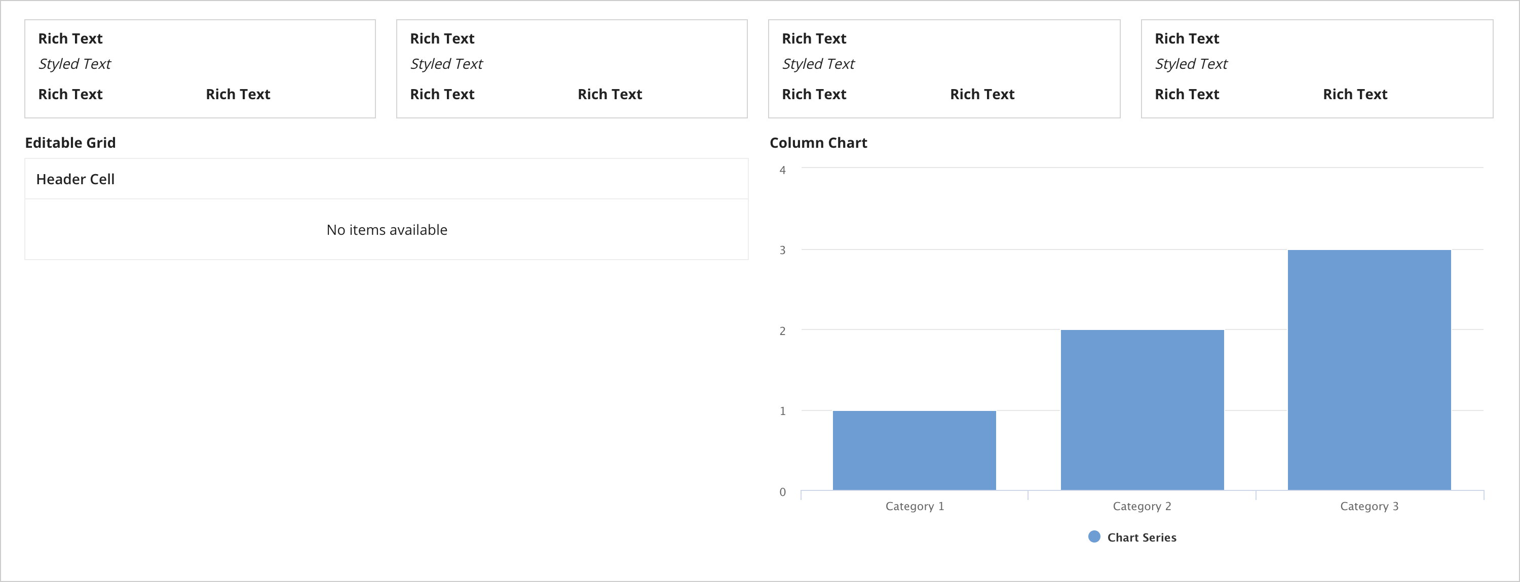
Tip: We will be recreating the Sales Team Dashboard example displayed when you first create the interface.
Design mode basicsCopy link to clipboard
Design mode is composed of three panels: the palette, the live view, and the configuration panel.
PaletteCopy link to clipboard
The palette is located on the left side of design mode.
The palette contains the primary elements you'll use to create interfaces:
-
Components: The fundamental building blocks of interfaces. Components are organized in the palette by component type. Learn more about components.
-
Patterns: Combinations of components that represent common interface features. Learn more about Patterns.
From the palette, you can drag and drop individual components and patterns into the live view. You can also preview and learn more about each component and pattern by hovering over them.
Learn more about using the palette.
Component plug-insCopy link to clipboard
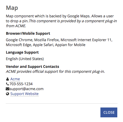
If there are any component plug-ins installed, they will appear at the bottom of the Components tab of the palette under Custom Components. Each custom component includes a link in the palette to view more information about the component vendor, whether the component is supported by the vendor, the support contacts, and the available languages and browsers/mobile clients. This information is also available in the component function documentation in expression mode.
PatternsCopy link to clipboard
Patterns are combinations of components that represent a typical design of component arrangement and appearance with UX best practices already accounted for. But they are more than just a pretty face! Patterns also come with handling for basic interactivity out of the box where applicable. As such, utilizing patterns can really accelerate the creation of rich interfaces.
Patterns use hard-coded data to showcase the component appearance and interactivity. To use a pattern in your interface, you'll need to replace the hard-coded data with data from your application. In each pattern, the underlying expression has helpful comments to guide you on which variables should be updated for customization. Learn how to adapt a pattern for your application.
Live viewCopy link to clipboard
The live view is the central panel in design mode.
This view contains three tabs:
-
EDIT: Represents your primary workspace for the interface. By default, this tab is active when you first open an interface object. The palette is only available when this tab is active.
-
PREVIEW: Allows you to see what the interface will look like when it's in use. The configuration panel is available when this tab is active.
Note: When you view your interface in the PREVIEW tab, the site navigation bar and branding configurations are not yet applied. Review the interface in the site to see these configurations applied.
-
PERFORMANCE: Provides a real-time report on the performance of the current configuration of the interface.
Configuration panelCopy link to clipboard
The configuration panel is on the right side of design mode.
When you view a new interface for the first time, the configuration panel displays a list of interface templates you can use to jumpstart your interface. Learn more about templates.
Once you've added components to interface, the configuration panel consists of the following panes:
Generate an interface from a PDF using Appian AI CopilotCopy link to clipboard
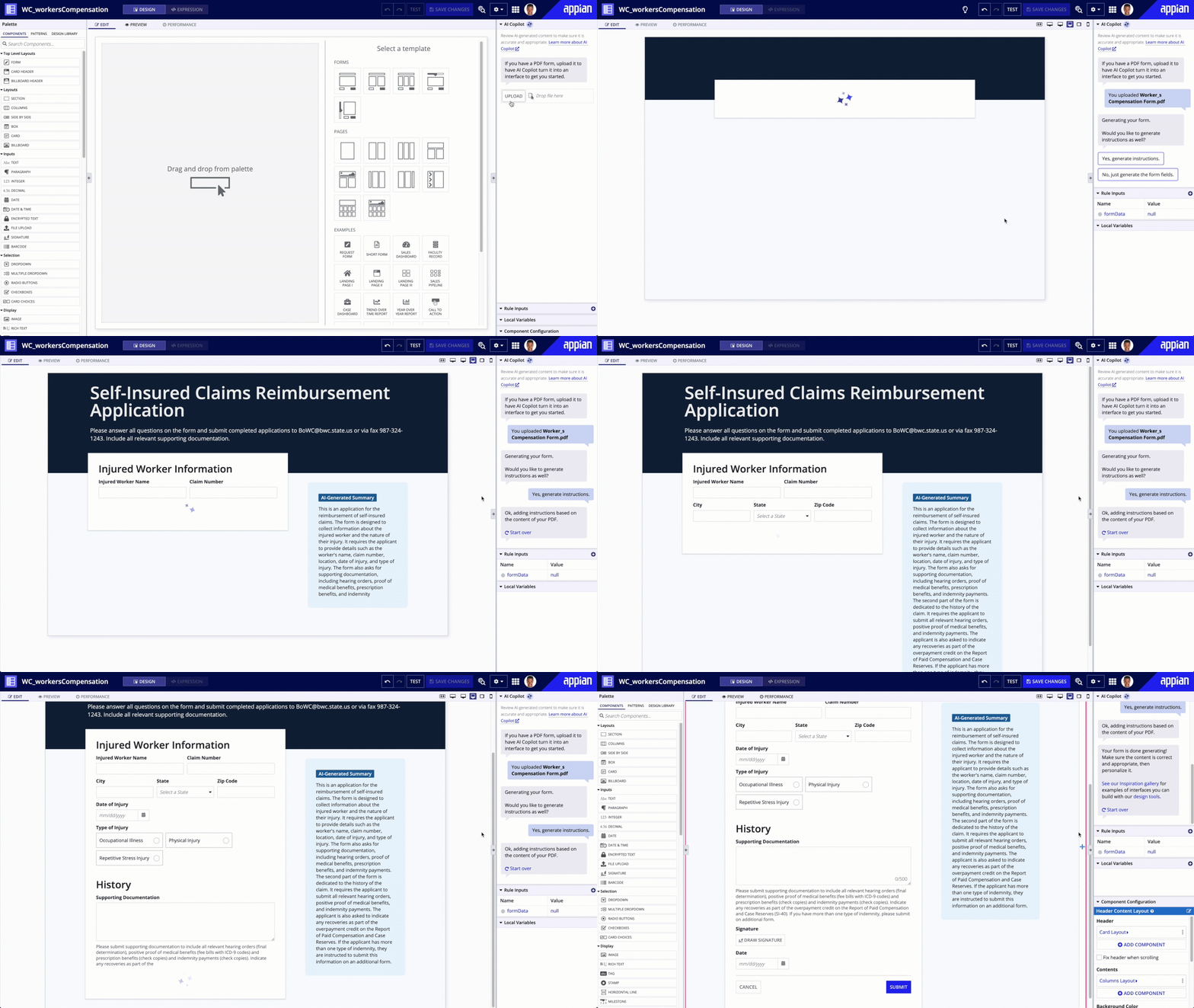
AI Copilot allows you to harness the power of generative AI to help you quickly build interfaces that provide a beautiful and effortless experience for your users. You can use AI Copilot to generate an interface directly from a PDF in just a few clicks.
Generating a beautiful form that users will love is as easy as 1, 2, 3:
- Upload a supported PDF.
- Click Yes if you want AI Copilot to generate instructions based on the content of your form, or No if you only need the form fields.
- Sit back, relax, and watch AI Copilot generate fields for your form and automatically map them to a rule input.
After the form is generated, you can take over. Verify that the generated content is correct and appropriate, then personalize it using our intuitive, low-code design tools.
Supported PDFsCopy link to clipboard
For the best results, the PDFs you upload should be forms that users can input text into.
Specifically, AI Copilot supports the following types of PDFs:
- Searchable PDF: Contains digital text data that can be highlighted, copied, searched, and accessed programmatically. This type of PDF has undergone previous processing or was saved from a word processor.
- Fillable PDF: Similar to a searchable PDF, this file allows the user to input and save additional information into form fields.
AI Copilot does not support:
- Flattened PDFs
- PDFs with forms that use XFA (XML Forms Architecture)
Support and compatibility considerationsCopy link to clipboard
This capability now uses private AI. For cloud customers in regions not supported by private AI, access to this capability may be limited unless cross-region configuration is enabled.
On June 6, 2025, Microsoft will end support for GPT-4, impacting Appian versions 23.3-24.3. Self-managed customers using these versions of Appian will lose access to the PDF to interface capability, which may result in errors if the capability remains active. To prevent issues, we recommend removing OpenAI credentials to disable and hide the capability when building interfaces.
Generate instructionsCopy link to clipboard
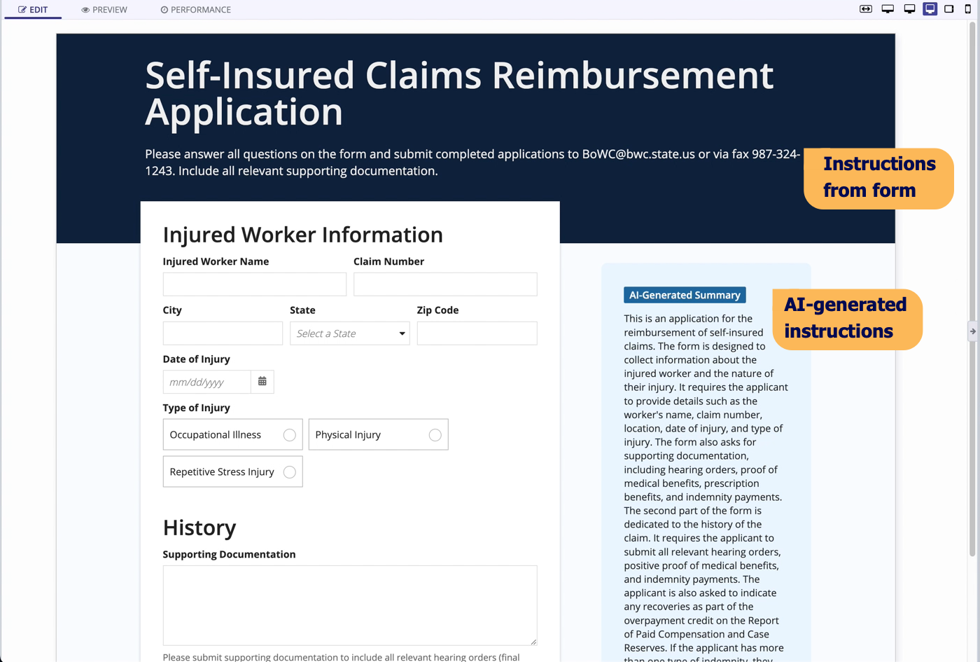
AI Copilot will ask if you want to generate instructions. If you click Yes, it generates instructions in a card next to the form fields. These instructions are based on the content of your form and generally include a summary of the form and instructions for how to fill out the form.
If your form has text that AI Copilot recognizes as instructions, it may add that text to the header of the form.
If you don't select Yes or No, instructions won't be generated. If you'd like to generate instructions after all, click Start over to upload your form again and select Yes the next time AI Copilot asks.
As always, be sure to review any AI-generated content to make sure it is accurate and appropriate.
TroubleshootingCopy link to clipboard
-
Why wasn't my entire form generated? Sometimes AI Copilot generates incorrect SAIL when it is generating a form. If this happens, it will stop generating, allowing you to take over. You can try to upload the same form again, but if it keeps having issues you may want to consider modifying the form or using a different one. If the PDF you upload is too large, AI Copilot will let you know that it couldn't generate the entire form.
-
Why am I getting an error that the file I uploaded can't be read? First, make sure your PDF is a supported type. Also, make sure the form is human readable. If a human can't read it, AI Copilot can't read it either. Sometimes, you'll see this error when a PDF isn't created correctly. For example, if a document is renamed using the .pdf extension, but it isn't saved as a PDF.
-
Why are some of the design capabilities disabled while the form is generating? When AI Copilot is generating your form, we disable some parts of the interface object, such as expression mode and the Preview and Performance tabs. This makes sure that AI Copilot isn't interrupted while it is generating the form. As soon as the form generation completes, the parts of the interface object that were disabled will be reenabled.
Using the paletteCopy link to clipboard
To get started creating an interface in design mode, start by adding a layout. Once you have a layout, add different interface components to make a beautiful, insightful user experience.
Layouts firstCopy link to clipboard
You can drag any component from the palette over to the EDIT tab of the live view, but typically you'll want to start your interface with a layout component.
Drag and drop is pretty straight forward. Let's go ahead and drag over a columns layout.
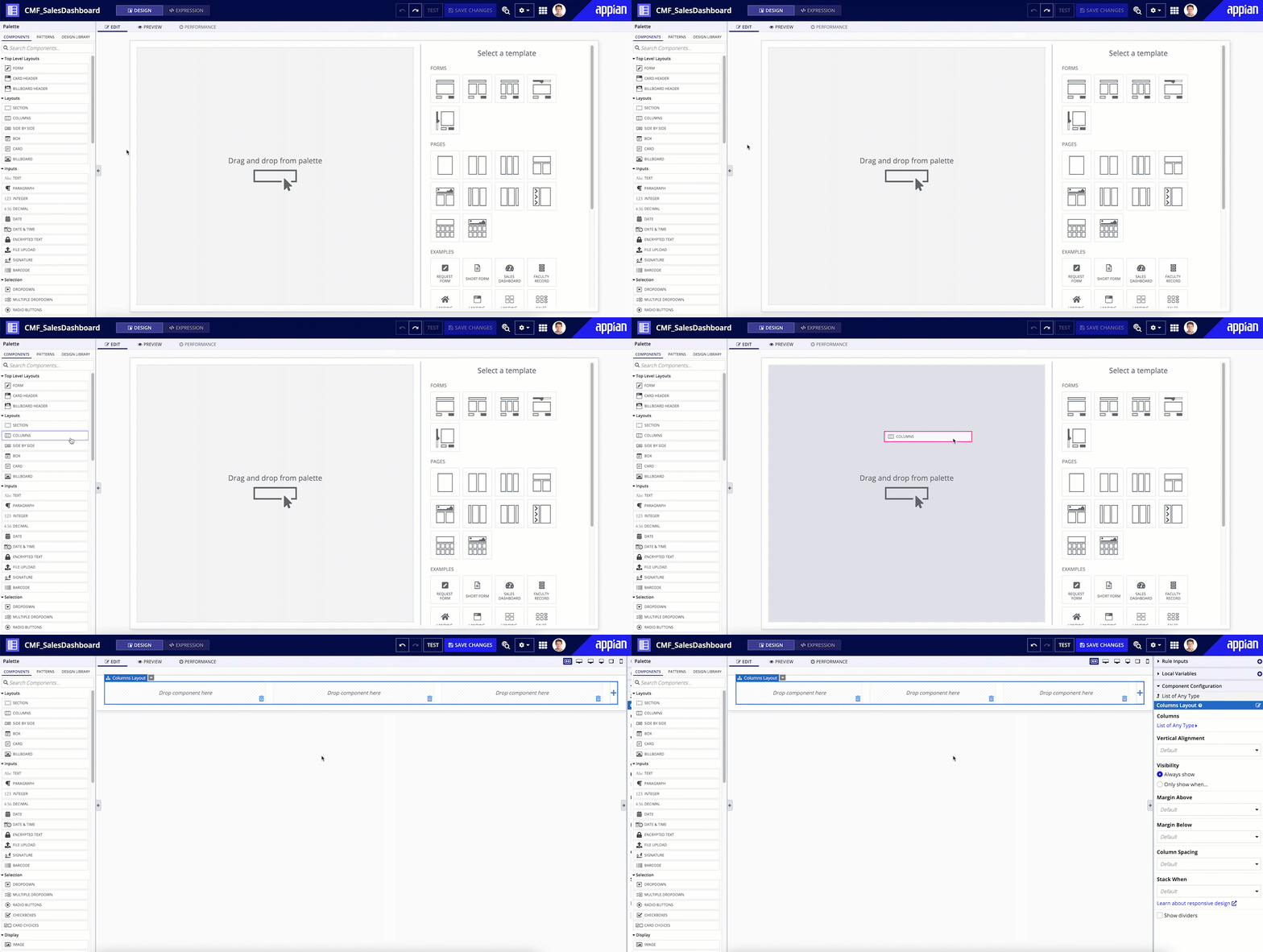
As soon as the columns layout is dragged over, notice that the live view changes with that layout.
Layout components appear with their own drag and drop areas where other components can be dropped.
Note: Safari users will need to drag components from their non-interactive areas. For example, you cannot drag from the input area of a text field.
Adding components to a layoutCopy link to clipboard
You've got your layout in place. Now it's time to fill that layout with useful components.
Drag and drop components from the palette to where you want them to appear in the EDIT tab of the live view. You can find out where the component will drop by where the pink highlight bar is located. The dotted gray outline and label tell you which area of the interface your component will drop into.

From here, we can continue to drag more components until we have the framework of our interface complete.
Tip: Duplicate is a very helpful feature when working if with interfaces. If you have a layout that requires the same or similar type of components, it's generally easier to create one set of components and duplicate as many as you need.
Handling errors with drag and dropCopy link to clipboard
Drag and drop is designed to let you know when an interface doesn't work out quite right. For example, certain components are not supported in the billboard layout. So if we accidentally dragged over a card choices component, the interface would let us know about it.

Fixing the issue is as easy as clicking the undo button or using the CTRL+Z keyboard shortcut.
Using the design libraryCopy link to clipboard
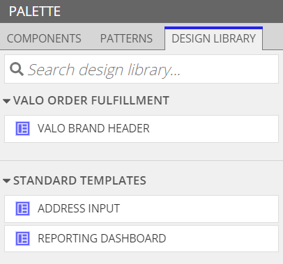
Once you've built some interfaces with your organization's design standards in mind, consider including interfaces in your design library. That way, you can easily govern interface design, promote best practices, and create a consistent user experience in every application. You can drag and drop an interface from the Design Library tab of the design mode palette into the live view while building and updating interfaces, just like any other component. Then, configure the rule inputs for the interface.
To include an interface in your design library, select Include in the design library when creating a new interface or in the properties of an existing interface. Interfaces in your design library are organized by application. You may find it helpful to create a dedicated application for some design library interfaces to keep your design library organized.
You must be a member of the Design Library Editors system group to include or exclude interfaces from your design library.
To learn more about using the design library, view the following video:
Passing data into child interfacesCopy link to clipboard
When you use a child interface with rule inputs inside a parent interface, such as a design library interface, you'll need to configure rule inputs in order to pass data back to the child interface.
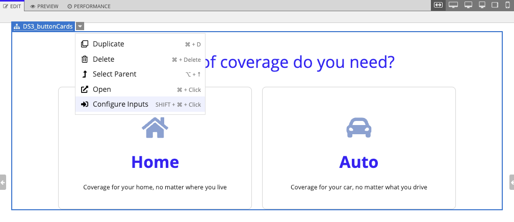
If you drag and drop a child interface in design mode, a Configure Inputs dialog appears. Use the Value column for each input to define the input type. You can also enter an input value. If you saved test values for the child interface, you can click LOAD DEFAULT TEST VALUES to load those values instead.
Check the Preview column to see a preview of the data that will be passed to the child interface for each rule input.
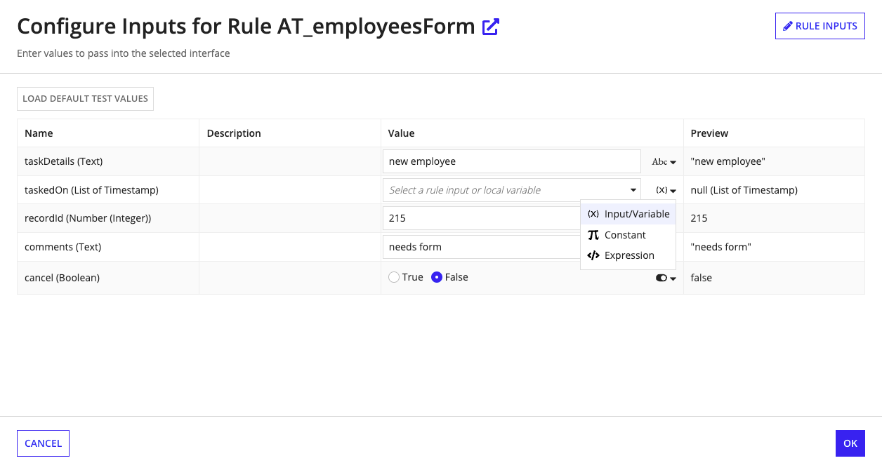
You can also configure inputs after adding a child interface. To do this, select the child interface in the live view so that the selected interface is highlighted in blue. Click the down arrow next to the label, then click Configure Inputs.
Defining rule inputsCopy link to clipboard
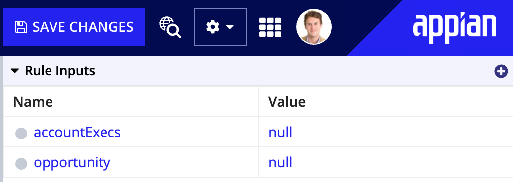
Before configuring the interface, it's important to know where we're getting or sending our data. The Rule Inputs pane allows us to define a variable for a specific data type and reference it in our expression.
Each rule input must have a name and data type. We can also add Descriptions to rule inputs to facilitate comprehension. If the rule input has multiple values, select the Array (multiple values) checkbox.
For the interface in the image below, it is assumed that Appian is passing in a rule input to retrieve data. However, this can also be handled with local variables.
Adding test valuesCopy link to clipboard
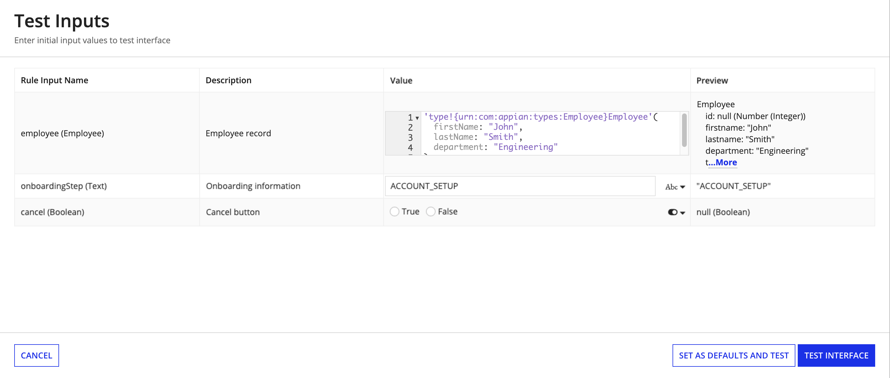
After creating some rule inputs, it's useful to set default test data. To get a more accurate representation of what our users will see, we can add test values to the interfaces by clicking the TEST button to open the Test Inputs dialog.

Tip: Click on the Set as default test values link in the test inputs dialog. That way the next time you open this interface, it will be pre-populated with data.
Defining local variablesCopy link to clipboard
You may need to define a specific type of variable that is only available within a particular expression and function. Local variables allow you to define and store data for this specific use case. To avoid confusion, we recommend giving each local variable in your interface a unique name. See Defining Local Variables for examples.
The Local Variables grid displays local variables defined in your interface, except for any local variables defined in looping functions like a!forEach(). The Local Variables grid appears between the Rule Input pane and the Component Configuration pane. This grid displays both the name and the value of each local variable. You can click + in the grid header to create a new local variable from design mode.

By default, all local variables are flattened in a list and ordered according to their definition in the expression rule. Similar to rule inputs, a local variable defined as a list, dictionary, or CDT is initially collapsed in the grid. You can click next to the variable name to expand the local variable and view the values.
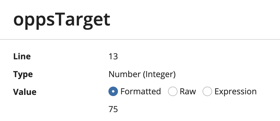
Click the link in the Name column to rename a local variable, which also updates any references to that variable. Click the link in the Value column to open a dialog with more details, including the local variable name, the line number of the variable definition, the variable type, and the full variable value.
Note: Local variables defined in looping functions like a!forEach() won't appear in the Local Variables grid, but could be renamed if they have the same name as a local variable that you rename from the Local Variables grid in design mode. This might cause you to update some local variable names unintentionally. As a best practice, give each local variable in the interface a unique name. If you have any local variables defined in a looping function that have the same name as a local variable defined in an a!localVariables() function, you might want to use expression mode to rename the local variable in the looping function first.
Component configurationCopy link to clipboard
Now that we have some data to work with, we can start to configure our components.
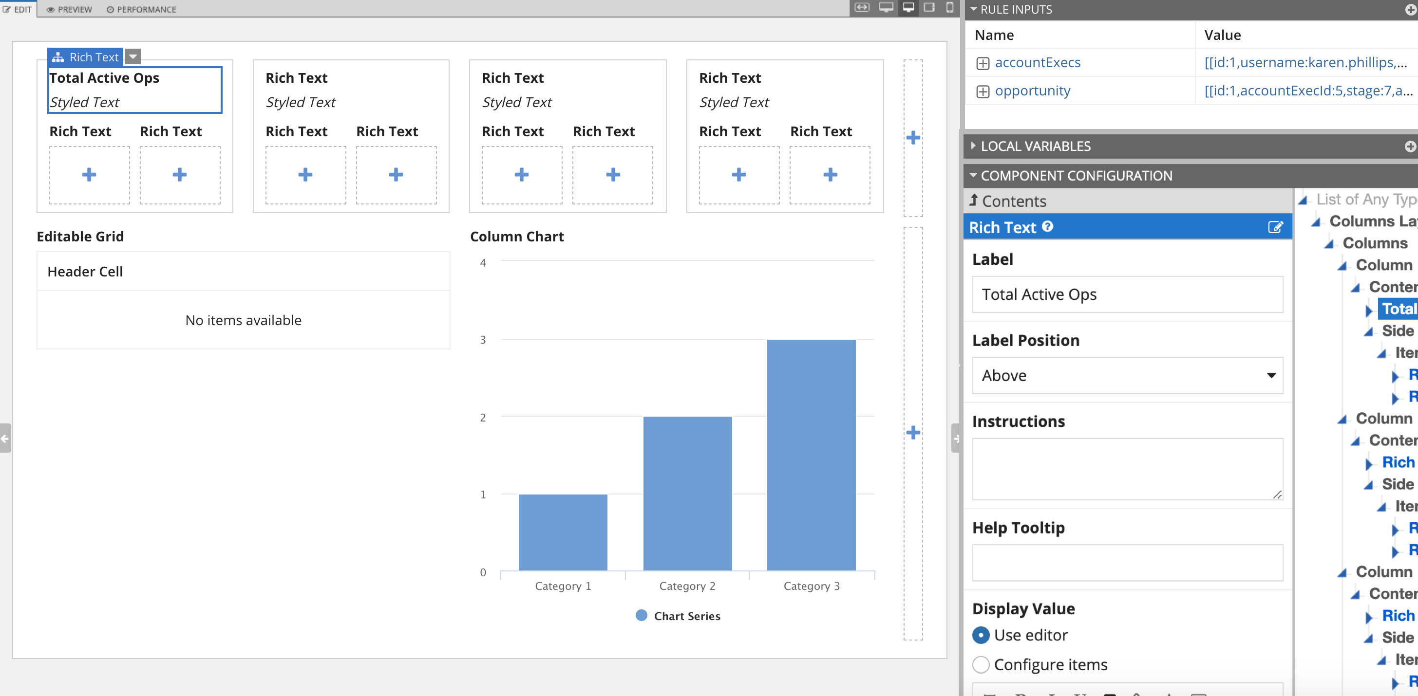
To configure an individual component, select the component in the live view. To do this, hover the component until pink highlighting appears, then click the component.
The selected component will be highlighted in blue and the component's properties will display for editing in the Component Configuration pane. A label that identifies the component type will also appear as part of the highlighting. For example, in the following image, the highlight label reads Rich Text.
Tip: If you are working in a heavily nested set of components, it can sometimes be difficult to select the right one directly in the live view. Instead, hover over the selected component to reveal all of the components in that click area of the live view.
In addition to the Component Configuration pane, you can also edit existing field labels and instructions directly in the live view.
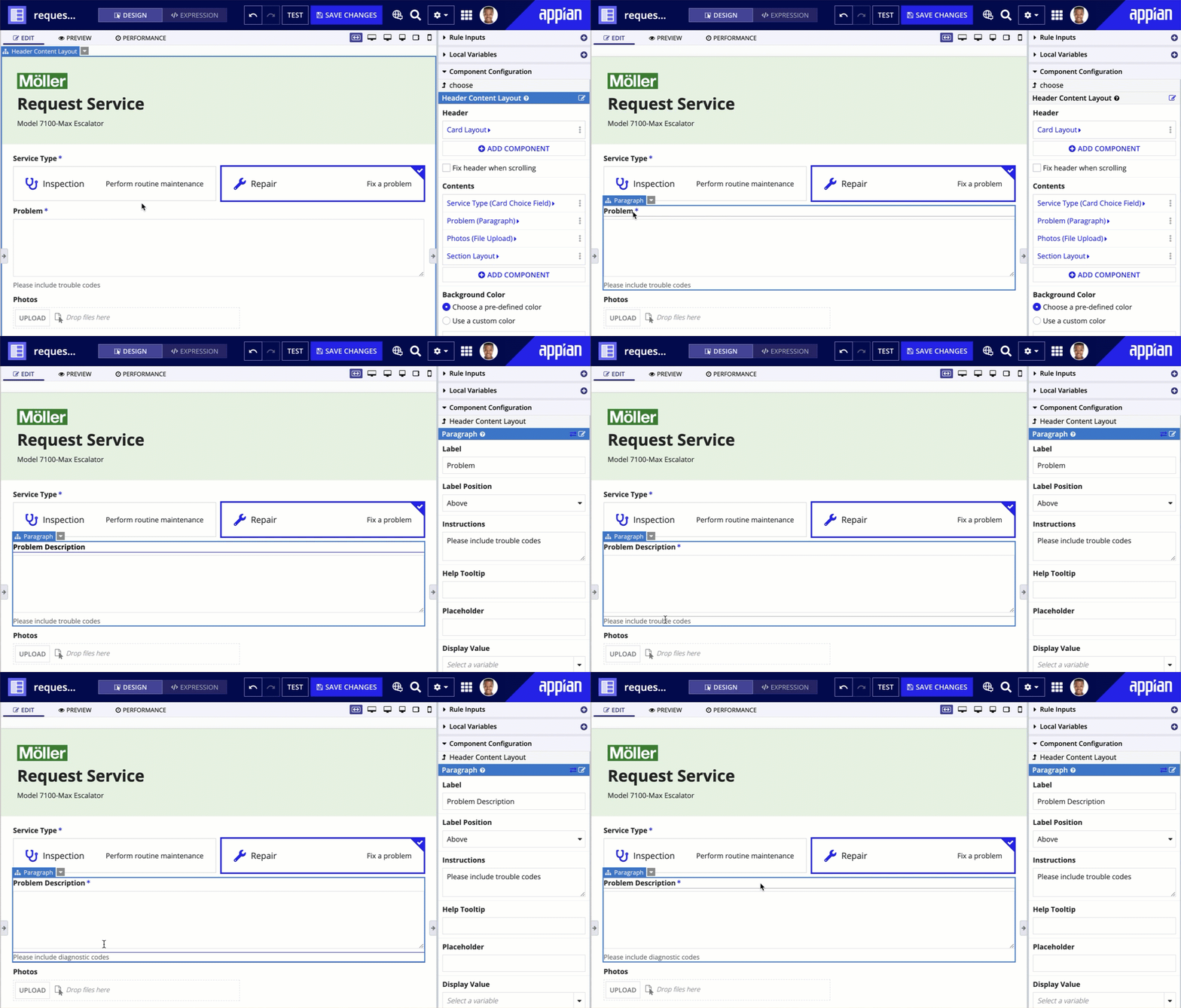
To quickly select the parent of the selected component, hover over the label until the parent label appears above it, then click the parent label.
You can also click the down arrow next to the label to access a context menu of actions:
- Duplicate: Copy the selected component and insert it above the original component.
- Delete: Remove the selected component from the interface.
- Select Parent: Selects the parent component, instead of the original child component.
- Open: Opens the component in a new tab.
- Configure Inputs: Change the value of rule inputs being passed to a referenced interface or expression rule.
Once you've configured all the components in your interface, your interface is ready to use with other objects in your application.
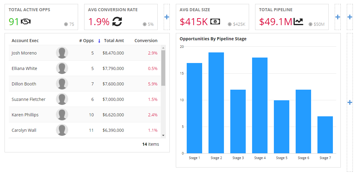
For more information about configuring individual components, see Interface Components.
Testing and troubleshootingCopy link to clipboard
As you configure your interface, the interactive live view immediately updates, allowing you to test the dynamic behavior of its components. The current values of all rule inputs are displayed in the Rule Inputs pane and the current values of all local variables are displayed in the Local Variables pane, so you can see how the data changes as a result of an interaction in the live view. You can also simulate different scenarios using the Test button in the top right corner.
Change the value of a variableCopy link to clipboard
You can change any component label by clicking directly on it (while on the Edit tab of Design mode). The value of other variables can be changed by interacting with the component in the live view that saves into that variable. However, you may wish to change the values of these variables outside of interactions with the live view. There are three ways to do this:
- Change input values individually (including indexes of an array and CDT fields) by editing the value in the Interface Inputs pane.
- Reset local variables to their initial values as defined in the expression by clicking the Test button in the top right corner.
- Set the default values of inputs to simulate the user loading the form for the first time. To do this:
- Click the Test button in the top right corner.
- Enter default values for inputs in the Test Inputs dialog, as shown below.
- As you enter an expression for an input, the Value column displays the evaluated result that will be used when testing the expression.
- For many types, you can simply enter a value directly in the Value column.
- Click the Test Interface button to evaluate the interface using the provided values.
Note: Values of all local variables except those defined using "refreshAlways", "refreshInterval", or in a with() function are persisted across reevaluations in the live view just as they would be in Tempo. Therefore, if you change the default value for a local variable in your expression, you may need to click the Test button to see the updated changes.
Save default test valuesCopy link to clipboard
Developers have an option to save a set of default test values with the interface. This allows you to save a common test scenario that can be used by any developer who modifies or tests the interface.
Test values may be expressions or literal values. All expression or text values have a 4,000 character limit. Additionally, the developer must have access to all selected users, groups, documents, or folders to save as a test value.
To save a set of default test values, enter the values in the Test Inputs dialog and click the Set as default test values link below the grid. Once set, the default values will be saved with the interface.
Previewing interfaces for mobileCopy link to clipboard
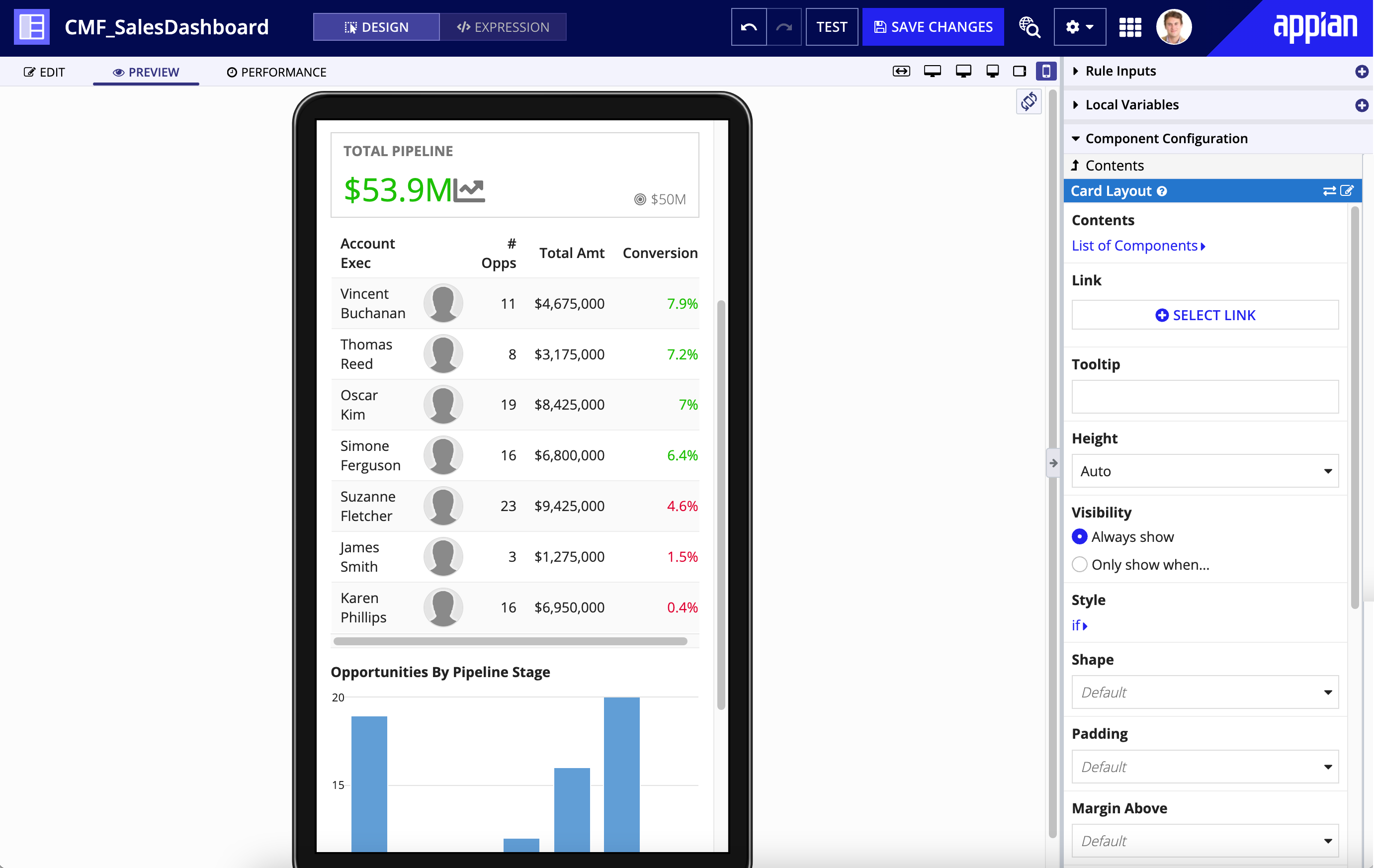
While the default live view displays your interface exactly as it would appear on a desktop web browser, you can also toggle between mobile views while editing in design or expression mode. To preview your interface on a tablet or phone, use the form factor preview options for those devices on the upper right of the Edit and Preview tabs (below the Save Changes button). You can drag and drop components directly into the phone and tablet views to see the changes to the interface as you make them.
Please note that while the tablet and phone options do show an accurate representation of the interface's layout, they do not show a pixel perfect (native) rendering of the individual components. For example, a dropdown menu in the live view will not have the same appearance as an iOS dropdown, but will have the same layout and stacking behavior, allowing you to create your interface for mobile use.
Differences between the live view and TempoCopy link to clipboard
In general, most components behave exactly the same in the interface live view as they do on an interface in Tempo. However, there are a few exceptions listed below:
- Links to internal objects, such as process tasks or record types, open in the same tab by default when clicked in an interface in Tempo, but open in a new tab when clicked in the live view.
- The Submit button on a process form submits the form and navigates away from the form (either by going to the next task in an activity chain or by going back to the Task or Action list) when clicked in an interface in Tempo, but does not navigate away when clicked in the live view. All other behavior of the Submit button is the same.
Exporting and importing default test valuesCopy link to clipboard
Default test values are always exported with the interface, but can only imported if the destination environment has the Allow Test Values to Be Imported with Design Objects setting enabled. For more about this configuration, see the Deployment section of the Admin Console page.

