IntroductionCopy link to clipboard
Color schemes allow you to create a polished and professional experience across your site while adhering to your company's branding. You can apply the same color scheme to your site branding, as well as the cards and header content layouts in the interfaces used for your site pages. This gives your site a consistent style and user experience.
This page will:
- Provide guidance on using dark and custom color schemes consistently throughout your site.
- Provide examples and hex codes for each dark color scheme.
- Provide links to extensive information and guidance on using dark color schemes.
Using color schemesCopy link to clipboard
When creating your site, you can choose from our selection of dark color schemes or you can create your own custom color scheme. To create a consistent style for your users, use the same color scheme that you select for your site branding across all user interfaces in your site.
Creating a consistent dark color schemeCopy link to clipboard
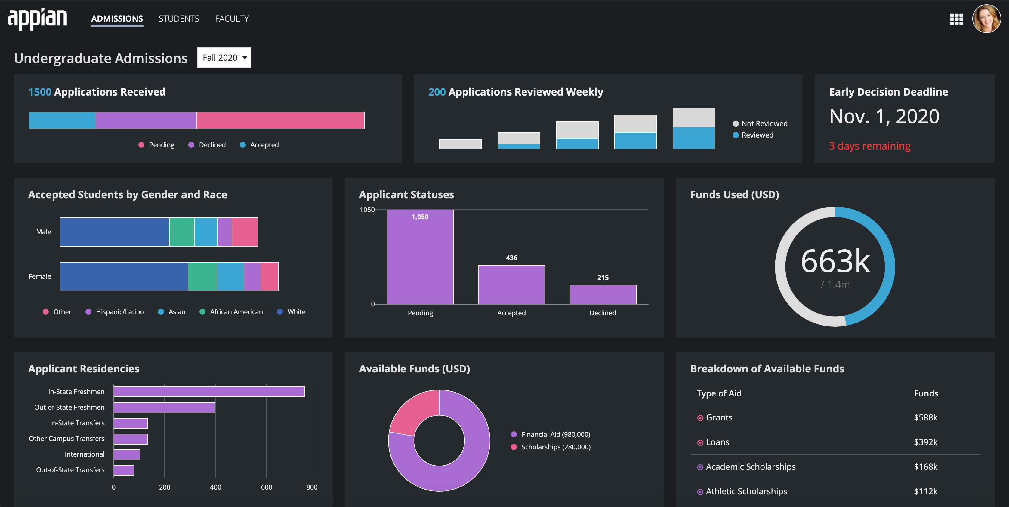
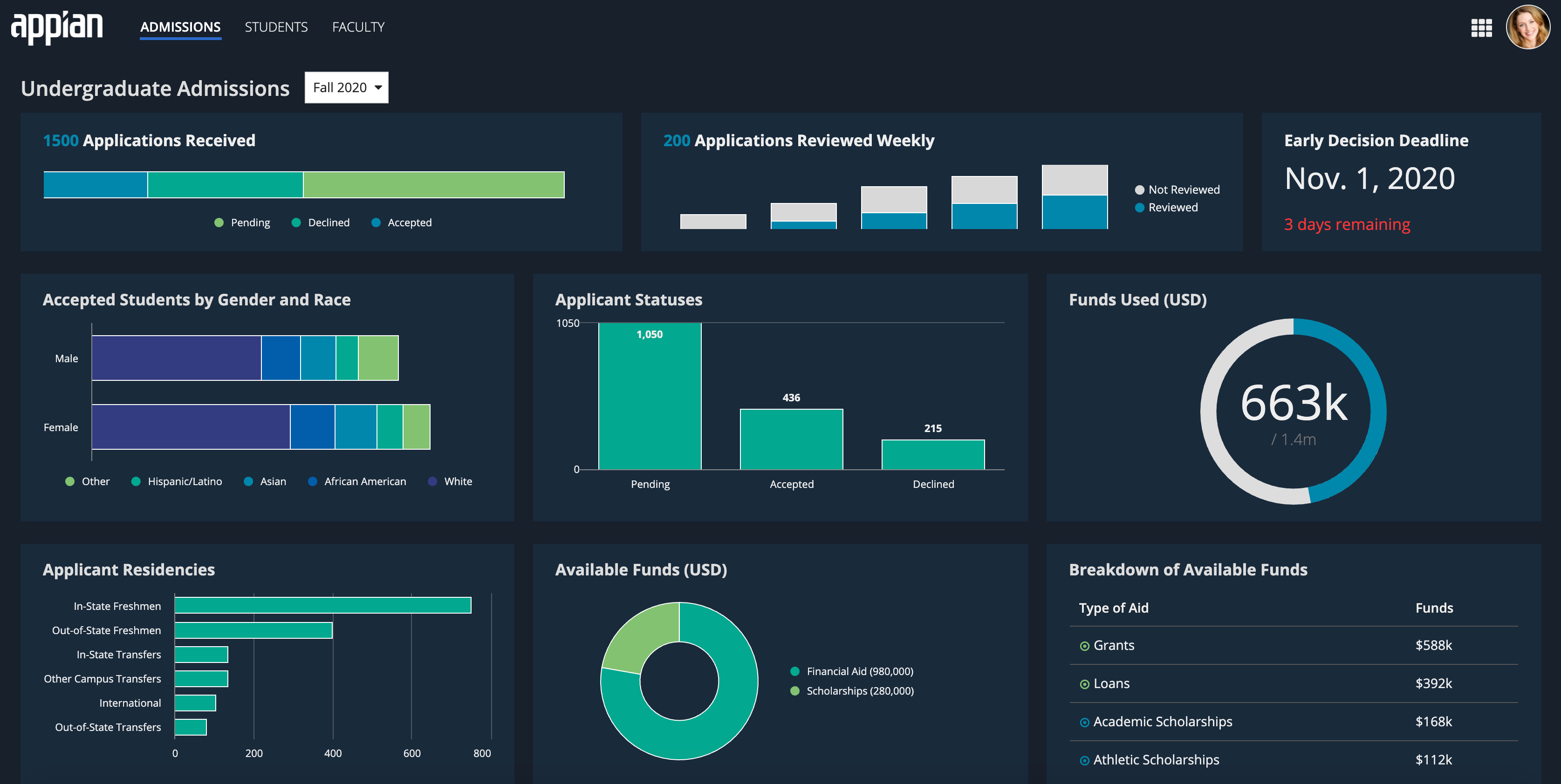
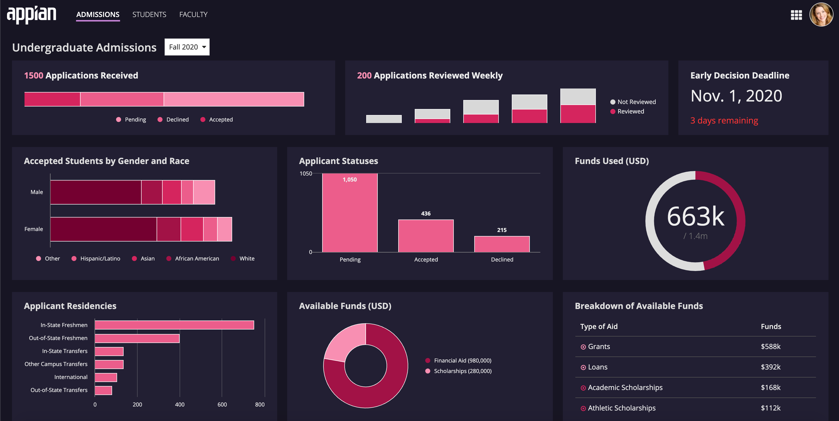
There are three dark color schemes to choose from for your sites and interfaces: Charcoal, Navy, and Plum.
Only use dark color schemes when you can apply the scheme to all of your site pages. Do not create sites with a mix of dark and non-dark color scheme pages. Dark color schemes shouldn't be applied to pages used on Tempo or across multiple sites with different color schemes.
To use a dark color scheme consistently across your site:
- In your site object, go to the Branding section.
- Under Try a Dark Color Scheme, select a dark color scheme.
- In the interfaces for your site pages, use a header content layout.
- Select your chosen dark color scheme as the value for the header content layout's backgroundColor parameter.
- If you're using a card header in your header content layout, enter the site header bar's hex code as the value of the card header's style parameter.
- For more information, see our Header Content Layout color scheme guidance.
- Place the interface's content in cards.
- Select your chosen dark color scheme as the value for the card layout's style parameter.
Creating a consistent custom color schemeCopy link to clipboard
Alternatively, you can create a custom color scheme to match your company branding. To create a custom color scheme, you will need to choose a set of site branding colors. These include your header bar color, selected highlight color, accent color, and loading bar color. Once you've selected the color scheme for your site, use them consistently across all interfaces and site pages for a cohesive and professional look.
For more information on custom color schemes for sites and header content layouts, see our header content layout design guidance.
Dark color schemes detailsCopy link to clipboard
For each dark color scheme, we've provided an example of the scheme used in a site dashboard and the list of hex codes for the color scheme.
The hex codes correspond to the site's header bar color, selected highlight color, accent color, and loading bar color. For more information on configuring these site branding colors, see Designing Sites and Portals.
CHARCOALCopy link to clipboard

Charcoal hex codesCopy link to clipboard

- Header bar color:
"#1a1e21" - Selected highlight color in the Helium style:
"#242a2d" - Selected highlight color in the Mercury style:
"#99a8c5" - Accent color & loading bar color:
"#69afdc"
NAVYCopy link to clipboard

Navy hex codesCopy link to clipboard

- Header bar color:
"#17202b" - Selected highlight color in the Helium style:
"#1a2a3c" - Selected highlight color in the Mercury style:
"#2c6acc" - Accent color & loading bar color:
"#69afdc"
PLUMCopy link to clipboard

Plum hex codesCopy link to clipboard

- Header bar color:
"#171523" - Selected highlight color in the Helium style:
"#232131" - Selected highlight color in the Mercury style:
"#CD482D5" - Accent color & loading bar color:
"#b388f4"
Further guidanceCopy link to clipboard
We have extensive color scheme design and style guidance for sites, header content layouts, and cards in our documentation. The following links provide in depth guidance on each topic.
Site linksCopy link to clipboard
- Sites design guidance: Dark color schemes: Guidance on site branding and dark color schemes.
- Site Object: Using predefined dark color schemes: Guidance on site object configuration and color scheme design considerations.
- Using Colors: Site branding: Guidance on selecting a dark color scheme for a site.
Header content layout component linksCopy link to clipboard
- Using Colors: Header content layout: Guidance and examples for using dark color schemes in header content layouts.
- Header Content Layout: Using the backgroundColor parameter: Design considerations for using background colors with header content layouts.
- Header Content Layout design guidance: Color schemes: Guidance on using dark color schemes with header content layouts and card headers.
