FunctionCopy link to clipboard
Displays an arrangement of cards, with the same width and height. The Card Group Layout component allows you to easily create consistent and responsive sets of cards, regardless of the card content, making your overall UI look more balanced and dynamic.
See also: Card Layout
ParametersCopy link to clipboard
| Name | Keyword | Types | Description |
|---|---|---|---|
|
Label |
|
Text |
Text to display as the field label. |
|
Label Position |
|
Text |
Determines where the label appears. Valid values: |
|
Help Tooltip |
|
Text |
Displays a help icon with the specified text as a tooltip. The help icon does not show when the label position is |
|
Cards |
|
Any Type |
Cards to display using |
|
Card Spacing |
|
Text |
Determines the space between the cards. Valid values: |
|
Card Width |
|
Text |
Determines the width of the cards in the layout. Valid values are: |
|
Fill Container |
|
Boolean |
When set to |
|
Card Height |
|
Text |
Determines the height of the cards in the layout. Valid values: |
|
Visibility |
|
Text |
Determines whether the layout is displayed on the interface. When set to |
|
Margin Above |
|
Text |
Determines how much space is added above the layout. Valid values: |
|
Margin Below |
|
Text |
Determines how much space is added below the layout. Valid values: |
Usage considerationsCopy link to clipboard
Card group layout ordering in LTR and RTL languagesCopy link to clipboard
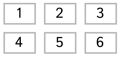
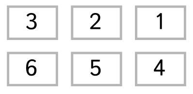
- The Card group layout component has the ability to maintain alignment for groups with variable number of cards, following a logical reading order that goes from left to right or right to left depending on your language and locale settings. For example, a group of cards numbered 1-6 and split into two rows might look like the following:
-
In LTR locales, cards 1, 2, and 3 would be in the first row, in that order (read left to right), with the second row consisting of cards 4, 5, and 6 in that order.

-
In RTL locales, cards 3, 2, and 1 would be in the first row, in that order (read left to right), with the second row consisting of cards 6, 5, and 4 in that order.

-
ExamplesCopy link to clipboard
Use the interactive editor below to test out your code.
Card group layout with only icons and textCopy link to clipboard
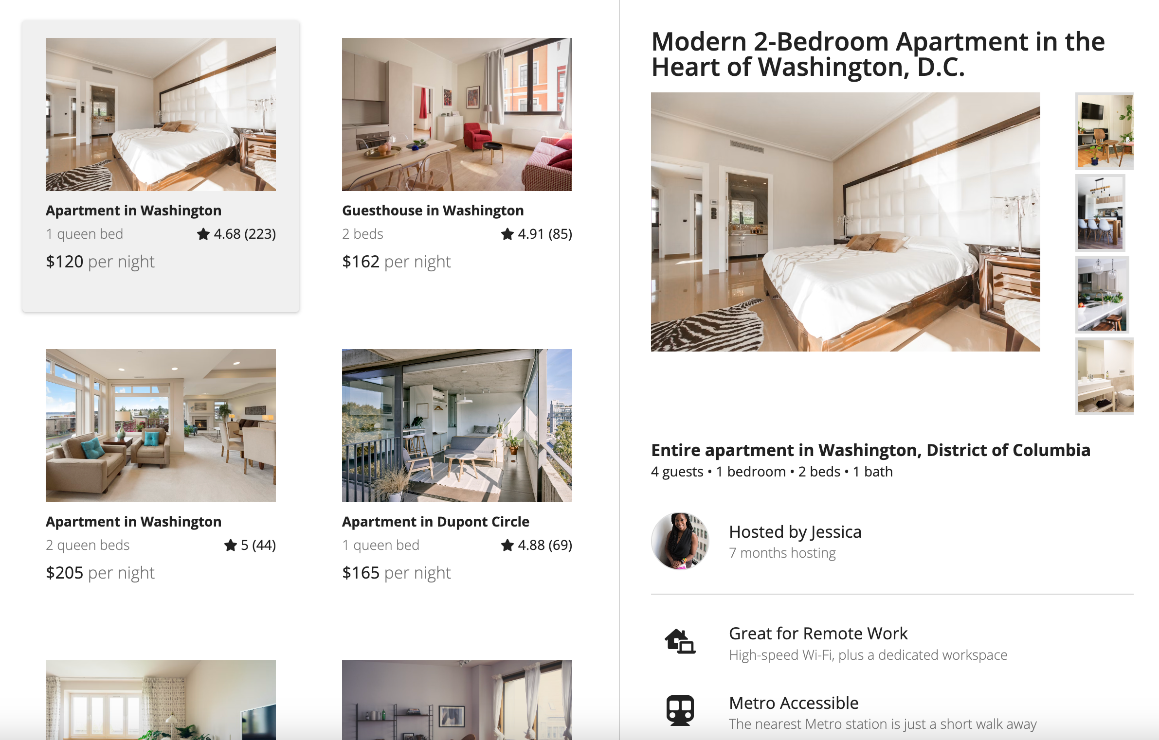
Card group layout with images, icons, and textCopy link to clipboard
The screenshot below shows how the example is displayed at full width.

Example expression
Feature compatibilityCopy link to clipboard
The table below lists this component's compatibility with various features in Appian.
| Feature | Compatibility | Note |
|---|---|---|
| Portals | Compatible | |
| Offline Mobile | Compatible | |
| Sync-Time Custom Record Fields | Incompatible | |
| Real-Time Custom Record Fields | Incompatible | Custom record fields that evaluate in real time must be configured using one or more Custom Field functions. |
| Process Reports | Incompatible | Cannot be used to configure a process report. |
| Process Events | Incompatible | Cannot be used to configure a process event node, such as a start event or timer event. |
| Process Autoscaling | Compatible |
