| SAIL Design System guidance available for Pane Layout
When users need to scroll through information but also leave part of the interface static, use the pane layout. Learn how to use two- and three-pane layouts to build flexible interfaces with greater user control. |
FunctionCopy link to clipboard
a!pane( contents, width, backgroundColor, showWhen, padding, accessibilityText )
Displays a pane within a pane layout.
See also:
ParametersCopy link to clipboard
| Name | Keyword | Types | Description |
|---|---|---|---|
|
Contents |
|
Any Type |
Components and layouts to display within the pane. |
|
Width |
|
Text |
Determines the width of the pane. Valid values: "AUTO" (default), "EXTRA_NARROW", "NARROW", "NARROW_PLUS", "MEDIUM", "MEDIUM_PLUS", "WIDE", "WIDE_PLUS". |
|
Background color |
|
Text |
Color to show behind the contents of the pane. Valid values: Any valid hex color or |
|
Visibility |
|
Boolean |
Determines whether the component is displayed on the interface. When set to false, the component is hidden and is not evaluated. Default: true. |
|
Padding |
|
Text |
Determines the space between the pane's edges and its contents. Valid values: |
|
Accessibility Text |
|
Text |
Additional text to be announced by screen readers. Used only for accessibility; produces no visible change. |
Usage considerationsCopy link to clipboard
Using the accessibilityText parameterCopy link to clipboard
Each pane must include a unique accessibilityText value. Panes are a top-level navigation item, so this text ensures users who rely on screen readers can accurately and more easily navigate a page with panes.
The text should briefly indicate what type of content is contained in the pane. For example, you might use AI options for a pane that lets users select from a list of available language models, or you could use Create solicitation to describe a pane containing fields needed for a new solicitation.
Do not include the following terms in the text: main, navigation, section, form, search, header, footer, article or region. These terms are common elements of web pages in general, and they should be avoided in favor of descriptors that apply specifically to the pane component.
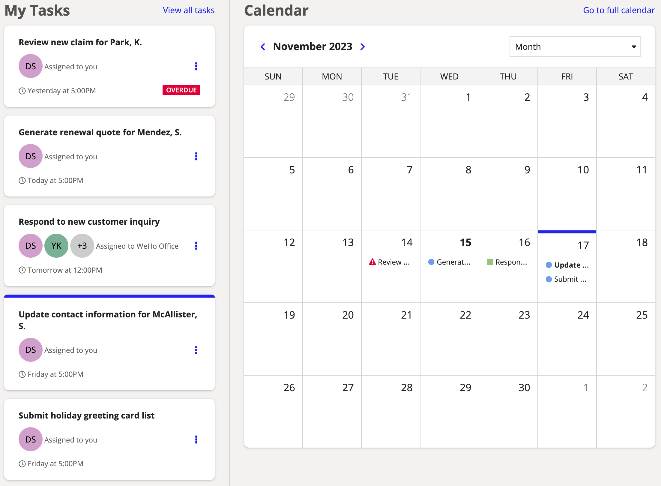
For example, say you have a pane that contains a list of cards defined as links. When a card is clicked, the corresponding calendar item is highlighted.
This lets the user navigate through their tasks, but you should say what is being navigated without using the term navigation. A description like Tasks needing attention tells users what the pane contains without mentioning that it is a navigation item.
Panes on Appian MobileCopy link to clipboard
Panes have different behavior when the interface is viewed in the Appian Mobile app. Panes are converted to columns, so the contents cannot be scrolled independently. Larger devices like tablets will display the columns side by side, while phones and other smaller devices will show the panes as stacked columns. This may result in very long pages depending on a pane's contents.
Note: Panes are not converted for mobile browsers. Users viewing the paned interface this way will have a similar experience to those using a desktop browser. See Adjusting for different screen sizes to learn how to adapt the layout for smaller screens.
ExamplesCopy link to clipboard
See the pane layout design guidance for information about setting widths, background colors, and padding.
Feature compatibilityCopy link to clipboard
The table below lists this component's compatibility with various features in Appian.
| Feature | Compatibility | Note |
|---|---|---|
| Portals | Compatible | |
| Offline Mobile | Compatible | |
| Sync-Time Custom Record Fields | Incompatible | |
| Real-Time Custom Record Fields | Incompatible | Custom record fields that evaluate in real time must be configured using one or more Custom Field functions. |
| Process Reports | Incompatible | Cannot be used to configure a process report. |
| Process Events | Incompatible | Cannot be used to configure a process event node, such as a start event or timer event. |
| Process Autoscaling | Compatible |


