Tip: Interface patterns give you an opportunity to explore different interface designs. Be sure to check out How to Adapt a Pattern for Your Application.
GoalCopy link to clipboard
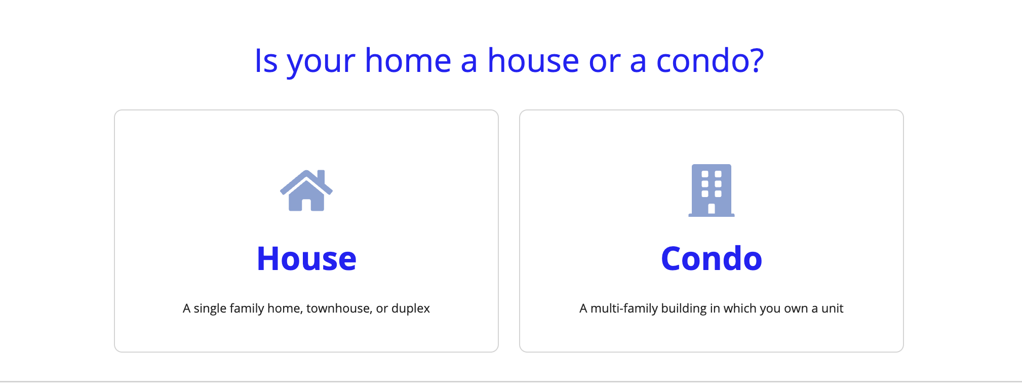
The cards as buttons pattern is a great way to prominently display a select few choices. This page explains how you can use this pattern in your interface, and walks through the design structure in detail.
Cards can be used as an alternative to choice inputs like radio buttons. Cards make it easier to show clear explanations for each choice, aided by icons and formatted text. They can also be used as an alternative to links for navigation, providing larger click targets for mouse users that require less effort to select.
This pattern allows you to easily keep card styles consistent for better clarity by aligning the cards the same way and keeping the amount of content and icons in sync. This pattern is also handy because it has saveInto's built in to allow you to easily switch user selections to another form if you need to. You only have to edit card layout details once since the pattern creates multiple cards using a!forEach().

Design structureCopy link to clipboard
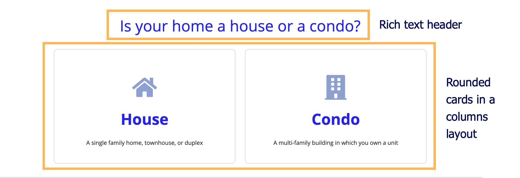
The main components in this pattern are rich text display and card layout components. The image below displays how the pattern looks on a blank interface with callouts of the main components. You can examine the entire expression or jump down to the subsections below with referenced line numbers to see a detailed breakdown of the main components.

Pattern expressionCopy link to clipboard
When you drag and drop the cards as buttons pattern onto your interface, 108 lines of expressions will be added to the section where you dragged it.
[Line 1-7] Defining options and selectionsCopy link to clipboard
At the top of the pattern, local variables set up the options the user can choose (local!options) and the actual option the user selects (local!selectedCard).
1
2
3
4
5
6
7
{
  a!localVariables(
    `local!options`: {
      a!map(icon: "home", name: "House", desc: "A single family home, townhouse, or duplex"),
      a!map(icon: "building", name: "Condo", desc: "A multi-family building in which you own a unit")
    },
    `local!selectedCard`,
Copy
[Line 8-24] Rich text display componentCopy link to clipboard
The first visible component is a rich text display component that shows only when local!selectedCard is null (line 177). In other words, if the user has not selected an option. Use this field to describe the choice the user is making when they select a card.
8
9
10
11
12
13
14
15
16
17
18
19
20
21
22
23
24
    {
      a!richTextDisplayField(
        labelPosition: "COLLAPSED",
        value: {
          char(10),
          char(10),
          a!richTextItem(
            text: "Is your home a house or a condo?",
            color: "ACCENT",
            size: "LARGE"
          ),
          char(10),
          char(10)
        },
        `showWhen: isNull(local!selectedCard)`,
        align: "CENTER"
      ),
Copy
[Line 25-76] Loop over card layoutsCopy link to clipboard
We then usea!forEach() to loop over each card layout with rich text display components that display an icon and text in a!columnlayout(). Each card layout also has a dynamic link that saves the user's selection.
An additional blank column is used on either side of the cards for spacing and to keep them centered. If you modify this pattern to have a larger number of options, you may want to remove the blank columnLayouts on line 27 and line 71.
25
26
27
28
29
30
31
32
33
34
35
36
37
38
39
40
41
42
43
44
45
46
47
48
49
50
51
52
53
54
55
56
57
58
59
60
61
62
63
64
65
66
67
68
69
70
71
72
73
74
75
76
      a!columnsLayout(
        columns: {
          a!columnLayout(),
          a!forEach(
            items: local!options,
            expression: a!columnLayout(
              contents: {
                a!cardLayout(
                  contents: {
                    a!richTextDisplayField(
                      labelPosition: "COLLAPSED",
                      value: {
                        char(10),
                        char(10),
                        a!richTextIcon(
                          icon: fv!item.icon,
                          color: "#8CA1D0",
                          size: "LARGE_PLUS"
                        ),
                        char(10),
                        char(10),
                        a!richTextItem(
                          text: fv!item.name,
                          color: "ACCENT",
                          size: "LARGE",
                          style: "STRONG"
                        ),
                        char(10),
                        char(10),
                        a!richTextItem(
                          text: fv!item.desc,
                          size: "SMALL"
                        )
                      },
                      align: "CENTER"
                    )
                  },
                  link: a!dynamicLink(
                    saveInto: a!save(local!selectedCard, fv!item.name)
                  ),
                  height: "MEDIUM",
                  shape: "ROUNDED"
                )
              },
              width: "MEDIUM"
            )
          ),
          a!columnLayout()
        },
        showWhen: isNull(local!selectedCard),
        marginBelow: "STANDARD"
      ),
Copy
[Line 77-108] Using rich text display components for selected optionsCopy link to clipboard
There are also two more rich text display components that only display once an option is selected. This is the part of the interface to modify or replace with whatever the next stage of your form is.
77
78
79
80
81
82
83
84
85
86
87
88
89
90
91
92
93
94
95
96
97
98
99
100
101
102
103
104
105
106
107
108
      a!richTextDisplayField(
        value: local!selectedCard & " next steps would appear here",
        showWhen: not(isNull(local!selectedCard)),
        align: "CENTER"
      ),
      a!richTextDisplayField(
        labelPosition: "COLLAPSED",
        value: {
          char(10),
          char(10),
          a!richTextIcon(
            icon: "arrow-left",
            link: a!dynamicLink(
              saveInto: a!save(local!selectedCard, null)
            ),
            linkStyle: "STANDALONE",
            color: "ACCENT"
          ),
          a!richTextItem(
            text: " Go back",
            link: a!dynamicLink(
              saveInto: a!save(local!selectedCard, null)
            ),
            linkStyle: "STANDALONE"
          )
        },
        showWhen: not(isNull(local!selectedCard)),
        align: "CENTER"
      )
    }
  )
}
Copy
