

| SAIL Design System guidance available for Header Content Layout
Give users a warm welcome to your page with the header content layout. Learn how to design your pages with two distinct zones to draw attention to any text or images that identify the purpose of the page or site. |
FunctionCopy link to clipboard
a!headerContentLayout( header, contents, showWhen, backgroundColor, contentsPadding, isHeaderFixed )
Displays any arrangement of layouts and components beneath a billboard or card header that is flush with the edge of the page. Similar to a form layout, this is a top-level layout and cannot be nested within other layouts. The header layout is ideal for landing pages and reports.
To add a header content layout to your interface from design mode, drag out either a CARD HEADER or BILLBOARD HEADER from the interface palette.
See also: Header Content Layout style guidance
ParametersCopy link to clipboard
| Name | Keyword | Types | Description |
|---|---|---|---|
|
Header |
|
Any Type |
Billboard, card, or list of billboards or cards to display at the top of the page. Configure using |
|
Contents |
|
Any Type Array |
Components and layouts to display in the body of the interface. |
|
Visibility |
|
Boolean |
Determines whether the layout is displayed on the interface. When set to false, the layout is hidden and is not evaluated. Default: true. |
|
Background color |
|
Text |
Color to show behind the contents of the page. Valid values: Any valid hex color or |
|
Contents Padding |
|
Text |
Determines the space surrounding the contents. Valid values: |
|
Fix header when scrolling |
|
Boolean |
Determines whether the header remains at the top of the page when scrolling. Default: false. |
Usage considerationsCopy link to clipboard
Designing headersCopy link to clipboard
- For configuring record views with a flush header, consider using a record header.
- If you are using a fixed header, be sure to view your interface on multiple screen sizes to make sure the content is accessible on all devices. See the header content layout design guidance for more information.
- If fixed header is selected in the header content layout, but it isn't selected for the record header, neither header will be fixed. See Design Record Views for more information.
- To quickly configure a fixed header in a one-page portal, consider enabling the header bar. On sites and multipage portals, the header bar is always enabled.
Using the backgroundColor parameterCopy link to clipboard
- If you're using a predefined color scheme for your background, make sure that your header content layout and cards are using the same predefined color scheme.
- If you're using a dark custom background color for your header content layout, make your cards a lighter color. For more information on backgrounds, check out our header content layout design guidance.
- When using predefined color schemes, cards are a lighter color than the background. If you're using a card header in combination with a predefined color scheme, you must manually set the card header's background color to use the same hex code as the header content layout's background. For more guidance on backgrounds, check out our design guidance for header content layouts.
- If you're using a predefined dark color scheme in a site, use the same color scheme for your site's header bar.
- Dark color schemes shouldn't be applied to interfaces used on Tempo or across multiple sites with different color schemes.
Using transparent backgroundsCopy link to clipboard
- The header content layout's transparent background eliminates the page outline on an interface and shows the background color.
- For Tempo, the background color is light blue.
- For Sites, the background color is gray.
- If you are using a billboard that contains an image with a transparent background, you'll be able to see the color specified in the billboard layout's backgroundColor parameter. For a clean look, make sure that the billboard's backgroundColor is the same hex code as the backgroundColor of the header content layout. See our header content layout design guidance for more information and examples.
Report titles in Tempo and embedded interfacesCopy link to clipboard
- This layout will not display the report title when viewed in Tempo and embedded interfaces.
ExamplesCopy link to clipboard
Click EXPRESSION to copy and paste an example into the Interface Definition to see it displayed.
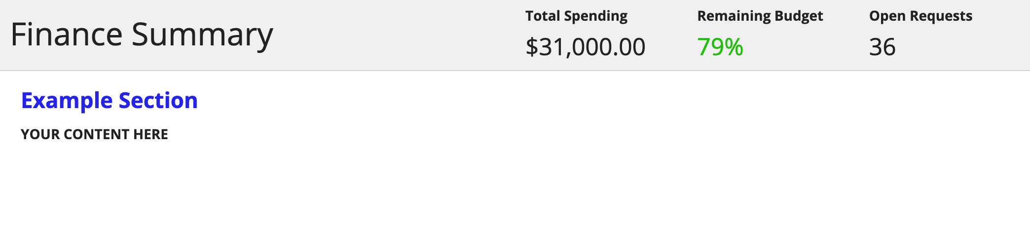
Billboard layoutCopy link to clipboard
This example uses a billboard layout within the header content layout. It displays the following interface.

See the page on Billboard Layouts for more information on billboards and the SAIL Design System: Billboard Layout for guidance on when to use each overlay style.
Copy and paste this example into an an interface object to experiment with it.
1
2
3
4
5
6
7
8
9
10
11
12
13
14
15
16
17
18
19
20
21
22
23
24
25
26
27
28
29
30
31
32
33
34
35
36
37
38
39
40
41
42
43
44
45
46
47
48
49
50
51
52
53
54
55
56
57
58
59
60
61
62
63
64
65
66
67
68
69
70
71
72
73
74
75
76
77
78
79
80
81
82
83
84
85
86
87
88
89
90
91
92
93
94
95
96
97
98
99
100
101
102
103
104
a!headerContentLayout(
  header: {
    a!billboardLayout(
      backgroundMedia: a!documentImage(
        document: a!EXAMPLE_BILLBOARD_IMAGE()
      ),
      backgroundColor: "#f0f0f0",
      height: "SHORT",
      marginBelow: "NONE",
      overlay: a!barOverlay(
        position: "BOTTOM",
        contents: {
          a!columnsLayout(
            columns: {
              a!columnLayout(
                contents: {
                  a!richTextDisplayField(
                    labelPosition: "COLLAPSED",
                    value: {
                      a!richTextItem(
                        text: {
                          "Finance Summary"
                        },
                        size: "LARGE"
                      )
                    }
                  )
                }
              ),
              a!columnLayout(
                contents: {
                  a!columnsLayout(
                    columns: {
                      a!columnLayout(
                        contents: {
                          a!richTextDisplayField(
                            label: "Total Spending",
                            value: {
                              a!richTextItem(
                                text: {
                                  "$31,000.00"
                                },
                                size: "MEDIUM_PLUS"
                              )
                            }
                          )
                        }
                      ),
                      a!columnLayout(
                        contents: {
                          a!richTextDisplayField(
                            label: "Remaining Budget",
                            value: {
                              a!richTextItem(
                                text: {
                                  "79%"
                                },
                                color: "POSITIVE",
                                size: "MEDIUM_PLUS"
                              )
                            }
                          )
                        }
                      ),
                      a!columnLayout(
                        contents: {
                          a!richTextDisplayField(
                            label: "Open Requests",
                            value: {
                              a!richTextItem(
                                text: {
                                  "36"
                                },
                                size: "MEDIUM_PLUS"
                              )
                            }
                          )
                        }
                      )
                    },
                    alignVertical: "TOP"
                  )
                }
              )
            },
            alignVertical: "MIDDLE"
          )
        },
        style: "DARK"
      )
    )
  },
  contents: {
    a!sectionLayout(
      label: "Example Section",
      contents: {
        a!textField(
          label: "YOUR CONTENT HERE",
          readOnly: true()
        )
      }
    )
  }
)
Copy
Card layoutCopy link to clipboard
This example uses a card layout within the header content layout. It displays the following interface.
See the page on Card Layouts for more information on cards.
Copy and paste this example into an an interface object to experiment with it.
1
2
3
4
5
6
7
8
9
10
11
12
13
14
15
16
17
18
19
20
21
22
23
24
25
26
27
28
29
30
31
32
33
34
35
36
37
38
39
40
41
42
43
44
45
46
47
48
49
50
51
52
53
54
55
56
57
58
59
60
61
62
63
64
65
66
67
68
69
70
71
72
73
74
75
76
77
78
79
80
81
82
83
84
85
86
87
88
89
90
91
92
93
94
95
a!headerContentLayout(
  header: {
    a!cardLayout(
      contents: {
        a!columnsLayout(
          columns: {
            a!columnLayout(
              contents: {
                a!richTextDisplayField(
                  labelPosition: "COLLAPSED",
                  value: {
                    a!richTextItem(
                      text: {
                        "Finance Summary"
                      },
                      size: "LARGE"
                    )
                  }
                )
              }
            ),
            a!columnLayout(
              contents: {
                a!columnsLayout(
                  columns: {
                    a!columnLayout(
                      contents: {
                        a!richTextDisplayField(
                          label: "Total Spending",
                          value: {
                            a!richTextItem(
                              text: {
                                "$31,000.00"
                              },
                              size: "MEDIUM_PLUS"
                            )
                          }
                        )
                      }
                    ),
                    a!columnLayout(
                      contents: {
                        a!richTextDisplayField(
                          label: "Remaining Budget",
                          value: {
                            a!richTextItem(
                              text: {
                                "79%"
                              },
                              color: "POSITIVE",
                              size: "MEDIUM_PLUS"
                            )
                          }
                        )
                      }
                    ),
                    a!columnLayout(
                      contents: {
                        a!richTextDisplayField(
                          label: "Open Requests",
                          value: {
                            a!richTextItem(
                              text: {
                                "36"
                              },
                              size: "MEDIUM_PLUS"
                            )
                          }
                        )
                      }
                    )
                  },
                  alignVertical: "TOP"
                )
              }
            )
          },
          alignVertical: "MIDDLE"
        )
      },
      style: "STANDARD"
    )
  },
  contents: {
    a!sectionLayout(
      label: "Example Section",
      contents: {
        a!textField(
          label: "YOUR CONTENT HERE",
          readOnly: true()
        )
      }
    )
  }
)
Copy
Fixed headerCopy link to clipboard
This example uses a fixed header within the header content layout. It displays the following interface.
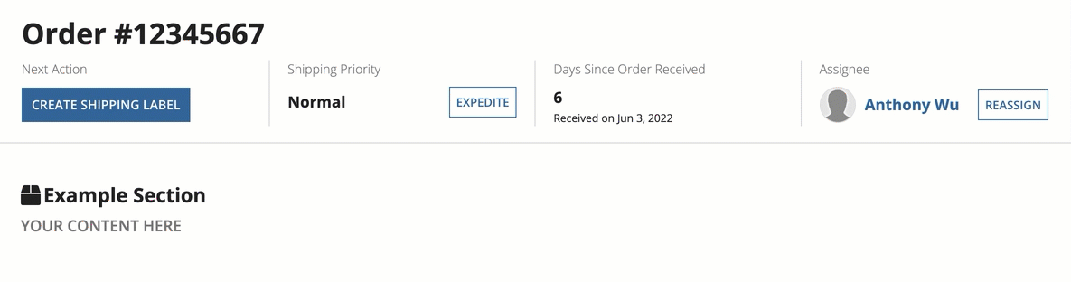
Note that this pattern contains two empty a!cardLayout() components to help you see the scrolling behavior with a fixed header. These components have no other purpose.
See the SAIL Design System: Header Content Layout for more information on fixed headers.
Copy and paste this example into an an interface object to experiment with it.
1
2
3
4
5
6
7
8
9
10
11
12
13
14
15
16
17
18
19
20
21
22
23
24
25
26
27
28
29
30
31
32
33
34
35
36
37
38
39
40
41
42
43
44
45
46
47
48
49
50
51
52
53
54
55
56
57
58
59
60
61
62
63
64
65
66
67
68
69
70
71
72
73
74
75
76
77
78
79
80
81
82
83
84
85
86
87
88
89
90
91
92
93
94
95
96
97
98
99
100
101
102
103
104
105
106
107
108
109
110
111
112
113
114
115
116
117
118
119
120
121
122
123
124
125
126
127
128
129
130
131
132
133
134
135
136
137
138
139
140
141
142
143
144
145
146
147
148
149
150
151
152
153
154
155
156
157
158
159
160
161
162
163
164
165
166
167
168
169
170
171
172
173
174
175
176
177
178
179
180
181
182
183
184
185
186
187
188
189
190
191
192
193
194
195
196
197
198
199
200
201
202
203
204
205
206
207
208
209
210
211
212
213
214
215
216
217
218
219
220
221
222
223
224
225
226
227
228
229
230
231
232
233
234
235
236
237
238
a!headerContentLayout(
  header: {
    a!cardLayout(
      contents: {
        a!columnsLayout(
          columns: {
            a!columnLayout(
              contents: {
                  a!richTextDisplayField(
                    labelPosition: "COLLAPSED",
                    value: {
                      a!richTextItem(
                        text: "Order" & " " & "#12345667",
                        size: "LARGE",
                        style: "STRONG"
                      )
                    }
                  )
              }
            )
          }
        ),
        a!columnsLayout(
          columns: {
            a!columnLayout(
              contents: {
                a!richTextDisplayField(
                  labelPosition: "COLLAPSED",
                  value: {
                    a!richTextItem(
                      text: "Next Action",
                      color: "SECONDARY"
                    )
                  }
                ),
                a!buttonArrayLayout(
                  buttons: {
                    a!buttonWidget(
                      label: if(
                        a!isPageWidth("TABLET_PORTRAIT"),
                        "Create Label",
                        "Create Shipping Label"
                      ),
                      style: "PRIMARY"
                    )
                  },
                  align: "START",
                  marginBelow: "NONE"
                )
              }
            ),
            a!columnLayout(
              contents: {
                a!richTextDisplayField(
                  labelPosition: "COLLAPSED",
                  value: {
                    a!richTextItem(
                      text: "Shipping Priority",
                      color: "SECONDARY"
                    )
                  }
                ),
                a!sideBySideLayout(
                  items: {
                    a!sideBySideItem(
                      item: a!richTextDisplayField(
                        labelPosition: "COLLAPSED",
                        value: {
                          a!richTextItem(
                            text: "Normal",
                            size: "MEDIUM",
                            style: "STRONG"
                          )
                        }
                      )
                    ),
                    a!sideBySideItem(
                      item: a!buttonArrayLayout(
                        buttons: {
                          a!buttonWidget(
                            label: "Expedite",
                            size: "SMALL"
                          )
                        },
                        align: "START",
                        marginBelow: "NONE"
                      ),
                      width: "MINIMIZE"
                    )
                  },
                  alignVertical: "MIDDLE",
                  stackWhen: "TABLET_PORTRAIT"
                )
              }
            ),
            a!columnLayout(
              contents: {
                a!richTextDisplayField(
                  labelPosition: "COLLAPSED",
                  value: {
                    a!richTextItem(
                      text: "Days Since Order Received",
                      color: "SECONDARY"
                    )
                  }
                ),
                a!richTextDisplayField(
                  labelPosition: "COLLAPSED",
                  value: {
                    a!richTextItem(
                      text: 6,
                      size: "MEDIUM",
                      style: "STRONG"
                    )
                  },
                  marginBelow: "NONE"
                ),
                a!richTextDisplayField(
                  labelPosition: "COLLAPSED",
                  value: {
                    a!richTextItem(
                      text: {
                        "Received on",
                        " ",
                        text(today()- 6, "MMM D, YYYY")
                      },
                      size: "SMALL"
                    )
                  }
                )
              }
            ),
            a!columnLayout(
              contents: {
                a!richTextDisplayField(
                  labelPosition: "COLLAPSED",
                  value: {
                    a!richTextItem(
                      text: "Assignee",
                      color: "SECONDARY"
                    )
                  }
                ),
                a!sideBySideLayout(
                  items: {
                    a!sideBySideItem(
                      item: a!imageField(
                        labelPosition: "COLLAPSED",
                        images: a!userImage(),
                        size: "TINY",
                        style: "AVATAR"
                      ),
                      width: "MINIMIZE"
                    ),
                    a!sideBySideItem(
                      item: a!richTextDisplayField(
                        labelPosition: "COLLAPSED",
                        value: {
                          a!richTextItem(
                            text: "Anthony Wu",
                            link: a!userRecordLink(),
                            linkStyle: "STANDALONE",
                            size: "MEDIUM",
                            style: "STRONG"
                          )
                        },
                        preventWrapping: true
                      )
                    ),
                    a!sideBySideItem(
                      item: a!buttonArrayLayout(
                        buttons: {
                          a!buttonWidget(
                            label: "Reassign",
                            size: "SMALL"
                          )
                        },
                        align: "START",
                        marginBelow: "NONE"
                      ),
                      width: "MINIMIZE"
                    )
                  },
                  alignVertical: "MIDDLE",
                  stackWhen: "TABLET_PORTRAIT"
                )
              }
            )
          },
          spacing: "SPARSE",
          showDividers: true
        )
      },
      padding: "STANDARD",
      marginBelow: "MORE"
    )
  },
    isHeaderFixed: if(a!isPageWidth("PHONE"),false,true),
  contents: {
    a!columnsLayout(
      columns: {
        a!columnLayout(
          contents: {
            a!sectionLayout(
              label: "Example Section",
              labelIcon: "box",
              labelColor: "STANDARD",
              contents: {
                a!sectionLayout(
                  label: upper("Your content here"),
                  labelSize: "SMALL",
                  labelColor: "SECONDARY"
                ),
                a!cardLayout(
                  contents: {},
                  height: "EXTRA_TALL",
                  style: "NONE",
                  marginBelow: "STANDARD",
                  showBorder: false
                ),
                a!cardLayout(
                  contents: {},
                  height: "EXTRA_TALL",
                  style: "NONE",
                  marginBelow: "STANDARD",
                  showBorder: false
                )
              }
            )
          }
        )
      },
      spacing: "SPARSE",
      stackWhen: {"TABLET_LANDSCAPE", "TABLET_PORTRAIT", "PHONE"
      }
    )
  }
)
Copy
Header content layout with navy color schemeCopy link to clipboard
This example uses the navy color scheme within a header content layout. It displays the following interface.

Copy and paste this example into an an interface object to experiment with it.
1
2
3
4
5
6
7
8
9
10
11
12
13
14
15
16
17
18
19
20
21
22
23
24
25
26
27
28
29
30
31
32
33
34
35
36
37
38
39
40
41
42
43
44
45
46
47
48
49
50
51
52
53
54
55
56
57
58
59
60
61
62
63
64
65
66
67
68
69
70
71
72
73
74
75
76
77
78
79
80
81
82
83
84
85
86
87
88
89
90
91
92
93
94
95
96
97
98
99
100
101
102
103
104
105
106
107
108
109
110
111
112
113
114
115
116
117
118
119
120
121
122
123
124
125
126
127
128
129
130
131
132
133
134
135
136
137
138
a!localVariables(
  local!universityAdmissionsMetricsSpring: {
    a!map(name: "Applications", totalCount: 1753),
    a!map(name: "Admitted",     totalCount: 367),
    a!map(name: "Accepted",     totalCount: 200),
    a!map(name: "Enrolled",     totalCount: 150)
  },
  local!universityAdmissionsMetricsFall: {
    a!map(name: "Applications", totalCount: 3415),
    a!map(name: "Admitted",     totalCount: 429),
    a!map(name: "Accepted",     totalCount: 212),
    a!map(name: "Enrolled",     totalCount: 199)
  },
  a!headerContentLayout(
    header:{},
    contents:{
      a!richTextDisplayField(
        labelPosition: "COLLAPSED",
        value:
        {
          a!richTextItem(
            text: {
              "2021 Admissions Dashboard"
            },
            size: "LARGE"
          ),
          char(10),
          char(10)
        }
      ),
      a!columnsLayout(
        columns: {
          a!columnLayout(
            contents: {
              a!cardLayout(
                contents: {
                  a!richTextDisplayField(
                    labelPosition: "COLLAPSED",
                    value: {
                      a!richTextItem(
                        text: "2021 Spring Semester",
                        size: "MEDIUM_PLUS"
                      ),
                      char(10),
                      char(10)
                    }
                  ),
                  a!columnsLayout(
                    columns: {
                      a!forEach(
                        items: local!universityAdmissionsMetricsSpring,
                        expression: a!columnLayout(
                          contents: {
                            a!richTextDisplayField(
                              labelPosition: "COLLAPSED",
                              value: {
                                a!richTextItem(
                                  text: fv!item.name,
                                  color: "STANDARD"
                                ),
                                char(10),
                                a!richTextItem(
                                  text: fv!item.totalCount,
                                  size: "LARGE",
                                  style: "STRONG"
                                )
                              }
                            )
                          }
                        )
                      )
                    },
                    showDividers: true
                  )
                },
                style: "NAVY_SCHEME",
                padding: "STANDARD",
                marginBelow: "STANDARD",
                showBorder: false
              )
            }
          ),
          a!columnLayout(
            contents: {
              a!cardLayout(
                contents: {
                  a!richTextDisplayField(
                    labelPosition: "COLLAPSED",
                    value: {
                      a!richTextItem(
                        text: "2021 Fall Semester",
                        size: "MEDIUM_PLUS"
                      ),
                      char(10),
                      char(10)
                    }
                  ),
                  a!columnsLayout(
                    columns: {
                      a!forEach(
                        items: local!universityAdmissionsMetricsFall,
                        expression: a!columnLayout(
                          contents: {
                            a!richTextDisplayField(
                              labelPosition: "COLLAPSED",
                              value: {
                                a!richTextItem(
                                  text: fv!item.name,
                                  color: "STANDARD"
                                ),
                                char(10),
                                a!richTextItem(
                                  text: fv!item.totalCount,
                                  size: "LARGE",
                                  style: "STRONG"
                                )
                              }
                            )
                          }
                        )
                      )
                    },
                    showDividers: true
                  )
                },
                style: "NAVY_SCHEME",
                padding: "STANDARD",
                marginBelow: "STANDARD",
                showBorder: false
              )
            }
          )
        }
      )
    },
    backgroundColor: "NAVY_SCHEME"
  )
)
Copy
Feature compatibilityCopy link to clipboard
The table below lists this component's compatibility with various features in Appian.
| Feature | Compatibility | Note |
|---|---|---|
| Portals | Compatible | |
| Offline Mobile | Compatible | |
| Sync-Time Custom Record Fields | Incompatible | |
| Real-Time Custom Record Fields | Incompatible | Custom record fields that evaluate in real time must be configured using one or more Custom Field functions. |
| Process Reports | Incompatible | Cannot be used to configure a process report. |
| Process Events | Incompatible | Cannot be used to configure a process event node, such as a start event or timer event. |