| SAIL Design System guidance available for Columns Layout
When you need greater flexibility and control over the width of certain sections on your interface, use the columns layout. Learn how to use different column widths and configurations to bring greater balance to your content arrangements. |
FunctionCopy link to clipboard
a!columnLayout( contents, width, showWhen )
Displays a column that can be used within the columns layout.
See also:
ParametersCopy link to clipboard
| Name | Keyword | Types | Description |
|---|---|---|---|
|
Contents |
|
Any Type |
Values that define the interface components for a column. |
|
Width |
|
Text |
Determines the width of the column. Valid values: |
|
Visibility |
|
Boolean |
Determines whether the layout is displayed on the interface. When set to false, the layout is hidden and is not evaluated. Default: true. |
Usage considerationsCopy link to clipboard
Using the contents parameterCopy link to clipboard
- The following layouts are not supported in the contents parameter: form layout, header content layout, and column layout. All other layouts can be used, including columns layout.
Column widthsCopy link to clipboard
Use the width parameter to set the width of each column. See the SAIL Design System for guidance on choosing between column widths.
Valid values are:
- "AUTO" (Default)
- Relative widths: "1X", "2X", "3X", "4X", "5X", "6X", "7X", "8X", "9X", "10X".
- Fixed widths: "EXTRA_NARROW", "NARROW", "NARROW_PLUS", "MEDIUM", "MEDIUM_PLUS", "WIDE", "WIDE_PLUS".
Auto widthCopy link to clipboard
The "AUTO" column width distributes the space evenly across all columns. As you resize the screen, the columns will remain distributed evenly.

Relative widthsCopy link to clipboard
Relative column widths are always proportional to other columns in the same columns layout. If there is only one column in a columns layout and it is set it to a relative width, it would take up the entire width because there isn't another column to compare it to.
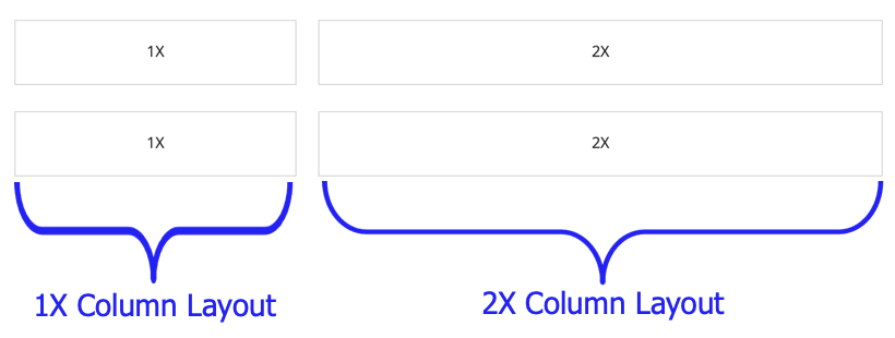
Relative widths are always a multiple of "1X". If you have two columns and one uses "2X" and the other uses "3X", you could imagine the columns being split into five sections. The "2X" column takes up 2/5 of the space, and the "3X" column takes up 3/5 of the space.

As you resize the screen, columns with a relative width will maintain the same proportions.

Fixed widthsCopy link to clipboard
As long as they have enough room on the screen, fixed column widths will always maintain the same pixel width.
If their combined width takes up more than the width of the screen, they will size down appropriately.

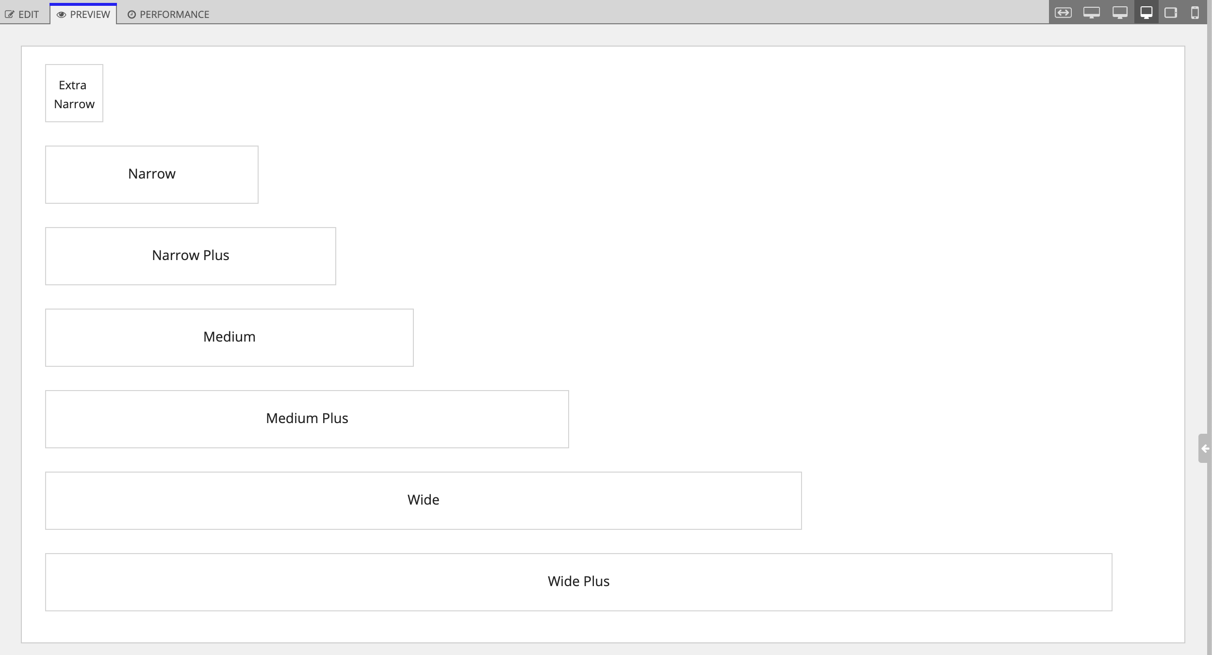
In this example, the "WIDE_PLUS" columns will almost always be wider than the "MEDIUM" column. But none of them will be as wide as their default width when the screen is wide enough to use their full width.
Combining column width typesCopy link to clipboard
Fixed and relative column widthsCopy link to clipboard
If you use fixed column widths and relative column widths in the same columns layout, the fixed width applies first. The relative columns split the remaining space.

In this example, the "NARROW_PLUS" and "MEDIUM" columns will first take up the specified amount of space. The "1X" and "3X" columns will take up 1/4 and 3/4 of the remaining space, respectively.
If the screen is resized, the fixed column widths will maintain their size for as long as possible. The relative column widths will maintain their proportion to each other in the remaining space.

Auto column widthsCopy link to clipboard
If used with relative column widths, "AUTO" column widths are equal to "1X".
If used with fixed column widths, "AUTO" column widths will take up the remaining space on the page.
ExamplesCopy link to clipboard
Single columnCopy link to clipboard
Use the interactive editor below to test out your code:
Relative column width: aligning columns across rowsCopy link to clipboard
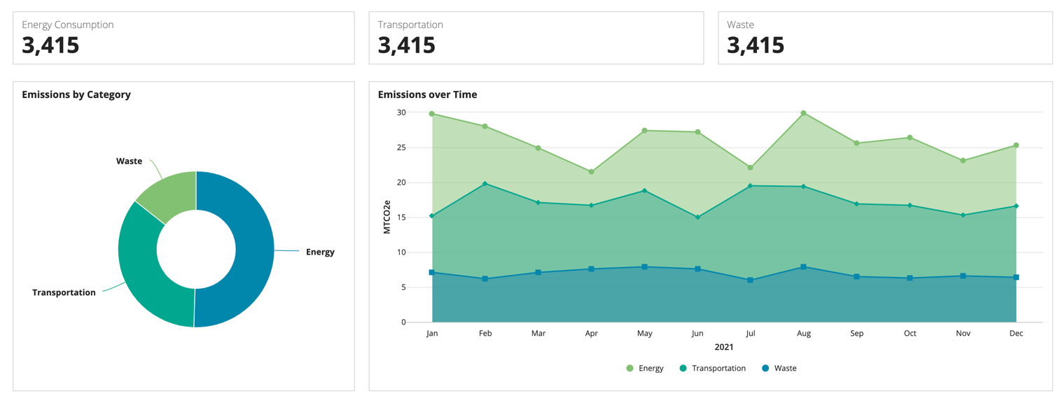
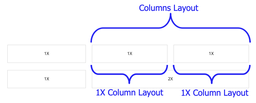
This example has three columns on the top row and two columns on the bottom row. The columns on the top row each take up 1/3 of the space and the columns on the bottom take up 1/3 and 2/3 of the space.

To do this, create two rows with the same number of columns. Use the same relative column widths for each row. This ensures that the margins will line up.

Then, for the column on the top row that lines up with the longer column on the bottom row, nest an a!columnsLayout() to split the space into to more columns.

Copy and paste the example into an Appian Expression Editor to experiment with it.
1
2
3
4
5
6
7
8
9
10
11
12
13
14
15
16
17
18
19
20
21
22
23
24
25
26
27
28
29
30
31
32
33
34
35
36
37
38
39
40
41
42
43
44
45
46
47
48
49
50
51
52
53
54
55
56
57
58
59
60
61
62
63
64
65
66
67
68
69
70
71
72
73
74
75
76
77
78
79
80
81
82
83
84
85
86
87
88
89
90
91
92
93
94
95
96
97
98
99
100
101
102
103
104
105
106
107
108
109
110
111
112
113
114
115
116
117
118
119
120
121
122
123
124
125
126
127
128
129
130
131
132
133
134
135
136
137
138
139
140
141
142
143
144
145
146
147
148
149
150
151
152
153
154
155
156
157
158
159
160
161
162
163
164
165
166
{a!columnsLayout(
    columns: {
      a!columnLayout(
        width: "1X",
        contents: {
          a!columnsLayout(
            columns: {
              a!columnLayout(
                contents: {
                  a!cardLayout(
                    height: "AUTO",
                    style: "NONE",
                    marginBelow: "STANDARD",
                    contents: {
                      a!richTextDisplayField(
                        labelPosition: "COLLAPSED",
                        value: {
                          a!richTextItem(text: "Energy Consumption", color: "SECONDARY"),
                          char(10),
                          a!richTextItem(text: "3,415", size: "LARGE", style: "STRONG")
                        }
                      )
                    }
                  )
                }
              )
            }
          )
        }
      ),
      a!columnLayout(
        width: "2X",
        contents: {
          a!columnsLayout(
            columns: {
              a!columnLayout(
                contents: {
                  a!cardLayout(
                    height: "AUTO",
                    style: "NONE",
                    marginBelow: "STANDARD",
                    contents: {
                      a!richTextDisplayField(
                        labelPosition: "COLLAPSED",
                        value: {
                          a!richTextItem(text: "Transportation", color: "SECONDARY"),
                          char(10),
                          a!richTextItem(text: "3,415", size: "LARGE", style: "STRONG"
                          )
                        }
                      )
                    }
                  )
                }
              ),
              a!columnLayout(
                contents: {
                  a!cardLayout(
                    height: "AUTO",
                    style: "NONE",
                    marginBelow: "STANDARD",
                    contents: {
                      a!richTextDisplayField(
                        labelPosition: "COLLAPSED",
                        value: {
                          a!richTextItem(text: "Waste", color: "SECONDARY"),
                          char(10),
                          a!richTextItem(text: "3,415", size: "LARGE", style: "STRONG")
                        }
                      )
                    }
                  )
                }
              )
            }
          )
        }
      )
    }
  ),
  a!columnsLayout(
    columns: {
      a!columnLayout(
        width: "1X",
        contents: {
          a!columnsLayout(
            columns: {
              a!columnLayout(
                contents: {
                  a!cardLayout(
                    height: "AUTO",
                    style: "NONE",
                    marginBelow: "STANDARD",
                    contents: {
                      a!pieChartField(
                        label: "Emissions by Category",
                        labelPosition: "ABOVE",
                        series: {
                          a!chartSeries(label: "Energy", data: 314),
                          a!chartSeries(label: "Transportation", data: 219),
                          a!chartSeries(label: "Waste", data: 89)
                        },
                        colorScheme: "RAINFOREST",
                        style: "DONUT",
                        seriesLabelStyle: "ON_CHART",
                        height: "MEDIUM"
                      )
                    }
                  )
                }
              )
            }
          )
        }
      ),
      a!columnLayout(
        width: "2X",
        contents: {
          a!columnsLayout(
            columns: {
              a!columnLayout(
                contents: {
                  a!cardLayout(
                    height: "AUTO",
                    style: "NONE",
                    marginBelow: "STANDARD",
                    contents: {
                      a!areaChartField(
                        label: "Emissions over Time",
                        labelPosition: "ABOVE",
                        categories: {"Jan", "Feb", "Mar", "Apr", "May", "Jun", "Jul", "Aug", "Sep", "Oct", "Nov", "Dec"},
                        series: {
                          a!chartSeries(
                            label: "Energy",
                            data: {29.8, 28, 24.9, 21.5, 27.4, 27.2, 22.1, 29.9, 25.6, 26.4, 23.1, 25.3}
                          ),
                          a!chartSeries(
                            label: "Transportation",
                            data: {15.2, 19.8, 17.1, 16.7, 18.8, 15, 19.5, 19.4, 16.9, 16.7, 15.3,16.6
                            }
                          ),
                          a!chartSeries(
                            label: "Waste",
                            data: {7.1, 6.2, 7.1, 7.6, 7.9, 7.6, 6, 7.9, 6.5, 6.3, 6.6, 6.4
                            }
                          )
                        },
                        xAxisTitle: "2021",
                        yAxisTitle: "MTCO2e",
                        stacking: "NONE",
                        showLegend: true,
                        showTooltips: true,
                        colorScheme: "RAINFOREST",
                        height: "MEDIUM"
                      )
                    }
                  )
                }
              )
            }
          )
        }
      )
    }
  )
}
Copy
Feature compatibilityCopy link to clipboard
The table below lists this component's compatibility with various features in Appian.
| Feature | Compatibility | Note |
|---|---|---|
| Portals | Compatible | |
| Offline Mobile | Compatible | |
| Sync-Time Custom Record Fields | Incompatible | |
| Real-Time Custom Record Fields | Incompatible | Custom record fields that evaluate in real time must be configured using one or more Custom Field functions. |
| Process Reports | Incompatible | Cannot be used to configure a process report. |
| Process Events | Incompatible | Cannot be used to configure a process event node, such as a start event or timer event. |
Related PatternsCopy link to clipboard
The following patterns include usage of the Column Layout.
-
Build a Wizard with Milestone Navigation (Wizards): Use the milestone component to show steps in a wizard.
-
Build an Interface Wizard (Wizards): Divide a big form into sections presented one step at a time with validation.
-
Call to Action Pattern (Formatting): Use the call to action pattern as a landing page when your users have a single action to take.
-
Cards as Buttons Pattern (Choice Components, Formatting, Conditional Display): The cards as buttons pattern is a great way to prominently display a select few choices.
-
Cards as List Items Patterns (Choice Components, Images): Use the cards as list items pattern to create visually rich lists as an alternative to grids or feeds. This pattern uses a combination of cards and billboards to show lists of like items. You can easily modify the pattern to change the card content or the number of cards per row to fit your use case.
-
Comments Patterns (Comments, Looping): Use this pattern when displaying a chronological list of messages from different users, such as comments on a topic or notes on a case.
-
Conditionally Hide a Column in a Grid (Grids, Conditional Display): Conditionally hide a column in a read-only grid when all data for that column is a specific value.
-
Document List (Documents): Use the document list items pattern to display a list of documents that can be searched and filtered. This pattern uses a combination of cards and rich text to show an easy to navigate list of documents of different types.
-
Drilldown Pattern (Grids): The drilldown pattern allows users to select an item from a grid to see more details in place of the grid.
-
Drilldown Report Pattern (Grids, Charts, Reports): The drilldown report pattern consists of a bar chart and column chart, which each drill down into a grid.
-
Dual Picklist Pattern (Choice Components, Cards, Checkboxes, Buttons): Use this pattern to view side-by-side lists and move items from one list to the other. The dual picklist is great for moving items from one state to another, like from active to inactive.
-
Dynamic Inputs (Inputs, Dynamic Links): Use the dynamic inputs pattern to allow users to easily add or remove as many values as needed.
-
Dynamically Show Sales by Product Category Compared to Total Sales (Records, Reports, Charts, Filtering): This pattern illustrates how to create an area chart that dynamically displays sales generated by product category compared to total sales.
-
Event Timelines (Timeline, Events): Use the event timeline pattern to display a dated list of events and actions in chronological order. This pattern uses a combination of cards, rich text, and user images to show an easy to navigate list of dated events.
-
Filter the Data in a Grid (Grids, Filtering, Records): Configure a user filter for your read-only grid that uses a record type as the data source. When the user selects a value to filter by, update the grid to show the result.
-
Form Steps (Stamps): Use the form steps patten to break down complicated forms into a series of quickly completed steps that are well organized and easy to navigate. This pattern uses a combination of cards and rich text to create steps that can represent fields from one or more interfaces.
-
Grid With Detail (Grids): The grid with detail pattern allows users to select an item from a grid to see more details next to the grid.
-
Grid with Heatmap Pattern (Grids): Displays a grid with conditional formatting of background colors at different thresholds.
-
Grid with Selection Pattern (Grids): This pattern is an example of good UX design for a grid that allows users to select items and easily view their selections when there are multiple pages of data. It also provides information on a common save behavior.
-
Inline Survey (Radio Buttons, Checkboxes, Buttons): Use this pattern to create a clean and easy to navigate survey.
-
KPI Patterns (Formatting): The Key Performance Indicator (KPI) patterns provide a common style and format for displaying important performance measures.
-
Leaderboard (Looping): Use the leaderboard pattern to show a selection of your data in an easy to read ranked display.
-
Limit the Number of Rows in a Grid That Can Be Selected (Validation, Grids, Records): Limit the number of rows that can be selected to an arbitrary number.
-
Make a Component Required Based on a User Selection (Validation): Make a paragraph component conditionally required based on the user selection.
-
Milestone Patterns (Looping): There are three options for milestone patterns which all display some form of a progress indicator to guide users through a series of steps.
-
Navigation Patterns (Conditional Display, Formatting, Navigation): Use the navigation patterns to help orient users and enable them to easily navigate pages and content.
-
Percentage of Online Sales (Records, Reports, Formatting): This pattern illustrates how to calculate the percent of sales generated from online orders and display it in a gauge component.
-
Refresh Data After Executing a Smart Service (Auto-Refresh, Smart Services):
-
Refresh Until Asynchronous Action Completes (Auto-Refresh): Use a refresh interval to display the results of an asynchronous action automatically.
-
Sales by Country and Currency (Records, Reports): This pattern illustrates how to create two different charts. One chart shows sales (calculated in US dollars) by country and the currency paid. The other shows sales by currency type, comparing the number of sales paid in US dollars versus the local currency.
-
Save a User's Report Filters to a Data Store Entity (Grids, Smart Services, Filtering, Reports): Allow a user to save their preferred filter on a report and automatically load it when they revisit the report later.
-
Searching on Multiple Columns (Grids, Filtering, Reports): Display a grid populated based on search criteria specified by end users.
-
Stamp Steps (Stamps): There are two similar stamp steps patterns. The stamp steps (icon) pattern is primarily icons and titles. It should be used for simple steps that don't require much information or instruction. The stamp steps (numbered) pattern is primarily text and should be used for steps that require context or explanation.
-
Task Report Pattern (Grids, Filters, Process Task Links, Task Reports): Provides a simple way to create and display an Appian task report.
-
Trend-Over-Time Report (Charts, Reports): This report provides an attractive, interactive design for exploring different series of data over time.
-
Update an Entity-Backed Record from its Summary View (Records, Smart Services): Enable users to make quick changes to a record by updating it right from a record view.
-
Use Links in a Grid to Show More Details and Edit Data (Grids): Allow end users to click a link in a read-only grid to view the details for the row, and make changes to the data. The data available for editing may include more fields than are displayed in the grid.
-
Use the Gauge Fraction and Gauge Percentage Configurations (Formatting, Reports): This recipe provides a common configuration of the Gauge Component using a!gaugeFraction() and a!gaugePercentage(), and includes a walkthrough that demonstrates the benefits of using design mode when configuring the gauge component.
-
Year-Over-Year Report (Charts, Reports, Formatting): This is a feature-rich, interactive report for sales and profits by products over select periods of time.
-
Year-Over-Year Sales Growth (Records, Reports, Formatting): This pattern illustrates how to calculate year-over-year sales growth and display it in a KPI.


