

| SAIL Design System guidance available for Grids
Grids should help your users take action and make decisions. Check out the grids design guidance page to learn how to display your data in a structured, easy-to-scan layout to help your users find what they need. |
Function
a!gridLayout( label, instructions, headerCells, columnConfigs, rows, validations, validationGroup, selectable, selectionDisabled, selectionRequired, selectionValue, selectionSaveInto, addRowLink, totalCount, emptyGridMessage, helpTooltip, labelPosition, showWhen, shadeAlternateRows, spacing, height, borderStyle, selectionStyle, rowHeader, accessibilityText )
Displays a tabular layout of SAIL components to provide quick inline editing of fields. For an example of how to configure an editable grid, see the Add, Edit, and Remove Data in an Inline Editable Grid SAIL Recipe.
Parameters
| Name | Keyword | Types | Description |
|---|---|---|---|
|
Label |
|
Text |
Text to display as the grid label. |
|
Instructions |
|
Text |
Supplemental text about this grid. |
|
Header Cells |
|
List of Variant |
Array of column headers created with a!gridLayoutHeaderCell(). |
|
Column Configurations |
|
List of GridColumnConfiguration |
Array of column configurations created with a!gridLayoutColumnConfig(). |
|
Rows |
|
List of Variant |
Array of grid rows created with a!gridRowLayout(). |
|
Validations |
|
List of Variant |
Validation errors to display below the grid. |
|
Validation Group |
|
Text |
When present, the requiredness of the field is only evaluated when a button in the same validation group is pressed. The value for this parameter cannot contain spaces. For example, |
|
Selectable |
|
Boolean |
Determines if the selection column is displayed. Default: false. |
|
Selection disabled |
|
Boolean |
Determines if selection is disabled on all rows. Default: false. |
|
Selection required |
|
Boolean |
Determines if a selection is required to submit the form. Default: false. |
|
Selection Value |
|
List of Variant |
Identifiers of selected rows. |
|
Save Selection To |
|
List of Save |
One or more variables that are updated with the selected identifiers when the user changes selections. Use a!save() to save a modified or alternative value to a variable. |
|
Add Row Link |
|
Any Type |
Link for adding a row to the grid. Create link using a!dynamicLink(). |
|
Total Count |
|
Number (Integer) |
Number of rows of data displayed in the grid. |
|
Empty Grid Message |
|
Text |
Text to display in the grid when no data is available. Default is |
|
Help Tooltip |
|
Text |
Displays a help icon with the specified text as a tooltip. The tooltip displays a maximum of 500 characters. The help icon does not show when the label position is |
|
Label Position |
|
Text |
Determines where the label appears. Valid values:
|
|
Visibility |
|
Boolean |
Determines whether the component is displayed on the interface. When set to false, the component is hidden and is not evaluated. Default: true. |
|
Shade alternate rows |
|
Boolean |
Determines whether alternate rows are shaded. Default: true. |
|
Spacing |
|
Text |
Determines the spacing within grid cells. Valid values: |
|
Height |
|
Text |
Determines the height of the grid. Valid values: |
|
Border Style |
|
Text |
Determines the style of the grid border. Valid values: |
|
Selection Style |
|
Text |
Determines the style when a row is selected. Valid values: |
|
Row Header |
|
Number (Integer) |
Index of the column to be used as the row header. Screen readers will announce the value in each row header when navigating to other cells within that row. Used only for accessibility; produces no visible change. |
|
Accessibility Text |
|
Text |
Additional text to be announced by screen readers. Used only for accessibility; produces no visible change. |
Usage considerations
Performance and data
- Performance is affected by the number of components in an interface. If your interface contains an editable grid with many cells, the interface may feel slow. See also: Interface Evaluation Lifecycle
- When using a datasubset obtained using a!queryEntity() as the source of data for the editable grid, make sure to set its fetchTotalCount parameter to
true. Otherwise, thetotalCountfield on the resulting datasubset may be invalid (i.e. set to -1). This is relevant for thetotalCountparameter on the editable grid. See also: a!queryEntity() Function.
Component behavior in grid cells
- When an interface component is placed into a grid cell, the following component configurations are ignored:
- label
- instructions
- label position
- Validation messages on the component within the grid cell are displayed when the component's value is not null.
- The components placed within a grid cell can be different across the rows in one column.
Using images in editable grids
- When placing an Image Field component inside an editable grid, there are some additional restrictions that do not apply when an image component is outside of a grid.
- The image component behaves slightly differently when it is placed inside of a Grid Layout component than when it is outside of a Grid Layout.
- Inside an editable grid, the image size
FITis not allowed. - Inside an editable grid, the default size for an image component is
ICON. Other valid image sizes includeSMALL,MEDIUM, andLARGE. - Inside an editable grid, you can only have 0 or 1 images in an image component. Multiple images in the same grid cell are not supported.
- All image components in the same column must have the same size.
- Inside an editable grid, the image size
- The Grid Text Column and Grid Image Column components cannot be used in an editable grid.
Grid height and headers
- Grid heights behave as a fixed height on web but a maximum height on mobile.
- Setting the height of the grid to
SHORT,MEDIUM, orTALLwill freeze the grid's header and footer. See the Short Editable Grid with Weighted Columns example below. - For accessibility purposes, every grid should have a row header configured. The first column containing text is usually the correct choice for row header. See the SAIL Design System for more information.
Examples
To experiment with examples, copy and paste the expression into an interface object.
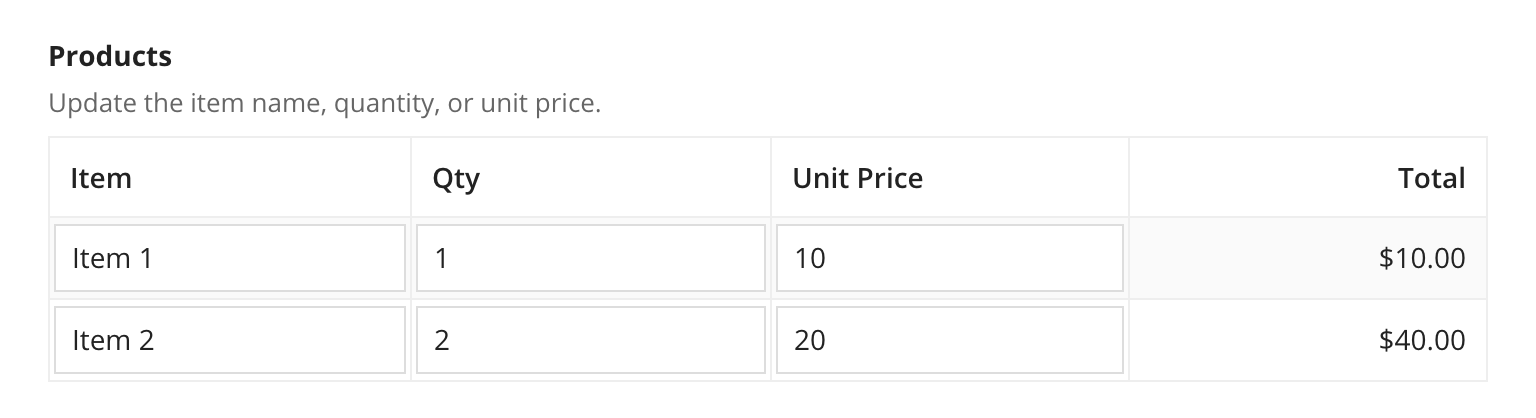
Editable grid with two rows
1
2
3
4
5
6
7
8
9
10
11
12
13
14
15
16
17
18
19
20
21
22
23
24
25
26
27
28
29
30
31
32
33
34
35
36
37
38
39
40
41
42
43
44
45
46
47
48
49
50
51
52
53
54
55
56
57
58
59
60
61
62
63
64
65
66
67
a!localVariables(
  local!items: {
    {item: "Item 1", qty: 1, unitPrice: 10},
    {item: "Item 2", qty: 2, unitPrice: 20}
  },
  a!gridLayout(
    label: "Products",
    instructions: "Update the item name, quantity, or unit price.",
    headerCells: {
      a!gridLayoutHeaderCell(label: "Item"),
      a!gridLayoutHeaderCell(label: "Qty"),
      a!gridLayoutHeaderCell(label: "Unit Price"),
      a!gridLayoutHeaderCell(label: "Total", align: "RIGHT")
    },
    rows: {
      a!gridRowLayout(
        contents: {
          a!textField(
            value: local!items[1].item,
            saveInto: local!items[1].item
          ),
          a!integerField(
            value: local!items[1].qty,
            saveInto: local!items[1].qty
          ),
          a!floatingPointField(
            value: local!items[1].unitPrice,
            saveInto: local!items[1].unitPrice
          ),
          a!textField(
            value: a!currency(
              isoCode: "USD",
              value: tointeger(local!items[1].qty) * todecimal(local!items[1].unitPrice)
            ),
            readOnly: true,
            align: "RIGHT"
          )
        }
      ),
      a!gridRowLayout(
        contents: {
          a!textField(
            value: local!items[2].item,
            saveInto: local!items[2].item
          ),
          a!integerField(
            value: local!items[2].qty,
            saveInto: local!items[2].qty
          ),
          a!floatingPointField(
            value: local!items[2].unitPrice,
            saveInto: local!items[2].unitPrice
          ),
          a!textField(
            value: a!currency(
              isoCode: "USD",
              value: tointeger(local!items[2].qty) * todecimal(local!items[2].unitPrice)
            ),
            readOnly: true,
            align: "RIGHT"
          )
        }
      )
    },
    rowHeader: 1
  )
)
Copy
Displays the following:
Editable grid with two rows using looping
See Add, Edit, and Remove Data in an Inline Editable Grid recipe for more help using a!forEach with the editable grid.
1
2
3
4
5
6
7
8
9
10
11
12
13
14
15
16
17
18
19
20
21
22
23
24
25
26
27
28
29
30
31
32
33
34
35
36
37
38
39
40
41
42
43
44
a!localVariables(
  local!items: {
    {item: "Item 1", qty: 1, unitPrice: 10},
    {item: "Item 2", qty: 2, unitPrice: 20}
  },
  a!gridLayout(
    label: "Products",
    instructions: "Update the item name, quantity, or unit price.",
    headerCells: {
      a!gridLayoutHeaderCell(label: "Item"),
      a!gridLayoutHeaderCell(label: "Qty"),
      a!gridLayoutHeaderCell(label: "Unit Price"),
      a!gridLayoutHeaderCell(label: "Total", align: "RIGHT")
    },
    rows: a!forEach(
      items: local!items,
      expression: a!gridRowLayout(
        contents: {
          a!textField(
            value: fv!item.item,
            saveInto: fv!item.item
          ),
          a!integerField(
            value: fv!item.qty,
            saveInto: fv!item.qty
          ),
          a!floatingPointField(
            value: fv!item.unitPrice,
            saveInto: fv!item.unitPrice
          ),
          a!textField(
            value: a!currency(
              isoCode: "USD",
              value: tointeger(fv!item.qty) * todecimal(fv!item.unitPrice)
            ),
            readOnly: true,
            align: "RIGHT"
          )
        }
      )
    ),
    rowHeader: 1
  )
)
Copy
Displays the following:
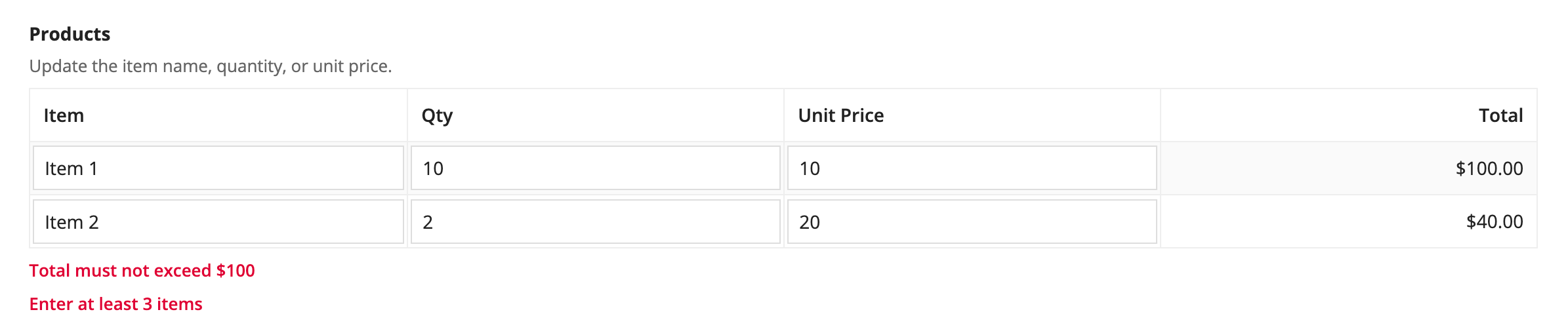
Editable grid with validations
1
2
3
4
5
6
7
8
9
10
11
12
13
14
15
16
17
18
19
20
21
22
23
24
25
26
27
28
29
30
31
32
33
34
35
36
37
38
39
40
41
42
43
44
45
46
47
48
49
50
51
52
53
54
55
56
57
58
a!localVariables(
  local!items: {
    {item: "Item 1", qty: 10, unitPrice: 10},
    {item: "Item 2", qty: 2,  unitPrice: 20}
  },
  a!gridLayout(
    label: "Products",
    instructions: "Update the item name, quantity, or unit price.",
    headerCells: {
      a!gridLayoutHeaderCell(label: "Item"),
      a!gridLayoutHeaderCell(label: "Qty"),
      a!gridLayoutHeaderCell(label: "Unit Price"),
      a!gridLayoutHeaderCell(label: "Total", align: "RIGHT")
    },
    rows: a!forEach(
      items: local!items,
      expression: a!gridRowLayout(
        contents: {
          a!textField(
            value: fv!item.item,
            saveInto: fv!item.item
          ),
          a!integerField(
            value: fv!item.qty,
            saveInto: fv!item.qty
          ),
          a!floatingPointField(
            value: fv!item.unitPrice,
            saveInto: fv!item.unitPrice
          ),
          a!textField(
            value: a!currency(
              isoCode: "USD",
              value: tointeger(fv!item.qty) * todecimal(fv!item.unitPrice)
            ),
            readOnly: true,
            align: "RIGHT"
          )
        }
      )
    ),
    validations: {
      if(
        sum(tointeger(local!items.qty) * todecimal(local!items.unitPrice))>100,
        "Total must not exceed $100",
        null
      ),
      if(
        length(local!items)<3,
        a!validationMessage(
          message: "Enter at least 3 items",
        ),
        null
      )
    },
    rowHeader: 1
  )
)
Copy
Displays the following:
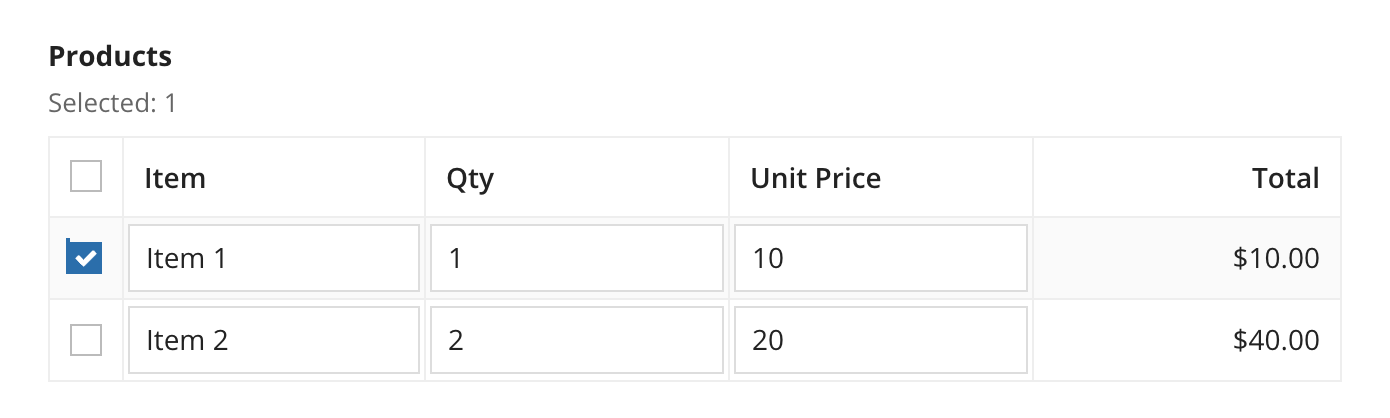
Editable grid with selection
1
2
3
4
5
6
7
8
9
10
11
12
13
14
15
16
17
18
19
20
21
22
23
24
25
26
27
28
29
30
31
32
33
34
35
36
37
38
39
40
41
42
43
44
45
46
47
48
49
50
51
a!localVariables(
  local!items: {
    {item: "Item 1", qty: 1, unitPrice: 10},
    {item: "Item 2", qty: 2, unitPrice: 20}
  },
  local!selected: tointeger({}),
  a!gridLayout(
    label: "Products",
    instructions: "Selected: " & local!selected,
    headerCells: {
      a!gridLayoutHeaderCell(label: "Item"),
      a!gridLayoutHeaderCell(label: "Qty"),
      a!gridLayoutHeaderCell(label: "Unit Price"),
      a!gridLayoutHeaderCell(label: "Total", align: "RIGHT")
    },
    rows: a!forEach(
      items: local!items,
      expression: a!gridRowLayout(
        id: fv!index,
        contents: {
          a!textField(
            value: fv!item.item,
            saveInto: fv!item.item
          ),
          a!integerField(
            value: fv!item.qty,
            saveInto: fv!item.qty
          ),
          a!floatingPointField(
            value: fv!item.unitPrice,
            saveInto: fv!item.unitPrice
          ),
          a!textField(
            value: a!currency(
              isoCode: "USD",
              value: tointeger(fv!item.qty) * todecimal(fv!item.unitPrice)
            ),
            readOnly: true,
            align: "RIGHT"
          )
        }
      )
    ),
    selectable: true,
    selectionValue: local!selected,
    /* Flatten the selected values so the result is easier to work with */
    /* when the select/deselect all option is used in an editable grid  */
    selectionSaveInto: a!save(local!selected, a!flatten(save!value)),
    rowHeader: 1
  )
)
Copy
Displays the following:
Editable grid with weighted columns
1
2
3
4
5
6
7
8
9
10
11
12
13
14
15
16
17
18
19
20
21
22
23
24
25
26
27
28
29
30
31
32
33
34
35
36
37
38
39
40
41
42
43
44
45
46
47
48
49
50
a!localVariables(
  local!items: {
    {item: "Item 1", qty: 10, unitPrice: 10},
    {item: "Item 2", qty: 2,  unitPrice: 20}
  },
  a!gridLayout(
    label: "Products",
    instructions: "This is a grid layout with column weights: 5, 1, 1, 2",
    headerCells: {
      a!gridLayoutHeaderCell(label: "Item"),
      a!gridLayoutHeaderCell(label: "Qty"),
      a!gridLayoutHeaderCell(label: "Unit Price"),
      a!gridLayoutHeaderCell(label: "Total", align: "RIGHT")
    },
    columnConfigs: {
      a!gridLayoutColumnConfig(width: "DISTRIBUTE", weight: 5),
      a!gridLayoutColumnConfig(width: "DISTRIBUTE"),
      a!gridLayoutColumnConfig(width: "DISTRIBUTE"),
      a!gridLayoutColumnConfig(width: "DISTRIBUTE", weight: 2)
    },
    rows: a!forEach(
      items: local!items,
      expression: a!gridRowLayout(
        contents: {
          a!textField(
            value: fv!item.item,
            saveInto: fv!item.item
          ),
          a!integerField(
            value: fv!item.qty,
            saveInto: fv!item.qty
          ),
          a!floatingPointField(
            value: fv!item.unitPrice,
            saveInto: fv!item.unitPrice
          ),
          a!textField(
            value: a!currency(
              isoCode: "USD",
              value: tointeger(fv!item.qty) * todecimal(fv!item.unitPrice)
            ),
            readOnly: true,
            align: "RIGHT"
          )
        }
      )
    ),
    rowHeader: 1
  )
)
Copy
Displays the following: 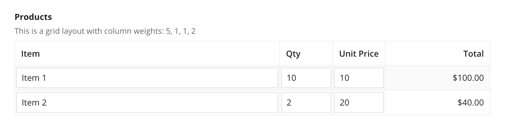
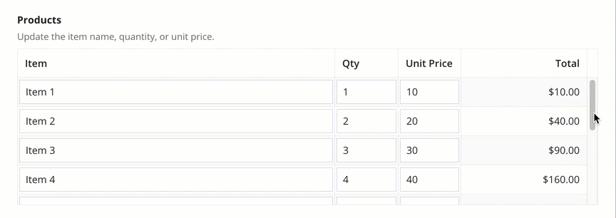
Short editable grid with weighted columns
1
2
3
4
5
6
7
8
9
10
11
12
13
14
15
16
17
18
19
20
21
22
23
24
25
26
27
28
29
30
31
32
33
34
35
36
37
38
39
40
41
42
43
44
45
46
47
48
49
50
51
52
53
54
55
56
57
58
59
a!localVariables(
  local!items: {
    {item: "Item 1", qty: 1, unitPrice: 10},
    {item: "Item 2", qty: 2, unitPrice: 20},
    {item: "Item 3", qty: 3, unitPrice: 30},
    {item: "Item 4", qty: 4, unitPrice: 40},
    {item: "Item 5", qty: 5, unitPrice: 50},
    {item: "Item 6", qty: 6, unitPrice: 60},
    {item: "Item 7", qty: 7, unitPrice: 70},
    {item: "Item 8", qty: 8, unitPrice: 80},
    {item: "Item 9", qty: 9, unitPrice: 90},
    {item: "Item 10", qty: 10, unitPrice: 100}
  },
  a!gridLayout(
    label: "Products",
    instructions: "Update the item name, quantity, or unit price.",
    headerCells: {
      a!gridLayoutHeaderCell(label: "Item"),
      a!gridLayoutHeaderCell(label: "Qty"),
      a!gridLayoutHeaderCell(label: "Unit Price"),
      a!gridLayoutHeaderCell(label: "Total", align: "RIGHT")
    },
    columnConfigs: {
      a!gridLayoutColumnConfig(width: "DISTRIBUTE", weight: 5),
      a!gridLayoutColumnConfig(width: "DISTRIBUTE"),
      a!gridLayoutColumnConfig(width: "DISTRIBUTE"),
      a!gridLayoutColumnConfig(width: "DISTRIBUTE", weight: 2)
    },
    rows: a!forEach(
      items: local!items,
      expression: a!gridRowLayout(
        contents: {
          a!textField(
            value: fv!item.item,
            saveInto: fv!item.item
          ),
          a!integerField(
            value: fv!item.qty,
            saveInto: fv!item.qty
          ),
          a!floatingPointField(
            value: fv!item.unitPrice,
            saveInto: fv!item.unitPrice
          ),
          a!textField(
            value: a!currency(
              isoCode: "USD",
              value: tointeger(fv!item.qty) * todecimal(fv!item.unitPrice)
            ),
            readOnly: true,
            align: "RIGHT"
          )
        }
      )
    ),
    height: "SHORT",
    rowHeader: 1
  )
)
Copy
Displays the following:
Feature compatibility
The table below lists this component's compatibility with various features in Appian.| Feature | Compatibility | Note |
|---|---|---|
| Portals | Compatible | |
| Offline Mobile | Compatible | |
| Sync-Time Custom Record Fields | Incompatible | |
| Real-Time Custom Record Fields | Incompatible | Custom record fields that evaluate in real time must be configured using one or more Custom Field functions. |
| Process Reports | Incompatible | Cannot be used to configure a process report. |
| Process Events | Incompatible | Cannot be used to configure a process event node, such as a start event or timer event. |
Related Patterns
The following patterns include usage of the Editable Grid Component.
-
Add Validations to an Inline Editable Grid (Validation, Grids, Looping): Allows the user to change data directly in a grid, and validate a various entries.
-
Add, Edit, and Remove Data in an Inline Editable Grid (Grids, Looping): Allow the user to change data directly in an inline editable grid.
-
Display Multiple Files in a Grid (Document Management, Grids): Show a dynamic number of files in a grid and edit certain file attributes.
-
Expand/Collapse Rows in a Tree Grid (Hierarchical Data, Grids): Create a grid that shows hierarchical data and allows users to dynamically expand and collapse rows within the grid.
-
Track Adds and Deletes in Inline Editable Grid (Grids): In an inline editable grid, track the employees that are added for further processing in the next process steps.
-
Use Selection For Bulk Actions in an Inline Editable Grid (Grids): Allow the user to edit data inline in a grid one field at a time, or in bulk using selection.