Tip: Interface patterns give you an opportunity to explore different interface designs. Be sure to check out How to Adapt a Pattern for Your Application.
GoalCopy link to clipboard
Display a column chart with a toggle to display an alternate grid view of the data.
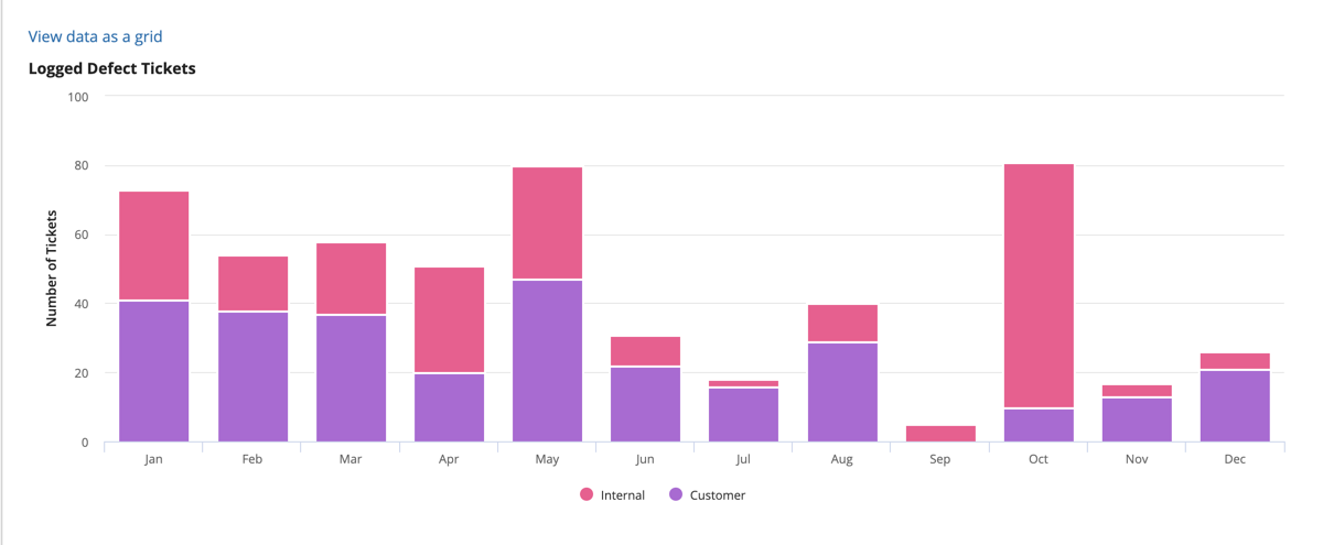
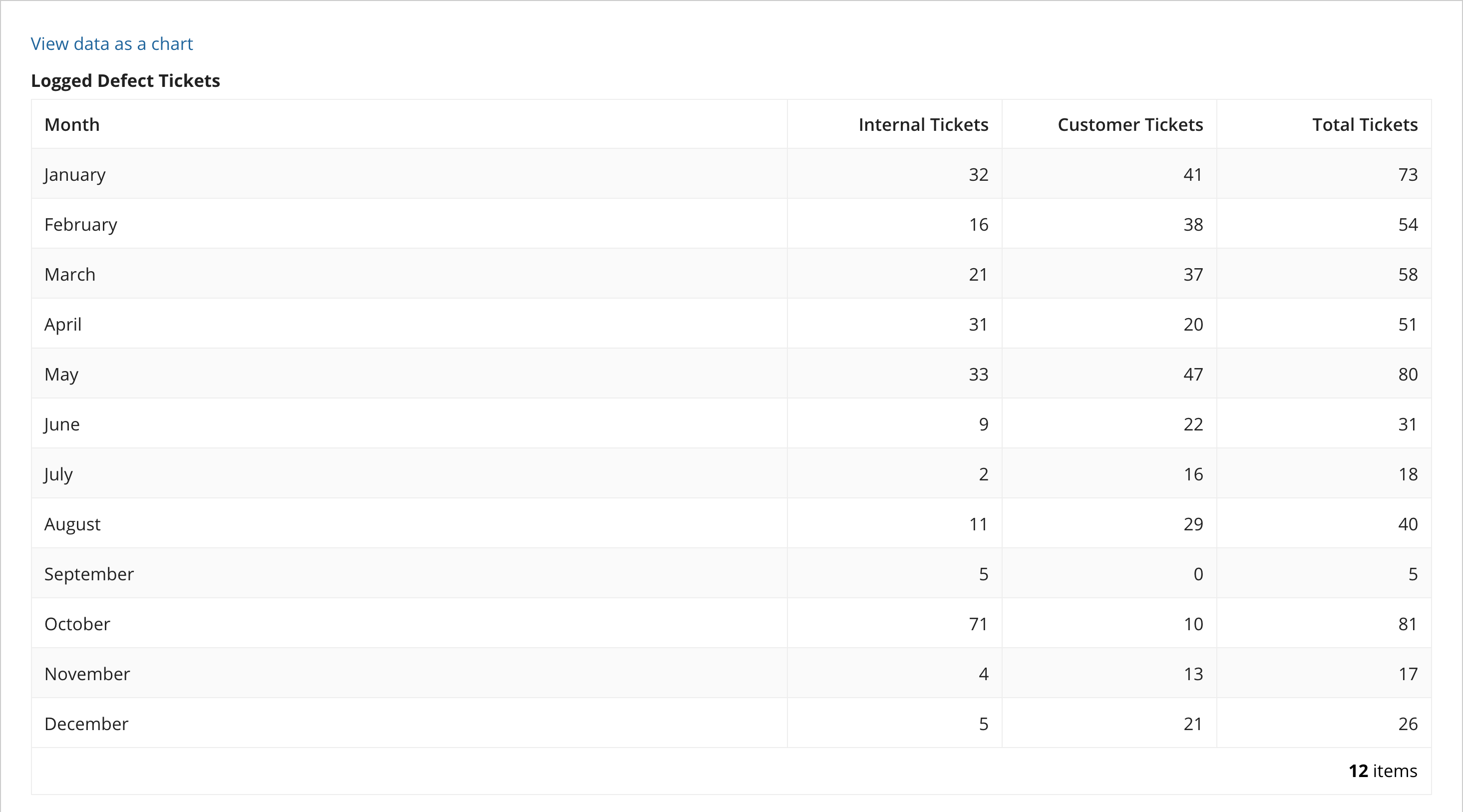
Display a chart with the number of tickets reported each month internally and from customers. Then add a grid to display the same data. Finally, add a link so that a user may toggle between the chart and grid views of the data. This pattern is recommended to provide a visual data display while still making the data accessible to users who employ assistive technology.
This is the data displayed as a chart:

This is the data displayed as a grid:

This scenario demonstrates:
- How to configure alternate displays of the same data.
- How to modify the expression to display a grid when the user clicks on a link toggle.
Create this patternCopy link to clipboard
1
2
3
4
5
6
7
8
9
10
11
12
13
14
15
16
17
18
19
20
21
22
23
24
25
26
27
28
29
30
31
32
33
34
35
36
37
38
39
40
41
42
43
44
45
46
47
48
49
50
51
52
53
54
55
56
57
58
59
60
61
62
63
64
65
66
67
68
69
70
71
72
73
74
75
a!localVariables(
  local!ticketData:{
    a!map( month:"January",   internalTickets:32, customerTickets:41 ),
    a!map( month:"February",  internalTickets:16, customerTickets:38 ),
    a!map( month:"March",     internalTickets:21, customerTickets:37 ),
    a!map( month:"April",     internalTickets:31, customerTickets:20 ),
    a!map( month:"May",       internalTickets:33, customerTickets:47 ),
    a!map( month:"June",      internalTickets:9, customerTickets:22 ),
    a!map( month:"July",      internalTickets:2, customerTickets:16 ),
    a!map( month:"August",    internalTickets:11, customerTickets:29 ),
    a!map( month:"September", internalTickets:5, customerTickets:0 ),
    a!map( month:"October",   internalTickets:71, customerTickets:10 ),
    a!map( month:"November",  internalTickets:4, customerTickets:13 ),
    a!map( month:"December",  internalTickets:5, customerTickets:21 )
  },
  /* This variable is referenced in the showWhen parameters of both the grid and
     the chart. */
  local!showAsGrid: false,
  {
    a!linkField(
      links:{
        /* The not() function simply inverts a true or false value, making for a
           simple toggle. */
        a!dynamicLink(
          label: "View data as a " & if(local!showAsGrid, "chart", "grid"),
          value: not(local!showAsGrid),
          saveInto: local!showAsGrid
        )
      }
    ),
    if(local!showAsGrid,
    a!gridField(
      label: "Logged Defect Tickets",
      data: local!ticketData,
      columns: {
        a!gridColumn(
          label: "Month",
          value: fv!row.month
        ),
        a!gridColumn(
          label: "Internal Tickets",
          value: fv!row.internalTickets,
          align: "END",
          width: "NARROW_PLUS"
        ),
        a!gridColumn(
          label: "Customer Tickets",
          value: fv!row.customerTickets,
          align: "END",
          width: "NARROW_PLUS"
        ),
        a!gridColumn(
          label: "Total Tickets",
          value: fv!row.internalTickets + fv!row.customerTickets,
          align:"END",
          width: "NARROW_PLUS"
        )
      },
      pageSize: 12
    ),
    a!columnChartField(
      label: "Logged Defect Tickets",
      categories: left(local!ticketData.month, 3),
      series: {
        a!chartSeries(label: "Internal", data: local!ticketData.internalTickets),
        a!chartSeries(label: "Customer", data: local!ticketData.customerTickets)
      },
      colorScheme: "PARACHUTE",
      yAxisTitle: "Number of Tickets",
      stacking: "NORMAL",
      showLegend: true
    )
    )
  }
)
Copy
Test it outCopy link to clipboard
- Click the "View this data as a grid" link. The chart will be replaced with a grid that displays all defect tickets.
- Click the "View this data as a chart" link. The grid will be replaced with the original chart.
Notable implementation detailsCopy link to clipboard
- This example uses a hard-coded data set. To use data from a record type, use a!queryRecordType() to populate
local!ticketDataand update the columns to use record type field references. See Aggregate Data and Conditionally Display in a Chart or Grid for a similar pattern using records.
FeedbackCopy link to clipboard
Was this page helpful?
