Tip: Interface patterns give you an opportunity to explore different interface designs. Be sure to check out How to Adapt a Pattern for Your Application.
GoalCopy link to clipboard
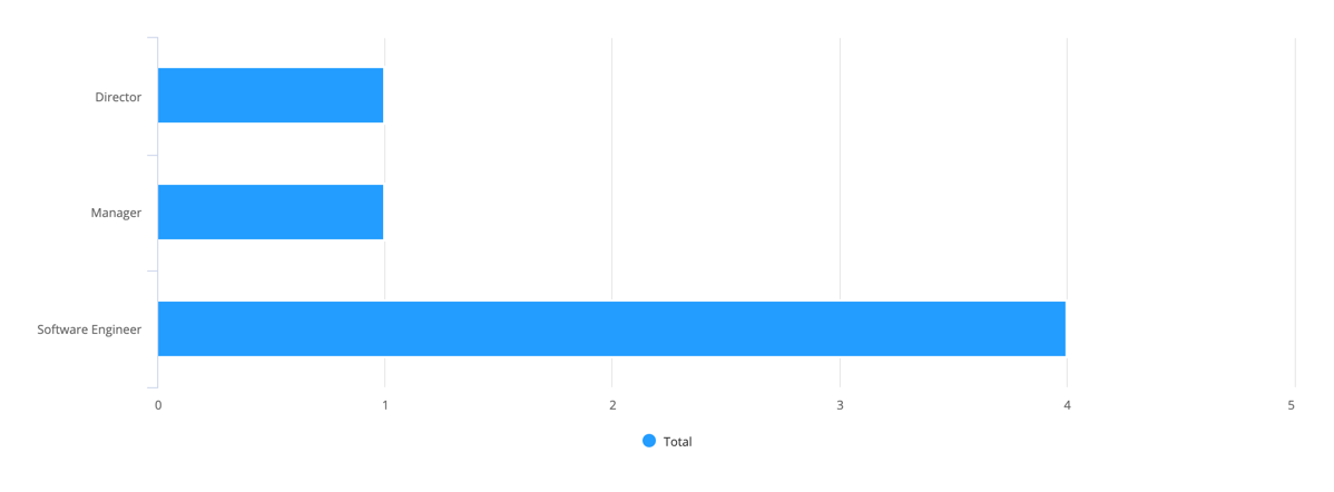
Aggregate data, specifically the total number of employees for each title in the Engineering department, to display in a bar chart.
Note: This expression uses direct references to the Employee record type, created in the Records Tutorial. If you've completed that tutorial in your environment, you can change the existing record-type references in this pattern to point to your Employee record type instead.

This scenario demonstrates:
- How to aggregated data and display it in a bar chart
- How to filter the bar chart
Create this patternCopy link to clipboard
You can easily create this pattern in design mode when you use a record type as the source of your chart.
Tip: If your record type has data sync enabled, you can also add filters directly on your measures. This allows you to determine which values are included in the measure's calculation. Learn more about using filters in a measure.
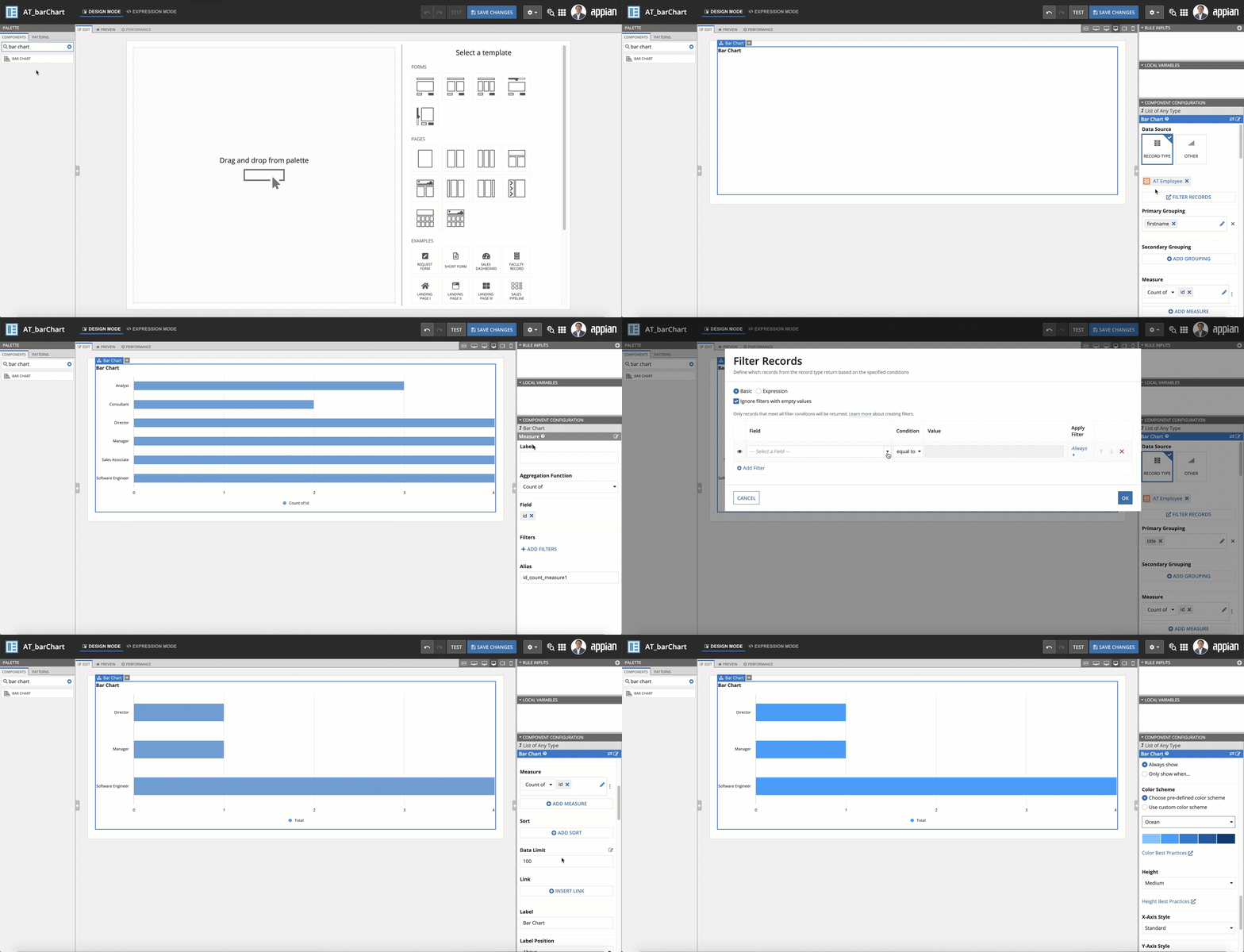
To create this pattern in design mode:
- Open a new or empty interface object.
- From the PALETTE, drag a Bar Chart component into the interface.
- From Data Source, select RECORD TYPE and search for the Employee record type.
- Under Primary Grouping, select the title field.
- Under Measure, use the dropdown to select Count of, then select the id field.
- Click the edit icon next to the measure.
- Under Label, enter Total.
- Return to the Bar Chart configuration and click FILTER RECORDS.
- Under Field, use the dropdown to select the department field.
- Under Condition, use the dropdown to select equal to.
- Under Value, enter
Engineering. - Click OK.
Your resulting expression will look something like this:
1
2
3
4
5
6
7
8
9
10
11
12
13
14
15
16
17
18
19
20
21
22
23
24
25
26
27
28
29
30
31
32
33
34
35
36
37
38
39
40
41
42
43
{
  a!barChartField(
    data: a!recordData(
      recordType: recordType!Employee,
      filters: a!queryLogicalExpression(
        operator: "AND",
        filters: {
          a!queryFilter(
            field: recordType!Employee.fields.department,
            operator: "=",
            value: "Engineering"
          )
        },
        ignoreFiltersWithEmptyValues: true
      )
    ),
    config: a!barChartConfig(
      primaryGrouping: a!grouping(
        field: recordType!Employee.fields.title,
        alias: "title_primaryGrouping"
      ),
      measures: {
        a!measure(
          label: "Total",
          function: "COUNT",
          field: recordType!Employee.fields.id,
          alias: "id_count_measure1"
        )
      },
      dataLimit: 100
    ),
    label: "Bar Chart",
    labelPosition: "ABOVE",
    stacking: "NONE",
    showLegend: true,
    showTooltips: true,
    colorScheme: "OCEAN",
    height: "MEDIUM",
    xAxisStyle: "STANDARD",
    yAxisStyle: "STANDARD",
    refreshAfter: "RECORD_ACTION"
  )
}
Copy
Notable implementation detailsCopy link to clipboard
- The expression for the filter is being passed into the filters parameter of
a!recordData(). Learn more about this function. - In the final expression, the chart color scheme "OCEAN" has been added. You can change the color scheme or create your own custom color scheme.


