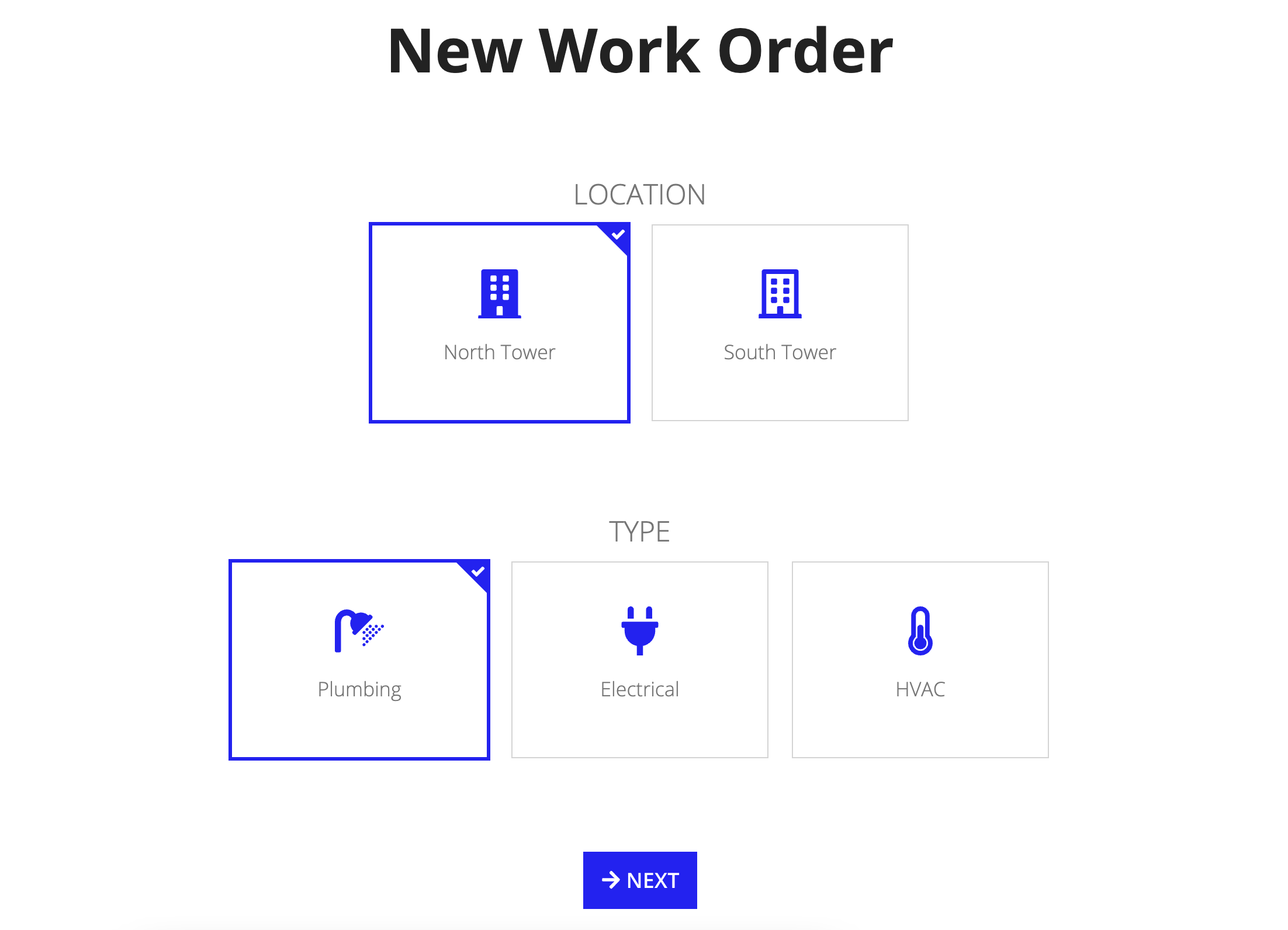
Tip: Interface patterns give you an opportunity to explore different interface designs. Be sure to check out How to Adapt a Pattern for Your Application.
GoalCopy link to clipboard
Use this pattern to display sets of choices that are quick and easy to navigate. This page explains how you can use this pattern in your interface, and walks through the design structure in detail.

Design structureCopy link to clipboard
This page will break down the expression so you can better understand how to adapt this pattern to your own data so that it works to best suit your needs.
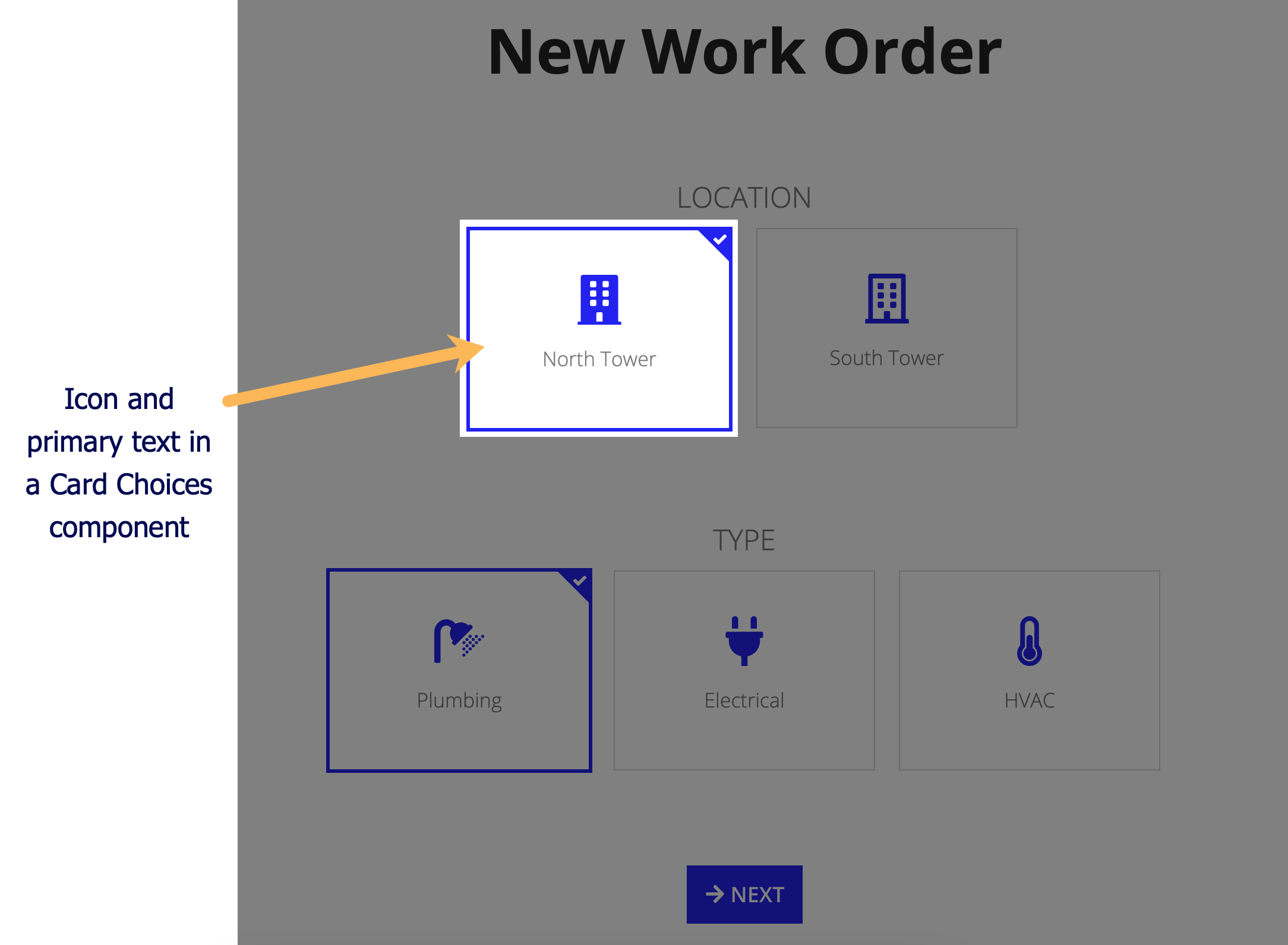
The main components in this pattern are rich text and card choices. The image below displays how the pattern looks on a blank interface with callouts for the main components. You can examine the entire expression or jump down to the subsections below with referenced line numbers to see a detailed breakdown of the main components.

Pattern expressionCopy link to clipboard
When you drag and drop the cards as choices pattern onto your interface, 105 lines of expressions will be added to the section where you dragged it.
1
2
3
4
5
6
7
8
9
10
11
12
13
14
15
16
17
18
19
20
21
22
23
24
25
26
27
28
29
30
31
32
33
34
35
36
37
38
39
40
41
42
43
44
45
46
47
48
49
50
51
52
53
54
55
56
57
58
59
60
61
62
63
64
65
66
67
68
69
70
71
72
73
74
75
76
77
78
79
80
81
82
83
84
85
86
87
88
89
90
91
92
93
94
95
96
97
98
99
100
101
102
103
104
105
{
  a!localVariables(
    local!locationChoices: {
      a!map(id: 1, icon: "building",   primaryText: "North Tower"),
      a!map(id: 2, icon: "building-o", primaryText: "South Tower")
    },
    local!typeChoices: {
      a!map(id: 1, icon: "shower",           primaryText: "Plumbing"),
      a!map(id: 2, icon: "plug",             primaryText: "Electrical"),
      a!map(id: 3, icon: "thermometer-half", primaryText: "HVAC")
    },
    local!selectedLocation: 1,
    local!selectedType: 1,
    {
      a!richTextDisplayField(
        labelPosition: "COLLAPSED",
        value: {
          a!richTextItem(
            text: "New Work Order",
            color: "STANDARD",
            size: "LARGE_PLUS",
            style: "STRONG"
          )
        },
        align: "CENTER"
      ),
      a!richTextDisplayField(
        labelPosition: "COLLAPSED",
        value: repeat(3, char(10)),
        align: "CENTER"
      ),
      a!richTextDisplayField(
        labelPosition: "COLLAPSED",
        value: {
          a!richTextItem(
            text: upper("Location"),
            color: "SECONDARY",
            size: "MEDIUM_PLUS"
          )
        },
        align: "CENTER"
      ),
      a!cardChoiceField(
        label: "Location Choices",
        labelPosition: "COLLAPSED",
        data: local!locationChoices,
        cardTemplate: a!cardTemplateTile(
          id: fv!data.id,
          primaryText: fv!data.primaryText,
          icon: fv!data.icon
        ),
        value: local!selectedLocation,
        saveInto: local!selectedLocation,
        maxSelections: 1,
        align: "CENTER"
      ),
      a!richTextDisplayField(
        labelPosition: "COLLAPSED",
        value: repeat(3, char(10)),
        align: "CENTER"
      ),
      a!richTextDisplayField(
        labelPosition: "COLLAPSED",
        value: {
          a!richTextItem(
            text: upper("Type"),
            color: "SECONDARY",
            size: "MEDIUM_PLUS"
          )
        },
        align: "CENTER"
      ),
      a!cardChoiceField(
        label: "Type Choices",
        labelPosition: "COLLAPSED",
        data: local!typeChoices,
        cardTemplate: a!cardTemplateTile(
          id: fv!data.id,
          primaryText: fv!data.primaryText,
          icon: fv!data.icon
        ),
        value: local!selectedType,
        saveInto: local!selectedType,
        maxSelections: 1,
        align: "CENTER"
      ),
      a!richTextDisplayField(
        labelPosition: "COLLAPSED",
        value: repeat(3, char(10)),
        align: "CENTER"
      ),
      a!buttonArrayLayout(
        buttons: {
          a!buttonWidget(
            label: "Next",
            icon: "arrow-right",
            size: "LARGE",
            style: "SOLID"
          )
        },
        align: "CENTER"
      )
    }
  )
}
Copy
[Line 1-13] Define local variablesCopy link to clipboard
The local variables at the top of the expression define the data that will be displayed in each set of card choices and set up a variable to store the selected card.
1
2
3
4
5
6
7
8
9
10
11
12
13
{
  a!localVariables(
    local!locationChoices: {
      a!map(id: 1, icon: "building",   primaryText: "North Tower"),
      a!map(id: 2, icon: "building-o", primaryText: "South Tower")
    },
    local!typeChoices: {
      a!map(id: 1, icon: "shower",           primaryText: "Plumbing"),
      a!map(id: 2, icon: "plug",             primaryText: "Electrical"),
      a!map(id: 3, icon: "thermometer-half", primaryText: "HVAC")
    },
    local!selectedLocation: 1,
    local!selectedType: 1,
Copy
[Line 14-56] Formatting the first two headers and configuring the first set of card choicesCopy link to clipboard
This section uses rich text and the card choices component to format the first two headers and the first set of card choices.
The New Work Order and Location headers are created using rich text items. The rich text display field (lines 27-31) creates white space between the page header and the first set of card choices by using the char() function within the repeat() function.
The char() function returns certain characters based on a numerical input. Here, char(10) is used to return a blank character. The repeat() function then repeats this blank character three times to create the desired amount of white space between the headers.
The first set of card choices (lines 43-56) use the data mapped in the locationChoices local variables to display a set of two selectable card choices. These card choices include an icon and primary text.
14
15
16
17
18
19
20
21
22
23
24
25
26
27
28
29
30
31
32
33
34
35
36
37
38
39
40
41
42
43
44
45
46
47
48
49
50
51
52
53
54
55
56
    {
      a!richTextDisplayField(
        labelPosition: "COLLAPSED",
        value: {
          a!richTextItem(
            text: "New Work Order",
            color: "STANDARD",
            size: "LARGE_PLUS",
            style: "STRONG"
          )
        },
        align: "CENTER"
      ),
      a!richTextDisplayField(
        labelPosition: "COLLAPSED",
        value: repeat(3, char(10)),
        align: "CENTER"
      ),
      a!richTextDisplayField(
        labelPosition: "COLLAPSED",
        value: {
          a!richTextItem(
            text: upper("Location"),
            color: "SECONDARY",
            size: "MEDIUM_PLUS"
          )
        },
        align: "CENTER"
      ),
      a!cardChoiceField(
        label: "Location Choices",
        labelPosition: "COLLAPSED",
        data: local!locationChoices,
        cardTemplate: a!cardTemplateTile(
          id: fv!data.id,
          primaryText: fv!data.primaryText,
          icon: fv!data.icon
        ),
        value: local!selectedLocation,
        saveInto: local!selectedLocation,
        maxSelections: 1,
        align: "CENTER"
      ),
Copy
[Line 57-86] Formatting the Type header and configuring the second set of card choicesCopy link to clipboard
This section is very similar to the first section, but in the reverse. The first rich text display item in this section uses the same repeat() and char() paradigm as explained above. The second rich text item to create the Type header is the same as the expression for the Location header.
The second set of card choices (lines 73-86) use the data mapped out in the typeChoices local variables to display a set of three selectable card choices. These card choices include an icon and primary text.
57
58
59
60
61
62
63
64
65
66
67
68
69
70
71
72
73
74
75
76
77
78
79
80
81
82
83
84
85
86
      a!richTextDisplayField(
        labelPosition: "COLLAPSED",
        value: repeat(3, char(10)),
        align: "CENTER"
      ),
      a!richTextDisplayField(
        labelPosition: "COLLAPSED",
        value: {
          a!richTextItem(
            text: upper("Type"),
            color: "SECONDARY",
            size: "MEDIUM_PLUS"
          )
        },
        align: "CENTER"
      ),
      a!cardChoiceField(
        label: "Type Choices",
        labelPosition: "COLLAPSED",
        data: local!typeChoices,
        cardTemplate: a!cardTemplateTile(
          id: fv!data.id,
          primaryText: fv!data.primaryText,
          icon: fv!data.icon
        ),
        value: local!selectedType,
        saveInto: local!selectedType,
        maxSelections: 1,
        align: "CENTER"
      ),
Copy
[Line 87-105] Formatting the white space and Next buttonCopy link to clipboard
The rich text formatting in this section is similar to the first two rich text char() items. The rest of this section creates the button layout for the Next button.
113
114
115
116
117
118
119
120
121
122
123
124
125
126
127
128
129
130
131
      a!richTextDisplayField(
        labelPosition: "COLLAPSED",
        value: repeat(3, char(10)),
        align: "CENTER"
      ),
      a!buttonArrayLayout(
        buttons: {
          a!buttonWidget(
            label: "Next",
            icon: "arrow-right",
            size: "LARGE",
            style: "SOLID"
          )
        },
        align: "CENTER"
      )
    }
  )
}
Copy
