Each chart type in Appian can be configured to use a different fixed height and style for each axis. These properties provide variety and enable more dense and meaningful dashboards while still displaying important trends. See the Chart Heights best practices for guidance on which type of chart type and style will work best for your data.
See Also:
Chart HeightsCopy link to clipboard
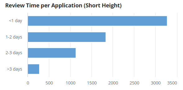
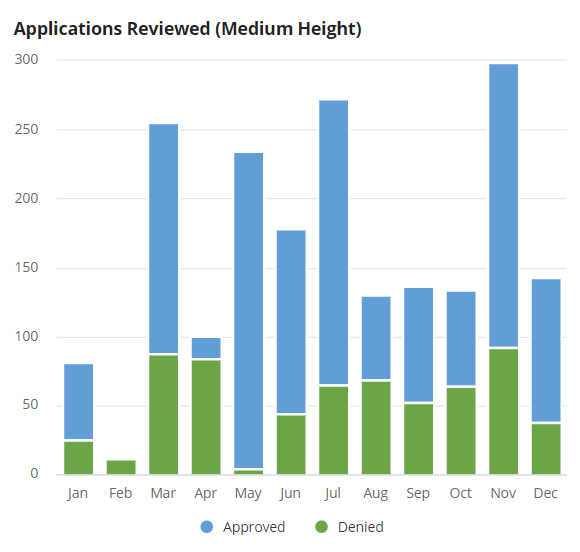
All charts in Appian come in at least three standard heights: "TALL", "MEDIUM", and "SHORT". Bar, column, and line charts also have a "MICRO" height available, which makes it easy to identify trends or outliers using limited space.
Short and Medium Charts Examples
Micro ChartsCopy link to clipboard
Since micro charts are limited in height, they look best with less clutter on the chart. Consider limiting use of the axes labels, legend, or data labels to ensure better readability.
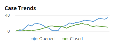
Micro Line Chart with Legend
This example shows a micro chart with a legend since two lines are used, but the x-axis and data labels are not displayed.
1
2
3
4
5
6
7
8
9
10
11
12
13
14
15
a!lineChartField(
  label: "Case Trends",
  labelPosition: "ABOVE",
  categories: today() + enumerate(32),
  series: {
    a!chartSeries(label: "Opened", data: {2, 3, 5, 13, 20, 17, 23, 24, 22, 18, 12, 10, 3, 4, 2, 15, 16, 20, 26, 23, 27, 28, 30, 34, 33, 32, 30, 35, 40, 38, 37, 42}),
    a!chartSeries(label: "Closed", data: {3, 5, 4, 2, 3, 2, 4, 5, 7, 10, 12, 16, 17, 15, 15, 16, 13, 10, 15, 17, 20, 21, 25, 22, 22, 17, 15, 17, 16, 15, 14, 13})
  },
  height: "MICRO",
  xAxisStyle: "NONE",
  yAxisStyle: "STANDARD",
  showLegend: true,
  showTooltips: true,
  colorScheme: "CLASSIC"
)
Copy
Micro Chart with KPI
In some cases, it may be best to hide all axes and labels to only show a general trend. This often works well when paired with additional text to describe the chart. Also, showing the tooltip enables users to still view each data point individually when axes or data labels are hidden.

1
2
3
4
5
6
7
8
9
10
11
12
13
14
15
16
17
18
19
20
21
22
23
24
25
26
27
28
29
30
31
32
33
34
35
36
37
38
39
40
41
42
43
44
45
46
47
48
49
50
51
52
53
54
55
56
a!cardLayout(
  contents: {
    a!columnsLayout(
      columns: {
        a!columnLayout(
          contents: {
            a!richTextDisplayField(
              labelPosition: "COLLAPSED",
              value: {
                a!richTextHeader(
                  text: "Total Revenue",
                  size: "SMALL"
                ),
                a!richTextItem(
                  text: a!currency(
                    isoCode: "USD",
                    value: 3276.91
                  ),
                  size: "LARGE"
                ),
                char(10),
                a!richTextIcon(
                  icon: "caret-up",
                  color: "POSITIVE",
                  size: "MEDIUM"
                ),
                a!richTextItem(
                  text: a!currency(
                    isoCode: "USD",
                    value: 116.31
                  ) & " " & "(18%)",
                  color: "POSITIVE",
                  size: "STANDARD"
                )
              }
            )
          }
        ),
        a!columnLayout(
          contents:   a!lineChartField(
            labelPosition: "ABOVE",
            categories: today() + enumerate(32),
            series: {
              a!chartSeries(label: "count", data: {1, 3, 2, 4, 3, 2, 5, 7, 10, 12, 7, 6, 15, 14, 13, 10, 15, 13, 15, 22, 24, 19, 15, 25, 25, 30, 30, 35, 32, 36, 39, 35, 38, 39, 40}, color: "#4CC900")
            },
            xAxisStyle: "NONE",
            yAxisStyle: "NONE",
            showLegend: false,
            height: "MICRO",
            yAxisMax: 40
          )
        )
      }
    )
  }
)
Copy
Other NotesCopy link to clipboard
- When there are a large number of categories in a limited height or width, the chart may skip some categories to ensure readability of the chart. We recommend using a tooltip to allow users to view all categories on hover.
- All micro-sized charts also will not show a scroll bar and will instead compress the data to fill the width of the chart.
Axes StylesCopy link to clipboard
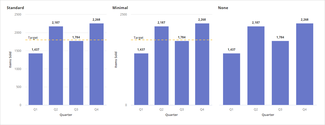
The axes style parameters provide an easy way to create clean, minimalist charts when viewing the general trend of the data is most important. These styles apply to both the x and y axes on bar, column, and line charts. The default style for both axes is STANDARD, but there are additional styles for MINIMAL and NONE that hide certain properties of the chart.
X-Axis StylesCopy link to clipboard
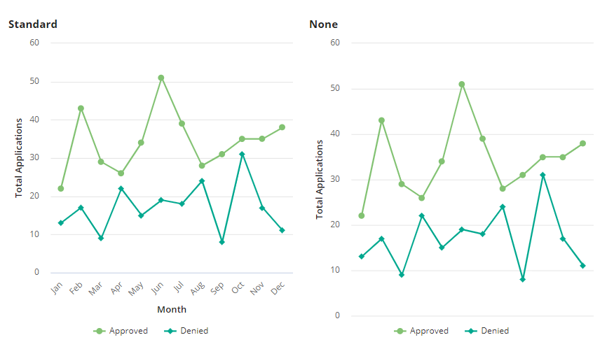
The x-axis always corresponds to the axis that shows the categories. On bar charts, this is the vertical axis; on column and line charts, this is the horizontal axis. The xAxisStyle determines whether to display any category labels and accepts two possible values: NONE or STANDARD. Here are the properties that are affected by the x-axis style:
- Category Labels: If
NONEis used for the x-axis style, category labels are not shown;STANDARDdisplays all category labels. - X-Axis Title: The title is not visible when the style is
NONE.
X-Axis Style Examples
Y-Axis StylesCopy link to clipboard
The y-axis shows the series data values, and each style affects the display of multiple aspects of the chart. The possible values for the y-axis style are STANDARD, MINIMAL, and NONE. The corresponding properties affected by the y-axis style are:
- Grid Lines: All grid lines display when the y-axis style is
STANDARD. WhenMINIMALis used, only the minimum and maximum grid lines are visible, andNONEhides the grid lines entirely. - Axis Data Labels: The axis data labels match the behavior of the grid lines:
STANDARDdisplays all axis data labels,MINIMALdisplays only the minimum and maximum labels and, andNONEdoes not display any axis data labels. - Chart Reference Lines: Chart reference lines do not display when the
NONEstyle is used. - Axis Titles: Similar to the x-axis style, axis titles are also hidden when
NONEis used for the y-axis style.
Y-Axis Style Examples
