
This page contains information related to an old version of the Section Layout Component.
To take advantage of the latest features and improvements, we always recommend you use the latest version whenever possible. See the latest version's page for information about what's been changed.
Section layout componentCopy link to clipboard
Function: a!sectionLayout_17r1()
Displays one or two columns of related components beneath a section title on an interface.
ParametersCopy link to clipboard
| Name | Keyword | Type | Description |
|---|---|---|---|
| Label | label | Text | Optional text to display as the section's title. |
| Column 1 Contents | firstColumnContents | Any Type Array | Values that define the contents for the first column in the interface. |
| Column 2 Contents | secondColumnContents | Any Type Array | Values that define the contents for the second column in the interface. |
| Validations | validations | Text or Validation Message Array | Validation errors displayed below the section title. Configured using a text array or an array with a mix of text and Validation Message using a!validationMessage(message, validateAfter). |
| Validation Group | validationGroup | Text | When present, the section is only validated when a button in the same validation group is clicked. |
| Collapsible | isCollapsible | Boolean | Determines if an expand/collapse control appears in the section label. Default is false. |
| Initially Collapsed | isInitiallyCollapsed | Boolean | Determines if the section is collapsed when the interface first loads. Default is false. |
| Visibility | showWhen | Boolean | Determines whether the layout is displayed on the interface. When set to false, the layout is hidden and is not evaluated. Default: true. |
Usage considerationsCopy link to clipboard
- If you put a two-column section within a column of a two-column dashboard, the section's columns collapse into one.
- If the Column 2 Contents argument is null, the content for the first column displays as in a single-column layout with no space left for where the second column would display.
- Sections that contain validation messages are not collapsible regardless of the setting of the Collapsible parameter. For example, if a validation is triggered when the form loads, then that section is expanded, even if you have specified
truefor the Initially Collapsed parameter. - If you have nested section layouts, any validations on an inner section will appear in the outer section.
ExamplesCopy link to clipboard
Click EXPRESSION to copy and paste an example into the Interface Definition to see it displayed.
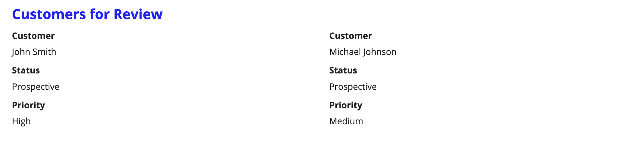
Two columns within a sectionCopy link to clipboard
1
2
3
4
5
6
7
8
9
10
11
12
13
14
15
16
17
18
19
20
21
22
23
24
25
26
27
28
29
30
31
32
33
34
35
36
37
a!sectionLayout_17r1(
  label: "Customers for Review",
  firstColumnContents: {
    a!textField(
      label: "Customer",
      value: "John Smith",
      readOnly: true
    ),
    a!textField(
      label: "Status",
      value: "Prospective",
      readOnly: true
    ),
    a!textField(
      label: "Priority",
      value: "High",
      readOnly: true
    )
  },
  secondColumnContents: {
    a!textField(
      label: "Customer",
      value: "Michael Johnson",
      readOnly: true
    ),
    a!textField(
      label: "Status",
      value: "Prospective",
      readOnly: true
    ),
    a!textField(
      label: "Priority",
      value: "Medium",
      readOnly: true
    )
  }
)
Copy
Displays the following:
Feature compatibilityCopy link to clipboard
The table below lists this component's compatibility with various features in Appian.
| Feature | Compatibility | Note |
|---|---|---|
| Portals | Compatible | |
| Offline Mobile | Compatible | |
| Sync-Time Custom Record Fields | Incompatible | |
| Real-Time Custom Record Fields | Incompatible | Custom record fields that evaluate in real time must be configured using one or more Custom Field functions. |
| Process Reports | Incompatible | Cannot be used to configure a process report. |
| Process Events | Incompatible | Cannot be used to configure a process event node, such as a start event or timer event. |