
| The capabilities described on this page are included in Appian's standard capability tier. Usage limits may apply. |
OverviewCopy link to clipboard
A portal is a public web app that users can access without signing in to Appian. A portal object is what you use to define and customize the settings and content for your portal. This includes configurations, service access information, branding, and progressive web app (PWA) settings.
This page provides detailed information on how to create and configure a portal object.
See alsoCopy link to clipboard
To learn more about Appian Portals, check out these pages:
- For design guidance, see Portal Best Practices.
- To learn how to query and write data using a portal, see Working with Data in a Portal.
- For information on publishing, testing, and deploying a portal, see Manage a Portal.
PropertiesCopy link to clipboard
You can create a portal object in two places:
- In the Build view, click NEW, then Portal.
- In the Explore view, in the SITES AND PORTALS section, click NEW. Select the PORTAL tab.
When creating your portal, configure the following properties:
| Field | Description |
|---|---|
| Name | Enter a name for the portal object that follows the recommended naming standard. Only developers can see this name. |
| Display Name | The website name displayed in the browser tab. Optionally, this name can also be displayed in the header bar. Visible to end users. Follow the recommended naming standard for display names. |
| Web Address Identifier | A unique identifier that is part of the web address. Appian uses this identifier to construct the web address where published portals are available to end users. The web address identifier must be unique in the current environment and any environments that you deploy the portal to. For more information on web address identifiers, see Configurations. |
| Description | (Optional) Enter a description of the portal. |
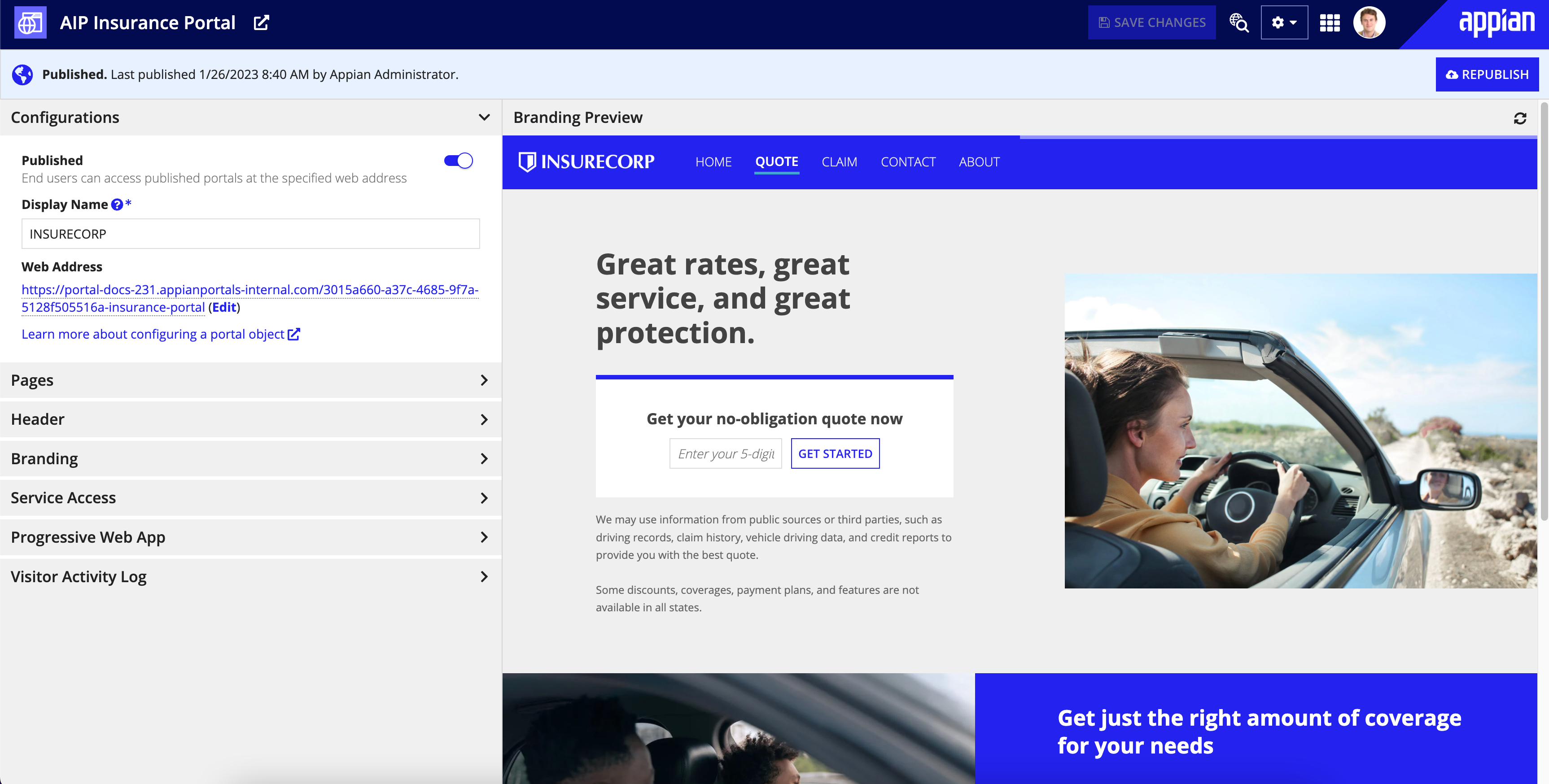
ConfigurationsCopy link to clipboard
The Configurations section allows you to:
- Publish a portal.
- Edit the Display Name and Web Address.
| Field | Description |
|---|---|
| Published | Determines whether or not your portal is available to end users at the specified web address. For more information on publishing, see Manage a Portal. |
| Display Name | The website name displayed in the browser tab. Optionally, this name can also be displayed in the header bar. Visible to end users. Follow the recommended naming standard for display names. |
| Web Address | The URL where users can access the published portal. Web addresses in your environment may contain a UUID to help you restrict access to portals that are intended for development and testing. This setting is applied at the environment level in the Administration Console. For more information on UUIDs, see Manage a Portal. |
By default, portal web addresses use the Appian environment name for the subdomain and appianportals.com for the domain. For example, if an environment is called insurecorp, the URLs for portals published from the environment will use insurecorp.appianportals.com. If you would like to configure a custom domain to use for all portals in your environment, see Configuring a Custom Domain for Portals.
PagesCopy link to clipboard
The Pages section allows you to add up to ten pages to your portal. Adding more than one page automatically turns on the Show header bar option in the Header section. Click ADD PAGE to add pages to the portal object.
When adding pages, configure the following properties:
| Field | Description |
|---|---|
| Title | Page title that displays in the header bar when you add more than one page. It also displays in the browser tab if the header bar is turned on. |
| Web Address Identifier | Used to form a unique URL for the page. If left blank, a random alphanumeric string will be generated. |
| Content | The interface to use as the content for the page. You can select an existing interface or click to create a new one. |
The order of the page titles in the portal object determines the order of the page titles in the header bar. To reorder the pages, use the and arrows.
Note: The interfaces you add as pages cannot contain rule inputs. However, they can reference other objects that use rule inputs. If you select an interface with rule inputs, you'll receive a validation message. For more information on alternatives to rule inputs in your interfaces, check out Portal Best Practices.
HeaderCopy link to clipboard
The Header section allows you to:
- Add a header bar to your single-page portal for additional branding options. Multipage portals automatically have the header bar turned on.
- Choose a header bar background color.
- Add a logo with alternative text to your header bar.
- Choose whether or not to show the display name in the header bar.
Portals use the Mercury style for the header bar.
| Field | Description |
|---|---|
| Show header bar | Determines whether or not a header bar is displayed for the portal. Portals that don't have this option turned on can only display one page. Adding more than one page will automatically turn this setting on. If you have multiple pages added and you try to turn this setting off, you'll receive a message asking if you want to remove the additional pages. |
| Color | The background color of the header bar. |
| Selected Page Highlight Color | The highlight color of the selected page in the header bar. |
| Logo | The logo to display in the header bar. Select an image with a transparent background. |
| Logo Alternative text | Text used by screen readers to describe the logo for accessibility. You should update the default value to something that conveys the same information as the logo, such as the company or entity name or any text used in the logo. |
| Show portal display name in header bar | Determines whether the Display Name from the Configurations section should display in the header bar. |
BrandingCopy link to clipboard
The Branding section allows you to configure the branding colors, shapes, and favicon for your portal. Check out the Branding Preview to see these configurations applied to the pages for your portal.
| Field | Description | Default Value |
|---|---|---|
| Input Shape | The shape applied to all input fields, selection fields, and picker components in a portal. There are two options for input shape: squared and semi-rounded. | Squared |
| Button Shape | The shape applied to all buttons in a portal. There are three options for button shape: squared, semi-rounded, and rounded. | Squared |
| Accent Color | Affects the color of many elements in all interfaces, such as buttons, links, active field border colors, milestone bars, and section titles. Avoid grayscale colors (black, white, and gray) as the accent color, since these are similar to colors used for interface elements. Avoid green/red colors as the accent color, since these are commonly used to indicate positive/negative values. | #1d659c |
| Loading Bar Color | The color of the bar at the top of the page that indicates when the system is processing. Select a loading bar color with sufficient contrast against the header bar color to ensure users notice it. | The accent color. |
| Favicon Image |
The favicon (or "favorite icon") is the icon that appears in the browser tab or URL bar. The file must be:
|
Appian "a" icon. |
Branding previewCopy link to clipboard
The Branding Preview allows you to see the branding configurations applied to the pages for your portal. If you have multiple pages, you can use the interactive header to see how your branding changes will look on each page.
The branding preview only shows a preview of the branding configurations applied to the interfaces you add as pages. It shouldn't be used to test the expressions, interface components, or functionality of the interfaces or portal.
Always fully test your portal and any connecting services after publishing. See Managing a portal for more information.
Service AccessCopy link to clipboard
The Service Access section allows you to configure access to two different services:
- The platform service via a Service Account.
- The Google reCAPTCHA service via a connected system.
| Field | Description |
|---|---|
| Service Account | The service account used to give end users the appropriate permissions to the information and processes in Appian. Make sure the service account is in a group that has access to the data, documents, and process models used in your portal, but doesn't have access to unrelated data. Note that if your portal uses a web API, you can use the same service account for API key authentication. See Service Accounts in Portals for more information. |
| Google reCAPTCHA | A reCAPTCHA connected system that connects to Google's reCAPTCHA services to help monitor you portals for unauthorized usage. Learn more about reCAPTCHA. |
Progressive Web AppCopy link to clipboard
In the Progressive Web App section, you can choose to configure your portal as a progressive web app (PWA).
It is a good idea to select this if:
- You want to give your users an easy way to access a portal that they use frequently. For example, a portal that allows users to submit repair requests.
- You want to make sure your portal maintains consistent branding if a user decides to install the app on their device.
See the What is a progressive web app section for more information about PWAs.
| Field | Description |
|---|---|
| Configure portal as a progressive web app | Determines whether or not your portal will be configured as a PWA. Selecting this requires you to specify an app name and icon. |
| App Name | The default name that displays when a user installs the app on their device. Names can use letters, numbers, and spaces and can be up to 12 characters long, including spaces. |
| App Icon | The app icon to use when users install the portal on their device. By default, the Appian "a" icon is selected. We recommend selecting a custom icon, which you can upload as a document. For icon best practices and requirements, see Designing an app icon. |
What is a progressive web app?Copy link to clipboard
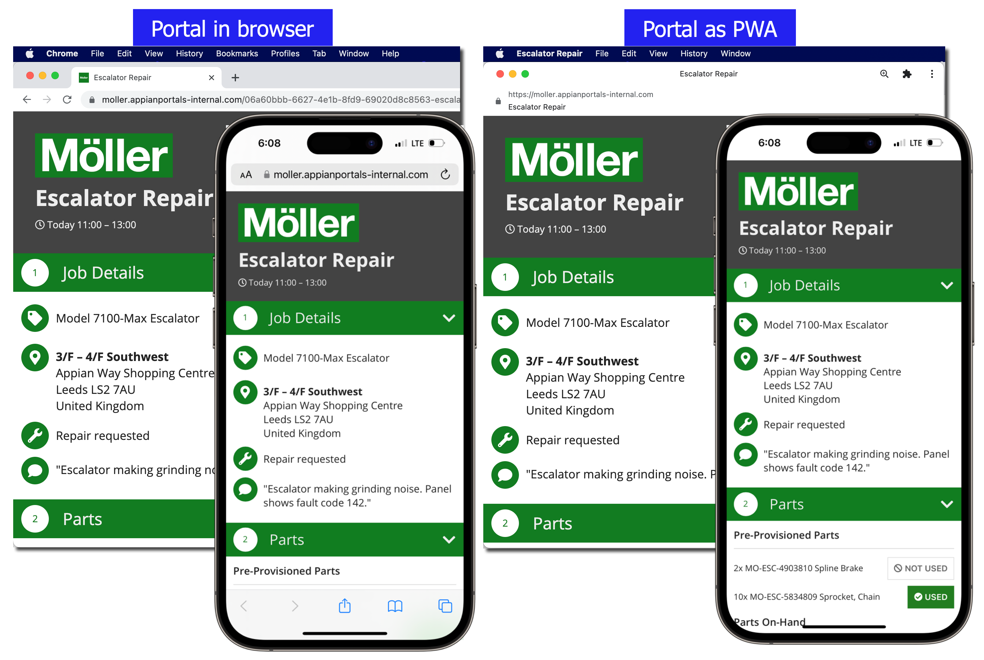
A PWA is a web app that looks and behaves as if it is a native application.
PWAs allow developers to have more control over the experience end users have when they install a portal on their device. When you configure a portal as a PWA, you specify the default app name and icon that users see when they install the portal on their device.
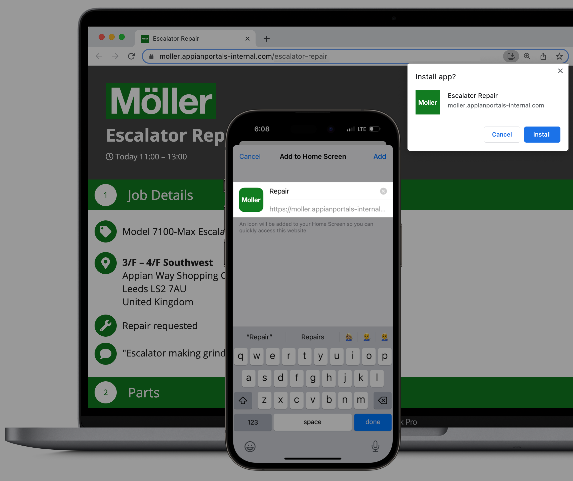
In some browsers, when users first visit a PWA-configured portal, a prompt displays that asks them if they want to add the portal to their device.
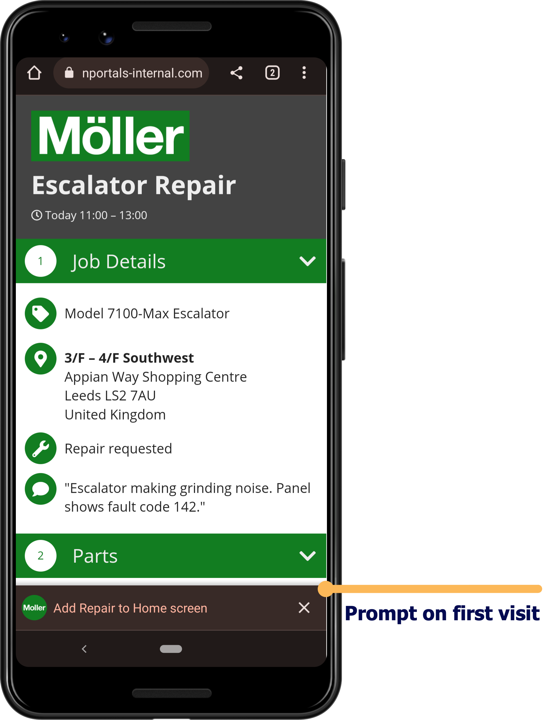
Additionally, when a user opens an installed portal on their device, it gives a more app-like experience. For example, the address bar doesn't display, and it may display its own menu bar on some devices.

Designing an app iconCopy link to clipboard
The app icon is one of the first parts of your PWA that your users interact with. To make sure your icon looks clean and professional on all devices and displays, there are some general guidelines and requirements you should follow.
Icon sizeCopy link to clipboard
To make the portal app icon work across all devices and browsers, it must be at least 512 x 512 pixels and square. However, since it may be displayed in higher resolution on some devices, we recommend icons that are 1024 x 1024 pixels. The app icon will be resized depending on where it displays.
Icon safe zoneCopy link to clipboard
App icons are maskable, meaning that the icon will fill up any shape that the device uses for icons. For example, icons may be circle, square, or teardrop shaped.
This means that the edges of your app icon may be cut off to fit a certain shape. To make sure that the important parts of your icon aren't cut off, design your app icons with a safe zone. The standard safe zone is a circle in the center of the icon with a radius that is 40% of the icon size. For more information about the safe zone and maskable icons, see this web.dev article.
Device settings for portals published from the same environmentCopy link to clipboard
If a user installs multiple portals that were published from the same environment, the portals may share some of the same settings. For example, cookie preferences and permissions such as access to the device microphone and location.
For these types of settings, the user will be unable to choose different options for PWAs published from the same environment.
Visitor Activity LogCopy link to clipboard
The first and best way to troubleshoot portal issues is to look at the error logs. However, because these logs are only available to administrators and in certain Appian Cloud environments, the vistor activity log can be a good place for developers to start when troubleshooting or gathering information.
The Visitor Activity Log section contains system-level logs for the microservice that runs the portal. These logs can provide insights about end-user activity and errors they might be encountering when they interact with your portal.
Visitor activity logs are only available for published portals and do not include every error related to the portal or the objects and connections it uses.
To download your visitor activity logs:
- Under Visitor Activity Log, use the dropdown list to select an increment of time to view the visitor activity during that time frame. You can choose to view logs from the last 15 minutes, hour, day, or week.
- (Optional) To reduce your logs download time, select Limit to 1000 entries to see only the last 1000 visitor activity entries.
- Click Download Activity Log to download the logs for the selected time frame.
SecurityCopy link to clipboard
Portals are publicly accessible, but that doesn't mean they aren't secure. You control access to your Appian environment using service accounts. End users will only be able to access the objects and data in your portal that you give them access to through service accounts.
Additionally, portals have both design-time and runtime security protections to keep your portal safe.
Security role mapCopy link to clipboard
The following table outlines the actions that can be completed for each permission level in a portal's security role map:
| Actions | Administrator | Editor | Viewer |
|---|---|---|---|
| View the portal | Yes | Yes | Yes |
| View the definition | Yes | Yes | Yes |
| View the security | Yes | Yes | Yes |
| Republish the portal | Yes | Yes | No |
| Update the security | Yes | No | No |
| Delete the portal | Yes | No | No |
Design guidanceCopy link to clipboard
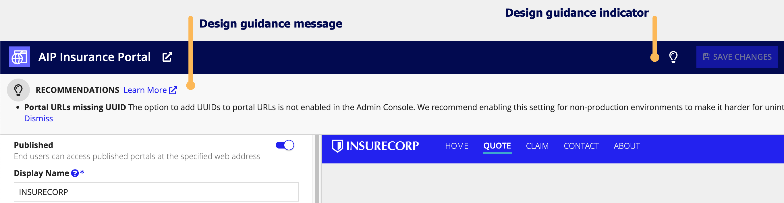
While editing your portal object, you may encounter design guidance. These warnings and recommendations reinforce best practice design patterns that should be implemented in the portal object. Design guidance for portal objects is triggered at the following times: while actively editing the portal object, while saving, or when a precedent of the portal is updated.
When a recommendation or warning is triggered for a portal object, an indicator icon will appear in the header. Click on the icon to learn more about the suggested guidance and how it can be addressed.
If a recommendation is not applicable to your use case, you can dismiss that individual recommendation for your portal. Learn more about recommendation dismissal. Warnings cannot be dismissed and should always be addressed to avoid complications when the logic in the object is executed.
Portals design guidance is also visible outside of the portal object on the Health Dashboard.
See portals design guidance for the full list of possible guidance.