OverviewCopy link to clipboard
This page covers what you can do in the Explore view in an application.
To access this view, click Explore in the navigation pane of an application.
The first time you open an application, you'll see the Explore view by default. Each time you open the application after that, Appian Designer displays either the Explore view or the Build view, depending on which of those views you've most recently accessed.
PurposeCopy link to clipboard
The Explore view in Appian Designer gives you immediate insights into the structure of your application, its packages, and supporting documentation. As you build out your application, this dynamic view will always reflect your application’s latest state and design.
For developers who are new to Appian Designer, this view suggests starting points to get you started faster.
For experienced developers, this view can accelerate onboarding across your team. Developers can ramp up quickly on existing applications using this structural overview and the convenient access to supporting documentation. You'll spend less time on knowledge handoff and more time on what you really care about—building applications.
ElementsCopy link to clipboard
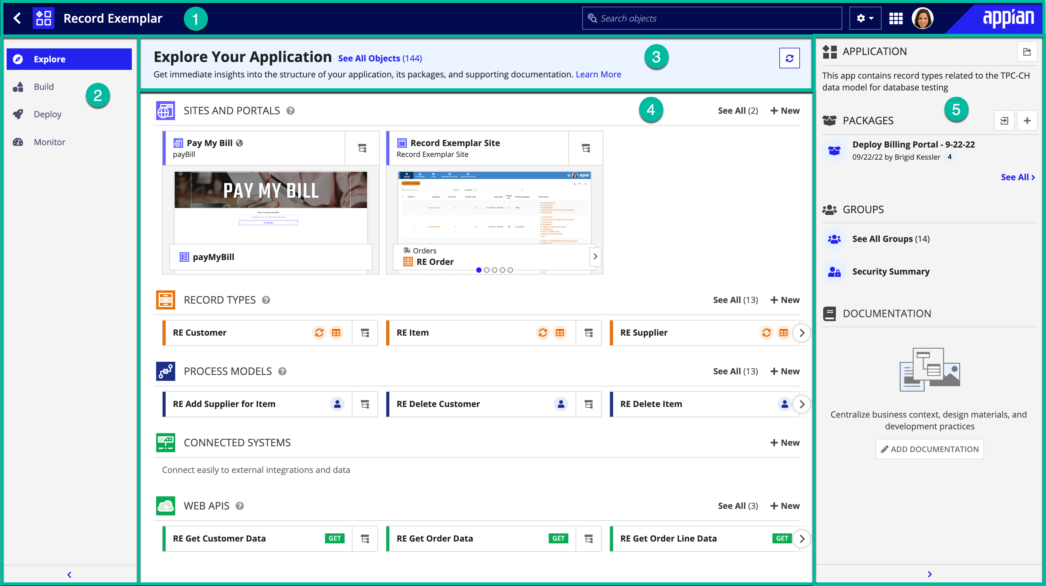
The following image highlights the elements that make up this view:
# |
Element |
Available Actions |
|---|---|---|
1 |
Header bar |
Learn more about the header bar. |
2 |
Navigation pane |
Learn more about the navigation pane. |
3 |
Explore your application pane |
Jump to all the application's objects in the Build view, or refresh the current high-level view. |
4 |
Application structure pane |
|
5 |
Application information pane |
At the top of this pane, you'll see the description of your application as configured in the application properties. In addition, you can perform the following actions in this pane: |
Core objectsCopy link to clipboard
Appian has identified the following objects as core to most applications:
The Explore view focuses on these core objects, so the content of the view varies depending on your creation of these objects. For example, your application might also include interfaces and expression rules, but in this view you'll see those objects only as they relate to the core objects.
View the application structureCopy link to clipboard
In this pane, what you see for an existing application will be different from what you see for a newly created app.
If you're just getting started, the application pane is overlaid with a dialog. This dialog displays objects that Appian recommends as starting points for an app:
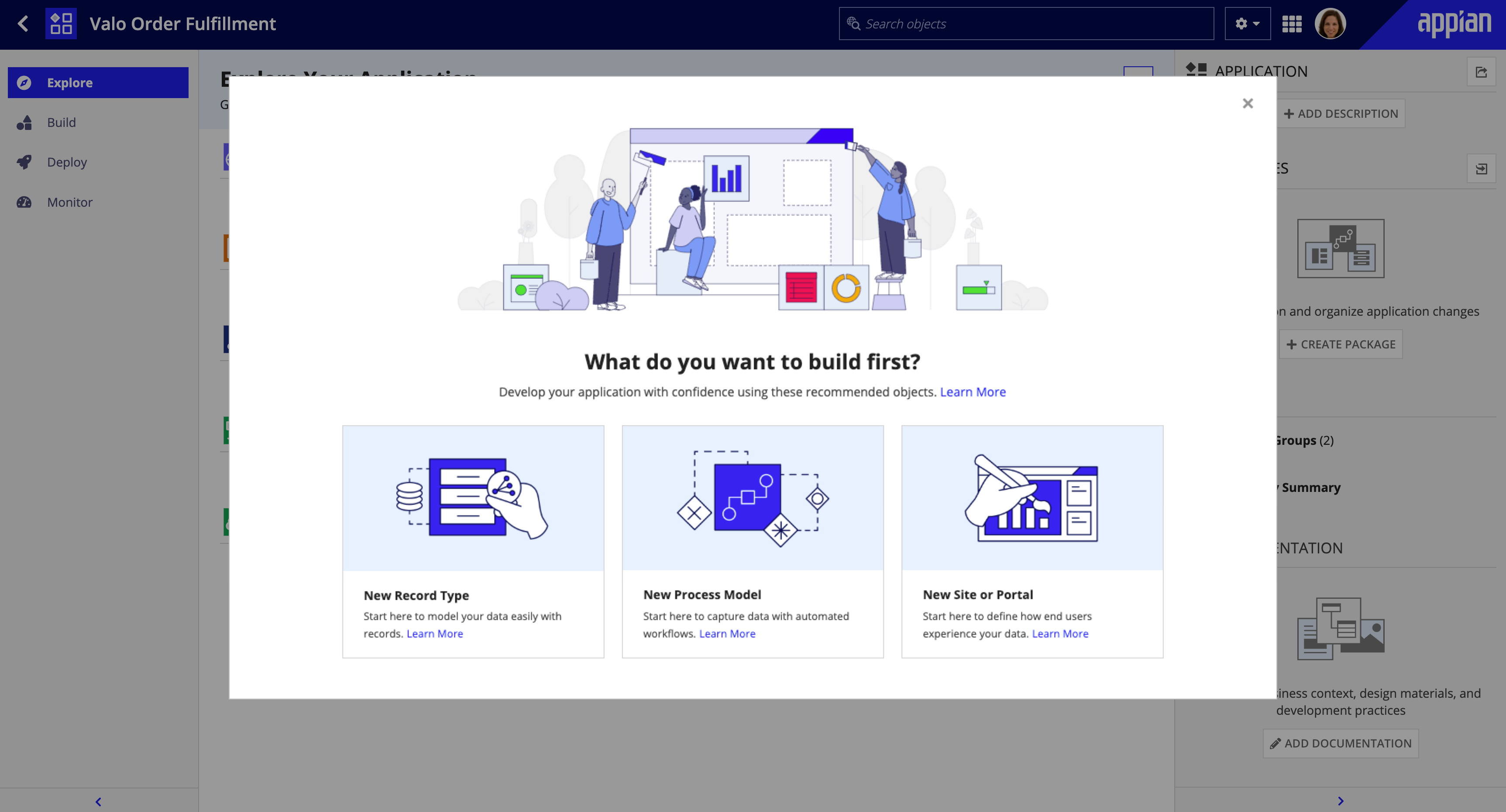
| Get Started With | Action |
|---|---|
| Modeling the data that will support your app | Click New Record Type to create a record type. Data is the heart of every application, so this object is the most common starting point. |
| Translating your analysis of business workflows into automated processes | Click New Process Model to create a process model. Typically, business analysts start with this object. |
| Focusing on the end-user experience | Click New Site or Portal to create a site or portal. User experience designers tend to start with these objects. |
If you close this dialog without creating any of the recommended objects, an empty version of the the application pane displays.
The application structure pane consists of sections for each core object. For an example, see the Elements section of this page.
Each section contains object cards based on criteria specific to that section. You can take a number of actions on these cards to view information and investigate object relationships.
Section criteriaCopy link to clipboard
The objects displayed in the sections of the Explore view change based on the following criteria:
| Section | Cards |
|---|---|
| Sites and Portals | The first five sites and portals configured for the application. The cards are listed alphabetically by site or portal name. |
| Record Types | The top record types in this application, ranked by number of record views, record actions, and unique record relationships. |
| Process Models | The top process models in this application, ranked by number of dependents, with heaviest weight applied to site and record type dependents. |
| Connected Systems | The top connected systems in this application, with data source systems listed first, and HTTP and Open API systems ordered by number of dependent integrations. |
| Web APIs | The first ten web APIs in this application, listed alphabetically. |
Informational iconsCopy link to clipboard
For all object cards except sites, you can determine certain object attributes at a glance with the following icons:
Icon |
Description |
|---|---|
Portals |
|
|
The portal is published. |
Record types |
|
|
Data sync is enabled for the record type. |
|
The data source for the record type is a database. |
|
The data source for the record type is a Salesforce connected system. |
|
The data source for the record type is a web service. |
|
The data source for the record type is a process model. |
|
This legacy record type uses a web service data source. |
Process models |
|
|
The process model includes a start form or an user input task. |
|
The process model includes the Start Doc Extraction or Reconcile Doc Extraction smart service. |
|
The process model includes an Execute Robotic Task smart service. |
Connected systems |
|
various |
The icon for the system your application is connecting to. |
Web APIs |
|
method |
The HTTP method that the web API uses (for example, GET). |
|
The web API creates a document in Appian. |
Available actionsCopy link to clipboard
In each core object section, you can perform the following actions:
- View section criteria: To view the criteria for a section, hover over the ? icon next to the section name.
- View all objects: To view all objects of the core object type, click See All. This action opens the Build view with the object type filter applied. For example, to view all sites and portals in an application, click See All in the SITES and PORTALS section, and the Build view displays all site and portal objects for the app.
- Create a new object: To create a new core object, click + New in the appropriate section. To create an object other than a core object, click Build in the navigation pane, then create the object in the Build view.
- Scroll through cards: To scroll through cards in a section, use the arrows at the edges of the section.
- Open an object: To open an object, click the object card. The object opens in a new tab or window.
- View related objects: Click the navigator icon
 on the card, then navigate to related objects.
 - View object descriptions: Hover over an object to view its description.
In the SITES and PORTALS section, you can perform the following additional actions:
- Open a site or portal object: To open the site or portal object, click the title of the site or portal card (for example, Order Fulfillment in the example below). The site object opens in a new tab or window.
-
Preview site or portal pages: You can preview site contents by scrolling through the pages. You can view portal contents for any published portal. Portal publishing status is indicated by an informational icon.

- View a page as an end user: Click the page preview. The page opens in a new tab or window.
View related objectsCopy link to clipboard
Object relationships are created when you reference an object from another object, creating either a precedent or dependent relationship. These object references can be present in the object properties, object security, or, if appropriate, the object's expression.
Each object card in the Explore view contains a navigator that lets you drill down on these relationships. For example, if you wanted to see what record views are configured for a record type:
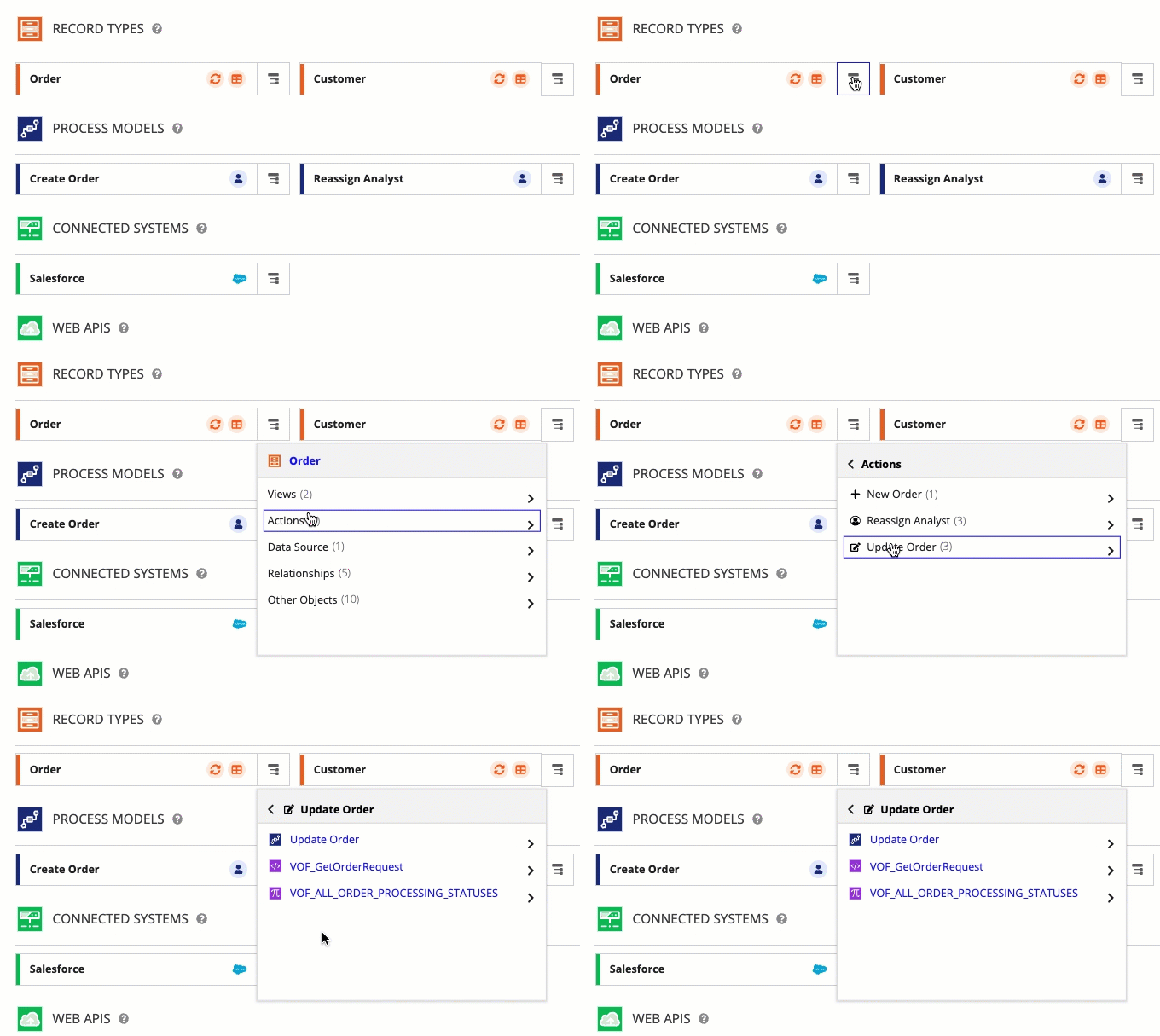
The related objects you'll see in this navigator are primarily precedents, rather than dependents. For connected system objects, however, you can view dependent integrations and dependent objects.
To view related objects for any object in the Explore view:
- On the object card, click the navigator icon
 . A menu of either objects or object categories displays.
 -
Continue as appropriate:
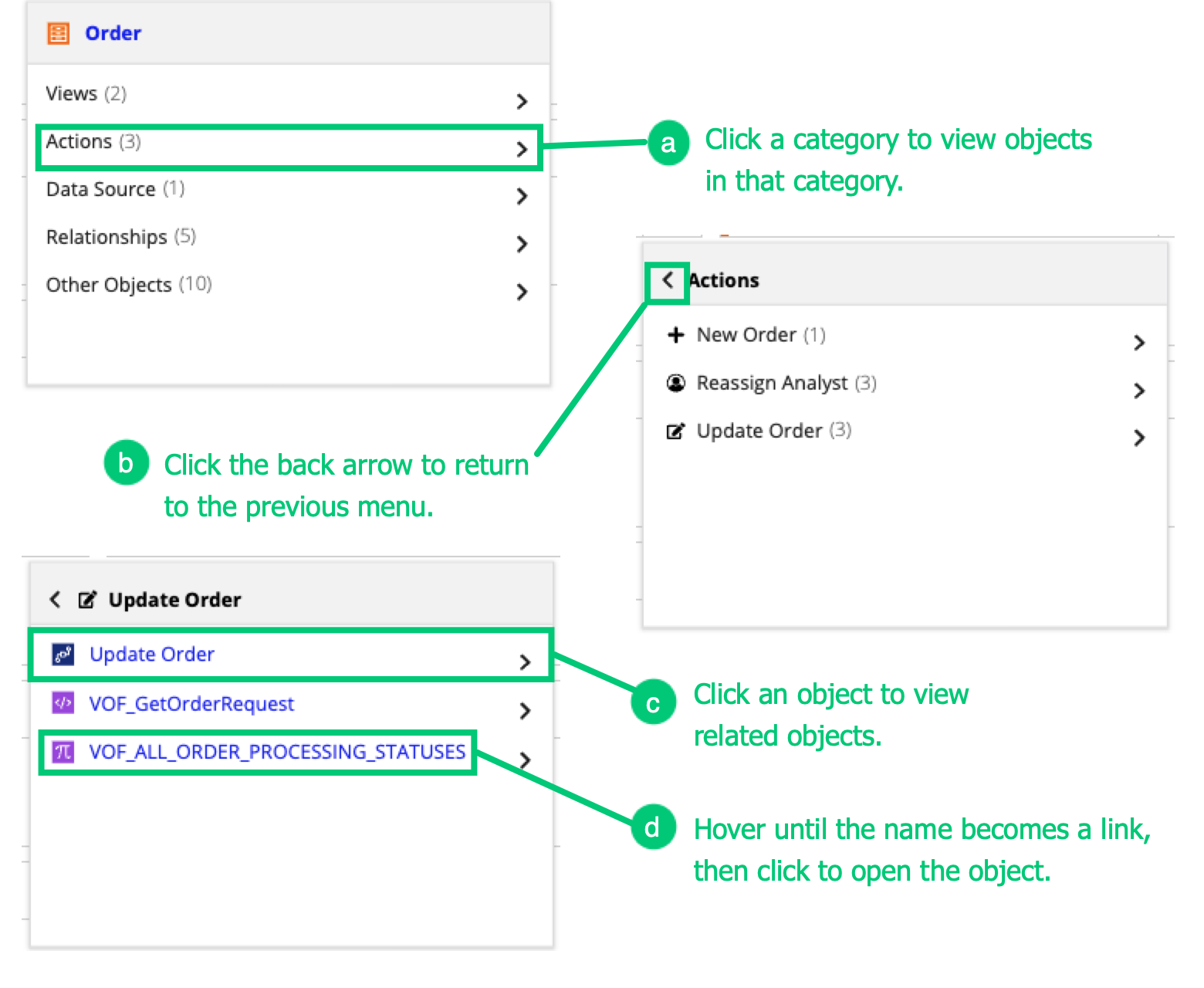
# Action a To view the objects in a category, click the category. b To return to a previous menu, clicking the back arrow in the menu header. c To view related objects for any object in a menu, click the object. A new menu displays, listing the objects related to the object you clicked. d To open a related object from the menu, hover over the name in the menu until the name becomes a link, then click the link. The object opens in another tab or window.
For each object type, you can also perform the following specific actions:
Menu Option |
Action |
|---|---|
Sites |
|
<page name> |
Click the page name to view the object that supports the page (for example, an interface or a report). |
Branding |
Click this category to view the objects used in the site's branding (for example, the documents used as header images). |
Portals |
|
<page name> |
Click the page name to view the interface used for the page. |
Service Access |
Click this category to view the reCAPTCHA connected system that the portal is using. |
Branding |
Click this category to view the icon document used for the favicon. |
Progressive Web App |
Click this category to view the document used for the PWA app icon. |
Record types |
|
Views |
Click to view a list of the views configured for the record type. Click the view name to view its related objects. |
Actions |
Click to view the actions configured for the record type. Click the action name to view its related objects. |
Data Source |
Click to view the data source configured for the record type. |
Relationships |
Click to view the relationships configured for the record type. |
Process models |
|
Forms |
Click to view any interfaces used as either start forms or user input tasks in the process model. |
Related Process Models |
Click to view any process models that are related to the current process model. These include any direct process model precedents (for example, process models called using a Subprocess node) and any process model called via a constant (such as a process model called by a constant in the Start Process node). |
Process Model Properties |
Click to view objects referenced in the process model properties. For example, a CDT configured as a node input or output. |
Integrations |
Click to view integrations referenced by the process model. For example, an Appian RPA integration to support an Execute Robotic Task smart service. |
Plug-ins |
Click to view plug-ins referenced by the process model. |
Connected Systems |
|
Dependent Objects/Integrations |
For data source and reCAPTCHA connected systems, click Dependent Objects to view all dependent objects (for example, data stores, record types, and process models). For all other types of connected systems, click Dependent Integrations to view a list of integrations configured to use the connected system. |
All objects |
|
Other Objects |
Click to view a list of precedents not listed in other categories; for example, folders or groups. This category is common to all objects. For web APIs, this category is not labeled, but represents the top-level menu instead. |
Create and view packagesCopy link to clipboard
A package is a collection of application changes that you can deploy to another environment. Using a package to organize your application changes during development allows you and your team to collaborate more easily. Learn more about packages.
To create a package in the Explore view:
- Click the + icon next to the PACKAGES section title. The Create Package dialog displays.
-
Configure the package properties.
For example:
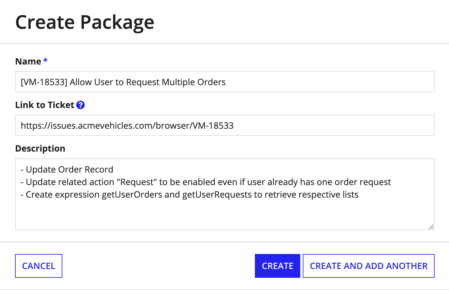
- Continue as appropriate:
- Click CREATE if this is the last or only package you want to create.
- Click CREATE AND ADD ANOTHER to create multiple packages, and repeat the previous steps again for each new package.
Once you've created a package, the Build view opens, filtered to display only the contents of that package. You'll notice the contents view for the package is empty right now. Learn more about the next steps you'll take to prepare the package for deployment.
To view an existing package in the Explore view, click the package in the PACKAGES section of the information pane. The Build view opens, filtered to display only the contents of that package.
View groupsCopy link to clipboard
Groups are used to organize users and faciliate security within both Appian Designer and the applications you build.
To view groups for the application, click See All Groups in the GROUPS section of the information pane. The Build view opens, filtered to display only the groups referenced in this application.
Learn more about group management.
View the Security SummaryCopy link to clipboard
The Security Summary allows you to view the security of all objects within an application in a single place. It also allows you to edit the security of objects in bulk.
To view the Security Summary, click Security Summary in the GROUPS section of the information pane.
Learn more about the Security Summary.
View and manage documentationCopy link to clipboard
As you're developing an application, you naturally create documentation that supports the application. The Application Documentation feature gives your teams a central place to access this documentation in the application itself.
To view the supporting documentation for the application, click a document or link in the DOCUMENTATION section of the information pane. The document or link opens in a new tab or window.
To manage the application documentation, click  next to the DOCUMENTATION section title. The Application Documentation dialog displays. Learn more about the actions you can take in this dialog.

