Grids
See the developer documentation for technical details about the editable grid component or read-only grid component.
Introduction
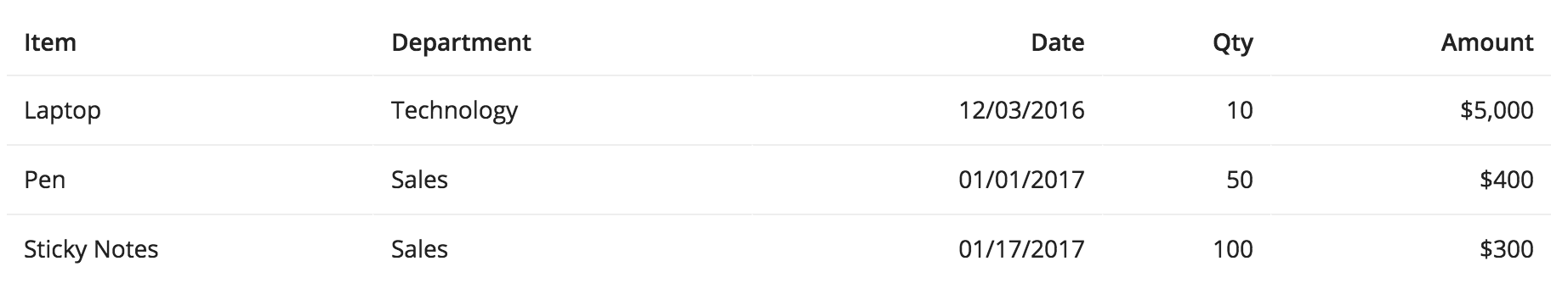
Use grids to display tabular data in a structured, easy-to-scan layout. Keep grid data values concise and consistently-formatted to maximize readability.
Apply the same formatting to all data in a given column.
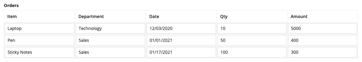
Don't use grids to display large blocks of text.
Sort order and filtering
Grids should be designed to allow users to quickly find the item(s) that they are looking for.
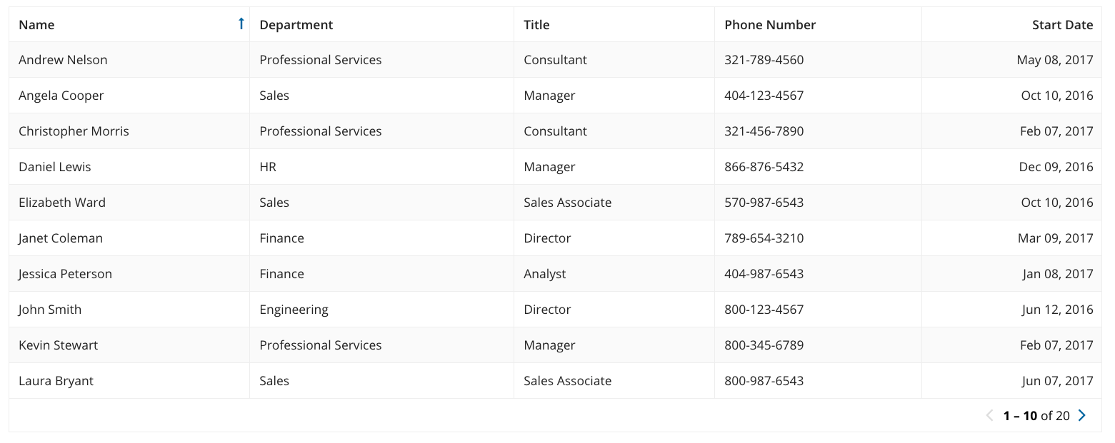
The first priority should be to apply a logical sort order that would display the most important information at the top of the list.
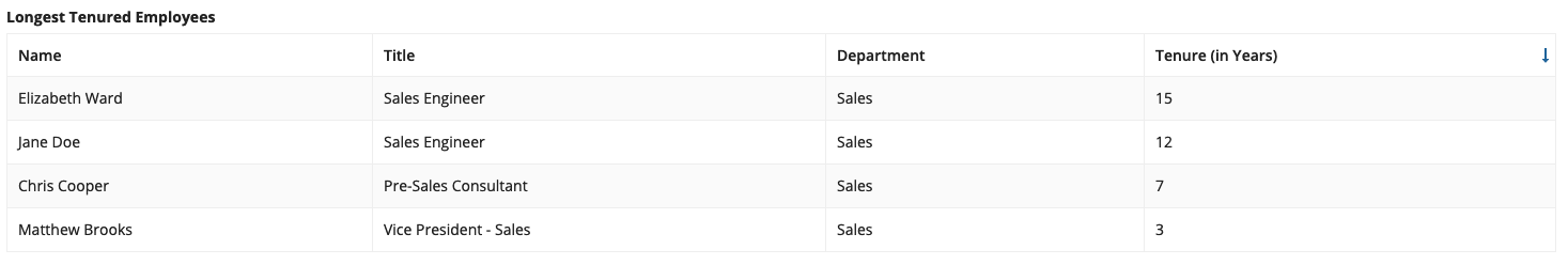
The sort order of the grid is applied to the "Tenure (in Years)" column
Then, provide commonly used filter and search capabilities to let users narrow down the list.
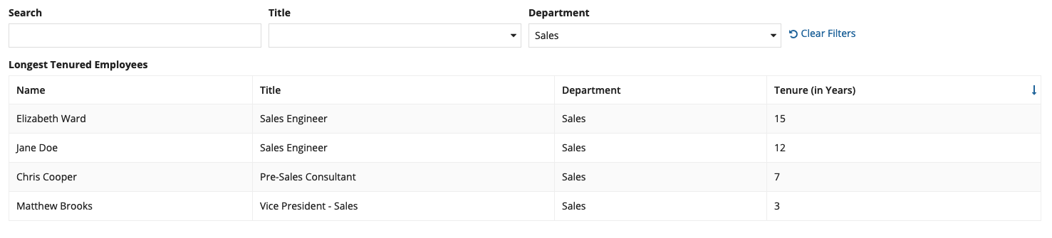
Use a Record Type as the grid’s data source to take advantage of a search field and user filters that have already been defined in the Record Type object.
Record actions
In grid columns
Record action buttons can be displayed in a grid column by using the Record Action component.
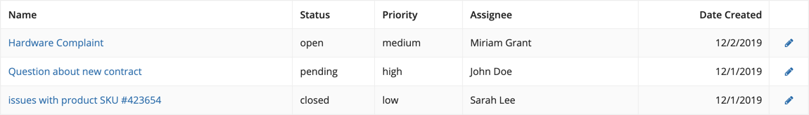
The pencil icon is a related action using the “Icon Only” style
Don’t display multiple related actions within a grid cell. Instead, try placing actions above the grid or in separate columns.
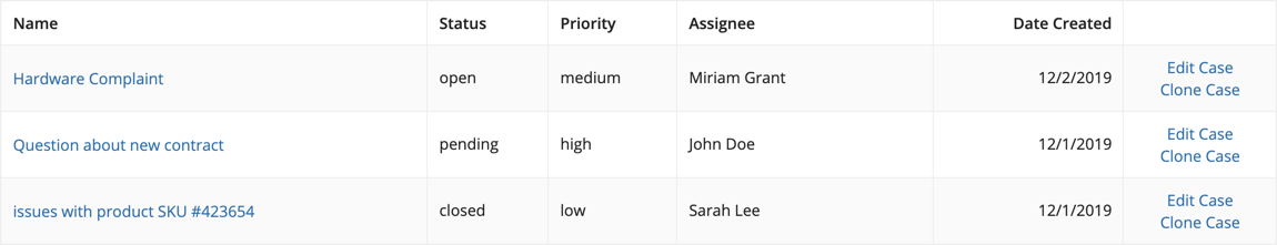
Above grids with record data
Record actions can be displayed in “Toolbar” style above a grid when the grid is backed by a Record Type. Selection is often necessary when related actions are configured. Refer to the Read-Only Grid documentation to learn more.
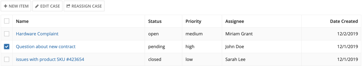
“New Item” is a record list action and “Edit Case” and “Reassign Case” are related actions
Batch size
Establish an appropriate batch size that minimizes scrolling.
Multiple component interface
If the interface has several other components along with the grid, then use a smaller batch size, such as 5 - 10 items, so that the user can easily access the other components in the interface.
Single grid interface
If the grid is the only component on the interface, prioritize getting the user to the items they are looking for on the first page using sort order and filter controls. Use a large batch size, such as 50 items, so that users can scroll to their items rather than paging multiple times and waiting for items to load.
If you are not sure if the sort order and filter controls will get the users to the items they are looking for on the first page, then use a smaller batch, size such as 25 items, and ensure that users are able to access paging controls without scrolling.
Cell formatting
Alignment
The first column should always be left aligned (in left-to-right languages) regardless of the value type. For all other columns, left align text columns and right align columns with numbers or dates.
For editable grid columns, use left alignment for all field types (in left-to-right languages) including numbers and dates.
Always align headers consistently with column content.
Empty cells
Use a hyphen (–) when displaying cells with no value/data.
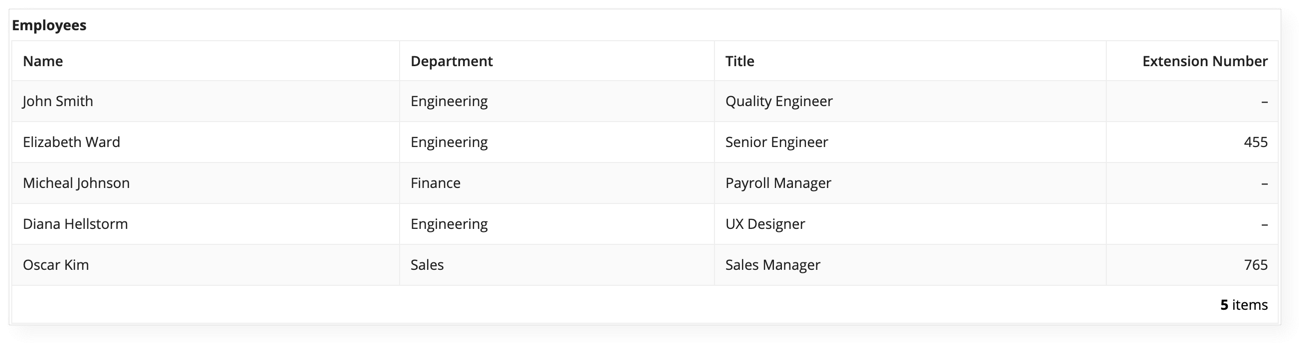
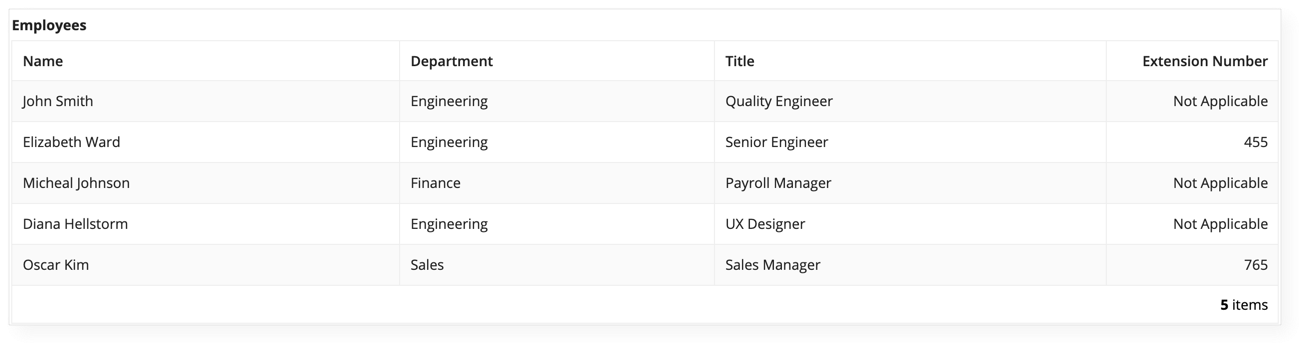
Avoid using "N/A" or "Not Applicable", as it tends to create cluttter
Column widths
Read-only grids
Automatic column widths
Set column widths to “Auto” (this is the default for new columns) to allow the grid to distribute space based on the amount of content in each column. When in doubt, try this setting first as it often produces good results without additional effort. Note that column widths will fluctuate as data changes: a cell with a large amount of text will cause its column to be wider, all else being equal.
Fixed column widths
Use fixed column widths, such as "Narrow" or "Wide", for consistent behavior that mimics how spreadsheets work. The width of each column will remain constant even as the width of the grid changes (such as when resizing the browser window). Horizontal scrolling will be automatically enabled when the total of column widths exceeds the grid’s width.
Note: when the total of configured column widths is less than the grid’s overall width, columns will be expanded to fill the available space.
Relative column widths
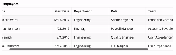
Use relative widths to set proportional column widths that distribute available space. For example, 3 columns with "2X", "3X", and "5X" widths, respectively, will take up 20%, 30%, and 50% of the width of the grid. As much as possible, the proportional relationship between columns will be preserved as the overall grid width changes. A particular set of relative widths that look appropriate on a wide monitor, for example, may not work well on a phone display because each column will become much narrower.
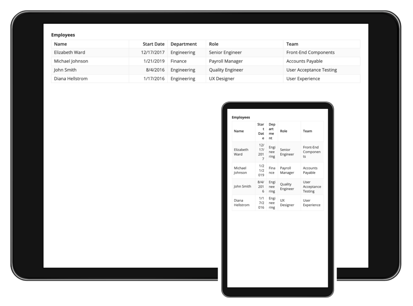
A particular set of relative widths that work well on wide screens may not transfer well to narrow screens. The "Start Date" and "Department" column values on the phone are too narrow.
In general, relative column widths work well when the grid is typically viewed on similar screen sizes (i.e. mostly viewed on a phone or mostly viewed on a desktop monitor). Fixed column widths offer more predictability when grids are viewed across a wide variety of screen form factors.
Combining different types of width configurations
Sometimes, the best results may come from using more than one type of grid column width configuration within the same grid. For example, one might set fixed widths for columns that always require the same amount of space: "Icon"-width for a column that shows a status icon, "Narrow"-width for a column that shows a percentage value. The remaining columns in the grid may show varying amounts of text and work best with "Auto" or a set proportion of relative widths.
Editable grids
While considerations for setting column widths are similar across the two types of grids, editable grids lack some of the configurations available for read-only grids.
No automatic column widths
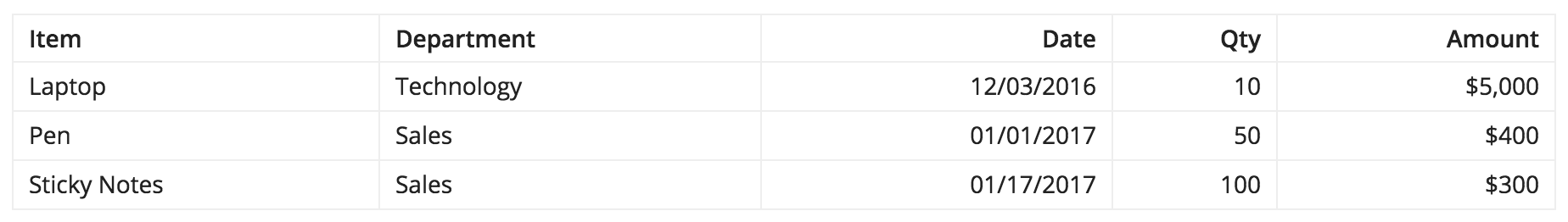
Editable grids do not support automatic column widths based on the amount of content in each cell. The default column width of "Distribute" produces the same result as specifying "1" as the weight. A grid with all "Distribute"-width columns will evenly distribute space across all columns.
The editable grid (TOP) has "Distribute"-width columns, so the column spacing is evenly distributed. The read-only grid (BOTTOM) has "Auto"-width columns, allocating space based on the column content.
Fewer fixed column widths
Editable grids only support "Icon" and "Narrow" fixed widths. Compared to read-only grids, less precision is possible when using fixed column widths and proportional weights may have to be relied upon in more cases. Remember that the same column weight may translate into a different width when a grid is viewed on different screen sizes.
Styling options
Spacing
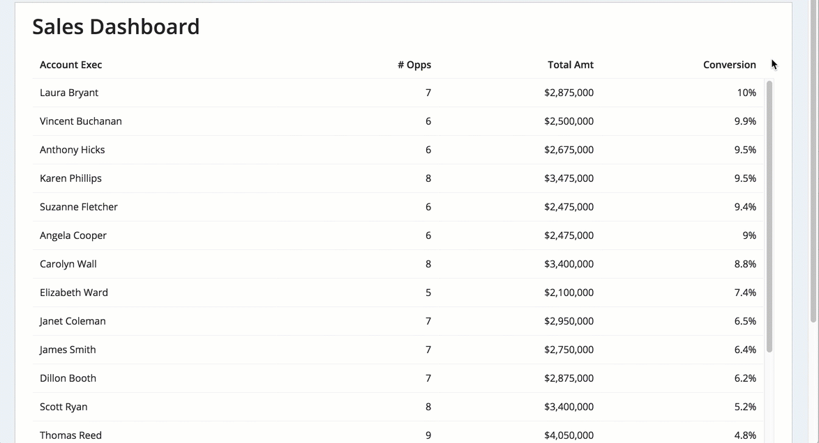
The "Standard" grid spacing offers a good balance between information density and readability.
Use the "Dense" spacing option to reduce the need for vertical scrolling when showing grids with a large number of rows. Note that some users may find the dense grids to be harder to read because of their reduced white space.
Shade alternate rows
Use the alternate row shading option to help users match up values on the same row when scanning grids with a lot of data. The shading may not be necessary when showing grids with only a few rows of data.
Border style
Use the "Light" border style to remove the outer border and vertical column divider lines from grids. This creates a less cluttered look for simple grids that can easily be scanned without the need for extra decorative lines.
Selection style
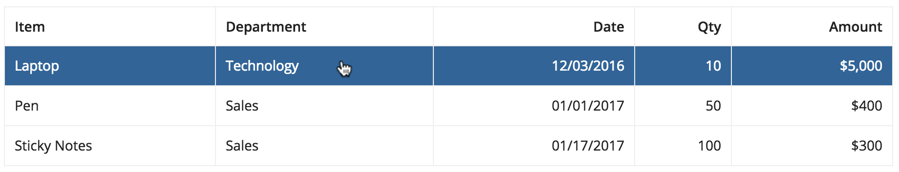
Use the "Row Highlight" selection style for read only content. An example of this can be seen in the grid with detail pattern.
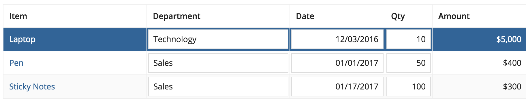
Avoid mixing "Row Highlight" selection style and interactive components, such as links or inputs, in grid cells. This may make it difficult for the user to differentiate between clicking on the row or one of the interactive components within the row. Instead, use the "Checkbox" selection style when there are interactive components in a grid.
Consistency
When displaying multiple grids on the same page, use the same density and styling options for all grids to create a consistent experience.
Fixed height
Use the height option to maintain a fixed height for the grid regardless of the number of rows and to ensure that the header is always visible.
Don't pick a fixed height when the grid is the only/main thing on the page as users may have to scroll the page AND scroll the contents of the grid to find what they're looking for
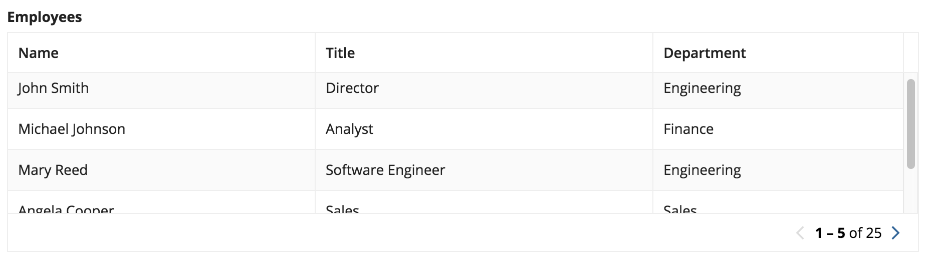
Don't mix paging and fixed heights as users would have to scroll and page to find what they're looking for. At the same time, be aware of performance considerations when choosing to remove paging or setting a very large batch size and relying on scrolling.
Accessibility
When designing a grid, use the row header parameter to help screen reader users better understand the context of each cell they’re traversing. The row header acts as the identifier for a given row, similar to how the column header is the identifier for each column. When users navigate to a cell within a grid, both the corresponding column header and row header values are announced by the screen reader.
Note that the row header is only recognized as the header for columns to its right. Because of this, the first column containing text is usually the correct choice for row header.