Header Content Layout
See the developer documentation for technical details about the header content layout component.
Introduction
The header content layout allows you to design pages with two distinct zones: header and content. The header consists of one or more card or billboard layouts into which other components and layouts may be placed. For a more seamless look, the header extends to the top, left, and right edges of the page.
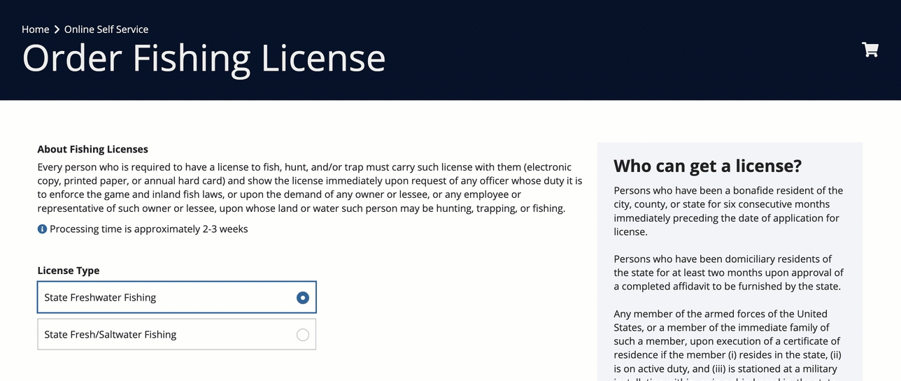
When to use a header content layout
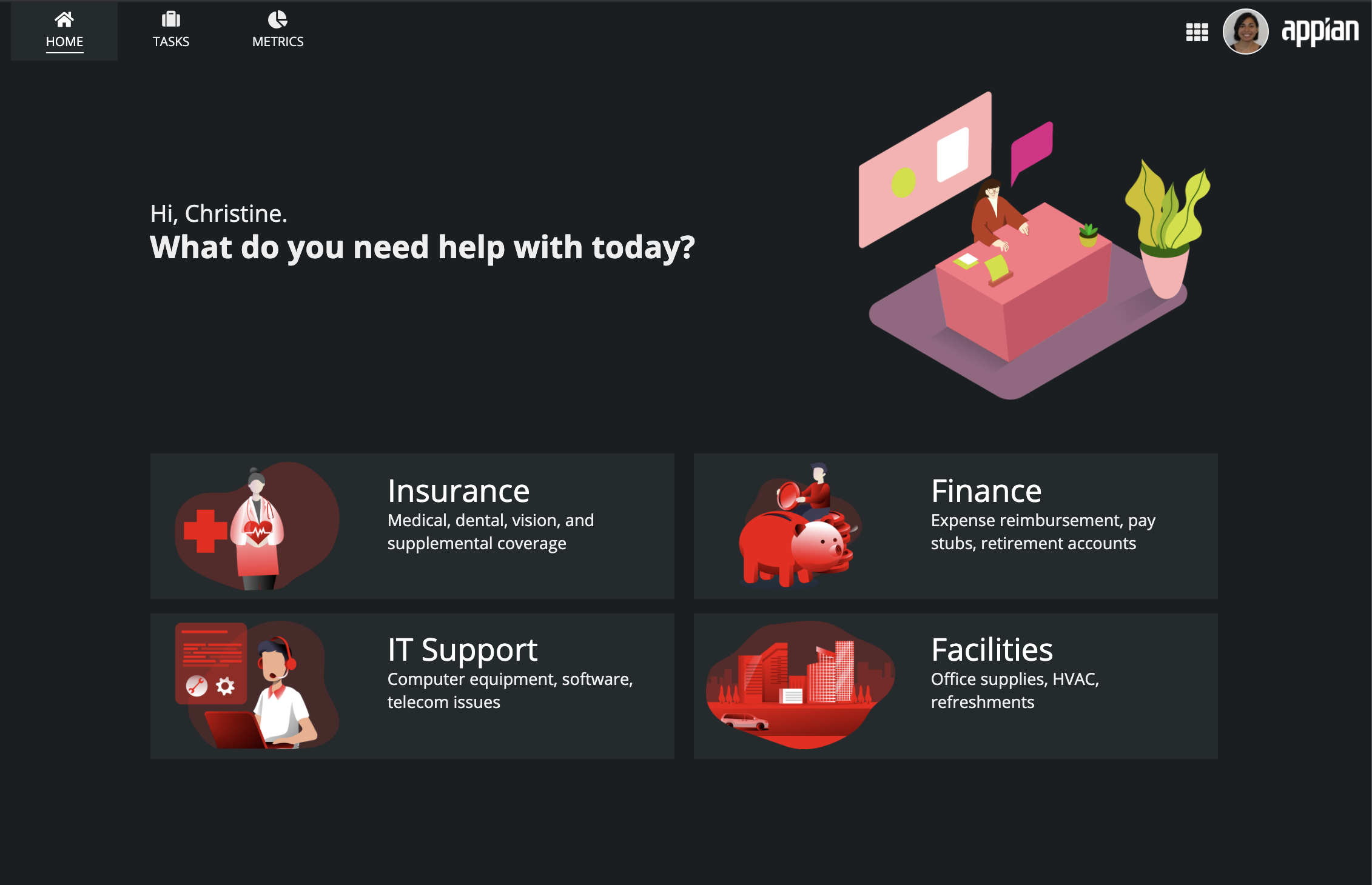
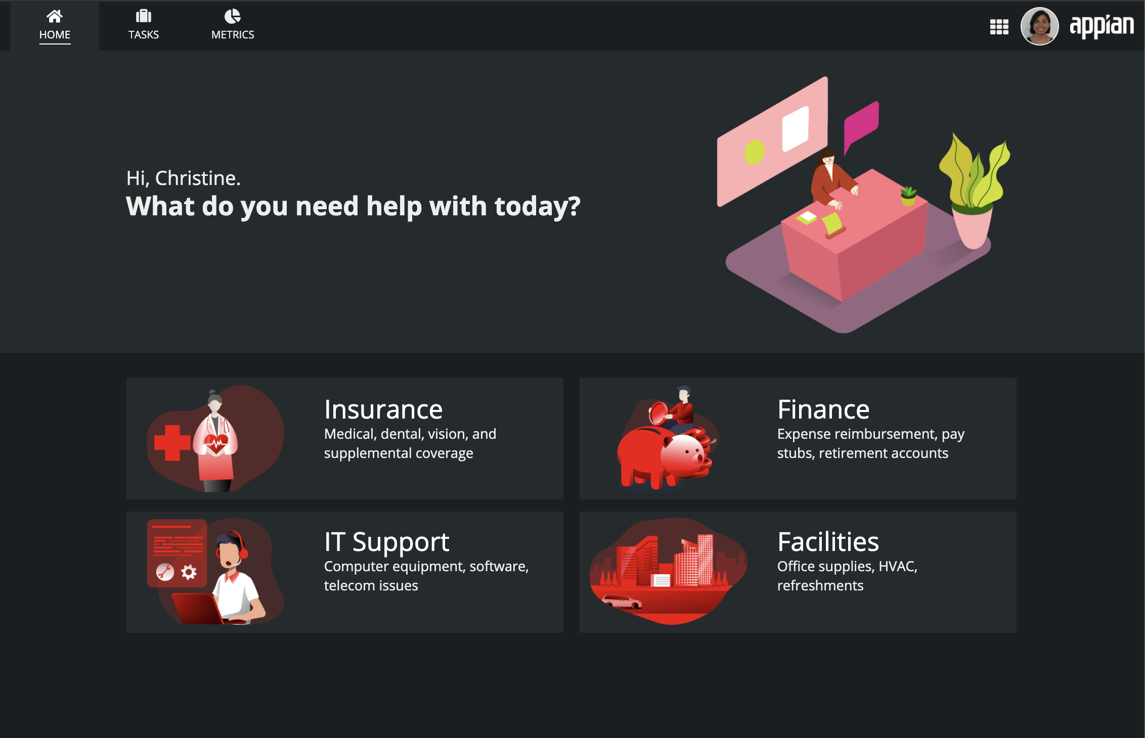
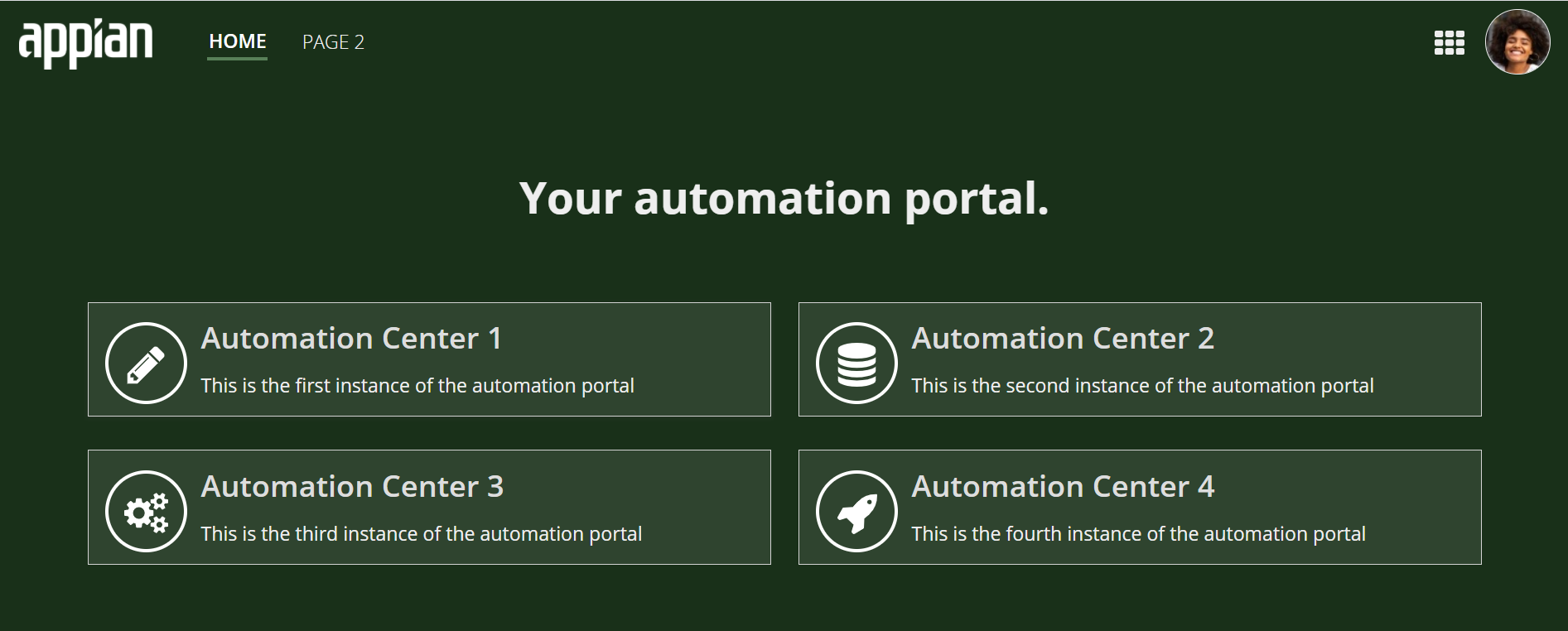
Welcome banners
Use a header content layout to feature a welcome banner at the top of a landing page. This design draws attention to text and images that identify the purpose of the page or site. Simpler designs with larger font sizes, bold pictures, and appropriate white space tend to work best. Matching the header background color to the site navigation bar background color also works well to create the impression of a larger, sleeker banner.
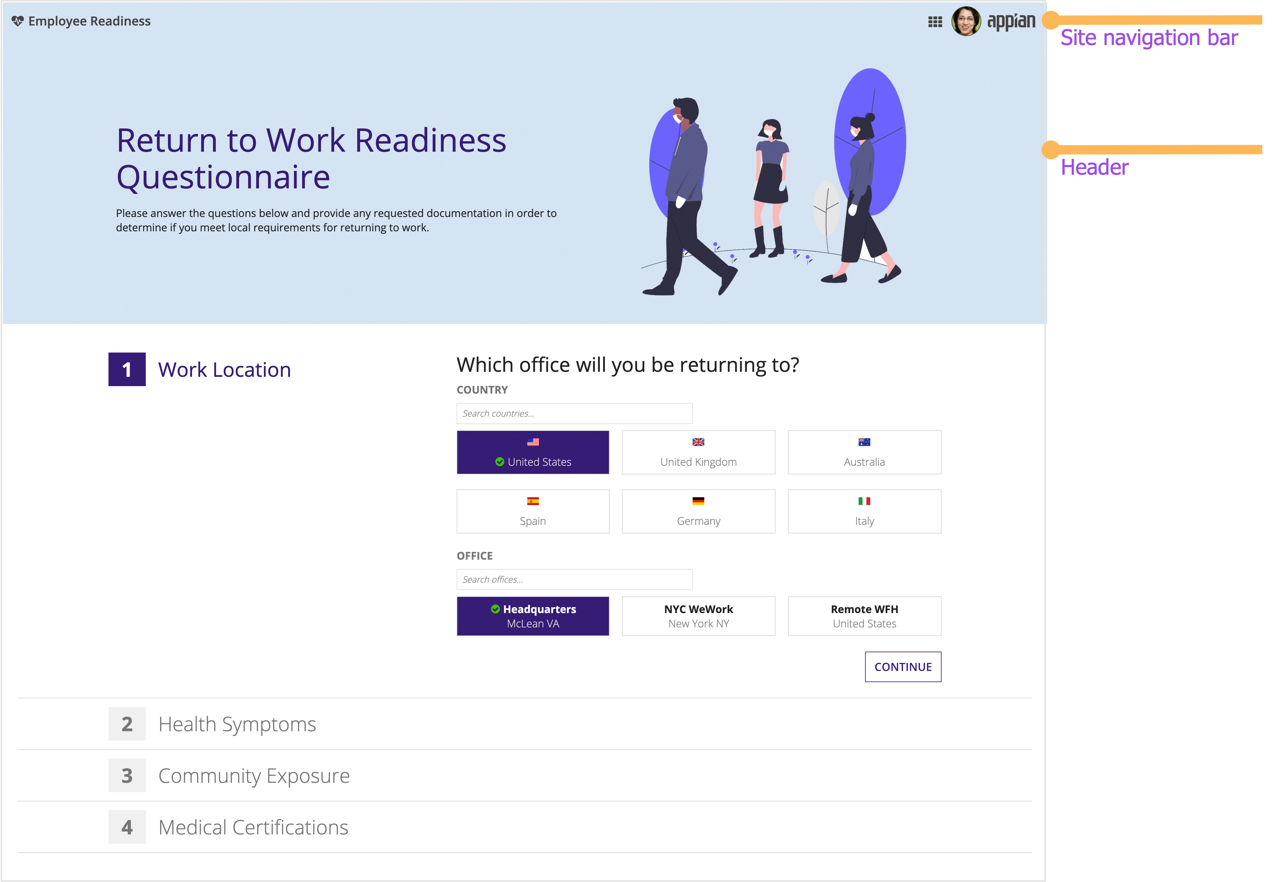
This employee health questionnaire site uses a bold welcome banner to clearly identify the purpose of the page.
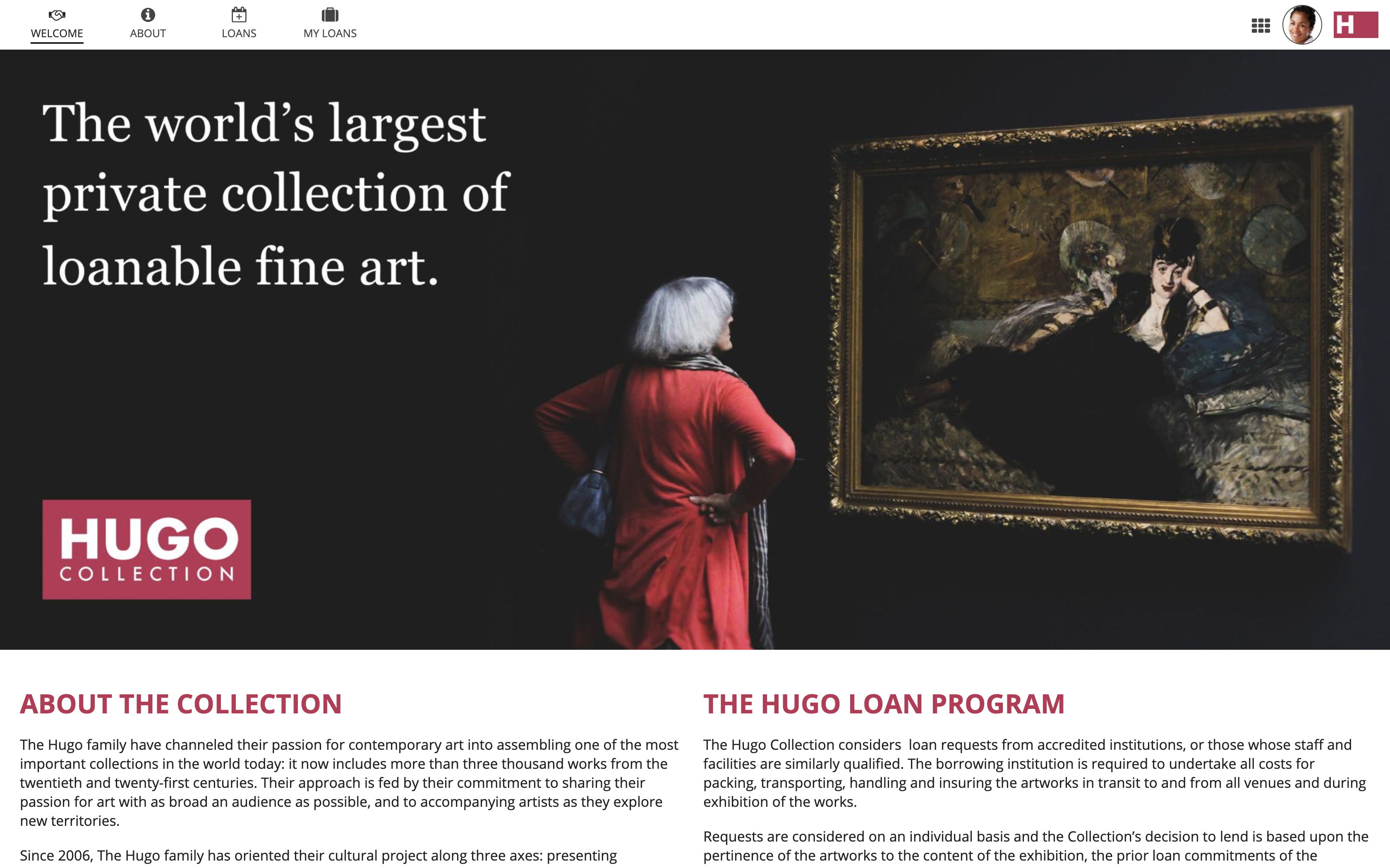
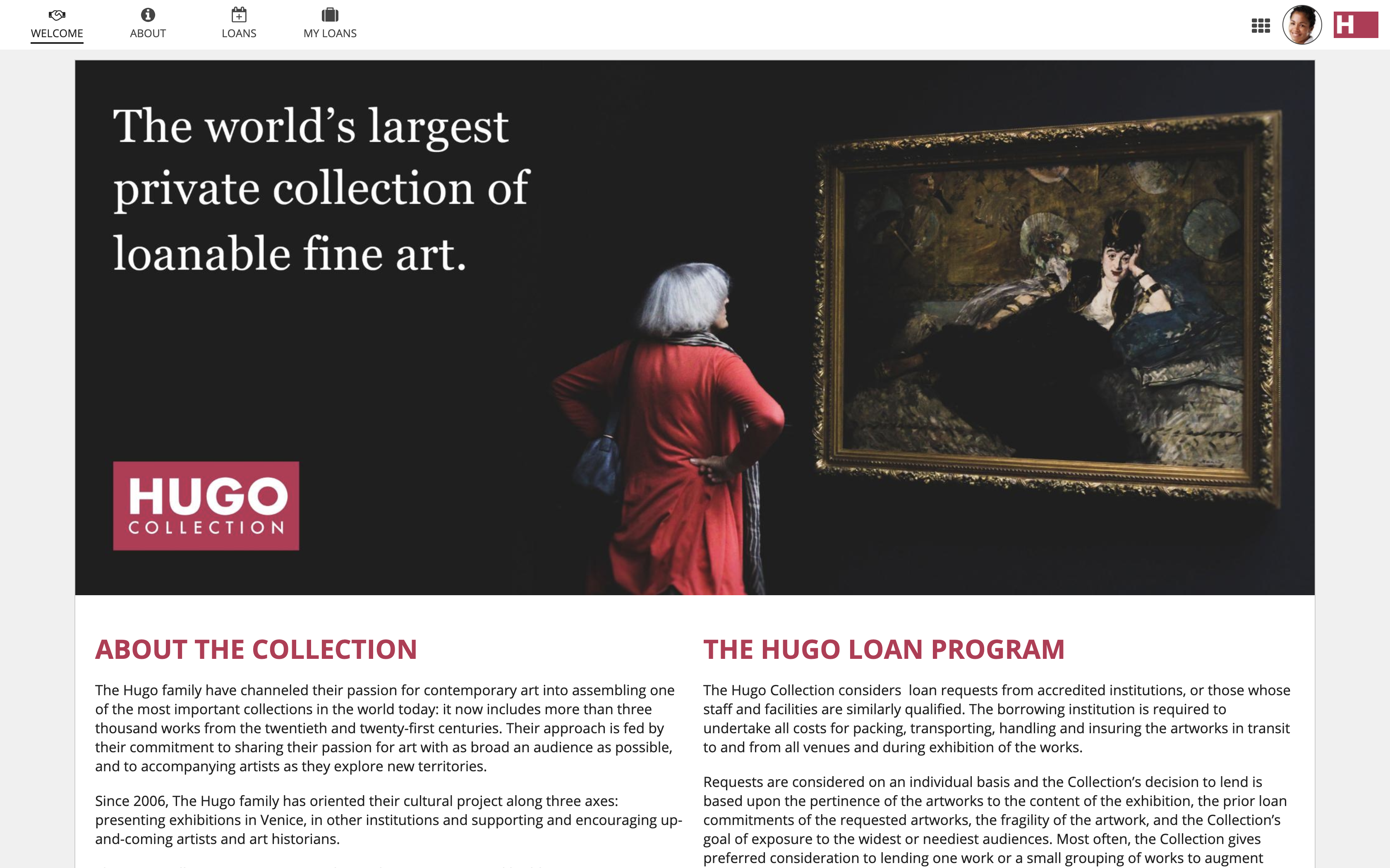
Title bars
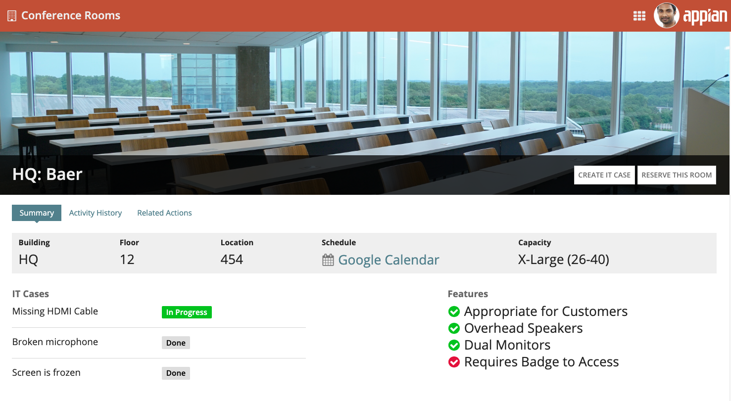
Use a header to display a prominent title bar that announces the topic of the page. The title bar can also highlight key attributes that provide summary information to viewers.
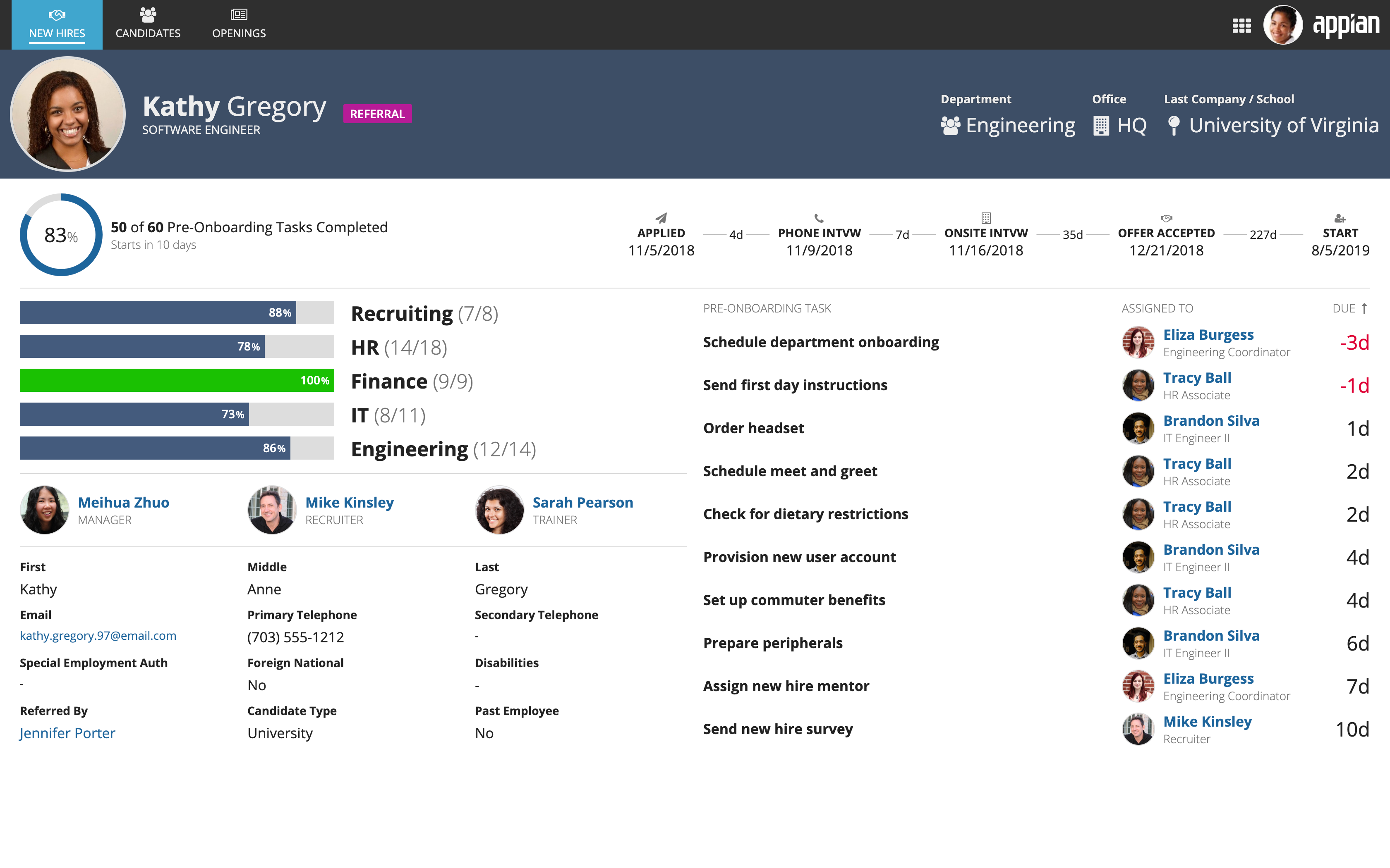
This new hire onboarding dashboard uses a header card to draw attention to the employee's photograph, name, and key information
Secondary navigation
A header can also be used to display secondary navigation controls that link to a sublevel of destinations within each site page.
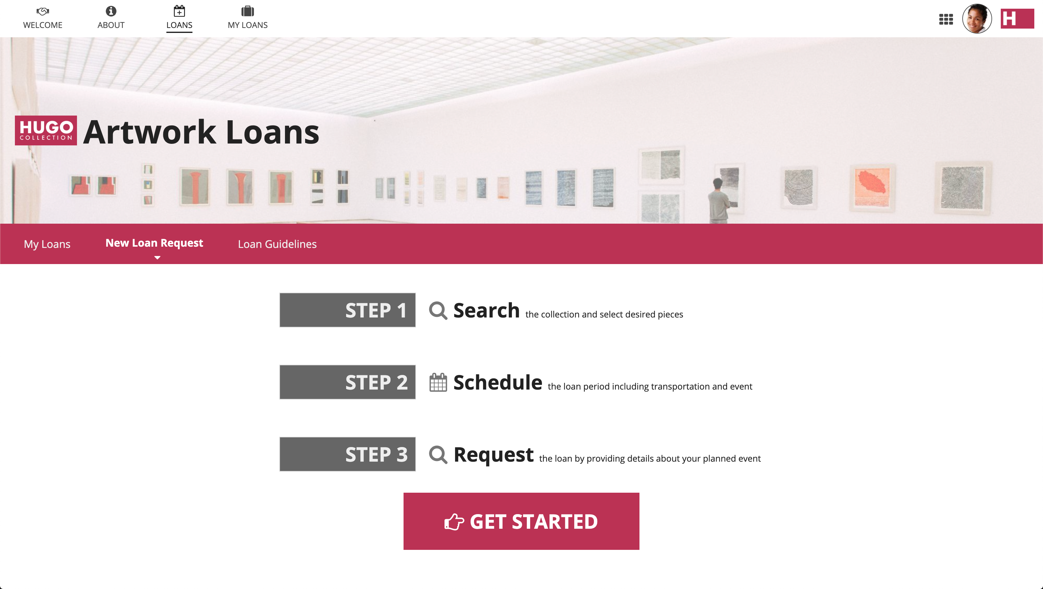
A billboard layout is combined with a card layout containing secondary navigation controls in this header example
Header backgrounds
Transparent content background
The header content layout can be configured to display with a transparent page background. When set, the light gray site background color will appear behind page content, instead of the default white page background. Use this option when your content is mostly or entirely arranged within card or box layouts (which provide their own white backgrounds). This setting allows cards and boxes to stand out clearly against a contrasting background.
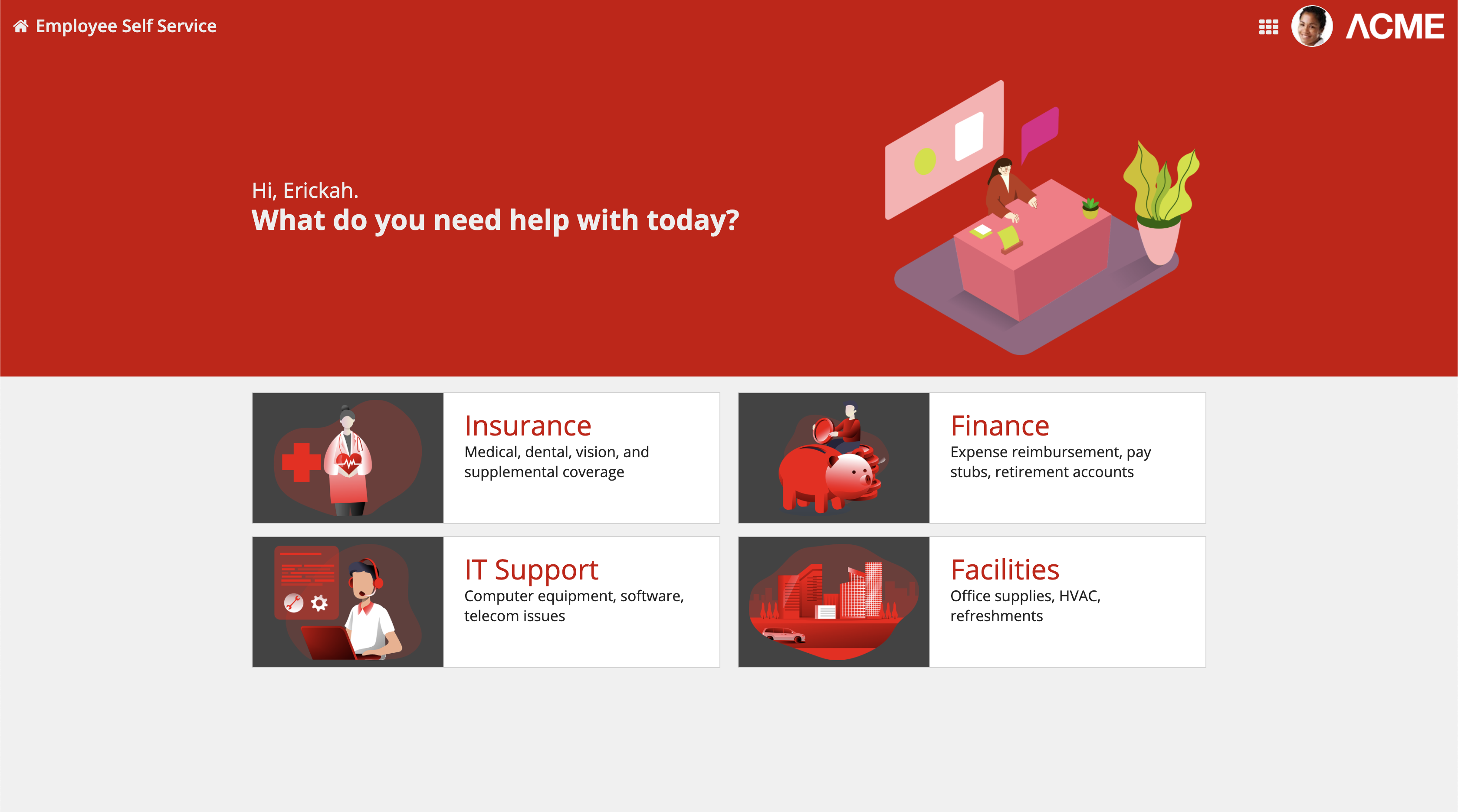
The four category cards on this landing page stand out clearly against the transparent page background
When using an image with a transparent background in a billboard layout, create a clean look by setting the billboard background to be the same hex value as the header content layout background.
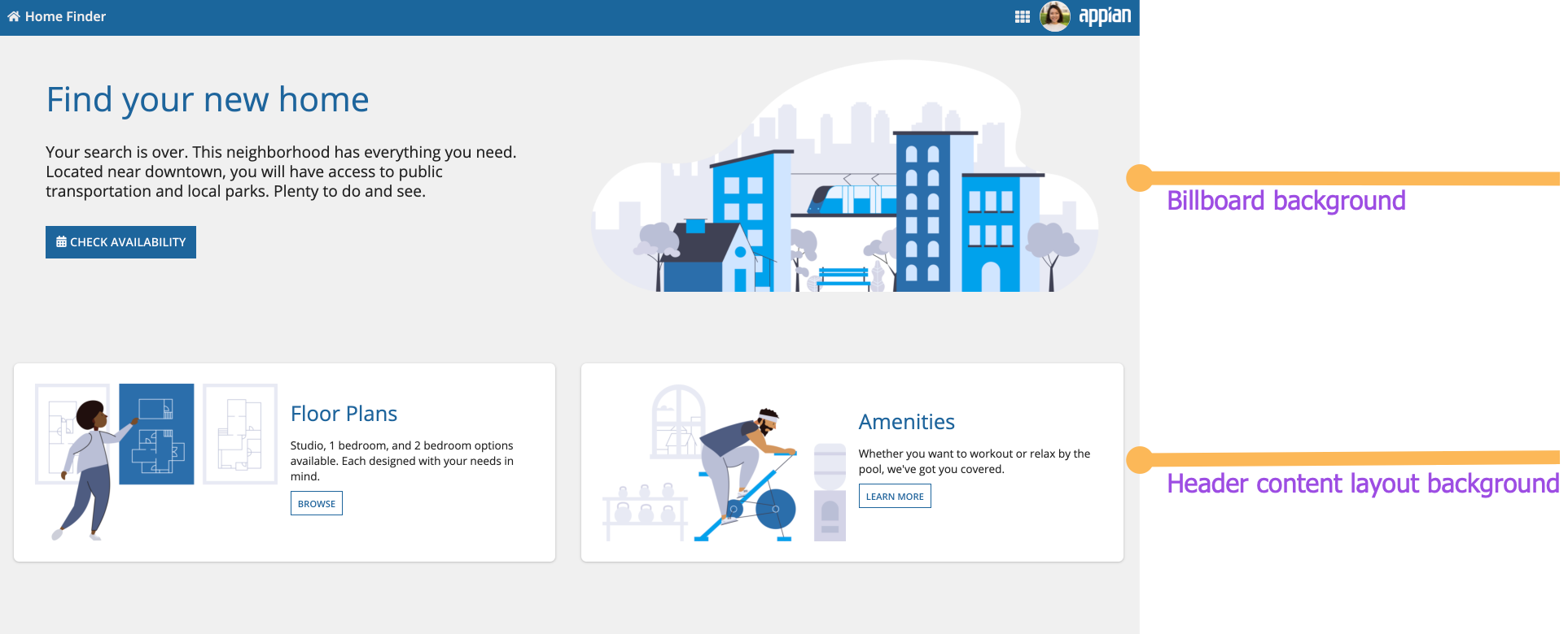
This landing page uses the same color for the billboard header and header content layout backgrounds
Custom content background color
The header content layout can be configured to display a custom background color. When set, the custom color will appear behind page content, instead of the default white page background.
Note: To ensure accessibility compliance, make sure there is enough contrast between the page contents and the page background color.
Color schemes
There are three predefined dark color schemes that you can use to set the background color: "CHARCOAL_SCHEME", "NAVY_SCHEME", and "PLUM_SCHEME". We recommend using one of these schemes instead of using plain black. Additionally, place content in cards with the corresponding scheme.
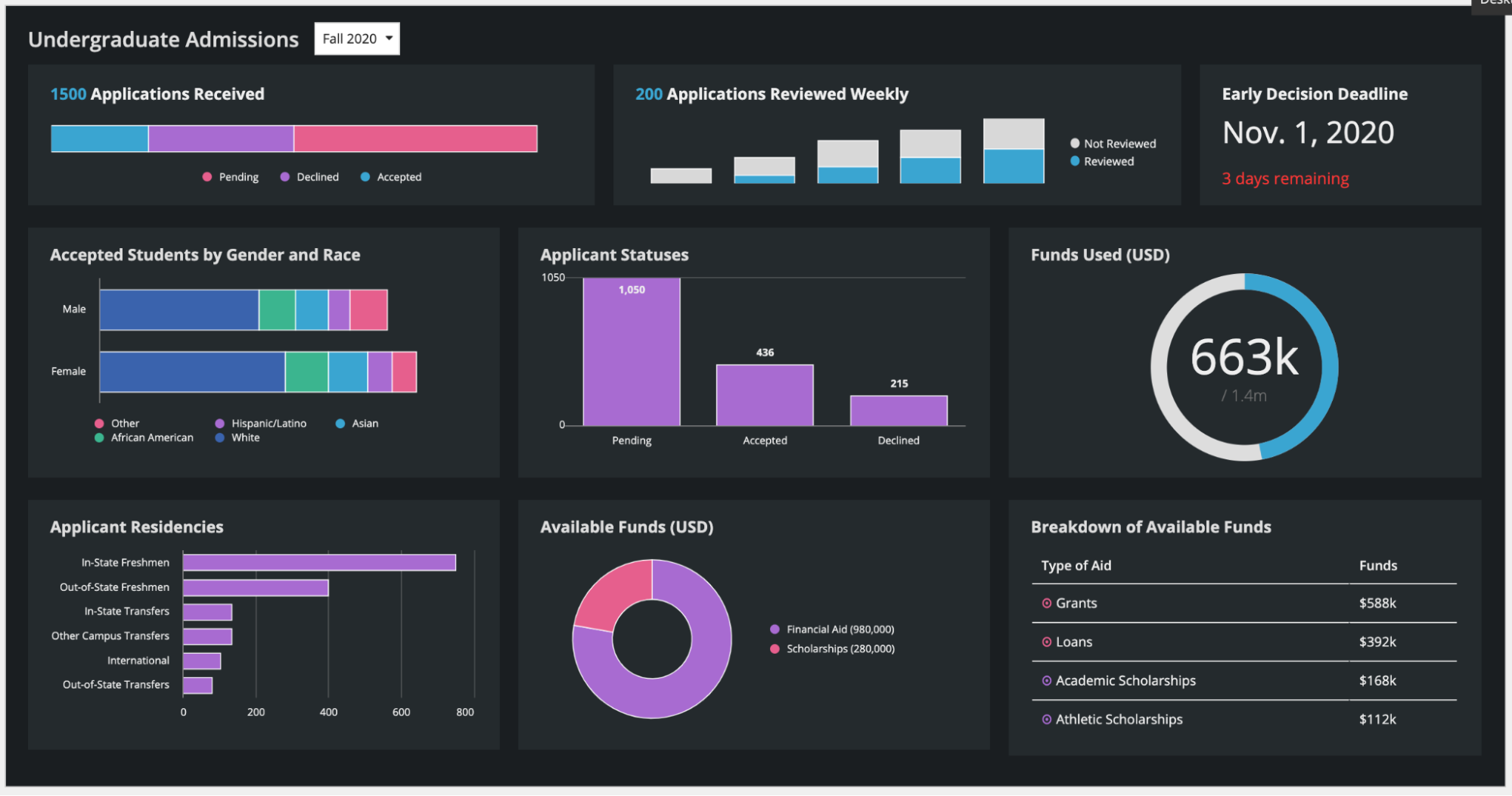
This dashboard uses a headerContentLayout with a "CHARCOAL_SCHEME" background color. The card styles use the same scheme.
When setting the color of the header in your header content layout, make sure to match the content background color. For example, a card header color should use the content background color hex value rather than the predefined dark color scheme options. This will ensure that the entire page background color is consistent with the site navigation bar color.
Use the background color hex value for the card header
Don't use the dark color scheme for the card header
Use dark color schemes when you can apply the scheme to all of your site pages. Avoid creating sites with a mix of dark color scheme pages and non-dark color scheme pages. It is important that your page background color works well with your site branding colors and is consistent across all site pages. Dark color schemes work best on display pages like reports or dashboards.
As an alternative to our predefined dark color schemes, you can set a custom background color to better match your company branding. Set any hex value using the backgroundColor parameter and place content in cards that are a lighter hex value than your set background color. See our Overview of Color guidance to ensure your page looks clean and professional.
This dashboard uses a custom color scheme. The cards have a lighter hex value than the background color.
Page width
While the header in a header content layout is flush with the top, left, and right edges of the page, the width of the page itself also affects the appearance of the overall interface.
Site pages configured to use the “Full” width will fill the interface edge-to-edge and the header will be flush with the bottom of the site navigation bar. This is also the case with the “Wide” width on typical devices and monitors.
When the page fills the width of the interface, there are no gaps around the header
When using the “Medium” or “Narrow” site page widths, the page does not fill the whole interface and a visible margin remains around the page. This is also the case when viewing the page in Tempo and when the pages with the “Wide” setting are viewed on very wide monitors.
When the page is narrower than the full interface, a margin surrounds the page
Record headers
If your interface is on a record view, you can achieve a similar look to the header content layout by adding a record header. This will create a card or billboard background on the header that extends to the top, left, and right edges of the page. See the Define record views and actions page for more information.
Fixed headers
Fixing a header to the top of a page allows users to easily see and act on important information, no matter where they are on the page. To use this in a header content layout, simply select Fix header when scrolling in the COMPONENT CONFIGURATION pane.
Defining margins for fixed headers
When you use a fixed header on your interface, the margins of the card or billboard layout will be fixed with the header. We recommend setting the Margin Below setting to "None" so that it isn't fixed with the header.
In order to create appropriate spacing between the header and the contents, use the Margin Above setting on the top component of the page.
This example uses the Margin Above parameter on the columns layout in the contents of the page. This causes the margin to scroll with the rest of the page.
This example uses the Margin Below parameter on the card header. This causes the margin to be fixed with the header.
Making sure fixed headers are responsive for all screen sizes
When you use a fixed header in your header content layout, be sure to test it on narrower screen sizes. You may need to use responsive design techniques, such as using a!isPageWidth(), to make sure your header looks good on all screen sizes.
Using a fixed header on this mobile interface takes up most of the screen and blocks interacting with the content below.
This interface uses a!isPageWidth() to set the fixed header to false if it is being viewed on a narrow device.