Pane Layout
See the developer documentation for technical details about the pane layout.
Introduction
The pane layout component lets you design pages with multiple scrollable areas. This could be a two-pane design with controls on one side and the main content in the other, or a three-pane layout with two content areas.
To give you flexibility when designing interfaces, the pane layout can have two or three panes, each containing input fields, images, charts, grids, and other components. See the Pane Layout component page for more information.
When to use a pane layout
The pane layout works best when users need to consume different sets of data side by side, and scroll each set of information independently.
Because the pane layout component is a top-level layout, it cannot be nested within other layout components.
Usage
This section highlights variations of the pane layout component to help you visualize what's possible for your interface designs.
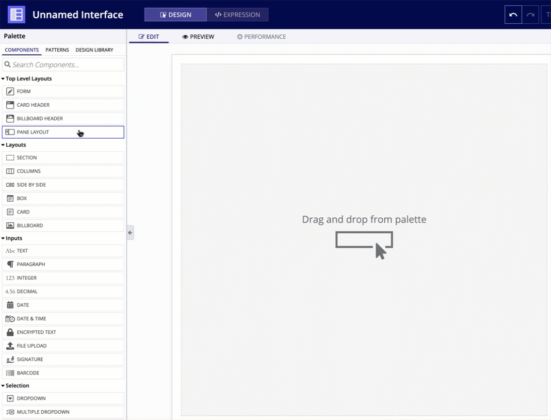
To use a pane layout component in design view, you must start with a blank interface. For existing interfaces, the TOP LEVEL LAYOUTS menu is not visible. To add a pane layout to an existing page, either remove all existing content or switch to EXPRESSION MODE.
In the COMPONENTS PALETTE, under the TOP LEVEL LAYOUTS section, drag and drop a PANE LAYOUT onto the page.
For each pane in a pane layout, you can configure the following parameters.
Contents
The Contents parameter contains all of the input and display components you want to appear
Width
Use the Width parameter to control the resizing behavior of the pane.
Using fixed pane widths
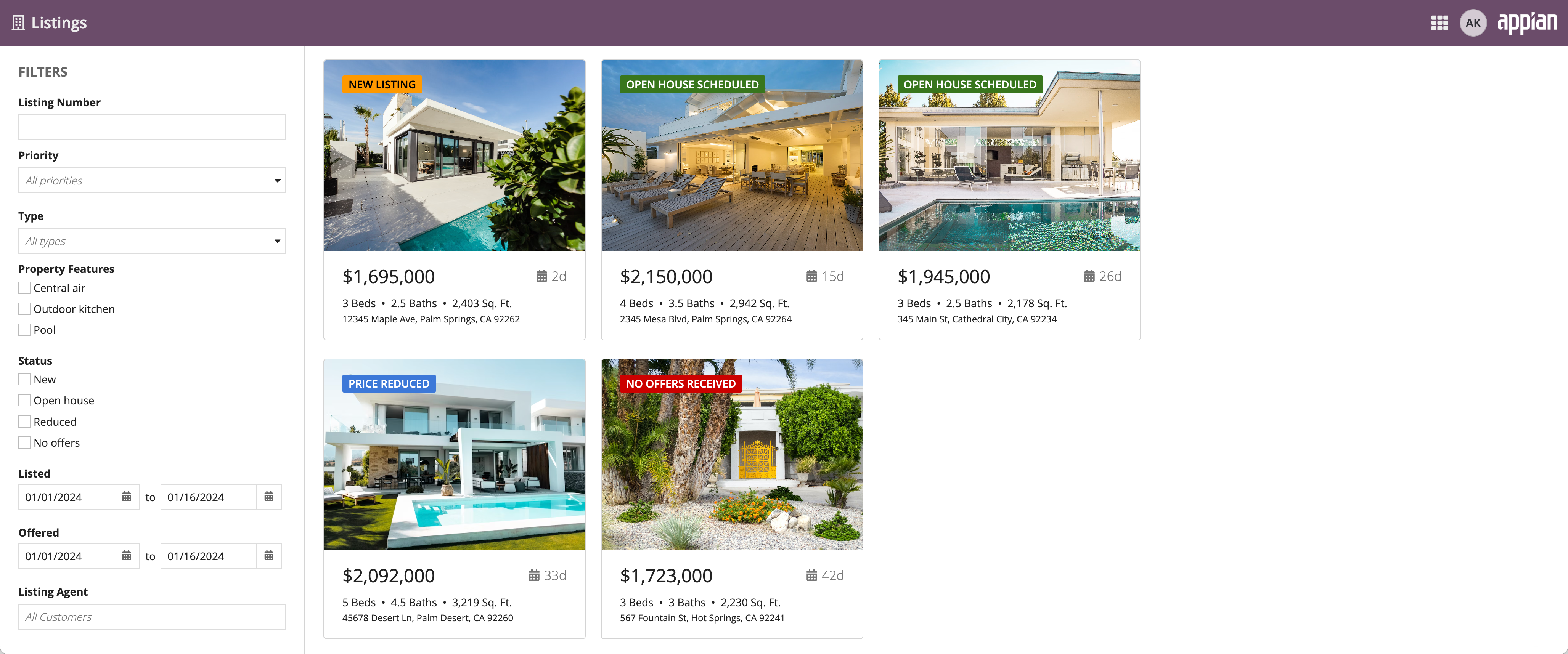
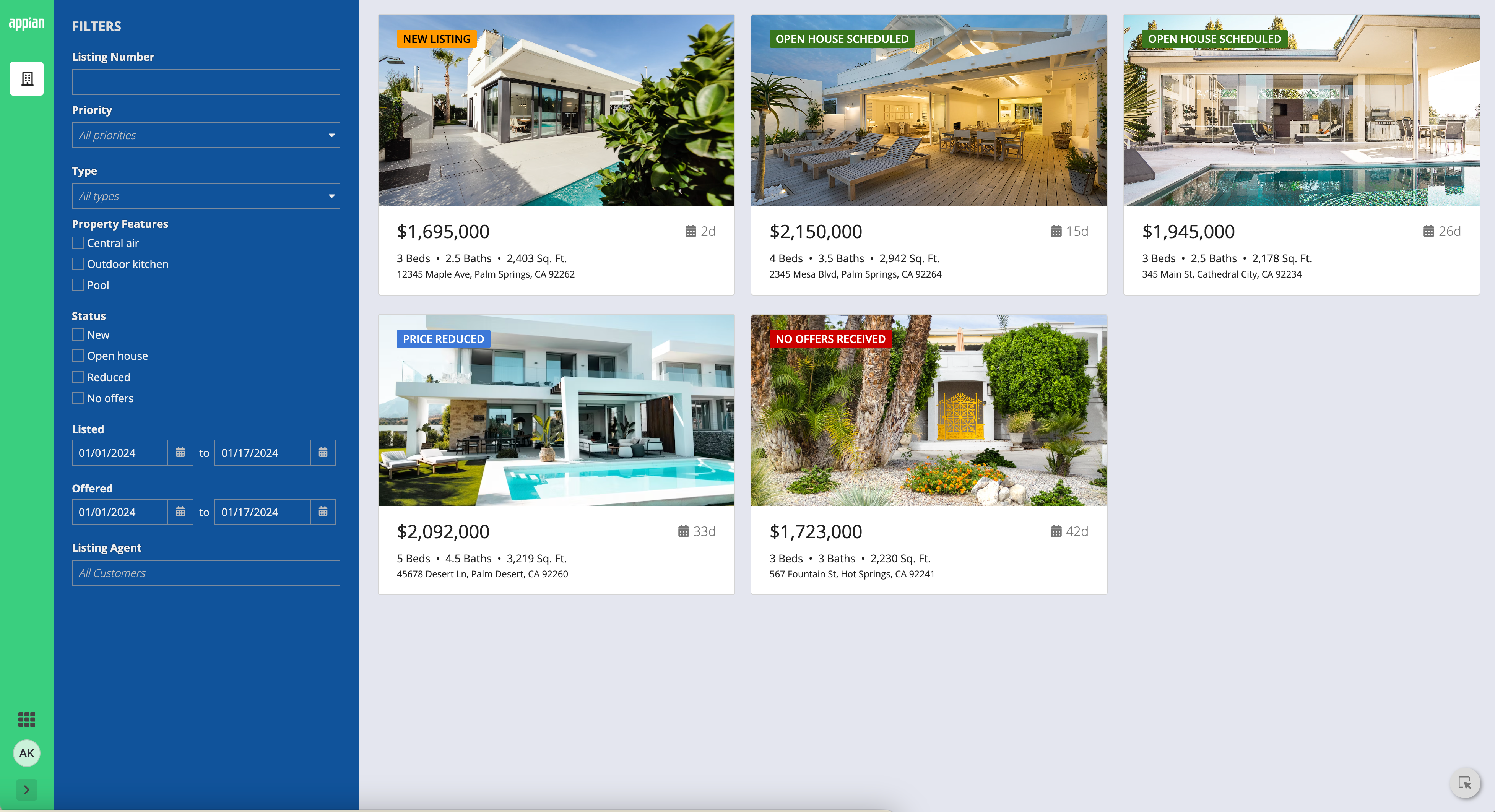
Most designs have a pane that should have a fixed width, so we recommend a fixed width value to maintain the same look across different screen sizes. For example, panes used to fix controls like filters to the side of the page should have a consistent width.
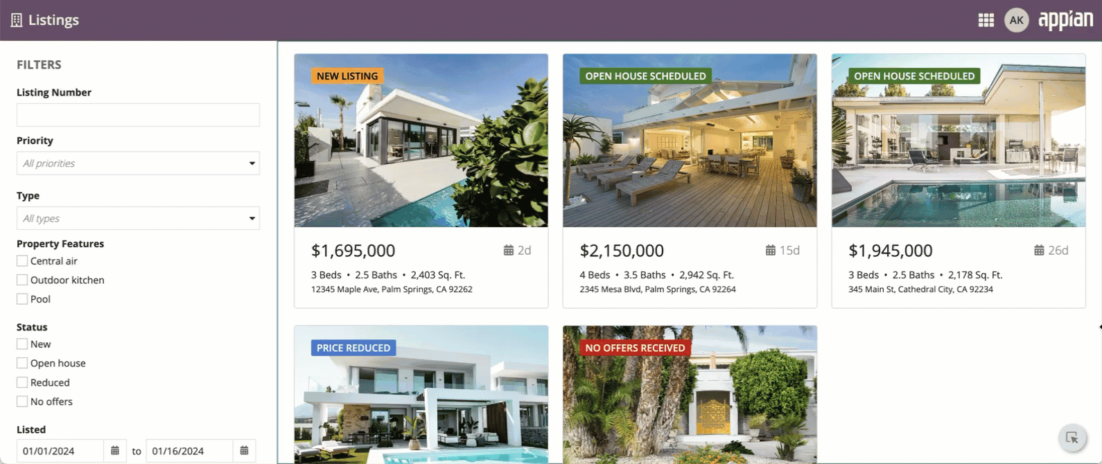
Using a fixed pane width allows the filters to look good on different screen sizes.
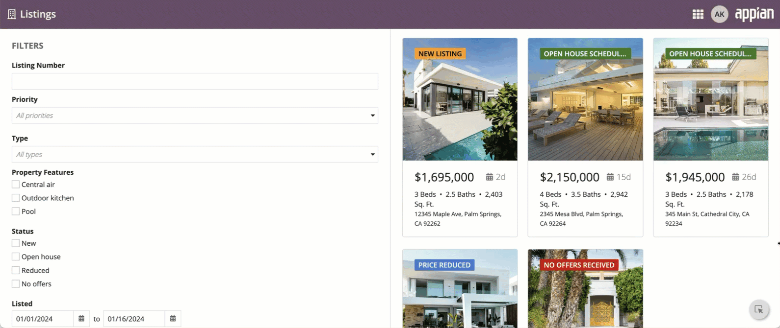
Using the automatic width for a control pane doesn't look good on different screen sizes.
Using automatic pane widths
When you set a fixed with for a pane, you must set at least one other pane to use the "AUTO" width. This ensures that the layout will adjust to fit any screen size.
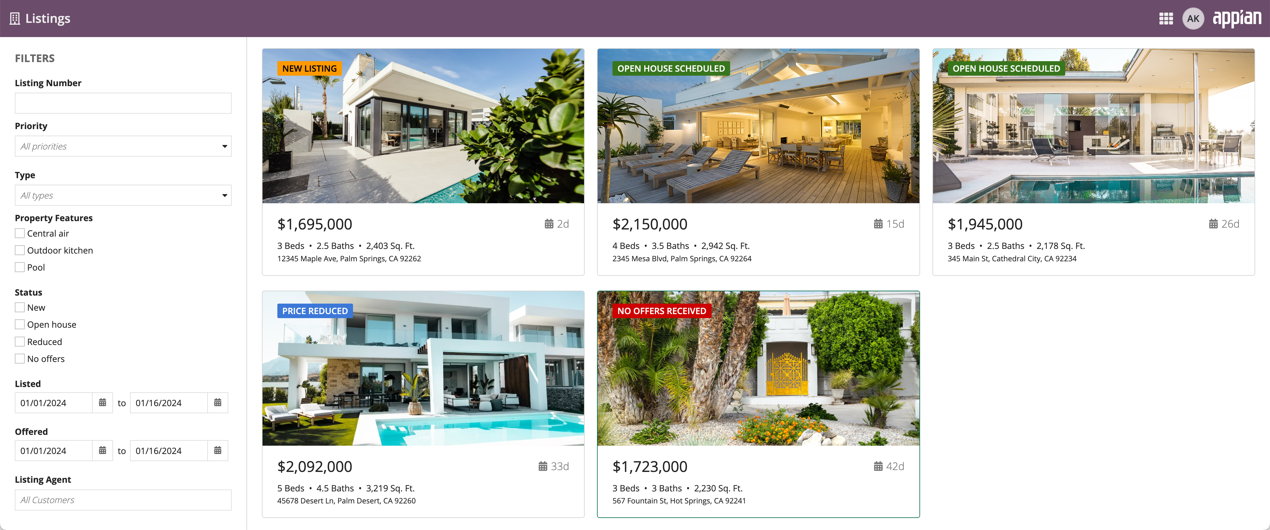
Using automatic width for the main content on this interface allows the pane to take up the rest of the screen, no matter how wide the screen is.
Using a fixed width for the main content on this interface doesn't allow the content to take up the rest of the screen when using a wide monitor.
Use the default automatic pane width to distribute space evenly across all panes.
If you don't specify a value for the width parameter, the pane's width will be set to auto. In general, we recommend that your layout have at least one pane with a fixed width for a consistent design across different screen sizes.
Background color
Use the Background Color parameter to change the color that appears behind the pane content. You can use different background colors to quickly create distinct vertical sections that completely fill the height of the window.
Valid values are "White" (default), "Gray", "Transparent", "Charcoal Scheme", "Navy Scheme", and "Plum Scheme". You can also set a custom color by using a hex code.
Padding
Use the Padding parameter to set the desired amount of whitespace around a pane's content. Valid values are "None", "Even Less", "Less", "Standard" (default), "More", and "Even More".
As you adjust this parameter to increase the padding, you'll notice you're creating more space around the contents section of your page.
If you want zero space around the contents section so that it's flush with the border of the page, select "None" for the parameter value.
The right amount of padding for your interface may depend on a variety of factors. Adjust the contents padding settings to see what works best.
The following example shows the progression of the padding values from "None" through "Even More".
Style guidelines
This section highlights specific design guidelines and recommendations.
Page contents background color
Create enough contrast between contents and background color
If you are using a custom background color, make sure there is enough contrast between the page contents and the page background color to ensure accessibility compliance.
Don't mix and match dark color schemes across site pages
Avoid creating pages with a mix of dark color scheme panes and non-dark color scheme panes. It is important that your pane background color works well with your site branding colors and is consistent across all site pages.
Use a custom background color to match company branding
To better match your company branding, set a custom background color. To set a custom background color, select Use a custom color for the Background Color parameter. Remember to also place content in cards that are a lighter hex value than your set background color. See our Using Colors guidance to ensure your page looks clean and professional.
This dashboard uses a custom color scheme. The cards have a lighter hex value than the background color.