

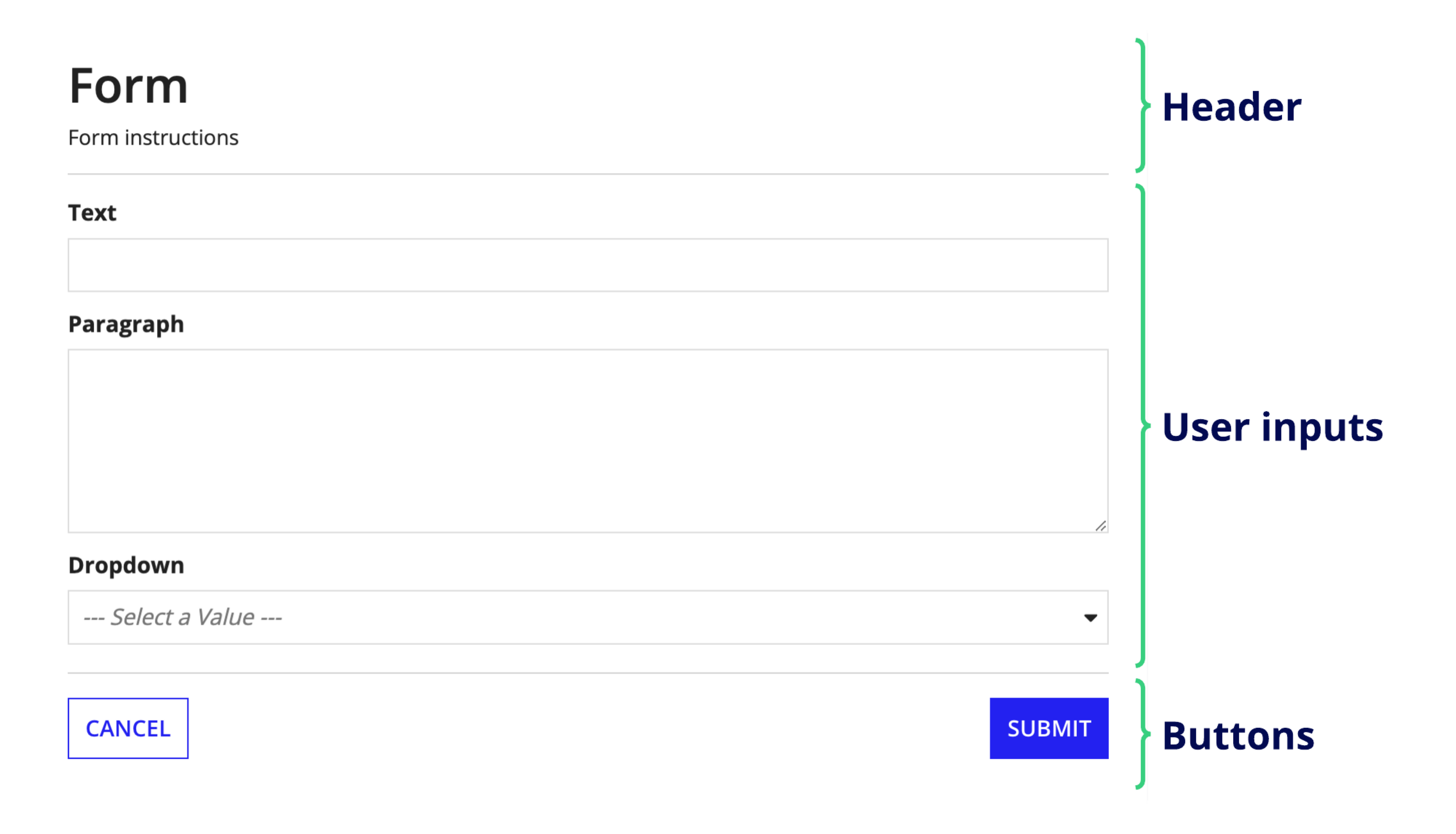
| SAIL Design System guidance available for Form Layout
When you need to collect data in a structured, intuitive way, use the form layout. Learn how to use the form layout to simplify data collection and create forms that work as seamlessly as they look. |
FunctionCopy link to clipboard
a!formLayout( backgroundColor, formWidth, showWhen, label, instructions, showHeaderDivider, isHeaderFixed, contents, skipAutoFocus, buttons, showButtonFooterDivider, validations, validationGroup )
Displays any arrangement of layouts and components beneath a header and above buttons. Use this as the top-level layout for start and task forms.
ParametersCopy link to clipboard
| Name | Keyword | Types | Description |
|---|---|---|---|
|
Background Color |
|
Text |
Color to show behind the contents of the form. Valid values: Any valid hex color or "WHITE" (default), "TRANSPARENT", "CHARCOAL_SCHEME", "NAVY_SCHEME", "PLUM_SCHEME". |
|
Form Width |
|
Text |
Determines the maximum width of the form on a page or in a dialog. If the page or dialog is narrower than the selected value, the form will fill the entire width. Valid values: "FULL" (default), "WIDE", "MEDIUM", "NARROW", "EXTRA_NARROW". |
|
Visibility |
|
Boolean |
Determines whether the layout is displayed on the interface. When set to false, the layout is hidden and is not evaluated. Default: true. |
|
Label |
|
Text |
Optional text to display as the interface's title. |
|
Instructions |
|
Text |
Optional text displayed below the field's label. |
|
Show header divider |
|
Boolean |
Determines whether to display a divider line below the header to separate it from the rest of the content. Default: true. |
|
Fix header when scrolling |
|
Boolean |
Determines whether the header remains at the top of the form when scrolling. In Appian Mobile, the header is never fixed. Default: In dialogs, the header is fixed; otherwise, it is not fixed. Setting this parameter to true or false will override this behavior. |
|
Contents |
|
Any Type Array |
Components and layouts to display in the form body. |
|
Don’t automatically focus on first input |
|
Boolean |
Determines whether the first input will receive focus when a form loads. Default is false. |
|
Buttons |
|
Button Layout |
Buttons to display at the bottom of the form, arranged using a!buttonLayout(). |
|
Show button footer divider |
|
Boolean |
Determines whether to display a divider line above the button footer to separate it from the rest of the content. Default: true. |
|
Validations |
|
Text or Validation Message |
Validation errors displayed above the form buttons. Configured using a text array or an array with a mix of text and Validation Message using |
|
Validation Group |
|
Text or Validation Message Array |
When present, the requiredness of the field is only evaluated when a button in the same validation group is pressed. The value for this parameter cannot contain spaces. For example, |
Usage considerationsCopy link to clipboard
Using a!formLayout()Copy link to clipboard
- A button layout must be present for a back button to appear for activity-chained tasks.
- Use form validation messages for problems that are not specific to a single component.
- This component cannot be read-only or disabled.
Form width in record action dialogsCopy link to clipboard
If you are planning to display the form in a record action dialog, keep in mind that the dialog size is set in the record type and that the form width is set in the form layout. Be sure to open the record action to make sure the form width looks good with the dialog size.
We recommend setting the formWidth parameter to "FULL" when displaying the form in a dialog.
Initial behavior & focusingCopy link to clipboard
- The component is not in an initially collapsed section.
- Focus will automatically be applied on initial load to the first component in a form that is one of the following:
Scroll behavior in wizardsCopy link to clipboard
In wizards, Appian automatically handles the page scrolling between each step of the wizard. This means that whenever a user navigates to the next step, the page will automatically scroll to the top of the page.
If you are using the form layout in a wizard, make sure that the buttons or dynamic links that control form navigation are placed in the buttons parameter. If they are placed in the contents parameter, auto scrolling will not work.
ExamplesCopy link to clipboard
To experiment with examples, copy and paste the expression into an interface object.
Read-only formCopy link to clipboard
Use the interactive editor below to test out your code:
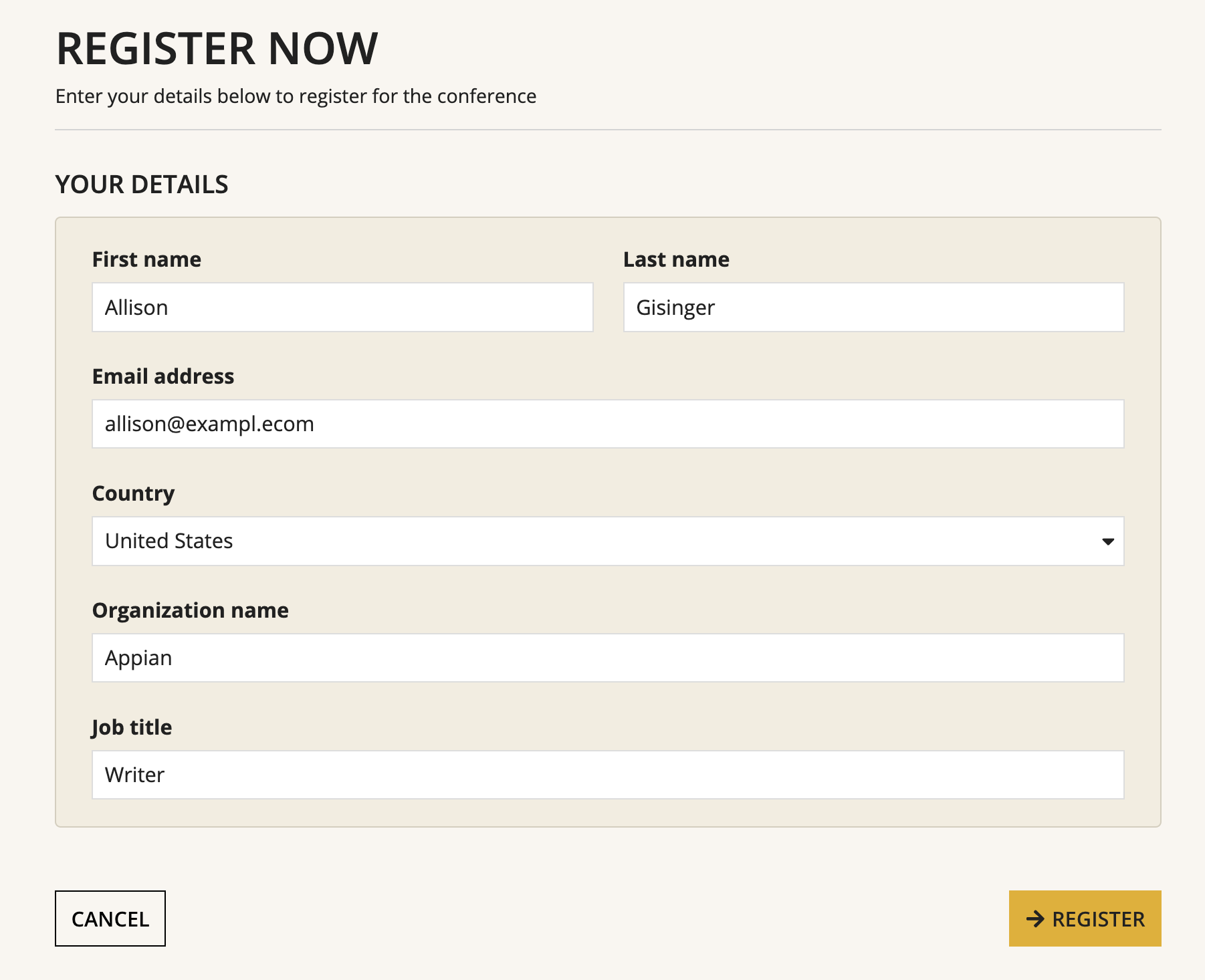
Form with background colorCopy link to clipboard
1
2
3
4
5
6
7
8
9
10
11
12
13
14
15
16
17
18
19
20
21
22
23
24
25
26
27
28
29
30
31
32
33
34
35
36
37
38
39
40
41
42
43
44
45
46
47
48
49
50
51
52
53
54
55
56
57
58
59
60
61
62
63
64
65
66
67
68
69
70
71
72
73
74
75
76
77
78
79
80
81
82
83
84
85
86
87
88
89
90
91
92
93
94
95
96
97
98
99
100
101
102
103
104
105
a!localVariables(
  local!data:a!map( firstName:null, lastName:null, email:null, country:null, orgName:null, title:null ),
  a!formLayout(
    backgroundColor: "#f8f6f0",
    formWidth: "MEDIUM",
    label: "REGISTER NOW",
    instructions: "Enter your details below to register for the conference",
    contents: {
      a!sectionLayout(
        label: "YOUR DETAILS",
        labelSize: "SMALL",
        labelColor: "STANDARD",
        contents: {
          a!cardLayout(
            contents: {
              a!columnsLayout(
                columns: {
                  a!columnLayout(
                    contents: {
                      a!textField(
                        label: "First name",
                        value: local!data.firstName,
                        saveInto: local!data.firstName
                      )
                    }
                  ),
                  a!columnLayout(
                    contents: {
                      a!textField(
                        label: "Last name",
                        value: local!data.lastName,
                        saveInto: local!data.lastName
                      )
                    }
                  )
                }
              ),
              a!textField(
                label: "Email address",
                labelPosition: "ABOVE",
                value: local!data.email,
                saveInto: local!data.email,
                marginAbove: "STANDARD"
              ),
              a!dropdownField(
                label: "Country",
                labelPosition: "ABOVE",
                placeholder: "Select your country of residence",
                choiceLabels: {"United States", "United Kingdom", "Canada"},
                choiceValues: {1, 2, 3},
                value: local!data.country,
                saveInto: local!data.country,
                marginAbove: "STANDARD"
              ),
              a!textField(
                label: "Organization name",
                labelPosition: "ABOVE",
                value: local!data.orgName,
                saveInto: local!data.orgName,
                marginAbove: "STANDARD"
              ),
              a!textField(
                label: "Job title",
                labelPosition: "ABOVE",
                value: local!data.title,
                saveInto: local!data.title,
                marginAbove: "STANDARD"
              )
            },
            style: "#f2ede1",
            shape: "SEMI_ROUNDED",
            padding: "STANDARD",
            marginBelow: "STANDARD",
            borderColor: "#d4cebe"
          )
        },
        marginAbove: "STANDARD"
      )
    },
    buttons: a!buttonLayout(
      primaryButtons: {
        a!buttonWidget(
          label: "Register",
          icon: "arrow-right",
          submit: true,
          validate: true,
          style: "SOLID",
          color: "#DEB03D"
        )
      },
      secondaryButtons: {
        a!buttonWidget(
          label: "Cancel",
          submit: true,
          validate: false,
          saveInto: {},
          style: "OUTLINE",
          color: "#000000",
          value: true
        )
      }
    ),
    showButtonFooterDivider: false
  )
)
Copy
Displays the following:
Feature compatibilityCopy link to clipboard
The table below lists this component's compatibility with various features in Appian.
| Feature | Compatibility | Note |
|---|---|---|
| Portals | Compatible | |
| Offline Mobile | Compatible | |
| Sync-Time Custom Record Fields | Incompatible | |
| Real-Time Custom Record Fields | Incompatible | Custom record fields that evaluate in real time must be configured using one or more Custom Field functions. |
| Process Reports | Incompatible | Cannot be used to configure a process report. |
| Process Events | Incompatible | Cannot be used to configure a process event node, such as a start event or timer event. |
| Process Autoscaling | Compatible |
Old versionsCopy link to clipboard
There are older versions of this interface component. You can identify older versions by looking at the name to see if there is a version suffix. If you are using an old version, be sure to refer to the corresponding documentation from the list below.
| Old Versions | Reason for Update |
|---|---|
| a!formLayout_17r1 | Replaced firstColumnContents and secondColumnContents with |
To learn more about how Appian handles this kind of versioning, see the Function and Component Versions page.
Related PatternsCopy link to clipboard
The following patterns include usage of the Form Layout.
-
Add Multiple Validation Rules to One Component (Validation): Enforce that the user enters at least a certain number of characters in their text field, and also enforce that it contains the "@" character.
-
Add Validations to an Inline Editable Grid (Validation, Grids, Looping): Allows the user to change data directly in a grid, and validate a various entries.
-
Add, Edit, and Remove Data in an Inline Editable Grid (Grids, Looping): Allow the user to change data directly in an inline editable grid.
-
Add, Remove, and Move Group Members Browser (Hierarchical Data, Group Management): Display the membership tree for a given group and provide users with the ability to add, remove, and move user members from a single interface.
-
Build a Wizard with Milestone Navigation (Conditional Display, Validation, Wizards): Create a wizard that divides a form into validated steps and uses the milestone component to display progress.
-
Configure Buttons with Conditional Requiredness (Validation): Present two buttons to the end user and only make certain fields required if the user clicks a particular button
-
Configure a Boolean Checkbox (Choice Components): Configure a checkbox that saves a boolean (true/false) value, and validate that the user selects the checkbox before submitting a form.
-
Configure a Dropdown Field to Save a CDT (Choice Components): When using a dropdown to select values from the database, or generally from an array of CDT values, configure it to save the entire CDT value rather than just a single field.
-
Configure a Dropdown with an Extra Option for Other (Choice Components): Show a dropdown that has an "Other" option at the end of the list of choices. If the user selects "Other", show a required text field.
-
Make a Component Required Based on a User Selection (Validation): Make a paragraph component conditionally required based on the user selection.
-
Set the Default Value Based on a User Input (Default Value): Set the default value of a variable based on what the user enters in another component.
-
Set the Default Value of CDT Fields Based on a User Input (Default Value): Set the value of a CDT field based on a user input.
-
Set the Default Value of an Input on a Start Form (Default Value): Display a default value in some form inputs on a start form, and save the value into the process when submitting.
-
Set the Default Value of an Input on a Task Form (Default Value): Display a default value in some form inputs on a task form, and save the value to process when submitting.
-
Showing Validation Errors that Aren't Specific to One Component (Validation): Alert the user about form problems that aren't specific to one component, showing the message only when the user clicks "Submit".
-
Track Adds and Deletes in Inline Editable Grid (Grids): In an inline editable grid, track the employees that are added for further processing in the next process steps.
-
Use Links in a Grid to Show More Details and Edit Data in External System (Grids, Web Services): Allow end users to click a link in a read-only grid to view the details for the row, and make changes to the data.
-
Use Selection For Bulk Actions in an Inline Editable Grid (Grids): Allow the user to edit data inline in a grid one field at a time, or in bulk using selection.
-
Use Validation Groups for Buttons with Multiple Validation Rules (Validation): Present two buttons to the end user that, based on the selection, will validate only after a particular button is clicked.