Form Layout
See the developer documentation for technical details about the form layout.
IntroductionCopy link to clipboard
The form layout component allows you to design pages with built-in features that streamline form design, including:
- A header that can include a title and instructions.
- A contents section that usually contains input fields, along with other components and layouts.
- A button section that allows you to specify primary and secondary button placement and automatically sticks to the bottom of dialogs.
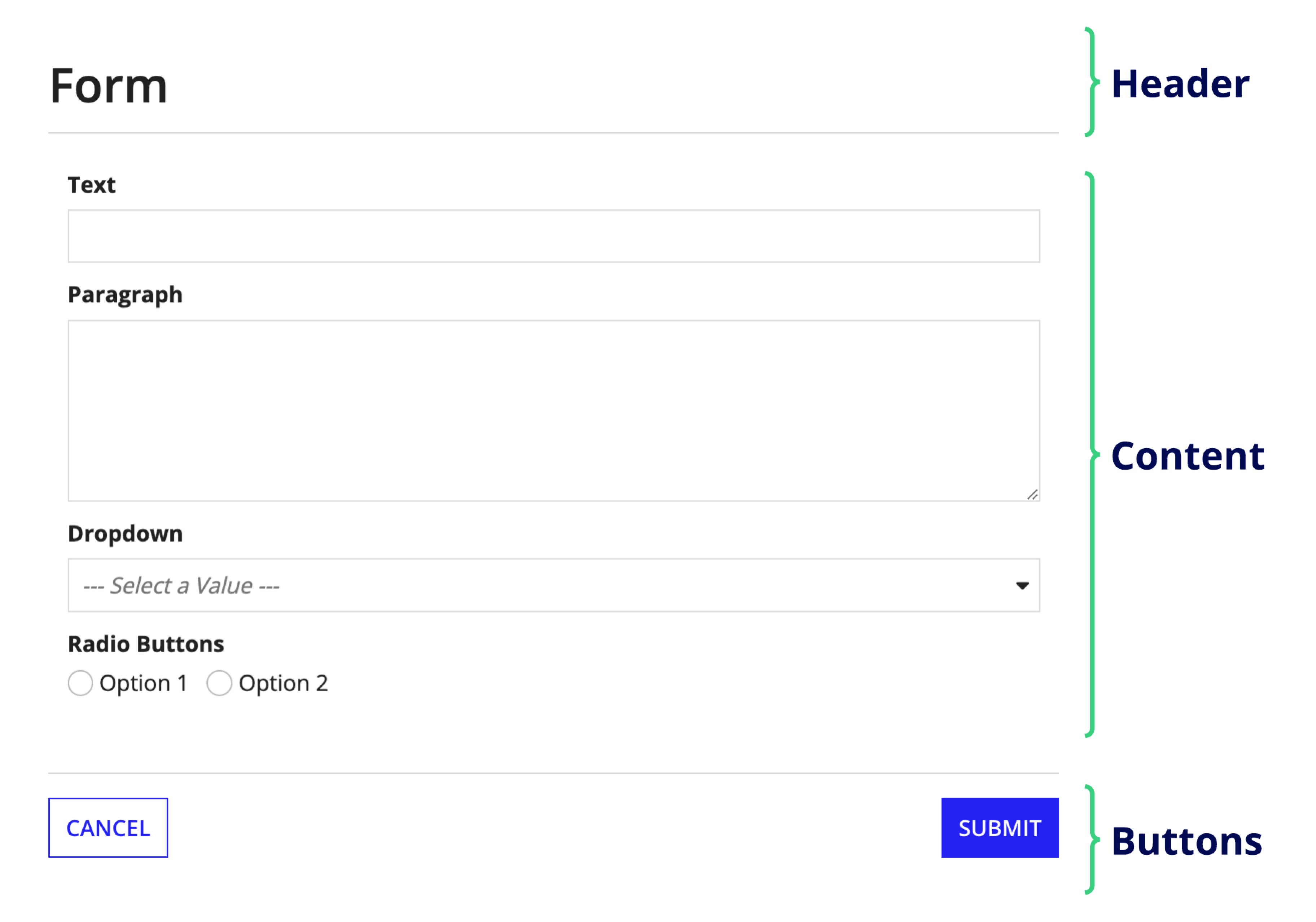
Because the form layout component is a top-level layout, it cannot be nested within other layout components.
This page talks about when to use the form layout, how to use its design configurations, and what style guidelines to follow when designing interfaces.
When to use a form layoutCopy link to clipboard
Use the form layout as your top-level interface to collect data in a structured, intuitive way. Drag and drop it from the component palette to quickly create a form with a header, content area, and button footer for a familiar user experience.
Form layout also provides some built in features that can help you provide a user-friendly experience, including:
- Automatically fixing the button footer to the bottom of record action dialogs.
- Automatically handling the placement and styling of primary and secondary buttons.
- Allowing you to specify if the form should focus on the first field when it is loaded.
- Allowing you to configure form-level validations.
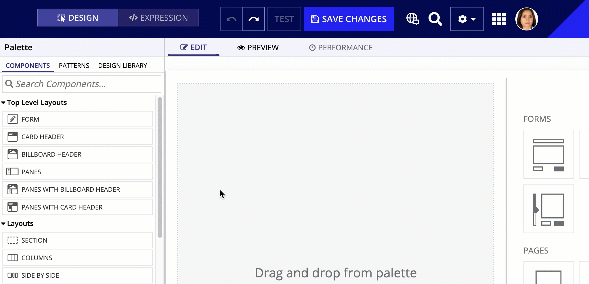
UsageCopy link to clipboard
This section highlights variations of the form layout component to help you visualize what's possible for your interface designs.
To use a form layout component in design view, you must start with a blank interface. For existing interfaces, the TOP LEVEL LAYOUTS menu is not visible. To add a form layout to an existing page, either remove all existing content or switch to EXPRESSION MODE.
The following sections describe the parameter configurations as they are displayed in the component configuration pane of an interface object.
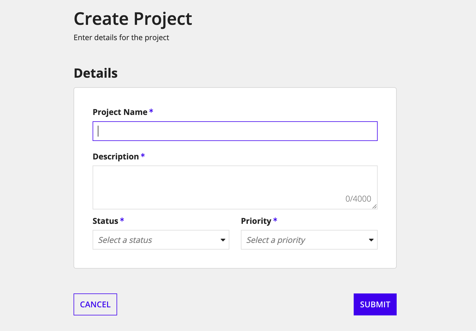
Form configurationsCopy link to clipboard
Form configurations affect the look of the entire form. They allow you to control the form background color, width, and visibility.
Background Color parameterCopy link to clipboard
Use the Background Color parameter to change the color of the form page. Valid values are, "White" (default), "Transparent", "Charcoal Scheme", "Navy Scheme", and "Plum Scheme". You can also set a custom color by using a hex code. See Form background color for guidance on using these different values.
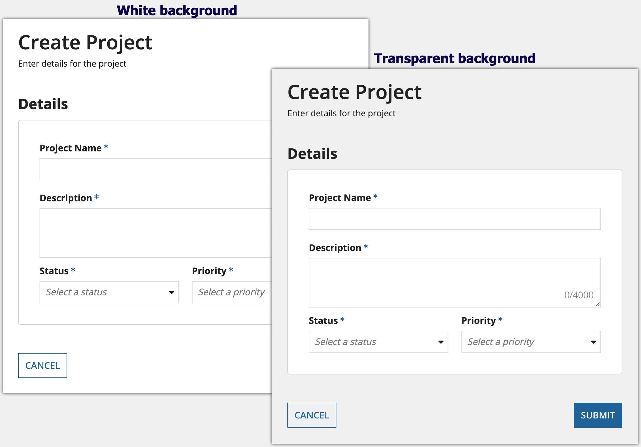
When configured with a "Transparent" background, the light gray background color that is standard in all sites and portals appears behind form content, instead of the default white background color.
The white card on this form stands out clearly against the transparent page background
There are three pre-defined dark color schemes that you can use to set the background color: "Charcoal scheme", "Navy scheme", and "Plum scheme". If you'd like to use a dark color scheme in your interface, it is recommended to use one of these schemes instead of using plain black. Additionally, for the content of your interface, it is recommended to use cards that use the corresponding scheme for their Style parameter.

Form Width parameterCopy link to clipboard
Use the Form Width parameter to set the width of the form. Valid values are "Full", "Wide", "Medium", "Narrow", and "Extra Narrow".
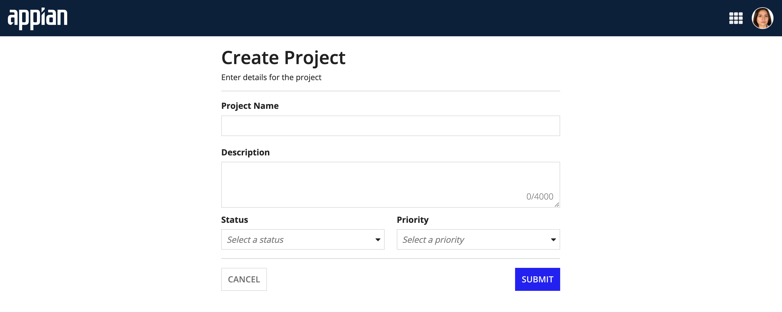
Select "Full" if you want the form to take up the entire width of the screen. If you are displaying the form in a record action dialog, we recommend selecting "Full" and configuring the dialog size in the record type to control the width of the form.
The best width for your interface may depend on a variety of factors. See Form width for details on how to choose the best width.
The following example shows the progression of form width values from "Full" to "Extra Narrow".

Visibility parameterCopy link to clipboard
Use the Visibility parameter to show or hide the entire form.
Header configurationsCopy link to clipboard
Header configurations affect the form header. They allow you to control the form title (label), instructions, and header divider, as well as fixing the header.
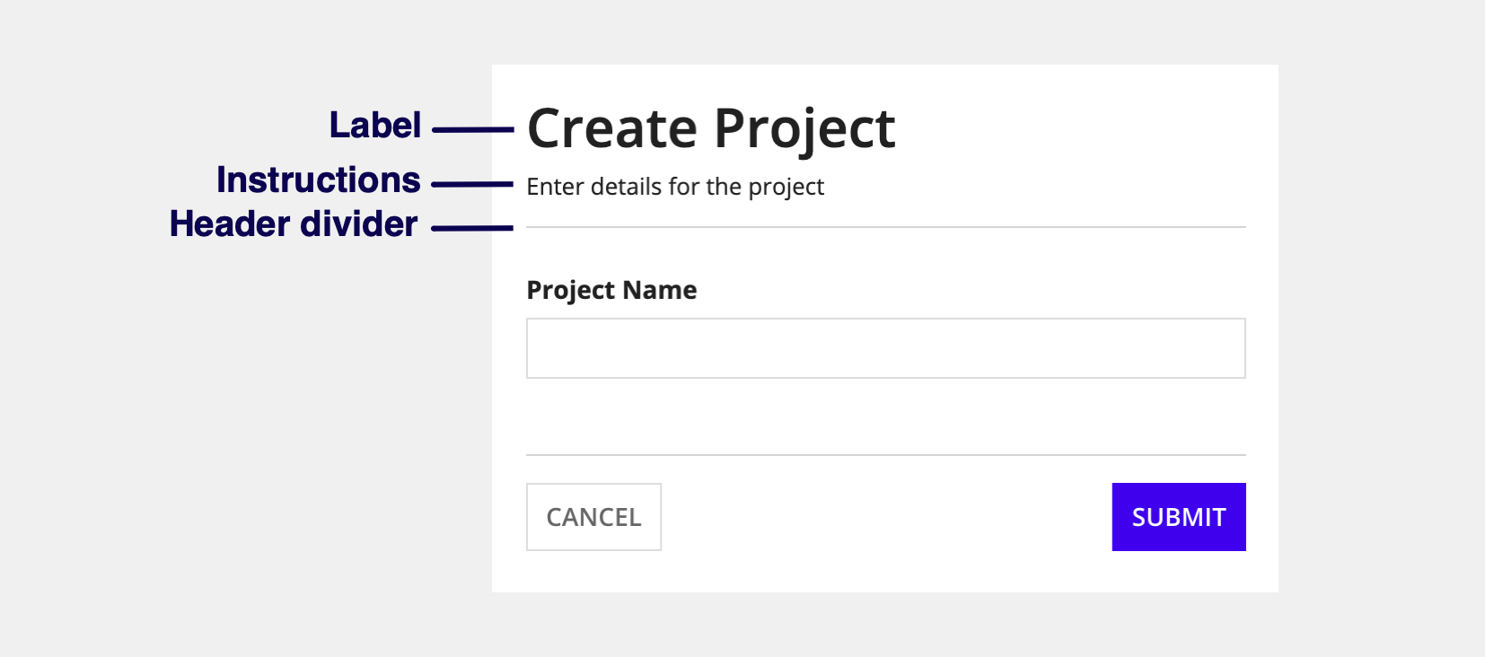
Label parameterCopy link to clipboard
Use the Label parameter to specify a form title that displays in the header.
Instructions parameterCopy link to clipboard
Use the Instructions parameter to add form instructions that display below the title in the header.
Show header divider parameterCopy link to clipboard
Use the Show header divider parameter to show or hide a divider line below the header.
Fix header when scrolling parameterCopy link to clipboard
Use the Fix header when scrolling parameter to choose if the header stays fixed at the top while scrolling.
Contents configurationsCopy link to clipboard
Contents configurations affect the main body of the form. They allow you to specify a list of components to display in the form's contents, as well as whether to automatically focus on the first form input.
Contents parameterCopy link to clipboard
Use the Contents parameter to add components and layouts you want to display in the body of the form. This will usually be input field components, but you can display any component or layout in the form contents, as long as it isn't a top-level layout.

Don't automatically focus on first input parameterCopy link to clipboard
Use the Don't automatically focus on first input parameter to control whether the cursor is automatically placed in the first field when the form loads. When this option is enabled, no fields will be active by default.
| Focus on first input | Don't focus on first input |
|---|---|
 |
 |
Button configurationsCopy link to clipboard
Button configurations allow you to control the form buttons and button divider.
Buttons parameterCopy link to clipboard
Use the Buttons parameter to add buttons to the bottom of the form using the Button Layout component.
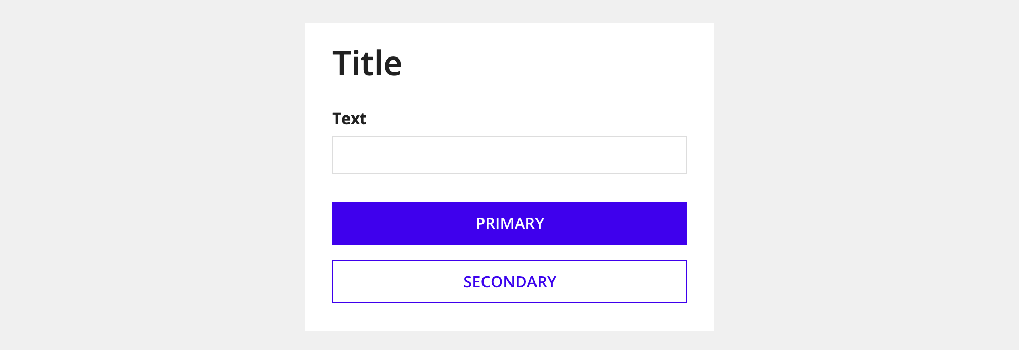
The button layout component splits buttons into primary buttons and secondary buttons. It automatically handles the placement and style of the buttons as follows.
Button locationCopy link to clipboard
When there is enough room for the buttons to display side by side without responsively stacking, primary buttons are aligned to the right and secondary buttons are aligned to the left (in left-to-right locales).
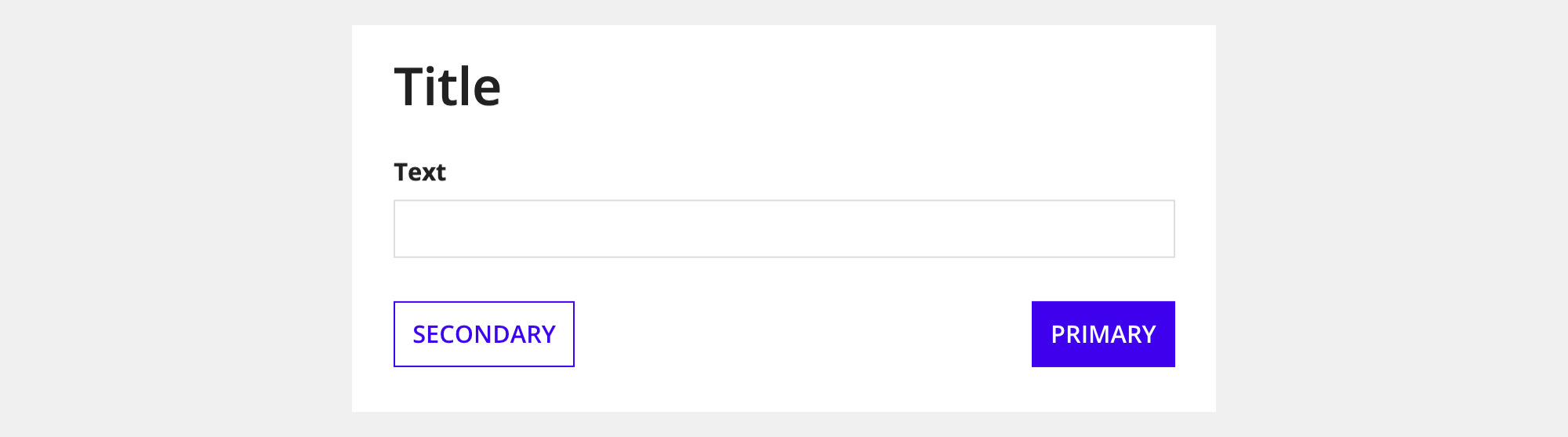
When the buttons are stacked due to the screen width, primary buttons appear on top.
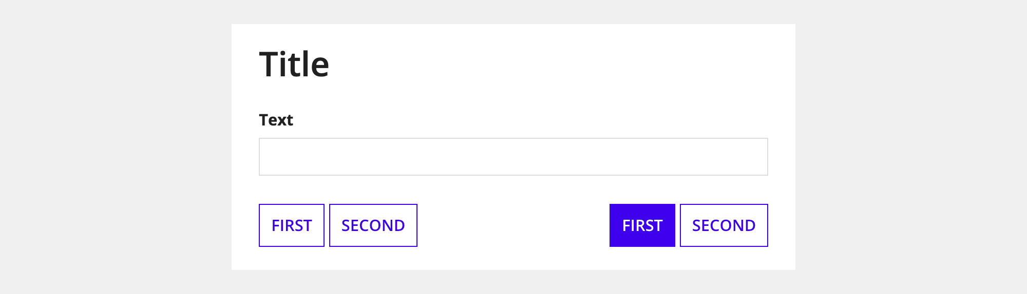
Multiple primary and secondary button locationCopy link to clipboard
Multiple primary and secondary buttons are automatically ordered based on their position in the list of buttons.
- Primary buttons: The first button in the list is the most prominent. It appears to the left of the other primary buttons (in left-to-right locales).
- Secondary buttons: The first button in the list is the least prominent. It appears to the left of the other secondary buttons (in left-to-right locales).
Button styleCopy link to clipboard
When you drag and drop a form layout from the palette, the primary button uses the "Solid" style and the secondary button uses the "Outline" style. All other buttons you add use the "Outline" style by default.
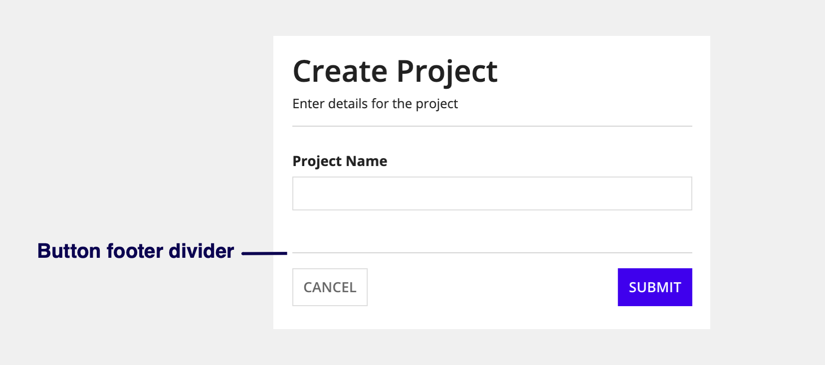
Show button footer divider parameterCopy link to clipboard
Use the Show footer divider parameter to show or hide a divider above the form buttons.
Validation configurationsCopy link to clipboard
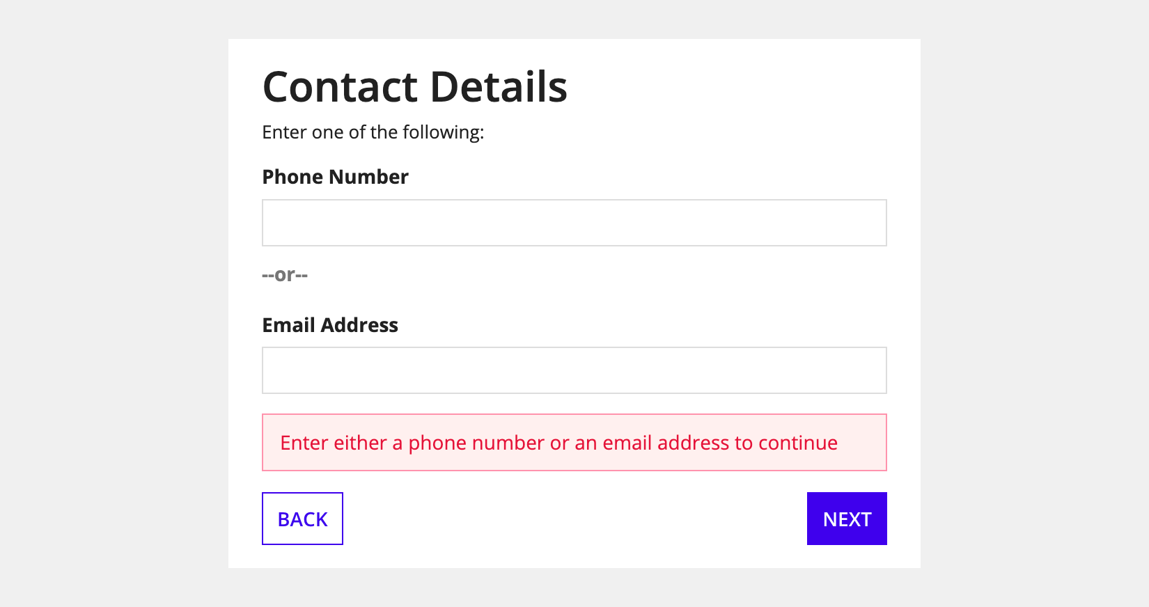
You can use form validation parameters to alert users about problems that aren't specific to one component.
For example, in a contact form requiring either a phone number or an email address, you wouldn't use the Required parameter for both fields, since only one is needed. Instead, you could use form-level validation to ensure at least one field is filled. If both are empty, it alerts the user to fill out at least one of the fields.
See Showing Validation Errors that Aren't Specific to One Component for an example of how to set this up.
Validations parameterCopy link to clipboard
Use the Validations parameter to display one or more messages using the Validation Message component.
Validation Group parameterCopy link to clipboard
Use the validation group parameter to specify which fields to validate when a user clicks a certain button.
See the following recipes for more information:
- Configure Buttons with Conditional Requiredness
- Validation Groups for Buttons with Multiple Validation Rules
Style guidelinesCopy link to clipboard
This section highlights specific design guidelines and recommendations.
Form background colorCopy link to clipboard
Use transparent background color when content is primarily cards or boxesCopy link to clipboard
Use the "Transparent" background color when your content is mostly or entirely arranged within card or box layouts. Because cards and boxes provide their own white backgrounds, this setting allows them to stand out clearly against a contrasting background.
Create enough contrast between contents and background colorCopy link to clipboard
If you are using a custom background color, make sure there is enough contrast between the page contents and the page background color to ensure accessibility compliance.
Don't alternate between dark and light color schemes across site pagesCopy link to clipboard
Use dark color schemes only when you can apply the scheme to all of your site pages. Avoid creating sites with a mix of pages with dark and light color schemes. It is important that your page background color works well with your site branding colors and is consistent across all site pages.
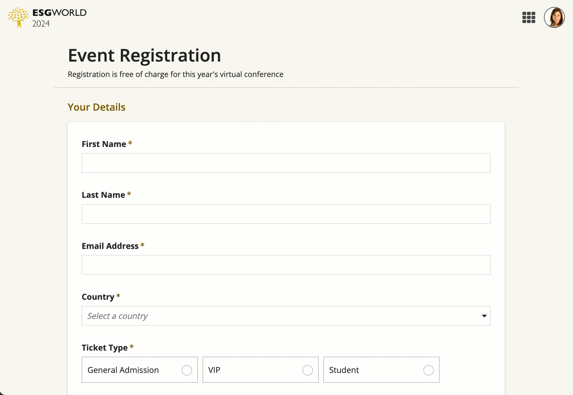
Form widthCopy link to clipboard
Use "Full" width when displaying forms in record action dialogsCopy link to clipboard
When you're designing a form to use in a record action dialog, set the Form width to "Full". This ensures the form takes up the entire width of the dialog and allows the Dialog Box Size to control the width of the form.
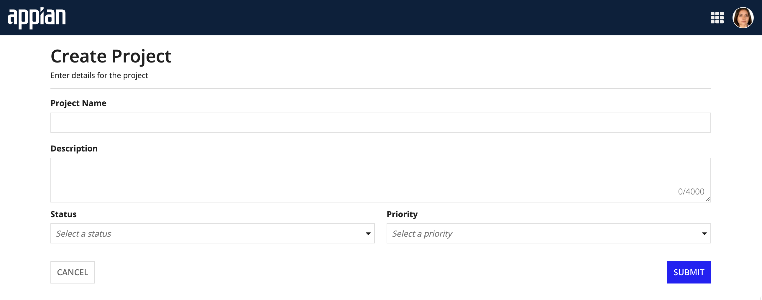
Use narrower widths on simpler one-column formsCopy link to clipboard
When you have a simple form, it is best to display all of the fields in one column. Use a narrower width on these forms so that your fields don't stretch across the entire screen.
If you are displaying the form in a record action dialog, you will still want to use "Full" for the form width. Just be sure to configure the dialog in the record type to be smaller.
This form uses "Narrow" for the Form width so that the fields take up only as much space as they need.
 This form uses "Full" for the Form width which isn't ideal since the fields stretch across the entire screen and take up more space than they need.
Use fixed headers when displaying forms in record action dialogsCopy link to clipboard
We recommend fixing the header when displaying the form in record action dialogs if the form contents are likely to require scrolling. By default, the header is fixed when displayed in record action dialogs, and not fixed when displayed elsewhere.
Show the header divider for long instruction fieldsCopy link to clipboard
If your form has a long instruction field, use the header divider to help separate the instructions from the content of the form. For more information on button styling, see Buttons.
