OverviewCopy link to clipboard
Themes allow you to customize the style of embedded interfaces in order to make them blend better into the host web page. The following sections provide details on how to configure and manage themes. Once you have created your theme, learn how to apply themes to embedded interfaces.
Create a themeCopy link to clipboard
Themes are created in the Embedded Interfaces page of the Admin Console.
To create a theme:
- In the Admin Console, click Embedded Interfaces.
- Under Themes, do one of the following:
- Click + New Theme to create a new theme from scratch OR
- Click the copy icon
 in the row of an existing theme to start with a copy of that theme.
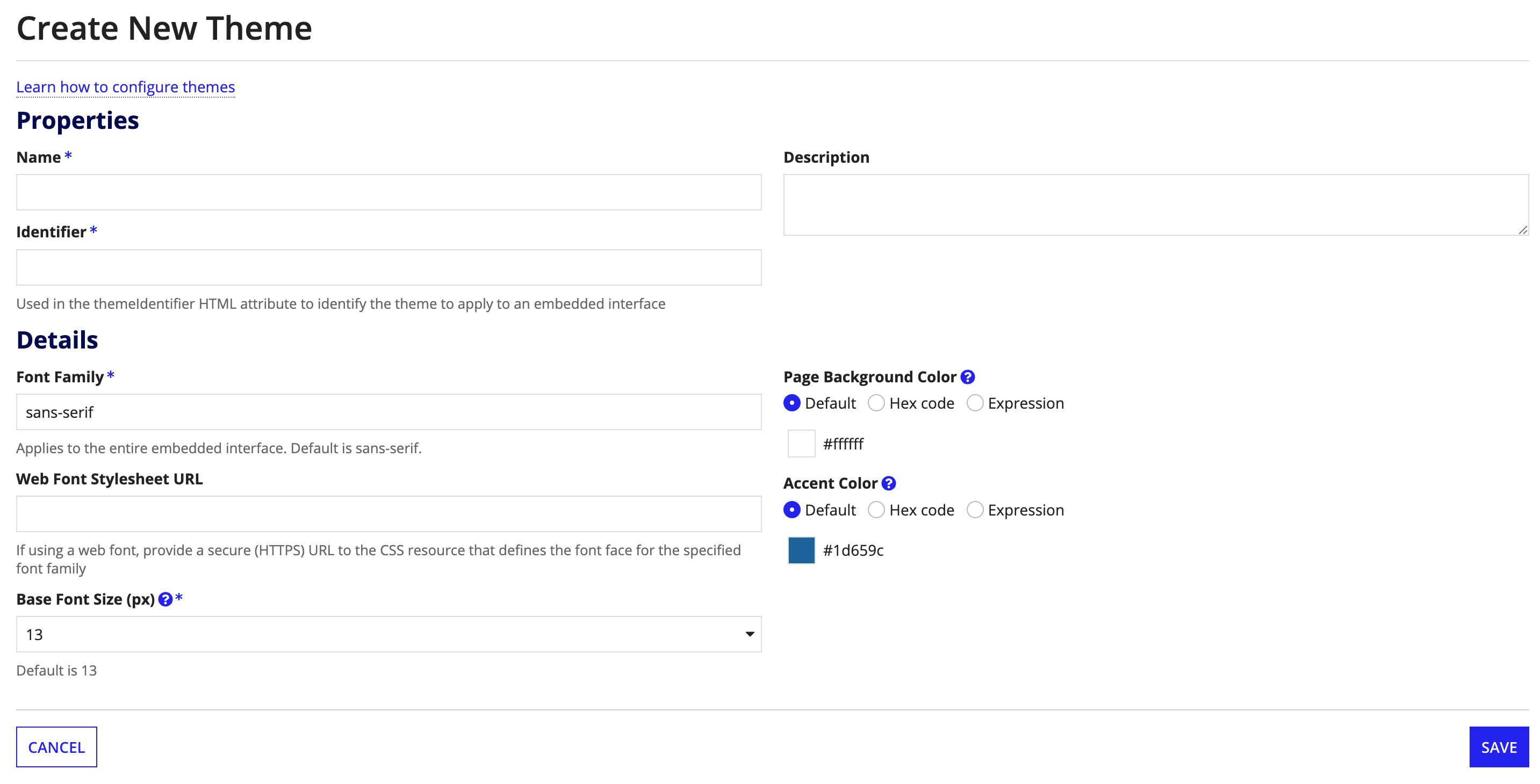
- Complete the Properties section. Each theme has the following properties:
- Name: The name of the theme.
- Identifier: A unique identifier that is used when applying the theme to an interface when embedding it in the host web page.
- Description: An optional description.
- Configure the theme by making the desired changes in the Details section. See Configure a Theme for information about the available settings.
- Click Save.

Configure a themeCopy link to clipboard
Configuring a theme involves specifying the custom font and color values that will be used to style an embedded interface. The fields listed in the following table are available for configuration.
Tip: Fields in the Details section are pre-populated with the default Appian values (or the values from the theme that you copied), so you only need to replace values that you wish to customize.
| Setting | Description | Valid Values |
|---|---|---|
| Font Family | Defines the font family used for all text, including headings, form content, and links. | To specify fallback font families, separate font names with commas. The browser will attempt to render the font families in order from left to right. For example: Helvetica Neue, Helvetica, Arial, sans-serif. |
| Web Font Stylesheet URL | CSS resource that defines the font face for the specified Web font. Only required when using a Web font. | Secure URL (HTTPS). For example: https://sample.com/css?family=Sample |
| Base Font Size | This font size, in pixels, is used to derive the font size of all text and headers in the embedded interface. It also increases or decreases the size of interface elements, such as buttons. | 10, 11, 12, 13, 14, 15, 16, 18, 20 |
| Page Background Color | Background color of the embedded interface. | Any valid hex code or expression evaluating to a valid hex code. We recommend that you select a light or dark background color to create sufficient contrast with foreground colors. Avoid grey colors that are similar to the color of input field borders. |
| Accent Color | The accent color is used to highlight key interface elements, for example, links, milestone completed steps | Any valid hex code or expression evaluating to a valid hex code. See the SAIL Design System for tips on selecting an accent color. |
Edit a themeCopy link to clipboard
To edit a theme, click the name of the theme you wish to edit. After making your desired edits, click Save.
Delete a themeCopy link to clipboard
When a theme is deleted, it is removed from the system and the identifier for that theme is available for use by another theme. Embedded interfaces that have a deleted theme applied will adopt the default Appian theme.
To delete a theme, find the theme that you wish to delete and click ![]() for that row in the grid.
for that row in the grid.
