This page contains information related to an old version of the Image Component.
To take advantage of the latest features and improvements, we always recommend you use the latest version whenever possible. See the latest version's page for information about what's been changed.
ImageCopy link to clipboard
Function: a!imageField_17r3()
Displays an image from document management or the web.
See also: Document Image, Web Image
Parameters
| Name | Keyword | Type | Description |
|---|---|---|---|
| Label | label | Text | Optional text to display as the field label. |
| Label Position | labelPosition | Text | Optional text to determine where the label appears. Valid values include
|
| Instructions | instructions | Text | Optional text displayed beneath the image. |
| Help Tooltip | helpTooltip | Text | Displays a help icon with the specified text as a tooltip. The tooltip displays a maximum of 500 characters. The help icon does not show when the label position is "COLLAPSED". |
| Images | images | Array of Images | A list of images to display created with |
| Size | size | Text | Optional text to control what size image displays. Valid values are "STANDARD" (default), "ICON", "THUMBNAIL", "SMALL", "MEDIUM", and "LARGE". |
| Alignment | align | Text | Determines alignment of the image(s). Valid values are "START" (default), "CENTER", and "END". |
| Visibility | showWhen | Boolean | Determines whether the component is displayed on the interface. When set to false, the component is hidden and is not evaluated. Default: true. |
The maximum display dimensions for each Size are listed below:
"ICON": 20x20 pixels"THUMBNAIL": 100x200 pixels"SMALL": 100x200 pixels"MEDIUM": 200x400 pixels"LARGE": 400x600 pixels"STANDARD": natural dimensions
Notes
- Images are scaled down as necessary to fit the size limit, preserving their natural aspect ratio. Images will never be scaled up, so they'll display at their natural size if they are smaller than the configured size.
- Images look best with the
"ICON"size if they are 40 x 40 pixels and have a transparent background. This size is recommended to ensure high quality rendering on high pixel density devices (E.g., MacBook Pros with Retina displays and many smartphones). - If Size is set to
"THUMBNAIL", images can be clicked to open slideshows. With this configuration, images cannot have links associated with them. - If Size is set to
"STANDARD", images display at either their natural width or the width of the column, whichever is smaller. - Avoid using this component for offline mobile forms because images do not render when offline.
Examples
To experiment with examples, copy and paste the expression into an interface object.
Display a Series of Document Images
1
2
3
4
5
6
7
8
9
10
11
12
13
14
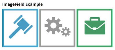
=a!imageField_17r3(
  label: "Image Field Example",
  images: {
    a!documentImage(
      document: a!iconNewsEvent(icon: "ENVELOPE")
    ),
    a!documentImage(
      document: a!iconNewsEvent(icon: "BRIEFCASE")
    ),
    a!documentImage(
      document: a!iconNewsEvent(icon: "CONVERSATION")
    )
  }
)
Copy
Returns the following when used as part of an interface expression:

Display a Series of User Images with Looping
1
2
3
4
5
6
7
8
9
10
11
12
13
14
=a!imageField_17r3(
  label: "Images",
  size: "SMALL",
  images: a!forEach(
    /*
    * Document ids of images in your environment.
    * Please adjust document ids appropriately.
    */
    items: { 1, 2, 3 },
    expression: a!documentImage(
      document: fv!item
    )
  )
)
Copy
Returns the following when used as part of an interface expression:

Feature compatibilityCopy link to clipboard
The table below lists this component's compatibility with various features in Appian.
| Feature | Compatibility | Note |
|---|---|---|
| Portals | Incompatible | |
| Offline Mobile | Incompatible | |
| Sync-Time Custom Record Fields | Incompatible | |
| Real-Time Custom Record Fields | Incompatible | Custom record fields that evaluate in real time must be configured using one or more Custom Field functions. |
| Process Reports | Incompatible | Cannot be used to configure a process report. |
| Process Events | Incompatible | Cannot be used to configure a process event node, such as a start event or timer event. |
| Process Autoscaling | Compatible |
