This page contains information related to an old version of the Form Layout.
To take advantage of the latest features and improvements, we always recommend you use the latest version whenever possible. See the latest version's page for information about what's been changed.
Form 17.1Copy link to clipboard
Displays up to two columns of components beneath a title and above buttons. Use this as the top-level layout of start and task forms.
See Also: Dashboard
Function: a!formLayout_17r1()
Parameters
| Name | Keyword | Type | Description |
|---|---|---|---|
| Label | label | Text | Optional text to display as the interface's title. |
| Instructions | instructions | Text | Optional text displayed below the field's label. |
| Column 1 Contents | firstColumnContents | Any Type Array | Values that define the contents for the first column in the interface. |
| Column 2 Contents | secondColumnContents | Any Type Array | Values that define the contents for the second column in the interface. |
| Buttons | buttons | Button Layout | Buttons to display at the bottom of the form, arranged using a!buttonLayout(). |
| Validations | validations | Text or Validation Message Array | Validation errors displayed above the form buttons. Configured using a text array or an array with a mix of text and Validation Message using a!validationMessage(message, validateAfter). |
| Validation Group | validationGroup | Text | When present, the form is only validated when a button in the same validation group is clicked. |
| Don’t automatically focus on first input | skipAutoFocus | Boolean | Determines whether the first input will receive focus when a form loads. Default is false. |
| Visibility | showWhen | Boolean | Determines whether the layout is displayed on the interface. When set to false, the layout is hidden and is not evaluated. Default: true. |
Notes
- A button layout must be present for a back button to appear for activity-chained tasks.
- If the Column 2 Contents parameter is null, the content for the first column displays as in a single-column layout with no space left for where the second column would display.
- Use form validation messages for problems that are not specific to a single component.
- Focus will automatically be applied on initial load to the first component in a form that meets the following conditions:
- The component is one of the following: checkbox, decimal, dropdown, encrypted text, integer, paragraph, radio button, text
- The component is neither read-only nor disabled
- The component is not in an initially collapsed section
Examples
To experiment with examples, copy and paste the expression into an interface object.
Two-Column Form
1
2
3
4
5
6
7
8
9
10
11
12
13
14
15
16
17
18
19
20
21
22
23
24
25
26
27
28
29
30
31
32
33
34
35
36
37
38
39
40
41
42
43
44
45
46
=a!formLayout_17r1(
  label: "Customers for Review",
  instructions: "Review the profiles for the customers below and contact as needed",
  firstColumnContents: {
    a!textField(
      label: "Customer",
      value: "John Smith",
      readOnly: true
    ),
    a!textField(
      label: "Status",
      value: "Prospective",
      readOnly: true
    ),
    a!textField(
      label: "Priority",
      value: "High",
      readOnly: true
    )
  },
  secondColumnContents: {
    a!textField(
      label: "Customer",
      value: "Michael Johnson",
      readOnly: true
    ),
    a!textField(
      label: "Status",
      value: "Prospective",
      readOnly: true
    ),
    a!textField(
      label: "Priority",
      value: "Medium",
      readOnly: true
    )
  },
  buttons: a!buttonLayout(
    primaryButtons: {
      a!buttonWidget(
        label: "Submit",
        submit: true()
      )
    }
  )
)
Copy
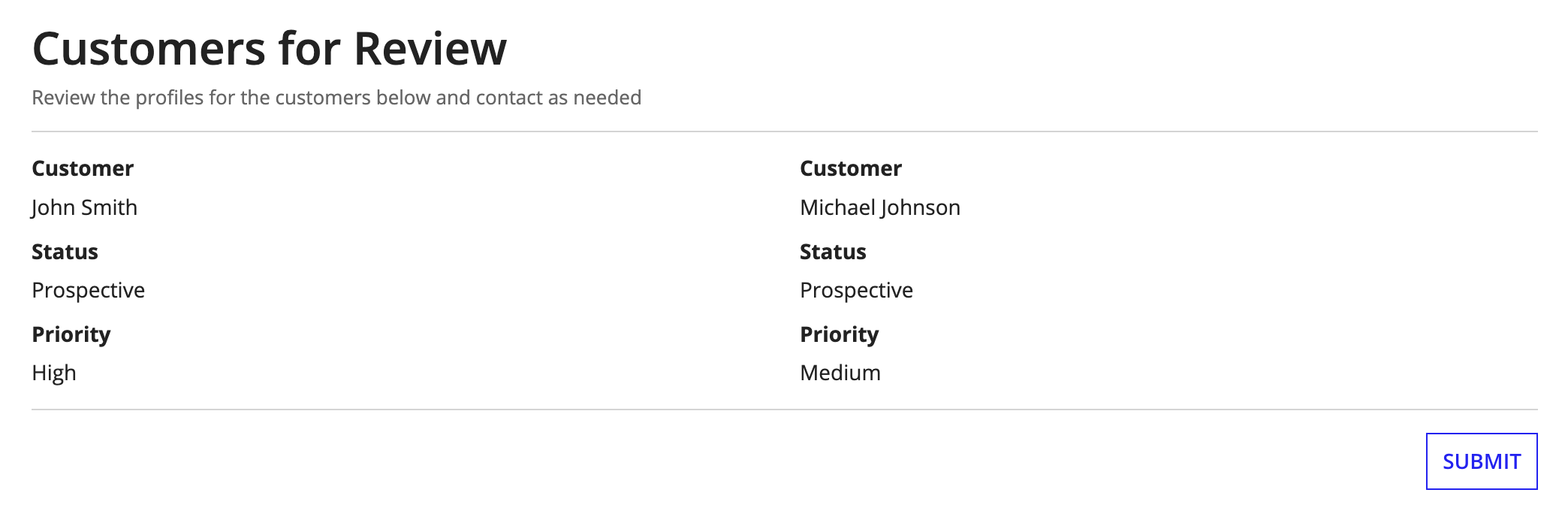
Displays the following:

Feature compatibilityCopy link to clipboard
The table below lists this component's compatibility with various features in Appian.
| Feature | Compatibility | Note |
|---|---|---|
| Portals | Compatible | |
| Offline Mobile | Compatible | |
| Sync-Time Custom Record Fields | Incompatible | |
| Real-Time Custom Record Fields | Incompatible | Custom record fields that evaluate in real time must be configured using one or more Custom Field functions. |
| Process Reports | Incompatible | Cannot be used to configure a process report. |
| Process Events | Incompatible | Cannot be used to configure a process event node, such as a start event or timer event. |
| Process Autoscaling | Compatible |
