Site Branding
Introduction
From the Branding section of the site object, you have the power to configure all the details that will shape the look and feel of your site. You can choose from different styles, colors, and shapes for a variety of different site elements to craft an experience that fits your brand and is right for your users.
Navigation bar style
There are two options for the navigation bar style that go beyond aesthetics and are designed for different use cases. These two styles are "Helium" and "Mercury".
Helium
"Helium" is the default style. In this style the logo is on the right, there are icons included with the page name, page names are displayed no matter the number of pages on the site, and the entire tab changes color when selected.

Site with "Helium" style and one page.
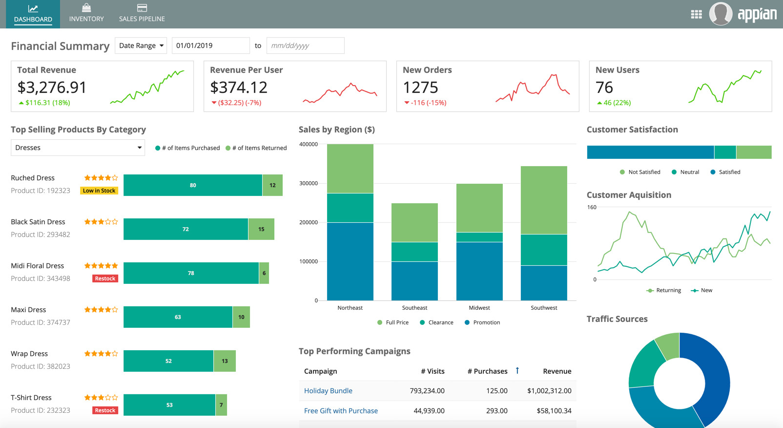
Site with "Helium" style and multiple pages.
Mercury
In the "Mercury" style the logo is on the left, the icons are not included with the page name, page names are only displayed if there is more than one page, and the selected page is underlined in the selected highlight color.
Use this style when you have a single page in your site and you don't want the page name to be shown in the navigation bar.
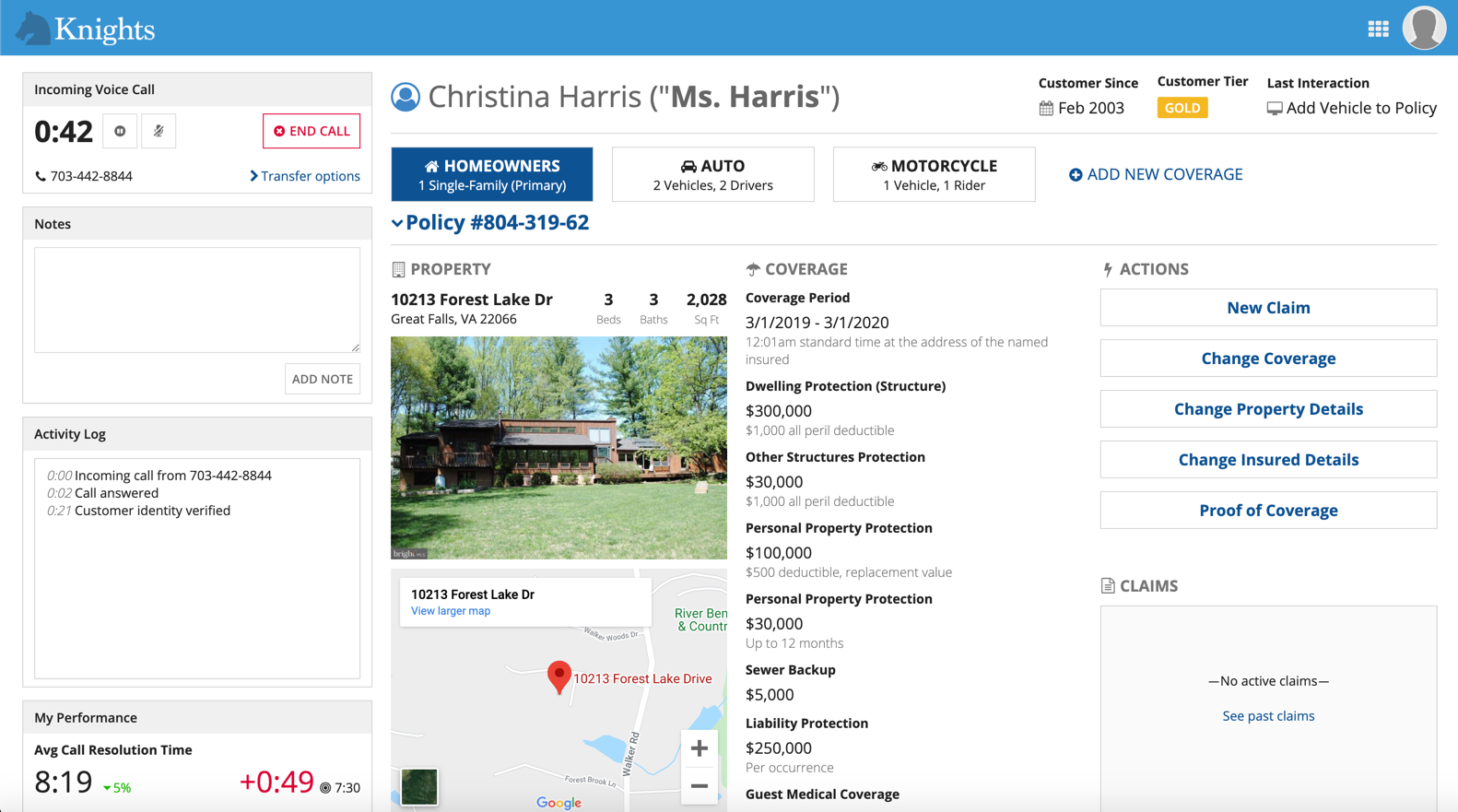
Site with "Mercury" style and one page
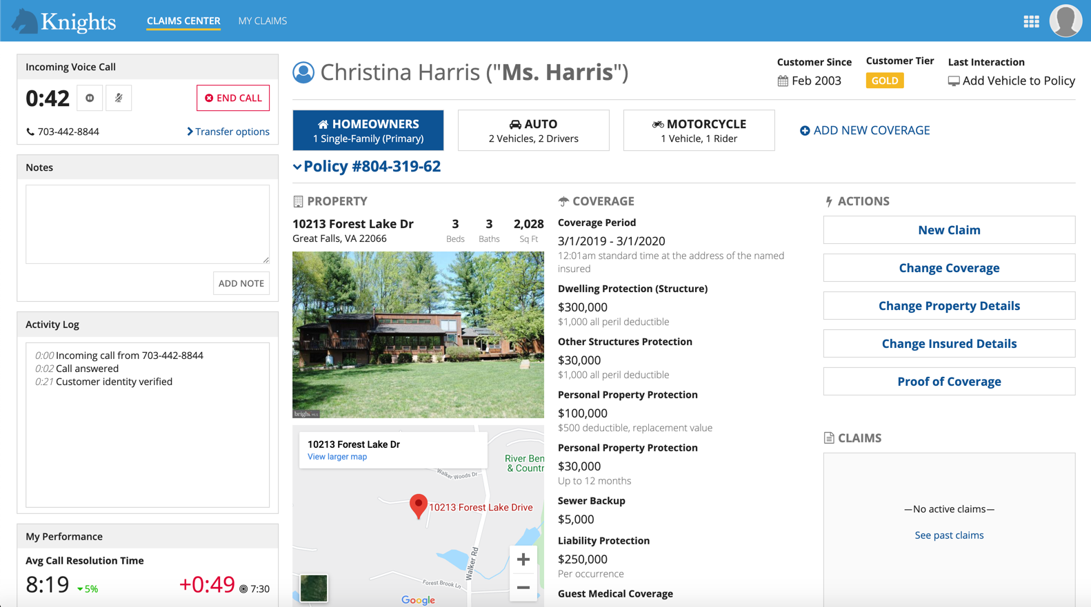
Site with "Mercury" style and multiple pages
The navigation bar style only applies to desktop and mobile browsers. It will not be reflected in the Appian Mobile application.
Color scheme
There are four configurations that determine the color scheme of a site: navigation bar color, selected highlight color, accent color, and loading bar color. You can either create your own custom color scheme by selecting hex codes for each field or you can use one of our predefined dark color schemes.
Navigation bar color
Based on the configured navigation bar color, a dark gray or white color is automatically applied to the text and icons in the navigation bar. Avoid a medium-brightness navigation bar color which may not provide sufficient contrast with the text and icon color.
Selected highlight color
The selected highlight color should be distinguishable enough from the navigation bar color so that users can easily tell which tab is highlighted.
For a clean, monochromatic look using the Helium navigation bar style, configure a selected highlight color that is a darker or lighter shade of the navigation bar color.

This site with the Helium navigation bar style uses a dark blue background with a lighter blue highlight to create a monochromatic look.
For a steamlined, easy to navigate look using the Mercury navigation bar style, configure a selected highlight color that contrasts well with the navigation bar background color so that users can easily tell which tab they're on.

This site with the Mercury navigation bar style uses a light blue background with a gold highlight to create user-friendly contrast.
Accent color
A configurable accent color is used to highlight key UI elements such as "Primary" style buttons, links, and section headings.
Avoid accent colors that are:
- Too close to the standard, black text color
- Too close to the red destructive button and error message color
- Too low in contrast against the white page background. The accent color should have a minimum contrast ratio of 4.5:1. Use a contrast checker to ensure your selected color meets the requirement.
If you're using a predefined dark color scheme, make sure that your accent color looks good everywhere that it will be used throughout your site.
Loading bar color
The loading bar, which appears above the navigation bar, gives users an idea of how long it will take the system to load a page or process an action. Select a loading bar color with sufficient contrast against the navigation bar color to ensure that users notice it.

The loading bar color should stand out from the navigation bar color so that users notice it
Dark color schemes
Each dark color scheme comes with predefined colors for the navigation bar color, selected highlight color, accent color, and loading bar color.
There are three predefined dark color schemes that you can choose from: "Charcoal", "Navy", and "Plum".

A site navigation bar using the "Charcoal" color scheme.

A site navigation bar using the "Navy" color scheme.

A site navigation bar using the "Plum" color scheme.
If you select one of these color schemes, make sure that your site pages are using the same color scheme.
To do this:
- In the interface for your site page, use a header content layout with the backgroundColor parameter set to the same color scheme used for your site: "Charcoal", "Navy", "Plum".
- Put the page's contents into Card Layouts with the style parameter of each Card Layout set to the same color scheme used for your site.
In order to create a consistent style and user experience across your site, avoid creating sites with a mix of dark and non-dark color scheme pages.
The following interface elements cannot use dark color schemes:
- Record lists.
- Related action modals.
- The news tab in records.
- The related actions tabs in records.
These elements use the default white background. For sites including any of these elements, use the default background on all site pages.
Site logo
The site logo configuration allows you to display your brand. Use a site logo with a transparent background and sufficient contrast against the navigation bar color.
Border shapes
You can configure the shapes of inputs and buttons site level.
Note: You can configure the shape of box layouts and card layouts at the component level. These shape configurations can't be applied site-wide.
Inputs
You can select an input shape to match your branding and experience. The input shape is applied to all inputs, pickers, and selection fields on every page of a site.
There are two options for input shape: squared and semi-rounded. Squared is the default selection.
The input shape does not apply to the following interface elements:
- Layouts
- Display fields
- Actions
- Grids
- Charts
- Browsers
- Record banners

This dashboard shows both rounded inputs and rounded cards displayed in a site. Use rounded cards and rounded inputs together for a professional and consistent user experience.
Buttons
You can select a button shape to match your branding and site's style. The button shape is applied to all buttons on every page of a site, including record view tabs and record actions.
There are three options for button shape: squared, semi-rounded, and rounded. Squared is the default selection.
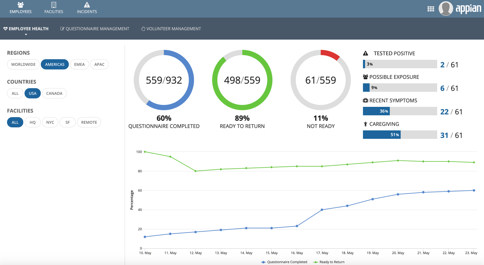
This dashboard shows rounded buttons displayed in a site.


