DO
Using fixed column widths allows these navigation sidebars to look good on different screen sizes.
To give you flexibility when designing interfaces, column layout has three different types of column widths: automatic, relative, and fixed. See the Column Layout component page for more information about these widths.
To help you choose which column width to use, consider the following guidelines.
Tip: Be sure to test your interface on multiple screen sizes to make sure that the column widths you choose look good on different device widths.
Use the automatic column width to distribute space evenly across all columns.
If you don't specify a value for the width parameter, the column width will automatically be auto.
Use fixed column widths for content that should maintain the same width across different screen sizes. For example, navigation sidebars.
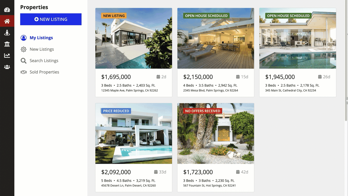
DO
Using fixed column widths allows these navigation sidebars to look good on different screen sizes.
DON'T
Using relative column widths for these navigation sidebars doesn't look good on different screen sizes.
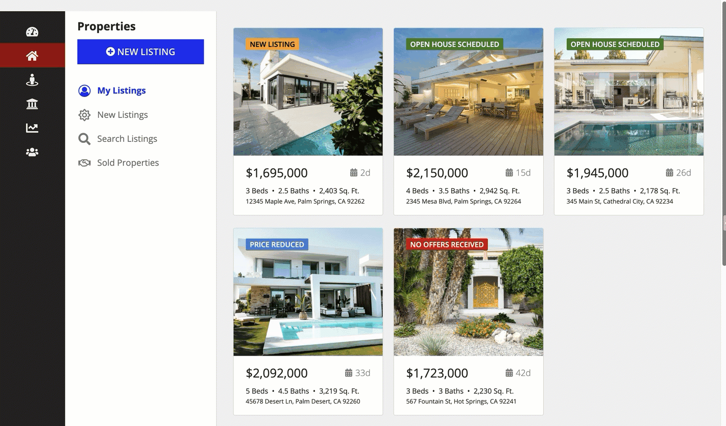
For the remaining content on a page with fixed column widths, use an automatic column width so that it will adjust to fit any screen size.
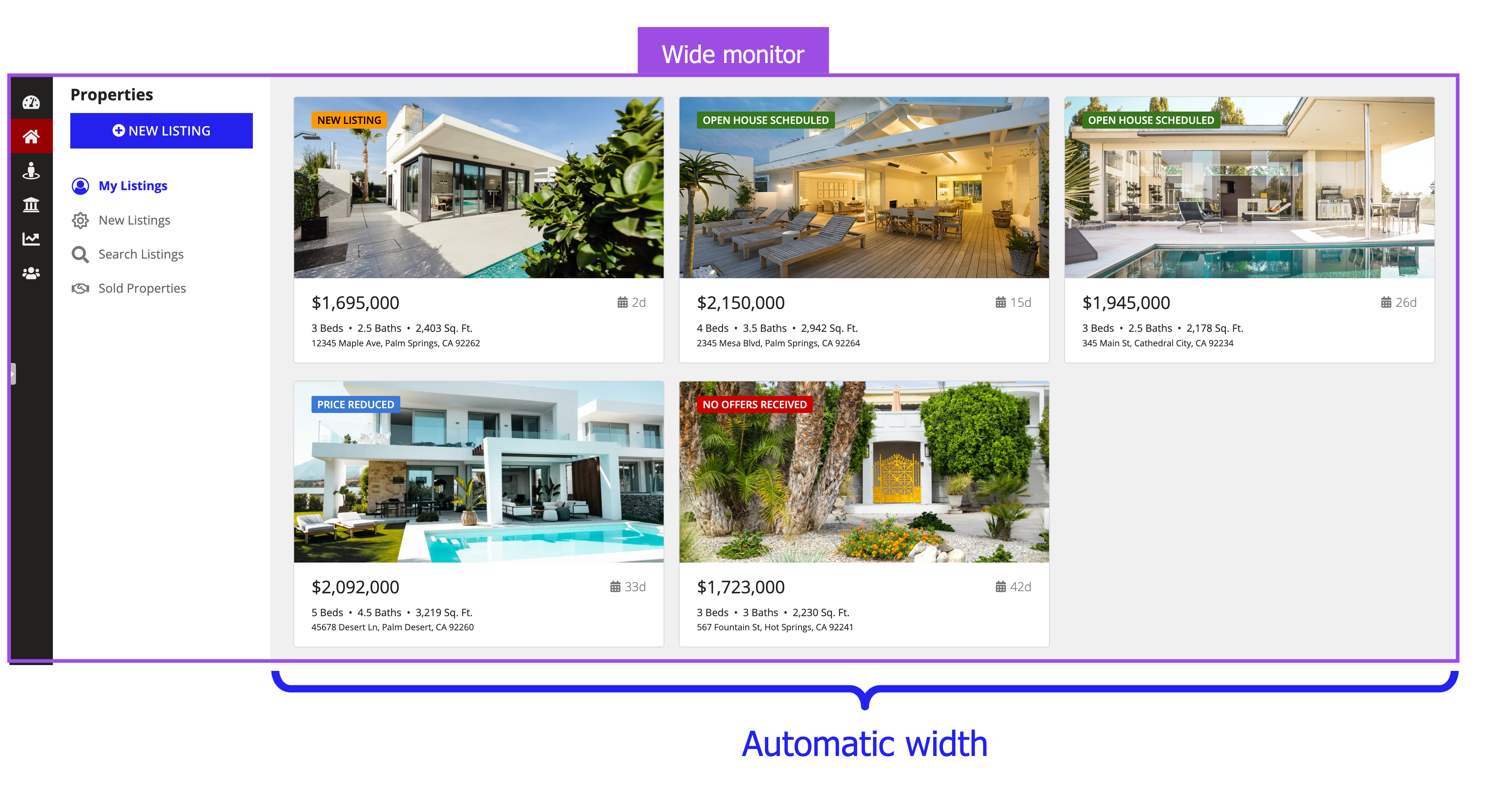
DO
Using automatic column width for the main content on this interface allows the column to take up the rest of the screen, no matter how wide the screen is.
DON'T
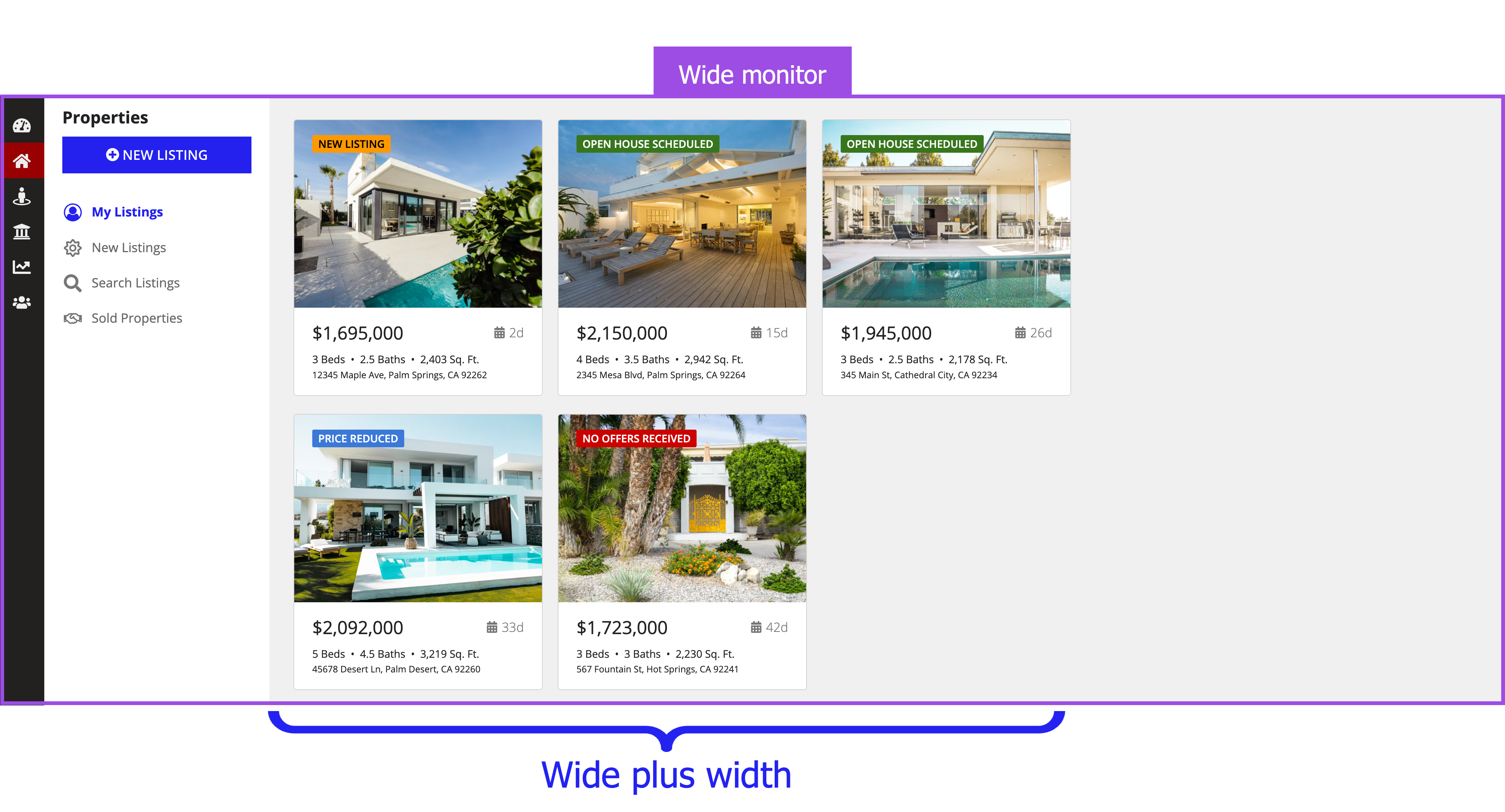
Using a fixed column width for the main content on this interface doesn't allow the content to take up the rest of the screen when using a wide monitor.
Use relative column widths for columns that will look good if they expand and contract as the screen size changes.

DO
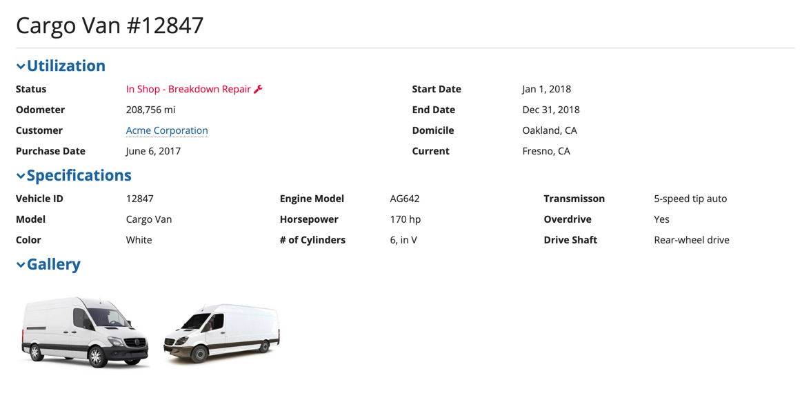
These columns use "1X" and "2X" relative column widths. Both charts look good as the screen size changes.

DON'T
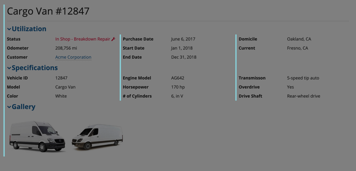
These columns use "Medium" and "Wide plus" fixed widths. Notice how the left column gets cut off as the interface becomes narrower.
For interfaces with two or more sections of similar content, use the same number of columns and same column widths to create balance on the page and align the interface components.
DO
For similar content across a page, use the number of columns along with their width to create balance across a page. In this example, the interface has two sections with similar content: read-only text fields. Each section has the same number of columns and uses the same columns widths.
DON'T
Don't mix and match the number of columns and column widths when there is similar content in an interface. Using a different number of columns and widths makes this interface unbalanced and unaligned.
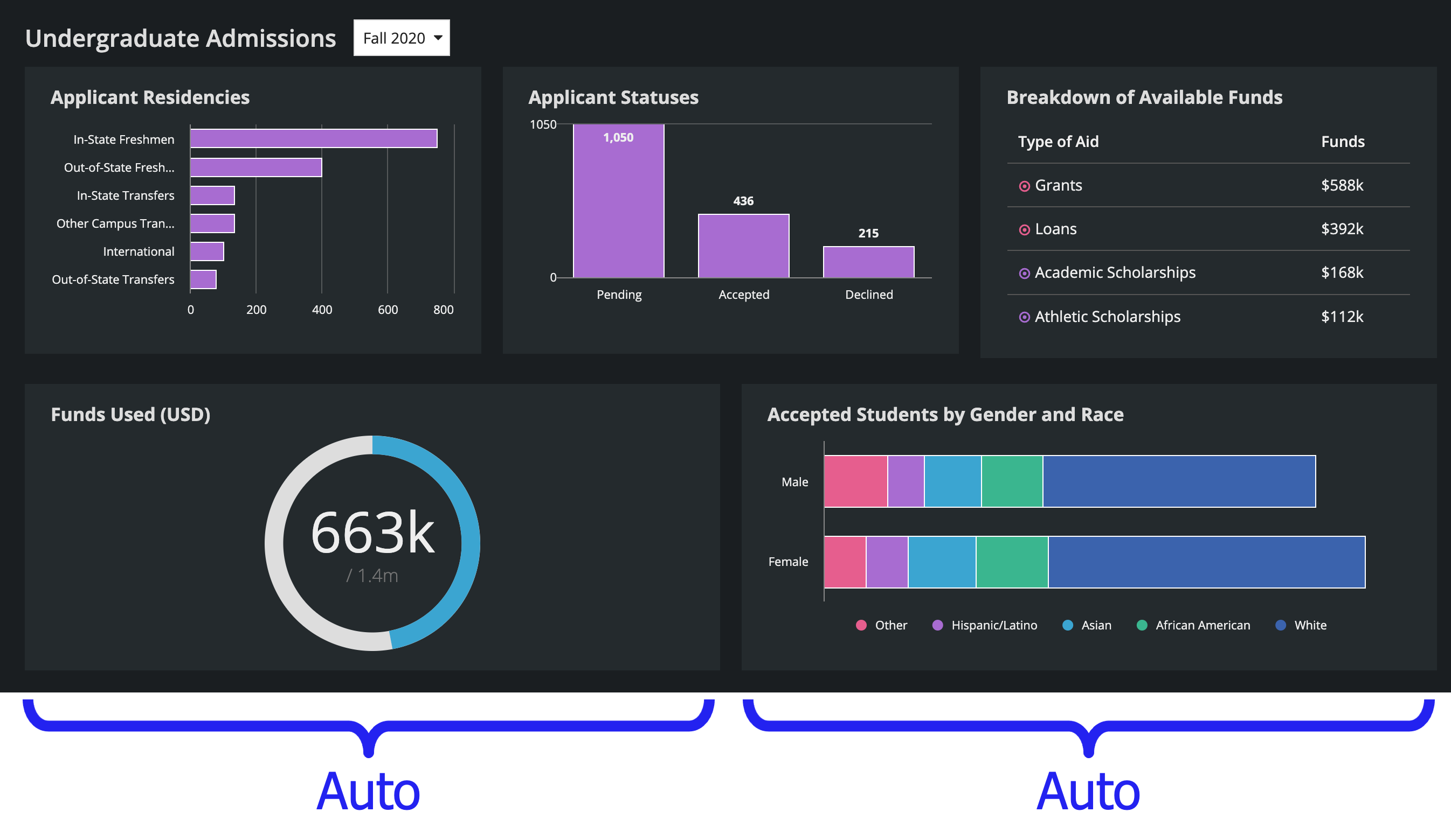
Furthermore, you can use relative column widths to line up content when you have a different number of columns in each row.
DO
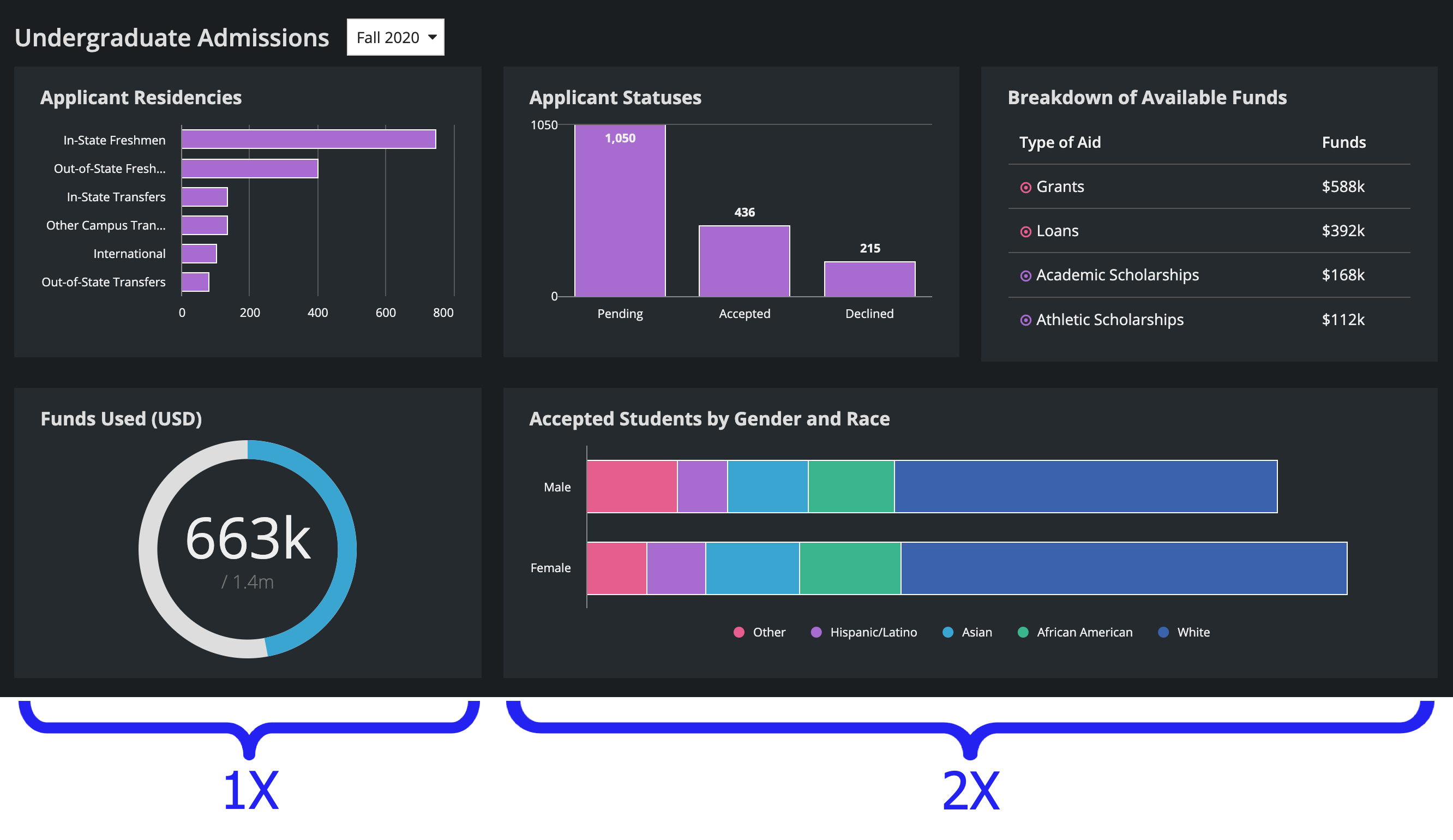
Using "1X" and "2X" relative widths for the bottom row in this dashboard allows the charts to line up with the top row. The charts on the bottom row take up 1/3 and 2/3 of the interface width, while the charts on the top row each take up 1/3 of the width.
DON'T
Using automatic column widths for these charts gives too much space to the bottom-left chart. It would look cleaner and more balanced if the bottom-right chart lined up with the two charts on the top.
