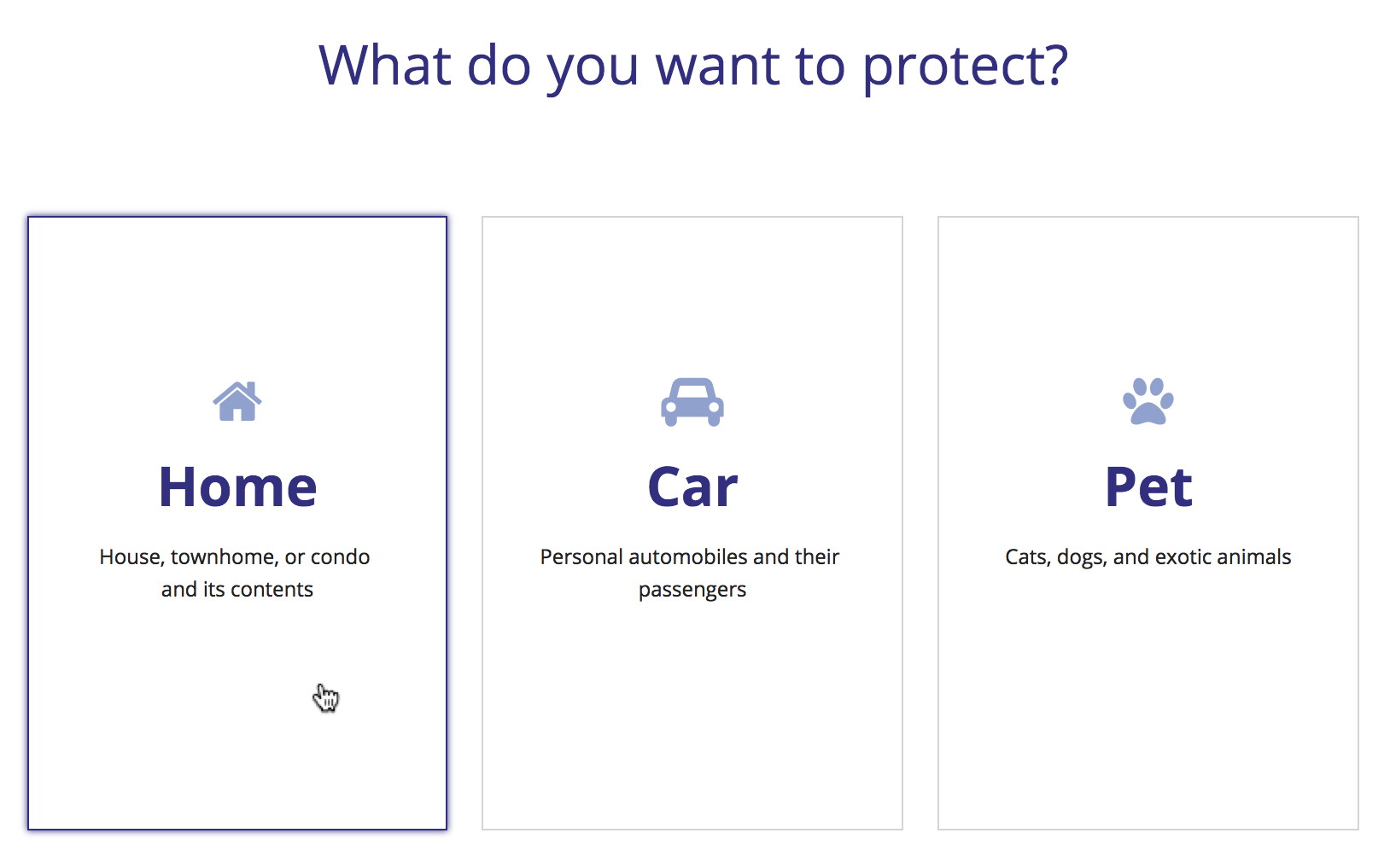
DO
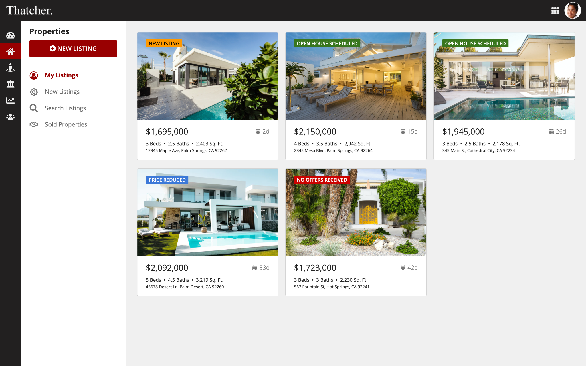
Use linked cards to present a set of clear and prominent choices to users
Card layouts display layouts and components within a card. Each card can be styled and configured in a variety of ways, including shape, background color, shadows, and more. Cards can also include links to help users interact with page content, navigate through forms, or provide them with selectable options.
Cards help group content, highlight information, and bring balance to your page. Use cards to group related content so that the content is easier for users to understand and navigate. If your content is already grouped, you can arrange your information in cards to enhance the visual balance of the page and highlight key information.
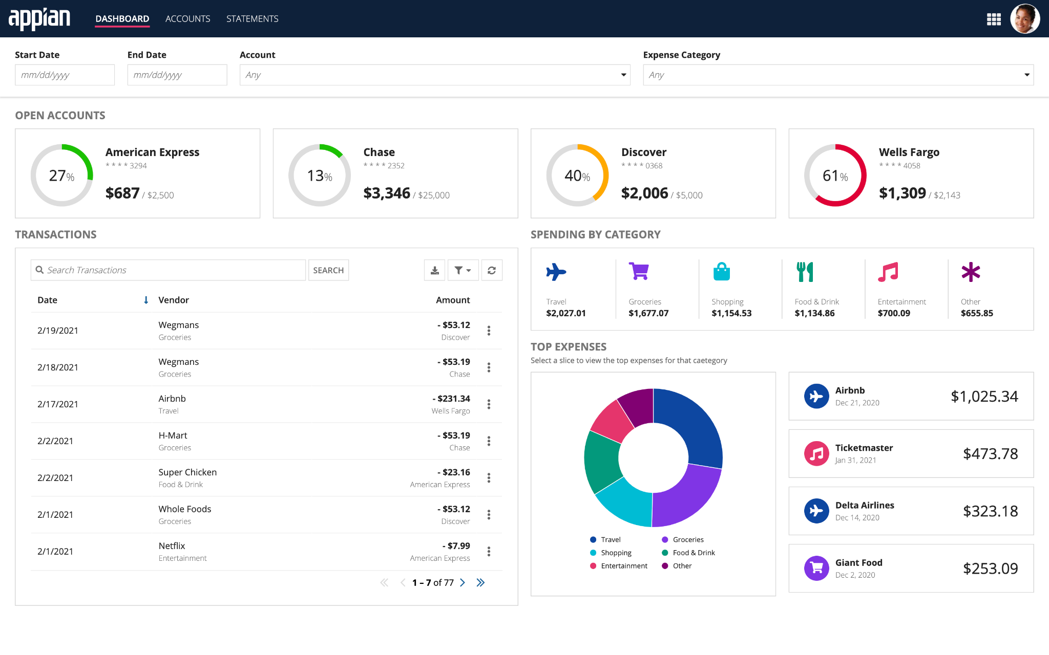
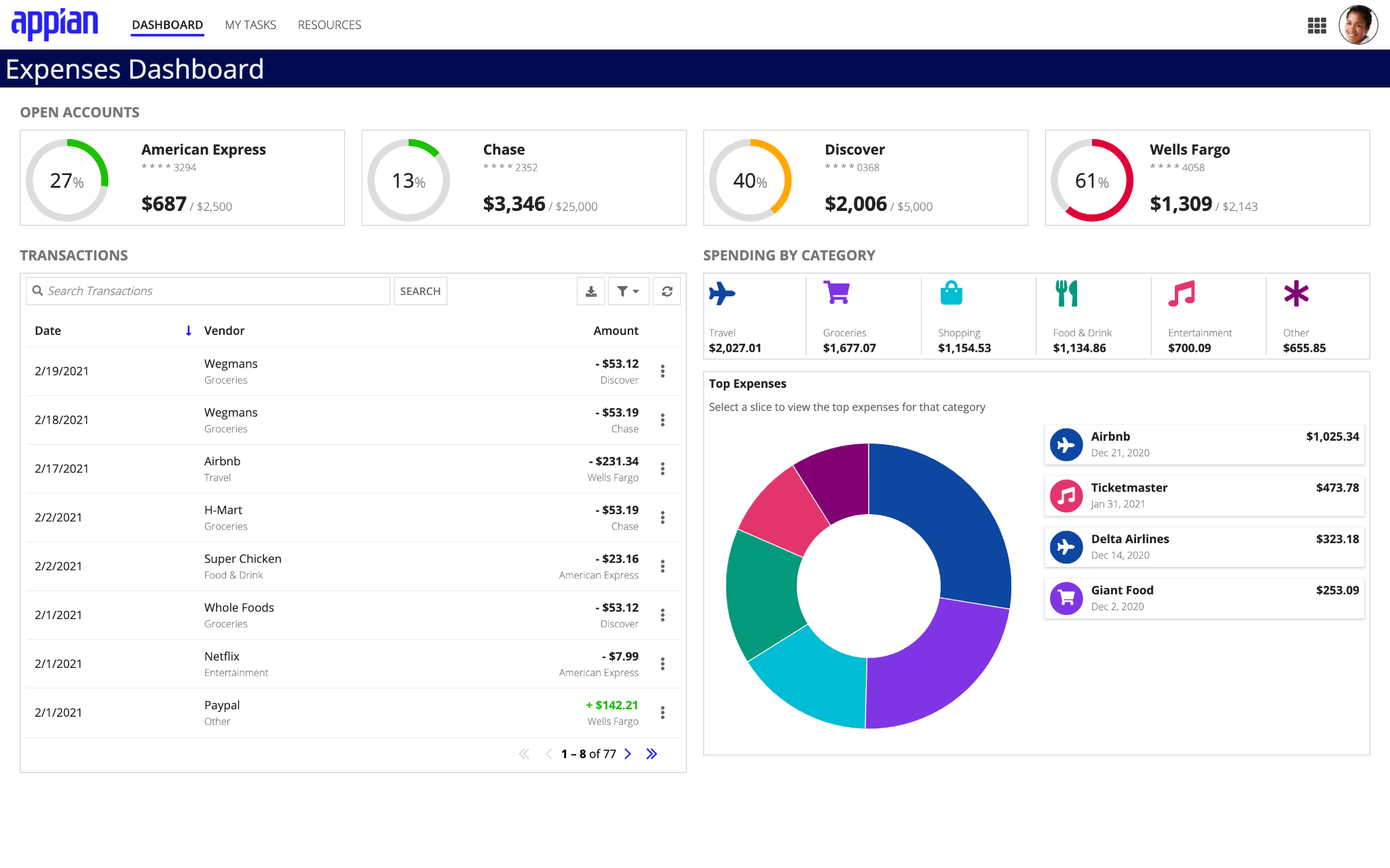
In this example, we used card layouts to both group content and balance the page layout. If there was disproportionate whitespace around each Open Accounts display or around the Top Expenses pie chart, the components wouldn’t fit well together and the page layout would look unbalanced. Displaying each content group in a card makes the interface look balanced and professional.
Instead of displaying individual cards for each item in a group, reduce clutter by combining the content into one card. Use column divider lines to visually separate multiple items in one card.
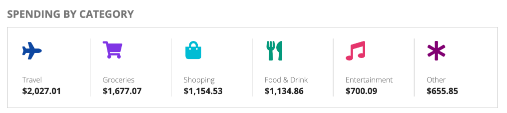
In this example, a single card is used to display all categories of spending.
Each card spans the full width of their container, so use columns layouts to arrange groups of cards containing related content. The width of the column that holds the card determines the width of each card.
Use cards as a simple and effective way for users to navigate an interface. Use a card layout and links associated with each card to allow for users to navigate to external links or from page to page similar to a wizard.
DO
Use linked cards to present a set of clear and prominent choices to users
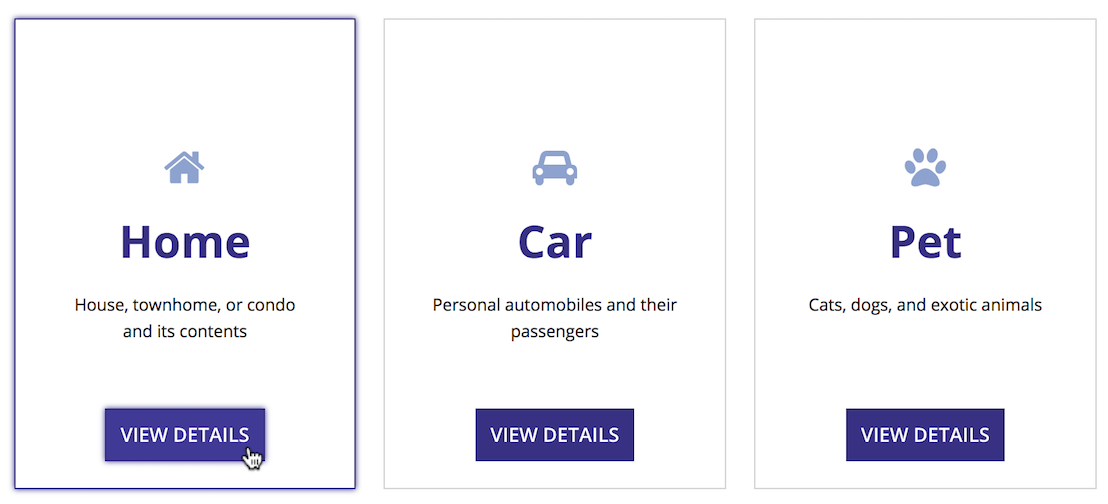
DON'T
Avoid using interactive components, such as links or buttons, within the contents of the card when the card itself has a link. This may make it difficult for the user to differentiate between clicking on the card or one of the components within the card.
For an example of using cards layouts to display navigation, see the Cards as Buttons pattern.
Use consistent margin dimensions within card groups on a page to achieve a balanced UI. When displaying multiple cards, make sure that the horizontal and vertical spacing is consistent.
To adjust spacing, use the:
Use card padding to keep your interfaces visually balanced and easy to read.
The right amount of padding for your interface depends on:
Try out the card padding settings to see which works best for your interface.
DO
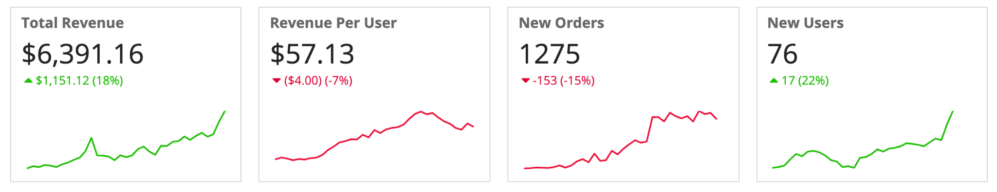
Use enough content padding inside and between your cards to make your cards readable and balanced. In this example, padding is used to effectively fill the page, making it easier for users to read and scan.
DON'T
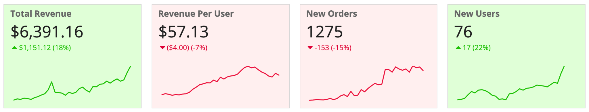
Don't minimize card padding throughout the page in order to create denser interfaces. In this example, padding is reduced in cards, giving a more cluttered and less professional look.
For cards with content, use a white card background color. Avoid using alternate card background colors on white or transparent pages.
You can use a non-white background color for cards on white or transparent pages to emphasize the card content, but use it sparingly. Too many colors make an interface look disorganized and hard to read.
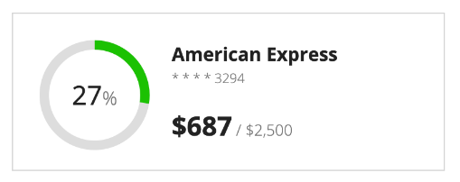
For Key Performance Indicators (KPIs) and similar designs, consider using a limited set of meaningful colors to highlight information and data by changing the text color. Use this to bring attention to the card content without overwhelming your users by making the entire card one color. However, be careful that you’re not using color alone to convey meaning and that your text follows all accessibility guidelines.
DO
DON'T
For pages with a dark background or color scheme, use a similar but lighter color in your color scheme for the card background to help the cards stand out. For more information on using dark color schemes with cards, view our guidance on color scheme considerations and header content layouts.
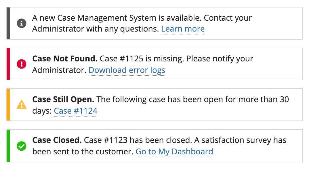
You can use the decorativeBarPosition and decorativeBarColor parameters to call attention to cards and their content. For accessibility reasons, don’t rely on the decorative bar alone to convey information.
When using decorative bars, here are a few things to keep in mind:

DO
Use the decorative bar to highlight cards on your page.
DO
Match your decorative bar color to other elements in your card.
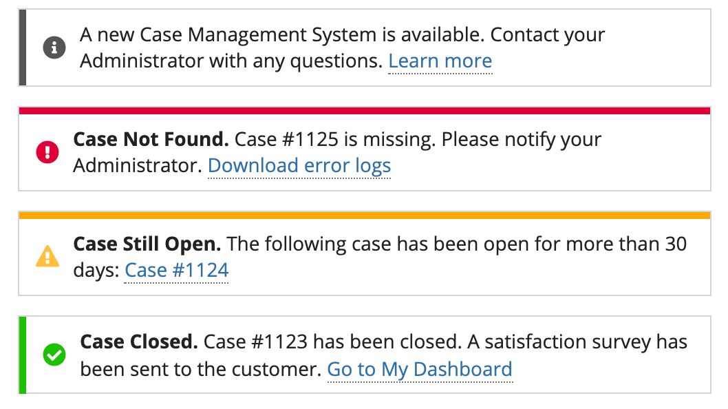
DON'T
Don't mix and match decorative bar position.
You can use both shadows and border on your cards, but you shouldn’t use them together.
DO
Use borders for cards on white page backgrounds. Cards on white-background pages look best without shadows.
Use shadows for cards on transparent page backgrounds. Showing content in white cards on a transparent page background allows the cards to stand out more. Cards on transparent-background pages look best without borders.
DON'T
Don’t use borders or shadows for cards on dark page backgrounds. To help your card standout on a dark background, use a lighter version of the page background color for the card background. You can use one of the preset dark color schemes for complementary navigation bar, page background, and card colors.
There are multiple components that can be used for selection and choices, such as radio buttons, checkboxes, card choices, and buttons. Use these components rather than displaying choices in card layouts to ensure that your interface is accessible to all users.
Apply a card styling to either radio buttons or checkboxes to get a similar look to cards while maintaining accessibility and providing larger click targets for your users.
The cards choices component is a visually and information rich alternative to other form choices that combines accessibility and style. Use it to easily create selectable and professional looking card choices from a set of data.
For more information on and examples of the card choices component, see card choices component page and the Cards as Choices pattern.
