Use icons in place of or alongside text as an alternative means of conveying information to users. Icons may take up less space in dense interfaces than their equivalent text values. Users may also find it easier to scan icons for meaning than to read text.
Non-sighted or low-vision users that rely on assistive technologies to interact with Appian UIs will not be able to recognize the meaning of visual symbols. Be sure to use the alternative text configuration to provide a text equivalent for all icons, identifying their shapes or explaining their meaning. For example, a thumbs-up icon may best be described as “Thumbs up” or “Approved” depending on its specific usage.
Standard icons are the recommended icon type for most user interface design patterns. These icons:
These icons that can be used in components such as rich text display, button, stamp, and section layout components, as well as in site and portal pages. Search the table to find specific icons.
Use standard icons alongside other rich text types for consistent presentation of information
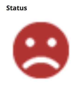
Indicator icons have been designed to look best at a specific size. For optimal quality, render indicator icons as:
Don’t show indicator icons at larger-than-recommended sizes as quality will suffer
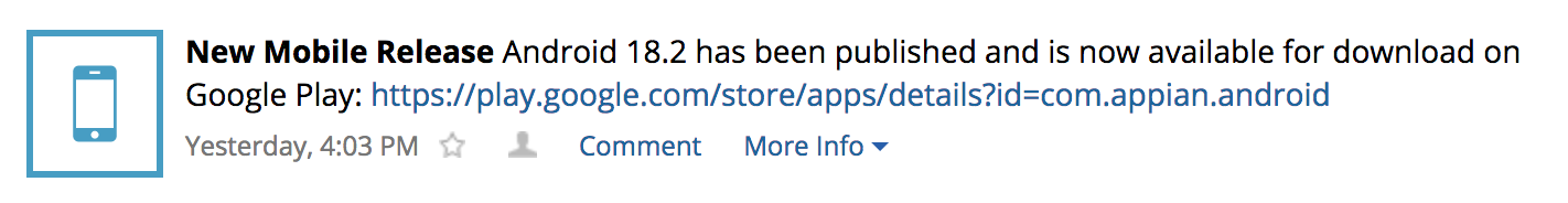
News event icons are a collection of images intended primarily for use in system events posted to the News feed. While these icons may be used in other interfaces, they may not look good when shown at substantially different sizes than news event icons.
Use news event icons to identify the source of system events in the News feed
Don’t show news event icons in non-News interfaces. Icons may be hard for users to recognize if shown at a smaller size.
The Record Icons page describes best practices for providing custom icons to represent specific records within a list.
Overview of Icons
