Designing Sites and Portals
IntroductionCopy link to clipboard
In both the site and portal objects, you have the power to configure all the details that will shape the look and feel of your site or portal.
While sites and portals share many of the same page structure and branding options, there are some instances where a certain setting is only available in one object and not the other.
To learn more about portal-specific design best practices, see Portal Best Practices and Portals design guidance.
Organizing pages and page groupsCopy link to clipboard
Pages provide the structure for how users will interact with and navigate through your site or portal. You can add a combination of up to ten pages or page groups to a site or portal. This section outlines the guidelines you should follow when adding pages and page groups to give your users the best experience. For more information on organizing and presenting information in your sites and portals, see Presenting Information Clearlyand Reordering pages and page groups.
Use an appropriate number of pages to optimize navigationCopy link to clipboard
Well-organized and clearly defined pages will offer the best navigation experience.
To help guide users to important information, pages and page groups should have a clear title and distinct purpose for being in your navigation bar. As a general rule, try to limit the number of top-level items in your navigation bar to eight.
Group pages with a similar purpose into page groups so they are organized under a single title in your navigation bar. You want to make it easy for users to scan the list of pages in a group and quickly find what they need. Keep this in mind when adding pages to your groups.
If you need additional navigation options on a particular page, use secondary navigation patterns like tabs or a sidebar to break up page contents.
For mobile-first sites that are only accessed on Appian Mobile, we recommend using no more than five pages or page groups in the navigation bar.

Order pages for efficient navigationCopy link to clipboard
Organize your pages and page groups in some kind of logical order, such as most-used to least-used or alphabetical order. Choose an arrangement will best suit the needs of your users.
Use clear, concise page namesCopy link to clipboard
Users can more easily scan and find information when the page names are clear and concise. Using concise pages names also prevents the names from being truncated, since they are more likely to fit on the screen.
Use clear titles for pages in page groupsCopy link to clipboard
To help users immediately understand what page they are on when navigating through page groups, make sure to include a title at the top of each page that clearly indicates its intended purpose.
For sites, use the best page width for the page contentCopy link to clipboard
When adding a site page, choose the page width that best matches the interface content.
For example, actions that have only a few fields will benefit from a narrow page width. Otherwise, the form may look stretched. Likewise, a dense interface or report can benefit from a wide page width or, if users have extra wide monitors, a full page width.
See Page Width for more information.
Note portal page width is always "Full".
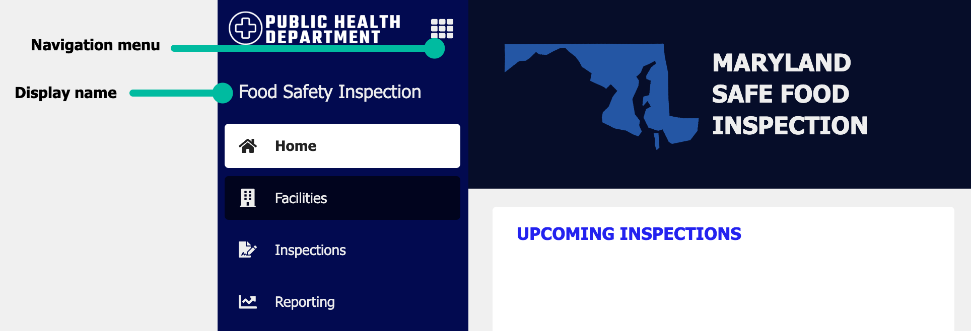
Navigation barCopy link to clipboard
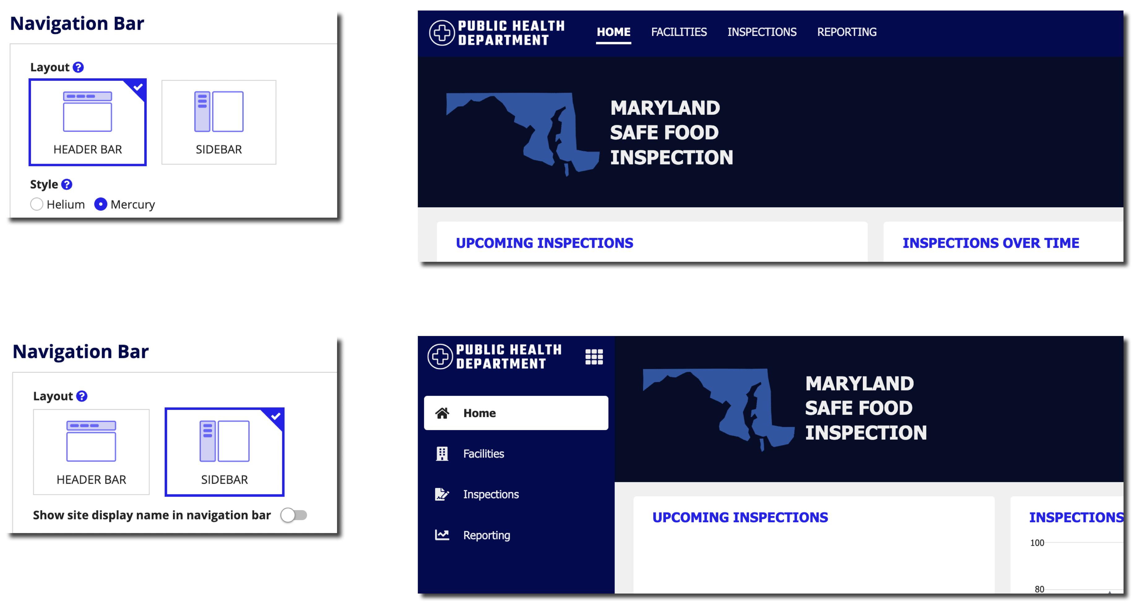
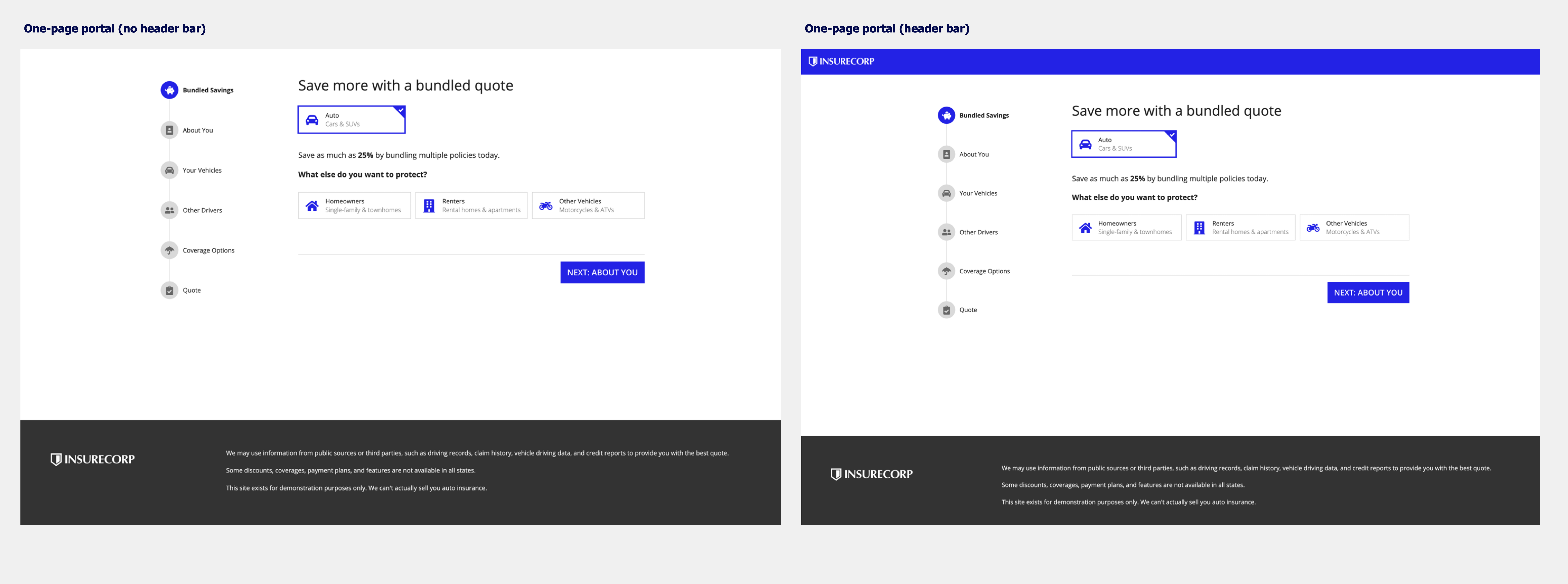
Sites and portals offer two different layout options for navigation: HEADER BAR and SIDEBAR.
Note both the header bar and sidebar layouts are automatically responsive. When the pages don't fit on the screen, they move from the navigation bar to a menu using the easily recognizable icon.
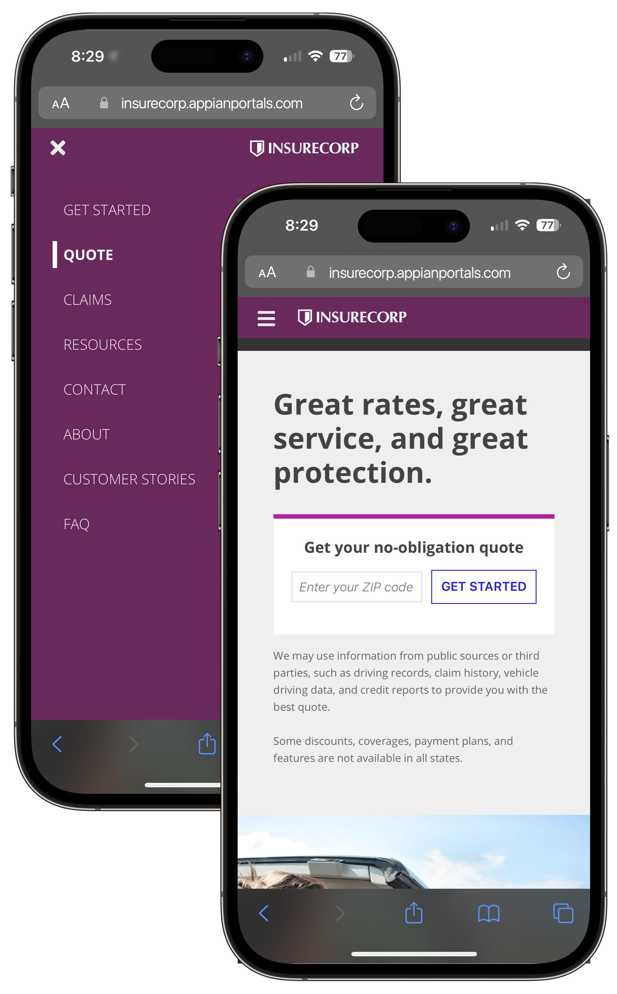
When accessed on a mobile browser, sites and portals automatically use this menu for page titles.
If you have users that will be switching between different sites, consider using the same layout for your navigation bar across those sites to provide a consistent user experience.
The navigation bar layout options as well as the header bar style options will not result in changes to the look of sites in the Appian Mobile app.
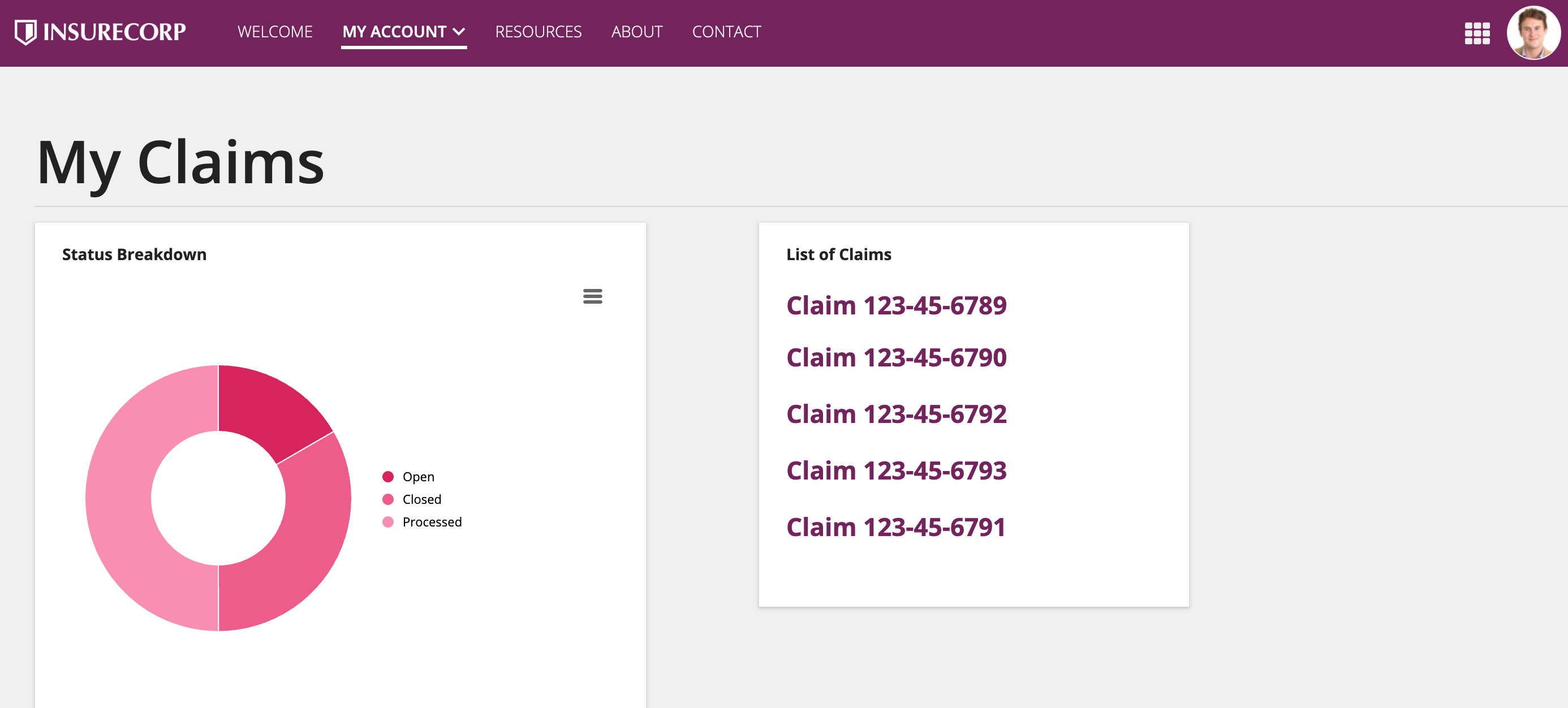
Header barCopy link to clipboard
A header bar allows you to configure additional branding to help users easily recognize your sites and portals. Additionally, it provides navigation options to help users find what they are looking for.
StyleCopy link to clipboard
Header bar style is not only an aesthetic consideration but also a practical one. The "Helium" and "Mercury" styles are designed for different use cases.
Both of these style options are available in the site object, while portals only use the "Mercury" style.
Note that Appian Mobile does not use the header bar styles. Choosing "Mercury" or "Helium" will not cause any changes in Appian Mobile.
HeliumCopy link to clipboard
Things to know about the Helium style:
- Only available for sites (default option).
- The logo is on the right side.
- Each page name has an icon above it. These icons should reflect the purpose of the page.
- Page names always display, even if the site has only one page.
- The selected highlight color highlights the entire page tab.
Site with "Helium" style and one page.

Site with "Helium" style and multiple pages.
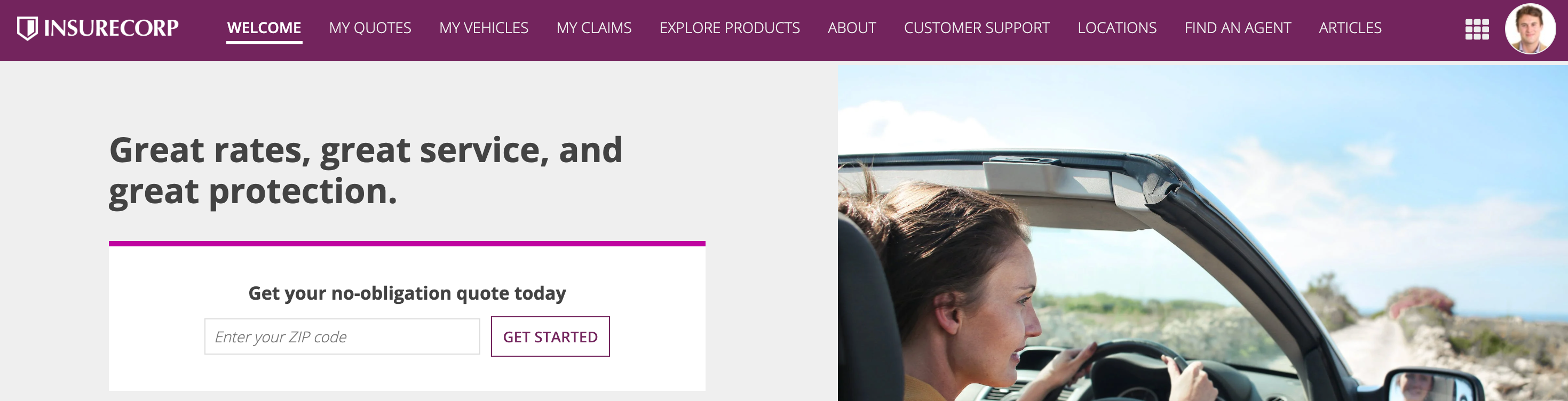
MercuryCopy link to clipboard
Things to know about the Mercury style:
- Available in both sites and portals (the only option for portals).
- The logo is on the left side.
- Page names display on their own, with no icons. However, keep in mind that icons always display in Appian Mobile. You should always choose an icon that reflects the purpose of the page
- Page names only display if there is more than one page.
- The selected highlight color underlines the page name.
Use this style for sites when you have a single page and you don't want the page name to be shown in the header bar.
Site with "Mercury" style and one page
Site with "Mercury" style and multiple pages
ColorCopy link to clipboard
Based on the configured header bar color, a dark gray or white color is automatically applied to the text and icons in the header bar. Avoid a medium-brightness header bar color which may not provide sufficient contrast with the text or icon color.

Don't choose a header bar color that makes the text and icons difficult to read.
Selected highlight colorCopy link to clipboard
The selected highlight color should be distinguishable enough from the navigation bar color so that users can easily tell which tab is highlighted.
For a clean, monochromatic look using the Helium header bar style, configure a selected highlight color that is a darker or lighter shade of the header bar color.

This site with the Helium header bar style uses a dark blue background with a lighter blue highlight to create a monochromatic look.
For a streamlined, easy to navigate look using the Mercury header bar style, configure a selected highlight color that contrasts well with the header bar background color so that users can easily tell which tab they're on.

This site with the Mercury header bar style uses a light blue background with a gold highlight to create user-friendly contrast.
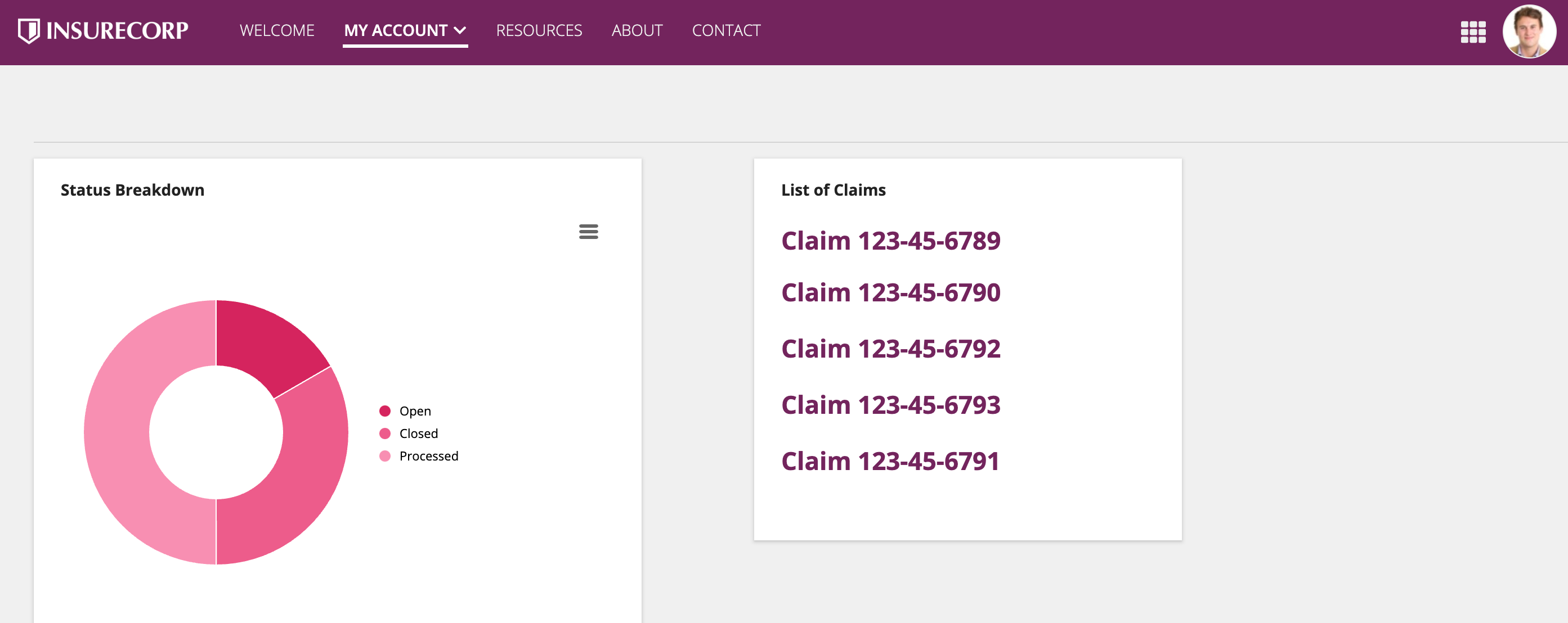
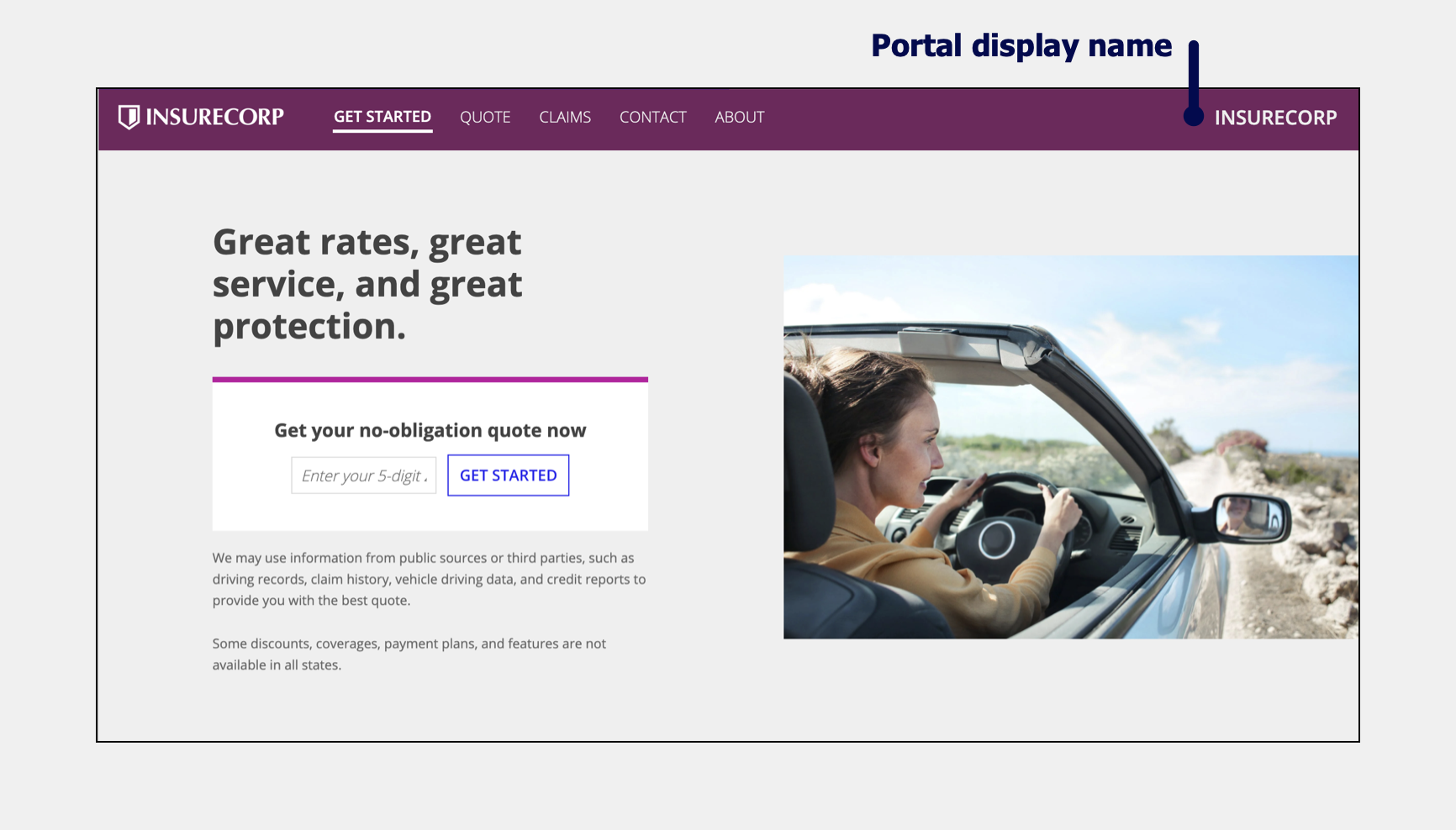
Show display nameCopy link to clipboard
You can choose whether or not to show the display name in the header bar. You can configure this in the site or portal object.
Site and portal differences for header barCopy link to clipboard
The below table summarizes the key differences between header bars in sites and portals.
| Sites | Portals |
|---|---|
| Header bar is one of two options for navigation bar. | Header bar is always enabled for portals with more than one page; optional for portals with only one page. |
| Choose between "Helium" and "Mercury" styles. | "Mercury" style only. |
| Header bar includes: - A configurable logo. - Page titles. For single page sites that use "Mercury," the page title does not display. - A navigation menu . The site display name can optionally display in the navigation menu. - A user menu. |
Header bar includes: - A configurable logo. - Page titles. For single page portals, the page title does not display. - Portal display name (optional). |
Using a header bar in portalsCopy link to clipboard
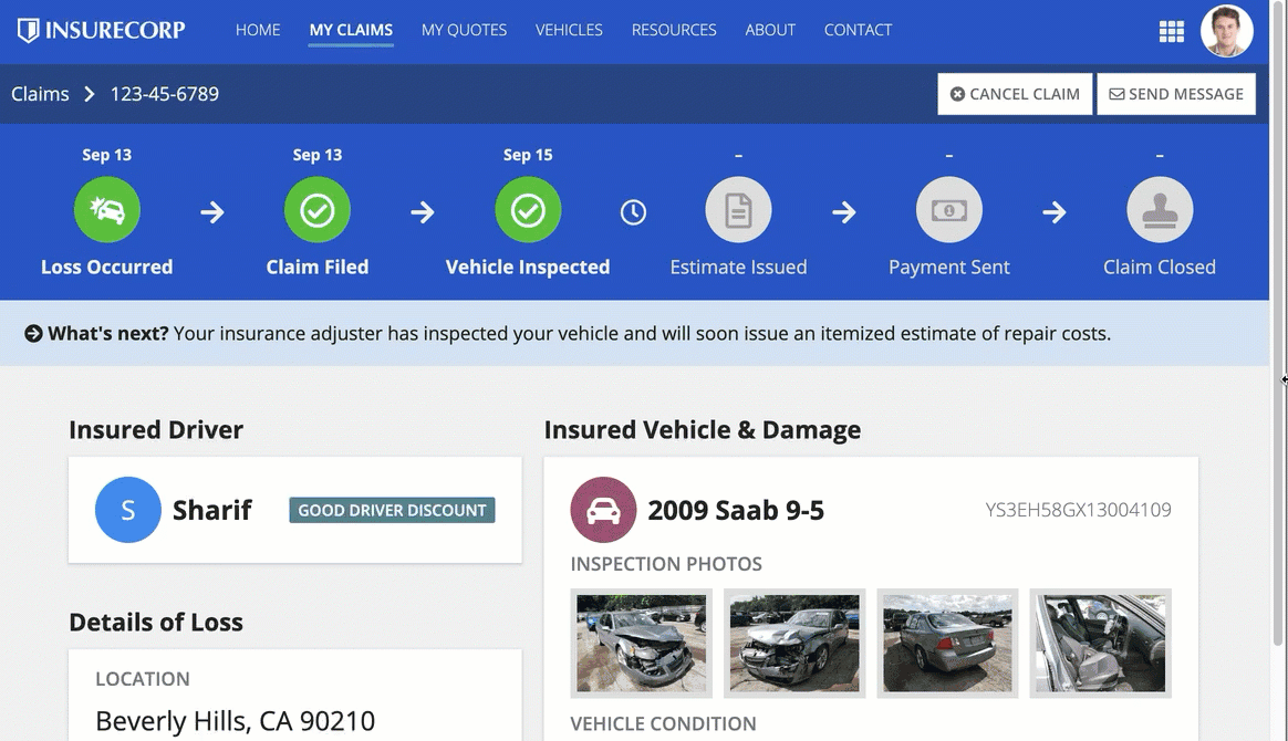
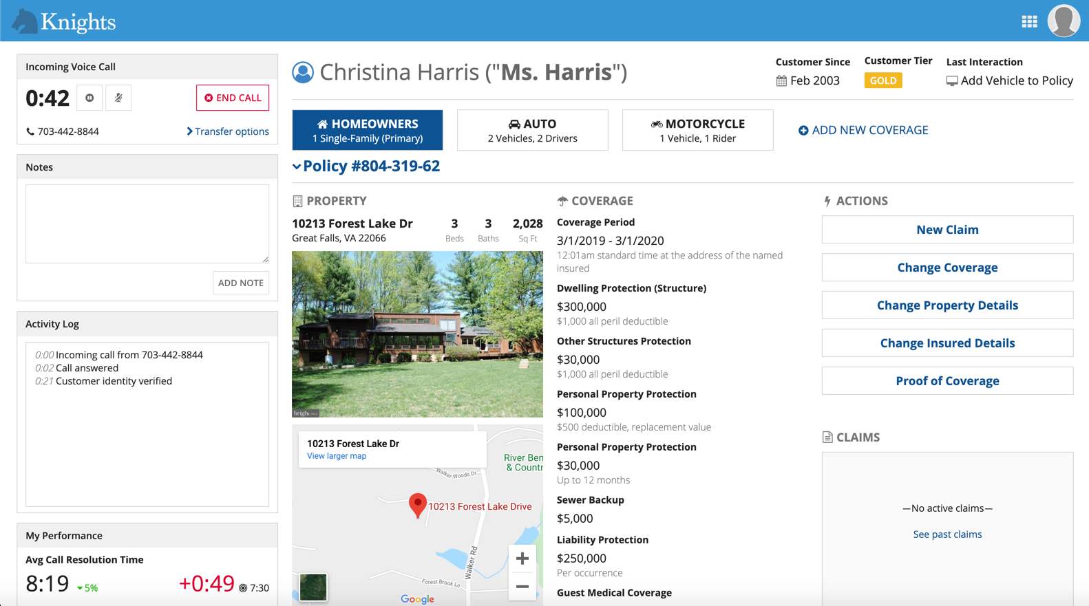
For a single-page portal, adding a header bar allows you to quickly add a fixed header that helps brand your portal with a company logo and custom color scheme to enhance the visual appeal of your portal and make it recognizable to users.
It can also provide additional pages of navigation which allows for richer user experiences in portals that support multiple actions.
SidebarCopy link to clipboard
Things to know about the sidebar layout for navigation bars:
- Does not have the Helium and Mercury style options.
- Displays pages and page groups in a vertically stacked, collapsible navigation bar on the side of the interface with icons displayed next to the titles.
- If users close a site or portal, their collapsible sidebar choice will be remembered the next time they open the individual site or portal.
- The selected page highlight color acts as the background color in the navigation bar rather than as a line beneath the page title.

ColorCopy link to clipboard
Based on the configured background color, a dark gray or white color is automatically applied to the text and icons in the sidebar. Avoid a medium-brightness color which may not provide sufficient contrast with the text or icon color.
Don't choose a background color that makes the text and icons difficult to read.
Selected highlight colorCopy link to clipboard
The selected highlight color should be distinguishable enough from the sidebar color so that users can easily tell which page is highlighted.
Choose a sidebar color that makes it clear which page is selected.
Don't choose a selected highlight color that makes it hard to tell which page is selected.
Show display nameCopy link to clipboard
You can choose whether or not to show the display name in the sidebar. You can configure this in the site or portal objects. The navigation menu always displays as the icon for this layout.
Sidebar guidanceCopy link to clipboard
The Sidebar option is available in both sites and portals but does not apply to Appian Mobile.
Use the sidebar for complex navigationCopy link to clipboard
If your site or portal has many top-level pages or page groups, a sidebar layout can simplify a more complex navigation experience because the vertically stacked list of menu items is easier for users to scan.
For sites or portals with only a few pages or a single page, the sidebar may introduce too much blank space.
Use a sidebar for complex navigation

Don't use a sidebar with only a few site or portal pages
Make sure page content will work well on a narrow widthCopy link to clipboard
Because the sidebar will take up some horizontal space that the header bar does not, make sure your pages work well on a slightly narrower width. Components may stack sooner with a sidebar than they would with a header bar.
Stacking behavior will follow the width of the page itself and will not take the sidebar into account. For example, the following interface begins stacking sooner with a sidebar than with a header bar even though the Stack When parameter has the same value and the screen size is the same.
Users have the option to collapse and expand the sidebar which will have some impact on the horizontal space on the page.
Don't use the same color for the sidebar and page backgroundCopy link to clipboard
Make sure the background color of your pages provide sufficient contrast against the sidebar color. Using a different color for your sidebar and page background color helps separate the page contents from the navigation bar and adds structure to your pages.

Don't use a page background color that is too similar to the sidebar color
Color schemeCopy link to clipboard
For sites, you can either create a custom color scheme by selecting hex codes for each field or you can use one of our predefined dark color schemes which will automatically set values for the navigation bar, selected highlight, accent, and loading bar colors.
For portals, you can create a custom color scheme using hex codes for the header bar, selected highlight, accent, and loading bar colors.
Accent colorCopy link to clipboard
A configurable accent color is used to highlight key UI elements such as "Primary" style links and section headings. The accent color is also used as the default color for buttons.
Avoid accent colors that are:
- Too close to the standard, black text color
- Too close to the red destructive button and error message color
- Too low in contrast against the white page background. The accent color should have a minimum contrast ratio of 4.5:1. Use a contrast checker to ensure your selected color meets the requirement.
If you're using a predefined dark color scheme, make sure that your accent color looks good everywhere that it will be used throughout your site.
AccessibilityCopy link to clipboard
A faded version of the accent color is used as a hover style on certain components, such as dropdown menus and grids with row highlight. For better accessibility, test your accent color while hovering on dropdown menus and grids with row highlight to ensure they have adequate color contrast. The contrast ratio between the cell color and the text should be 4.5:1.
Loading bar colorCopy link to clipboard
The loading bar, which appears above the header bar, gives users an idea of how long it will take the system to load a page or process an action. Select a loading bar color with sufficient contrast against the header bar color to ensure that users notice it.

The loading bar color should stand out from the header bar color so that users notice it
Dark color schemes (sites)Copy link to clipboard
Each dark color scheme comes with predefined colors for the header bar color, selected highlight color, accent color, and loading bar color.
There are three predefined dark color schemes that you can choose from: "Charcoal", "Navy", and "Plum".

A site header bar using the "Charcoal" color scheme.

A site header bar using the "Navy" color scheme.

A site header bar using the "Plum" color scheme.
If you select one of these color schemes, make sure that your site pages are using the same color scheme.
To do this:
- In the interface for your site page, use a header content layout with the backgroundColor parameter set to the same color scheme used for your site: "Charcoal", "Navy", "Plum".
- Put the page's contents into Card Layouts with the style parameter of each Card Layout set to the same color scheme used for your site.
In order to create a consistent style and user experience across your site, avoid creating sites with a mix of dark and non-dark color scheme pages.
The following interface elements cannot use dark color schemes:
- Record lists.
- Related action modals.
- The news tab in records.
- The related actions tabs in records.
These elements use the default white background. For sites including any of these elements, use the default background on all site pages.
LogosCopy link to clipboard
The logo configuration allows you to brand your site or portal to make it instantly recognizable to users. Use a site logo with a transparent background and sufficient contrast against the header bar color.


Border shapesCopy link to clipboard
You can configure the shapes of inputs and buttons at the site or portal level.
You can configure the shape of box layouts and card layouts at the component level. These shape configurations can't be applied site-wide.
Input ShapeCopy link to clipboard
You can select an input shape to match your branding and experience. The input shape is applied to all inputs, pickers, and selection fields on every page of a site or portal.
There are two options for input shape: squared and semi-rounded. Squared is the default selection.
The input shape does not apply to the following interface elements:
- Layouts
- Display fields
- Actions
- Grids
- Charts
- Browsers
- Record banners
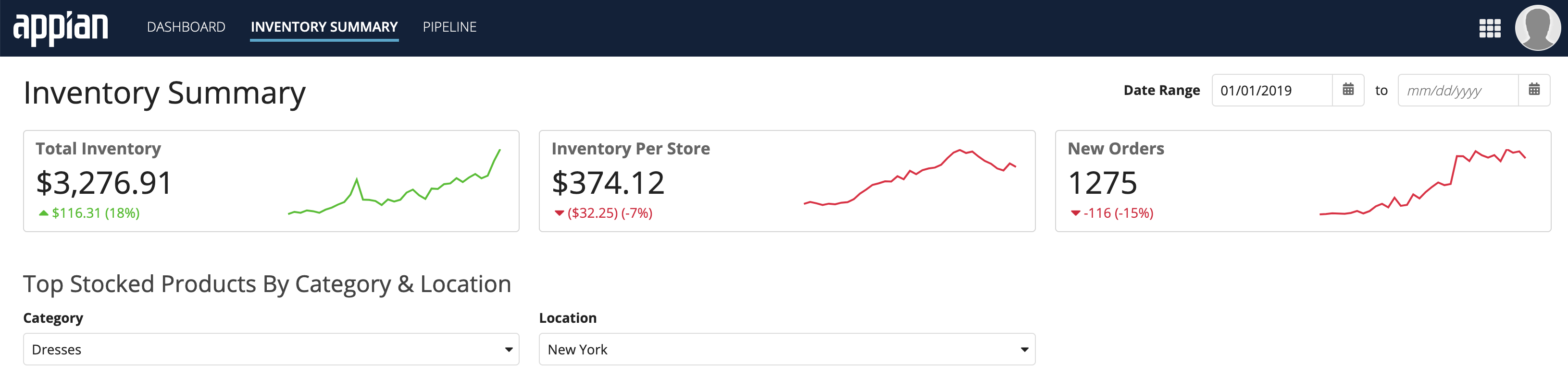
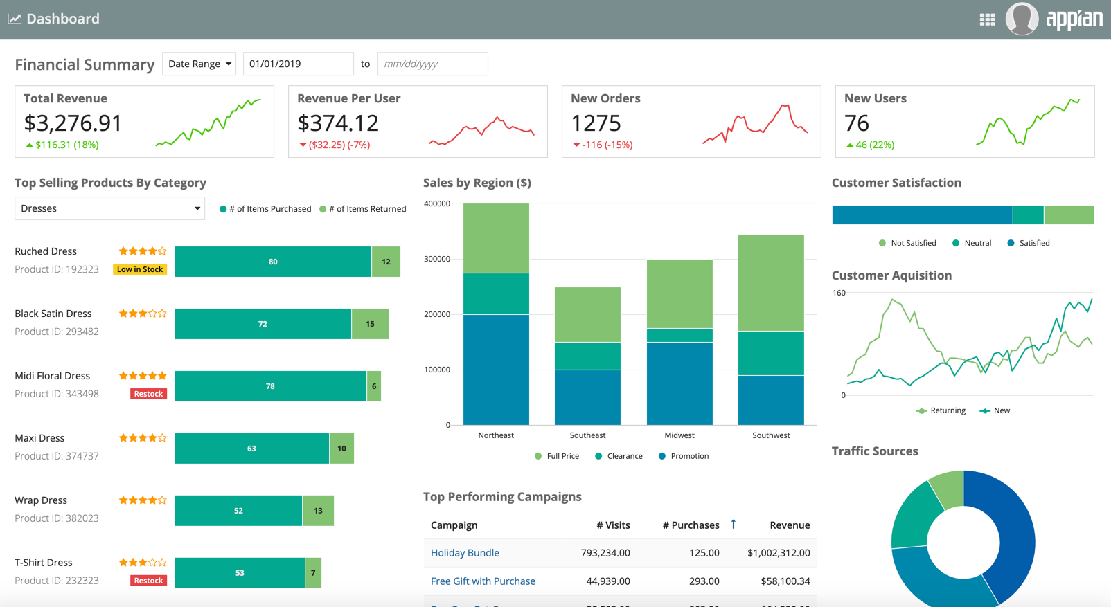
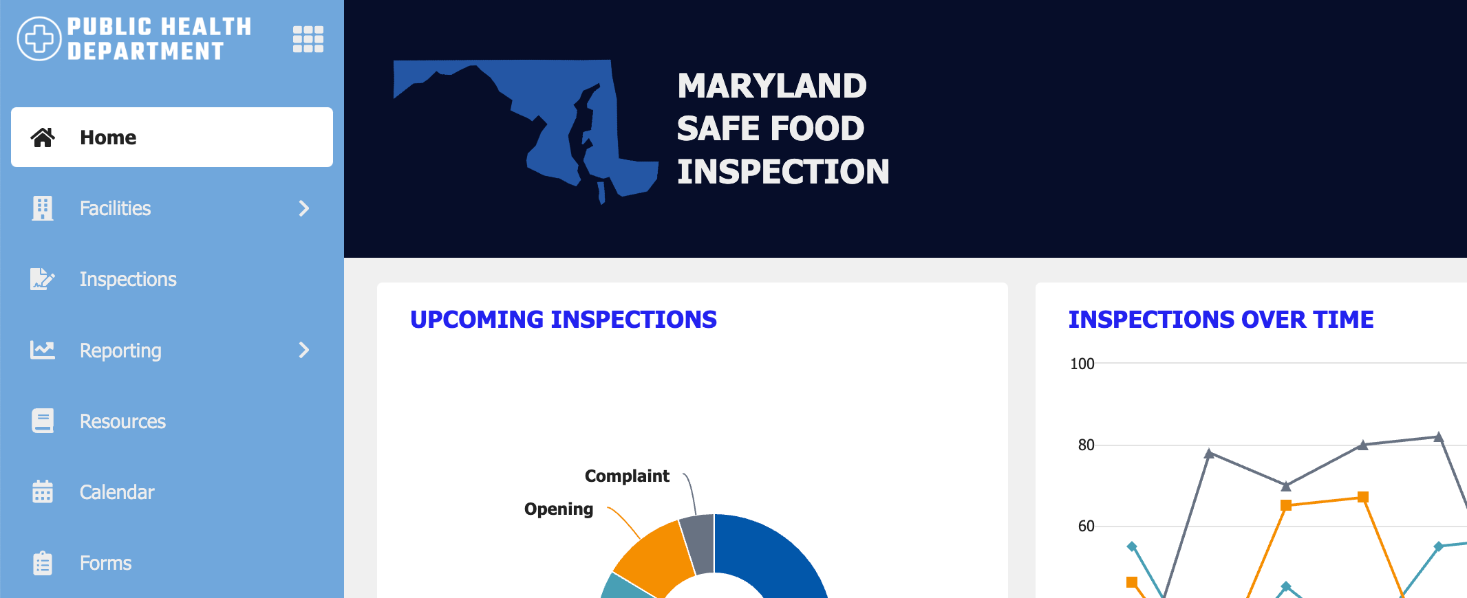
This dashboard shows both semi-rounded inputs and semi-rounded cards displayed in a site. Use rounded cards and rounded inputs together for a professional and consistent user experience.
Button ShapeCopy link to clipboard
You can select a button shape to match the branding and style of your site or portal. The button shape is applied to all buttons on every page of a site or portal, including record view and record actions.
There are three options for button shape: squared, semi-rounded, and rounded. Squared is the default selection.
This dashboard shows rounded buttons displayed in a site.
