
IntroductionCopy link to clipboard
Grids allow us to display data in a tabular format (AKA a table). A record type takes data from a data source and maps that information to a set of fields that become the records. A grid displays fields as columns and records as rows. The read-only grid understands the relationship between columns and rows, and is designed to handle your record data in intelligent ways.
In this tutorial, you'll learn all the major features and functions of the read-only grid by creating a grid with selection pattern in Design Mode (the best way).
Use caseCopy link to clipboard
We've been asked to create a grid list that displays a complete list of all employees in the company. From the grid, we should be able to select any number of employees to be entered into a raffle and configure a secondary display zone that populates a list of selected employees by their first and last name. We've also been asked to prevent the selection of employees in the Sales department (since they're already drowning in additional compensation), but allow them to still show up in the grid list.
Tip: The interface you'll create is a variation of the Grid with Selection pattern. Component patterns are a great way to get started quickly, or learn from expert designs.
ObjectivesCopy link to clipboard
Learn how to create a read-only grid with the most common configurations in about 15 minutes. After completing this tutorial, you will know how to:
- Create a read-only grid in design mode
- Use the grid's function variables
- Format the display value of column data
- Configure selection for a grid
- Capture and share row data from a grid
- Conditionally disable row selection
RequirementsCopy link to clipboard
This tutorial requires basic familiarity with the Appian platform. If you are brand new to Appian, head over to Appian Academy Online and explore the many, free courses available.
In this tutorial, we'll be working with the following design objects and components:
- Interface Object
- Read-Only Grid Component
- Read-Only Grid Column Component
- Column Component
- Grid Selection Component
- Checkbox Component
Create the Appian Tutorial applicationCopy link to clipboard
Tip: The Appian Tutorial application is used throughout Appian tutorials. Skip the steps in this section if you've already created this application in another tutorial.
To begin with, we need to create an application to contain our design objects.
We will be creating the Appian Tutorial application for this tutorial. All of Appian's tutorials use the Appian Tutorial application as the reference application. After completing this tutorial, you can reuse this application as you work through other Appian tutorials.
To create the Appian Tutorial application:
- Log in to Appian Designer (for example, myappiansite.com/suite/design).
- In the Applications view, click +New Application.
-
In the Create New Application dialog, configure the following properties:
Property Description Name Enter Appian Tutorial.Prefix Keep the default prefix, AT, which Appian constructs using the initial characters of each word you entered in the Name parameter. We'll be following the recommended naming standard, and using this short, unique prefix whenever we name an object in this application.Description Leave blank. It's normally a best practice to add descriptions to all design objects. However, to save a little time during this tutorial, we'll skip adding descriptions unless the description displays to the end user. Generate groups and folders to secure and organize objects Keep this checkbox selected, so that Appian will automatically generate standard groups and folders and assign default security groups for this application. - Click CREATE.
-
In the Review Application Security dialog, keep the default security settings. Because we selected the Generate groups and folders option in the previous step, Appian automatically uses the AT Users and AT Administrator groups it generated to set our application security appropriately.
Tip: The security of the application object is unrelated to the security of each of the objects contained within the application. This means that you will need to set security permissions for every object in an application in addition to the application object itself. For more information about security permissions for the application object, see Application Security.
-
Click SAVE.
Right now, the application contains the folders and groups Appian generated automatically. To see these, click Build in the navigation pane. Each design object that you create during the course of this tutorial will appear in this list in the Build view and be associated with the tutorial application.
Create the Employee record typeCopy link to clipboard
To build the interface, you need to create an Employee record type as described in the Database-Backed Record Type Tutorial.
Complete the following sections of that tutorial before continuing:
Set up the read-only gridCopy link to clipboard
Once you've completed the application and record type setup, we can start building our grid.
To set up the grid:
- In the Appian Retail application, go to the Build view.
- Click NEW > Interface.
- Configure the following interface properties:
- Name:
AT_raffleGrid - Description:
Grid for selecting employees for the raffle. - Folder:
AT Examples
- Name:
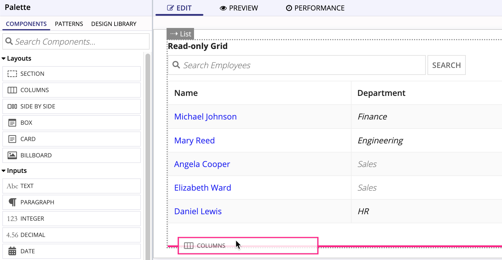
- From the COMPONENTS palette, drag the READ-ONLY GRID component onto your blank interface.
Select the data sourceCopy link to clipboard
After dragging the grid onto your interface, you can select your record data using the Component Configuration panel on the right.
To select a data source for your grid:
- In the Data section, leave the default selection of RECORD TYPE.
-
In the Search record types field, enter
ATand select AT Employee.Your grid is now populated with the employee data from the record type.
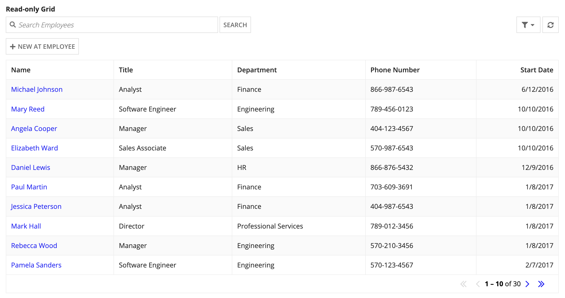
If you're just reading this tutorial, and you see the image above and think, "Wait, that was too easy. I must have missed a bunch of steps somewhere." You can relax; you didn't miss anything.
When you use the a record type as the data source of a grid, Appian automatically queries the record type, populates the grid columns, makes them sortable, and even concatenates the firstName and lastName fields into a single Name column that links to each Employee record. In addition, when Appian detects a column with numbers or dates, it aligns the field data to the right for you.
Set paging & sortingCopy link to clipboard
You can configure paging and sorting for the query, but the grid handles both automatically. This allows you to change these settings from the Component Configuration panel.
To set paging and sorting on the grid:
- From the Paging & Sorting section, enter
5in Rows to Display Per Page. - Under Initial Sorts, click ADD SORT.
- For Field, select lastName.
- For Order, select Ascending.
- Click Read-only Grid to navigate back up to the grid properties.
Configure columnsCopy link to clipboard
When you select a record type as the data source, the grid will automatically populate with the record list configuration. The grid's columns will match the columns selected in the record list, but you can modify them as required for the interface you're building.
The display value of every column is set with the function variable, fv!row. This variable contains all the data for the entire row. For example, in the Start Date column, the display value is fv!row[recordType!AT Employee.fields.startDate].
In this section, we'll remove a column from the grid and update the formatting on another columns.
Remove a columnCopy link to clipboard
Since we don't need to see the employee's title, let's remove it.
- From the Columns section, hover over the Options menu ( ) for Title (Grid Column), and click X to delete the Title column.
Format a columnCopy link to clipboard
Now, let's format the Department column by changing the text style.
- From the Columns section, click Department (Grid Column).
- Under Display Value, click DISPLAY OPTIONS.
- In Display Options, select STYLED TEXT from the RICH TEXT row.
- In the Display Value field for the grid column, click the Rich Text link.
- In the Display Value field for the Rich Text, click the Styled Text link under Configure items.
- From the Style dropdown, select Emphasis.
Conditionally change the text color in a columnCopy link to clipboard
Since we don't want anyone from the Sales department entered into the raffle, let's remind the user by changing the color of "Sales" in that column.
- Hover over Color until the Edit as Expression icon () appears, then click it.
-
In the expression editor, enter:
1
2
3
4
5
if(
   fv!row[recordType!AT Employee.fields.department] = "Sales",
   "SECONDARY",
   null
)
Copy
Note: Record type field references are specific to each record type and environment. This means that you need to reference the record type fields from your own environment whenever you copy and paste a record type reference from outside the application.
-
Click OK.
Now when the row evaluates, if the Department in that row is
Sales, the text color will be set to"SECONDARY"; otherwise it'll benull(the default).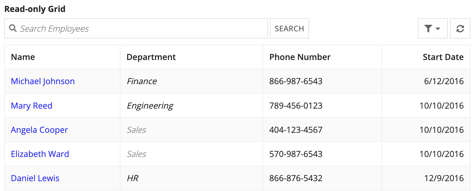
Add display zoneCopy link to clipboard
Since our grid has selection and paging, it's a good UX practice to provide a secondary display so the user can see the totality of their selection no matter what page they're on.
If you're familiar with interface design, you can follow the higher-level steps below to add a display zone. If you're still somewhat new to interface design in Appian, skip to these directions.
- Add a Columns Layout with two columns.
- Put the grid in the left column, and set the column width to
WIDE. - Put a Rich Text component in the right column.
- In that Rich Text component, add two items:
- Styled Icon (
user-circle). - Styled Text (
First Last).
- Styled Icon (
- Jump to Add Selection.
Add columnsCopy link to clipboard
We'll add a columns layout so that our grid is in one column, and the grid rows appear in the other column.
To add a columns layout:
-
Drag a COLUMNS component from the palette to just below the grid.
-
Delete one of the columns by clicking on the Delete column icon ().
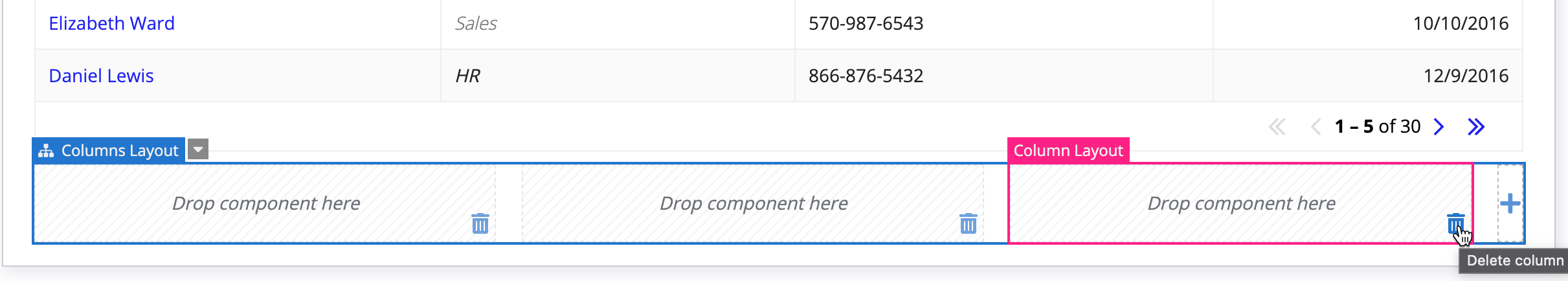
- Drag the grid into the first column.
-
Hover over the Read-Only Grid selector until the component hierarchy displays, then click Column Layout.
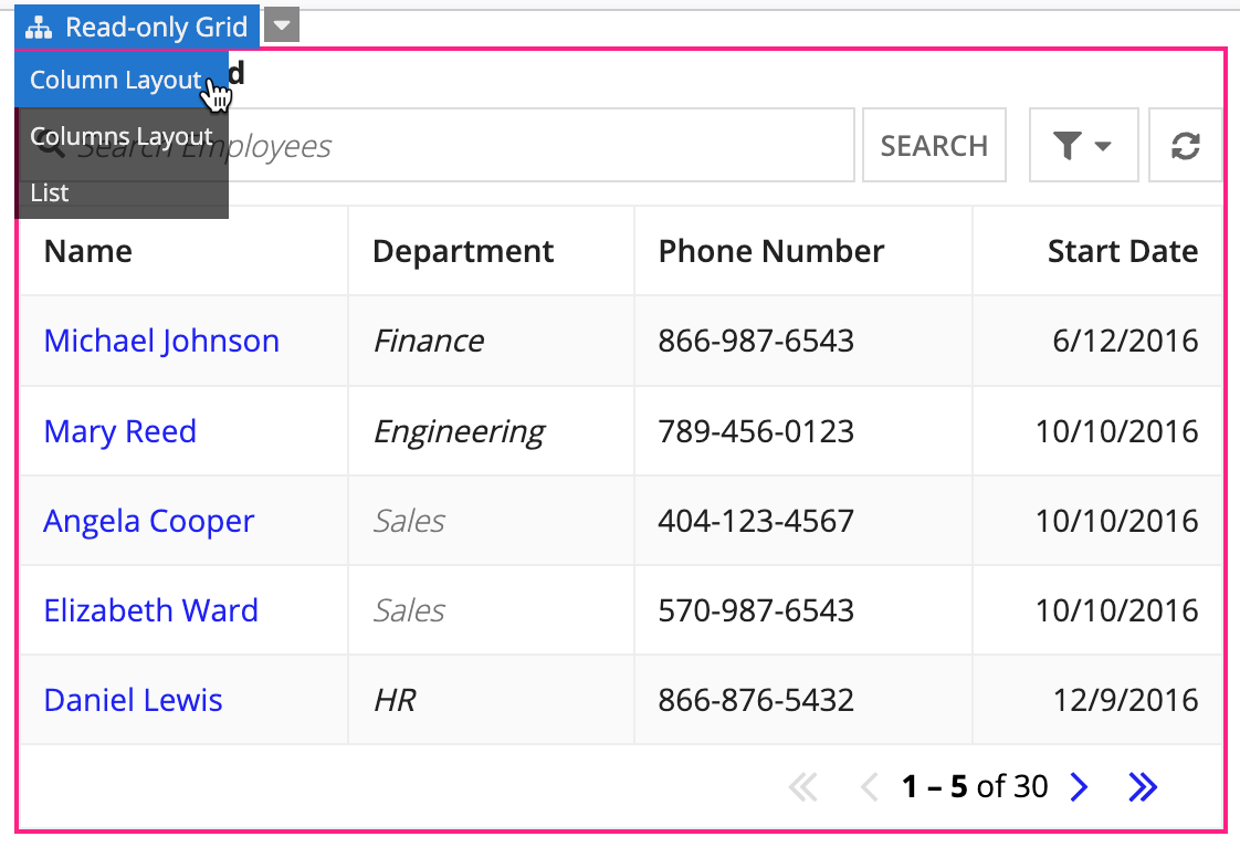
Now that the column is selected, let's increase the width.
- For Width, select Set fixed width.
- From the dropdown, select Wide.
Add a display fieldCopy link to clipboard
Now, that the grid is in one column, we'll add a display field in the other column. The display field will show all of the selected grid rows.
To add a display field:
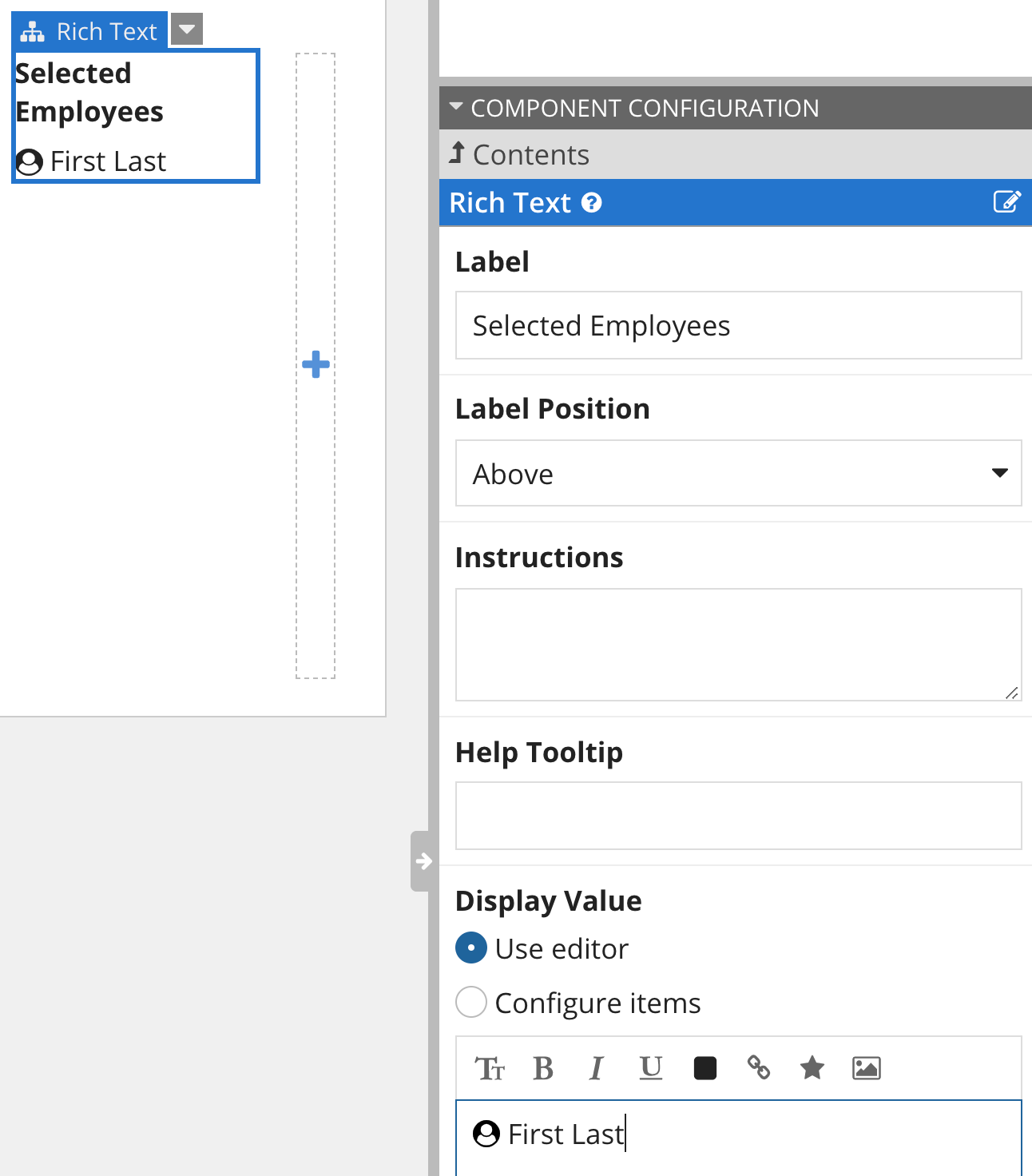
- Drag a RICH TEXT component from the Component Palette into the second column.
- For Label, enter
Selected Employees. - For the Display Value, with Use editor selected, click the Icon button ().
- Enter
user-circleinto the search box and select this icon (), and click INSERT. -
In the editor, after the icon, enter
First Last.And this is where we're going to leave it for now:
Add local variables and selectionCopy link to clipboard
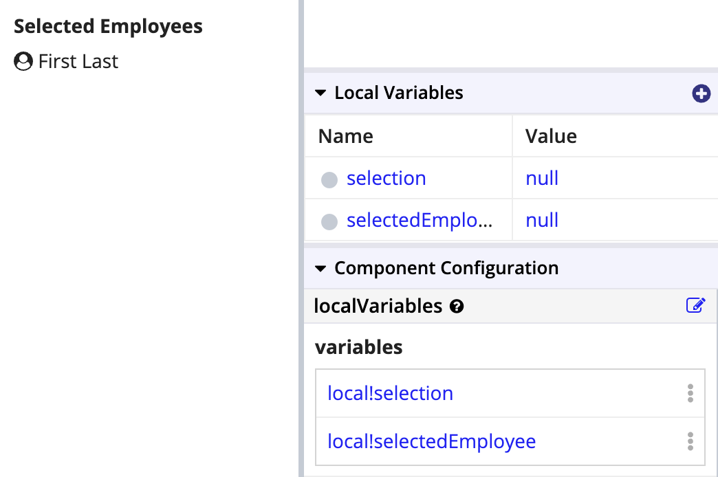
To set up grid selection, you need to create a local variable to save the selection value into. In our case, we also need to pass the selected row's data to a local variable so we can display the selected employees in the display zone. To accomplish this, we're going to add two local variables: (1) local!selection for the grid's current selection, and (2) local!selectedEmployees for the row data of those selections.
To add these local variables:
- From the Local Variables panel toolbar, click the New Local Variable icon.
- For Name, enter
selection. - Click CREATE AND ADD ANOTHER.
- For Name, enter
selectedEmployees. - Click CREATE.
Configure selection valuesCopy link to clipboard
- In design mode, select the Read-Only Grid component to get to the component configuration.
- From the Selection section, select Selectable. This will enable selection for the grid, and provide some additional configurations below.
- From the Selection Value dropdown, select local!selection.
- Hover over Save Selection To until the Edit as Expression icon () appears, then click it.
-
In the expression editor, enter this expression:
1
2
3
4
5
6
7
{
  local!selection,
  /* This save adds the full rows of data for items selected in the most recent user interaction to local!selectedEmployees. */
  a!save(local!selectedEmployees, append(local!selectedEmployees, fv!selectedRows)),
  /* This save removes the full rows of data for items deselected in the most recent user interaction to local!selectedEmployees. */
  a!save(local!selectedEmployees, difference(local!selectedEmployees, fv!deselectedRows))
}
Copy - Click OK.
You can now persist your selection. Try it out by selecting and deselecting rows. The selection index is saved to local!selection, and the row data for those selections is saved to local!selectedEmployees; you can't see that yet, but we'll set that up in the next section.
Tip: The grid is actually smart enough to use a single selection variable for both the selection index and the row data. You can test it out by setting the Selection Value to local!selectedEmployees[recordType!AT Employees.id]. If you only pass the data, the grid won't know which field is the primary key, so you'll need to create a second variable for the selection index; we show the two-variable method in this tutorial because it works in both cases.
Populate display sectionCopy link to clipboard
It's time to configure the second column of our interface to show the employee names of the selected rows. With the components we want already setup, we're going to wrap them in a looping function (a!forEach()) to reuse them for every employee in local!selectedEmployees.
- Click on the Rich Text component to show its Component Configuration.
-
Hover over Display Value until the () Edit as Expression icon appears, then click it. You will see the following expression in the editor:
1
2
3
4
5
6
{
  a!richTextIcon(
    icon: "user-circle"
  ),
  " First Last"
}
Copy -
Replace that expression with this one:
1
2
3
4
5
6
7
8
9
a!forEach(
  items: local!selectedEmployees,
  expression: {
    a!richTextIcon(
      icon: "user-circle"
    ),
    " " & fv!item[recordType!AT Employees.fields.firstName] & " " & fv!item[recordType!AT Employees.fields.lastName]&char(10)
  }
)
Copy
The record field references for
firstnameandlastnameare placeholders and need to be replaced with those from your environment. - Click OK.
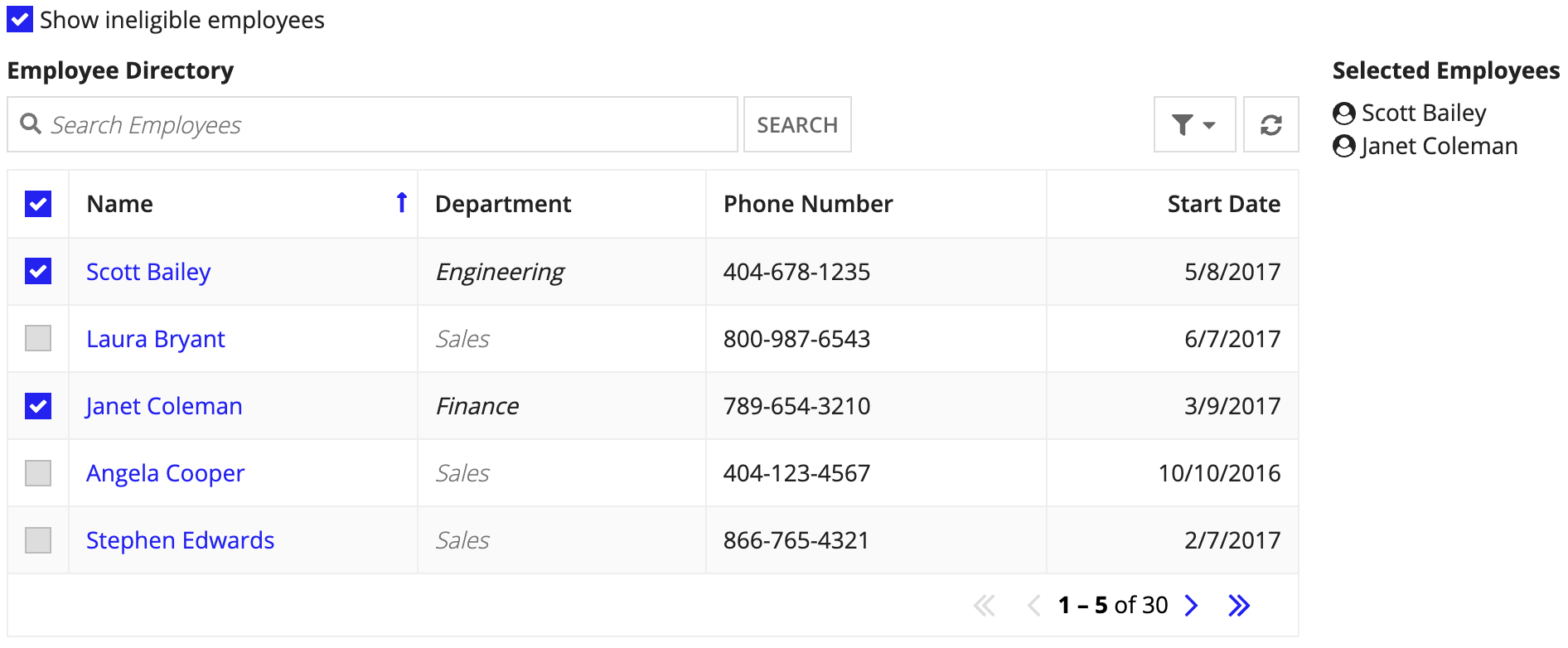
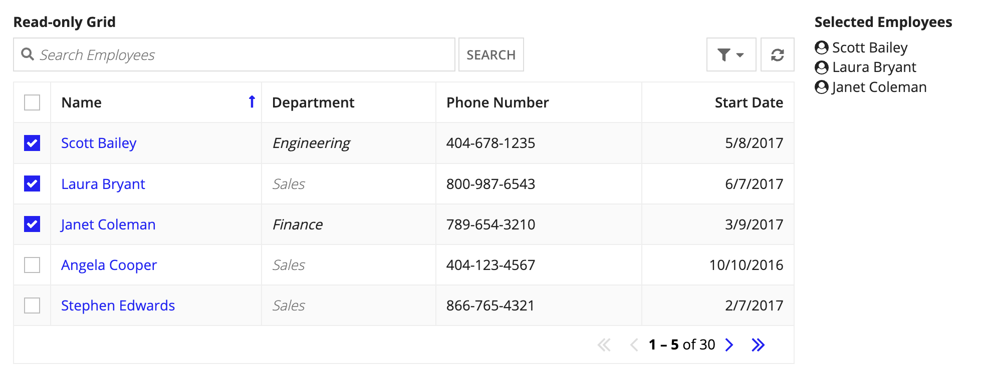
Select Scott Bailey, Laura Bryant, and Janet Coleman in the grid to see each name appear on the right.
Disable selection for salesCopy link to clipboard
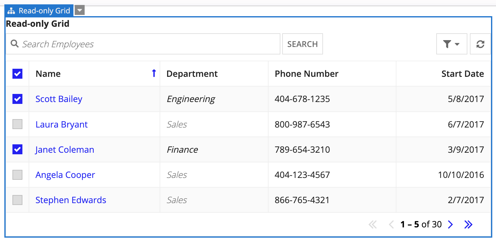
Changing the color of "Sales" isn't enough; to prevent users from selecting anyone in the Sales department, we're going to tell the grid to disable selection for rows when the department in that row is Sales.
Note: Be sure to unselect the employee records you selected in Populate display section before proceeding with the steps in this section.
- Select the Read-only Grid to show the Component Configuration.
- From the Selection section, select Only disable when… under Disable Row Selection.
- Click Edit Condition.
- In the expression editor, replace the existing value with the following expression:
fv!row[recordType!AT Employee.fields.department] = "Sales" - Update the placeholder record field reference to use the
departmentfrom your Employee record type. - Click OK.
Now employees in Sales can't even be selected from the grid. Try it out for yourself.
Filter ineligible rowsCopy link to clipboard
Now that you've had a good look at your grid, you realize not everyone will be interested in seeing those employees in Sales who aren't eligible for the raffle. So, we're going to add an option to hide those rows with a checkbox. For this, we're going to use the method described in the Configure a Boolean Checkbox pattern.
Set variable & defaultCopy link to clipboard
Before we create the checkbox, let's first create a local variable to store the checkbox value, and set a default value on load.
To add a local variable:
- From the Local Variables panel toolbar, click the New Local Variable icon.
- For Name, enter
showIneligible. - For value, enter
false(). - Click CREATE.
Add a checkboxCopy link to clipboard
Now that we have the local variable, we're ready to set up the checkbox to have only one option, and for that option to toggle true and null in the variable to act as a switch for the filter we will create in the next section.
To add a checkbox:
- Drag a Checkboxes component from the palette onto the canvas, just above the grid.
- From the Component Configuration panel, under the Checkboxes section, select Hidden for Label Position.
- From Choice Labels, click the List of Text link.
-
Hover over the options menu on the second item and click and click X to delete it.
Note: Note that the interface will warn you that your options and values don't match; ignore the warning for now.
- Replace the text for the first item with:
Show ineligible employees - Click Checkboxes to navigate up.
Set up the checkboxCopy link to clipboard
Now that we've set up the choice labels, we'll update the choice values. This will also remove the error.
To configure the choice values:
- From Choice Values, click the List of Any Type link.
- Hover over the options menu on the second item and click and click X to delete it.
- Click on the number 1 link.
- In the expression editor, replace the value (
1) withtrue. - Click OK.
- Click Checkboxes to navigate up.
- Hover over Selected Values until the Edit as Expression icon () appears, then click it.
- Enter this expression:
if(local!showIneligible, true, null) - Click OK.
- Hover over Save Selection To until the Edit as Expression icon () appears then click it.
-
Enter this expression:
1
2
3
4
5
6
7
8
a!save(
 local!showIneligible,
 if(
  isnull(save!value),
  false,
  true
 )
)
Copy - Click OK.
Now that the checkbox is set up, let's connect a query filter to it.
Filter the gridCopy link to clipboard
We're going to add a simple filter to the grid to exclude employees in the Sales department. This filter exclusion will only run when the checkbox variable (local!showIneligible) is false.
To filter the grid when the checkbox is selected:
- Click on the grid to select it, then from the Component Configuration, under Data Source, click FILTER RECORDS.
- On the Filter Records dialog, click the Add Filter link. This adds an empty row to the filters table.
- For Field, select department.
- For Condition, select not equal to.
- For Value, enter
Sales. - From Apply Filter, click the Always link.
- In the expression editor, enter
local!showIneligible = false. - Click OK.
- Click SAVE CHANGES to save the changes to your interface.
Now you can toggle the checkbox on and off to view or hide the Sales rows.
Finish up and celebrateCopy link to clipboard
Now that it's all working, let's wrap up:
- Double-click on Read-only Grid and change that label to
Employee Directory.
That's it!
We know that was pretty easy, but you should feel proud anyway.
What you do next is up to you.
- You might want to limit the number of rows that can be selected to the number of raffle tickets you have. In which case, check out Limit the Number of Rows in a Grid That Can Be Selected.
- It probably makes sense to only enter people into the raffle who haven't been entered recently. Check out Show Calculated Columns in a Grid.
Learn more about the Read-Only Grid, and find more patterns and examples here.