FunctionCopy link to clipboard
a!documentBrowserFieldColumns( label, labelPosition, instructions, helpTooltip, rootFolder, navigationValue, navigationSaveInto, selectionValue, selectionSaveInto, showWhen, readOnly, height, accessibilityText )
Displays the contents of a folder and allows users to navigate through a series of folders to find and select a document.
ParametersCopy link to clipboard
| Name | Keyword | Types | Description |
|---|---|---|---|
|
Label |
|
Text |
Text to display as the field label. |
|
Label Position |
|
Text |
Determines where the label appears. Valid values:
|
|
Instructions |
|
Text |
Supplemental text about this field. |
|
Help Tooltip |
|
Text |
Displays a help icon with the specified text as a tooltip. The tooltip displays a maximum of 500 characters. The help icon does not show when the label position is |
|
Root Folder |
|
Any Type |
The contents of the specified folder or knowledge center are displayed in the first column of the browser. |
|
Navigation Folder Value |
|
Folder |
The folder that has been navigated to whose contents are displayed in the rightmost column. |
|
Save Navigation Folder To |
|
List of Save |
Variable or list of variables to update when the navigation folder changes. |
|
Selection Value |
|
Document |
The document to show as selected. |
|
Save Selection To |
|
List of Save |
Variable or list of variables to update when a document is clicked. |
|
Visibility |
|
Boolean |
Determines whether the component is displayed on the interface. When set to false, the component is hidden and is not evaluated. Default: true. |
|
Read-only |
|
Boolean |
Determines whether selection is enabled. Default: false. |
|
Height |
|
Text |
Determines the height of the component. Valid values: |
|
Accessibility Text |
|
Text |
Additional text to be announced by screen readers. Used only for accessibility; produces no visible change. |
Usage considerationsCopy link to clipboard
Displaying items and offline useCopy link to clipboard
- Each column displays items in alphabetical order, with folders always listed first.
- Avoid using this component for offline mobile forms because tapping on a folder does not display its contents.
PermissionsCopy link to clipboard
- The current user must have permission to view the selected folder or knowledge center in the parameter.
- Within a folder or knowledge center, the user can only see contents for which they have permission to view.
ExamplesCopy link to clipboard
Copy and paste an example into the INTERFACE DEFINITION in EXPRESSION MODE to see it displayed.
Document browserCopy link to clipboard
1
2
3
4
5
6
7
8
9
10
11
12
13
14
15
16
17
18
19
20
21
22
23
24
25
26
27
28
29
a!localVariables(
  local!selection,
  local!navigation: if(
    isnull(local!selection),
    null,
    document(local!selection[1], "folderId")
  ),
  local!rootFolder: cons!REPORTS_FOLDER,
  a!sectionLayout(
    label: "System Report Picker",
    contents: {
      a!documentBrowserFieldColumns(
        rootFolder: local!rootFolder,
        selectionValue: local!selection,
        selectionSaveInto: local!selection,
        navigationValue: local!navigation,
        navigationSaveInto: local!navigation
      ),
      a!pickerFieldDocuments(
        label: "Selection",
        labelPosition: "JUSTIFIED",
        folderFilter: local!rootFolder,
        maxSelections: 1,
        value: local!selection,
        saveInto: local!selection
      )
    }
  )
)
Copy
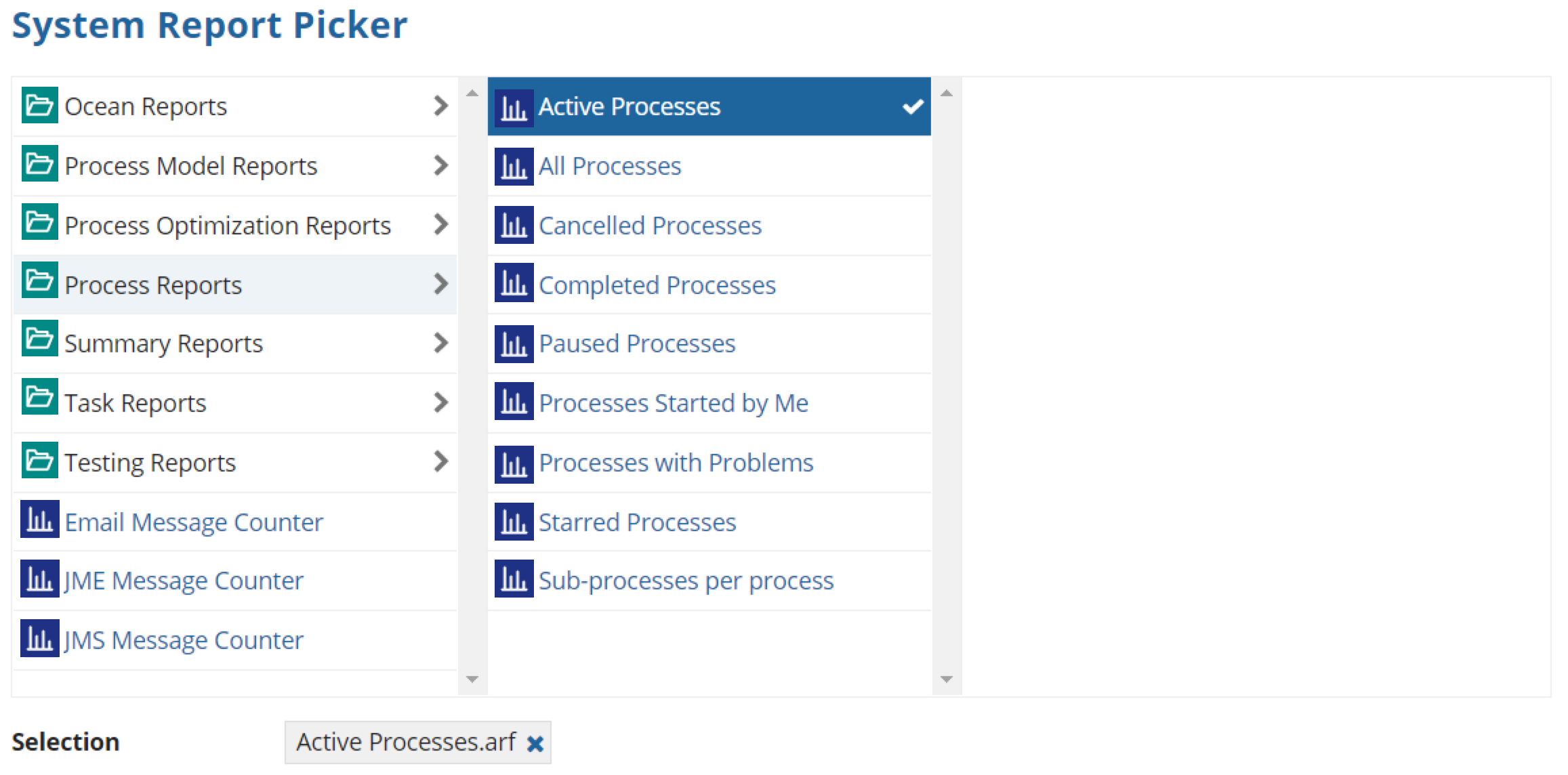
A document browser similar to the one pictured below displays. Note that your folder contents may differ from the example:

Feature compatibilityCopy link to clipboard
The table below lists this component's compatibility with various features in Appian.
| Feature | Compatibility | Note |
|---|---|---|
| Portals | Incompatible | |
| Offline Mobile | Incompatible | |
| Sync-Time Custom Record Fields | Incompatible | |
| Real-Time Custom Record Fields | Incompatible | Custom record fields that evaluate in real time must be configured using one or more Custom Field functions. |
| Process Reports | Incompatible | Cannot be used to configure a process report. |
| Process Events | Incompatible | Cannot be used to configure a process event node, such as a start event or timer event. |
Old versionsCopy link to clipboard
There are older versions of this interface component. You can identify older versions by looking at the name to see if there is a version suffix. If you are using an old version, be sure to refer to the corresponding documentation from the list below.
| Old Versions | Reason for Update |
|---|---|
| a!documentBrowserFieldColumns_17r3 | Now supports selection in addition to browsing. |
To learn more about how Appian handles this kind of versioning, see the Function and Component Versions page.
